What is Notan Light-Dark?
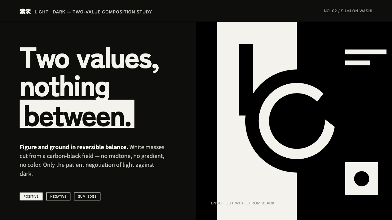
Notan Light-Dark reduces the interface to its oldest visual argument: light and dark must hold each other in balance.
Notan Light-Dark in brief
Notan is the Japanese discipline of light-dark balance: masses of black and white arranged with no middle tone to soften their relationship. A notan study is not simply a high-contrast picture. It is an exercise in equal force, where every white form gains meaning from the black around it and every dark area is treated as active visual material rather than empty background.
In sumi ink practice on washi, the composition is fundamentally reversible. Positive and negative can exchange roles like yin and yang without one becoming secondary. This makes notan unusually demanding: a form cannot rely on shading, texture, or color to explain itself. Its silhouette, placement, and interval must do all the work.
Notan Light-Dark translates that discipline into an interface language. The honest ground is a carbon-black field, with flat white components appearing as if cut from it. Edges may carry a dry-brush irregularity, but the system remains uncompromisingly binary: no color, no gray, no gradients, only the patient negotiation of light against dark.
Where does Notan Light-Dark come from?
Notan is rooted in older Japanese ink practice, where the relation between ink and unpainted paper can be more important than descriptive detail. The name itself means light-dark. Rather than treating darkness as a shadow added after an object is drawn, notan begins with the whole field and asks how opposing masses can be made equally necessary.
Its natural home is sumi-e, the ink tradition associated with brush marks on washi. Here the white of the paper is not passive reserve. It can become atmosphere, opening, direction, or a counterweight to the brush. The visual lesson is direct: absence has shape, and a mark is only as strong as the space that receives it.
Around the turn of the twentieth century, notan was codified for Western design pedagogy. Arthur Wesley Dow and Ernest Fenollosa are identified as key figures in that transmission, which brought Japanese compositional thinking into art-school theory. In this educational setting, notan became a way to teach composition before students depended on realism, modeling, or decorative finish.
The idea subsequently aligned with early compositional design education and modernist black-and-white abstraction. Its endurance comes from its economy. By withholding every intermediate value, notan exposes whether a composition has actual structure. The discipline therefore remains useful wherever a designer needs hierarchy, figure-ground clarity, and a visual system that survives reduction.
What defines the Notan Light-Dark look?
Binary Value
The system permits only black and white. There is no middle tone to smooth contrast, describe volume, or rescue an uncertain edge. This restriction gives every boundary consequence: a change in silhouette changes the entire balance of the composition.
Active Ground
Black is not a backdrop waiting to be decorated. It is the field from which white masses are cut. Treating the dark ground as a designed shape prevents the familiar mistake of making the white content feel like an ordinary page placed on a dark screen.
Figure-Ground Reversal
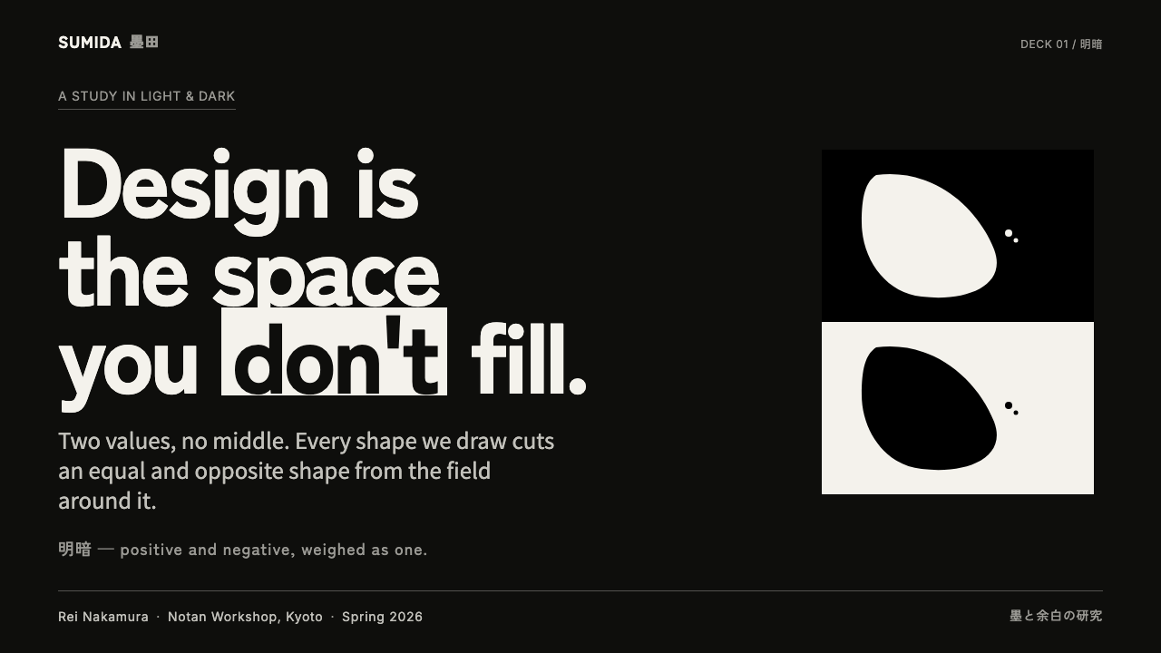
A successful notan composition can survive reversal because figure and ground carry comparable visual weight. White may read as object and black as opening, then exchange those roles without the layout collapsing. The relationship matters more than either color alone.
Cut-Paper Flatness
Components read as solid masses, not as modeled objects under light. Panels, controls, and symbols should feel cut out and placed against the field. The resulting flatness is not a lack of depth; it is a refusal to substitute lighting illusion for compositional order.
Dry-Brush Edge
The dry-brush character introduces tactile irregularity without introducing tonal complexity. An edge can feel brushed, broken, or slightly weathered while remaining decisively black against white. It gives the interface a connection to ink practice without turning it into decorative texture.
No Chromatic Escape
Color is deliberately absent. Alerts, emphasis, and hierarchy must be expressed through placement, area, reversal, and form. This makes the system severe but legible: when something changes, the viewer sees a structural change rather than merely receiving a colored signal.
Who shaped Notan Light-Dark?
Dow is identified as a key figure in bringing notan into Western design pedagogy around the turn of the twentieth century. Within that transmission, notan became a compositional method: a way to study balance and relation before students reached for realism or ornamental finish.
Fenollosa is likewise named as a key figure in the transmission of Japanese notan theory into Western art-school design thinking. His importance here is not an individual style signature, but the educational bridge through which light-dark balance became a teachable design principle.
This is a lineage rather than a single author. Japanese sumi-e and notan theory supplied the underlying lesson: ink and unpainted ground are equal compositional participants. Modern applications inherit that lesson when they make dark space active instead of treating it as a neutral background.
How do you use Notan Light-Dark today?
For slides, use the cover as a figure-ground proposition: let one large white mass emerge from the black field, then place the title where it either completes or interrupts that mass. Content slides should preserve broad dark breathing room around concise white text blocks. Data slides work best when charts are rebuilt as opposing areas, with selected values reversed into white and surrounding structure held in black rather than decorated with extra visual categories.
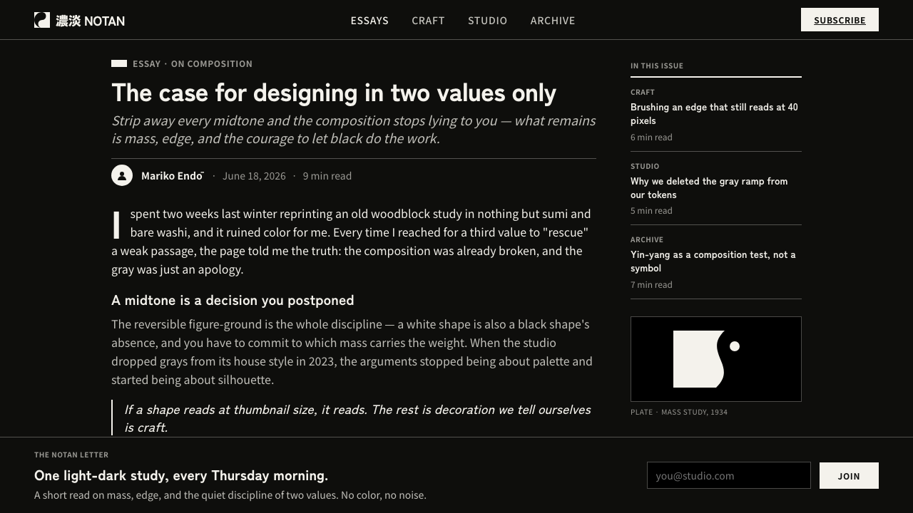
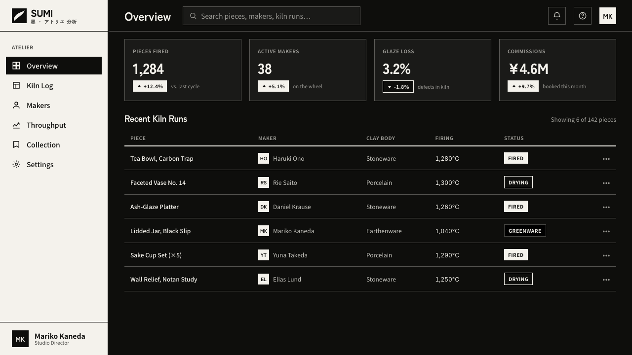
For web interfaces, Notan Light-Dark suits dashboards, analytical tools, and pricing pages that need immediate hierarchy. Establish the black field first, then make navigation, selected states, and primary actions read as white cuts within it. A dashboard benefits when summaries are grouped as distinct light masses, while secondary information recedes by occupying less area or returning to the ground.
For editorial and marketing work, use the style to turn reading into a sequence of reveals. A headline can arrive as a white interruption in darkness; a pull quote can reverse the relationship; an image can be reduced to silhouette or a high-contrast crop. The effect is strongest when each section has a clear visual claim, not when every paragraph is boxed into identical white containers.
The common mistake is to call any dark interface with white text notan. That produces contrast, not balance. Another error is adding gray, colored status accents, glow, or soft depth as soon as the composition becomes difficult. Notan asks the designer to solve that difficulty with proportion and negative space. If an element needs tonal decoration to be understood, its underlying relationship is probably unresolved.
Notan Light-Dark — FAQ
Is Notan Light-Dark simply a monochrome dark mode?
No. A monochrome dark mode can still treat black as background and white as ordinary content. Notan requires figure-ground balance: dark and light must both act as shaped masses, and a reversal should remain compositionally meaningful. The method is about relation, not merely contrast.
Why are gray and gradients excluded?
They would introduce intermediate value and make it possible to model volume or soften an uncertain separation. Notan intentionally removes that option. The designer must establish clarity through silhouette, area, interval, and reversal, so the composition can be judged without atmospheric effects.
Can the dry-brush character make the system feel decorative?
It can, if it is applied as a surface effect after the layout is finished. Used correctly, dry-brush character belongs at the edge, where it preserves the memory of ink without weakening the binary structure. The mass remains flat and decisive; only its boundary carries a tactile trace.
Where does Notan Light-Dark work poorly?
It is a demanding system for interfaces that require many simultaneous categories, subtle tonal comparison, or a richly chromatic emotional atmosphere. Its strength is disciplined hierarchy, not expressive abundance. When the product depends on many differentiated signals, the binary vocabulary may be too narrow unless the information can be reorganized into clearer groups.
Related design styles
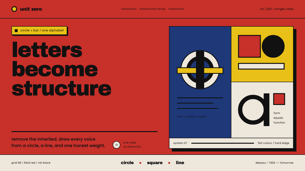 Bayer Universal BauhausLetters become structure. Bauhaus red, primary blocks, and black circle-bar f…
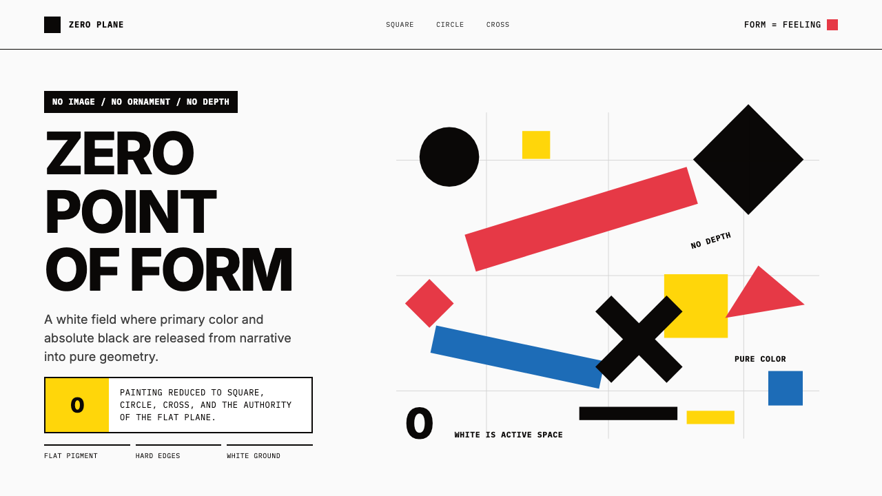 Malevich SuprematismGeometry declares zero. Red, yellow, blue and black blocks float on active wh…
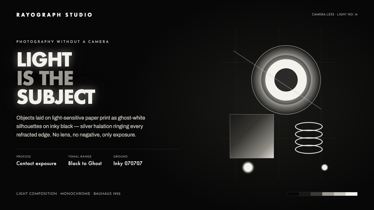 Photogram RayographLight is the subject. Ghost-white silhouettes and silver halation float on in…
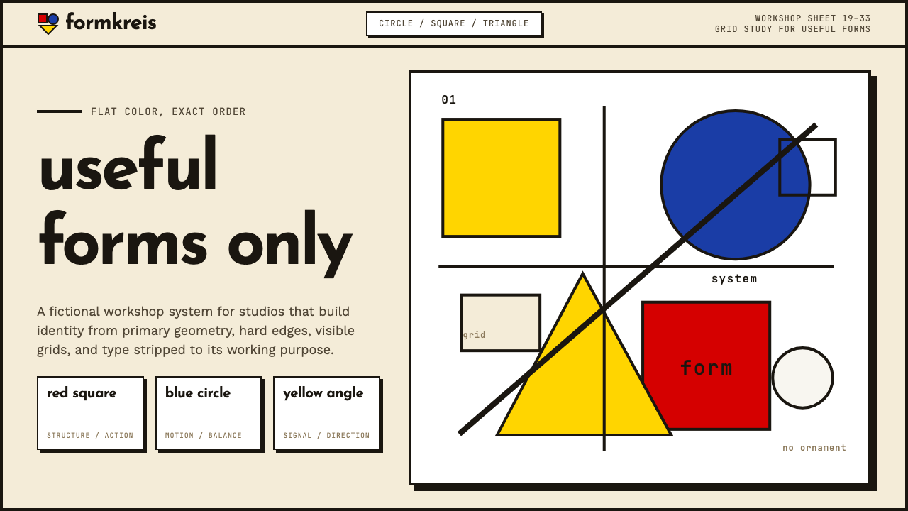 Bauhaus WeimarForm follows revolution. Primary red-blue-yellow on cream, hard shadows, no o…
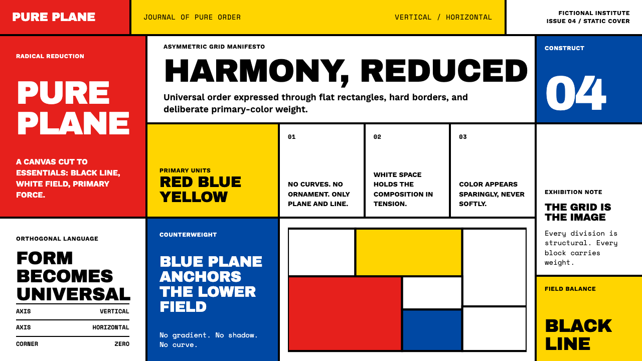 De StijlPrimary colors, locked in a black grid. Mondrian's compositions, in thick bor…
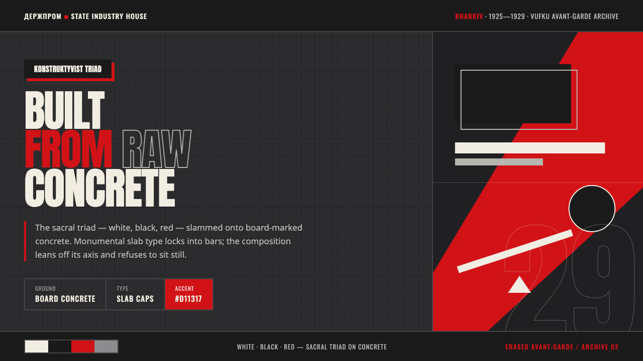 Kharkiv Constructivism (Derzhprom)Monumental, made structural. White-black-red triad on raw concrete, slab caps…