What is Kharkiv Constructivism (Derzhprom)?
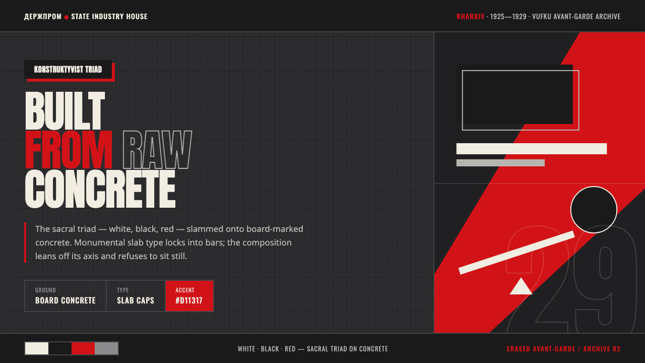
Kharkiv Constructivism turns infrastructure into image: white, black, and red lock against raw concrete, while monumental type and diagonals make every surface feel built for public address.
Kharkiv Constructivism (Derzhprom) in brief
Kharkiv Constructivism is the visual language of Ukraine’s interwar avant-garde, rooted in Kharkiv and concentrated most visibly around the Derzhprom building, Vasyl Yermilov’s agitprop graphics, and VUFKU film posters. It treats architecture, typography, photography, and political address as parts of one structural system. The result is not decoration placed on a surface; it is a surface made to read like a constructed public instrument.
Its central visual proposition is monumental construction. The bridged concrete mass of Derzhprom supplies the architectural model: heavy volumes, strong crossings, exposed structure, and a scale that makes the individual viewer feel positioned inside a larger civic machine. In graphic work, that same force becomes slab-like text, compressed fields of contrast, diagonal movement, and image fragments arranged with the urgency of a poster rather than the calm of an illustration.
The palette follows Constructivism’s white-black-red sacred triad, but this version places it against raw, board-marked concrete instead of clean printed paper. White becomes a cutting plane or legible interruption within darkness; black supplies mass and depth; red acts as a forceful signal. The atmosphere is industrial and severe, yet not inert. Concrete grain, typographic bars, and photomontage-like interruption give the system a sense of pressure, assembly, and collective momentum.
Where does Kharkiv Constructivism (Derzhprom) come from?
The style belongs to the broad period from 1900 to 1950, with Kharkiv Constructivism reaching its clearest concentration around 1925 to 1929. Its region is Eastern Europe, specifically Kharkiv, Ukraine, and its historical vocabulary sits at the meeting point of Ukrainian Constructivism, the Soviet avant-garde, and photomontage. These terms matter because the style is not merely a local variation in surface taste: it joins an architectural ambition to reorganize space with a graphic ambition to organize attention.
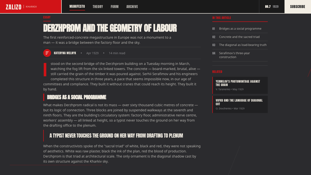
Derzhprom is the decisive architectural reference. The source material describes it as a bridged concrete megastructure, and that description explains much of the visual language. Rather than relying on a façade as a picture, the building’s force comes from connected masses and structural crossings. A Kharkiv Constructivist composition therefore feels strongest when its parts appear interdependent: a title bar should behave like a beam, a photo crop like an inserted volume, and a dark field like a weight-bearing void.
The graphic lineage runs through Vasyl Yermilov and the designers of VUFKU film posters. Their presence establishes agitprop and cinema as essential contexts, not optional references. Agitprop supplies directness, typographic force, and public urgency. Film-poster thinking supplies montage, framing, cropping, and a sense that images can collide rather than simply illustrate. Together, they make the style communicative at speed while preserving the visual gravity of built structure.
This historical combination is why the style resists nostalgic prettiness. Its concrete ground recalls poured material and construction process; its dark interface form translates that ground into a contemporary field for type and image. Slab capitals, red-and-black bars, and diagonal photomontage rhythm are not isolated motifs. They are graphic equivalents of a monumental system in which material, direction, hierarchy, and public message must visibly hold one another in place.
What defines the Kharkiv Constructivism (Derzhprom) look?
Concrete Ground
Raw board-marked concrete is the defining ground, replacing the neutral paper field associated with many poster traditions. Its grain should feel poured, compressed, and materially present rather than distressed for atmosphere alone. The texture gives white, black, and red something physical to resist. It should support hierarchy, not make text look weathered or difficult to read.
White, Black, and Red
The white-black-red triad carries the composition. White cuts through the dark ground and restores legibility; black creates mass, concealment, and spatial pressure; red delivers emphasis with unmistakable force. The colors work best as large structural decisions, not as scattered accents. Their tension is clearest when one field dominates and the others establish interruption, hierarchy, or direction.
Slab Typography
Display type is heavy, capitalized, and block-like, especially in Cyrillic applications. It should appear to grip the composition rather than float above it. Text can become a bar, a wall, or an inserted structural member. The important contrast is between massive headlines and disciplined supporting information, with typography carrying the public, declarative character usually assigned to architecture.
Diagonal Montage
Diagonal movement breaks the stability of concrete mass and gives the system its agitational rhythm. Cropped imagery, bars, and text may all participate in a shared directional push. The diagonal should feel purposeful, as though it connects structural nodes across the composition. Used without a clear route or counterweight, it becomes merely restless; used well, it directs attention with cinematic compression.
Typographic Bars
Red-and-black bars act as carriers of message and as visible framework. They divide, bridge, mask, and announce. Unlike decorative rules, these strips need enough mass to alter the balance of the page. A phrase placed inside one becomes an assertion; a bar crossing an image makes the image part of a larger public statement rather than an isolated illustration.
Monumental Compression
Kharkiv Constructivism values density without fussiness. Large dark masses, forceful type, and limited chromatic contrast compress the composition into a civic, industrial presence. Empty space is still useful, but it reads as a structural gap or exposed span, not as a soft luxury. The work should feel assembled under pressure, yet remain immediately legible from a distance.

Who shaped Kharkiv Constructivism (Derzhprom)?
Yermilov is a key figure in the supplied account of Kharkiv Constructivism and represents its agitprop graphic dimension. His inclusion keeps the style from being reduced to architecture alone. In this visual language, his reference point is direct public communication: typography, contrast, and constructed image should act with the force of a civic address rather than the polish of private decoration.
Serafimov is listed among the key figures associated with the Kharkiv Constructivist context. Within a style centered on Derzhprom, his presence reinforces the architectural side of the reference set: connected mass, monumental structural logic, and a visual order in which individual elements derive their force from the larger system around them.
Felger is another named figure in the source’s Kharkiv reference constellation. His role here is to anchor the style’s civic and built dimension alongside its poster vocabulary. The resulting system should never treat concrete, typography, and graphic contrast as separate effects; they belong to one monumental language of structure made visible.
The VUFKU film designers supply the photomontage and cinema-poster dimension of the style. Their reference is especially useful when imagery is necessary: crop decisively, let images collide with type, and give composition a directional sequence. The image is not a scenic backdrop. It is evidence, interruption, or momentum inside a larger typographic and structural argument.
How do you use Kharkiv Constructivism (Derzhprom) today?
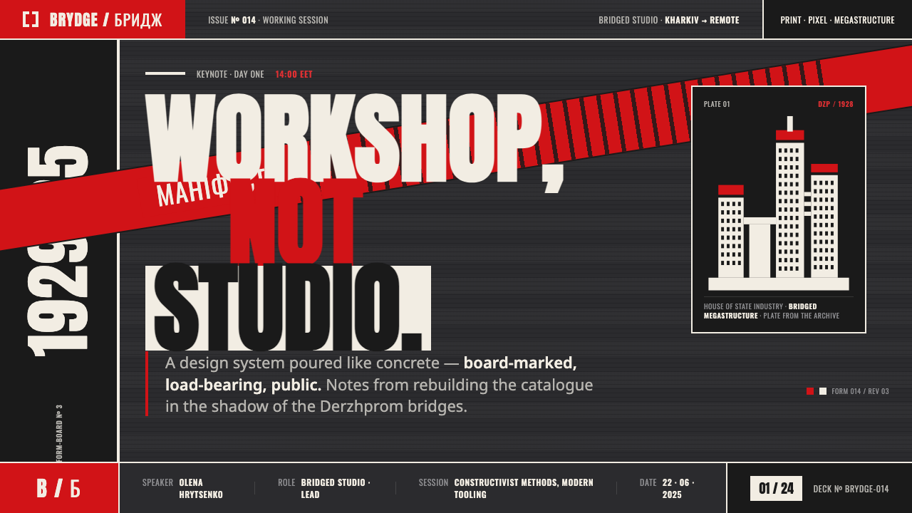
For presentation covers, begin with a dark concrete-like ground, one commanding title block, and a single architectural or photographic interruption. Let white establish the title’s reading plane and use red as a decisive bar, signal, or directional cut. Content slides should retain the same structural discipline: treat headings as beams, group supporting copy into compact blocks, and allow empty areas to read as spans between heavy elements rather than as decorative breathing room.
For data slides, Kharkiv Constructivism can make analytical information feel public and consequential. Build charts as clear dark masses with white labels and carefully rationed red emphasis. A red segment should identify the point that needs attention, not merely make every series louder. Use diagonal separators or typographic bars to distinguish evidence, conclusion, and next action, while keeping the underlying chart easier to read than the stylistic framing around it.
For web interfaces, the style is particularly effective for dashboards, operational tools, institutional platforms, and pricing pages where hierarchy must feel firm. Use the concrete ground selectively, especially in high-impact regions, rather than covering every surface with texture. Panels should feel like inserted slabs; navigation and status labels can take on the authority of signage. In pricing, plan names and commitments benefit from bold typographic bands, while comparison details remain quieter and more conventional to protect scanning.
For editorial and marketing work, use the language for launches, exhibitions, cultural programming, film-related pages, and campaigns that need collective energy rather than lifestyle softness. Pair a large cropped image with a short declarative line, then let the remaining information sit in strict blocks. The common mistake is to treat the style as generic brutalism: adding random concrete texture, oversized capitals, and red accents without structural relationships. If the bars do not organize, the diagonals do not direct, and the type does not carry the message, the result is noise rather than Constructivism.
Kharkiv Constructivism (Derzhprom) — FAQ
Is Kharkiv Constructivism simply a dark version of Constructivist posters?
No. The dark treatment is a contemporary interface translation, but the defining reference is the meeting of poster logic with Derzhprom’s bridged concrete monumentality. Constructivist poster devices such as direct type and montage remain important, yet they need architectural weight: connected masses, material ground, and bars that behave as structure. Without that built logic, the result may reference avant-garde posters but not this specifically Kharkiv language.
How should red be used without overwhelming the composition?
Treat red as a command, not as ambient decoration. It works most convincingly when it identifies one route through the page: a headline bar, urgent label, key datum, or diagonal interruption. Black should preserve mass and white should preserve reading clarity. When red is distributed evenly across every component, it loses its agitational force and turns the composition into a field of equal-volume signals.
Can the style use photography?
Yes. Photomontage is one of its named movements, and VUFKU film-poster design is a central reference. Photography should be cropped with conviction and placed into an active relationship with type and directional bars. Avoid treating it as a soft, naturalistic hero image. It is more effective as an inserted fragment, a sharply framed piece of evidence, or a force that the typography visibly confronts.
Where does this style struggle?
It struggles where reassurance, intimacy, or sensory softness is the product’s primary promise. Its monumental scale, hard contrast, and public-address tone can make personal or restorative experiences feel over-directed. It also fails when information density becomes theatrical rather than clear. Use it where a product needs structural authority, collective momentum, or cultural force; soften or avoid it where the experience depends on calm personal trust.
Related design styles
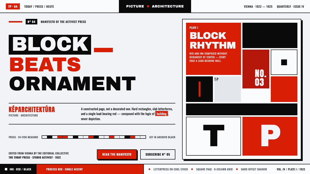 Lajos Kassák MA ConstructivismPage as building, not picture. Red and ink slab-sans blocks set asymmetricall…
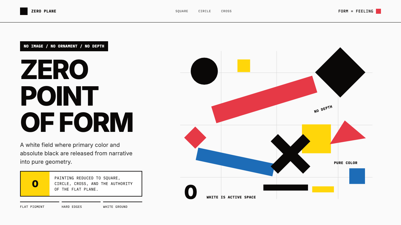 Malevich SuprematismGeometry declares zero. Red, yellow, blue and black blocks float on active wh…
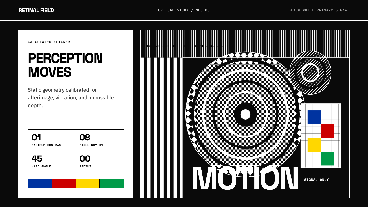 Op Art (Riley / Vasarely)Perception is engineered. Black-white grids and primary signals make static g…
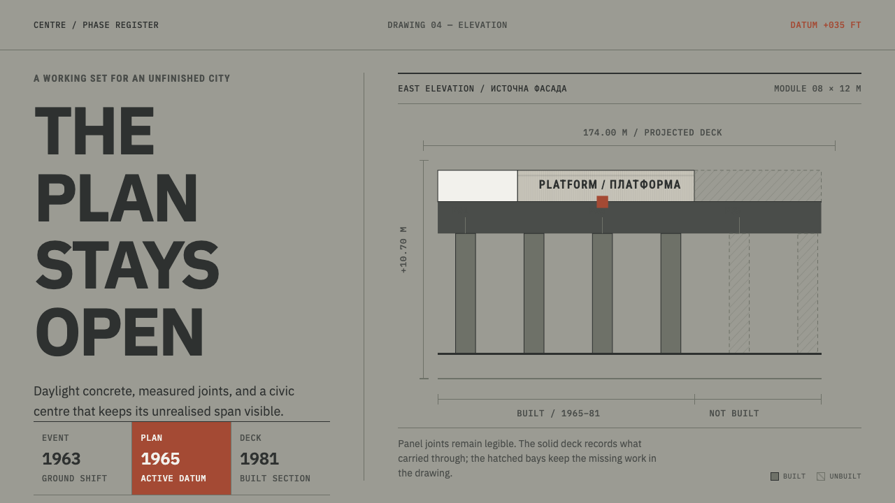 Skopje 1963 ReconstructionCompletion is not the point. Concrete-grey grids keep built bays solid and fu…
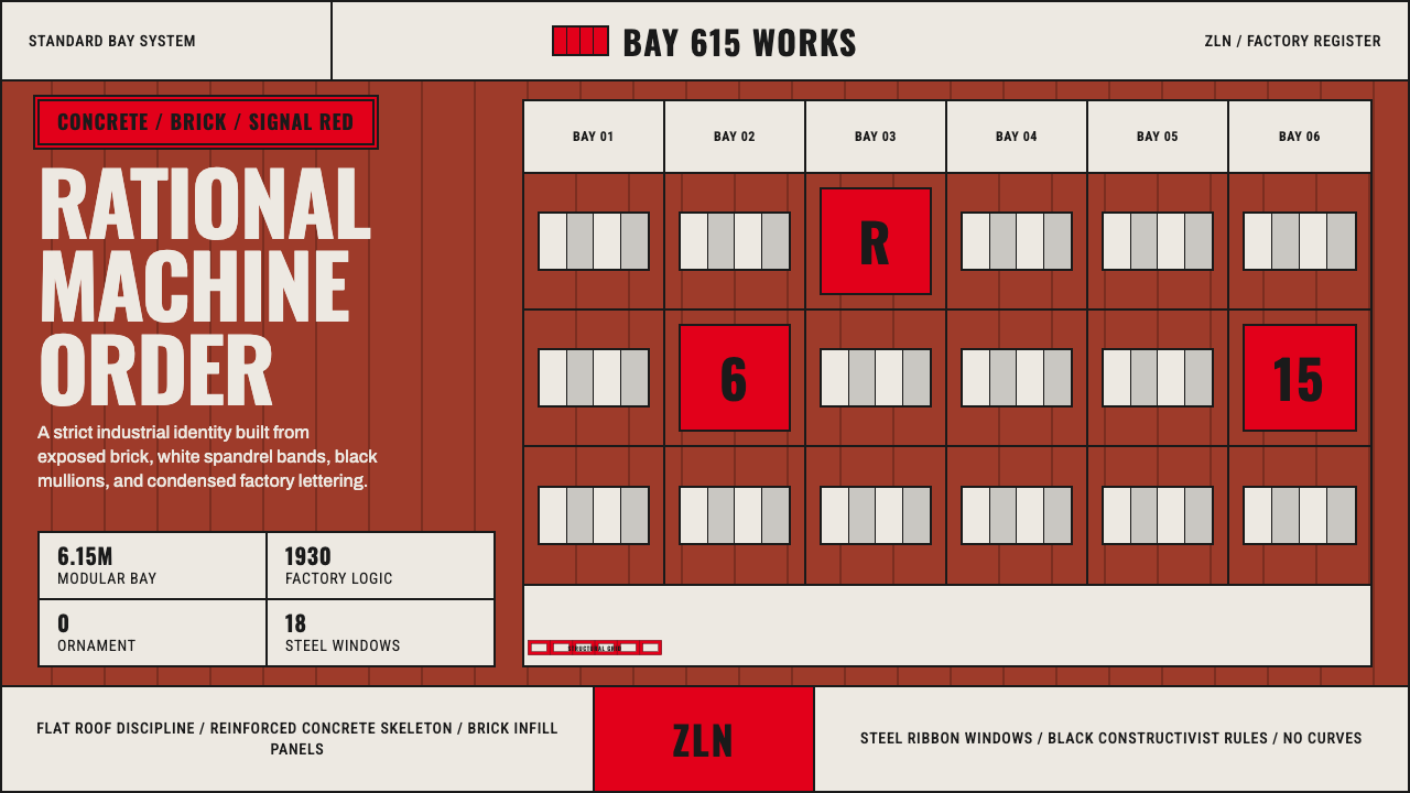 Baťa Zlín Functionalist BrandMachine-age precision. Brick red, concrete bands, and Oswald type lock into a…
 Iridescent Scarab DrawerOrder makes the shimmer read. Jewel scarabs pinned in a grid on black foam, m…