What is Lajos Kassák MA Constructivism?
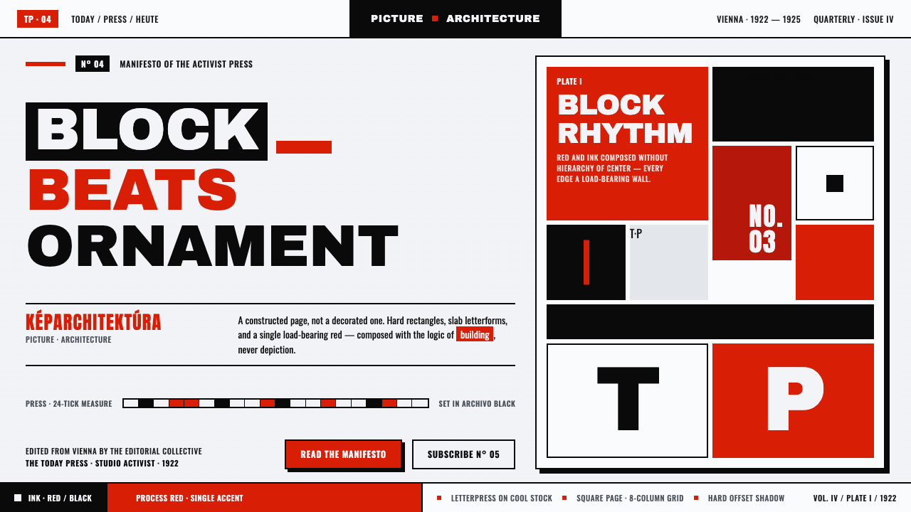
MA turned the printed page into a building site: red and ink-black slab-sans blocks lock into an asymmetric picture-architecture on white paper.
Lajos Kassák MA Constructivism in brief
Lajos Kassák’s MA journal, whose title means Today, defined a Hungarian activist form of Constructivism during its post-1922 Vienna phase. Its square covers treat the page as a built environment: hard red and black rectangles, bars, right angles, and oversized letterforms are arranged on clean printed white stock rather than placed as illustration.
The governing idea is picture-architecture, or képarchitektúra. A cover is not a window onto an image and not a decorated container for text. It is an autonomous construction in which typography, color, proportion, and empty paper carry the same structural responsibility as walls, beams, and openings. Every block must hold its position through tension and relation.
The result is sparse, asymmetric, and immediately legible. Architectonic slab-sans letters behave like masonry; the M and A can become visual masses as well as readable characters. Red supplies an emphatic signal against ink black and white, while the composition relies on rectangles and horizontal bars. Curves, soft shadows, and ornamental flourishes have no role.
Where does Lajos Kassák MA Constructivism come from?
The style belongs to the modernist field of 1900–1950 and is rooted in the Eastern European avant-garde. Its defining vehicle was MA, a Hungarian émigré publication issued in Vienna. The post-1922 Vienna phase is the period in which Kassák’s visual language became most clearly associated with activist Constructivism: the printed cover became a site for ideas about collective energy, construction, and modern form.
Constructivism supplied the movement’s basic conviction that composition should be built from relations rather than composed as pictorial ornament. On MA covers, the page behaves like a plan or elevation. Rectangles establish mass, bars create direction, white paper separates structural zones, and type becomes an architectural material. The effect is not an image of a building; it is a building-like order made from printed elements.
The style also carries a Dada-adjacent typographic impulse, especially in its refusal to keep language and image in separate categories. Kassák’s letters are not merely captions or neutral carriers of information. Their scale, density, and geometry participate in the construction. The result is a language at once literary, graphic, and spatial: a page where reading and looking are inseparable.
What defines the Lajos Kassák MA Constructivism look?
Color
The palette is deliberately narrow: printed white forms the ground, ink black establishes text and mass, and red appears as a forceful structural accent. Red is not atmosphere or decoration; it marks a block, interrupts a field, or creates directional pressure. The contrast is severe and economical, with no need for a spectrum of supporting hues.
Typography
Letterforms are heavy, slab-like, and sans-serif, with an architectonic presence that makes them feel assembled rather than written. Oversized type can become a rectangle or bar within the composition. The letters M and A are especially important because their forms can operate as both language and structure, allowing reading and construction to happen at once.
Geometry
The visual vocabulary is made from rectangles, horizontal bars, right angles, and the hard edges of letterforms. Curves are absent because the system depends on joinery, alignment, and planar force. Shapes are not pictorial symbols floating on a page; they are components whose edges define the pressure and stability of the whole.
Asymmetric Tension
Balance comes from opposing weights rather than mirrored halves. A dense black block may press against an isolated red bar; a large title may be countered by a small mark or a broad area of white. The composition feels stable because its forces are calibrated, not because its parts are centered or equal.
White Ground
Printed white is an active material, not leftover space. It separates masses, exposes the logic of the grid, and gives each block room to register as an independent construction. The clean ground also preserves the starkness of the palette: black and red appear as applied matter on paper, not as effects suspended in a digital field.
Material Directness
The surface should retain the directness of printed matter. Slight paper grain may be felt as a quiet physical trace, but it never becomes a decorative texture. There are no soft shadows, simulated lighting, ornamental borders, or false depth cues. The work declares its construction openly: ink, paper, edge, interval, and type.
Who shaped Lajos Kassák MA Constructivism?
Kassák is the named figure at the center of the MA language. Through the journal’s post-1922 Vienna phase, his work established a Hungarian activist Constructivism in which the printed page could function as a built structure. His importance lies in joining literary publication, typographic force, and picture-architecture within one coherent visual field.
MA, meaning Today, is the publication through which the style becomes concrete. Its square printed covers turn the journal into a repeatable laboratory for red, black, white, type, and geometry. The title itself can be treated as an architectural presence rather than a label placed after the composition is complete.
Képarchitektúra, or picture-architecture, names the central formal proposition. It describes a page that is constructed through blocks, intervals, and directional relations, producing a visual object rather than an illustrated scene. The term is useful because it explains why MA feels architectural even when its materials are only ink and paper.
The letters M and A act as recurring structural units. Their strong diagonals and upright strokes can be read as characters, but they can also occupy the page as beams, gates, or compact masses. This dual role captures the style’s essential condition: typography is not applied to architecture; typography is the architecture.
How do you use Lajos Kassák MA Constructivism today?
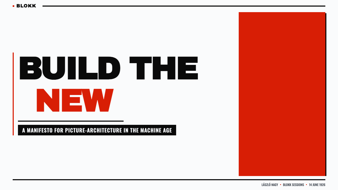
For presentation slides, use the cover as a constructed poster: a square-like field, a dominant red or black block, and a title whose scale gives it physical mass. Content slides should preserve the same architectural logic through clear alignments and generous white intervals. Data slides can turn bars, labels, and numbers into a family of rectangular elements, with red reserved for the decisive signal rather than spread evenly across every datum.
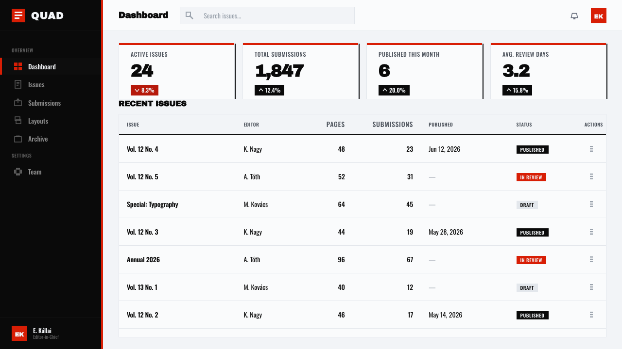
For web interfaces, the style suits dashboards and pricing pages that need authority, scanning clarity, and a strong sense of system. Use white as the active ground, black for primary information, and red for selected states, warnings, or the most important action. Cards should feel like placed blocks with firm edges; navigation should rely on typographic labels and alignment rather than decorative iconography or soft atmospheric effects.
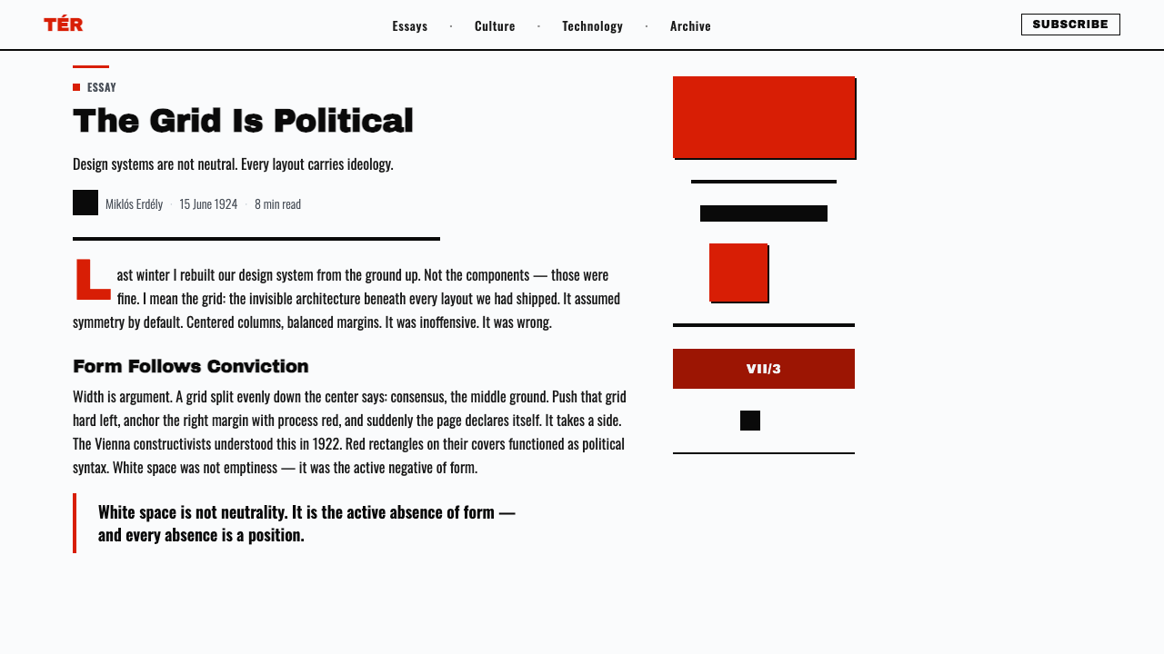
For editorial and marketing work, MA Constructivism gives a publication or campaign a highly recognizable voice. Build article pages around a strong title block, narrow text zones, and visible relationships between headline, metadata, and image area. Marketing compositions can use a red field against white and black, or a black typographic mass against white, but each spread should feel assembled from structural decisions rather than filled with visual embellishment.
The common mistake is to reproduce the palette while abandoning the construction. Red, black, and white alone do not create MA Constructivism if the layout is centered, softly shadowed, filled with rounded forms, or dependent on ornamental texture. Another failure is making every element equally loud. The style needs hierarchy: a few dominant masses, controlled intervals, and enough white ground for the tension between them to remain visible.
Lajos Kassák MA Constructivism — FAQ
Is MA Constructivism simply a version of Constructivism?
It is a specifically Hungarian activist expression of Constructivism, shaped by Kassák’s MA journal and its post-1922 Vienna setting. The broader Constructivist impulse supplies the idea of building through relations, but MA gives that idea a distinct printed language: red and ink black on white, slab-sans typography, square covers, and the concept of picture-architecture. Its identity comes from this combination rather than from geometry alone.
Can this style work on a dark-background layout?
A contemporary variation could invert the ground, but the source language is fundamentally associated with clean printed white stock. White is not a passive backdrop; it provides the interval that lets red and black blocks remain separate, forceful, and legible. If the ground becomes dark, preserve that same structural clarity and do not compensate with extra effects, gradients, or multiple competing accents.
How should typography behave in an MA-inspired interface?
Treat typography as a structural material. Let a strong sans-serif headline establish a block, allow labels and metadata to align with its edges, and use scale and density to create hierarchy. The letters should remain readable, but they may also contribute mass, direction, and rhythm. Keep the family disciplined; the style gains strength from repeated formal behavior rather than typographic variety.
Why are curves, soft shadows, and ornament excluded?
Because they weaken the sense that the page has been built. Curves introduce a different formal language, soft shadows suggest atmospheric rendering, and ornament adds a layer that does not participate in the construction. MA’s visual argument depends on directness: rectangles, bars, right angles, ink, paper, and type should show exactly how the composition is made.
Related design styles
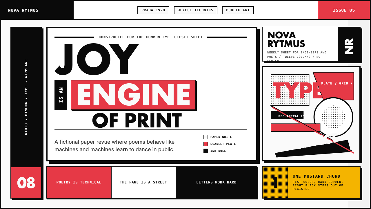 Czech Devětsil Avant-GardeJoy is engineered. Scarlet ink blocks and rotated sans type collide on an asy…
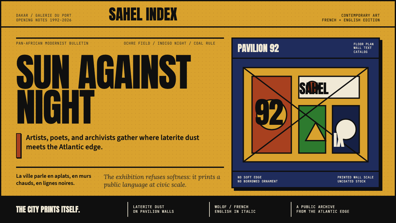 Dak'Art BiennalePan-African modernism speaks loud. Ochre ground, indigo block, Anton type, bl…
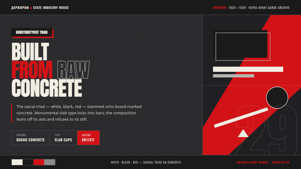 Kharkiv Constructivism (Derzhprom)Monumental, made structural. White-black-red triad on raw concrete, slab caps…
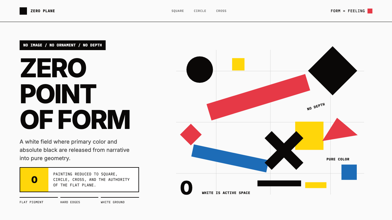 Malevich SuprematismGeometry declares zero. Red, yellow, blue and black blocks float on active wh…
 Bauhaus WeimarForm follows revolution. Primary red-blue-yellow on cream, hard shadows, no o…
 Bayer Universal BauhausLetters become structure. Bauhaus red, primary blocks, and black circle-bar f…