What is Semana de Arte Moderna?
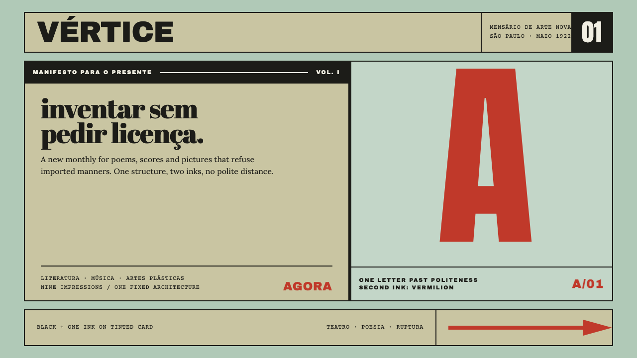
Klaxon's covers refuse politeness: black ink plus exactly one colour, a single giant letter overprinting a fat-face subtitle, all locked onto tinted card.
Semana de Arte Moderna in brief
Semana de Arte Moderna is a design language taken from Klaxon, the printed voice of the Modern Art Week that took over the Teatro Municipal de São Paulo in February 1922. The magazine ran for nine issues with one cover layout and two variables: the tint of the card and the colour of the second ink. Everything in the system is built from that discipline, so a page is always black plus exactly one colour.
The layout is blunt. Heavy grotesque capitals run across the top. One giant letterform overprints a fat-face subtitle that breaks flush left. A solid black bar, a numeral and an arrow at the foot complete the sheet. Black and vermilion on mint card is the best-known pairing, but the pairing can change; what cannot change is the structure and the rule of two inks.
The attitude matters as much as the grid. This is type that refuses politeness: letters are large to the point of rudeness, space is allowed to be empty, and where two inks overlap they produce a third colour that is the system's only real subtlety. Its expressive range is limited on purpose, and what expression there is lives in whitespace, proportion and overprint.

Where does Semana de Arte Moderna come from?
The Semana de Arte Moderna took place at the Teatro Municipal de São Paulo from 13 to 17 February 1922. The source frames it as a double motion: the Week brought the European avant-garde's methods straight to Brazil and then immediately rewrote them in local terms. Brazilian modernismo, the umbrella under which the Week sits, was less a single style than a stance: take the radical form, then make it answer to Brazilian materials and Brazilian arguments.
Klaxon was the movement's printed voice. It appeared from May 1922, with number one, to January 1923, with number nine, so the whole run fits inside a little under a year. The title is the name of a loud electric horn, a noise of the modern age, and the covers behave the same way, announcing themselves from across a street. A magazine about new art had to look like a signal before it looked like anything else.
Constraint is the story of the covers. Because the layout is fixed, the only things that change are the colour of the card and the second ink, so each issue is recognisable as part of a series and distinguishable from its neighbour. Heavy grotesque capitals form the masthead; a giant letterform overprints a fat-face subtitle; a black bar, a number and an arrow complete the sheet. The repeated furniture works like a rubber stamp, and the variation sits where the eye catches it immediately.
Two strands named in the source, Pau-Brasil and Antropofagia, mark where Brazilian modernismo went next in the later 1920s. Pau-Brasil took its name from the brazilwood that gave the country its name, and Antropofagia proposed that Brazil should devour foreign influence and digest it into something its own. The Klaxon covers do not illustrate either idea, but they behave like them: they borrow the poster-like boldness of the avant-garde and then insist on an economical, repeatable, locally made format.
What defines the Semana de Arte Moderna look?
Black plus one colour
The master rule: every page is black ink plus exactly one other colour, and never a third as a separate ink. This is a printer's constraint turned into an aesthetic. It forces decisions, makes every piece of the layout earn its place, and gives the whole series its unity. The chosen colour is typically strong and unblended, such as a vermilion, so that it stands next to black without softening it.
Tinted card ground
The ground is a tinted card rather than white paper, and the tint is the first of the two variables. Mint is the signature, but the point is that colour is built into the stock before anything is printed. The page therefore feels like an object, a piece of board, rather than a neutral screen, and the black and the second ink sit on it like stamps on a surface.
Heavy grotesque masthead
The title runs across the top in heavy grotesque capitals, in black, spanning the width of the sheet. It is a horizontal wall of letters that tells you what you are looking at and sets the scale for everything beneath it. There is nothing delicate about it: no flourish, no contrast of thin and thick strokes, only mass and legibility.
Giant overprinting letterform
One enormous letterform dominates the middle of the sheet and overprints the subtitle behind it. Where the two inks overlap a third colour appears, which is the cover's single moment of subtlety and the reason the system needs transparency rather than opaque boxes. The letter is treated as an image: it is cropped, crowded and allowed to run larger than manners would permit.
Fat-face subtitle, flush left
Behind the giant letter sits a subtitle set in a fat-face roman in lower case, breaking flush left, line by line, as the words fall. The ragged right edge is intentional, an anti-symmetry that makes the sheet feel spoken rather than composed. Against the severity of the capitals, the fat face provides a rounder, heavier voice with more personality.
Fixed furniture
A solid black bar, a numeral for the issue and an arrow at the foot recur on every cover. They are the system's furniture: always present, always in the same relation to each other, never decorated. The bar adds weight, the numeral gives the series order, and the arrow points the reader onward. Repeating them is what turns nine separate sheets into one voice.
Scale and whitespace
The source points to whitespace, proportion and the third colour from overprint as the whole range of expression. That is a strong claim and it holds: with fixed furniture and two inks, the designer's only freedoms are how big, how much empty space and how much overlap. Letters are bold enough to be impolite, and empty areas are left empty without apology.

Who shaped Semana de Arte Moderna?
Writer and critic, named in the source among the key figures of the movement and closely associated with the circle that produced Klaxon. His writing and criticism gave Brazilian modernismo much of its intellectual vocabulary, and his name is a reminder that the covers were the visual face of a literary project as much as an art one.
Writer and provocateur, one of the most combative voices of Brazilian modernismo. His name is tied to the later strands the source calls Pau-Brasil and Antropofagia, the ideas of making a native art out of foreign materials. The blunt, confrontational register of the Klaxon covers shares that spirit.
Painter whose work became closely identified with Pau-Brasil and Antropofagia and with a distinctly Brazilian modern palette. She joined the group's orbit around the time of the Week. Her inclusion in the list of key figures points to how closely the visual and the verbal sides of the movement were bound together.
Painter whose earlier, controversial exhibition of modern painting had become a rallying point for the younger artists before the Week. Her name stands for the stubborn insistence on new forms that made the event possible, and it recalls that the Week was a public argument as much as an exhibition.
Painter and illustrator, closely involved in organising the Week. His presence on the list links the event to the graphic and illustrative traditions of the period, where commercial printing, magazine culture and fine art shared techniques, and where a two-ink cover was a natural place for an artist to work.
How do you use Semana de Arte Moderna today?
Semana de Arte Moderna is one of the most rule-driven styles in the library, and its strength is that the rules are few. Use black plus one colour, fix the furniture, vary only the card tint and the second ink, and let scale do the talking. Applied this way it produces layouts that feel loud and intelligent at once, which is hard to achieve with a larger palette.
For presentation slides, a cover is the style at its best: a tinted ground, a masthead in heavy capitals, one giant letter or numeral overprinting the subtitle, a black bar and an arrow at the foot. Content slides should reuse the same furniture so that the deck reads as a series, with a big numeral for the section number and short, flush-left statements. Data slides benefit from the style's love of the single huge figure: pick the number that matters, set it enormous in black, and let the second ink highlight its context.
For web interfaces, the style suits landing pages, campaign sites, event pages and portfolio sections, where a loud first screen is an asset. Use a tinted section ground, a headline that runs edge to edge, and a numeral or arrow as navigation cues. Dashboards and pricing pages are better served by taking a single idea from the system, such as the black bar as a divider and the second ink as the only highlight, than by copying the cover layout, because dense interfaces need more quiet than the covers allow.
For editorial and marketing work, the style behaves like a manifesto. Magazine covers, event posters, programme booklets and announcements all fit, especially for cultural subjects. Series of related pieces should share the layout and vary only the card tint and the second ink, so that the set reads as a family. The style also suits statements and slogans, as long as they are short enough for the type to be enormous.
A common mistake is to add a third colour, a gradient or a drop shadow, each of which breaks the two-ink logic and returns the work to generic poster design. Another is to treat overprint as a decorative blur and not as a real mixing of inks: the third colour should appear only where the two inks genuinely overlap. A third is to politely shrink the giant letter to make room for more content. The style depends on a refusal of politeness, and when the type gets small the system collapses.

Semana de Arte Moderna — FAQ
What is the single most important rule of this style?
Black plus one colour. Every composition uses black ink and exactly one other colour, with the card tint as the only other variable. Everything else follows from that: the fixed furniture, the reliance on scale, and the use of overprint to create a third colour where two inks meet. Break it and the work stops being Klaxon and turns into an ordinary poster.
What does overprint mean, and why does it matter here?
Overprint means one ink is printed over another so that they mix where they overlap, producing a third colour. In this system it is the only source of tonal variety, so it has to be real: the giant letter overprints the subtitle and the overlap shows a new colour. On screen, use a multiply-style blend that darkens the overlap rather than hiding one layer behind the other with an opaque shape.
How is this different from Bauhaus?
Both are bold, flat and anti-ornamental, but they have different origins and temperaments. Bauhaus built a teachable system around primary colours and geometric form. Klaxon works from a printer's constraint, black plus one colour on tinted card, and it is rougher, more confrontational, and driven by the attitude of a local avant-garde answering an imported one. Bauhaus aims at order; this style aims at a signal.
Can I change the colours?
Yes, but only the two variables. The card tint and the second ink can change from issue to issue, which is exactly how the nine covers differ. Keep black constant, keep the second ink strong and unblended, and make sure the card tint lets both inks read. Adding more colours, or softening the second ink into a pastel, undermines the contrast on which the style depends.
Is this style suitable for dense, content-heavy screens?
Not in its full cover form. The style gets its power from huge type and empty space, which dense interfaces cannot afford. It works well for headlines, section openers, campaign pages and slides, and it can contribute a few principles to denser work, such as one highlight colour and a solid black divider. For long reading, switch the body to a calm text setting and keep the Klaxon manner for the display moments.
Related design styles
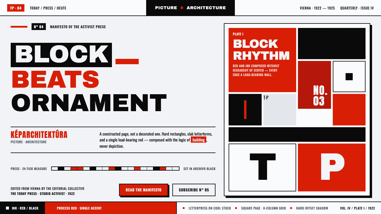 Lajos Kassák MA ConstructivismPage as building, not picture. Red and ink slab-sans blocks set asymmetricall…
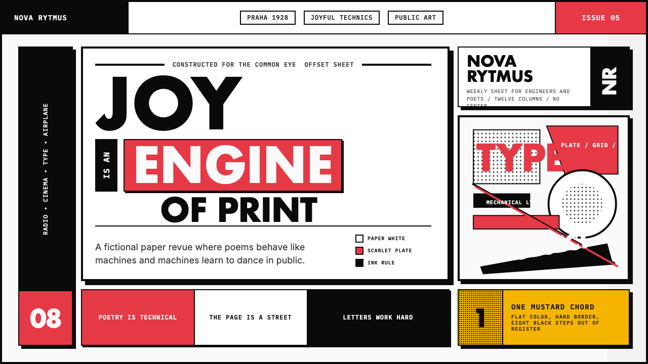 Czech Devětsil Avant-GardeJoy is engineered. Scarlet ink blocks and rotated sans type collide on an asy…
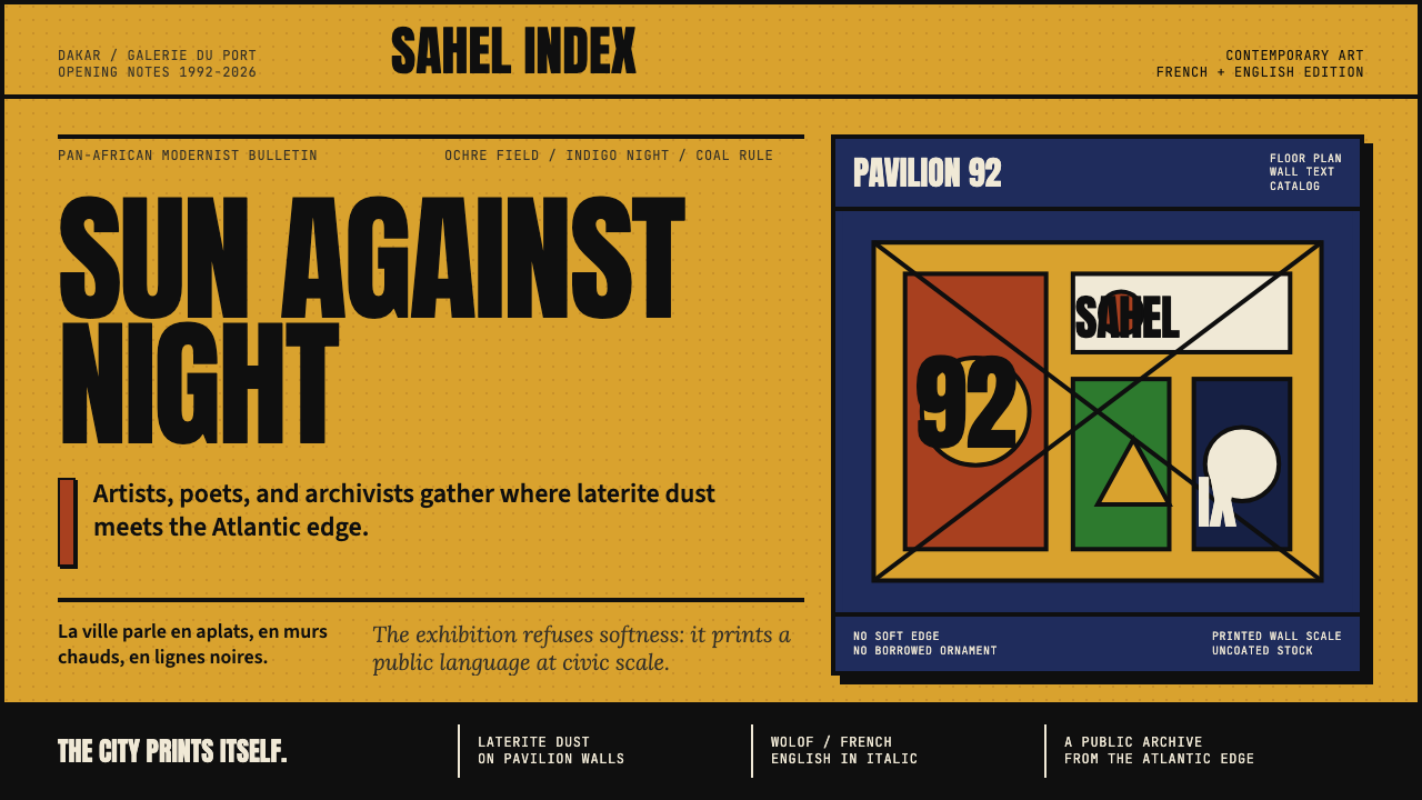 Dak'Art BiennalePan-African modernism speaks loud. Ochre ground, indigo block, Anton type, bl…
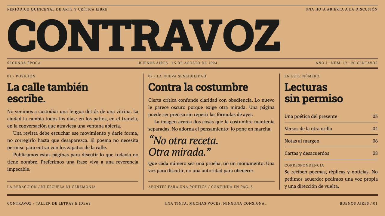 Martín Fierro MagazineA newspaper that argues. A heavy slab masthead and ruled columns press black…
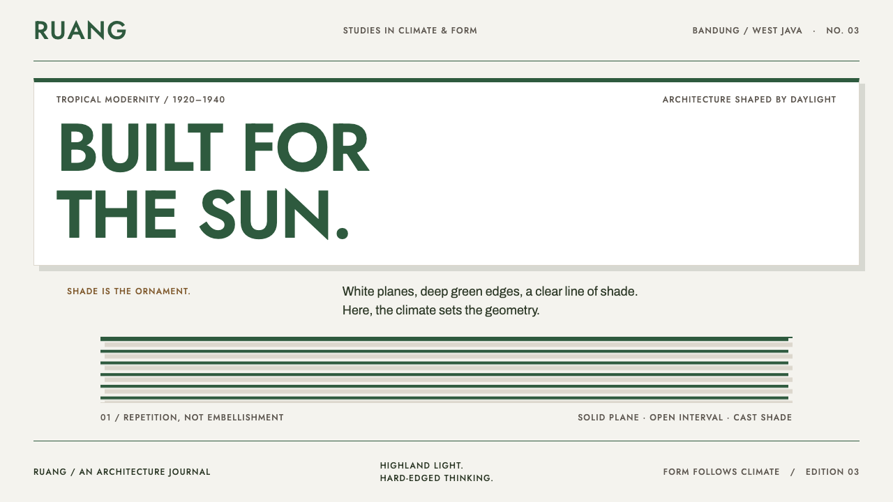 Bandung Tropical Art DecoClimate writes the geometry. Bottle-green bands on stucco white make hard sha…
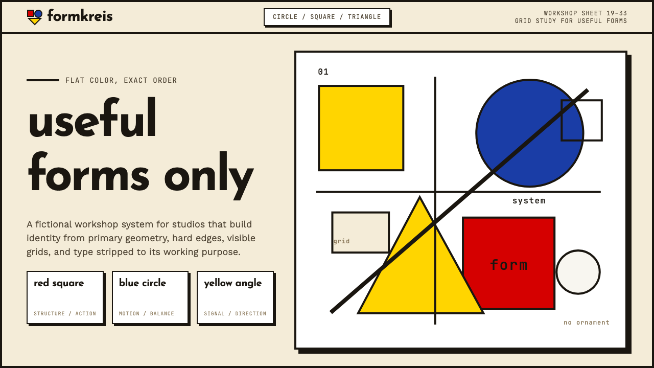 Bauhaus WeimarForm follows revolution. Primary red-blue-yellow on cream, hard shadows, no o…