About Semana de Arte Moderna
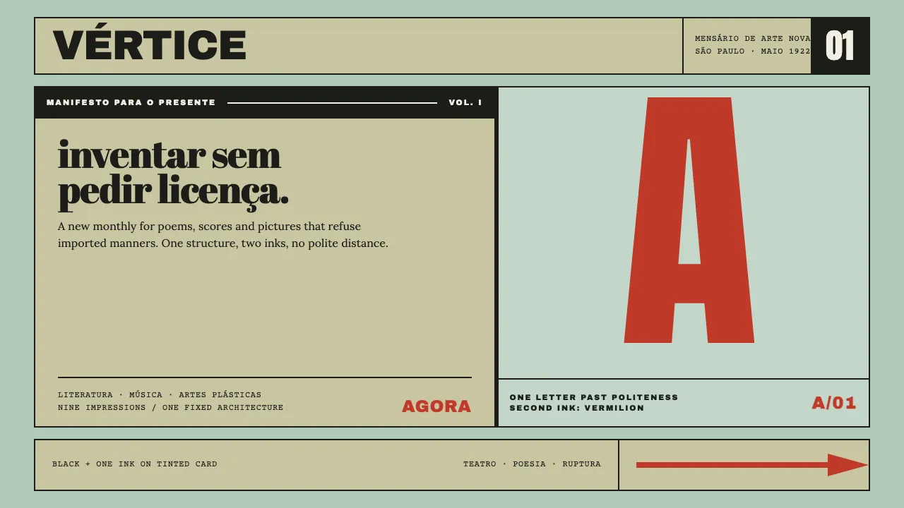
Klaxon was the printed voice of the Modern Art Week that took over the Teatro Municipal de São Paulo in February 1922. Nine issues, one cover layout, two variables: the tint of the card and the second ink.
Everything is built from that discipline. Heavy grotesque caps across the top, one giant letterform overprinting a fat-face subtitle that breaks flush-left, a solid black bar, a numeral, an arrow at the foot. Black plus one colour, every time.
- Origin
- São Paulo, Brazil
- Era
- 1922–1923 (Semana de Arte Moderna, 13–17 February 1922; Klaxon nº1 May 1922 – nº9 January 1923)
- Key figures
- Mário de Andrade · Oswald de Andrade · Tarsila do Amaral · Anita Malfatti · Di Cavalcanti
- Movements
- Brazilian modernismo · Pau-Brasil · Antropofagia
Semana de Arte Moderna design spec
Colors
Background
Surface
Primary
Secondary
Accent
Text
Typography
Archivo BlackHeadings
LoraBody
Courier PrimeMono
Unlock for 1 credit
The other 11 sections — buttons, cards, spacing, motion, techniques and more — open once you unlock. Download the DESIGN.md or send it to your AI in one click. Unlock once, yours forever.
Sign up nowHave an account? Sign in
Styles similar to Semana de Arte Moderna
Also inspired by print & type, with a close feel.
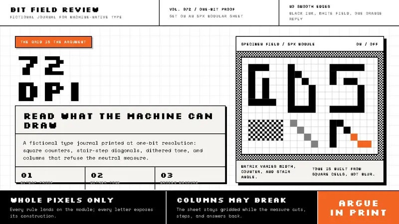 Emigre / Zuzana LickoThe pixel grid argues back. Black bitmap type, dithered grey, and one orange interruption.
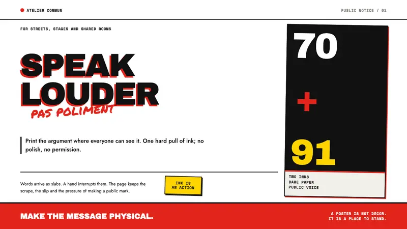 Grapus CollectivePrints dissent without polish. Red-black type slabs are disrupted by blunt marker scrawl.
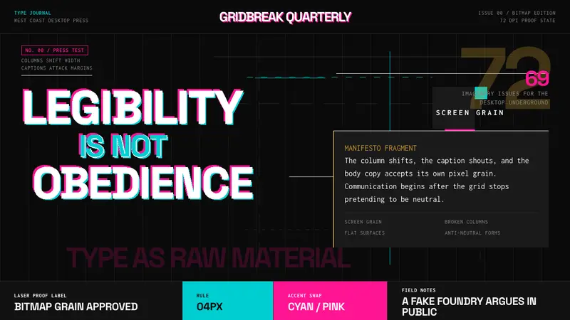 Emigre Magazine (1984–2005)Defies the tidy grid. Cyan, ochre, and hot-pink bitmap type collides on black.
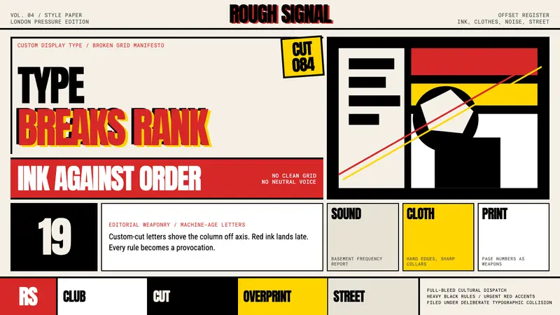 Neville Brody / The FaceType mutinies on paper. Cream stock, black rules, urgent red overprint, broken grids.