What is Bandung Tropical Art Deco?
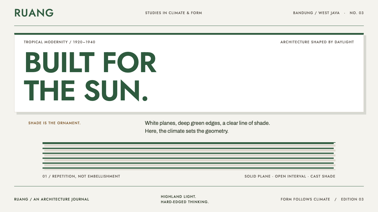
Bandung's Art Deco was drawn by the sun before it was drawn by fashion — white stucco, bottle-green joinery and hard shadow where the overhang itself becomes the ornament.
Bandung Tropical Art Deco in brief
Bandung Tropical Art Deco is a design style drawn from the Art Deco buildings that Dutch architects put up in Bandung, in the highlands of West Java, between roughly 1920 and 1940. It takes the clean geometry and streamlined curves of European Art Deco and rewrites them for an equatorial climate, with deep overhangs, louvred screens, white stucco walls and dark green timber. Its premise is in the opening line of its own brief: climate writes the geometry.
Where much Art Deco depends on gilding, sunburst motifs and rich contrast, this version has almost none of that. The ornament is whatever the building's response to sun and heat leaves behind. A projecting sunshade makes a deep shadow line along a wall; a grid of louvres makes a rhythm of thin bars and dark gaps; a curved balcony casts a bent shadow that moves across the stucco during the day. These effects are not applied afterward. They are the architecture working.
Visually, the style is bright, crisp and cool. The ground is a pale, troweled white. The main colour is a deep bottle green, drawn from Dutch-style woodwork, with warm browns of teak and rattan as small accents. Shadow is drawn hard, never blurred, because in equatorial light shadows have clean edges. The overall impression is of a modern city that has been quietly adapted to its weather, confident and uncluttered.
Where does Bandung Tropical Art Deco come from?
Bandung was planned as the next capital of the Dutch East Indies. The source material describes its architects building Art Deco in a climate that 'refused to cooperate' with the European original, and that single fact explains the whole style. A building designed for a cool northern city would face hard sun, tropical rain and humid heat in the Priangan highlands, and the Dutch designers working there had to rethink the image of modern architecture to survive it.
The reference buildings show the two moods of the style. Villa Isola, dated 1933 and attributed to Charles Prosper Wolff Schoemaker, steps down its hillside in white stucco terraces, with curved forms retreating toward the Priangan valley. Savoy Homann, dated 1939 and attributed to Albert Aalbers, runs a streamline curve along Jalan Asia-Afrika, pulling the sleek, wind-swept shapes of Streamline Moderne into the street. One building is about terraces and landscape, the other about speed and a continuous horizontal sweep.
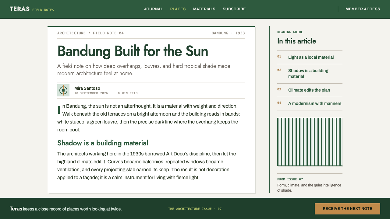
What connects the two is that both were shaped by sun angle before style. The source lists deep eaves, cross-ventilation and louvre grids as the real decision-makers, and notes that the strong equatorial light cuts shadow boundaries cleanly. Stucco is troweled white because white reflects heat; shade is cast deeply because walls need protecting; openings are screened because air must move. Elegance is the by-product of these choices, not the goal.
The reference list places the style within three movements: Tropical Art Deco, Nieuwe Bouwen in the Indies and Streamline Moderne. Nieuwe Bouwen is the Dutch name for the functionalist modern movement, here carried to a colonial setting, while Streamline Moderne supplies the curves and horizontal bands. The source dates the style to 1920 to 1940 in the Dutch East Indies, and places it in Bandung, West Java, the Preanger highlands, a name that is also spelled Priangan.
What defines the Bandung Tropical Art Deco look?
Climate-driven geometry
Every form has a reason in sun, rain or airflow. Overhangs are deep because the sun is high; walls are screened because air must pass; terraces step because the hillside demands it. In design this becomes a rule that structure should answer a need, so layouts are built from purposeful shelves, bands and screens, not from ornament that has nothing to do with function.
Troweled white stucco
The ground is a bright, pale white with the slight unevenness of hand-troweled plaster. It reflects light and heat, which is why it was used, and it provides a clean field against which every shadow and every dark line reads clearly. It should feel matte and mineral, not glossy and not pure screen white, with enough texture to feel like a wall.
Bottle-green joinery
The dominant colour is a deep bottle green drawn from Dutch-style timber windows, shutters and frames. It appears as bands, borders and structural lines rather than as large fields, giving the white ground a firm skeleton. Used with discipline, it feels colonial, calm and slightly formal, and it pairs well with warm brown accents.
Shadow as ornament
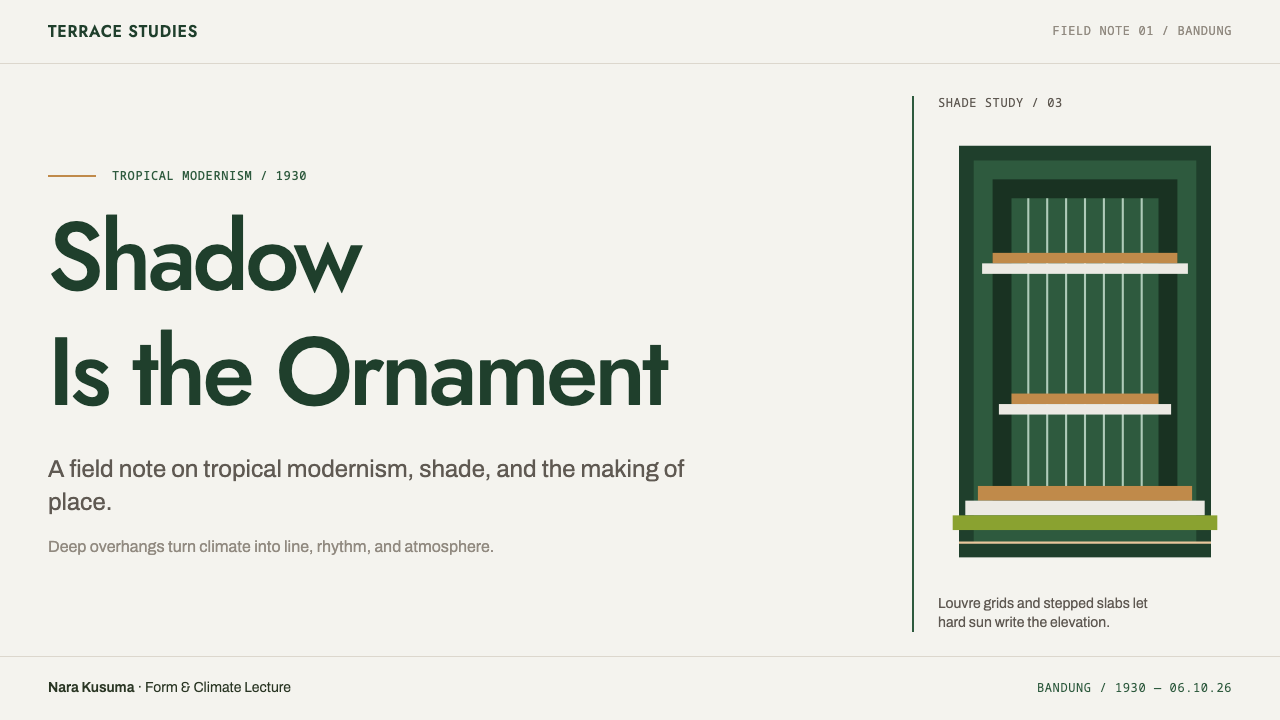
Shadow is the true decoration of the style. It is drawn hard-edged and falls at a consistent angle, as it would at noon under a deep overhang. Blurring it would turn a piece of architecture into a mood, and the style needs the opposite: crisp, legible dark shapes that mark where the building shields itself. The shadow line is as deliberate as any moulding in the European original.
Louvre grids
Repeating thin bars with dark gaps give the style its rhythm and its ventilation. The effect is a regular, almost typographic texture that can be used for headers, side panels or decorative inserts. It is a pattern with a job to do, and it should keep to evenly spaced, horizontal or vertical lines rather than becoming a generic stripe.
Terrace and streamline forms
Two silhouettes recur: stepped terraces that descend in white tiers, and sleek curves that run along a street as a continuous band. In layout terms, these become stacked horizontal layers and rounded corners or sweeping bars, used sparingly. Curves should be few and structural, because the style's geometry stays mostly rectilinear.
Warm teak and rattan accents
Small touches of warm brown from teak and rattan balance the cool white and green. They appear on handrails, furniture, small controls or highlights, never as a major field. These tones add human warmth to an otherwise climate-engineered surface and stop the palette from feeling clinical.
Who shaped Bandung Tropical Art Deco?
Schoemaker is the architect associated in the source material with Villa Isola, dated 1933. The villa's white stucco terraces, stepping down the hillside toward the valley, are the clearest picture of the style's terraced mood. His work shows how a European architect could let landscape and sun, rather than fashion, set the form of a house.
Aalbers is the architect associated with Savoy Homann, dated 1939, whose streamline curve runs along Jalan Asia-Afrika. If Villa Isola is the terraced half of the style, Aalbers represents the other half: sleek horizontal forms and continuous bands that pull the language of Streamline Moderne into a tropical street.
A reference building rather than a person, but central to the story. Its white stucco terraces step down the hillside and curve toward the valley, and its geometry is explained by sun angle and landscape. For designers, it is a model of how stacked horizontal layers can create a sense of lightness and order without any decorative detail.
The second reference building, with a streamline curve running the length of Jalan Asia-Afrika. It demonstrates that Tropical Art Deco was not only terraces but also fast, curved horizontal forms. In a layout, it suggests the sweep of a header band or a bar that carries the eye across a page.
How do you use Bandung Tropical Art Deco today?
Bandung Tropical Art Deco is a bright, orderly and practical style, and it works best when a layout behaves as if it had to deal with weather. Start with a white ground, let green carry the structural lines and treat every shadow as a deliberate shape. Do not add decoration that does not do some architectural job.
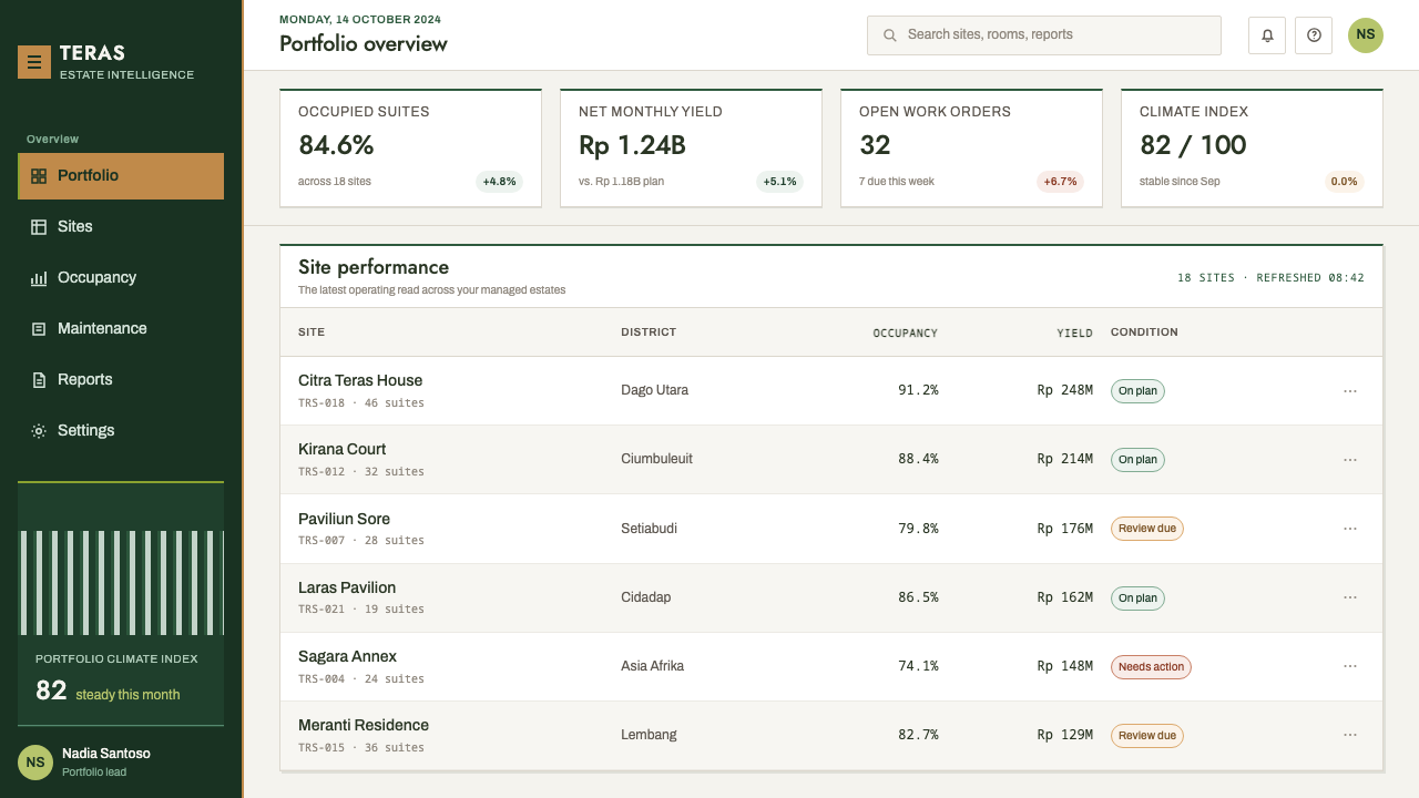
For presentation slides, a cover works well as a white field with a single deep green band across it and a title tucked beneath a hard-edged shadow line, like text under an overhang. Content slides can be organised in horizontal layers, with a green rule between each. Data slides suit banded or stacked horizontal charts, with bars casting a crisp, consistent shadow, and a small number of colours drawn from green, brown and grey on the white ground.
For web interfaces, the style suits light dashboards, travel, hospitality, architecture, real estate and clean utility products. Cards can sit as white panels with a green top rule and a hard shadow offset in one direction. Navigation can be built from louvre-like bars of thin lines. Pricing pages can step tiers like terraces, each one slightly offset from the last. Keep the interface bright and well-spaced, and use brown only for warm details such as highlights and small icons.
For editorial and marketing work, the style conveys a calm, modernist confidence with an unmistakable sense of place. It fits stories about cities, travel, design history, climate-responsive architecture and sustainable building. Photography of buildings works especially well alongside the system, because the shadows in the photographs echo the shadows in the layout. Wide horizontal bands make good section dividers.
The most common mistake is to add European Art Deco ornament, such as gold sunbursts or radiating fans, because the source is clear that those are not part of this version. A second mistake is to blur the shadows, which turns a hard, weather-made shape into a generic soft drop shadow. A third is to flood the layout with green; it works as a band and a structural line, not as the main field. Finally, avoid dark backgrounds, since the style depends on bright light.
Bandung Tropical Art Deco — FAQ
Is this just ordinary Art Deco?
No. It is Art Deco rewritten by climate. It keeps the geometry and the streamlined curves but drops the gilding and sunburst ornament, putting deep overhangs, louvre grids, white stucco and hard shadow in their place. The source frames the difference clearly: in Bandung, sun angle came before style, so the decoration is whatever the sun-shielding structure leaves behind.
Why is the main colour bottle green?
It comes from Dutch-style woodwork: window frames, shutters and joinery painted a deep green. In the style it works as a structural colour, appearing in bands and lines against the white stucco, in the same way the timber framed the white walls. It carries a calm, slightly colonial formality that suits the style's order.
Why must the shadows be hard-edged?
Because the light that shapes the buildings is equatorial sun, which cuts shadow boundaries cleanly. A hard shadow reads as an architectural fact, a mark of where the overhang or the louvre blocks the sun. A blurred shadow reads as ambience. The style relies on shadow as a decorative device, so it has to be legible as a shape.
What is Nieuwe Bouwen?
It is a Dutch term, literally 'new building', for the functionalist modern movement. The source lists it as one of the style's currents, in its form as practised in the Indies. In design terms it contributes the preference for plain, purposeful surfaces and honest structure, which sits alongside the curves of Streamline Moderne and the local adaptation to climate.
Does the style work with a dark background?
It is a light-ground style by definition. The white stucco and the hard shadow depend on bright daylight for their meaning, and a dark background removes the contrast that makes shadows legible as decoration. If a dark version is needed, treat it as a night view of the same buildings, keep the green and white as lines and make sure the shadow shapes still read clearly.
Related design styles
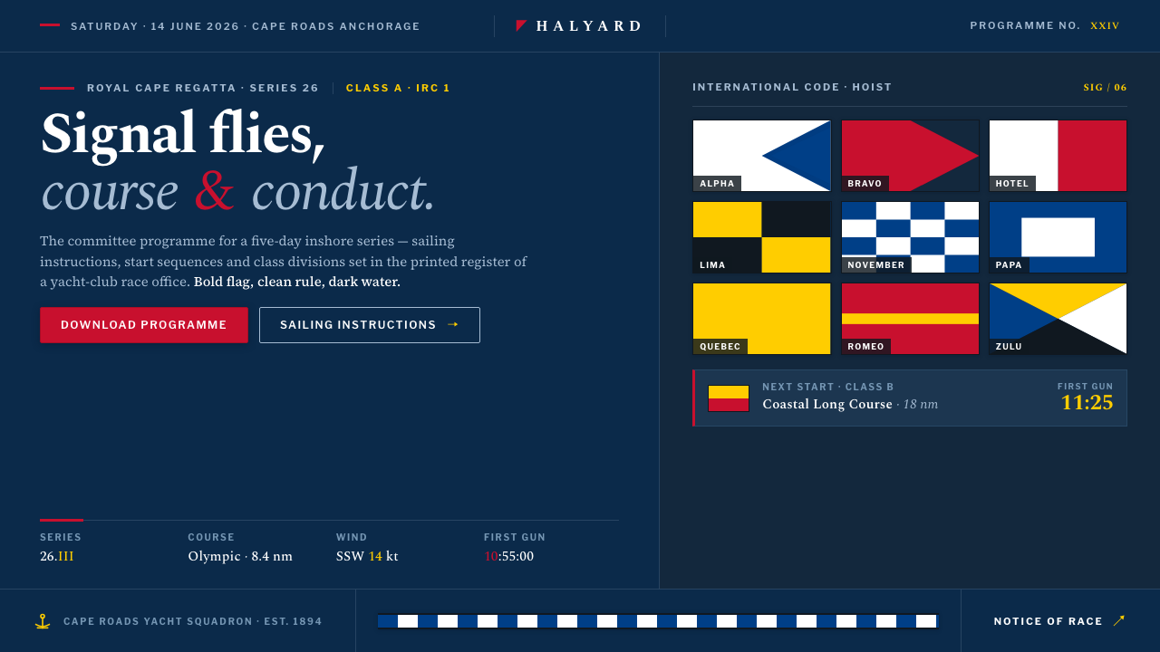 Sailing RegattaSignal-flag discipline on dark water. Rectilinear red-blue-yellow blocks on d…
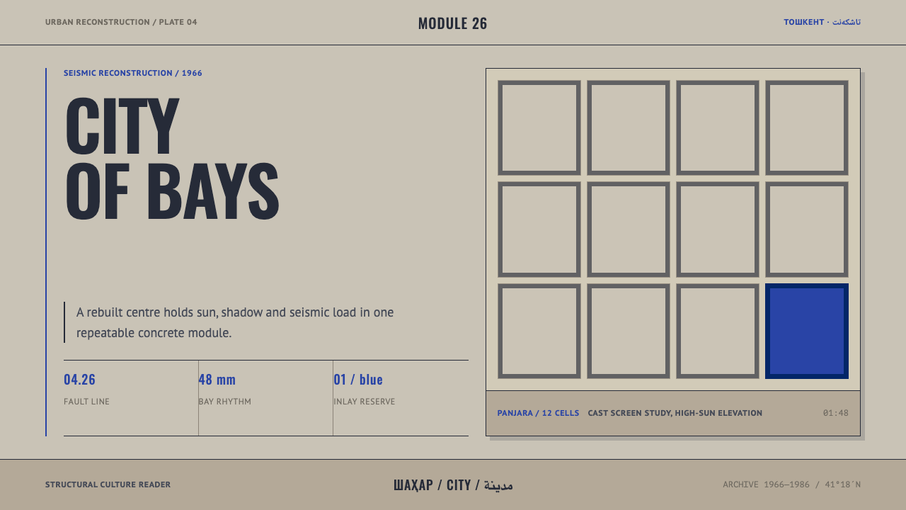 Tashkent Seismic ModernismStructure keeps its cool. Sun-bleached concrete grids hold one reserve of Tim…
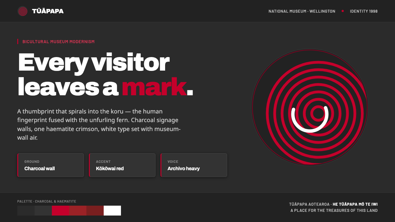 Te Papa Aotearoa ModernEvery visitor leaves a mark. Charcoal museum walls, one haematite crimson, a…
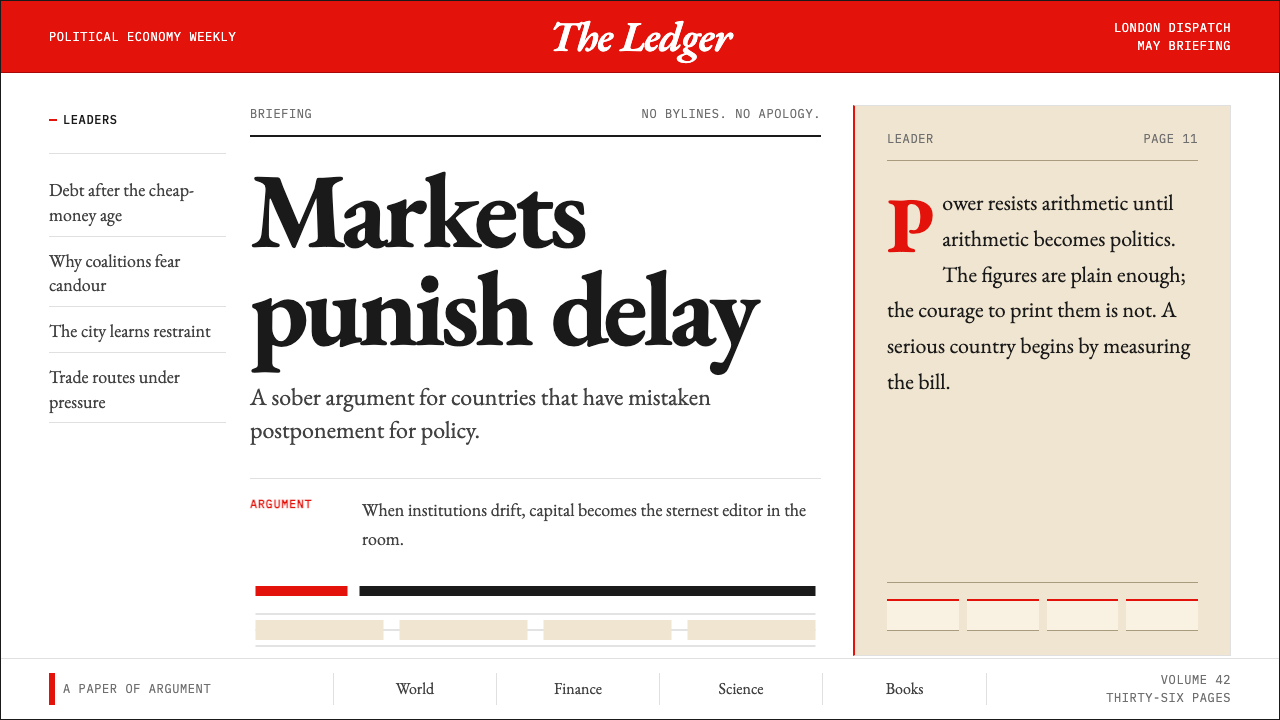 The Economist (Red-Banner)Argument made visible. Red banner, cream paper and Garamond columns enforce t…
 Vietnamese Áo Dài 1934 (Cát Tường)Indigo editorial poise. Parchment serif columns and lotus-pink rules frame th…
 Bucharest Interwar ModernismModernism gathers civic weight. Sooted plaster, strict glazing bands and one…