What is Tashkent Seismic Modernism?
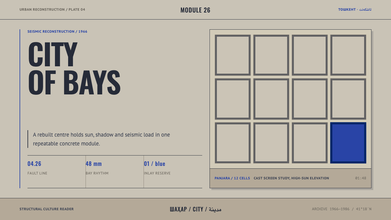
Tashkent Seismic Modernism is Soviet precast concrete after it had to negotiate with an earthquake, a desert sun and an older tradition of pierced screens.
Tashkent Seismic Modernism in brief
Tashkent Seismic Modernism is the architectural language of the Uzbek capital as it was rebuilt after the earthquake of 26 April 1966, and as it developed through the following two decades until the late 1980s. It is a regional strand of Soviet modernism built with large-panel precast construction: standardised concrete frames, slabs and screens made in factories, lifted into place by crane, and engineered first of all to survive another shock. As a visual system it reads as sun-bleached warm-grey concrete, a grid of deep square cells, and one carefully rationed reserve of Timurid blue.
What makes the style distinctive is that it is a compromise rather than an import. Elsewhere in the Soviet Union the same industrial method produced housing blocks that could be set down in any city and look identical. In Tashkent the method had to cope with heat, glare and a strong local building culture. The result keeps the logic of the factory — repetition, modular dimensions, structure left visible — but borrows the pierced lattice of Central Asian architecture, the panjara, and recasts it as an industrial module that can be hung across a facade and repeated without end.
Seen on a street or on a page, the look is quiet and severe. Surfaces are pale and warm rather than white. The light is high, hard and directional, and every opening holds a cold, deep shadow. Blue never floods a surface; it survives as ceramic inlay, as a dome, as a single band. Corners are square, recesses are deep, and nothing is added by hand to soften the grid. Structure keeps its cool, and the whole composition is organised around the module.
Where does Tashkent Seismic Modernism come from?
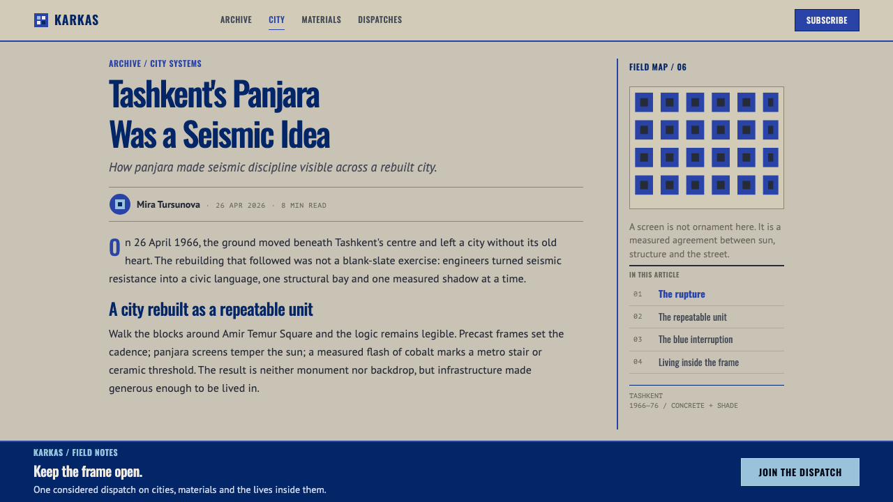
The story begins on 26 April 1966, when an earthquake took out the centre of Tashkent. The city was one of the largest in the Soviet Union and the administrative and cultural capital of Central Asia, and a great deal of its older fabric, including traditional low courtyard housing, had little defence against ground shaking of that kind. The disaster left the authorities with a question that was as much political as technical: how quickly could a major city be handed back to the people who lived in it?
The answer was mobilisation on a union-wide scale. Brigades from every Soviet republic came to Tashkent, and the city was rebuilt in under a decade. Speed demanded industrial methods, so the reconstruction leaned on precast frames and large panels cast in factories and assembled on site, with seismic load treated as the governing design problem rather than a footnote. Reinforced frames, stiff structural cores and joints that let neighbouring parts move independently became the skeleton of the new city, and they also became its visible rhythm: here the structure is the pattern.
The people who shaped the architecture worked inside a state design system that prized standardised solutions. Names associated with the period include Yevgeny Rozanov, Andrey Kosinsky, Sabir Adylov and Ilya Merport, and the labels attached to their work — Soviet modernism, regional modernism, large-panel precast construction — describe the tension they lived with. The brief was to build quickly, safely and in series. The achievement was to make that series feel as though it belonged to Tashkent rather than to a catalogue issued from the centre.
The local content arrived through two channels. The first was climate. Strong sun, glare and heat made deep reveals and screened facades practical as well as beautiful, and the pierced lattice of Central Asian tradition offered a ready answer. Cast in concrete, the panjara became a repeatable screen that filters light while still looking like structure. The second channel was colour. The deep blue of the Timurid tradition survives in the ceramic of the metro and in the dome at Chorsu, where it appears as an inlay against grey rather than as a general colour of the city. The period is usually dated from 1966 to the late 1980s, and its legacy has since drawn international recognition, with a UNESCO inscription noted for 2026.
What defines the Tashkent Seismic Modernism look?
Concrete Ground
The ground colour is cast concrete bleached by decades of sun: a pale, warm grey rather than a white sheet. It is slightly uneven, with the subtle tonal drift of precast panels poured, cured and weathered in different batches. Text and structure sit on this grey. Pure white is used sparingly, as a highlight where light strikes an edge, and never as the default page colour. The page is meant to feel like a wall, not like paper.
The Panjara Module
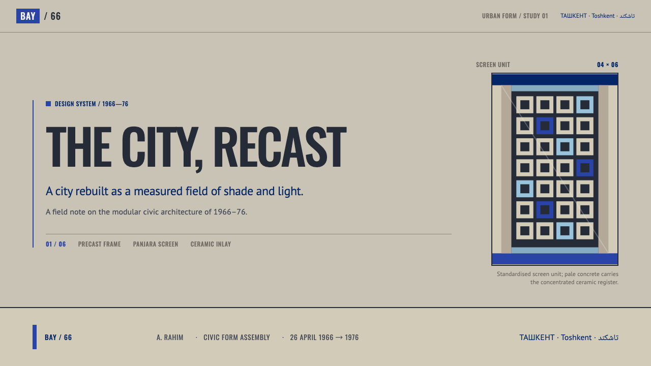
The signature motif is the pierced screen translated into precast form. Central Asian lattices were carved or assembled by hand into intricate patterns; here the lattice is reduced to a repeatable unit, an open square or rectangular cell that can be multiplied across a wall. The pattern is geometric and mechanical, and its beauty is the beauty of repetition. It works as a module for layout rather than as decoration pasted on top.
One Reserve of Blue
Timurid blue is the only saturated colour in the system, and it is used as an inset rather than a field: a ceramic panel, a dome, a single band, a call to action. It appears once or twice in a composition and never as a background. The scarcity is the point. Against pale concrete, a small area of deep blue acts like a jewel set into a structural frame, and that contrast is the entire job the colour has to do.
Light and Recess
Contrast comes from light, not from colour. The sun is high, hard and directional, and every cell of the lattice holds a deep, cold-toned shadow. Depth is built from recess: openings are set back into the surface, so shadow falls in a predictable direction and stays sharply edged. Soft glows, blurry halos and diffuse shadows are foreign to the system. A shadow here is a consequence of geometry, not a lighting effect applied afterwards.
Square Corners, Deep Reveals
Everything is cut square. Corners are sharp, frames are thick, and elements sit inside openings rather than floating on the surface. The weight of the frame around each cell is part of the identity: it shows that the wall is structure, and it echoes the seismic logic of buildings that depend on stiff, tied-together frames. Rounded, pill-shaped or soft-edged forms contradict that logic and read as imported from another idiom.
One Module, Edge to Edge
Content aligns to the same module as the facade. Columns, rows and gaps all derive from one repeating cell, so text blocks, images and numbers snap to the same lattice and the repetition runs to the very edge of the page. The visible joints between modules, a trace of the gaps that let seismic buildings move, can be expressed as consistent hairline spacing. The discipline is repetition without drift: no hand-drawn flourish interrupts the rhythm.
Who shaped Tashkent Seismic Modernism?
Rozanov is named among the central architectural figures of Tashkent's post-earthquake reconstruction. Within this style he stands for the ambition to give a standardised, factory-driven programme a civic face — order, monumentality and a clear structural logic — while keeping it legible as the architecture of this particular city rather than of the Union in general.
Kosinsky belongs to the same generation of designers working inside the state institutes. He is cited here for a way of thinking that the visual language borrows directly: the facade as an engineered surface, a frame that carries load, shades the interior and gives the street its pattern all at once. The structural honesty of that idea is what the style turns into layout discipline.
Adylov's place on the list points to the local dimension of the story. The reconstruction was not only a Soviet import, and local knowledge of climate, courtyard housing and the lattice tradition is what makes the translation of the panjara into precast form credible. In design terms his name marks the regional half of the phrase 'regional modernism'.
Merport is the fourth name usually attached to the period's key figures, and his presence is a reminder that the Tashkent style was produced by exchange. Expertise moved between republics just as the construction brigades did, and the city's architecture is the record of that movement: shared industrial method on one side, local conditions and local pride on the other.
Not a single person but the defining collective actor of the story: the construction brigades sent from every Soviet republic, who rebuilt the city in under a decade. Their working conditions explain the style's priorities, which were speed, repeatability and structural safety, and they explain why a visual system built on one repeatable cell feels so natural here.
How do you use Tashkent Seismic Modernism today?
This style suits subjects that need to look sturdy, rational and quietly confident: infrastructure, engineering, architecture, civic services, cities, real estate, construction technology, research institutions, and anything else where the audience wants proof that something was built to last. Its severity is an asset when the message is reliability and a liability when the message is play. Applying it well means obeying the module first and the colour second.
For presentation slides, treat the whole page as a facade. A cover works well with a large cell grid in pale concrete tones, the title set deep into one cell, and a single inlay of Timurid blue as the only colour event on the page. Content slides divide into equal modules, and every text block, image and figure occupies a whole number of cells. Data slides suit the style especially well: charts are drawn with square ends and heavy frames, one series carries the blue and the rest sit in graded greys, and gridlines echo the module rather than fighting it.
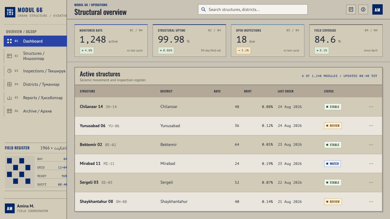
For web interfaces, dashboards, admin tools and pricing pages benefit from the grid discipline. Build the layout on one repeating module, give cards square corners and deep, consistent insets, and let shadow fall in a single direction with a hard edge. Reserve the blue for the primary action and the selected state, so that it never competes with itself. Navigation should be plain and structural, with labels sitting in cells, and decorative illustration should be left out. If a pattern is needed, derive it from a repeated cell instead of drawing a new ornament.
In editorial and marketing work, the style supports long-form pieces about cities, buildings, infrastructure and engineering, as well as brand pages for companies that want an industrial but human tone. Photography should be high-sun, high-contrast and unretouched, cropped to fit the module. Section breaks can be a row of repeated cells, and pull quotes can sit in a recessed panel. Calls to action take the single reserve of blue, and everything else on the page stays concrete.
The most common mistake is to treat the panjara as a pattern to be pasted over the layout as wallpaper. In the source architecture the lattice is a working screen, a module that carries light and structure; used as mere texture it turns into cliché. The second mistake is spending the blue: if it appears on headings, links, borders and backgrounds at once, nothing is left that feels like an inlay. A third is softening the shadows or rounding the corners, which instantly swaps the seismic logic for a generic modern look.
Tashkent Seismic Modernism — FAQ
Is Tashkent Seismic Modernism just Brutalism?
They are neighbours rather than twins. Brutalism is usually associated with massive, raw concrete volumes and a sculptural heaviness. This style also relies on concrete, but as a precast frame, screen and panel: lighter in section, more repetitive, and shaped by climate and by an earthquake. It also carries a defined local colour, the Timurid blue inlay, which gives it a regional identity that most Brutalist work does not have.
Why is the blue limited to a small inlay?
Because that is how it exists in the buildings. Timurid blue survives in the ceramic of metro stations and in the dome at Chorsu, set against grey structure, and it is its rarity that gives it value. In a layout the same rule keeps the blue meaningful: when it is reserved for a single action, a single figure or a single band, it directs attention. When it is spread across the page it turns into a theme colour and the concrete-and-jewel contrast disappears.
Can the style work on a dark background?
The system is light-grounded by nature, because the pale, sun-bleached concrete is the page. A dark version is possible but needs care. Let the cold deep shadow become the field, keep the concrete grey as frame lines and text, and preserve a consistent light direction so that cells still read as recesses. The blue remains an inlay. What you lose is the bleached quality of the surface, so a dark variant works best for infographics and control-style screens rather than for editorial pages.
What does 'seismic' mean in visual terms?
It means the design looks braced. Frames are thick and tied together, modules repeat evenly, joints between parts are visible and consistent, and nothing cantilevers or hangs as fragile decoration. Compositions feel low, wide and stable, and elements sit inside openings rather than floating. In practice that translates into square corners, even spacing, deep insets and a grid that never breaks, which together give the impression of a layout that could take a shock.
Which kinds of products does it suit, and where does it struggle?
It suits products that sell reliability, structure and public trust: infrastructure and engineering firms, city and transport services, architecture and real estate portfolios, research and data platforms, and institutional reports. It struggles with products built on playfulness, intimacy or softness, such as children's brands, lifestyle apps and anything that leans on rounded friendliness. The severity can read as cold in those settings, so consider a warmer system if the emotional tone is the point.
Related design styles
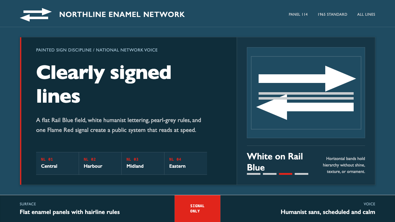 Gill Sans British RailPublic authority, enamel-flat. Rail Blue bands, white humanist type, one red…
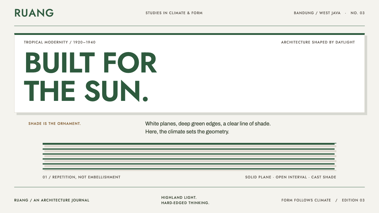 Bandung Tropical Art DecoClimate writes the geometry. Bottle-green bands on stucco white make hard sha…
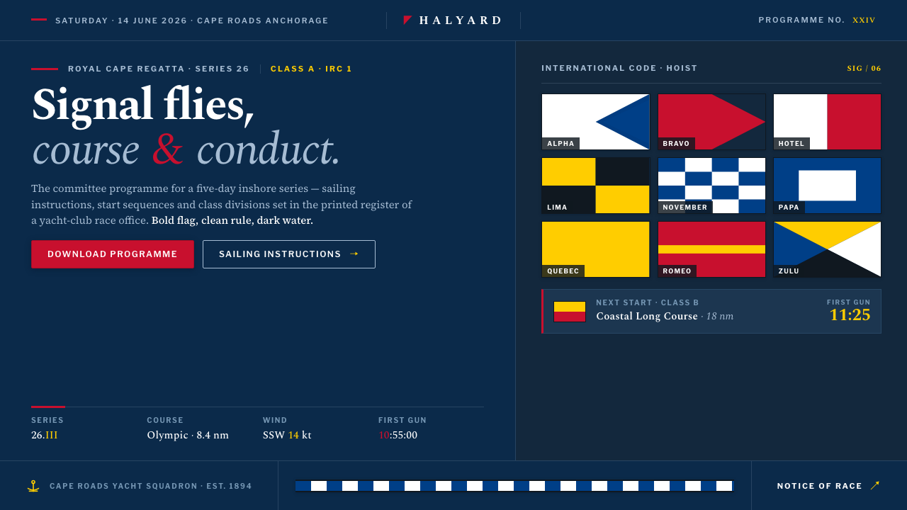 Sailing RegattaSignal-flag discipline on dark water. Rectilinear red-blue-yellow blocks on d…
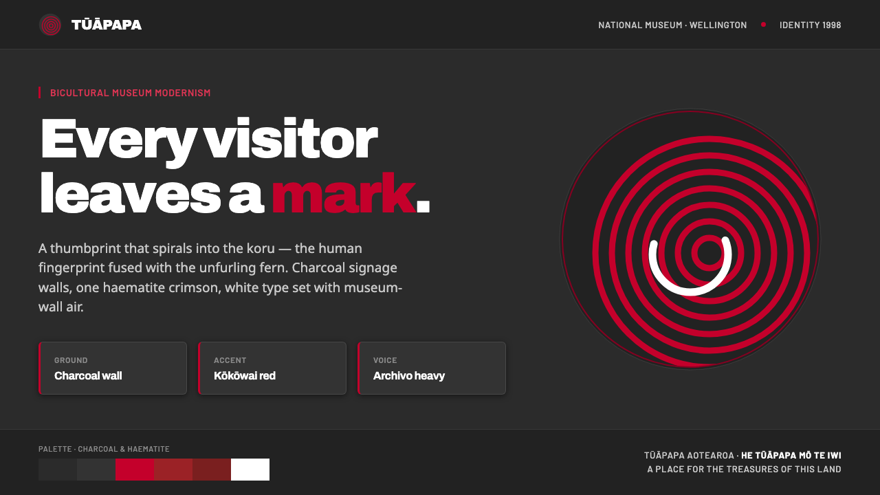 Te Papa Aotearoa ModernEvery visitor leaves a mark. Charcoal museum walls, one haematite crimson, a…
 The Economist (Red-Banner)Argument made visible. Red banner, cream paper and Garamond columns enforce t…
 Yugoslav Socialist ModernismGeometry on concrete. EXAT-51 circles and bars in hot orange and clean teal,…