What is Sailing Regatta?
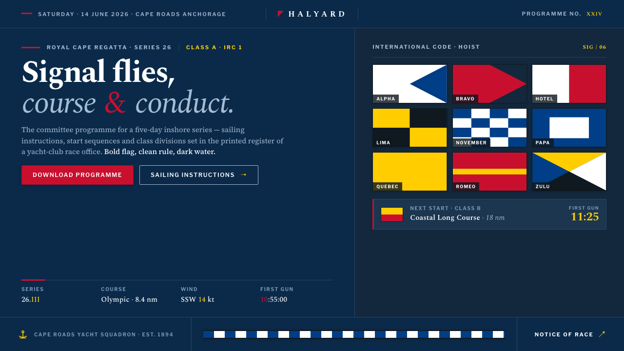
Sailing Regatta brings signal-flag discipline to digital design: deep navy water, sharp heraldic color, and the composed authority of a printed race program.
Sailing Regatta in brief
Sailing Regatta is the visual language of a yacht-club race committee translated into a digital setting. Its foundation is a deep navy ground, recalling dark water and hull livery, over which red, yellow, blue, black, and white signal panels appear as deliberate blocks. The result is nautical without becoming picturesque: the atmosphere comes from discipline, contrast, and editorial control rather than from decorative maritime imagery.
The palette is led by signal-flag red, with heraldic high-visibility colors supporting it. Rectilinear fields sit against the navy like flags caught in clear wind, while crisp horizontal rules organize information with the authority of a race notice. Color is never ambient filler. Each panel has a communicative role, and the dark ground gives every bright field the visual force of a signal seen across water.
Typography supplies the system’s literary register. Refined serif letterforms evoke the printed regatta program and give the interface a sense of institutional continuity. The contrast between formal type, hard-edged color fields, and nautical darkness produces a style that feels competitive, ceremonial, and exact. It is a visual language for information that must be noticed, understood, and trusted.
Where does Sailing Regatta come from?
Sailing Regatta belongs to the modern competitive regatta era of 1990–2010 and is rooted in Western European yacht clubs and regatta committees. Its cultural starting point is not a single designer or studio but an operational environment: race information must be visible, orderly, and authoritative, while the identity of the club must remain composed. The style therefore feels institutional without becoming bureaucratic, and nautical without depending on illustration.
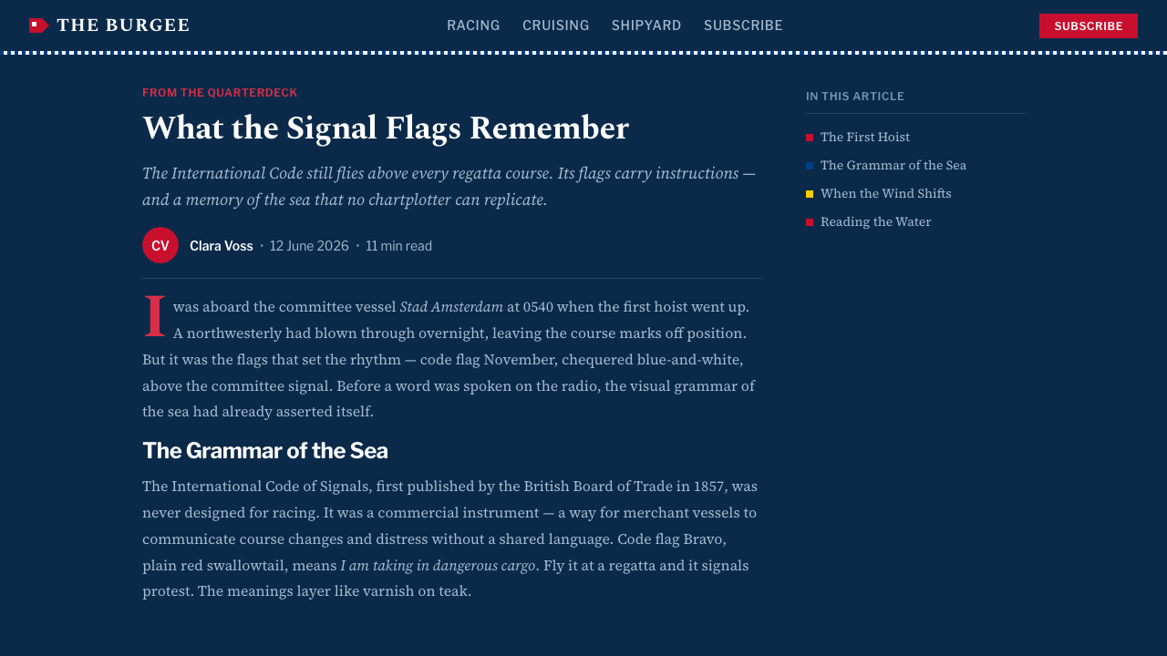
Its deepest source is the maritime signaling tradition represented by the International Code of Signals. Signal flags are not treated here as casual decoration. They are the underlying idea of the system: a bounded field of color carries meaning, contrast makes recognition immediate, and a clear arrangement prevents ambiguity. The digital interpretation preserves that logic through disciplined color blocks, sharp edges, and a restrained visual vocabulary.
A second source is the heraldic flag tradition. Heraldic color gives the palette its ceremonial confidence, while the yacht-club context adds polish and continuity. The blue-and-white stripe livery associated with yacht-club branding contributes a quieter structural rhythm beneath the brighter signal colors. Together, these influences create a balance between announcement and refinement: the system can command attention while still belonging to a printed program, club pennant, or formal race notice.
The final source is the visual culture of the race committee itself. Officers, skippers, and crews depend on shared conventions, so the style favors unmistakable hierarchy over expressive improvisation. In digital form, deep navy becomes the governing field, flag-like rectangles become emphasis devices, horizontal rules become navigational anchors, and serif typography carries the editorial voice. The result is a system that turns maritime discipline into a coherent interface language.
What defines the Sailing Regatta look?
Deep Navy Ground
Deep navy is the governing field, recalling dark water and the painted hulls of yacht-club craft. It is not merely a fashionable dark background; it establishes the visual conditions under which signal colors can work. Bright panels appear more decisive against it, while white type and rules gain a calm, high-contrast clarity. The ground should remain spacious and steady so that every interruption reads as intentional.
Signal-Flag Color
Signal-flag red leads the palette, while yellow, blue, black, and white provide support and contrast. The colors should feel heraldic and highly visible rather than soft, atmospheric, or blended. Red can mark the principal call to attention; yellow can sharpen a secondary signal; blue can reinforce the nautical field. The exact balance changes with the content, but the governing rule remains constant: every color must earn its place.
Rectilinear Flag Fields
The central shape language is rectilinear. Color arrives in bounded fields that resemble signal flags, pennants, or painted livery rather than organic forms. Their edges are crisp and their proportions feel composed, giving the page a sense of engineered order. These blocks can frame a title, identify a state, separate a section, or create a visual counterweight, but they should remain structural signals rather than decorative confetti.
Editorial Serif Typography
Serif typography carries the voice of the printed regatta program. Its presence softens the severity of the blocks without weakening authority, bringing literary polish to an otherwise hard-edged system. Headings, labels, and body copy should share a coherent typographic family or character. Contrast comes from scale, placement, and spacing, while the letters themselves remain composed, legible, and formal.
Crisp Horizontal Rules
Horizontal rules act as course markers for information. They divide content with the clarity of a race notice and reinforce the long, directional rhythm associated with waterline and hull stripe. A rule should clarify a relationship, not merely fill empty space. Used with restraint, it can turn a dense editorial page into a sequence of readable signals without competing with the primary color fields.
Heraldic Contrast
The style balances command and refinement. High-visibility color, dark water, formal type, and clean geometry create a visual presence that is ceremonial without being ornate. Contrast should feel intentional and public-facing, like a flag displayed for recognition. The system is strongest when bright elements are given enough surrounding darkness to remain distinct, rather than being crowded into constant visual noise.

Who shaped Sailing Regatta?
Race-committee officers are the operational archetype behind the style. Their visual world values clear notices, shared conventions, and information that can be recognized without hesitation. In the system, they justify the disciplined hierarchy, the crisp rules, and the insistence that each color field communicate rather than decorate.
Yacht skippers and crews represent the audience that reads the system under competitive conditions. Their presence gives the style its practical urgency: color must remain visible, hierarchy must remain stable, and typography must support fast orientation. The result is polished, but never merely luxurious; it is designed to carry shared information.
The authors of the International Code of Signals stand for the system’s underlying logic of visual communication. Their connection here is conceptual rather than personal: bounded colors, recognizable arrangements, and disciplined signaling become the foundation for the digital palette. Sailing Regatta borrows that clarity while giving it the editorial polish of a yacht-club program.
How do you use Sailing Regatta today?
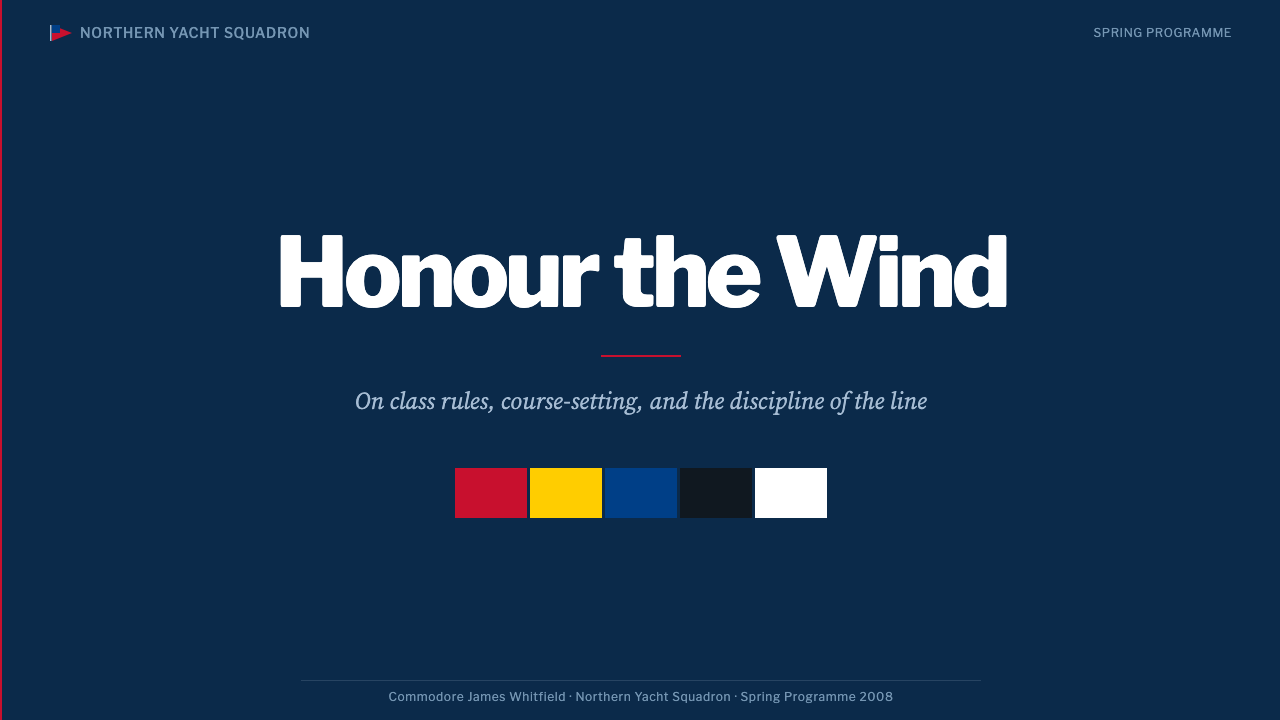
For presentation covers, Sailing Regatta works best as a controlled field of darkness interrupted by a decisive signal. Set the title in a refined serif against deep navy, then use a red or yellow rectilinear panel as the primary visual anchor. A crisp rule can establish the baseline of the composition, while a quieter blue or white detail supports the identity. The cover should feel like an official race document: confident, spacious, and immediately legible.
Content slides should use the same signal logic at a calmer intensity. Let serif headings establish the editorial voice, use horizontal rules to separate sections, and reserve the strongest color field for the point the audience must remember. Data slides can treat tables, rankings, or race information as organized notices rather than decorative infographics. A single dominant signal is usually clearer than a crowded arrangement of competing panels.
For web interfaces, the style suits dashboards and pricing pages that need authority, scannability, and a strong institutional identity. Deep navy can hold the main shell, while red, yellow, blue, black, and white distinguish states or tiers. Rectangular cards and crisp dividers should make relationships visible; serif headings can give the interface a premium editorial register. The design should remain calm between signals so that important changes feel consequential.
Editorial and marketing work can draw directly from the printed regatta program. Use a dark navy page or section as the primary stage, then alternate formal serif copy with flag-like color fields and horizontal rules. A campaign can feel both exclusive and public-minded when its color hierarchy is consistent: red announces, yellow sharpens, blue steadies, and white clarifies. The visual language is especially effective when the message needs ceremony without excessive ornament.
The common mistake is to treat Sailing Regatta as permission to cover every surface with nautical color. If red, yellow, blue, black, and white all compete at once, the signal loses its authority. Another mistake is replacing the editorial serif voice with casual display lettering or scattering decorative maritime motifs across the layout. Keep the navy field generous, give each block a communicative job, and let the strongest signal remain unmistakable.
Sailing Regatta — FAQ
Is Sailing Regatta simply a generic nautical style?
No. Generic nautical design often begins with maritime imagery or decoration, while Sailing Regatta begins with signaling discipline. Its identity comes from deep navy, bounded flag-like fields, heraldic contrast, horizontal rules, and editorial serif typography. The style may feel nautical, but its real subject is clear public communication within a formal regatta culture.
Why does signal-flag red lead the palette?
Red leads because the system is based on the visual hierarchy of a signal: one element should command attention while supporting colors clarify or stabilize the field. Red carries the strongest announcement, while yellow, blue, black, and white can provide emphasis, contrast, or restraint. The principle is not to maximize color, but to make the intended signal unmistakable.
Can the style work on a light background?
It can, but the deep navy ground is central to the identity. A light variation must preserve the contrast between quiet field and decisive flag color, rather than becoming a general white-and-color layout. Navy can return through large structural areas, rules, type, or hull-like bands. Without that dark nautical counterweight, the system may lose its regatta character.
How should serif typography behave in the system?
Serif typography should feel refined, legible, and editorial rather than ornamental or nostalgic. It carries the voice of the printed regatta program, so headings and body text need a shared formal character. Let hierarchy come from scale, placement, spacing, and contrast with the flag fields. The type should remain composed enough to support information, not compete with it.
Where does Sailing Regatta work best, and where can it struggle?
It works best for regatta programs, yacht-club identities, competition dashboards, pricing pages, editorial reports, and presentations that need authority with a polished maritime register. It can struggle when a product requires softness, organic warmth, or highly expressive decoration. The style depends on clear signals and controlled contrast; contexts that rely on visual abundance may find its discipline too severe.
Related design styles
 The Economist (Red-Banner)Argument made visible. Red banner, cream paper and Garamond columns enforce t…
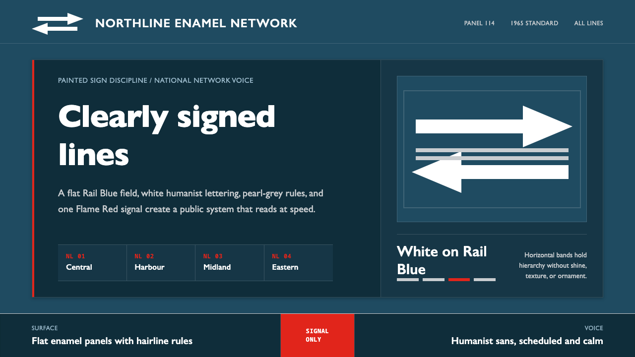 Gill Sans British RailPublic authority, enamel-flat. Rail Blue bands, white humanist type, one red…
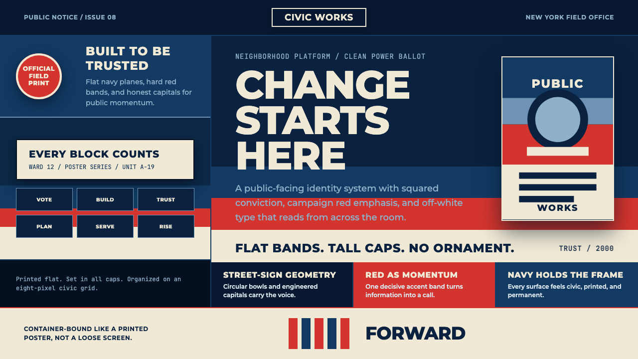 Gotham Geometric SansCivic trust in tall caps. Navy, red, and off-white bands turn geometry into c…
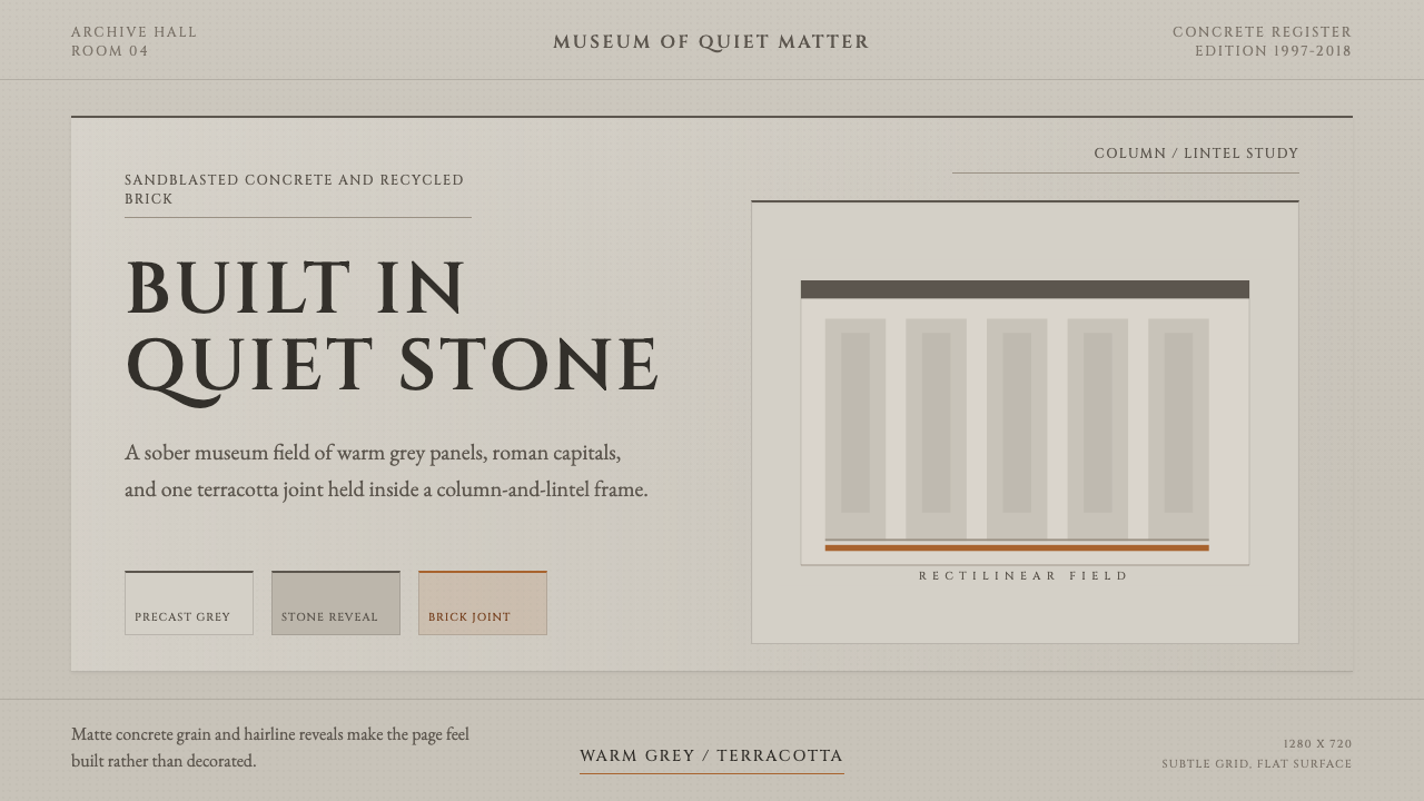 Chipperfield Museum GrayMuseum gravity, rendered quietly. Warm concrete grey, roman capitals, one ter…
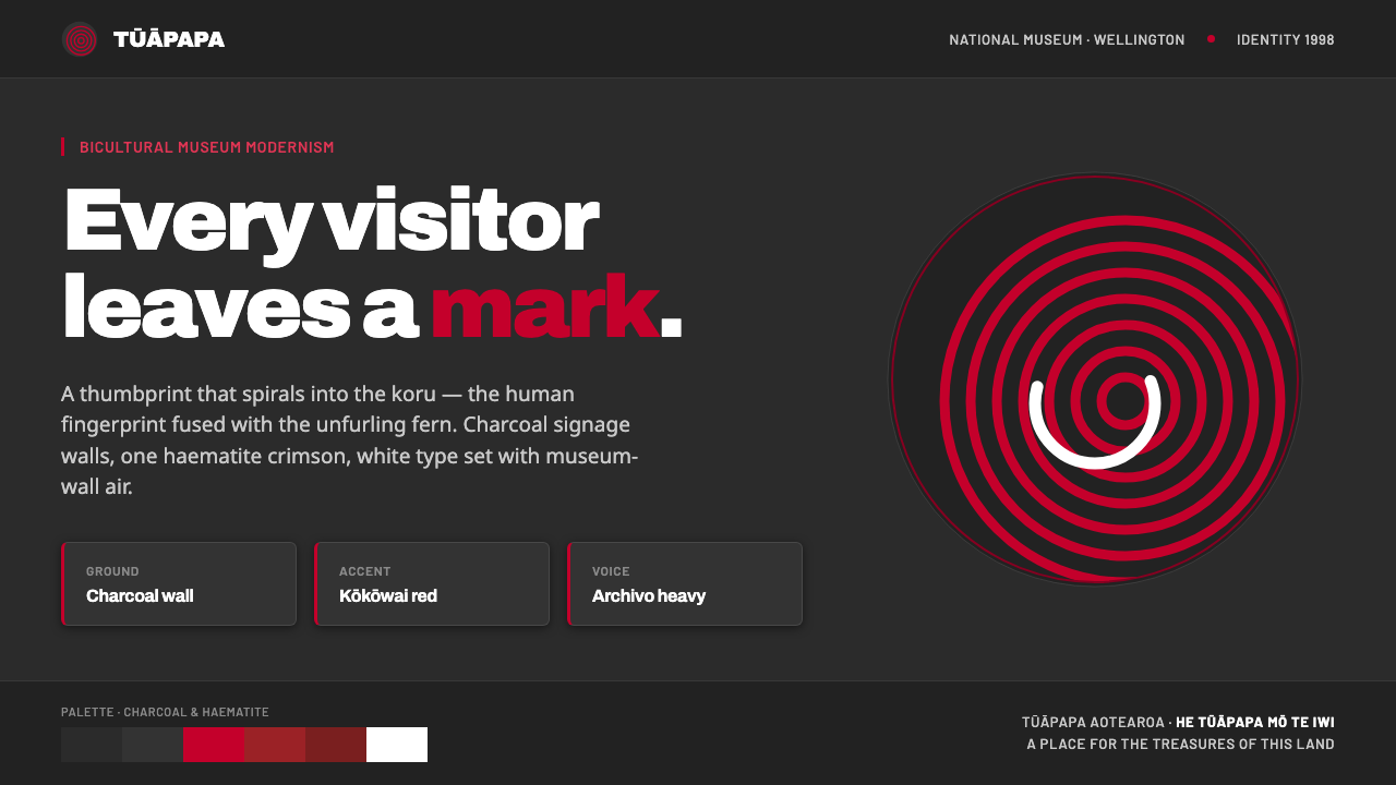 Te Papa Aotearoa ModernEvery visitor leaves a mark. Charcoal museum walls, one haematite crimson, a…
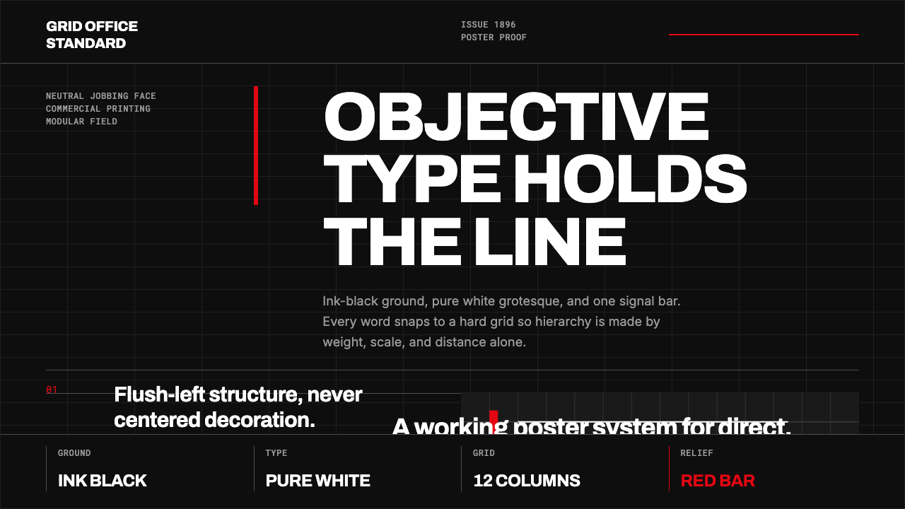 Akzidenz-Grotesk BertholdObjectivity in black ink. White grotesque type, hard grid, one rationed red b…