What is Gotham Geometric Sans?
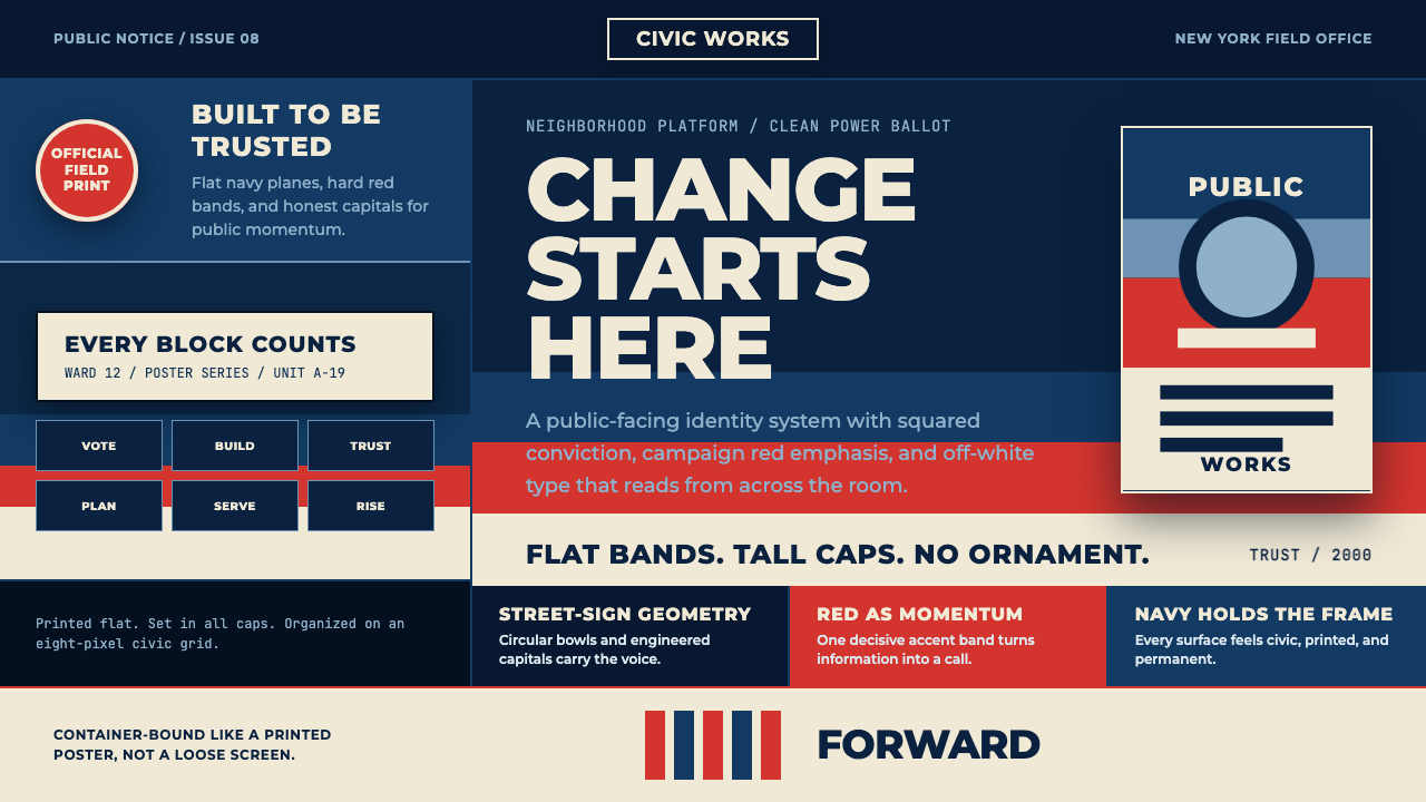
Gotham Geometric Sans turns civic lettering into campaign force — tall honest capitals, deep navy ground, and red and off-white bands that make geometry feel trustworthy at a glance.
Gotham Geometric Sans in brief
Gotham Geometric Sans is a civic display system built around the architectural clarity of Gotham, the geometric sans Tobias Frere-Jones drew in 2000 from workmanlike lettering on mid-century New York buildings, especially the Port Authority Bus Terminal. Its character is defined by circular bowls, tall capitals, and an absence of ornamental gestures. The letterforms feel public rather than personal: sturdy enough for a building, direct enough for a poster, and open enough to remain legible at a glance.
The system becomes distinctive through its surface treatment. A deep patriotic navy ground carries stacked all-caps slogans, while red and off-white appear as broad, screen-printed bands. These bands do not behave like decoration applied after the fact. They divide, emphasize, and badge the message, turning a typographic composition into something that resembles campaign material or civic signage. The result is flat, declarative, and deliberately easy to recognize.
Its historical charge comes from the meeting of type and political branding. In 2008, the Obama campaign used Gotham for HOPE and CHANGE, while Shepard Fairey’s associated visual language used flat bands of red, faded blue, and off-white. This system rebuilds that visual memory as a design language: geometric, patriotic, disciplined, and designed to project public confidence without relying on ornament or visual softness.

Where does Gotham Geometric Sans come from?
Gotham was released in 2000 after Tobias Frere-Jones drew it from the workmanlike lettering attached to mid-century New York architecture. The Port Authority Bus Terminal is the defining reference in the approved material: its lettering was practical, public, and engineered to be read by strangers moving through a shared city. Gotham carried that setting into a typeface whose geometry feels familiar without becoming ornamental. Its circular forms and upright capitals create a voice that is plainspoken, civic, and physically grounded.
The type belongs to a geometric and architectural sans tradition, but its appeal is not presented as abstract geometry alone. Its forms retain the social character of the lettering that inspired them. The letters seem made for institutions, transit, buildings, and public announcements. Tall capitals create a vertical authority, while circular bowls soften the system just enough to keep it approachable. The balance is important: the style seeks trust through structural steadiness rather than through warmth, luxury, or expressive flourish.
The defining public moment arrived in 2008, when the Obama campaign used Gotham for HOPE and CHANGE. The typeface moved from architectural reference into mass political communication, where its broad capitals and clear geometry could function across campaign material. Shepard Fairey’s flat bands of red, faded blue, and off-white gave that communication a recognizable printed surface. In this context, color and type worked together as a public-facing signal: the letters stated the message, while the bands made the message feel organized, reproduced, and ready to circulate.
This system treats that moment as a visual source rather than a literal replica. It retains the deep navy ground, the civic triad of navy, red, and off-white, the stacked all-caps slogans, and the screen-printed flatness. Its movement is therefore not ornamental revival but a reconstruction of a public graphic language. The style works when every part appears to belong to the same campaign object: the type, the bands, the badge-like blocks, and the dark field all speak with the same controlled confidence.
What defines the Gotham Geometric Sans look?
Civic Geometry
The geometry is architectural rather than playful. Circular bowls, upright stems, and tall capitals make the alphabet feel engineered for shared space. Forms are reduced until they are direct, but not sterile; the letters remain familiar and human enough to read as public language rather than technical diagram. Every character should appear capable of standing on a building, a station, or a civic notice.
Tall Capitals
All-caps typography is the system’s strongest voice. Capitals create a public register: declarative, collective, and easy to recognize from a distance. Stacked lines turn short phrases into visual architecture, with each line behaving like a sign panel or a campaign block. The effect depends on restraint. A few strong words have more force than a crowded paragraph rendered in capitals.
Patriotic Triad
Deep navy, red, and off-white form a civic triad with clear roles. Navy provides the authoritative ground, red supplies urgency and emphasis, and off-white keeps the message printable, human, and visibly grounded in paper rather than light. The colors are broad fields, not delicate accents. Their strength comes from separation into bands and blocks, allowing the palette to read as organized communication.
Banded Flatness
The surface resembles screen printing: flat, decisive, and visibly assembled from ink-like fields. Bands can separate a slogan from its ground, frame a message, or create a badge around a short statement. They should not dissolve into gradients or simulated lighting. The style gains credibility when every color edge feels printed, intentional, and strong enough to survive reproduction.
Stacked Slogans
Short language is treated as a compositional object. A slogan can occupy several horizontal levels, with changes in scale, placement, or color creating rhythm without decorative illustration. The words should remain blunt and legible. Their visual power comes from alignment, repetition, and the tension between the tall letterforms and the broad horizontal bands beneath them.
Badge Authority
Blocks of type and color often behave like badges. A compact phrase inside a red or off-white field can signal a category, a promise, or a public statement without requiring an illustrative emblem. The badge should feel stamped rather than polished: bounded, reproducible, and immediately identifiable. This gives the system its campaign-like ability to organize many messages under one visual authority.

Who shaped Gotham Geometric Sans?
Tobias Frere-Jones drew Gotham in 2000 from the workmanlike lettering found on mid-century New York buildings, with the Port Authority Bus Terminal as the defining reference named by this system. His contribution is the transformation of ordinary civic lettering into a geometric sans whose circular bowls and tall capitals could carry public messages with structural clarity.
Jesse Ragan is named among the key figures attached to this Gotham Geometric Sans lineage. The approved material does not assign him a separate historical episode, so his place here is best understood through the system’s broader type history: a geometric architectural sans defined by practical lettering, civic scale, and unornamented clarity.
Shepard Fairey is the visual figure associated here with the flat bands of red, faded blue, and off-white that accompanied the 2008 campaign moment. His importance to this system lies in the printed surface: broad color fields, simplified contrast, and a graphic treatment that made type, color, and public messaging feel like parts of one reproducible campaign object.
How do you use Gotham Geometric Sans today?
For presentation slides, use the style as a sequence of public statements. A cover can place a compact all-caps title against the deep navy ground, with a red or off-white band cutting across the composition like a campaign strip. Content slides should keep the same authority but reduce the slogan pressure: use clear stacked headings, broad fields of color, and generous breathing room. Data slides should turn charts, labels, and callouts into badge-like civic graphics rather than decorative dashboards.
For web interfaces, Gotham Geometric Sans suits dashboards and pricing pages that need confidence, direct comparison, and fast scanning. Use the navy field to establish the main environment, then reserve red for emphasis, alerts, or decisive action and off-white for readable surfaces. Cards can feel like printed panels, with strong edges and flat fills instead of soft atmospheric effects. Navigation should rely on clear words and geometric grouping, allowing the type itself to provide the interface identity.
For editorial and marketing work, the system is strongest when content is arranged like campaign literature. A feature page can open with a large stacked statement, followed by horizontal bands that separate context, proof, and action. Editorial sections should keep body copy calm and readable beneath the louder display language. Marketing pages can use badge-like claims, poster-scale headlines, and repeated navy, red, and off-white fields to make separate sections feel like one public-facing program.
For identity systems, the style creates consistency through repetition rather than ornament. The same tall capitals, band logic, and civic triad can move across posters, social cards, landing pages, event signage, and product announcements. A small badge or short slogan can become a recurring recognition device, provided it remains legible and does not compete with every other message on the page.
The common mistake is treating campaign energy as permission for constant shouting. Filling every surface with all-caps slogans, red bands, badges, and maximum contrast destroys the hierarchy that makes the system persuasive. Another mistake is replacing the flat printed character with gradients, glossy lighting, or decorative texture. The style works when the materials feel stamped, organized, and repeatable; it weakens when the surface starts performing luxury or spectacle.

Gotham Geometric Sans — FAQ
Is Gotham Geometric Sans simply a Gotham type specimen?
No. Gotham is the typographic foundation, but this system adds a complete civic surface around it: deep navy, red and off-white bands, stacked all-caps slogans, badge-like blocks, and screen-printed flatness. The style depends on the relationship between the letters and those fields. Using the typeface alone without the banded structure would preserve the source but not the full visual language.
Why does the system use a dark navy ground?
The navy ground gives the composition a public and authoritative field without making it feel glossy or luxurious. It also allows red and off-white bands to read as strong printed interventions. Because the surface remains flat, the dark ground behaves like ink or paper rather than simulated depth. The result is patriotic and civic, but still controlled and graphic.
Can the style work without political campaign references?
Yes. Its deeper structure comes from architectural lettering, civic scale, geometric sans forms, and reproducible color bands. Those qualities can support public information, cultural events, educational materials, dashboards, or institutional campaigns. The 2008 Obama campaign is the defining historical association in this source material, but the visual system can be applied more broadly wherever clarity, collective address, and public recognition are desired.
How can the style remain trustworthy instead of becoming propaganda-like?
Trust comes from disciplined hierarchy rather than from making every element louder. Keep the message short, let the typography remain open and legible, and use bands to organize rather than decorate. Navy can carry the field, red can mark emphasis, and off-white can preserve reading comfort. When every block is treated as a demand for attention, the style loses the calm civic clarity that made its source language effective.
Related design styles
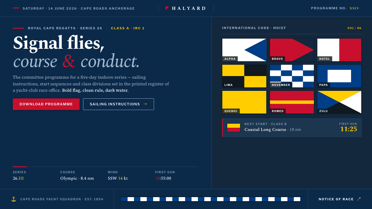 Sailing RegattaSignal-flag discipline on dark water. Rectilinear red-blue-yellow blocks on d…
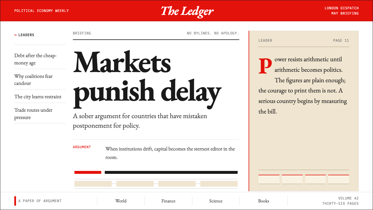 The Economist (Red-Banner)Argument made visible. Red banner, cream paper and Garamond columns enforce t…
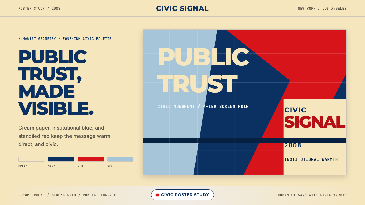 Gotham / Obama Hope Poster (2008)Public trust, made visible. Cream, navy, and red grid the poster.
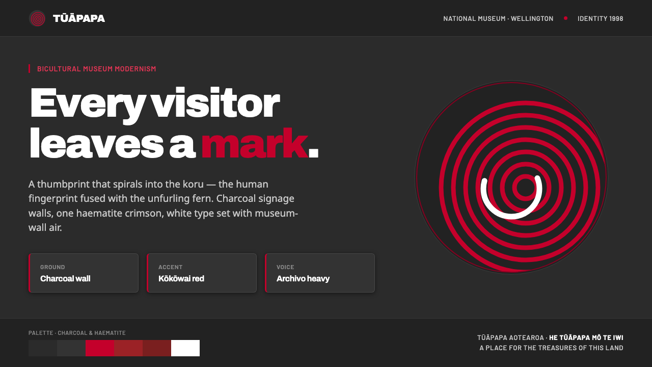 Te Papa Aotearoa ModernEvery visitor leaves a mark. Charcoal museum walls, one haematite crimson, a…
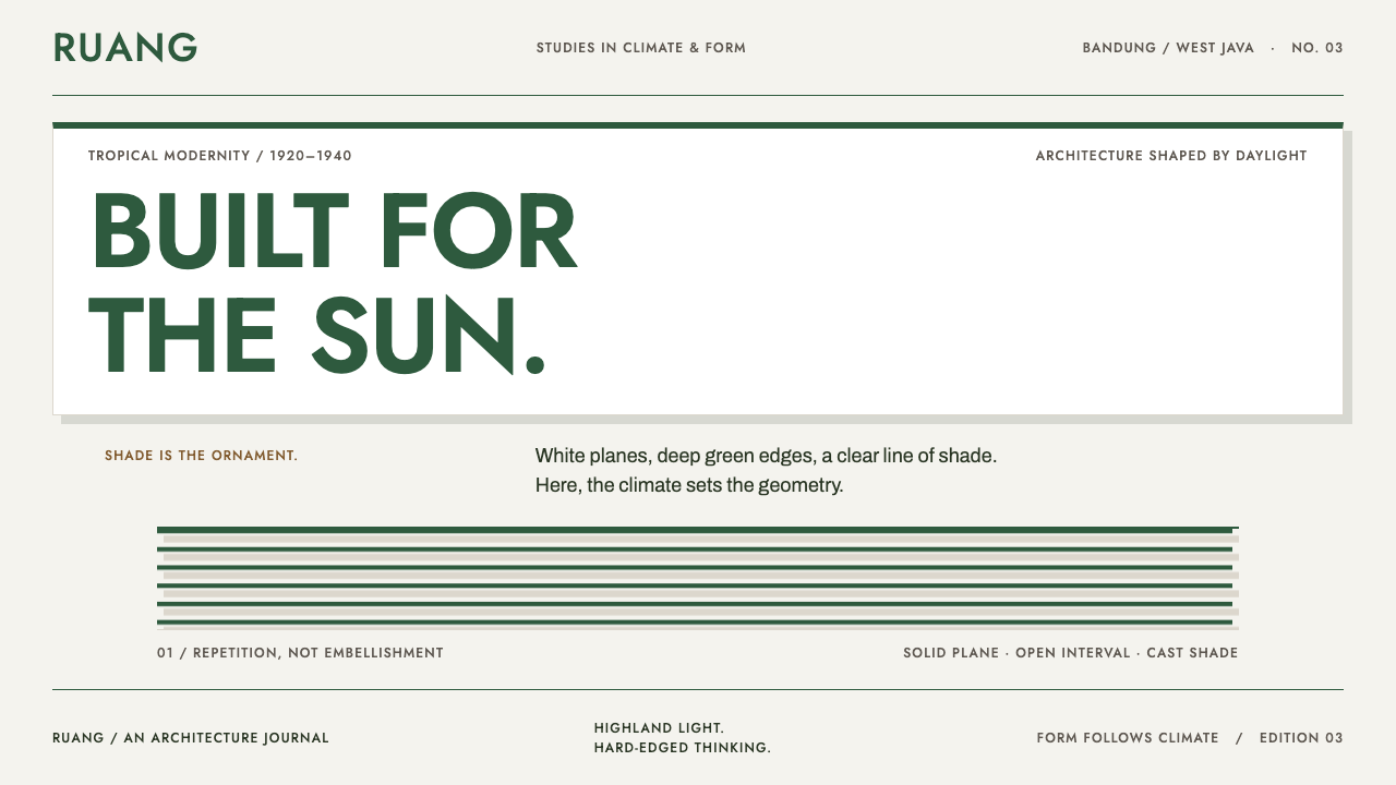 Bandung Tropical Art DecoClimate writes the geometry. Bottle-green bands on stucco white make hard sha…
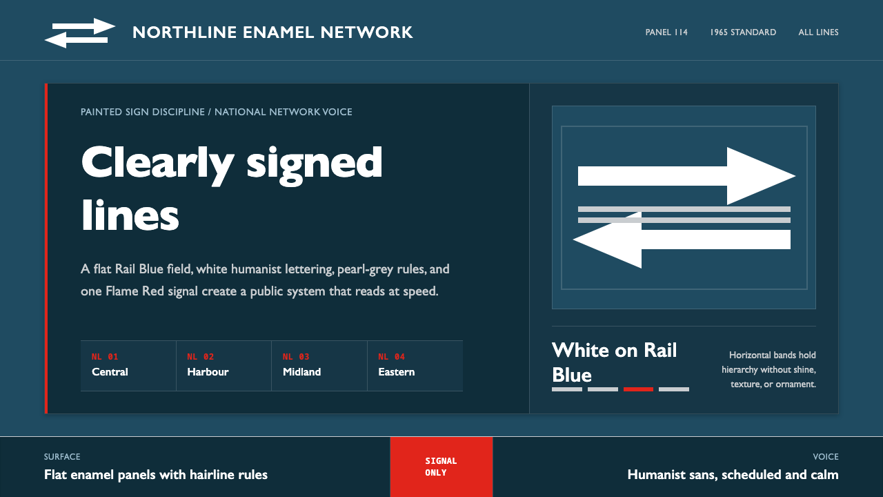 Gill Sans British RailPublic authority, enamel-flat. Rail Blue bands, white humanist type, one red…