What is Te Papa Aotearoa Modern?
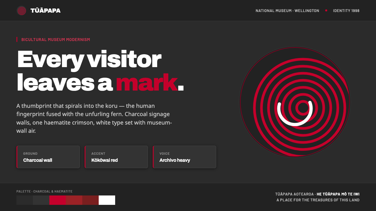
Te Papa Aotearoa Modern turns the museum into a human trace — charcoal walls, haematite crimson, and a thumbprint spiraling into a Māori koru.
Te Papa Aotearoa Modern in brief
Te Papa Aotearoa Modern is the contemporary identity of Te Papa Tongarewa, New Zealand’s national museum, opened in Wellington in 1998. Its visual language is dark, confident, and deliberately grounded: charcoal evokes the museum wall, white provides sharp relief, and kōkōwai red brings the cultural memory of Māori haematite ochre into a restrained modernist system.
The identity is organized around one unmistakable device: a thumbprint that spirals into the koru, the unfurling-fern motif associated with Māori visual culture. The mark joins bodily presence with cultural form. It says that every visitor arrives with an identity and leaves a trace, while the spiral suggests growth, movement, and a form still becoming.
Everything else supports that central gesture. The palette avoids bright primary red in favor of a deep crimson; typography is firm and legible, with Archivo used in a heavy signature-like treatment; signage, packaging, and interiors share the same dark ground and symbolic accent. The result is modern without becoming anonymous, and bicultural without reducing culture to surface ornament.
Where does Te Papa Aotearoa Modern come from?
Te Papa Tongarewa opened in February 1998 in Wellington, Aotearoa New Zealand, within the contemporary design period associated with the years 1990–2010. As the national museum, it required an identity capable of operating across architecture, public signage, packaging, and interior experience. The resulting system had to feel institutional without becoming distant, and contemporary without severing itself from the cultural ground it represented.
Cato Brand Partners built the identity around a single visual invention: the thumbprint-koru. A fingerprint is intimate, individual, and unmistakably human. The koru is a Māori unfurling-fern motif, recognized here as a form of cultural continuity and movement. Their fusion creates a mark that is neither a literal fingerprint nor a conventional ornamental fern. It is a compact statement about people, place, and an institution shaped by more than one cultural tradition.
The identity belongs to a broader bicultural New Zealand brand-design context, but its expression is unusually disciplined. Instead of accumulating symbols, colors, and decorative references, it lets one mark carry the encounter between personal trace and Māori form. Charcoal, kōkōwai red, and white then establish a consistent environment around it. The system’s modernism comes from reduction, contrast, and repetition across touchpoints rather than from technological effects or visual novelty.
What defines the Te Papa Aotearoa Modern look?
Charcoal Ground
Charcoal is the identity’s architectural ground, recalling the dark walls of the museum rather than a neutral canvas. It gives the system gravity and makes the white and kōkōwai red feel deliberate. The darkness should be broad and continuous, allowing the mark and information to emerge from a shared environment. This is not a moody backdrop added for atmosphere; it is the visual equivalent of entering the institution.
Haematite Crimson
Kōkōwai red is a deep crimson derived from Māori haematite ochre. Its value lies in its earthiness and cultural specificity, not in brightness. Used against charcoal, it becomes a concentrated signal: a mark, a directional cue, or a point of emphasis. It should feel mineral and grounded, closer to pigment than to commercial primary red. The restraint keeps the red meaningful whenever it appears.
Thumbprint–Koru Mark
The thumbprint spiraling into the koru is the system’s essential form. Its power comes from fusion: a uniquely human trace becomes a culturally resonant unfurling spiral. The mark can operate as a signature, an emblem, or a repeated visual anchor, but it should remain recognizable as one continuous gesture. It is neither generic pattern nor decorative iconography. It is the identity’s argument made visible.
Firm Typography
Typography is clean, assertive, and built for public legibility. Archivo in a heavy treatment supplies the identity’s signature presence, especially where the mark needs a typographic companion. Type should stand firmly against the charcoal ground, with clear hierarchy and little stylistic fuss. The aim is not historical lettering or handcrafted irregularity. It is a contemporary institutional voice that feels direct, memorable, and composed.
Bicultural Integration
The identity’s bicultural character is structural rather than additive. Māori reference is not placed beside a separate modern identity as an illustration; it is fused into the central device itself. The fingerprint and koru become one mark, allowing personal and cultural presence to coexist within the same visual act. This approach gives the system respect and coherence while avoiding a collection of disconnected symbolic decorations.
Modernist Restraint
Te Papa Aotearoa Modern achieves confidence through limitation. The system relies on a dark ground, a single culturally specific red, white, one central mark, and firm type. There is no need for gradients, ornamental layering, or a crowded palette to communicate importance. Repetition across signage, packaging, and interiors turns restraint into recognition. The identity feels expansive because its few elements are given room to operate fully.
Who shaped Te Papa Aotearoa Modern?
Cato Brand Partners created the Te Papa identity opened with the museum in 1998. The studio’s defining contribution was to organize the system around the thumbprint that spirals into the koru. Rather than treating the mark as one decorative asset among many, the identity makes it the bridge between individual human presence, Māori form, and a contemporary public institution.
Te Papa Tongarewa is New Zealand’s national museum, located in Wellington, Aotearoa New Zealand. Its identity had to work across signage, packaging, and interiors, giving the thumbprint-koru device an institutional setting and repeated public life. The museum is therefore not merely the client behind the style; it is the place whose walls, visitors, and bicultural character give the system its meaning.
The thumbprint-koru is the identity’s central conceptual figure. It joins a fingerprint, the most personal of marks, with the Māori unfurling-fern motif. Its spiral movement makes the symbol feel active rather than static, while its combined form resists separating human identity from cultural context. It is the clearest expression of the principle that every visitor leaves a mark.
Kōkōwai is the deep crimson red drawn from Māori haematite ochre. Within the identity, it is more than an accent color: it carries material and cultural memory. Its subdued, mineral character prevents the system from drifting into generic modernist brightness. Against charcoal and white, kōkōwai acts with precision, giving the thumbprint-koru and selected information a grounded visual voice.
How do you use Te Papa Aotearoa Modern today?
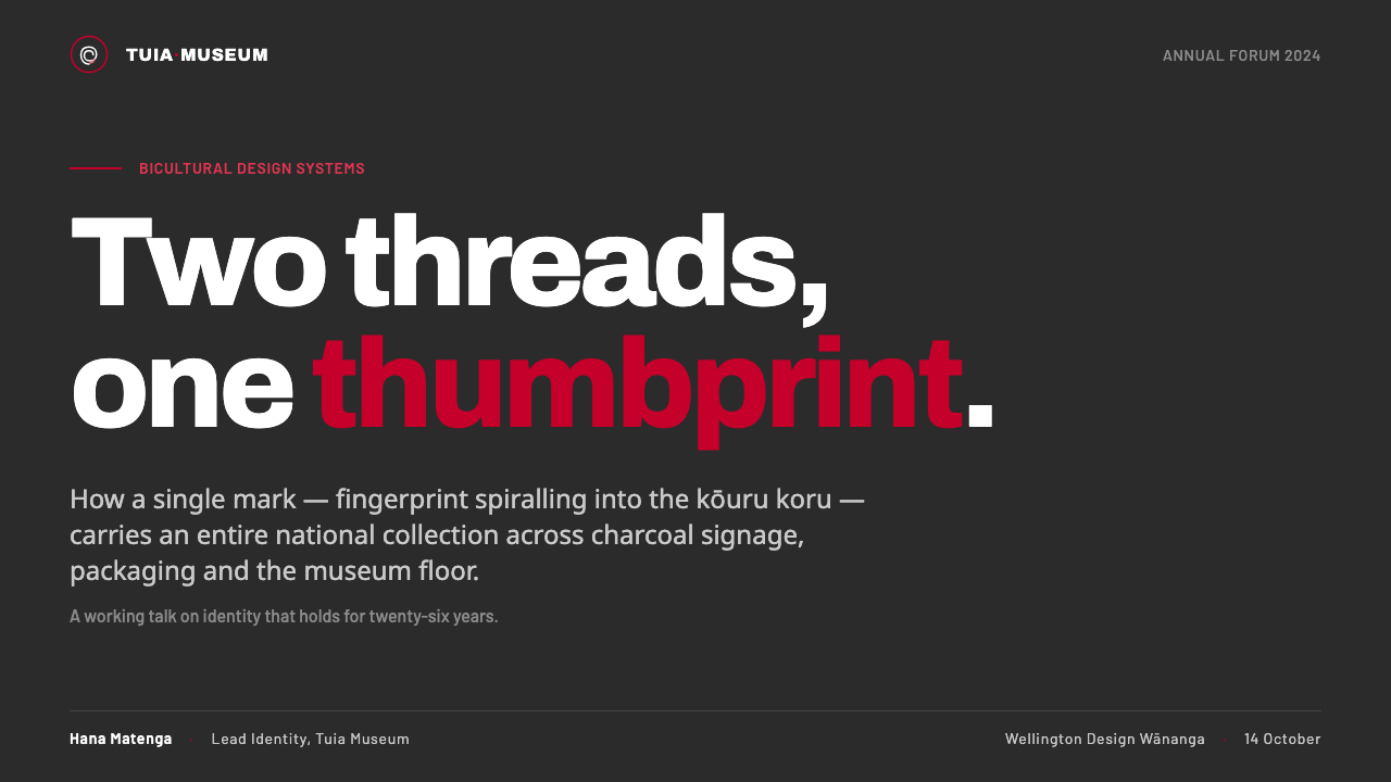
For presentation slides, use charcoal as the shared field across cover and content pages. The cover can place the thumbprint-koru prominently, with a firm white title and one concentrated kōkōwai accent. Content slides should keep the same discipline: clear typographic hierarchy, generous dark space, and a single organizing gesture. Data slides can treat charts and diagrams as quiet white structures with red reserved for the key finding, direction, or category that matters most.
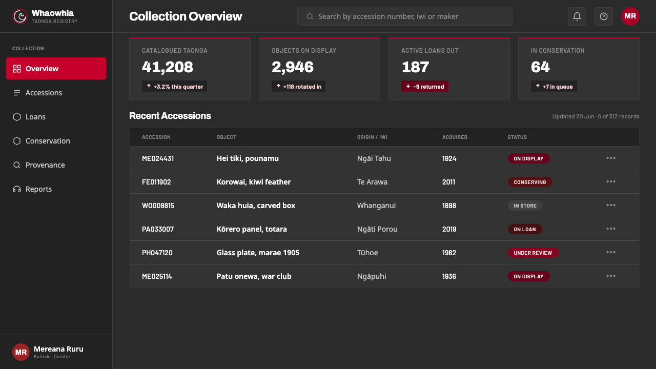
For web interfaces, the style suits museum dashboards, cultural platforms, and pricing pages that need authority without corporate gloss. Use charcoal for the main environment, white for readable information, and kōkōwai for selected actions, status cues, or tier distinction. The thumbprint-koru can serve as a wordmark companion or recurring navigation anchor. Keep panels visibly structured and avoid soft atmospheric effects that would dilute the mineral, architectural quality of the system.
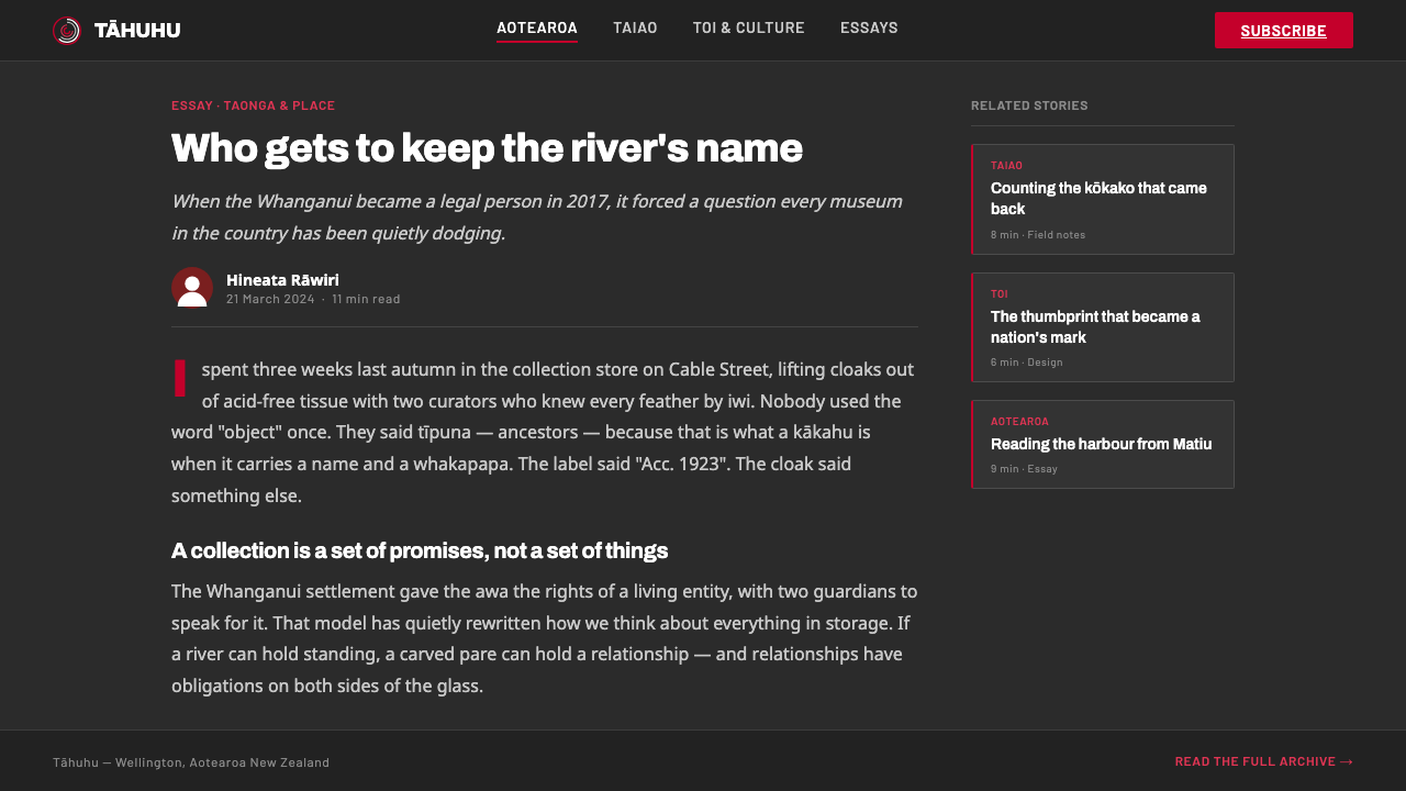
For editorial and marketing work, Te Papa Aotearoa Modern supports a strong institutional voice. Articles can place white text and compact metadata against charcoal, with the koru mark appearing as a recurring signature rather than a decorative divider. Campaigns can use the deep red for a single headline, call to action, or image intervention. Packaging and promotional layouts should feel tactile and place-based, even when the composition remains clean and modernist.
The common mistake is to treat the style as a generic dark theme with a red logo. Bright scarlet, multiple cultural motifs, decorative spirals, or excessive red would sever the identity from its source. The red must retain its kōkōwai character; the koru must remain fused with the thumbprint; and the charcoal ground must function as an environment, not merely a fashionable background. Meaning comes from the relationship among these elements.
Te Papa Aotearoa Modern — FAQ
What does the thumbprint-koru symbolize?
It fuses the human fingerprint with the Māori unfurling-fern motif. The fingerprint brings individuality and bodily presence; the koru brings cultural form, continuity, and movement. Together they express the idea that every visitor arrives with a distinct identity and leaves a mark within the museum’s shared environment.
Why is the background charcoal rather than white?
Charcoal recalls the dark museum walls named in the identity’s visual logic. It gives the system an architectural and institutional ground, while allowing white information and kōkōwai red to appear with clarity. A white ground could support the mark, but the characteristic Te Papa atmosphere depends on charcoal behaving as the environment itself.
How should kōkōwai red be used?
Use it as a concentrated cultural accent, not as a bright primary filling the whole composition. Its haematite-ochre origin makes it deep, mineral, and grounded. It works best for the thumbprint-koru, a key message, a directional cue, or a selected action. Keeping it scarce protects both its visual force and its cultural specificity.
Does this style work outside a museum identity?
Yes, when the product values clarity, place, cultural grounding, and confident public communication. It can translate to cultural platforms, editorial systems, dashboards, pricing pages, packaging, and campaigns. The essential condition is to preserve the relationship among charcoal, kōkōwai, white, firm typography, and a meaningful central mark rather than copying only the dark palette.
Related design styles
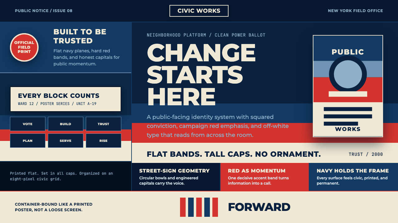 Gotham Geometric SansCivic trust in tall caps. Navy, red, and off-white bands turn geometry into c…
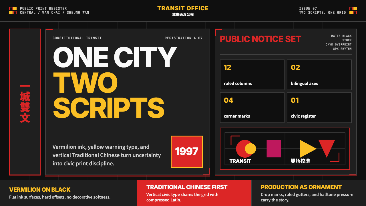 Hong Kong Handover 1997 PosterCivic pressure, printed loud. Vermilion on black, yellow type, bilingual grid…
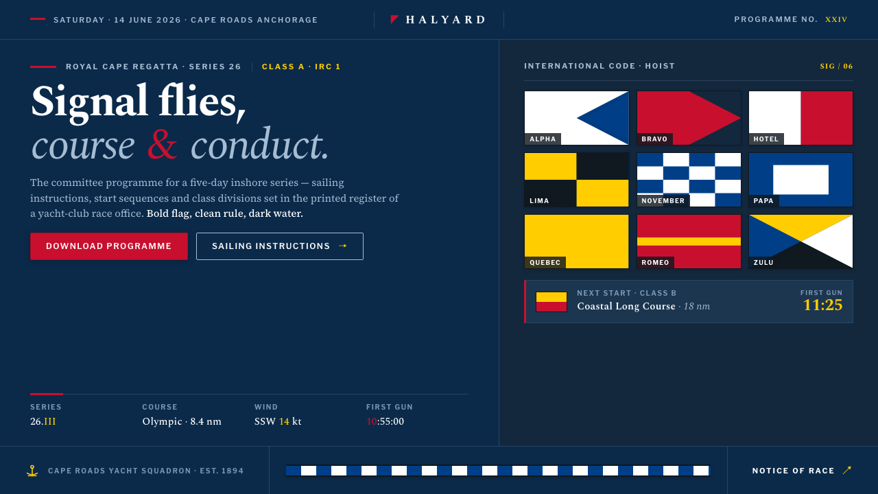 Sailing RegattaSignal-flag discipline on dark water. Rectilinear red-blue-yellow blocks on d…
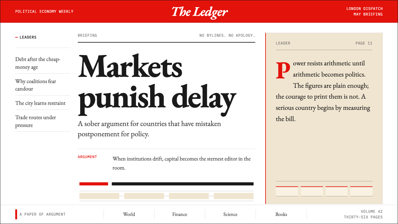 The Economist (Red-Banner)Argument made visible. Red banner, cream paper and Garamond columns enforce t…
 Gill Sans British RailPublic authority, enamel-flat. Rail Blue bands, white humanist type, one red…
 Akzidenz-Grotesk BertholdObjectivity in black ink. White grotesque type, hard grid, one rationed red b…