What is Gill Sans British Rail?
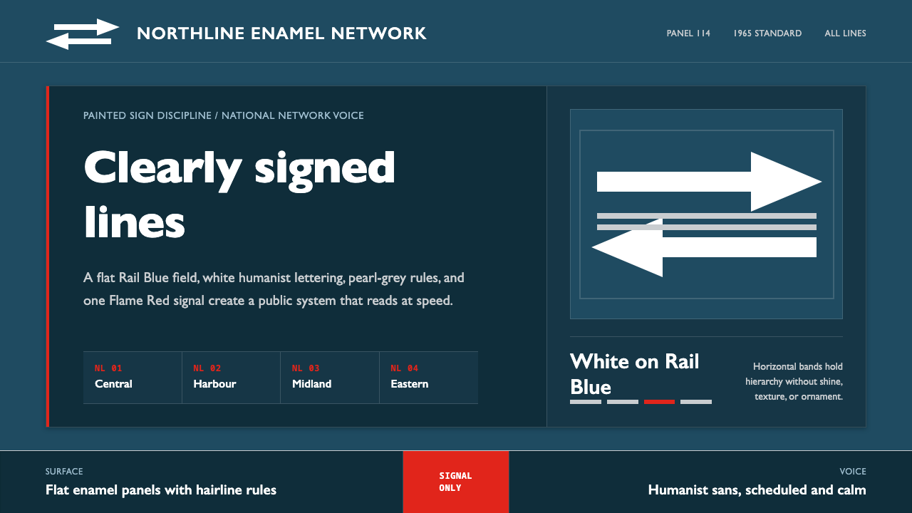
Gill Sans British Rail turns a national transport network into a single authoritative surface — Rail Blue, white humanist lettering, parallel motion, and one red signal.
Gill Sans British Rail in brief
Gill Sans British Rail is a design style derived from the 1965 British Railways corporate identity, recognizable through broad Rail Blue fields, white reversed lettering, pearl-rail greys, Flame Red warnings, and Gerry Barney's Double Arrow. The mark consists of two interlocked arrows carried by parallel lines, compressing the idea of a connected national railway into a compact emblem of exchange, direction, and continuous movement.
Its typographic character comes from Gill Sans, Eric Gill's humanist sans-serif first associated here with the LNER signage tradition from which the later identity grew. Unlike a purely geometric sans-serif, its voice combines institutional clarity with traces of the written hand. The result is public rather than commercial, confident rather than theatrical: language meant to identify, direct, and reassure people moving through a shared transport system.
The visual discipline is enamel-flat. Information is organized in horizontal bands, surfaces remain opaque and even, and contrast carries the hierarchy. Rail Blue forms the stable field; white supplies names, instructions, and symbols; restrained greys support secondary information; red interrupts only when attention is urgent. There is no polished shine, atmospheric gradient, or decorative depth. Everything behaves like durable signage.
Where does Gill Sans British Rail come from?
The style begins with Gill Sans, created by Eric Gill in 1928. Within this railway lineage, the typeface is tied to the signage of the LNER and supplies the typographic ancestry of the later British Railways identity. Its humanist construction gave railway language a distinctive balance: sufficiently plain for rapid public reading, yet sufficiently shaped to avoid the anonymous mechanical tone of a strictly geometric alphabet. Typography could therefore sound official without becoming forbidding.
In 1965, British Railways adopted a comprehensive corporate identity associated with the Design Research Unit. Its most visible elements were Rail Blue and Gerry Barney's Double Arrow. The symbol joined opposing arrows with parallel rail-like strokes, allowing a single white mark to stand for movement in more than one direction and for separate routes belonging to one network. Applied to enamel totems and rolling-stock panels, the identity made stations, vehicles, and signs appear as parts of the same national system.
The identity's authority depended on repetition and restraint. Rail Blue created continuity across differently shaped objects, while white type and the Double Arrow remained legible against the dark field. Pearl-rail greys could separate supporting information without competing with the main message. Flame Red retained the inherited force of a transport signal because it was restricted to warnings and moments of exceptional emphasis. It was never treated as an expansive decorative field.
Gill Sans British Rail, as a contemporary digital style, carries that surface logic from physical railway hardware into interfaces and editorial systems. It does not imitate aged stations or reproduce enamel as nostalgic texture. Instead, it preserves the operational principles of the 1965 identity: one commanding blue field, white public lettering, horizontal organization, a network emblem based on parallel motion, and red used as an event rather than an atmosphere.
What defines the Gill Sans British Rail look?
Railway Palette
Rail Blue is the environmental constant: deep, cool, and authoritative enough to unify signs, panels, and screens. White carries primary language and the Double Arrow, producing the direct contrast of reversed station lettering. Pearl-rail greys form quieter secondary layers. Flame Red is a signal, not a companion color; its rarity gives it urgency.
Humanist Typography
Gill Sans gives institutional information a human voice. Its sans-serif economy supports quick recognition, while its humanist shaping prevents the message from feeling engineered into anonymity. Headlines should be firm and plainly stated; supporting copy should remain open and conversational. Hierarchy comes through changes in scale, spacing, and placement rather than ornamental type effects.
Horizontal Bands
Layouts behave like destination boards and rolling-stock panels. Broad horizontal zones separate identity, primary information, supporting detail, and warning states. The bands may differ in tonal weight, but they should read as one continuous system rather than a pile of independent cards. Direction is lateral, steady, and rail-like.
Double Arrow Logic
The Double Arrow is more than a logo placed in a corner. Its opposing directions and parallel strokes establish the compositional grammar: paired movements, aligned routes, and information traveling across a common line. Dividers, diagrams, and directional cues can echo this logic, but literal repetition of the complete mark should remain controlled.
Enamel Flatness
Surfaces are solid, opaque, and visually sealed, recalling enamel without simulating scratches, reflections, or age. Depth comes from adjacency and contrast rather than light effects. Panels meet with decisive edges. Icons and marks appear printed or applied onto the field, not suspended above it. The finish is durable in character, never glossy.
Signal Hierarchy
Most information belongs to the calm blue, white, and grey system. Red enters only when the normal flow must be interrupted: a service alert, critical status, prohibition, or immediate action. Using red for routine decoration weakens the transport logic, because a signal color can remain authoritative only when the ordinary interface leaves it unused.
Who shaped Gill Sans British Rail?
Eric Gill created Gill Sans in 1928. In this railway-derived style, the typeface supplies the humanist voice behind the institutional surface: economical enough for public signage, but shaped enough to preserve warmth and character. Its association with LNER signage forms the typographic bridge to the later British Railways identity.
Gerry Barney designed the white Double Arrow used by the 1965 British Railways corporate identity. By interlocking opposing arrows with parallel lines, he produced a compact sign for bidirectional travel and an integrated national network. Its strength lies in immediate recognition, flat reproduction, and the ability to remain clear across different railway surfaces.
The Design Research Unit is associated with the 1965 British Railways corporate identity that brought Rail Blue, the Double Arrow, typography, and transport applications into a coherent public system. Its importance here is systemic: the identity was not merely a logo but a repeatable discipline capable of linking rolling stock, enamel signs, and public information.
How do you use Gill Sans British Rail today?
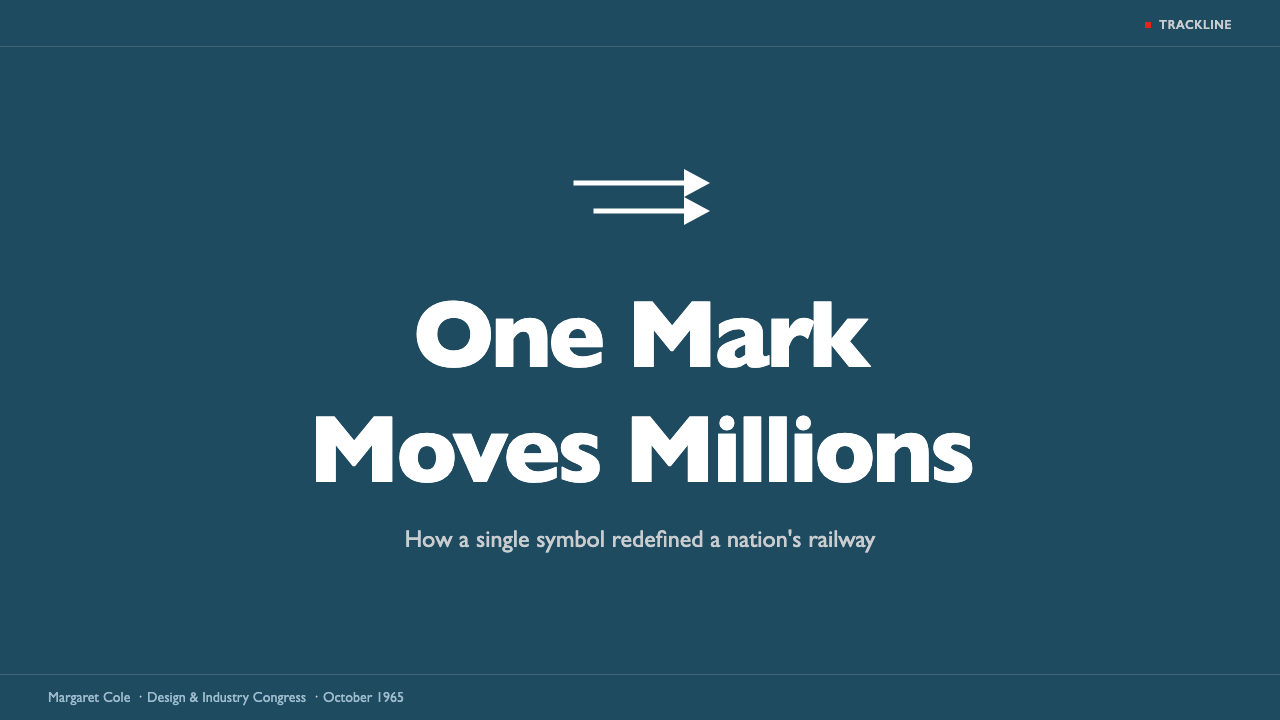
For presentation covers, establish a broad Rail Blue field and let the title read like a station name: direct, white, and confidently placed within a horizontal band. The Double Arrow or an arrow-derived directional motif can anchor one side without becoming decorative wallpaper. Content slides should preserve the same route-like continuity, using stable bands for section identity, narrative text, and supporting notes.
Data slides benefit from the identity's network logic. Timelines can behave like routes, comparisons like parallel tracks, and process diagrams like connected stations. White should carry the principal values against blue, while greys distinguish context and inactive states. Red belongs only to the exception that demands attention. If every chart series competes in bright colors, the railway hierarchy disappears.
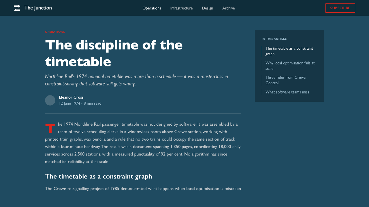
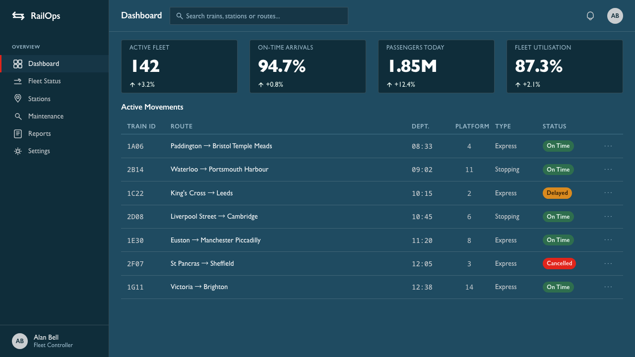
For web interfaces, the style suits dashboards, service monitors, booking flows, and pricing pages that need public clarity. A persistent blue frame can hold navigation and identity, while white or grey information zones create readable working areas. Pricing tiers should be differentiated through naming, order, and tonal contrast rather than decorative color variety. Critical availability or service messages alone receive the red signal.
Editorial and marketing layouts should borrow the identity's decisiveness without turning every page into a replica station sign. Use strong horizontal openings, concise humanist headlines, disciplined captions, and diagrams based on parallel movement. Campaign pages can alternate blue-dominant and pale information fields while repeating a consistent directional motif. Photography, if present, should remain subordinate to the public-information structure rather than dissolving it into atmosphere.
The common mistake is to confuse transport authority with retro decoration. Artificial enamel shine, distressed station textures, ornamental arrows, and abundant red produce nostalgia rather than the British Railways system described here. Another error is making the typography rigidly geometric: Gill Sans contributes essential human warmth. The authentic balance is firm but approachable, standardized but not anonymous, and flat without feeling empty.
Gill Sans British Rail — FAQ
Is Gill Sans British Rail simply a dark theme using Gill Sans?
No. The typeface is only one part of a coordinated transport language. Rail Blue establishes the shared environment, white reversal creates public-sign clarity, horizontal bands organize movement, the Double Arrow expresses an integrated network, and Flame Red functions as a restricted signal. Removing those relationships leaves ordinary dark styling rather than a British Railways-derived system.
Why must Flame Red remain an accent rather than a background?
Because its meaning depends on interruption. The blue, white, and grey system establishes a calm normal state; red breaks that state to announce warning, prohibition, or urgency. A large routine red field turns the signal into scenery. Once viewers become accustomed to it, the interface must find some louder device for genuine alerts, undermining the original hierarchy.
How should the Double Arrow influence a layout without being overused?
Treat it first as a structural idea: opposing directions, parallel paths, aligned endpoints, and movement across a shared system. Those ideas can guide dividers, data flows, navigation, and page transitions without copying the complete emblem repeatedly. Reserve the actual mark for moments of identity. Its authority grows when the surrounding composition echoes its logic quietly.
Can this style use light content areas?
Yes. Rail Blue must remain the identity anchor, but not every reading surface needs to be dark. White and pearl-rail grey areas can support longer text, dense tables, or operational controls while blue bands preserve continuity around them. The crucial requirement is that the pale areas feel integrated into one horizontal transport system rather than appearing as unrelated floating cards.
Where does Gill Sans British Rail work poorly?
It struggles when a product depends on softness, intimacy, luxury sheen, or abundant expressive color. The system was formed around public authority, legibility, network coherence, and durable transport surfaces. It is naturally effective for information-heavy services and institutional communication, but it can feel severe when emotional storytelling or tactile richness is the primary experience. The style should be chosen for shared order, not merely for British nostalgia.
Related design styles
 Sailing RegattaSignal-flag discipline on dark water. Rectilinear red-blue-yellow blocks on d…
 Amtrak Arrow (1971)Civic authority at speed. Deep navy, Helvetica lockups, and red-blue arrows.
 The Economist (Red-Banner)Argument made visible. Red banner, cream paper and Garamond columns enforce t…
 Vitsœ 606 ShelvingQuiet form, built to endure. Brushed silver rails impose rhythm on cool plast…
 Akzidenz-Grotesk BertholdObjectivity in black ink. White grotesque type, hard grid, one rationed red b…
 Athos Bulcão Azulejo PanelCobalt grid, alive. Majolica white marks rotate across a broken navy tile fie…