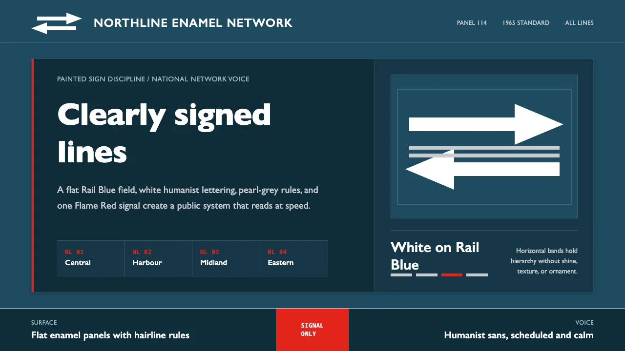
About Gill Sans British Rail
Gill Sans British Rail is the surface of the 1965 British Railways corporate system: Rail Blue enamel totems and rolling-stock panels carrying Gerry Barney's white Double Arrow — two interlocked arrows on parallel lines, the sign of a national network. Eric Gill's humanist sans, the LNER signage face the identity grew out of, supplies the voice; Flame Red is the warning accent, never the field.
This system distills enamel-sign discipline into the screen: a dark Rail Blue ground, white reversed type, pearl-rail greys, and a single bright signal red reserved for alert. Flat surfaces, horizontal hierarchy bands, no shine.
- Origin
- United Kingdom
- Era
- Gill Sans 1928; British Railways corporate identity 1965 (Rail Blue & Double Arrow)
- Key figures
- Eric Gill · Gerry Barney · Design Research Unit
- Movements
- Humanist sans-serif · British corporate identity · Transport design
Gill Sans British Rail design spec
Colors
Typography
The other 11 sections — buttons, cards, spacing, motion, techniques and more — open once you unlock. Download the DESIGN.md or send it to your AI in one click. Unlock once, yours forever.
Sign up nowStyles similar to Gill Sans British Rail
Also inspired by brands & products, with a close feel.
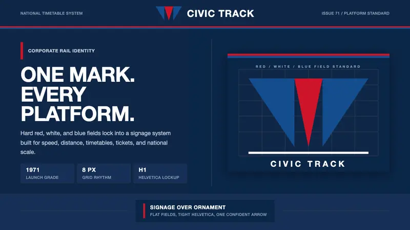 Amtrak Arrow (1971)Civic authority at speed. Deep navy, Helvetica lockups, and red-blue arrows.
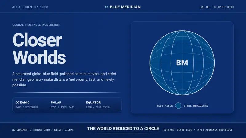 Pan Am Jet AgeJet-age confidence. Globe-blue field, steel type, meridian circle on a strict grid.
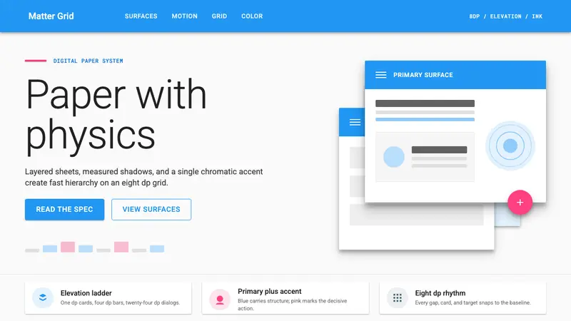 Material Design 1.0Depth made flat usable. Blue app bars, pink FABs, 8dp grids, and crisp paper shadows.
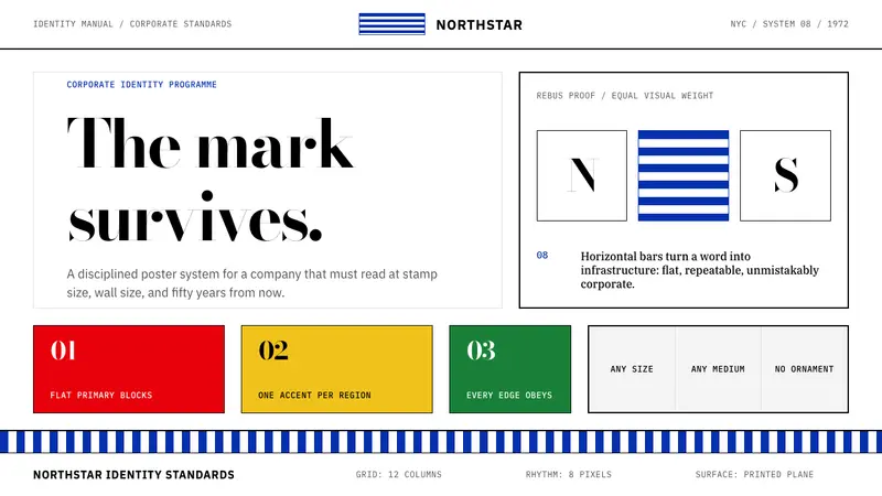 Paul Rand / IBM Corporate IdentityCorporate modernism stays exact. Blue 8-bar stripes, high-contrast serif, hard grid blocks.