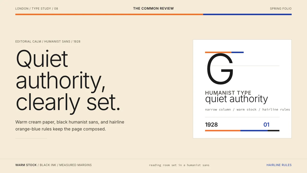
About Gill Sans (BBC, 1928)
Gill Sans is the voice of British institutions — warm, classical, and unadorned. Designed by Eric Gill for Monotype in 1928, its stroke modulation descends from Edward Johnston's Underground type and Roman capital proportions, producing a humanist sans-serif that speaks with quiet authority. The BBC, Penguin Books, and the Church of England all chose it for the same reason: it is legible, dignified, and unmistakably English.
This system captures that editorial restraint — warm cream paper, pure black type, and the citrus-orange and deep blue of Penguin's iconic series covers. Every surface breathes with generous margins and hairline dividers, letting the humanist letterforms do the work.
- Origin
- England
- Era
- 1928 commercial release; BBC corporate adoption 1980s–present
- Key figures
- Eric Gill · Edward Johnston · Stanley Morison
- Movements
- British humanist sans-serif tradition · early-20th-century British craft-typography · BBC corporate identity heritage
Gill Sans (BBC, 1928) design spec
Colors
Typography
The other 11 sections — buttons, cards, spacing, motion, techniques and more — open once you unlock. Download the DESIGN.md or send it to your AI in one click. Unlock once, yours forever.
Sign up nowStyles similar to Gill Sans (BBC, 1928)
Also inspired by print & type, with a close feel.
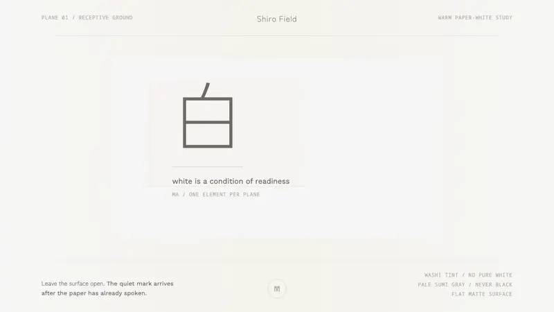 Kenya Hara «White»Emptiness is the subject. Warm washi white holds one pale sumi-gray mark.
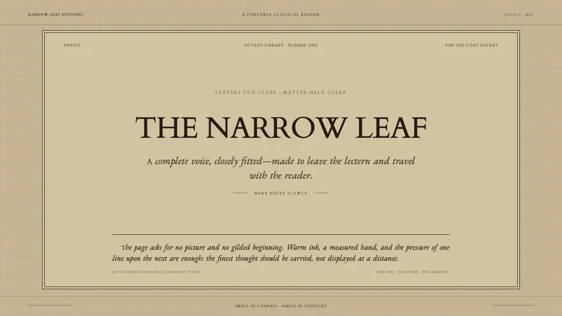 Aldine Press ItalicText needs nothing added. Tight chancery italic meets upright roman caps on mid-tan rag.
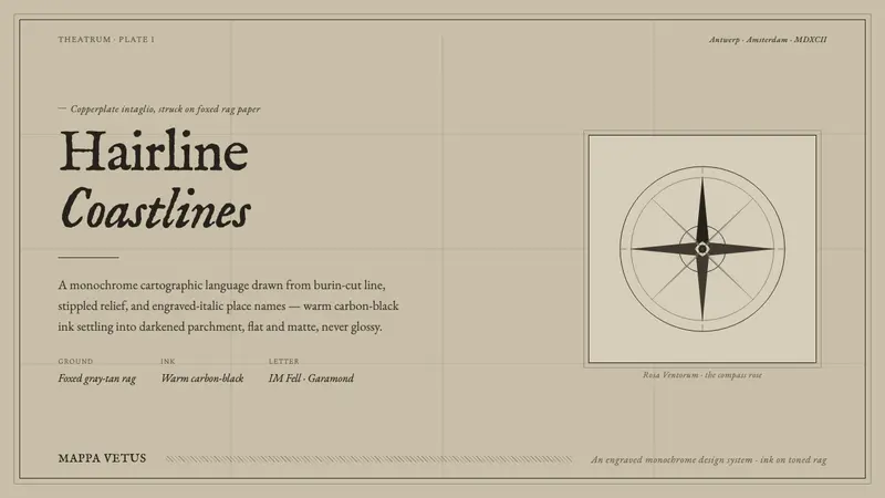 Engraved Monochrome MapThe gravity of an old printed sheet. Warm carbon-black ink on foxed rag paper, hairline coastlines.
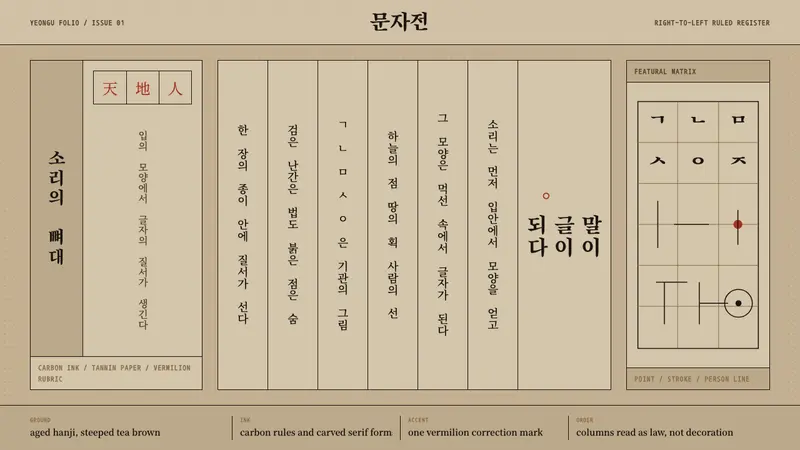 Hangul 訓民正音Ink obeys the grid. Carbon rules, vertical Myeongjo columns, and rare vermilion marks.