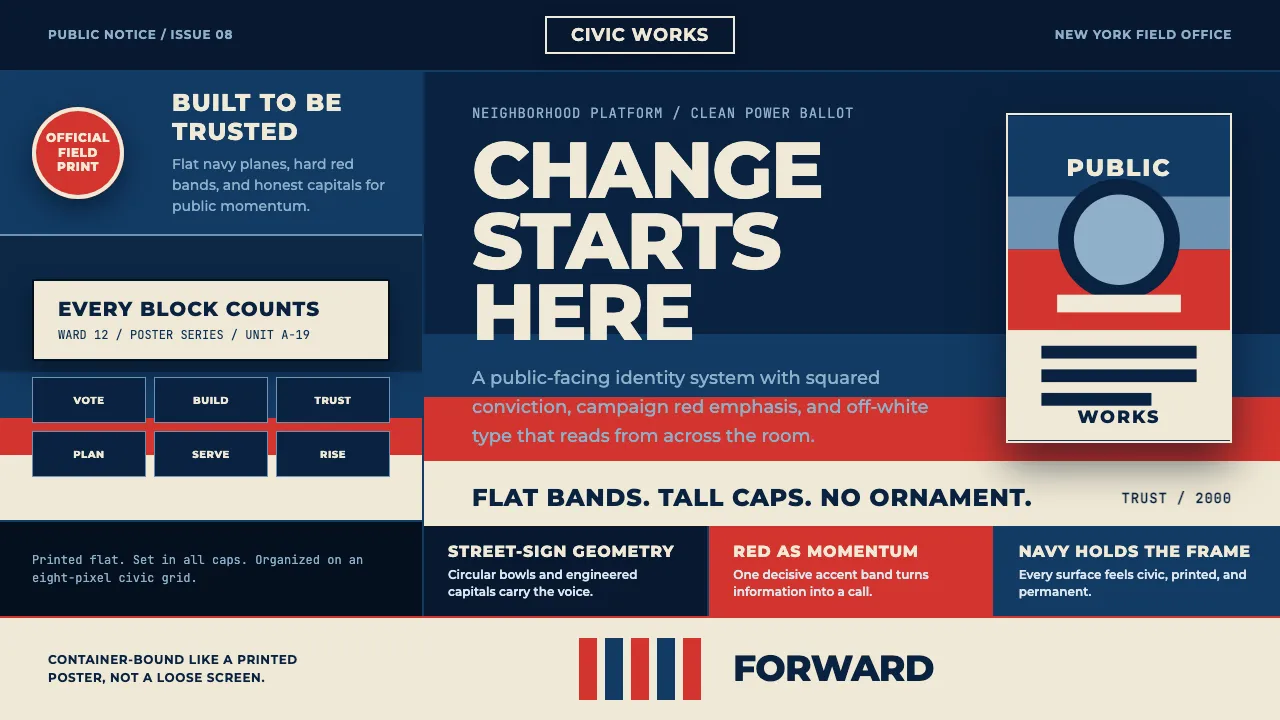
About Gotham Geometric Sans
Gotham is the geometric sans Tobias Frere-Jones drew in 2000 from the workmanlike lettering bolted to mid-century New York buildings — the Port Authority Bus Terminal above all. Circular bowls, tall honest caps, no ornament. Then 2008 made it a household face: the Obama campaign set every "HOPE" and "CHANGE" on it, over Shepard Fairey's flat bands of red, faded blue and off-white.
This system rebuilds that surface. A deep patriotic navy ground, screen-printed flatness, stacked all-caps slogans, and a crisp civic triad of navy, red and off-white. Everything reads like campaign material: banded, badged, and built to be trusted at a glance.
- Origin
- United States — New York City
- Era
- 2000 (Gotham release); 2008 Obama campaign as its defining moment
- Key figures
- Tobias Frere-Jones · Jesse Ragan · Shepard Fairey
- Movements
- Geometric/architectural sans · American political & civic branding
Gotham Geometric Sans design spec
Colors
Typography
The other 11 sections — buttons, cards, spacing, motion, techniques and more — open once you unlock. Download the DESIGN.md or send it to your AI in one click. Unlock once, yours forever.
Sign up nowStyles similar to Gotham Geometric Sans
Also inspired by print & type, with a close feel.
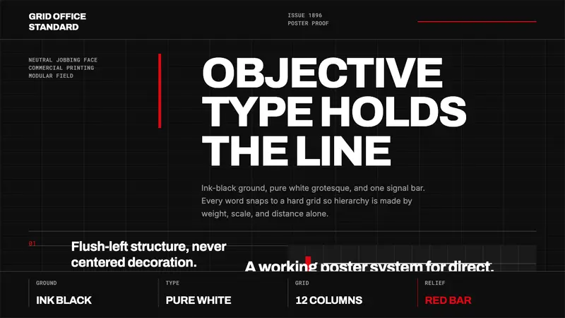 Akzidenz-Grotesk BertholdObjectivity in black ink. White grotesque type, hard grid, one rationed red bar.
 Montserrat Startup Deck (2016)Series-A on a projector. Black Montserrat on charcoal-teal, lit by one bright cyan keyline.
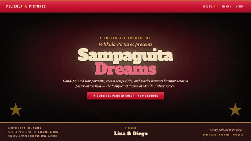 Manila LVN Film PosterLobby-card drama for the screen. Cream slab title on poster-black, scarlet banners, gilt rules.
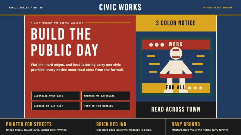 WPA Poster (Federal Art Project, 1936)Civic urgency in ink. Navy, brick red, mustard bands and Bebas Neue shout across the platform.