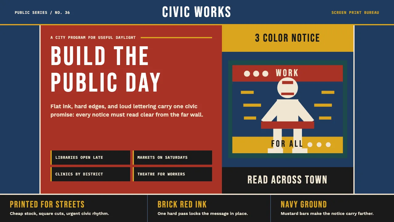
About WPA Poster (Federal Art Project, 1936)
The WPA Federal Art Project produced over 2,000 screen-printed posters between 1935 and 1943, employing out-of-work artists to advertise national parks, public health, theatre, and civic programs. Constrained to 3–5 ink runs on uncoated stock, the designers developed a flat, geometric, silhouette-driven language that borrowed from Bauhaus and Soviet constructivism but remained distinctly American in its civic optimism.
This design system captures that workshop-printed urgency: deep navy and brick-red ink blocks, chunky condensed sans-serif lettering, bold figure/ground separation, and the slight textural imperfection of hand-pulled screen prints. Every element reads like it was designed to be understood across a subway platform.
Learn more about the WPA Poster (Federal Art Project, 1936) style
- Origin
- USA — New York City, Chicago, San Francisco, Philadelphia, New Orleans
- Era
- 1935–1943 (peak output 1936–1939)
- Key figures
- Anthony Velonis · Vera Bock · Katherine Milhous · Lester Beall
- Movements
- WPA Federal Art Project · American Modernism · Depression-era civic graphics
WPA Poster (Federal Art Project, 1936) design spec
Colors
Typography
The other 11 sections — buttons, cards, spacing, motion, techniques and more — open once you unlock. Download the DESIGN.md or send it to your AI in one click. Unlock once, yours forever.
Sign up nowStyles similar to WPA Poster (Federal Art Project, 1936)
Also inspired by print & type, with a close feel.
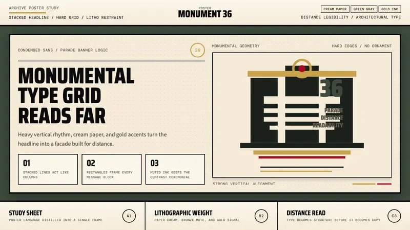 Olympic Poster Berlin (1936)Monumental and legible. Green-gray, cream, and gold turn type into architecture.
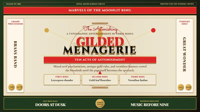 Victorian Circus Poster (1880)Spectacle leaves no inch quiet. Forest green, antique gold borders, mixed serifs, vermilion sash.
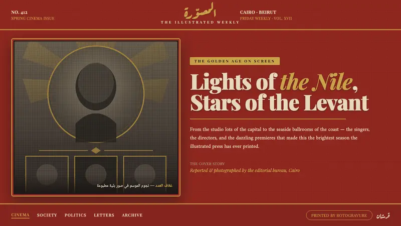 Pan-Arab Illustrated MagazineMid-century Arab press glamour. Brick-red fields, sepia halftone montage, gold Deco frames.
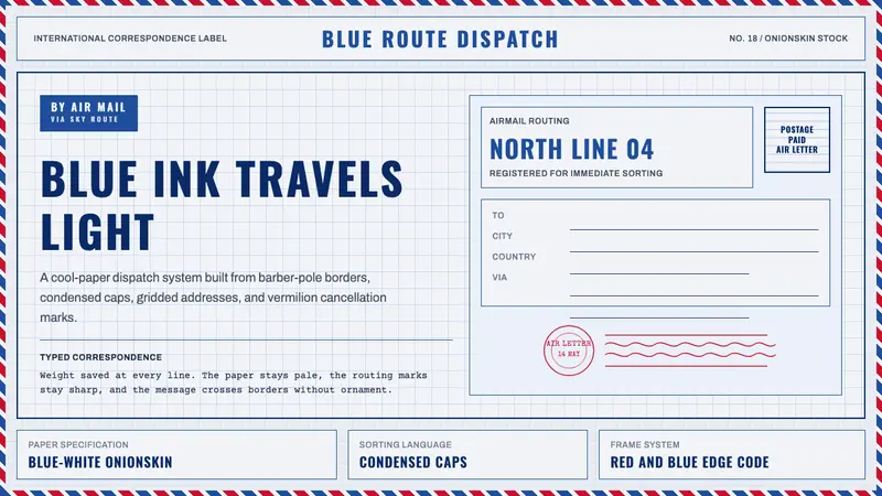 Par Avion Air MailPostal lightness made strict. Onionskin blue, Oswald caps, and red-blue edge stripes.