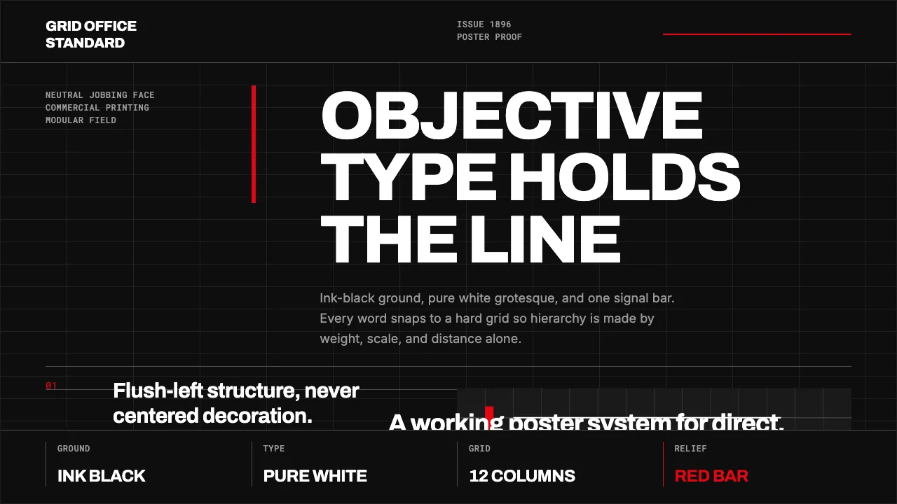
About Akzidenz-Grotesk Berthold
Akzidenz-Grotesk is the neo-grotesque sans that H. Berthold AG issued in Germany around 1896 — the grandfather of Swiss typography and the direct ancestor of Helvetica and Univers. Cut as a neutral black-ink jobbing face for commercial printing, it became the type of the International Typographic Style. This system renders it in the black-ground Swiss-poster tradition it spawned: ink-black fields, pure-white type set flush-left, a rigid modular grid, and a single accent red as the only relief. Hierarchy comes from size and weight alone — no ornament, no shadow, no compromise.
- Origin
- Berlin, Germany; later Switzerland
- Era
- released c.1896–1898 by H. Berthold AG; canonical Swiss identity ~1950s–1960s
- Key figures
- H. Berthold AG · Josef Müller-Brockmann · Emil Ruder
- Movements
- neo-grotesque type · Swiss Style / International Typographic Style · mid-century modernism
Akzidenz-Grotesk Berthold design spec
Colors
Typography
The other 11 sections — buttons, cards, spacing, motion, techniques and more — open once you unlock. Download the DESIGN.md or send it to your AI in one click. Unlock once, yours forever.
Sign up nowStyles similar to Akzidenz-Grotesk Berthold
Also inspired by print & type, with a close feel.
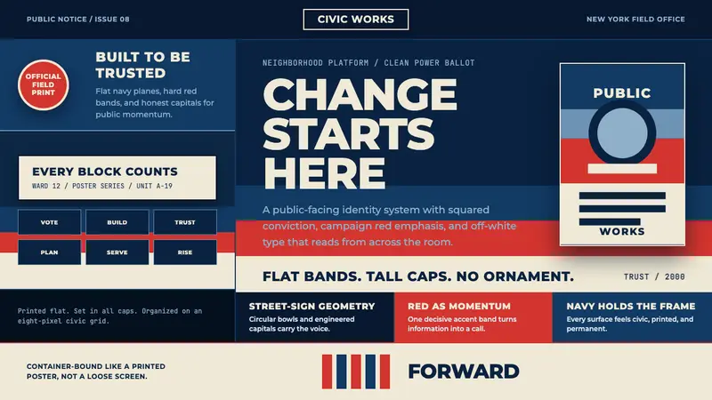 Gotham Geometric SansCivic trust in tall caps. Navy, red, and off-white bands turn geometry into campaign force.
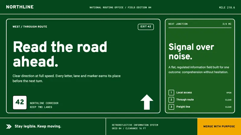 Interstate by Frere-JonesBuilt to be read at speed. Highway green, crisp white legends and strict sign-panel grids.
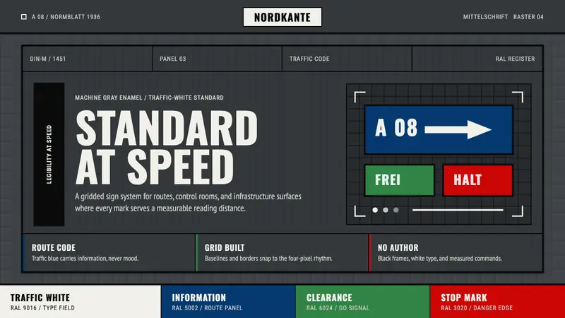 DIN 1451 SignageAuthorless and exact. Enamel gray grid, traffic-white DIN type, and RAL signal bars.
 Montserrat Startup Deck (2016)Series-A on a projector. Black Montserrat on charcoal-teal, lit by one bright cyan keyline.