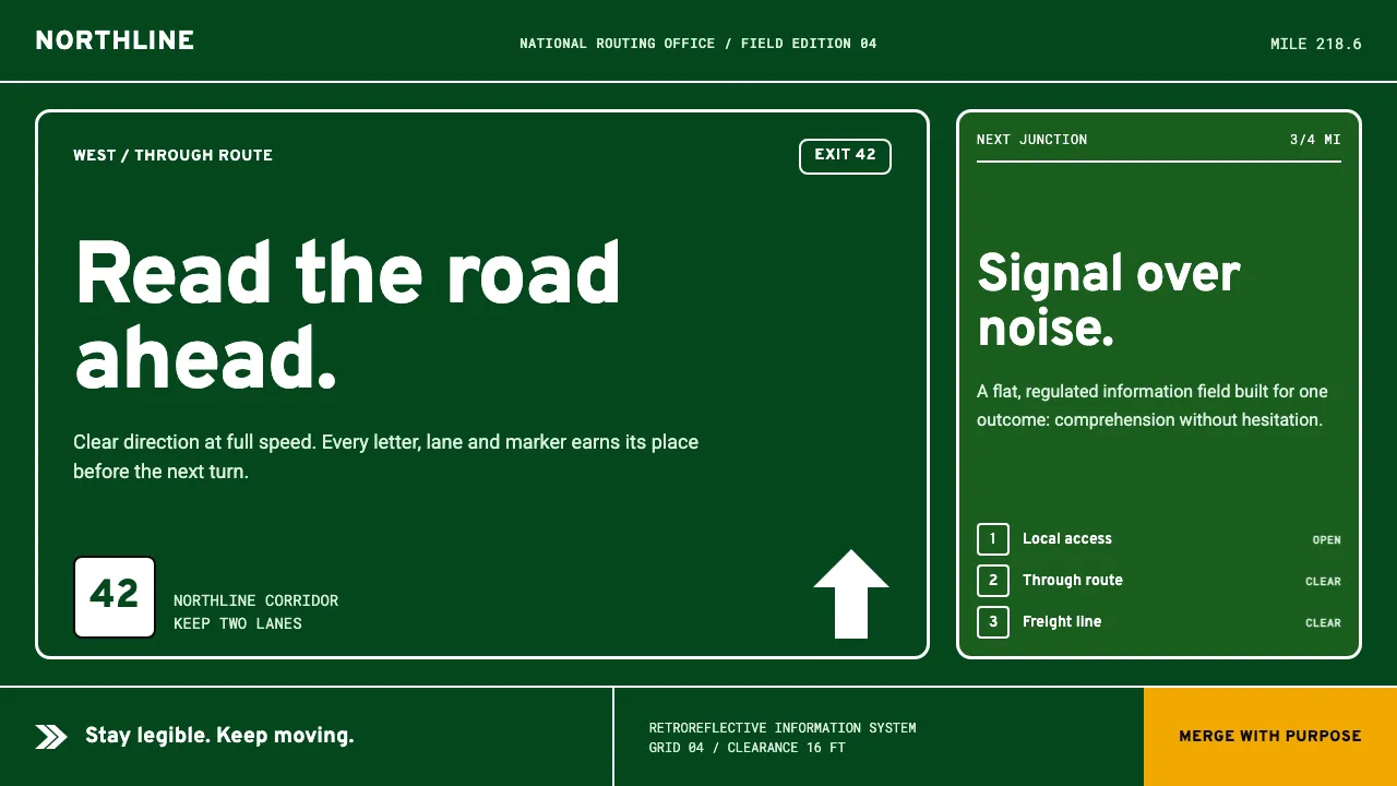
About Interstate by Frere-Jones
Interstate is Tobias Frere-Jones's 1993–99 typographic reinterpretation of Highway Gothic — the FHWA Series letters Theodore Forbes drew in 1949 for US road signs. This system reads a guide sign directly: a flat field of retroreflective green carrying crisp white lettering, exit tabs, arrows and route shields.
The vocabulary is functional, not decorative. Wide apertures, rounded-square terminals and generous tracking keep legends legible at speed. Colour is regulated by MUTCD convention — guide-sign green, warning amber, regulatory red — never expressive. Everything is matte, borderless-clean and built to be read, not admired.
- Origin
- United States
- Era
- 1993–99 typeface; source FHWA alphabet from 1949
- Key figures
- Tobias Frere-Jones · Theodore W. Forbes
- Movements
- American vernacular information design · MUTCD signage standards
Interstate by Frere-Jones design spec
Colors
Typography
The other 11 sections — buttons, cards, spacing, motion, techniques and more — open once you unlock. Download the DESIGN.md or send it to your AI in one click. Unlock once, yours forever.
Sign up nowStyles similar to Interstate by Frere-Jones
Also inspired by print & type, with a close feel.
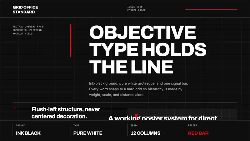 Akzidenz-Grotesk BertholdObjectivity in black ink. White grotesque type, hard grid, one rationed red bar.
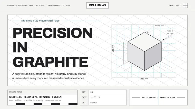 Graphite Technical DrawingDrafting-room precision. Non-photo-blue grid and graphite DIN lettering do the work.
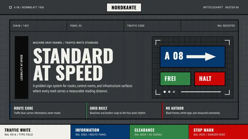 DIN 1451 SignageAuthorless and exact. Enamel gray grid, traffic-white DIN type, and RAL signal bars.
 Montserrat Startup Deck (2016)Series-A on a projector. Black Montserrat on charcoal-teal, lit by one bright cyan keyline.