What is Interstate by Frere-Jones?
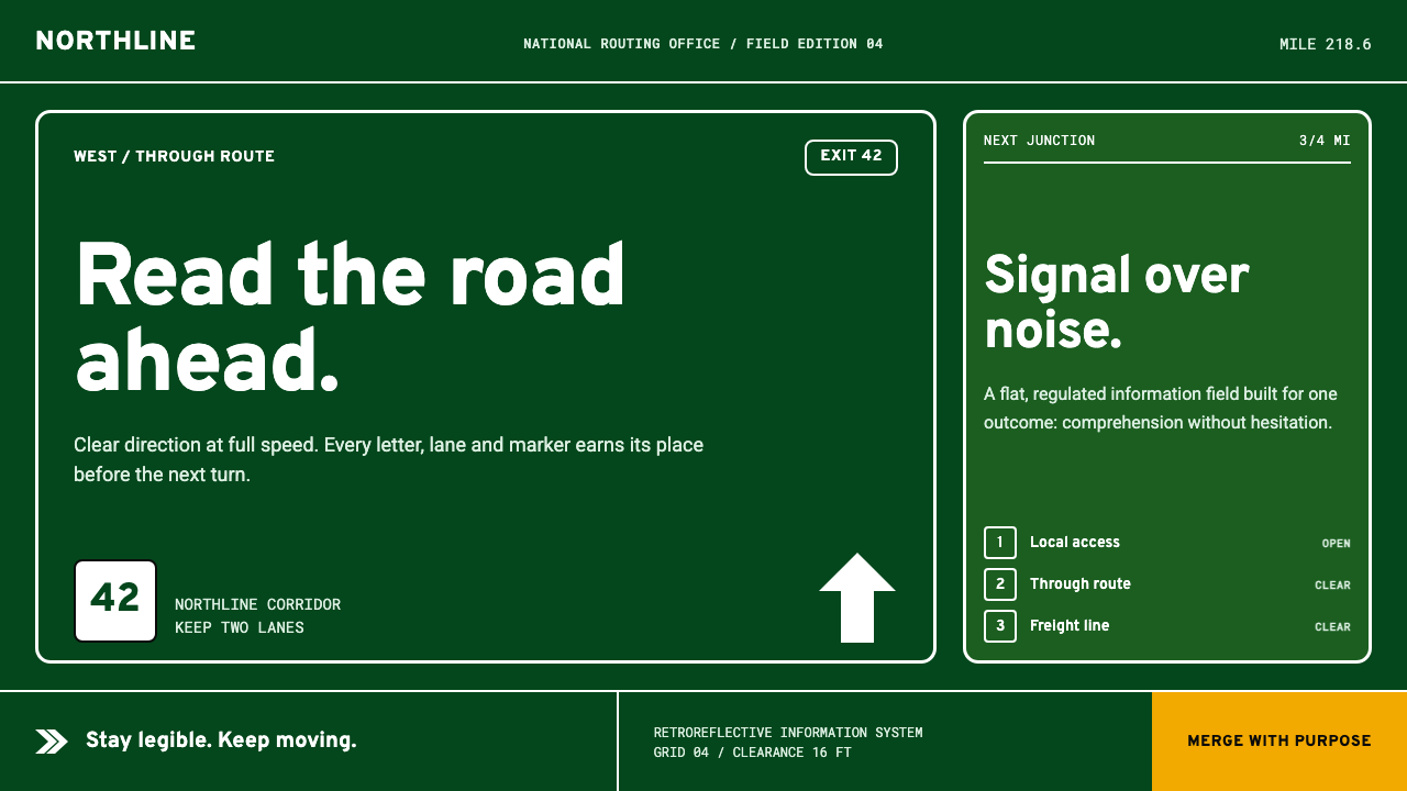
Built to be read at speed, Interstate turns American highway signage into a disciplined visual language of green fields, white legends, arrows, route shields, and uncompromising clarity.
Interstate by Frere-Jones in brief
Interstate is Tobias Frere-Jones’s typographic reinterpretation of Highway Gothic, the alphabetic tradition associated with American road signs. Created between 1993 and 1999, it reads less like a conventional display typeface than a complete sign system: a dark green field, crisp white legends, exit tabs, directional arrows, and route shields arranged for immediate recognition.
Its defining quality is not nostalgia but operational clarity. Wide apertures keep letter interiors open, rounded-square terminals prevent forms from becoming brittle, and generous tracking separates neighboring characters when the viewer has only a moment to read. The letterforms are designed to remain distinct under speed, distance, and visual pressure.
Interstate is governed by the logic of signage rather than expressive branding. Green identifies the guide-sign field, white carries the primary message, amber marks warning, and red marks regulation. The palette does not drift according to mood. Surfaces stay matte, flat, and clean, while arrows, tabs, and shields provide the graphic structure that makes information immediately navigable.

Where does Interstate by Frere-Jones come from?
Interstate belongs to a specifically American lineage of vernacular information design: the highway sign. Its immediate source was the FHWA Series alphabet drawn by Theodore W. Forbes in 1949 for US road signs. That origin matters because the letters were shaped around a public task rather than an artistic manifesto. Their purpose was to make destinations, exits, and routes readable inside a moving landscape.
Tobias Frere-Jones revisited that source between 1993 and 1999. His project did not treat Highway Gothic as a museum artifact or simply copy its outlines. It treated the earlier alphabet as a working system whose practical intelligence could be examined, refined, and carried into new typographic settings. Interstate therefore preserves the directness of road lettering while presenting it as a deliberate family of related forms.
The historical environment around the design is the American highway itself: broad guide-sign fields, bright legends, directional devices, and route markers that must communicate without explanation. The result is a visual language in which typography and supporting symbols are inseparable. A word does not float alone; it arrives with the spatial cues of a sign panel, the direction of an arrow, or the enclosing authority of a route shield.
Its second foundation is the convention of MUTCD signage standards. In this system, color is regulated rather than lyrical: guide-sign green, warning amber, and regulatory red each carry an assigned informational role. Interstate inherits that discipline. Its visual character comes from the meeting of two forces—the authored reinterpretation of Frere-Jones and the standardized public vocabulary of American road signage.
What defines the Interstate by Frere-Jones look?
Signage Color
The palette is led by highway green and crisp white, with amber and red reserved for warning and regulatory meaning. These colors behave like instructions, not decoration. The green field establishes the sign environment, white creates maximum message clarity, and the alert colors appear only when the information itself changes category.
Typography
The letterforms are built for recognition before personality. Broad counters, open apertures, sturdy strokes, and rounded-square terminals keep letters separate and stable. Tracking is deliberately generous, allowing words to hold together as messages while individual characters remain legible under pressure.
Panel Grid
Interstate assumes that content belongs inside a sign panel with a clear internal order. Headings, route information, exit labels, arrows, and supporting details occupy distinct zones rather than competing for the same visual field. The grid is felt through alignment and spacing, not announced through decorative rules.
Arrows and Shields
Supporting symbols are structural components. Arrows establish movement and reading direction, while route shields turn route identity into a compact visual object. Both should be drawn with the same confidence as the lettering: solid, unmistakable, and easy to locate without becoming pictorial decoration.
Surface and Depth
The visual field is flat, matte, and borderless-clean. There are no atmospheric gradients trying to imitate illumination and no soft effects competing with the message. Contrast comes from the relationship between the green field, white lettering, and sharply bounded symbols. The result feels manufactured for public use rather than rendered for spectacle.
Reading at Speed
Every decision is measured against limited attention. Words need enough separation to be scanned, forms need enough openness to avoid confusion, and hierarchy needs to be visible before the text is fully read. Interstate therefore feels calm rather than ornamental: its confidence comes from removing ambiguity at the moment information matters.

Who shaped Interstate by Frere-Jones?
Frere-Jones created Interstate between 1993 and 1999 as a typographic reinterpretation of Highway Gothic. His contribution was to treat the road-sign alphabet as a coherent design system whose practical qualities could be carried into broader graphic and typographic contexts without losing its directness.
Forbes drew the FHWA Series letters in 1949 for US road signs. His work forms the historical source that gives Interstate its public, infrastructural character: lettering designed to identify routes, exits, and destinations inside the moving environment of the highway.
Highway Gothic is the source alphabet behind Interstate. It represents the sign-lettering tradition that turns legibility, distance, and immediate recognition into primary design requirements rather than secondary refinements.
MUTCD signage standards provide the regulated color logic associated with guide signs, warnings, and regulation. They help explain why Interstate’s palette feels authoritative: each hue belongs to an informational role, so color reinforces navigation instead of adding mood.
How do you use Interstate by Frere-Jones today?
For presentation slides, use Interstate most strongly on the cover, then let the internal pages behave like sign panels. A cover can place a large highway-green field behind a crisp white title, with an exit-tab or route-shield gesture establishing the subject. Content slides should rely on clear alignment, short legends, directional arrows, and restrained hierarchy. Data slides benefit from sign-like grouping: labels, values, and directional cues should be immediately separable, while amber or red appears only when the data carries warning or regulatory significance.
For web interfaces, Interstate is naturally suited to dashboards, pricing pages, navigation-heavy tools, and other products where users need to orient themselves quickly. Use a dark guide-sign field as the primary environment, crisp light text for essential content, and a disciplined panel grid for cards, filters, and status areas. Buttons and links should feel like destinations or decisions, not ornamental controls. Route-shield shapes can identify plans or sections, while arrows should indicate movement with consistent visual logic.
For editorial and marketing work, the style works best when the page feels like a controlled information environment rather than a retro poster. Headlines can behave as destinations, section labels as exit markers, and pull quotes as compact sign panels. Marketing pages may use a strong green field with white messaging and a carefully limited warning accent, especially when the product promises speed, navigation, infrastructure, or operational confidence. The writing should remain direct, because elaborate copy conflicts with the visual system’s purpose.
The system also adapts well to identity work that needs to feel public, infrastructural, or immediately dependable. A campaign, service, or publication can build a consistent vocabulary from panel shapes, route shields, arrows, and regulated color roles. The important principle is not to imitate a road sign literally in every location, but to preserve the relationship between clear message, visual direction, and functional color. Interstate becomes convincing when the whole interface appears to know where the reader is going.
The common mistake is treating Interstate as a generic dark theme with green accents. Excessive glow, soft gradients, decorative shadows, playful color shifts, or crowded iconography destroy the sign logic. Another mistake is using every regulated color at once, making warning and regulation impossible to distinguish from ordinary content. Let green establish the field, let white carry the message, and introduce amber or red only when the information itself earns that emphasis.

Interstate by Frere-Jones — FAQ
Is Interstate the same as Highway Gothic?
No. Highway Gothic is the source alphabet associated with the FHWA Series letters drawn by Theodore W. Forbes in 1949 for US road signs. Interstate is Tobias Frere-Jones’s typographic reinterpretation of that source, created between 1993 and 1999. They belong to the same lineage, but Interstate treats the earlier road-sign language as a system to be revisited and extended.
Why does Interstate feel especially effective on dark backgrounds?
Its visual logic begins with a guide-sign field: highway green carrying crisp white legends, supported by arrows, exit tabs, and route shields. A dark field preserves that sign-panel relationship and gives the light lettering immediate authority. The darkness should remain flat and matte, however. If it becomes atmospheric, glossy, or luminous, the system starts behaving like a mood-driven interface rather than a functional sign.
Can the regulated sign colors be used decoratively?
They can be adapted, but their informational roles should remain visible. Green should continue to establish the guide-sign environment, white should remain the clearest carrier of the main message, amber should suggest warning, and red should suggest regulation or restriction. When all of them are used as arbitrary accents, the palette loses its authority because the reader can no longer tell which color carries which instruction.
Does Interstate work only for transportation projects?
No. Its source is transportation signage, but its deeper principles are broader: rapid recognition, disciplined panels, directional hierarchy, and color assigned by function. Those qualities transfer well to dashboards, pricing pages, navigation tools, educational materials, and brands that need to communicate infrastructure or operational confidence. It is less suitable when the experience depends on softness, ornament, or expressive color shifts.
Related design styles
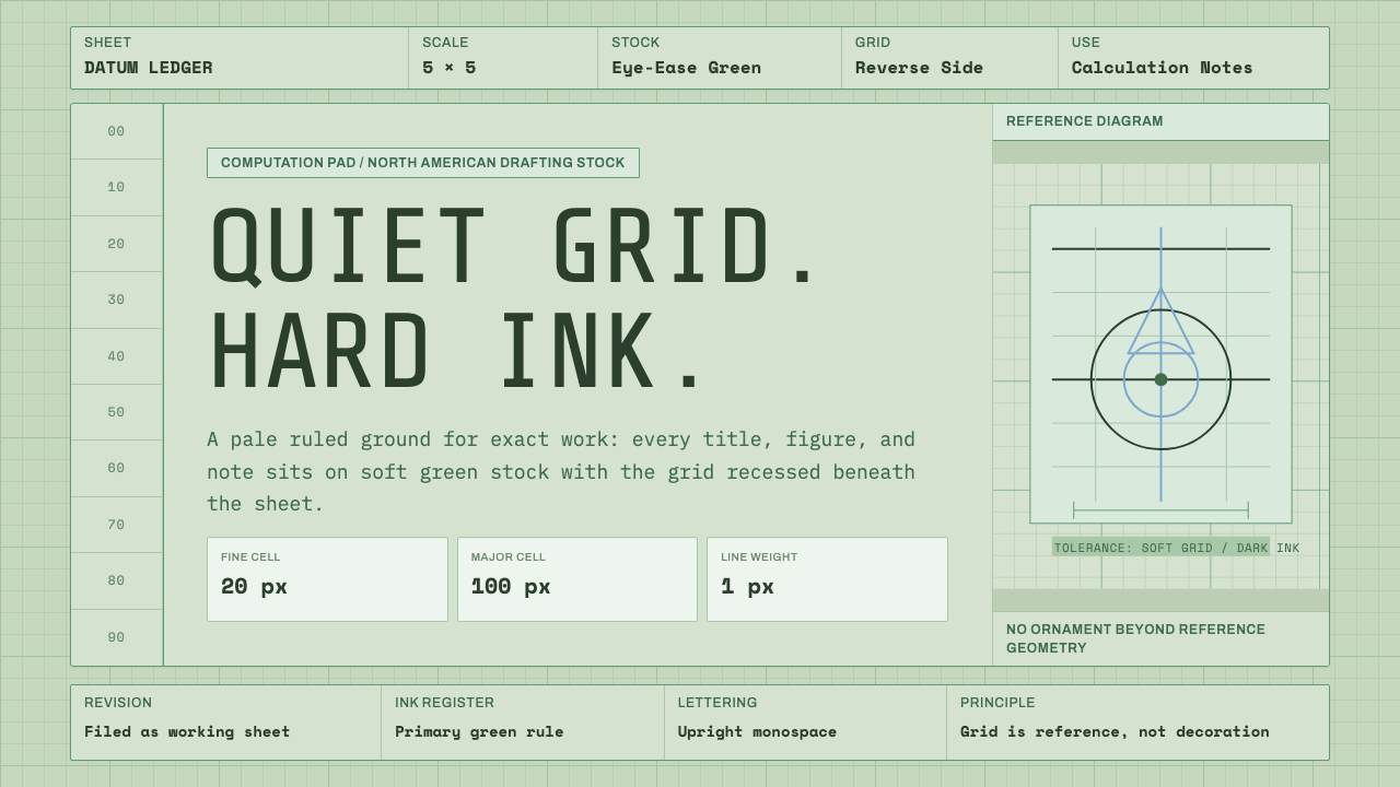 Engineering Graph PadQuiet precision. Eye-ease green, monospace title blocks, and a faint reverse-…
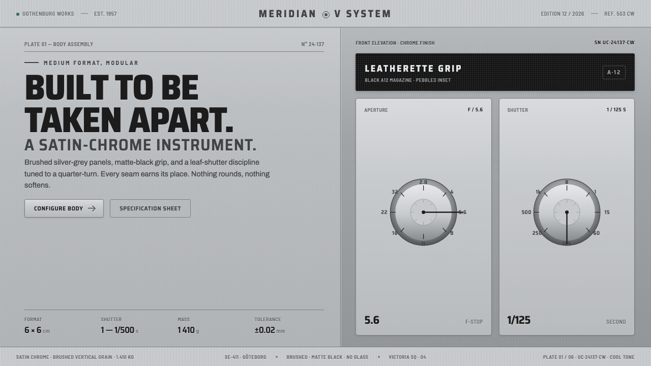 Hasselblad 500C ChromeBuilt to be taken apart. Brushed silver-grey panels, matte-black leatherette,…
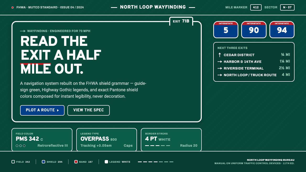 Interstate Highway ShieldEngineered for 70 mph. Guide-sign green, Pantone shield blue and red, Highway…
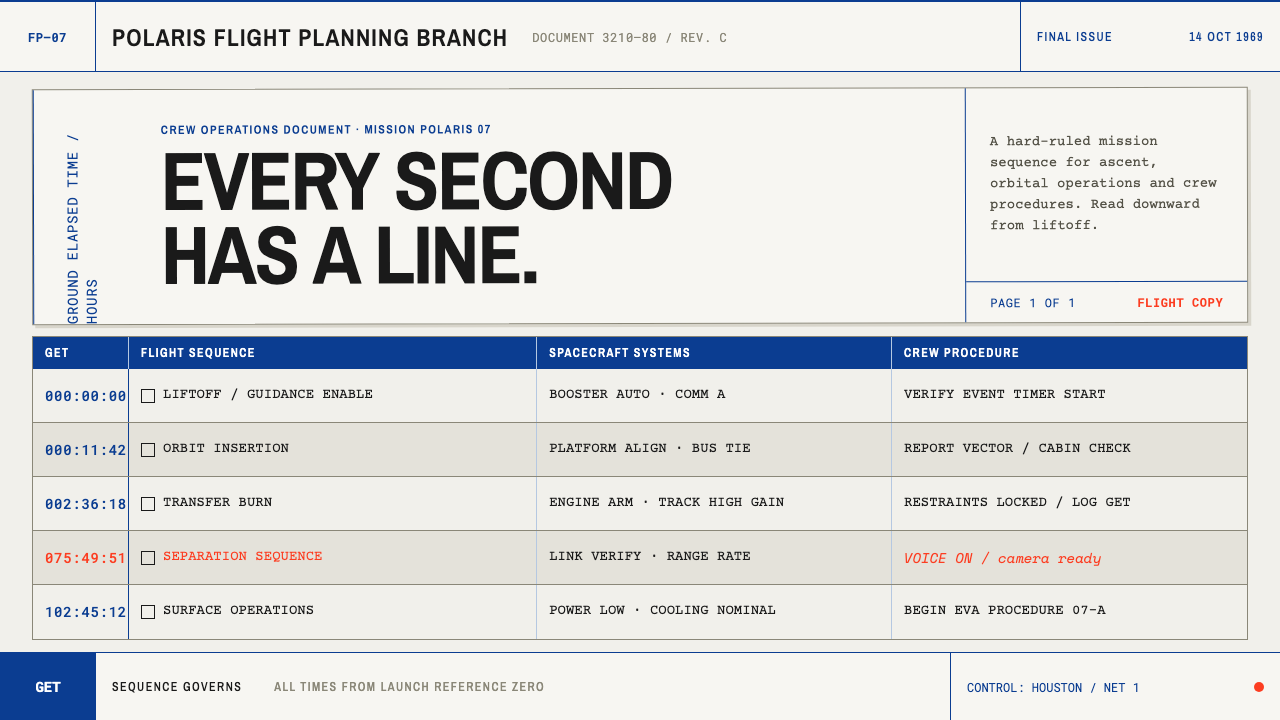 Apollo Flight PlanEvery second has a line. NASA blue rules and monospaced GET stamps discipline…
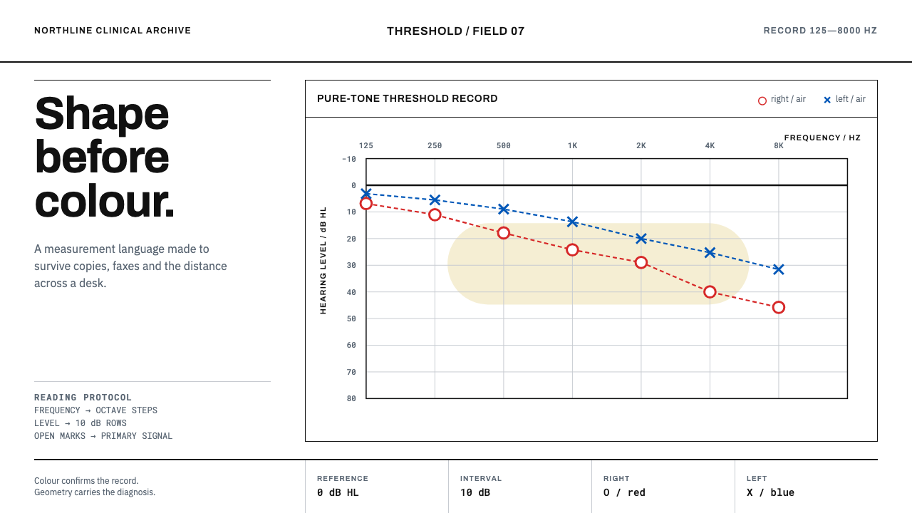 Audiogram ChartShape carries the diagnosis. Open red and blue marks cross a disciplined clin…
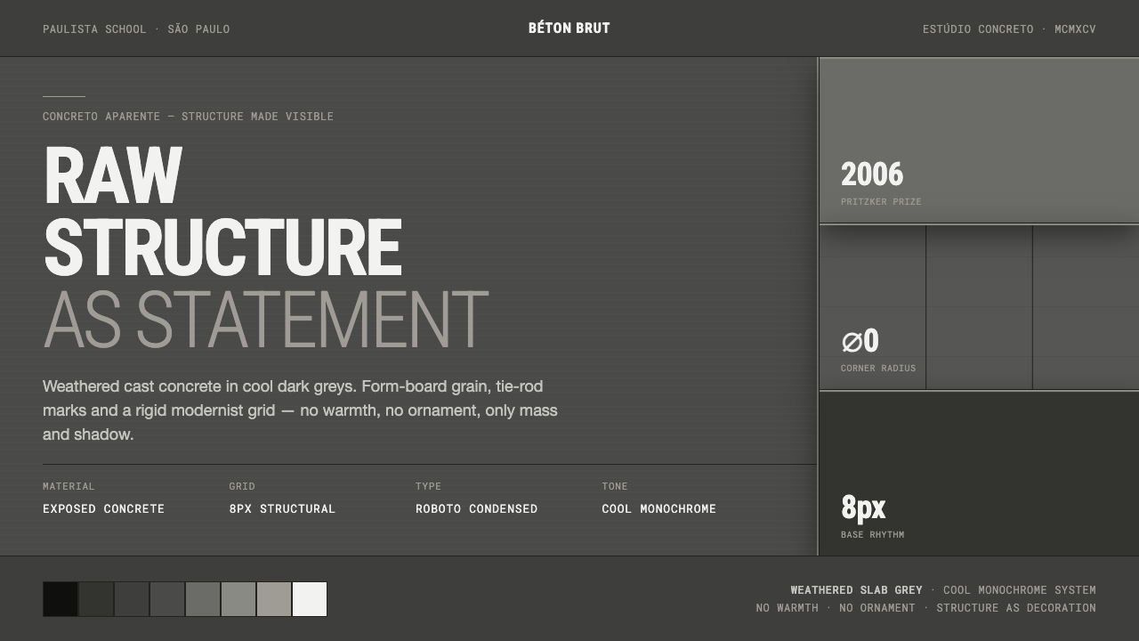 Brazilian Paulista ConcreteStructure made visible. Weathered béton-brut greys, hard cast shadows, conden…