What is Hasselblad 500C Chrome?
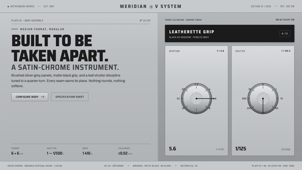
Hasselblad 500C Chrome turns the logic of a modular camera into design language — cool satin metal, matte-black grip surfaces, engraved clarity, and the quiet authority of an instrument built to come apart.
Hasselblad 500C Chrome in brief
Hasselblad 500C Chrome is an interface and graphic style derived from the Swedish Hasselblad 500C/M medium-format single-lens reflex camera. Its essential materials are brushed silver-grey metal, matte-black leatherette panels, and the dark A12 film magazine. These contrasting surfaces make the camera read not as a seamless shell but as an assembled system whose parts have distinct jobs.
The style preserves that modular character. Silver-grey fields form the chassis; black insets mark areas of control, concentration, or tactile importance. Fine directional grain suggests satin chrome without becoming decorative texture, while compact mechanical curves keep panels precise and manufactured. Typography resembles engraved identification on an instrument: crisp, restrained, slightly condensed, and more concerned with exact labeling than expressive personality.
Its atmosphere is cool, calm, and engineered. Metal must feel optically cold rather than warm or luxurious, and black should appear matte rather than glossy. Depth comes from joints, nested panels, restrained edge changes, and the contrast between hard metal and grippable leatherette. The result is neither nostalgic ornament nor futuristic spectacle. It is a disciplined visual system grounded in serviceability, handling, and mechanical trust.

Where does Hasselblad 500C Chrome come from?
The source object belongs to the Hasselblad modular medium-format camera lineage developed by Victor Hasselblad AB in Gothenburg, Sweden. The 500C appeared in 1957, and the 500C/M followed from 1970. Across the broader 1950–1990 era associated with this system, the camera established a durable identity through satin-chromed metal, black leatherette, interchangeable-looking sections, and a form organized around photographic operation rather than a continuous sculpted exterior.
Its visual character grows directly from modular construction. The body, lens system, viewing assembly, and film magazine are perceived as cooperating units rather than concealed internals. The matte-black A12 magazine gives the rear of the camera its own mass, while silver-grey structural surfaces define the central chassis. The object therefore explains itself through material boundaries: metal indicates frame and precision; leatherette indicates grip and contact; dark detachable sections indicate equipment that can be exchanged, handled, or serviced.
The lineage brings together Victor Hasselblad, Sixten Sason, and lens partner Carl Zeiss within a specifically Scandinavian tradition of precision instrument design. The relevant Scandinavian quality is not domestic softness or pale decorative minimalism. It is the disciplined coordination of material, function, and human handling. Every visible transition suggests assembly, every label belongs to an operating system, and every contrasting surface helps the user understand where the machine begins, separates, or invites touch.
The Apollo Hasselblad lineage added another layer of meaning to this already technical object. A camera family associated with lunar use inevitably acquired connotations of reliability, documentation, and performance beyond ordinary conditions. Yet the style does not need rockets, stars, or overt space imagery to communicate that heritage. Its strongest historical signal remains the camera itself: a cool Swedish mechanism whose credibility comes from visible construction, modular logic, and an absence of unnecessary drama.
What defines the Hasselblad 500C Chrome look?
Cool Chrome Palette
Silver-grey is the dominant field, but it should resemble satin-chromed machinery rather than polished jewelry. Its tone remains cool and slightly restrained, supported by white highlights, dark seams, and matte-black masses. Warm metallic hues weaken the camera association. Accent color, if needed, should behave like a small operational marking rather than a decorative flourish.
Brushed Direction
Metal surfaces carry a fine, consistent directional grain. The grain is quiet enough to disappear at first glance and become apparent only as a material cue. It should not resemble wood, fabric, noise, or a dramatic reflective effect. Direction matters because it makes each panel feel cut and finished as a physical component rather than filled with a generic silver color.
Leatherette Contrast
Matte-black leatherette functions as both visual contrast and an implied grip surface. It appears in bounded insets rather than washing across the whole composition. Its texture is dense, subdued, and tactile without becoming ornamental. In interface work, these dark areas are natural homes for controls, focused content, image wells, or information that requires concentrated attention.
Engraved Typography
Typography is crisp, sans-serif, and moderately condensed, recalling labels engraved or printed onto precision equipment. Headings feel firm without becoming oversized spectacle; secondary text behaves like operating notation. Tracking and alignment should communicate careful calibration. Decorative display faces, soft humanist forms, or visibly casual lettering interrupt the instrument character.
Mechanical Assembly
The composition should reveal how parts meet. Panels nest inside frames, dark modules attach to silver bodies, and controls sit within clearly bounded zones. Divisions are functional rather than ornamental. This visible assembly gives the design its distinctive authority: the user can intuit a chassis, removable units, and contact surfaces even when the result is entirely digital.
Tight Curves and Seams
Corners are compact and mechanically resolved, neither perfectly severe nor softly inflated. Seams, thin boundaries, and subtle edge changes do more work than atmospheric shadow. The ideal depth resembles closely fitted manufactured parts. Excessively rounded cards, floating glass surfaces, and diffuse elevation make the system feel like generic software rather than a camera-derived instrument.
Operational Restraint
Every visual gesture should suggest use. A line separates modules, a dark field improves focus, a label identifies a function, and a change in finish distinguishes touch from structure. Ornament without an operational explanation is foreign to the system. Restraint does not mean emptiness; it means that richness comes from material relationships, component logic, and exact hierarchy.

Who shaped Hasselblad 500C Chrome?
Victor Hasselblad is the central figure identified with the Gothenburg company and the camera lineage behind this style. His name anchors the system’s Swedish origin, modular photographic purpose, and instrument-grade identity. In design terms, the Hasselblad association represents a belief that professional credibility can be communicated through visible construction, material discipline, and controls that belong unmistakably to the work of making photographs.
Sixten Sason appears among the key figures of the Hasselblad 500C lineage and helps locate the camera within a broader culture of Scandinavian precision design. For this visual system, his relevance lies in the coherence of the complete object: metal surfaces, dark gripping areas, mechanical divisions, and human operation are read together rather than treated as independent styling gestures.
Carl Zeiss is identified as the lens partner in the Hasselblad system. That partnership reinforces the camera’s character as a coordinated photographic platform rather than a solitary styled body. Within the derived aesthetic, the Zeiss association supports an emphasis on optical seriousness, interchangeable components, exact labeling, and the idea that every visible module belongs to a larger precision system.
How do you use Hasselblad 500C Chrome today?
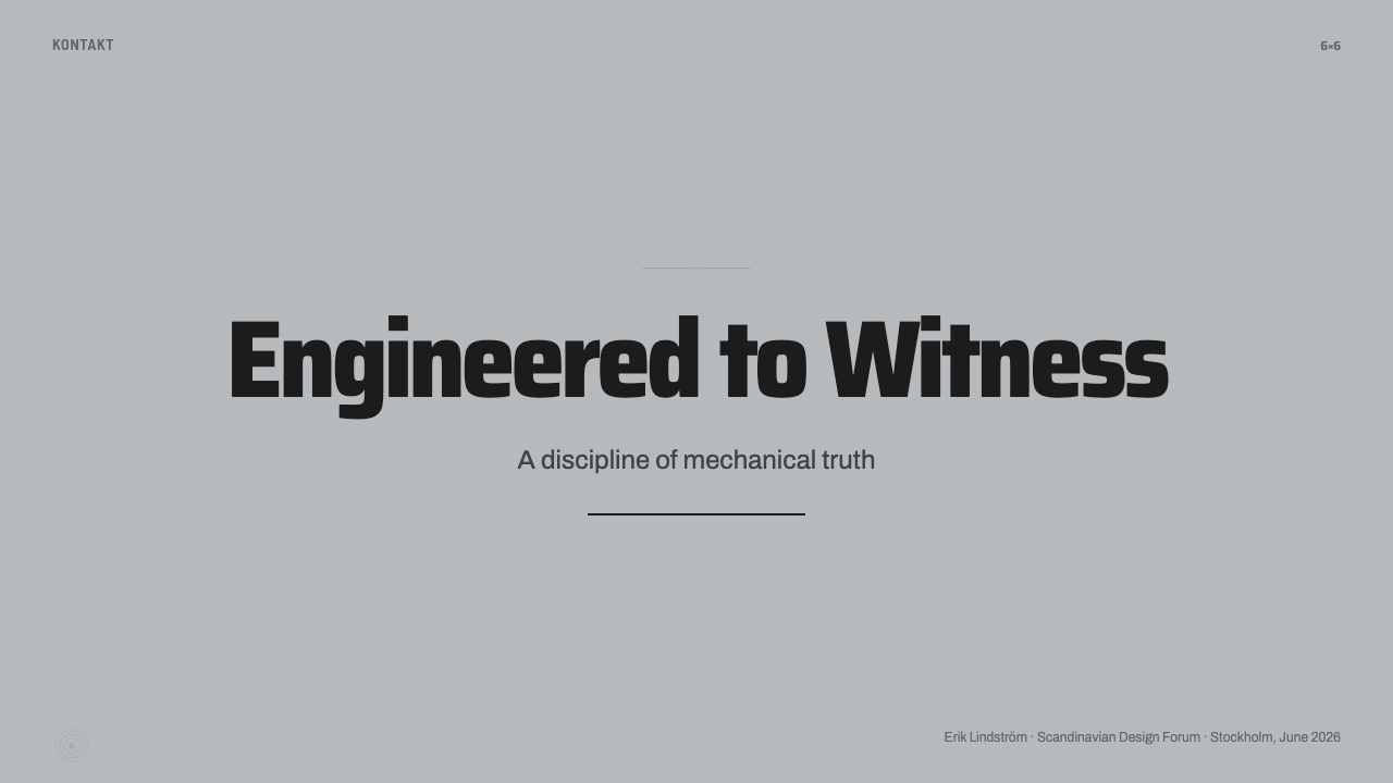
For presentation slides, the style is strongest when the deck behaves like an opened equipment case. A cover can use a broad silver-grey chassis, one matte-black inset, and a compact engraved title block, with a small technical label establishing subject or edition. Content slides should divide information into fitted modules rather than loose floating cards. Keep hierarchy firm and economical: a decisive heading, calibrated supporting labels, and enough unoccupied metal field for the composition to feel engineered rather than crowded.
Data slides benefit from the camera’s operational logic. Charts can sit in dark instrument panels surrounded by cool metal framing, while legends and annotations resemble lens or magazine markings. Use contrast to separate reading functions: silver for structure, black for concentrated data, and light text for active information. Avoid turning every chart into a literal camera control. The connection should come from panel construction, precise labeling, and modular arrangement, not from decorative dials pasted onto unrelated information.
For web interfaces, Hasselblad 500C Chrome suits dashboards, asset managers, analytical tools, and pricing pages that need a professional equipment-like presence. Navigation can occupy a black grip-like rail, while the main workspace remains a cool metal field assembled from bounded sections. Pricing tiers should resemble compatible modules in one system rather than brightly competing advertisements. Selected states may deepen into matte-black panels; utility actions can appear as compact labeled controls whose position and wording make their purpose immediately legible.
Editorial and marketing layouts should use the style as a framework for evidence. Product photography, technical diagrams, or documentary images belong naturally inside dark image wells bordered by silver structure. Long-form articles can pair a restrained reading column with marginal labels, captions, or system notes. Marketing pages should emphasize durability, precision, modularity, and lineage through close material crops and orderly sequencing. Lunar heritage may be acknowledged through documentary context, but overt space motifs easily overwhelm the quieter authority of the camera itself.
The common mistake is to equate chrome with shine. Strong reflections, glossy gradients, inflated highlights, and luxurious metallic spectacle turn a precision camera into consumer electronics or jewelry. Another error is covering every surface with grain, screws, dials, and simulated leather. The authentic lesson is selective material differentiation: cool metal for chassis, matte black for grip and concentration, typography for identification, and seams for assembly. If every element announces its texture, the system loses the composure that makes it convincing.
Hasselblad 500C Chrome — FAQ
Is Hasselblad 500C Chrome simply a retro camera style?
No. Historical recognition is part of its appeal, but the transferable principle is modular instrument design. A superficial retro treatment adds old-fashioned labels, decorative dials, or simulated wear. This style instead asks how parts are organized, where the user grips or controls the system, and how materials distinguish those roles. It can feel contemporary when the construction logic remains clear and nostalgic props are withheld.
How should chrome be represented without making the interface look glossy?
Use cool silver-grey fields, fine directional grain, restrained highlights, and crisp changes at panel edges. The material should be inferred from consistency rather than demonstrated through dramatic reflection. Matte-black neighbors are essential because they let the silver read as metal through contrast. If the surface starts behaving like a mirror, polished vehicle trim, or luxury packaging, the design has moved away from the satin-chromed camera.
Does every component need leatherette texture?
No. Leatherette is powerful because it is limited to zones associated with grip, focus, or protected equipment. Applying it everywhere removes the distinction between chassis and contact surface. In a digital product, one dark navigation rail, image well, selected panel, or control cluster may be enough. The texture should remain subdued; the structural contrast between matte black and cool metal matters more than literal surface imitation.
Can the style work for content that has nothing to do with photography?
Yes, provided the product benefits from precision, modularity, and operational clarity. Analytical platforms, technical documentation, professional tools, archives, and structured commerce can all use the language effectively. It is less natural for experiences whose primary promise is softness, spontaneity, or emotional warmth. The question is not whether the subject contains cameras, but whether users should feel that they are handling a dependable, carefully assembled system.
How explicitly should a design reference the Apollo lineage?
Usually with restraint. Documentary imagery, a concise historical note, or language about reliability can establish the connection without turning the composition into space-themed entertainment. Stars, orbital diagrams, and lunar graphics may be appropriate when the subject specifically concerns that lineage, but they are not required for the style itself. The camera’s material discipline and modular confidence carry the heritage more convincingly than decorative space symbolism.
Related design styles
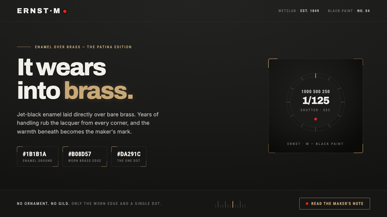 Leica M Black PaintIt wears into brass. Jet-black enamel over bare brass, exposed only at worn e…
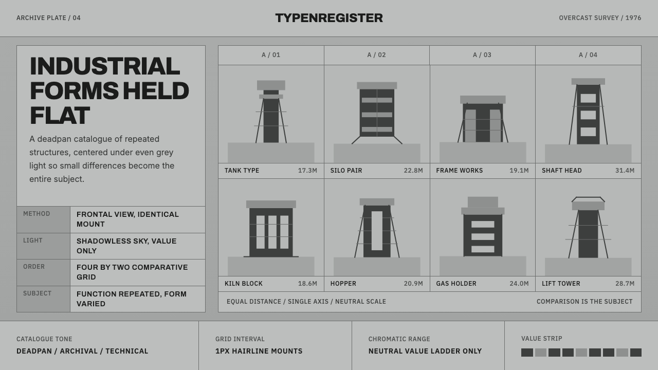 Bechers Industrial TypologyDeadpan order. Mid-grey ground, Archivo labels, and strict hairline grids rev…
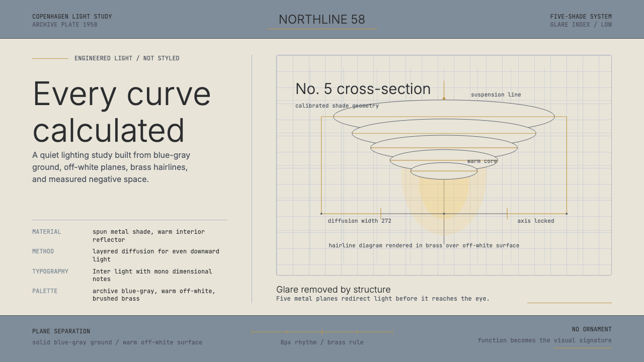 Danish PH5 Louis Poulsen (1958)Engineered, not styled. Blue-gray ground, brass hairlines, and a precise shad…
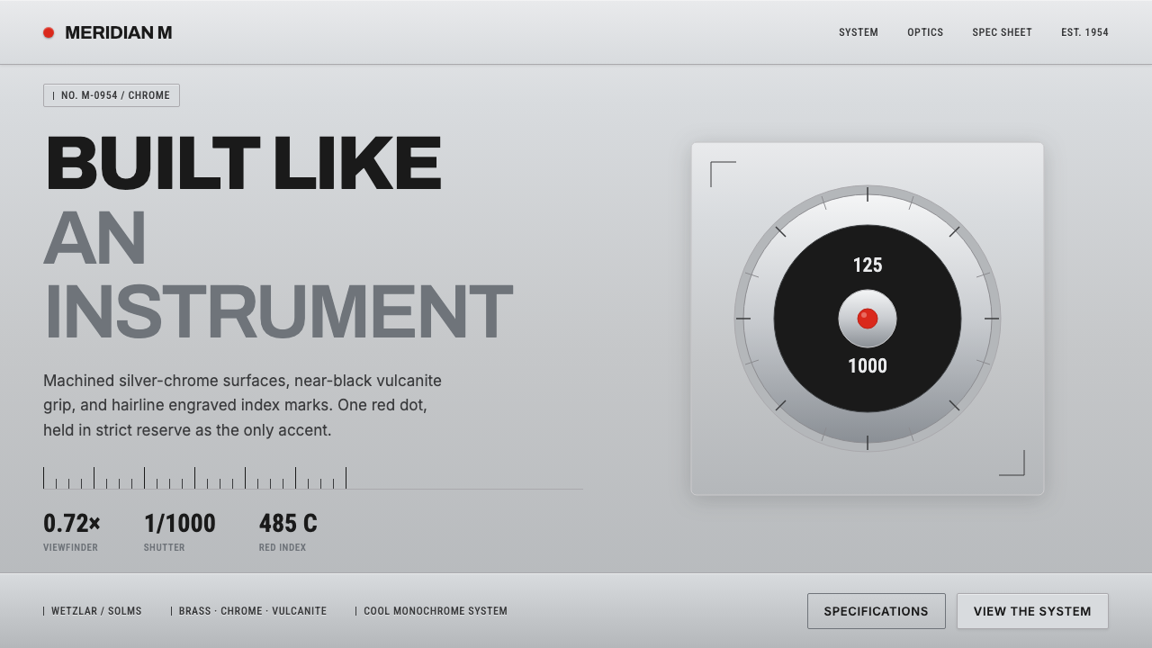 Leica M Silver ChromeBuilt like an instrument. Brushed silver-chrome on near-black vulcanite, one…
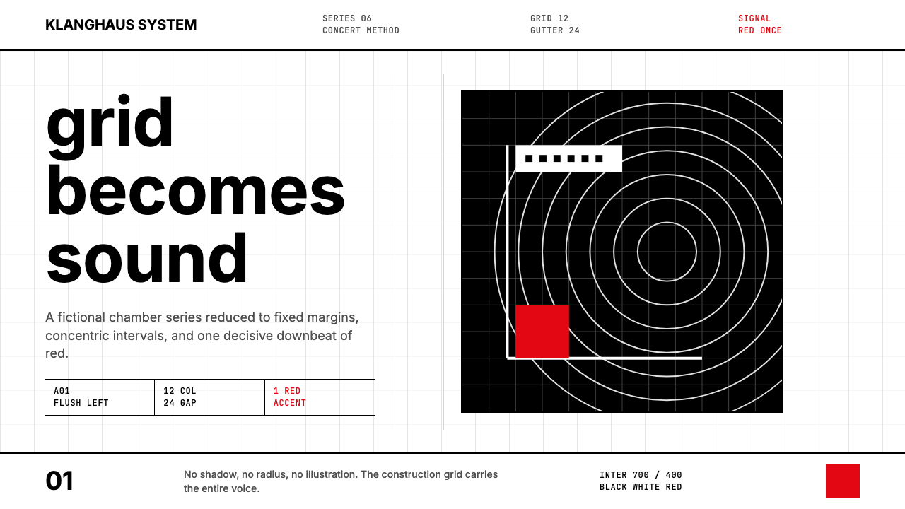 Müller-Brockmann GridOrder becomes force. Black-white 12-column grid, Inter type, one red downbeat.
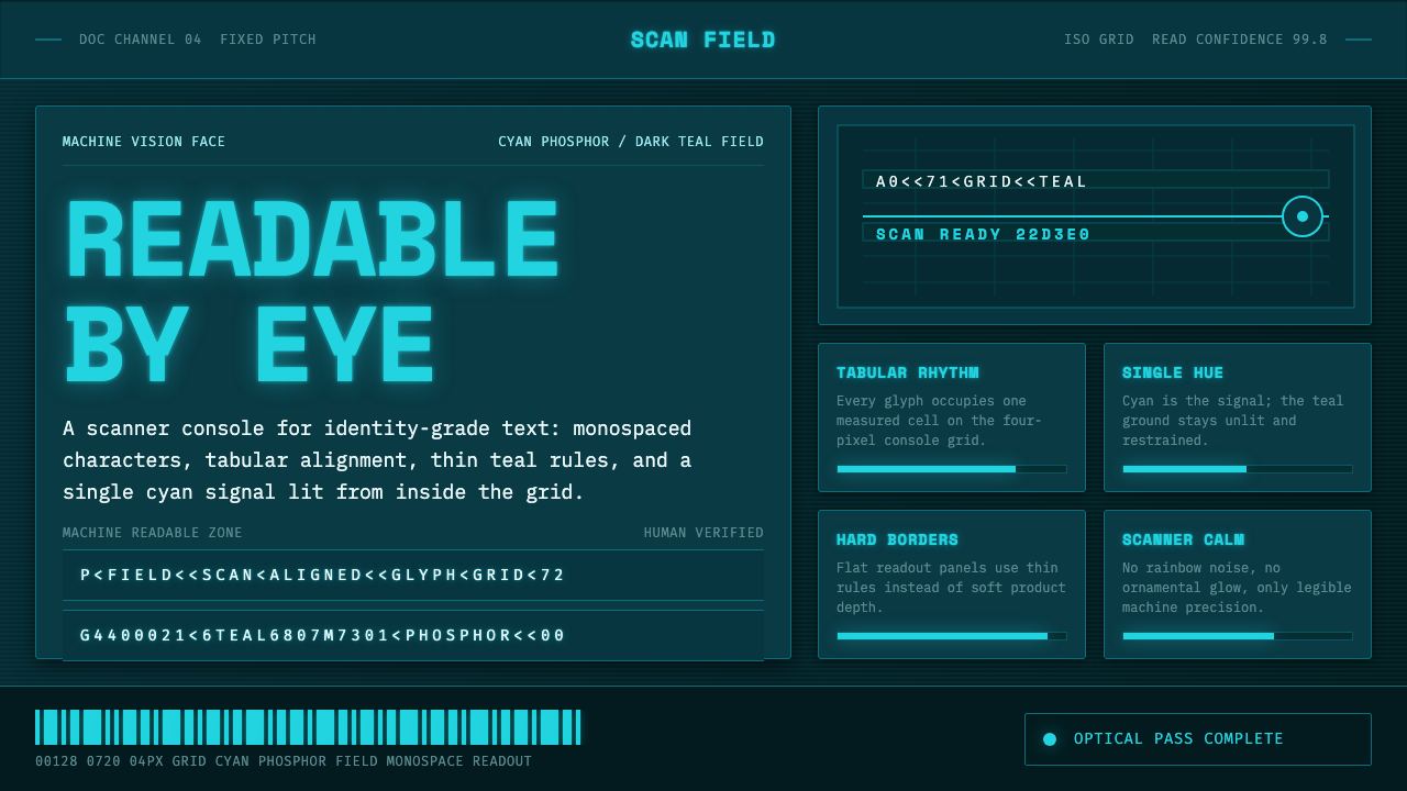 OCR-B Machine ReadableMachine vision, made calm. Cyan monospace glows on a dark teal scanner grid.