What is OCR-B Machine Readable?
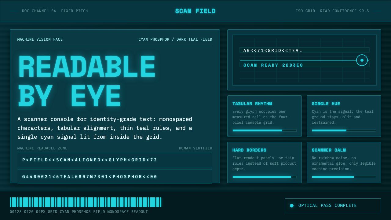
OCR-B turns the language of scanners into a calm visual system: fixed-pitch cyan characters, dark teal space, and clarity engineered for both machines and people.
OCR-B Machine Readable in brief
OCR-B is a monospaced typeface drawn by Adrian Frutiger in 1968 for ECMA and ratified as an ISO/ECMA standard in 1973. It belongs to the history of optical character recognition: lettering shaped so that an optical scanner can distinguish individual characters reliably, while a human reader can still recognize them without strain. Its most familiar public presence is quiet but pervasive—the digits beneath barcodes and the machine-readable lines at the foot of a passport.
That dual audience gives OCR-B its character. It is not merely a technical face that happens to be readable, nor a decorative monospace that borrows the atmosphere of computing. Each character occupies an equal horizontal measure, producing an even cadence across numbers, letters, codes, and tabular information. The result is visual order that feels procedural rather than ornamental: a document or interface appears ready to be inspected, indexed, or scanned.
The OCR-B Machine Readable system interprets this heritage as a scanner console. Cyan phosphor-like characters glow against a deep dark-teal field; the ground stays unlit, while the information appears to generate its own light. The mood is controlled and observant rather than flashy. A single luminous hue, fixed-width typography, restrained grid lines, and table-like alignment make data feel present, legible, and continuously available.
Where does OCR-B Machine Readable come from?
OCR-B began with a practical design problem. In 1968, Adrian Frutiger drew the face for ECMA in a period when optical character recognition required type to perform as part of a technical system. A character could not depend only on stylistic distinction or typographic convention; it needed a shape that could be recognized under machine reading. Yet the face was also intended for documents encountered by people, so technical differentiation and ordinary legibility had to coexist.
Its standardization in 1973 matters because it places OCR-B beyond the private vocabulary of one device or one publisher. The ISO/ECMA designation identifies it as part of a shared machine-readable language. That context explains why the typeface is associated with barcodes and passport machine-readable text: these are places where characters must retain their identity while moving between institutions, equipment, and human hands.
The visual consequences of that origin are unusually direct. Monospacing creates a regular field in which every character arrives on the same beat. The page begins to resemble a record, a register, or a scanner output rather than conventional prose. Repetition is not monotony here; it is evidence of a system that treats every position as accountable and every mark as separable.
The contemporary OCR-B Machine Readable interpretation preserves that discipline while changing the setting. Rather than imitating paper documentation, it imagines the type as illuminated information on a dark console. Cyan light over dark teal recalls phosphor display behavior without turning the composition into retro spectacle. The point is not nostalgia for old equipment, but an atmosphere of measured machine vision: information is lit, organized, and waiting to be read.
What defines the OCR-B Machine Readable look?
Fixed-Pitch Rhythm
OCR-B is monospaced, so each character receives the same horizontal territory. This makes columns, serial strings, and mixed letter-number records settle into an immediate visual rhythm. Alignment is not an added effect; it emerges from the typeface itself. In the machine-readable interpretation, that rhythm should remain visible across headings, labels, values, and dividers, giving the whole surface the discipline of an instrument panel.
Cyan Internal Light
The system uses cyan as information light rather than surface decoration. Characters appear phosphorescent against the dark field, with their brightness suggesting active signal and readable output. The glow should feel contained by the letterforms and gently echoed nearby, never expanded into a haze that competes with the text. One luminous hue gives the interface coherence and preserves the calm implied by a working scanner.
Dark Teal Ground
The deep dark-teal background is an unlit environment, not a decorative color block. It creates the contrast required for cyan information to read as signal, while remaining softer in mood than an absolute black void. The ground should be broad, quiet, and nearly featureless except for restrained scanner-grid structure. Its job is to give the glowing content space, not to announce itself.
Scanner Grid
Grid lines evoke the measured field of a scanner and make the dark ground feel calibrated. They should remain subordinate to the characters: faint enough to suggest coordinate, registration, and inspection, but never so strong that the interface becomes graph paper. A useful grid supports tabular reading and gives isolated values a shared reference plane without enclosing every element in a box.
Tabular Information
This style favors labels, codes, records, and values arranged as a readable system. Empty space functions like a pause between fields, while rules and aligned baselines establish relationships without decorative containers. Information may feel technical, but it should not feel hostile. Clear grouping, deliberate sequence, and consistent character spacing let the viewer scan the display as easily as an instrument reads a result.
Restrained Signal
The central discipline is refusal of neon clutter. A machine-vision interface becomes less convincing when every border, icon, label, and background effect tries to glow. OCR-B Machine Readable concentrates illumination in the characters and treats all surrounding structure as support. The resulting contrast is conceptual as well as visual: active information is bright; the system around it remains quiet, stable, and ready.
Who shaped OCR-B Machine Readable?
Adrian Frutiger drew OCR-B in 1968 for ECMA. His role is foundational because the typeface begins with the problem of making characters intelligible to optical scanners without giving up human legibility. In this style, his contribution is visible less as authorial flourish than as disciplined character identity, regular spacing, and a letterform system prepared to carry codes as clearly as language.
ECMA is named as the organization for which OCR-B was drawn. Its presence locates the typeface in a standards-oriented context rather than a purely expressive typographic one. That frame helps explain why the style values consistency, repeatable reading, and orderly information fields. The visual language treats type as part of an interoperable system, not as an isolated graphic gesture.
The 1973 ISO/ECMA standard marks OCR-B as a ratified machine-readable form. The designation is important to the aesthetic because it gives regularity a purpose: fixed pitch, clear separation, and tabular order are not generic futurist motifs but visual expressions of reliable recognition. A convincing application preserves that sense of shared readability instead of using technical cues as costume.
How do you use OCR-B Machine Readable today?
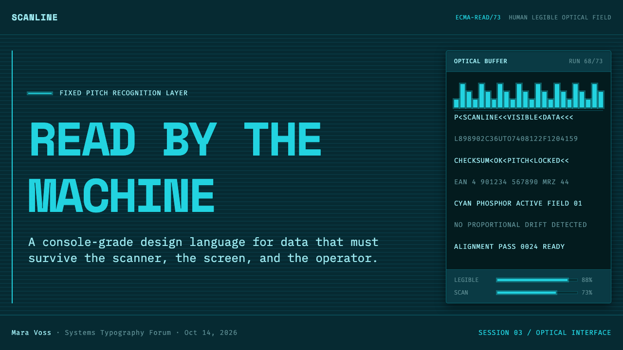
For presentation covers, use the dark-teal field as a quiet instrument bay and let a short OCR-B title supply the principal light. A small cluster of aligned metadata, a restrained scanner grid, and one clear cyan signal can establish the theme without illustration. Content slides should preserve the same field but organize material as records: section labels, compact descriptions, and deliberate empty intervals. The visual effect should be that of information entering a stable system, not text pasted onto a dark background.
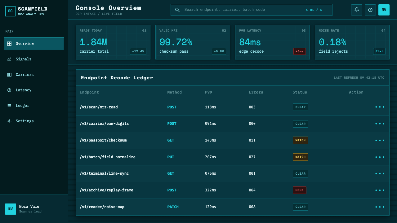
Data slides are especially natural territory. Tables, serial comparisons, timestamps, status labels, and numerical readouts benefit from the face’s equal-width cadence. Keep headings distinct through position and brightness rather than decorative badges; let rows align cleanly and use grid rules only where they clarify a relationship. A chart can borrow the same logic by making labels and values feel registered to the display. The screen should remain legible at a glance before it feels atmospheric.
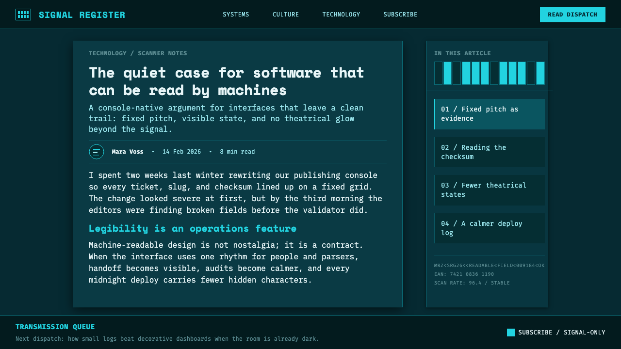
For web interfaces, OCR-B Machine Readable fits dashboards, monitoring surfaces, search results, account activity, inventory records, and pricing pages that want to communicate technical confidence. Reserve the cyan light for live values, primary navigation states, essential actions, or key status changes. Secondary explanations should recede into quieter text, while panels use alignment and spacing more than glowing outlines to define themselves. The system works best when a user can identify what is current, what is stable, and what requires attention without visual noise.
Editorial and marketing applications can use the style to frame a product as precise, inspectable, or infrastructure-aware. A long-form page may pair ordinary reading passages with OCR-B captions, record-like pullouts, or structured metadata, allowing the machine-readable voice to punctuate rather than dominate. Campaign pages can use dark sections as moments of technical focus, then maintain the same disciplined hierarchy in lighter surrounding content. The aesthetic is strongest when the product genuinely has data, systems, or verification to show.
The common mistake is to confuse scanner-console calm with cyberpunk excess. Flooding every surface with cyan, adding glow to every rule, or filling the grid with arbitrary codes erases the distinction between signal and ambience. Another mistake is to set dense explanatory copy as though it were raw machine output; OCR-B’s regularity needs breathing room and clear grouping. Use the luminous treatment selectively, let the dark ground stay quiet, and make every visible code, label, and line earn its place.
OCR-B Machine Readable — FAQ
Is OCR-B simply a computer-style monospace font?
No. OCR-B was drawn for optical character recognition, so its monospacing and character distinction arise from a machine-readable purpose. A generic monospace face may suggest code or terminals, but OCR-B carries a more specific association with scanners, barcodes, passport machine-readable text, and shared standards. The visual system should preserve that specificity through orderly records and readable signal, rather than reducing it to a retro technical mood.
Why is cyan used against a dark-teal ground?
The pairing interprets the style as a scanner console: cyan characters read like illuminated phosphor, while the dark-teal field remains unlit. This separation gives information a clear role as active signal. It also keeps the atmosphere calm, because the background absorbs attention instead of competing with the text. The effect depends on restraint; cyan is most useful when it identifies what is meant to be read first.
Can the style support long-form reading?
It can, but the machine-readable voice should be used with editorial judgment. OCR-B is especially effective for headings, captions, codes, structured metadata, compact labels, and tabular passages. Long explanatory material needs generous separation, clear grouping, and a quieter hierarchy so that fixed-pitch repetition does not make the reading experience feel mechanically dense. The style works best when it alternates human reading rhythms with moments of registered information.
What makes an OCR-B Machine Readable interface feel authentic rather than decorative?
Authenticity comes from treating the visual language as an information system. Use fixed-pitch alignment where it reveals relationships, make the grid serve inspection rather than ornament, and reserve illumination for actual priority. The dark field should provide silence around the data, not become a stage for effects. If the display communicates status, records, values, or verification with greater clarity than a conventional layout, the machine-readable heritage is doing useful work.
Related design styles
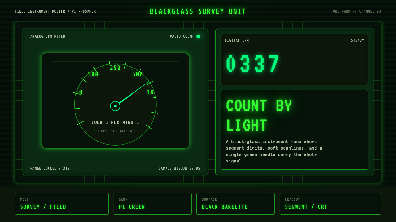 Geiger Counter Green ReadoutReads by glow. P1 green digits, scanlines, and a bordered black instrument gr…
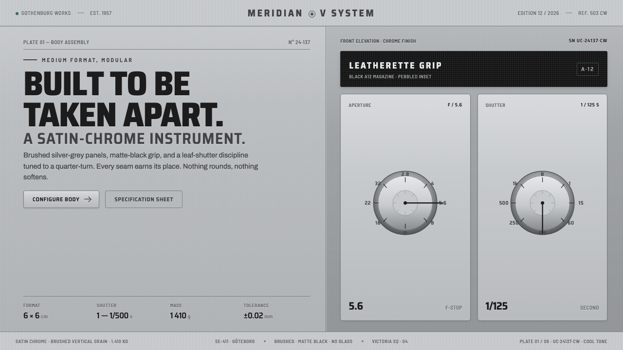 Hasselblad 500C ChromeBuilt to be taken apart. Brushed silver-grey panels, matte-black leatherette,…
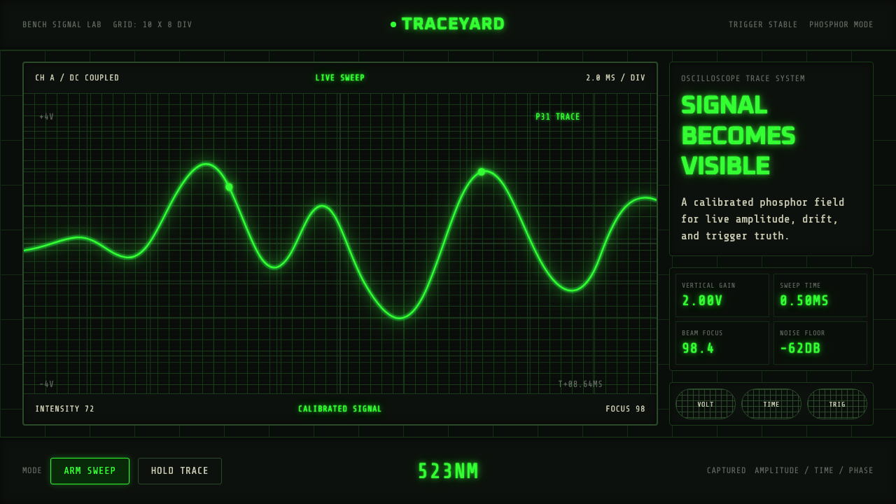 Oscilloscope TraceMeasurement glows. P31 green waveforms burn through a black graticule.
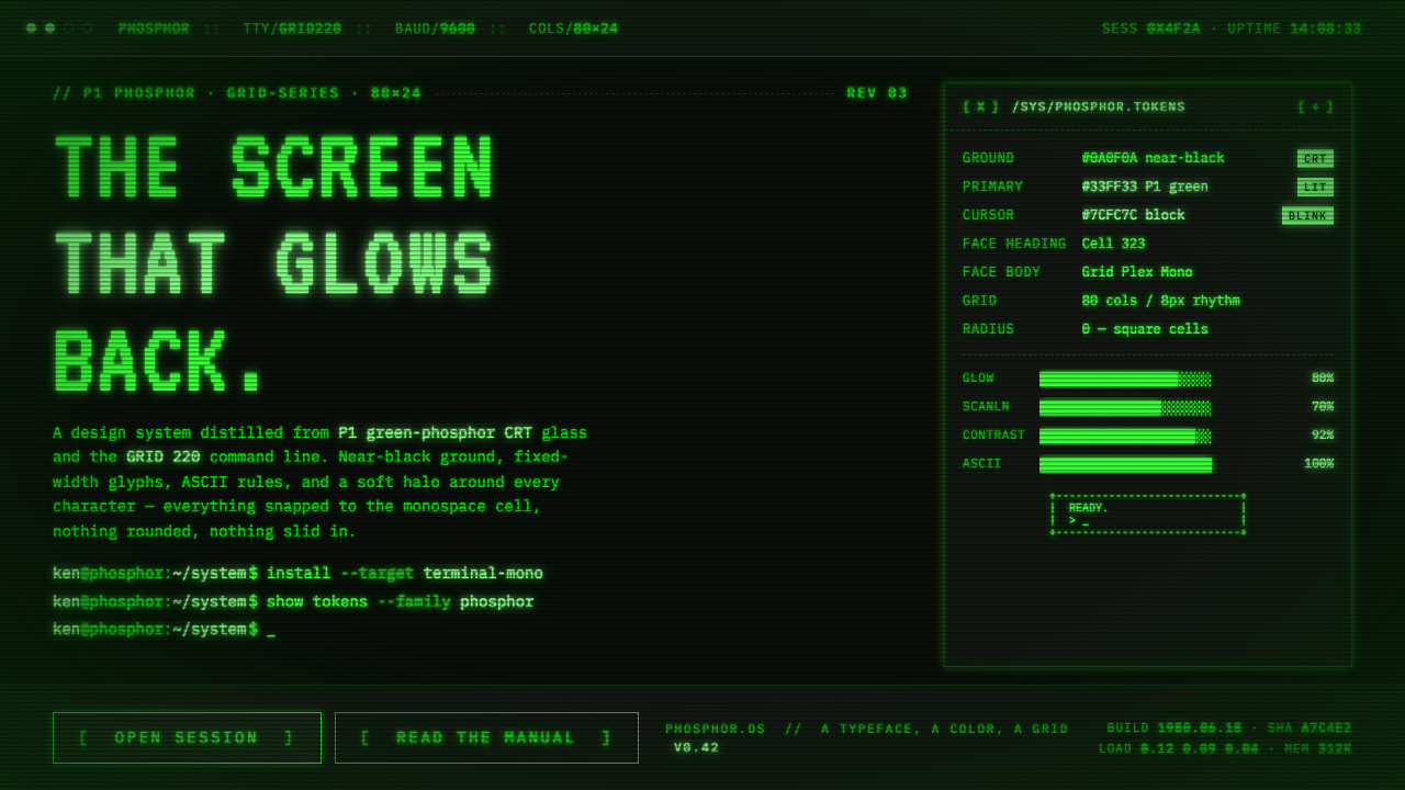 Unix Terminal MonoNear-black CRT glass that glows back. P1 phosphor green, VT323 mono, ASCII ru…
 Moog Modular SynthWalnut cabinet, brushed-aluminum panels. Toggle-blue switches, orange patch c…
 Pan Am Jet AgeJet-age confidence. Globe-blue field, steel type, meridian circle on a strict…