What is Geiger Counter Green Readout?
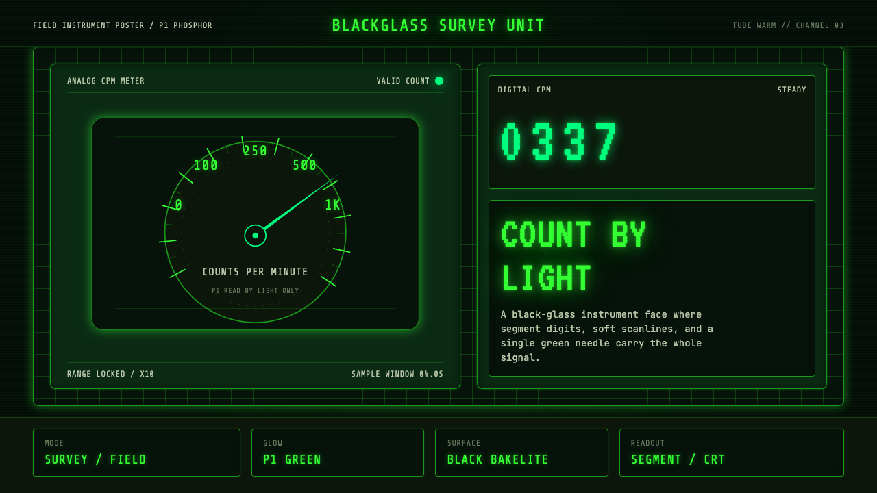
Geiger Counter Green Readout turns darkness into an instrument face, where phosphor-green digits, scanlines, and a restless survey needle make every reading feel urgent, technical, and alive.
Geiger Counter Green Readout in brief
Geiger Counter Green Readout is a dark visual system derived from radiation survey meters, black bakelite instrument faces, monochrome displays, and P1 green-phosphor CRTs. Its defining image is information produced by light: green digits and markings glow from a field of black rather than resting like ink on a pale surface. The result belongs equally to laboratory equipment, field instrumentation, and the visual memory of early monochrome computing.
The style combines two modes of measurement. Analog information appears through a swinging CPM needle, ruled scales, bordered gauges, and visible instrument divisions. Digital information appears through monospaced segment numerals and compact terminal-like text. Placed together, these forms suggest a system that is continuously sensing, counting, and reporting rather than merely displaying static content.
Its atmosphere depends on controlled optical imperfection. Scanlines imply a refreshed electronic image; phosphor bloom softens luminous marks at their edges; concentrated green accents make the surrounding black seem deeper. These effects should never obscure the reading. The aesthetic is most convincing when the glow serves legibility, hierarchy, and operational feedback, preserving the discipline of an actual instrument.
Where does Geiger Counter Green Readout come from?
The style begins with radiation instrumentation of the Cold War era, especially analog survey meters used in laboratories and field settings. These devices were built to turn an invisible environmental condition into an observable reading. A needle moving across a calibrated face made changing intensity visible at a glance, while strong borders and orderly divisions separated the scale, labels, and operating information. The black instrument face was not decorative darkness; it formed a controlled field against which every luminous or pale mark could be judged quickly.
Alongside the analog meter developed the lineage of monochrome P1 green-phosphor CRTs. On dark CRT glass, characters were not printed shapes but small emissions of light. Green phosphor became closely associated with computing because it could render text, numbers, and simple symbols with immediate contrast on a black field. The display carried its own material signatures: horizontal scanline texture, slight bloom around bright marks, and a sense that the image existed only while the machine remained active.
From the 1950s through 1990, analog survey instruments and monochrome computing established parallel visual vocabularies. One used needles, arcs, ticks, and physical panels; the other used fixed-width characters, segment-like numerals, and luminous terminal rows. Geiger Counter Green Readout condenses these vocabularies into a single system. The needle communicates change and physical measurement, while the terminal readout communicates count, status, and machine interpretation.
As computing imagery migrated into global internet culture, the green-phosphor terminal became a recognizable shorthand for monitoring, diagnostics, technical access, and hidden processes made visible. The style retains that association but anchors it in instrument logic. Its borders resemble panel divisions, its grids resemble organized banks of readings, and its glow resembles emitted phosphor rather than decorative neon. The historical source is therefore not a single product or maker, but a shared lineage of survey-meter construction and monochrome display technology.
What defines the Geiger Counter Green Readout look?
Phosphor Color
The palette is built around luminous P1 green against pure or nearly pure black. Green carries almost every active role: digits, labels, scale marks, graph traces, status signals, and needle illumination. Variations should feel like differences in emitted intensity rather than unrelated hues. Dim green supports secondary information, while the clearest glow belongs to current readings and active states.
Instrument Grid
Content is divided into bordered black compartments resembling a bank of laboratory instruments. The grid should feel assembled and operational: one panel contains the primary count, another a needle gauge, another a status log or small trace. Borders clarify ownership and reading order, while dark internal space prevents a dense dashboard from becoming visually noisy.
Segment Typography
Primary numbers use monospaced, segment-derived forms that make each count appear machine-produced. Supporting text should remain compact, regular, and technical, with clear differences between headline readings, panel labels, and annotations. Alignment matters more than typographic flourish: columns of values should lock together, labels should sit close to their instruments, and every numeral should be easy to compare.
Needle and Scale
The analog needle supplies tension that static digits cannot. It crosses a ruled arc or linear scale, converting change into direction and position. Scale marks should be disciplined and subordinate to the reading, with major divisions easy to locate and minor divisions creating measured density. The needle is most effective as a focused signal, not as a decorative centerpiece.
Scanlines and Bloom
Fine horizontal scanlines and restrained phosphor bloom evoke dark CRT glass. Scanlines create a persistent surface texture without becoming a pattern that competes with text. Bloom should gather around the brightest marks and fade quickly into black, suggesting emitted light while preserving sharp character shapes. Uniform haze weakens the instrument quality and should be avoided.
Read by Light
Every important element is conceived as illumination emerging from darkness. The system does not support a light-background counterpart, because reversing it would change the governing metaphor from phosphor emission to printed pigment. Black is therefore active negative space: it isolates readings, establishes silence between panels, and gives the green enough darkness to appear genuinely luminous.
Who shaped Geiger Counter Green Readout?
The makers of scintillation and survey-meter instruments established the practical visual grammar behind the style. Their products organized scales, needles, counters, labels, and operating states into compact panels intended for rapid reading in laboratories and field conditions. The resulting authority came from operational necessity: borders separated functions, high contrast protected legibility, and the meter face converted invisible radiation into a visible, interpretable event.
The P1 green-phosphor CRT lineage supplied the style's defining light, dark glass, and electronic texture. It made text and numerals appear as luminous events rather than printed marks, binding green-on-black display to monochrome computing. Scanlines and slight phosphor bloom were consequences of the display medium, but they later became recognizable aesthetic signs of an active machine producing information in real time.
The green-phosphor terminal aesthetic carried the monochrome display language from specialized hardware into global computing and internet imagery. Fixed-width text, aligned values, compact command-like labels, and luminous rows turned the screen into a field of inspection and diagnosis. Within this theme, that terminal vocabulary complements the analog survey meter by giving measured phenomena a machine-readable record.
How do you use Geiger Counter Green Readout today?
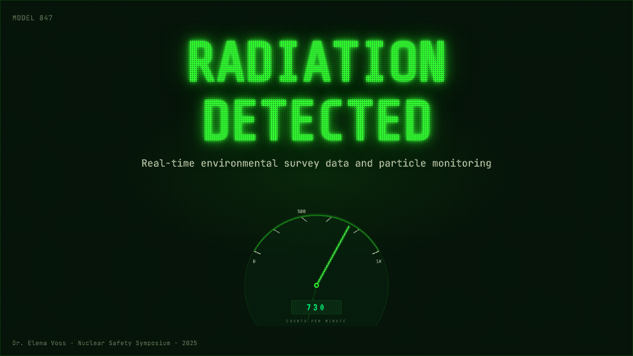
For presentation slides, the style is strongest when the deck behaves like a sequence of instrument states. A cover can place one commanding green readout or partial gauge within a broad black field, accompanied by a compact technical title and restrained panel markings. Content slides should use bordered compartments for arguments, evidence, and annotations rather than filling the canvas with glow. Data slides are especially natural: plots can resemble phosphor traces, key values can become segment readouts, and a needle gauge can summarize direction or intensity.
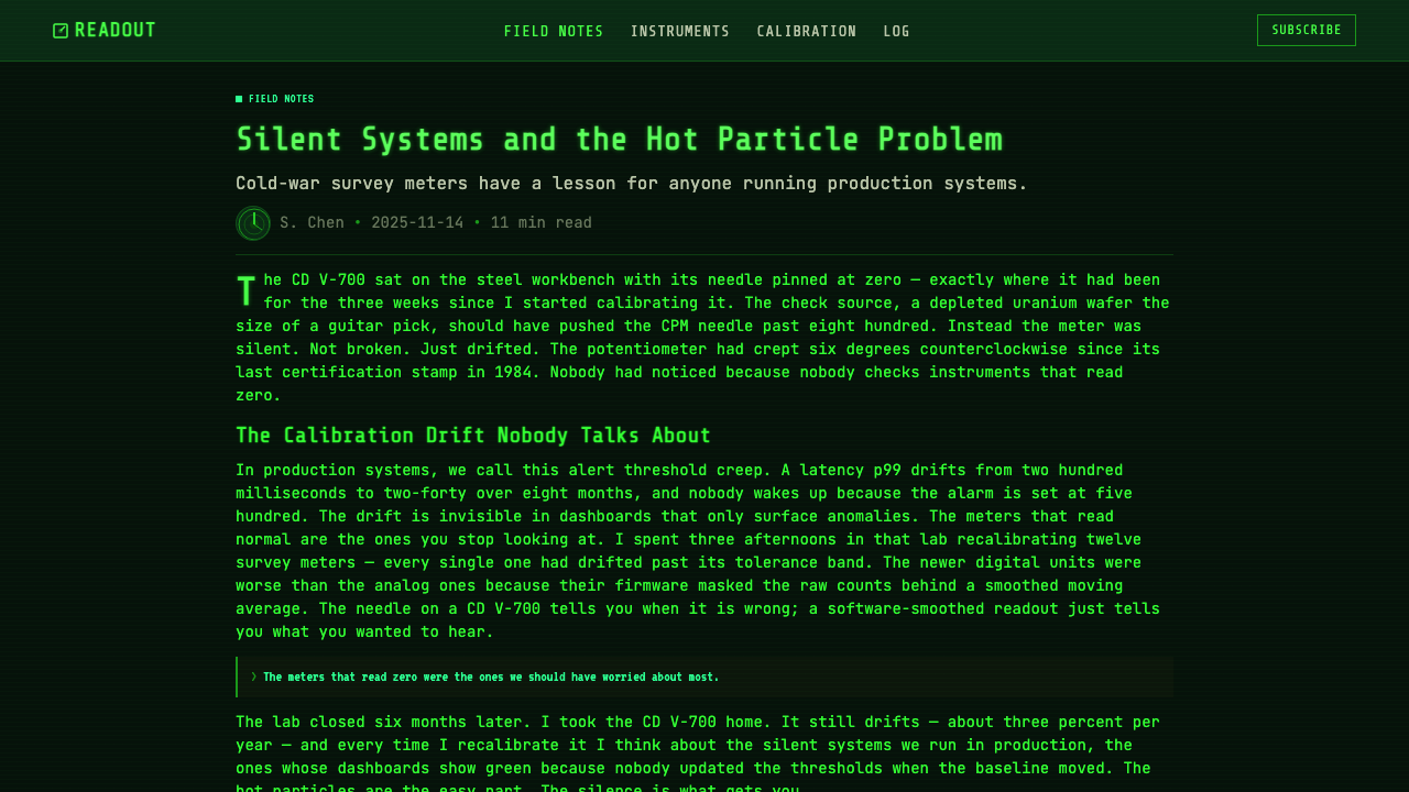
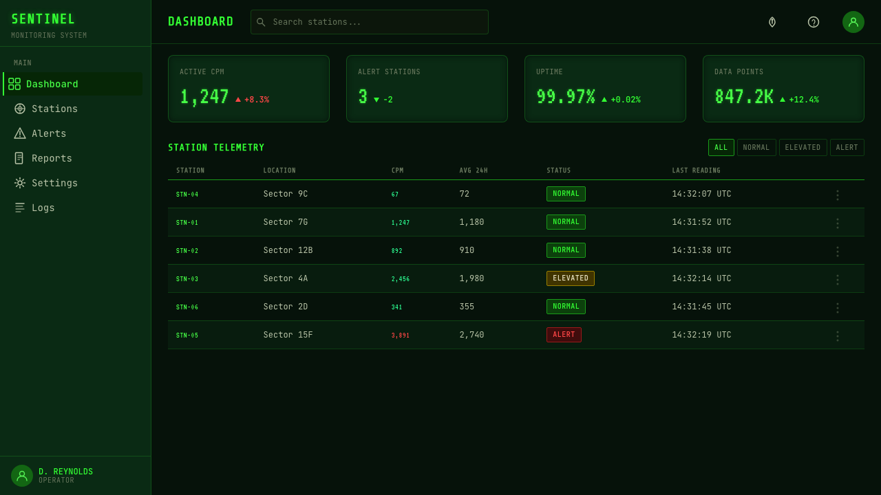
For web interfaces, Geiger Counter Green Readout suits monitoring dashboards, diagnostic tools, system consoles, and pricing pages framed as equipment tiers. A dashboard should reserve the brightest green for live measurements, warnings, or selected controls, while quieter green handles labels and historical values. Pricing cards can become instrument bays, each with a bordered enclosure, a prominent machine-like value, and a clearly illuminated action. Interaction feedback should resemble activation, signal acquisition, or a change in luminous intensity.
For editorial design, the theme works best for subjects involving instrumentation, radiation, computing, monitoring, or invisible systems. Long reading sections need calmer typography and generous black space, with scanlines and bloom concentrated around diagrams, pull readings, and section openings. Marketing pages can adopt the drama of a machine coming online: an opening readout establishes the promise, subsequent panels reveal capabilities as measured outputs, and the final action appears as the clearest active signal rather than an unrelated bright button.
The most common mistake is treating the style as generic green neon. Excessive glow, decorative circuitry, unrelated futuristic symbols, and luminous borders around every object turn a disciplined instrument into science-fiction scenery. Another mistake is applying scanlines uniformly at such visual strength that small text becomes difficult to read. Authentic use begins with measurement and hierarchy: decide what is being sensed, which value matters now, how status changes, and which panels support interpretation. The phosphor effects should make that system more believable.
A second practical mistake is relying entirely on segment numerals and terminal lettering. Those forms are excellent for counts, short labels, and operational states but tiring in extended prose. Keep long explanations in a restrained, highly legible monospaced or technical text face, and allow the segment vocabulary to identify readings rather than dominate every sentence. Contrast should come from luminous intensity, grouping, and scale, not from introducing many colors or competing type styles.
Geiger Counter Green Readout — FAQ
Is Geiger Counter Green Readout simply a retro computer-terminal style?
No. The green-phosphor terminal is one half of the system; the analog radiation survey meter is the other. Terminal imagery contributes monospaced text, aligned values, scanlines, and emitted characters. Survey instrumentation contributes the swinging needle, calibrated scale, bordered panel divisions, and the idea that the display represents a changing physical condition. Removing either lineage produces a narrower and less distinctive result.
Can the style be used on a light background?
Not without changing its central metaphor. P1 green-phosphor characters are read as light emitted from dark CRT glass, and the survey-meter atmosphere depends on a black instrument field. On a pale ground, green behaves like printed color rather than illumination, while scanlines and bloom lose their material logic. A light adaptation may borrow the typography or grid, but it is no longer a faithful Geiger Counter Green Readout treatment.
How much scanline texture and phosphor bloom should be visible?
Enough to establish the CRT surface, but never enough to interfere with measurement. Scanlines should become apparent when the viewer attends to the screen rather than announcing themselves before the content. Bloom should gather around high-intensity readings and active traces, leaving labels and small annotations comparatively crisp. If every mark has the same halo, hierarchy disappears and the display begins to look foggy instead of luminous.
Does every interface need a Geiger-counter needle?
No. The needle is valuable when the information has direction, range, intensity, or continuous change. It becomes misleading when attached to a purely categorical choice or an arbitrary decorative value. A terminal log, segment counter, phosphor trace, or bordered status grid can carry the theme without a gauge. When a needle is used, it should summarize meaningful data and respond as part of the instrument system.
Where does this style work poorly?
It struggles when warmth, daylight, softness, or broad emotional variety is central to the experience. The black field and concentrated green signal technical vigilance, which can make hospitality, lifestyle, wellness, or intimate storytelling feel unnecessarily severe. It also performs poorly when a product requires many simultaneous semantic colors, because its identity depends on a tightly unified phosphor palette. The style is strongest when monitoring and interpretation are part of the product's actual purpose.
Related design styles
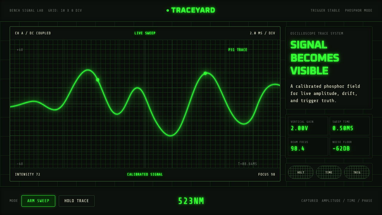 Oscilloscope TraceMeasurement glows. P31 green waveforms burn through a black graticule.
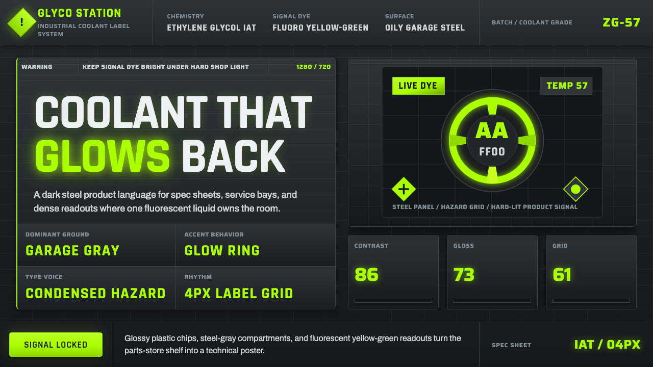 Fluorescent Antifreeze GreenCoolant becomes hazard signal. Fluoro green burns through steel-gray label gr…
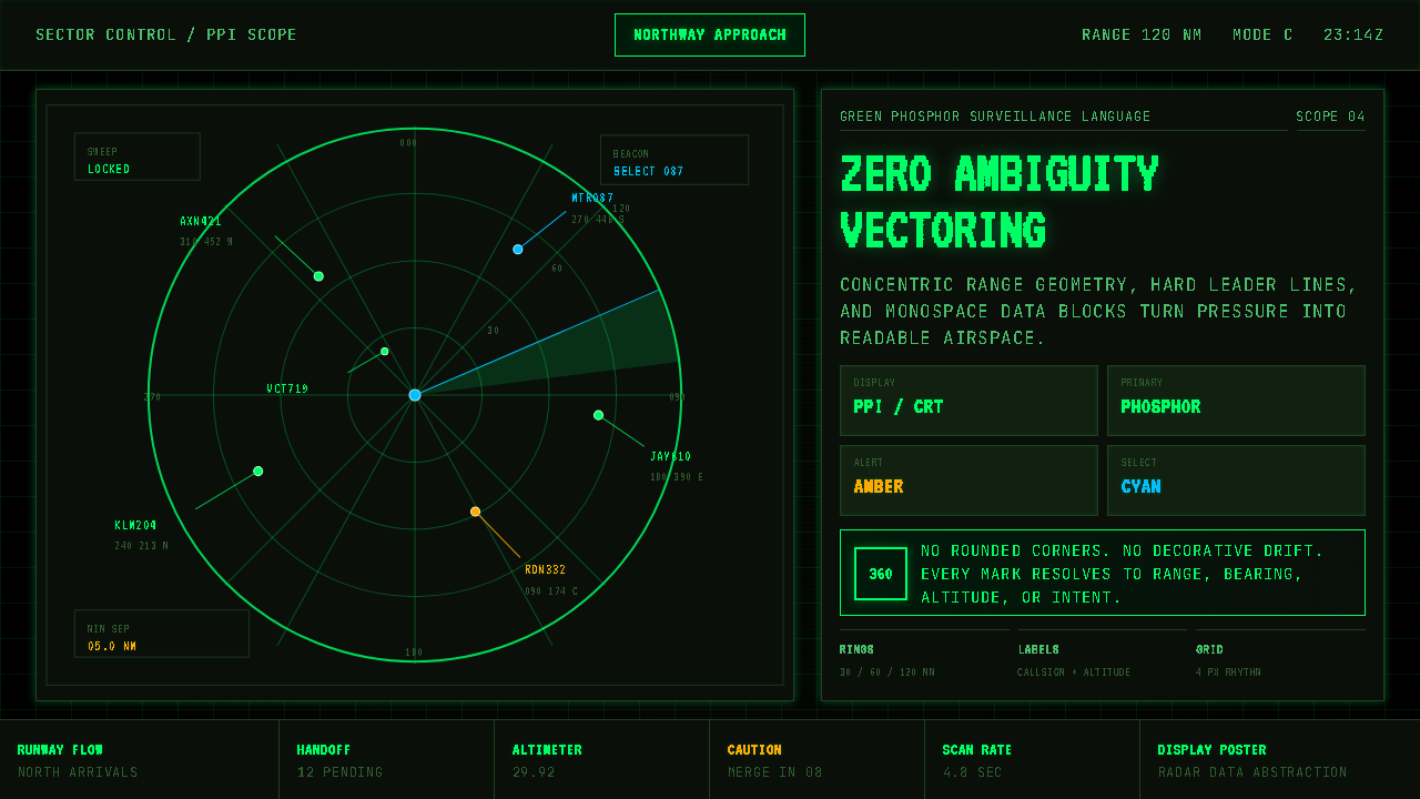 Air Traffic Control RadarOperational gravity. Phosphor green rings, sweep wedges, and monospace blips…
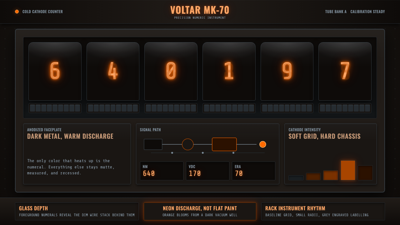 Nixie Tube DisplayHeat inside the machine. Neon-orange digits glow over black metal gridwork.
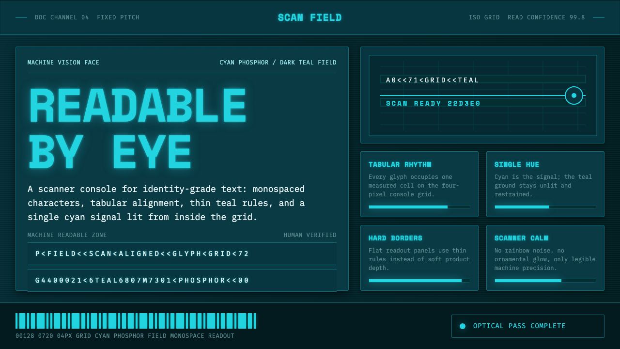 OCR-B Machine ReadableMachine vision, made calm. Cyan monospace glows on a dark teal scanner grid.
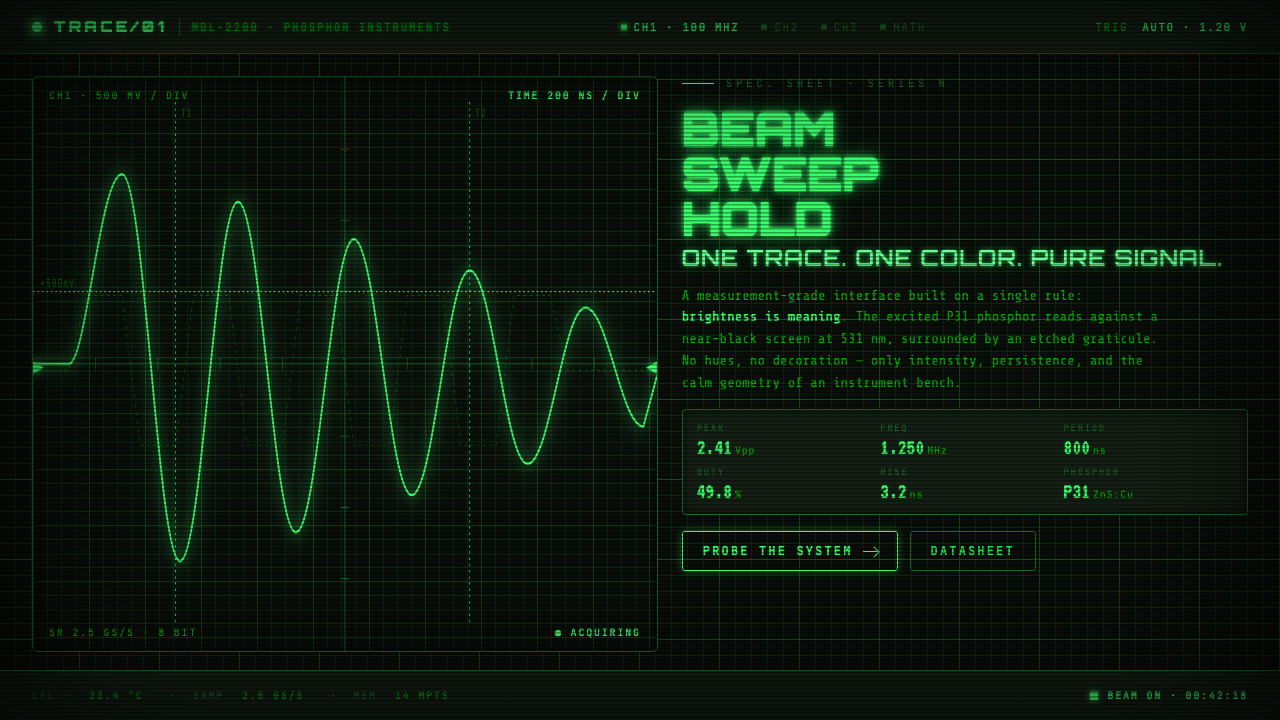 Oscilloscope WaveformBrightness is meaning. One P31 phosphor trace glowing across an etched gratic…