What is Oscilloscope Waveform?
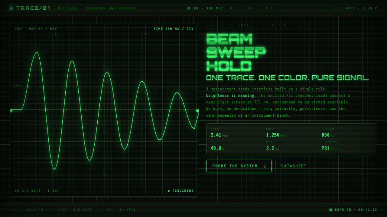
Brightness is meaning: a single P31 phosphor trace crossing an etched graticule turns the black screen into a precise, quietly luminous instrument.
Oscilloscope Waveform in brief
Oscilloscope Waveform distills the visual language of analog electronic test equipment from the mid-century laboratory: a near-black CRT field behind glass, a restrained internal graticule, and one energized line rendered in yellow-green P31 phosphor light. It does not imitate a generic retro computer display. Its reference point is the measuring instrument, where a waveform is not decoration or ambient animation but evidence: a visible record of electrical behavior.
The system is strictly monochrome. Everything belongs to one phosphor family at different states of excitation: the brilliant active trace, its modest bloom, the steadier residual glow, and the much dimmer etched grid. Black is not an empty background placed behind green elements; it is the visual condition that makes intensity legible. The interface therefore communicates through contrast, persistence, density, and motion rather than through a conventional multicolor hierarchy.
At its best, Oscilloscope Waveform feels instrument-grade rather than nostalgic. It suggests attention, calibration, and observation. The glow is controlled, never theatrical; the graticule is useful, never ornamental; the trace is the visual event. This makes the style especially compelling when a product needs to present live signals, measurements, diagnostics, or technical status with a sense of physical presence.
Where does Oscilloscope Waveform come from?
The style belongs to the visual culture of analog electronic measurement, especially the North American test-and-measurement laboratory environment from the 1950s through 1990. In that setting, an oscilloscope was a working instrument for making invisible electrical variation observable. Its display needed to preserve a direct relationship between signal and mark: a trace crossing a calibrated field could be read, compared, and discussed without decorative mediation.
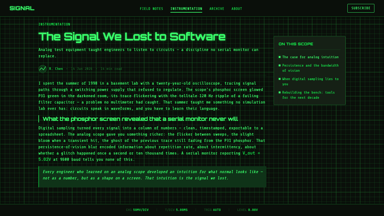
The cathode-ray tube established the style’s basic physical scene. A glass faceplate contained a dark viewing field, while an internal graticule supplied reference structure for judging shape, position, repetition, and change. Unlike a modern interface grid that often disappears into layout logic, the oscilloscope graticule remains visibly present because it serves the act of measurement. It gives the glowing trace scale and context without competing for attention.
P31 phosphor display technology gave the image its characteristic yellow-green luminosity. The phosphor’s response produces a bright excited mark against the dark tube face, with a short-lived bloom that makes a moving signal appear both exact and alive. That behavior matters aesthetically: the line is not merely colored green. It seems energized by the instrument, with intensity rising where the visual signal is most active and receding into a quieter afterglow.
Tektronix CRT and phosphor engineering helped define the technical and visual expectations associated with this family of displays. Howard Vollum and Jack Murdock are key figures in the broader test-instrument lineage represented by the style. Their context is important not because it supplies a decorative historical story, but because it explains the underlying ethic: the screen exists to reveal a phenomenon faithfully, and every visible component earns its place by helping that revelation.
What defines the Oscilloscope Waveform look?
Monochrome Intensity
Phosphor green is the entire chromatic vocabulary, but it is never visually uniform. The active trace carries the highest intensity, nearby bloom softens its edge without obscuring it, and the grid remains deliberately subdued. Hierarchy comes from excitation and contrast, not from assigning unrelated colors to different categories. Introducing accent colors breaks the premise that brightness itself carries meaning.
Black CRT Field
The background should feel like the deep face of a switched-on tube rather than a flat dark theme. It is quiet, absorbent, and nearly featureless away from the graticule. This darkness creates the room required for the trace to emit light perceptually. A busy backdrop, visible texture, or decorative image turns the screen from an observation surface into a stage set.
Etched Graticule
The graticule is a measured reference field, not a generic graph-paper pattern. Its lines should be faint, stable, and subordinate to the signal, suggesting that they are etched within the instrument rather than drawn over the content. It supports comparison and orientation while retaining enough visual distance that the trace can cross it cleanly.
Luminous Trace
One clear trace is the central actor. It can be sinusoidal, stepped, irregular, pulsing, or nearly still, but its shape must imply information rather than ornament. The line should retain a defined core even where it blooms. If it becomes too diffuse, it reads as neon atmosphere; if it becomes too thin and sterile, it loses the physical impression of phosphor excitation.
Short Persistence
The style benefits from the suggestion of short persistence: a restrained halo, a slight remnant of a prior position, or a brighter concentration where the signal appears energized. Persistence should explain motion and intensity, not create cinematic blur. The viewer should feel that the display is continuously drawing a signal in the present moment.
Instrument Restraint
Every element should behave like part of a measuring apparatus. Labels, readouts, rules, markers, and small indicators may appear when they clarify a state, but they should remain concise and aligned with the field. Decorative badges, rounded playful widgets, and expressive illustration weaken the authority of the system because they introduce a visual language unrelated to observation.
Who shaped Oscilloscope Waveform?
Tektronix CRT and phosphor engineering represents the technical lineage behind the clear, dark-field instrument display central to this style. Its relevance is not a logo-like association with vintage equipment, but the disciplined integration of tube face, graticule, trace brightness, and phosphor response into a coherent measuring surface.
Howard Vollum is a key figure in the North American analog test-and-measurement context from which this visual language emerges. His place in the story anchors the style in practical instrumentation: displays were expected to make electrical behavior inspectable, not merely impressive.
Jack Murdock is likewise associated with the analog test-instrument lineage behind the style. The significance of that lineage is an ethic of legibility: a signal, its reference field, and the evidence of its movement should remain immediately available to the trained observer.
How do you use Oscilloscope Waveform today?
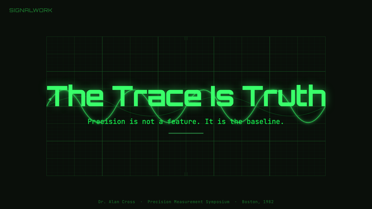
For presentation covers, use the waveform as a concentrated statement of subject matter. A near-black field, a subdued graticule, and one strong trace can frame a title about systems, research, audio, engineering, operations, or live data. The title should remain spare and visibly secondary to the signal’s presence. On content slides, treat the screen as an instrument panel: organize headings, notes, and key findings along the grid, and let only the most consequential status or figure take on trace-level brightness.
Data slides are a natural fit when the information genuinely concerns change over time, signal behavior, thresholds, or monitoring. A line chart can be treated as an energized trace, while markers and subdued reference rules inherit the role of the graticule. Avoid forcing every chart into a waveform metaphor. Tables, categories, and dense comparisons still need calm legibility; use the phosphor hierarchy to direct attention to a selected reading rather than turning all data into equally glowing noise.
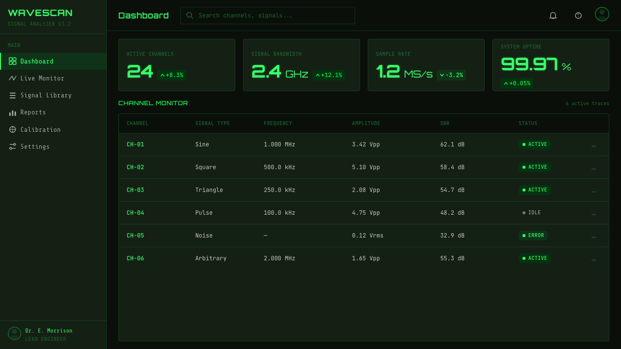
For web interfaces, the style is especially effective in dashboards, monitoring consoles, developer tools, audio analysis, and diagnostic surfaces. The main panel should read as a bounded display field with one obvious active signal. Secondary controls and labels belong around or within that field as restrained instrumentation. In pricing or product pages, the same language can convey technical confidence when used as a focused hero treatment, a product demonstration panel, or a live-status motif rather than as a glowing decoration applied to every section.
Editorial and marketing work benefits from the contrast between technical calm and visible energy. A feature story can use the graticule to structure pull quotes, timestamps, or annotated observations, while a single phosphor line guides the eye across a dark page. Product campaigns can use waveform imagery to suggest precision, responsiveness, and direct observation. The key is to preserve the screen’s sense of measurement: copy should read like an explanation of what is being observed, not like generic futuristic spectacle.
The common mistake is treating this style as neon cyberpunk. Saturated secondary colors, broad atmospheric glows, glassy decorative panels, random scan lines, and multiple competing waveforms turn a disciplined instrument display into visual noise. Another mistake is making the grid brighter than the data. Keep the system monochrome, let intensity establish hierarchy, and reserve the brightest state for the one signal or action that truly deserves it.
Oscilloscope Waveform — FAQ
Is Oscilloscope Waveform simply a retro-futurist or cyberpunk style?
No. It may overlap with those styles at a superficial level because it uses a dark field and luminous green, but its source is analog measurement rather than fiction. The defining question is whether the display behaves like an instrument. A restrained trace, a useful graticule, and meaningful intensity belong to Oscilloscope Waveform; decorative neon abundance does not.
Can the style use more than one waveform?
It can, when multiple signals are genuinely necessary to the measurement or comparison. However, the visual system is strongest when one trace remains clearly primary and the others recede through lower intensity or simpler treatment. If every line blooms equally, the viewer loses the immediate reading that makes an oscilloscope display useful.
Why must the graticule stay so dim?
Because the graticule provides context, while the trace provides evidence. In an analog instrument, the grid exists to help judge the signal’s shape and movement; it is not the subject of the display. Keeping it subdued preserves that relationship and makes the active trace appear physically brighter by comparison.
Does the style work for text-heavy interfaces?
It works best when text serves observation: concise labels, technical notes, values, alerts, and interpretation close to a signal. Long-form reading can become tiring on a luminous dark display, especially if too much text receives high contrast. For text-heavy material, use the waveform treatment as a framing or analytical panel and keep extended reading areas calmer and more conventional.
What makes a convincing phosphor glow?
A convincing glow begins with a defined bright trace and uses bloom as a consequence of that trace, not as an independent effect. The halo should be close, controlled, and tied to local intensity. The surrounding grid and labels need to remain quieter, so the eye reads one energized mark against a dark tube face rather than a uniformly luminous interface.
Related design styles
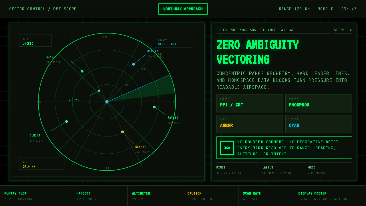 Air Traffic Control RadarOperational gravity. Phosphor green rings, sweep wedges, and monospace blips…
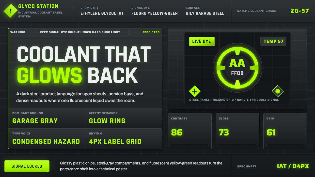 Fluorescent Antifreeze GreenCoolant becomes hazard signal. Fluoro green burns through steel-gray label gr…
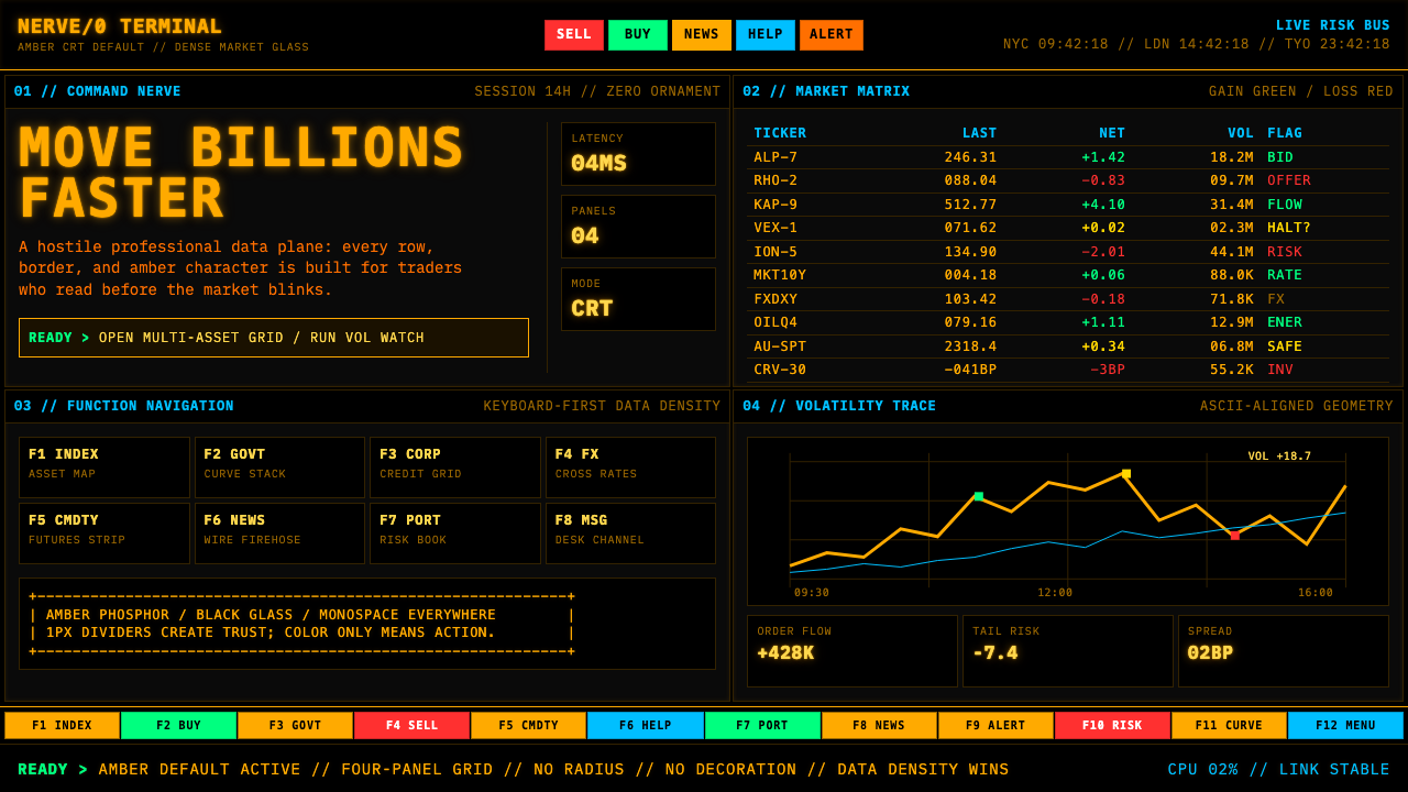 Bloomberg Terminal (Amber CRT)Hostile data authority. Amber mono grids and four hard panels make black glas…
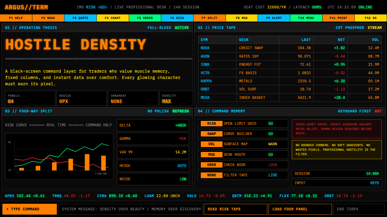 Bloomberg Terminal (CRT Green)Hostile density wins. Orange CRT mono, black grids, and four-panel data walls.
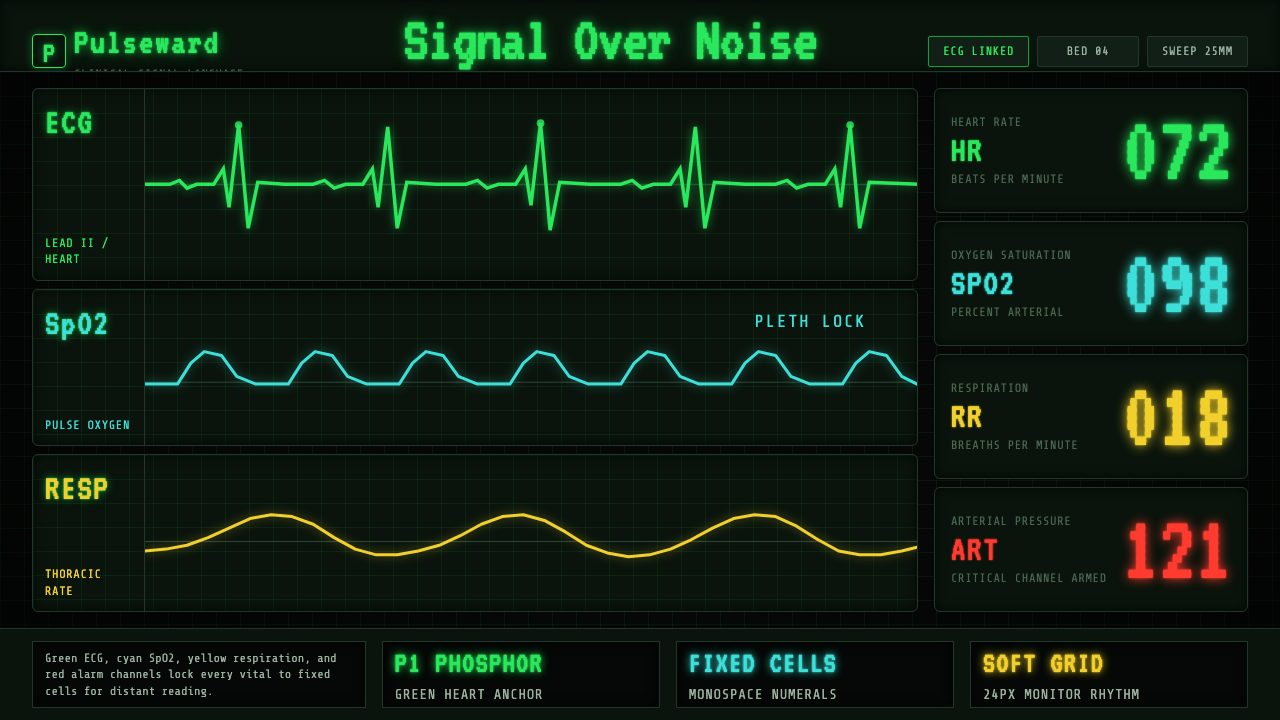 EKG Vital MonitorClinical clarity glows. Phosphor ECG green, cyan and yellow channels lock to…
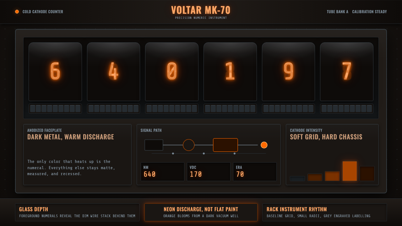 Nixie Tube DisplayHeat inside the machine. Neon-orange digits glow over black metal gridwork.