What is Leica M Black Paint?
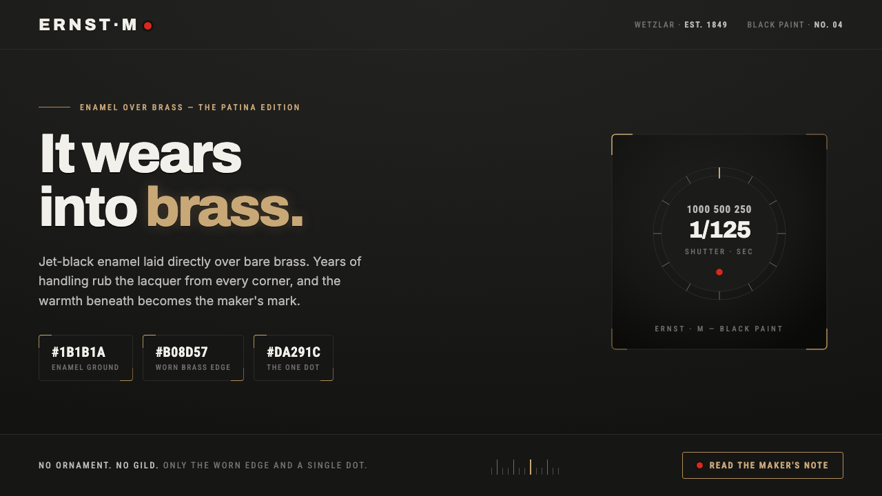
Leica M Black Paint turns wear into identity — jet-black enamel, warm brass at the edges, white-incised markings, and one perfectly restrained red dot.
Leica M Black Paint in brief
Leica M Black Paint is a visual language derived from the black-paint M2, M3, and M4 cameras associated with Wetzlar between 1950 and 1990. Its defining object is a deep matte-black enamel finish applied directly over bare brass. With use, the black wears away at corners and edges, revealing the warm metal underneath. The result is not damage disguised as decoration, but a record of contact, handling, and time.
The interface translation is deliberately narrow. Jet black establishes the ground; white enamel-like markings provide legibility; brass appears only where an edge, boundary, or selected detail should feel exposed; and the Leica red dot is held back as a single precise accent. The system gains its character from scarcity. Every visible color has a material or navigational role, and none is allowed to become general decoration.
The mood is quiet, technical, and tactile. Surfaces should feel like machined plates or handled equipment rather than polished software panels. Labels remain crisp against darkness, hierarchy is established through contrast and placement, and worn brass functions as evidence of use. The style is dark without becoming theatrical: its authority comes from restraint, precision, and the sense that every mark belongs to an object built to be operated.
Where does Leica M Black Paint come from?
The source of the style is the black-paint Leica M tradition, especially the M2, M3, and M4 made within the period from 1950 to 1990. The regional anchor is Germany and Western Europe, specifically Wetzlar, where the visual identity is tied to Ernst Leitz GmbH and the Leica M-system design team. The historical object is defined less by ornament than by a direct relationship between finish and underlying construction.
Black enamel over bare brass creates the essential temporal mechanism. When the finish is new, the camera reads as an uninterrupted black instrument. After years of handling, the coating recedes at the places most exposed to touch and friction. Brass does not appear as an added embellishment; it is revealed by use. That distinction is central to the design system, because it gives patina a logic of placement rather than treating aging as an all-over texture.
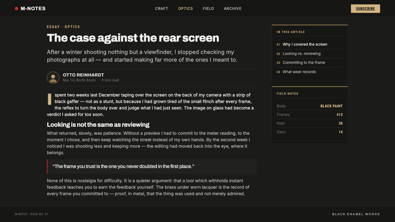
The style also belongs to a culture of photojournalism tooling. Press and documentary photographers wore the paint thin through repeated work, turning the camera into an archive of professional use. In this context, visible wear suggests familiarity and endurance. The object becomes more individual as it records the conditions of its life, while the white LEICA and ERNST LEITZ WETZLAR engravings remain crisp and functional.
The broader cultural frame combines German precision engineering, photographic equipment, and patina or wabi collector culture. The interface adaptation preserves those relationships instead of borrowing only the color scheme. Black is the working field, white is the inscription, brass is the exposed structure, and red is a singular point of recognition. The result should feel assembled around a tool and its history, not styled after a generic luxury object.
What defines the Leica M Black Paint look?
Black Ground
The dominant surface is deep, matte, and nearly uninterrupted. Black gives the interface the density of a camera body and allows every lighter mark to read as an inscription or exposed edge. It should feel substantial rather than glossy, with broad fields of darkness creating calm between functional elements.
Brassing
Brass is the signature highlight, but it belongs to edges, corners, seams, and points of contact. It should appear as a consequence of wear, never as a broad decorative fill. The warm metallic note is strongest when surrounded by black and used to suggest exposure, age, or a boundary that matters.
White Incisions
White markings behave like enamel-filled engravings cut into a dark instrument. Labels should be crisp, direct, and easy to scan, with no need for ornamental display treatment. Typography is strongest when it feels applied to the object through naming, indexing, and operational instruction.
Material Hierarchy
The system has a strict visual order: black carries the field, white carries information, brass carries exposure and patina, and red carries recognition. This hierarchy prevents the interface from becoming a general dark theme. Each color corresponds to a different material or communicative condition, so contrast always feels purposeful.
Tool-Like Composition
Layouts should feel organized for handling rather than arranged for spectacle. Panels, controls, labels, and indicators can be treated as parts of a precision instrument. Repetition is useful when it clarifies operation; empty black space is useful when it separates one working area from another. The composition gains authority through order and restraint.
Single Red Accent
The Leica red dot is a recognition mark, not a secondary palette. It should identify a focal action, status, or brand moment with exceptional economy. Turning red into a background, repeated badge system, or general call-to-action color weakens the reference. Its power comes from being unmistakably present and otherwise absent.
Who shaped Leica M Black Paint?
Ernst Leitz GmbH anchors the style in the manufacturer and Wetzlar context supplied by the black-paint Leica M tradition. Its importance here is not treated as a decorative brand reference, but as the source of an object whose finish, engraved naming, and exposed brass are inseparable from its identity.
The Leica M-system design team represents the coherent relationship between camera body, finish, markings, and operation. In the visual adaptation, this relationship becomes a design discipline: surfaces remain subordinate to use, labels remain legible, and accents are limited to the details that deserve recognition.
Press and documentary photographers are the users who wore the paint thin and made brassing culturally meaningful. Their repeated handling transformed finish into evidence. In the interface, that legacy encourages visible restraint: signs of use should appear where interaction is plausible, while the underlying system remains dependable and clear.
How do you use Leica M Black Paint today?
For presentation slides, use the black ground as a confident cover field with a small red recognition mark and a restrained brass edge or exposed corner. Content slides should read like labeled instrument panels: white titles and annotations, clear grouping, and enough black space to keep each section separate. Data slides can use brass to identify the most consequential comparison or selected measure, while red remains reserved for one decisive alert, point, or conclusion.
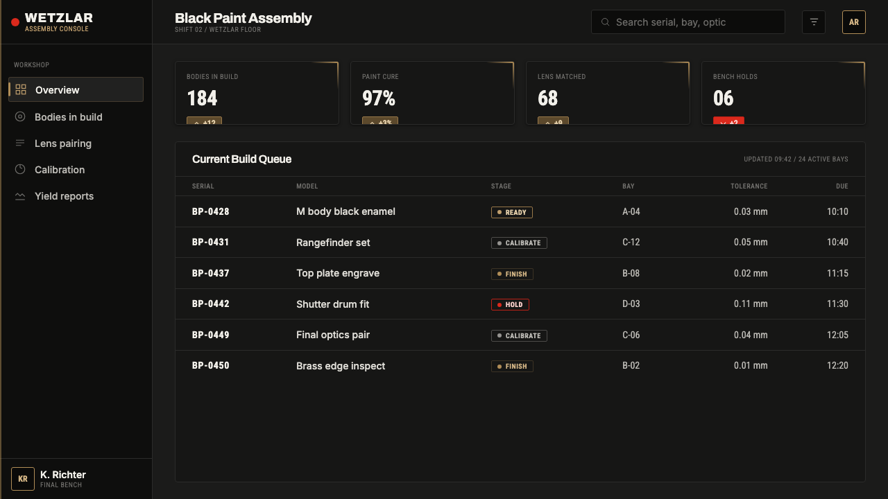
For web interfaces, the style suits dashboards, monitoring tools, pricing pages, and products that want to communicate durable precision. Keep the main working surfaces black, use white for navigation and labels, and let brass appear on active boundaries, selected controls, or carefully chosen separators. Pricing tiers should be differentiated by hierarchy and naming before color; a single red marker can identify the recommended or urgent state without turning the page into a red interface.
For editorial and marketing work, build the page as a dark photographic tool rather than a luxury brochure. Headlines can feel engraved into the black field, while brass appears along a cropped object edge, a worn corner, or a narrow rule that suggests contact. Marketing imagery should emphasize the relationship between use and identity: the camera, the hand, the working environment, and the marks that accumulate through service. The red dot works best as a quiet signature at the moment of recognition.
The most common mistake is treating the style as a generic black-and-gold theme. Broad brass surfaces, repeated red highlights, decorative metallic effects, and simulated wear applied everywhere all contradict the source object. The correct question is where the finish would naturally recede, where a label would need to remain readable, and which single detail deserves recognition. If every element looks aged, metallic, or accented, nothing feels used, precise, or rare.

Leica M Black Paint — FAQ
Is Leica M Black Paint simply a dark-mode interface?
No. Dark mode uses darkness primarily as a display condition, while Leica M Black Paint uses darkness as the body of an object. Its black surface is tied to bare brass beneath, white markings are tied to engraved naming, and the red dot is tied to recognition. Without those material relationships, the result is only a dark palette, not this style.
Why should brass appear only at worn edges?
Because brassing is the visual record of use. On the source camera, black enamel recedes where handling and contact are greatest, exposing the brass underneath. If brass becomes a broad surface color, it stops reading as revealed structure and starts reading as decoration. Restricting it to edges preserves the logic of patina.
Can the red dot be used for every important action?
It can identify a singular focal action or state, but it should not become the general language of importance. The red dot works because it is precise and scarce. Repeating it across every button, badge, warning, or background removes its recognition value and breaks the material hierarchy.
Does the style require visible distressed texture?
No. The defining idea is selective exposure, not artificial aging. Wear should be implied through a corner, boundary, or contact point that makes sense within the composition. A clean black field with one convincing brass reveal is more faithful than an interface covered in scratches, noise, or decorative patina.
Related design styles
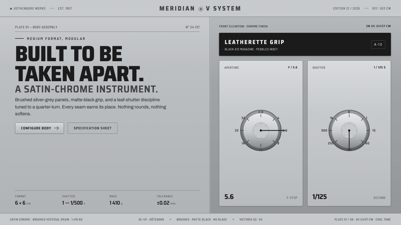 Hasselblad 500C ChromeBuilt to be taken apart. Brushed silver-grey panels, matte-black leatherette,…
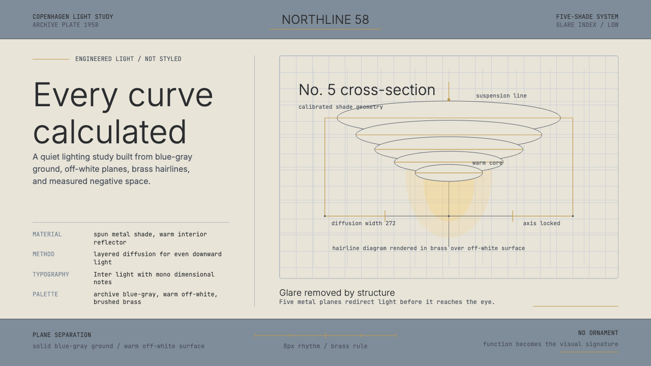 Danish PH5 Louis Poulsen (1958)Engineered, not styled. Blue-gray ground, brass hairlines, and a precise shad…
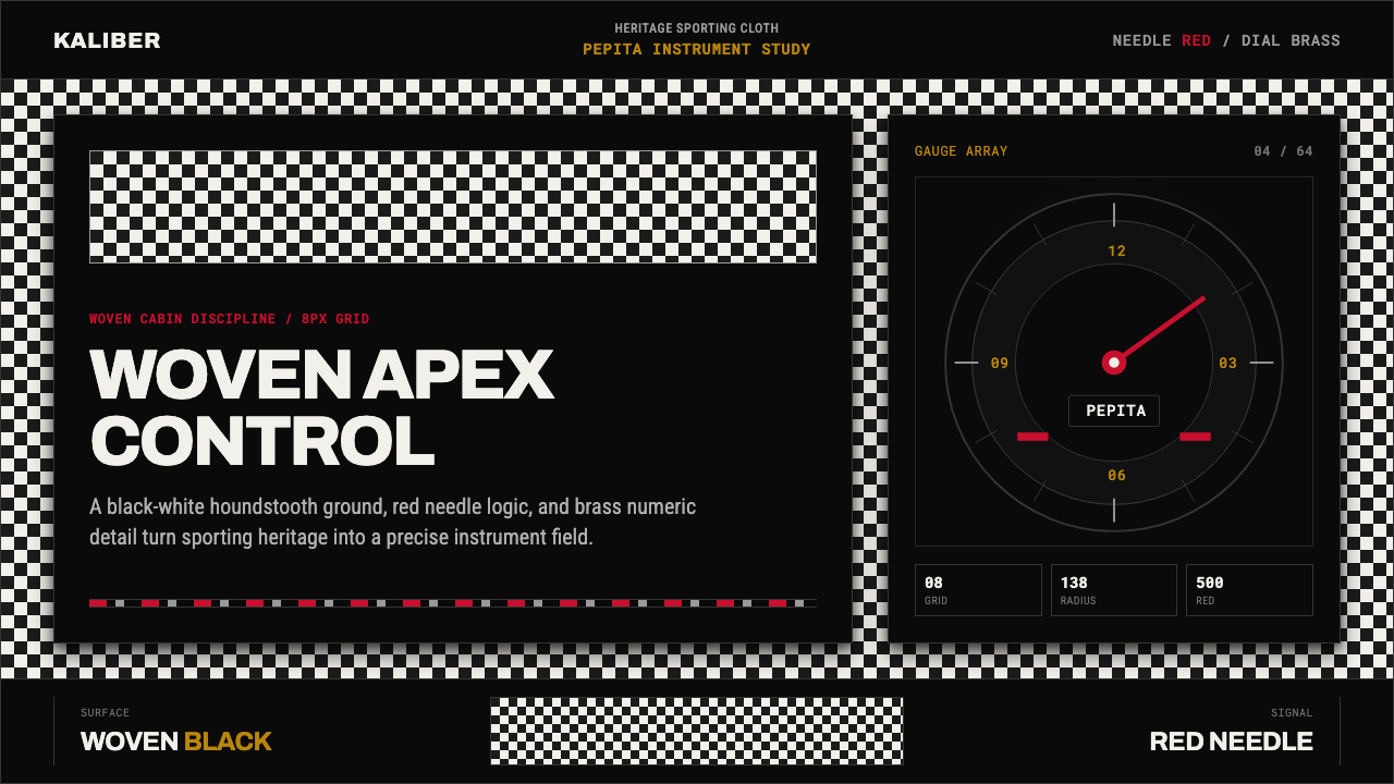 Porsche PepitaHeritage runs on instruments. Pepita checks, brass numerals, and red needles…
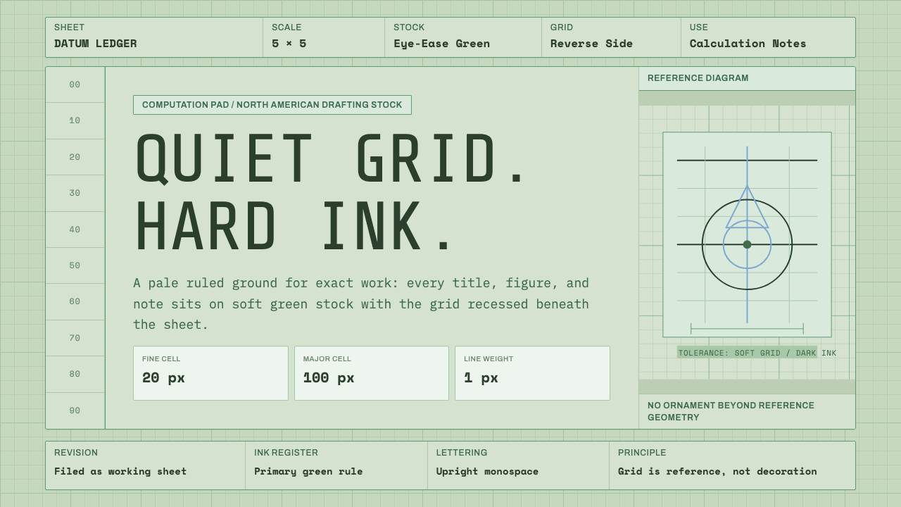 Engineering Graph PadQuiet precision. Eye-ease green, monospace title blocks, and a faint reverse-…
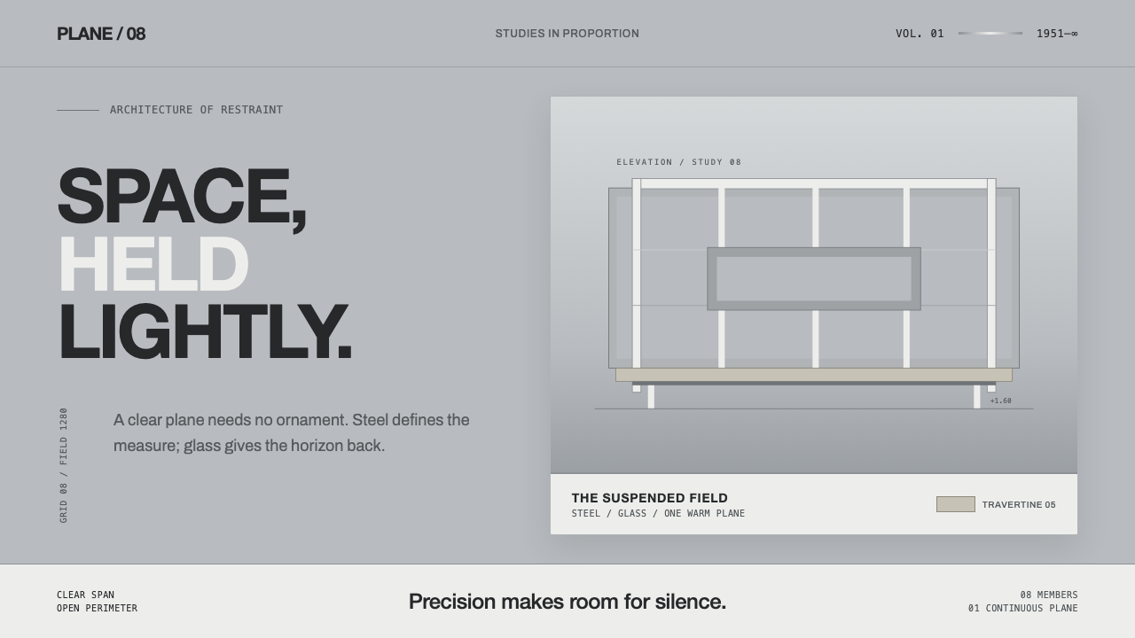 Farnsworth HouseWeightless by precision. White steel planes float across reflective gray with…
 Microfiche ArchiveRecords as lit frames in a matrix. Cyan-blue back-lit panel, glowing mono typ…