What is Porsche Pepita?
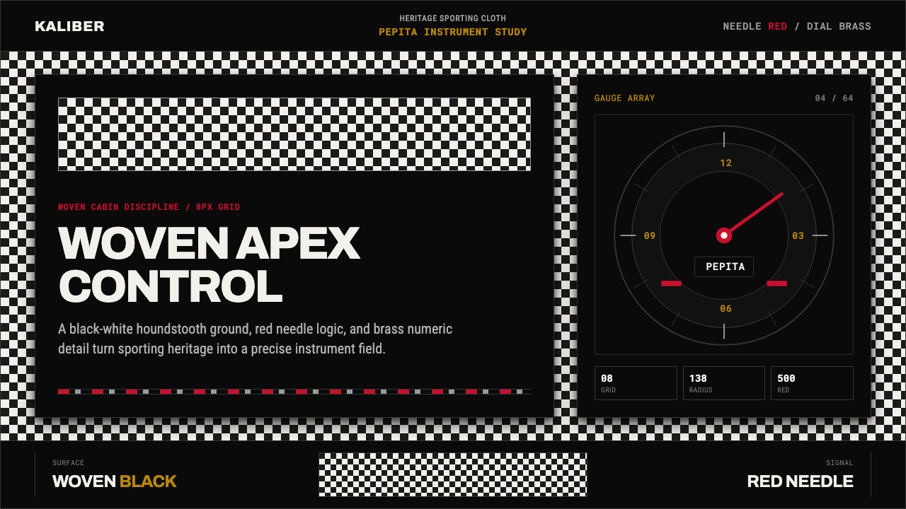
Porsche Pepita takes the small black-and-white check woven into the seats of the classic 911 and turns it into a cockpit language of pattern, brass numerals, and red needles.
Porsche Pepita in brief
Porsche Pepita is a heritage-sporting interface built around the small woven houndstooth check — known in the trade as pepita cloth — that lined the seat inserts of the classic 1960s Porsche 911. It is not a costume of racing stripes and spoilers; it is the quieter, more disciplined visual world of the cabin itself: woven fabric, brushed and painted metal, and a circular instrument cluster lit from within.
The system pairs the fine black-and-white check with Guards Red as the single accent color, set against a dark graphite or near-black ground that reads as the inside of a coupe at dusk. Everything else stays deliberately quiet — brushed aluminum bezels, painted matte surfaces, chrome-ringed dials — so that the red needle sweeping across a numbered gauge face becomes the one moment of drama in an otherwise composed, engineered environment.
Structurally, the aesthetic behaves like an instrument panel rather than a poster: information is arranged in fixed circular zones, labels are set in a condensed, evenly-spaced engineering sans derived from the same German road-and-dial signage tradition that produced automotive gauge faces, and every surface transition is a clean seam rather than a decorative flourish. The mood is mechanical precision worn as heritage, not nostalgia for its own sake.
Where does Porsche Pepita come from?
The pattern itself is far older than the car. Houndstooth — a broken, jagged check of alternating light and dark — descends from shepherd's plaid woven in the Scottish Borders for centuries, prized because the irregular broken edge hid dirt and wear better than a clean stripe. By the nineteenth century the pattern had migrated into fashionable tailoring across Britain and the Continent, and a finer, smaller-scale version of the check — sized down almost to a texture rather than a visible motif — became popular in mid-century European upholstery and suiting under the name pepita, a term that stuck in German and French textile trade language for this tightly-woven miniature houndstooth.
Porsche adopted pepita cloth for the 911's seat centers in the mid-1960s as a practical alternative to leather: it wore well, showed less fading in sunlight, and gave the cabin a textured, almost tweed-like warmth that read as understated rather than showy. Unlike the exterior of the car, which was sculpted by Ferdinand "Butzi" Porsche's styling studio into the clean, unbroken silhouette the 911 is still recognized by today, the interior fabric choice was a quieter, craft-level decision — closer to tailoring than to automotive sculpture — and it became one of the most requested heritage details on later reissues.
The instrument side of the aesthetic has its own separate lineage. Porsche's five-dial dashboard, with its central tachometer flanked by smaller circular gauges, was engineered in partnership with German instrument specialists of the period, the same firms that supplied gauge faces across the German automotive industry. Their house style — white or cream numerals on a dark face, a slim red needle, condensed sans-serif digits spaced for legibility at speed — became as recognizable as the bodywork itself, and it is this instrument-cluster vocabulary, as much as the seat fabric, that gives the system its mechanical authority.
Ferry Porsche, who steered the company from his father's engineering consultancy into an independent sports-car maker after the Second World War, insisted that the 911's cabin feel like a tool built for a specific purpose rather than a showroom ornament — a philosophy that Erwin Komenda, the company's longtime chief body engineer, carried into every seam and panel gap of the car. That insistence on restraint is why the pepita check, rather than a louder pattern, survived as the interior's signature: it added warmth and craft without ever competing with the instruments for attention.
What defines the Porsche Pepita look?
Color
The palette is almost monochrome — black, white, and graphite carrying the bulk of every surface — with Guards Red reserved as the single accent that marks needles, warning marks, and key interactive moments. Because red appears so rarely against the dark ground, it reads as urgent and precise rather than decorative, the way a single red line reads on a technical drawing.
Pattern and Texture
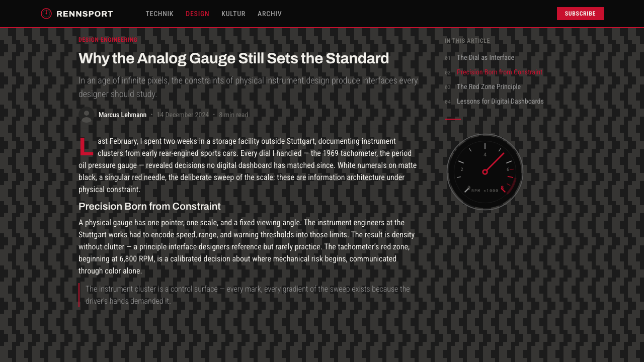
The houndstooth check is applied as a woven ground texture, never scaled up into a bold graphic motif. It sits quietly behind or beneath primary content — a seat-insert texture, not a wallpaper pattern — so it reads as material rather than illustration. Overusing it at large scale is the fastest way to break the effect.
Typography
Numerals and labels borrow the condensed, evenly-spaced logic of German instrument-face signage: tight letterforms designed for legibility at a glance rather than for personality. Headline text stays plain and structural; the typographic drama, if any, belongs to the gauge numerals, not to display type.
Geometry and Layout
Composition centers on circular zones — the gauge face is the fundamental unit — arranged in a fixed horizontal row the way a dashboard arranges its dials. Rectangular panels around the circles behave like bezels: functional frames, not decorative borders.
Material Honesty
Every surface reads as what it claims to be: woven cloth looks woven, brushed metal looks brushed, painted panel looks matte-painted. There is no simulated leather grain standing in for fabric and no glossy plastic pretending to be chrome — the system's credibility depends on that discipline.
Light and Shadow
Light behaves like cabin lighting at dusk: a warm, localized glow around the gauge faces against an otherwise dark field, rather than an even, bright wash. Shadows are soft-edged and low-contrast outside the instrument zone, letting the illuminated dials do all the visual work.
Who shaped Porsche Pepita?
As head of the company's styling studio, Butzi Porsche shaped the 911's exterior silhouette into the unbroken, understated form still recognized today. His preference for restraint over ornament set the tone that let a quiet fabric like pepita read as heritage rather than filler.
Ferry Porsche steered his father's engineering consultancy into an independent sports-car manufacturer after the Second World War and insisted the 911's cabin feel like a purpose-built tool rather than a showroom object — the guiding idea behind the car's understated, instrument-led interior.
As the company's longtime chief body engineer, Komenda translated Butzi Porsche's styling into the exacting seams and panel fits that made the 911's cabin feel machined rather than assembled — the same precision that carries over into how this system treats surface transitions.
The specialist firms that supplied Porsche's five-dial gauge clusters established a house visual style — white numerals on a dark face, a slim red needle, condensed digits spaced for legibility — that became as recognizable as the car's bodywork and remains the direct source of this system's instrument vocabulary.
How do you use Porsche Pepita today?
Applying Porsche Pepita well means treating pattern and instrumentation as two separate jobs rather than one decorative layer. The houndstooth texture supplies warmth and material credibility in the background; the red-on-dark gauge language supplies focus and hierarchy in the foreground. Confusing the two — putting bold pattern where the eye needs to read data — is the fastest way to lose the system's clarity.
For presentation slides, a cover page works well with the pepita texture as a quiet full-bleed ground and the title set in plain, confident type near a single red accent mark, echoing a dial face. Content slides should keep the check to a thin strip or corner texture and let information sit on clean dark or near-white panels; data slides benefit most from the system, since bar values and progress indicators map naturally onto the red-needle-on-gauge metaphor.
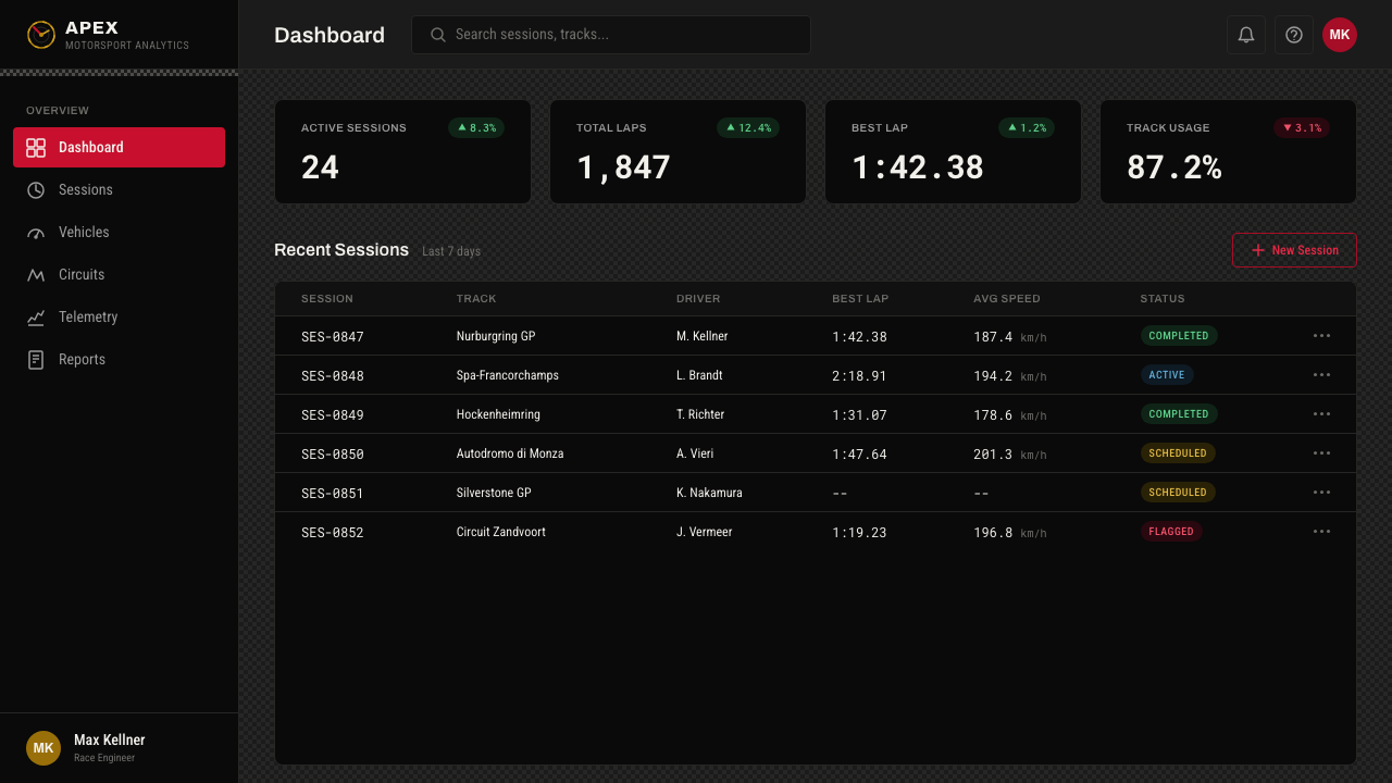
For web interfaces, the system suits dashboards, settings panels, and pricing pages where a small number of values need to command attention against a calm, premium background. Circular progress indicators, radial gauges, and single-accent status badges all borrow directly from the instrument-cluster logic; navigation and body text should stay in the quiet graphite-and-white register so the red accent keeps its rarity value.
For editorial and marketing work, the pattern reads well as a textured section divider or a subtle background on a heritage-brand feature story — automotive, horological, or craft-goods content in particular. Marketing pages can use full-bleed dark panels with a single red call-to-action button as the one moment of saturated color on the page.
A common mistake is treating this as a generic checkered pattern and scaling it up into a loud, all-over graphic, or introducing a second bright color alongside the red. Both moves undo the discipline the system depends on: the check should stay small and textural, and red should remain the only color allowed to demand attention.

Porsche Pepita — FAQ
Is pepita the same thing as houndstooth?
Pepita is a finer, smaller-scale relative of houndstooth. Houndstooth is the broader family of broken checks descended from Scottish shepherd plaid; pepita refers specifically to a tightly-woven miniature version of that check, popular in mid-century European upholstery and tailoring, that reads almost as a texture rather than a visible pattern at a distance. Porsche's seat fabric is a pepita weave, which is why it feels closer to a material than a graphic.
Does this style work outside automotive contexts?
Yes — the underlying language is heritage craftsmanship plus precision instrumentation, which translates well to watches, audio equipment, tailoring, and any premium product story built on engineering pedigree. The gauge-and-needle metaphor works for any interface that needs to communicate a small number of precise values with authority.
How much red is too much red?
As a rule of thumb, red should never cover more than a small fraction of any given screen or panel — it works as a needle, a mark, a single button, or a thin rule, not as a background or a large shape. The moment red starts competing with itself for attention, the system loses the single-accent discipline that gives it authority.
Can the houndstooth pattern be replaced with a different check?
Substituting a different check undercuts the specific heritage reference. Larger tartan-style plaids, gingham, or diagonal windowpane checks read as entirely different design traditions with different cultural associations; the small, broken pepita weave is what ties the system back to mid-century automotive upholstery rather than to fashion or interior-design checks in general.
Does the system need a dark background to work?
It works best on a dark ground because that is how the original cabin reads — instrument faces glowing against near-black surroundings. A light-ground variant is possible, but it must invert carefully: keep the gauge faces themselves dark so the red needle and white numerals still read as illuminated instruments rather than flat icons on a bright page.
Related design styles
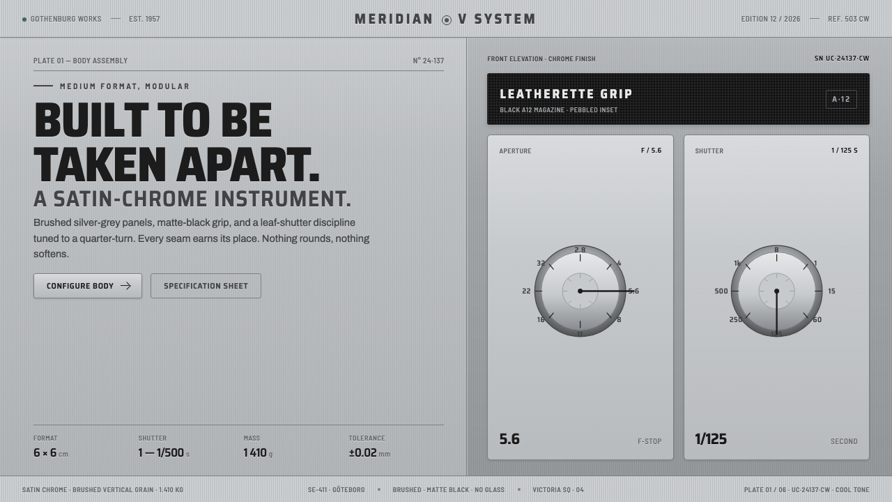 Hasselblad 500C ChromeBuilt to be taken apart. Brushed silver-grey panels, matte-black leatherette,…
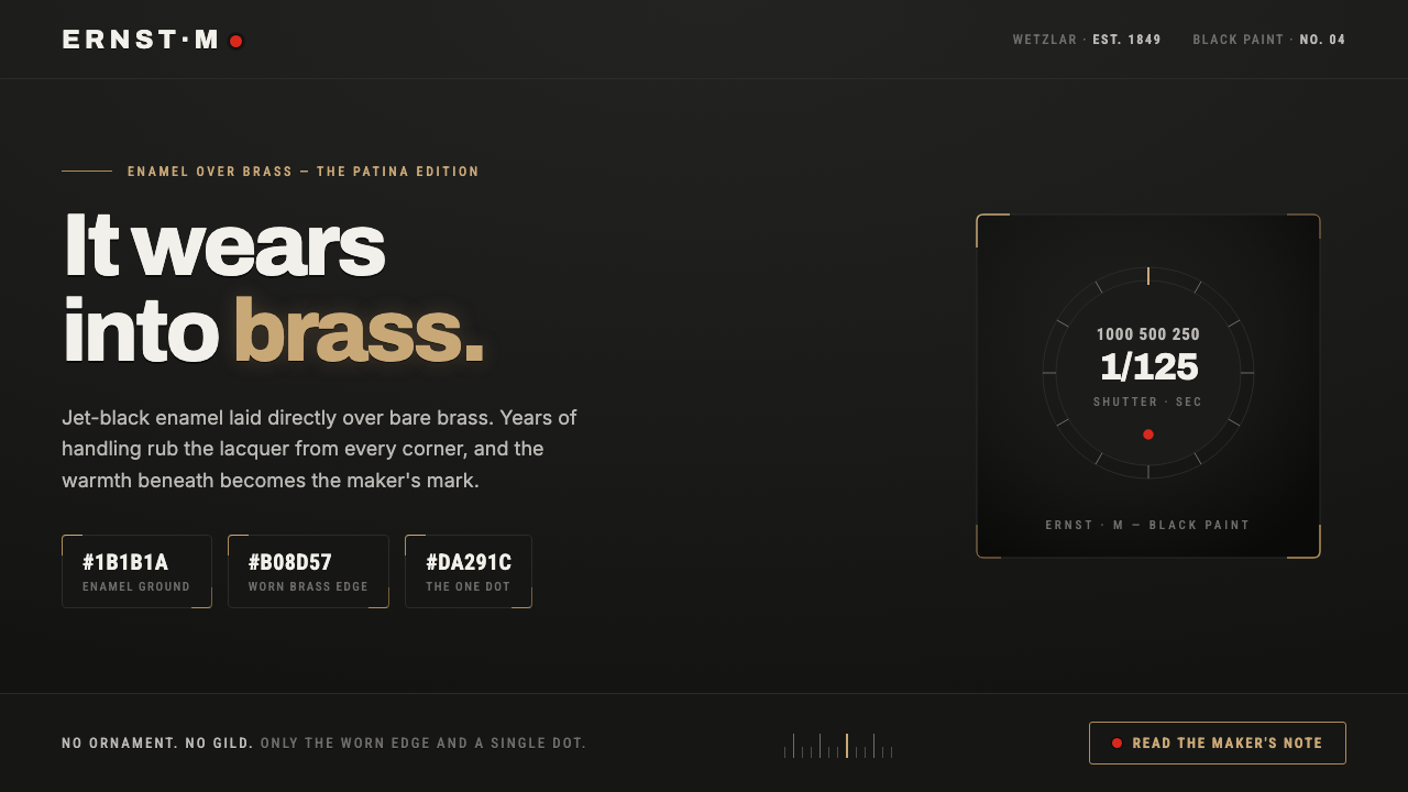 Leica M Black PaintIt wears into brass. Jet-black enamel over bare brass, exposed only at worn e…
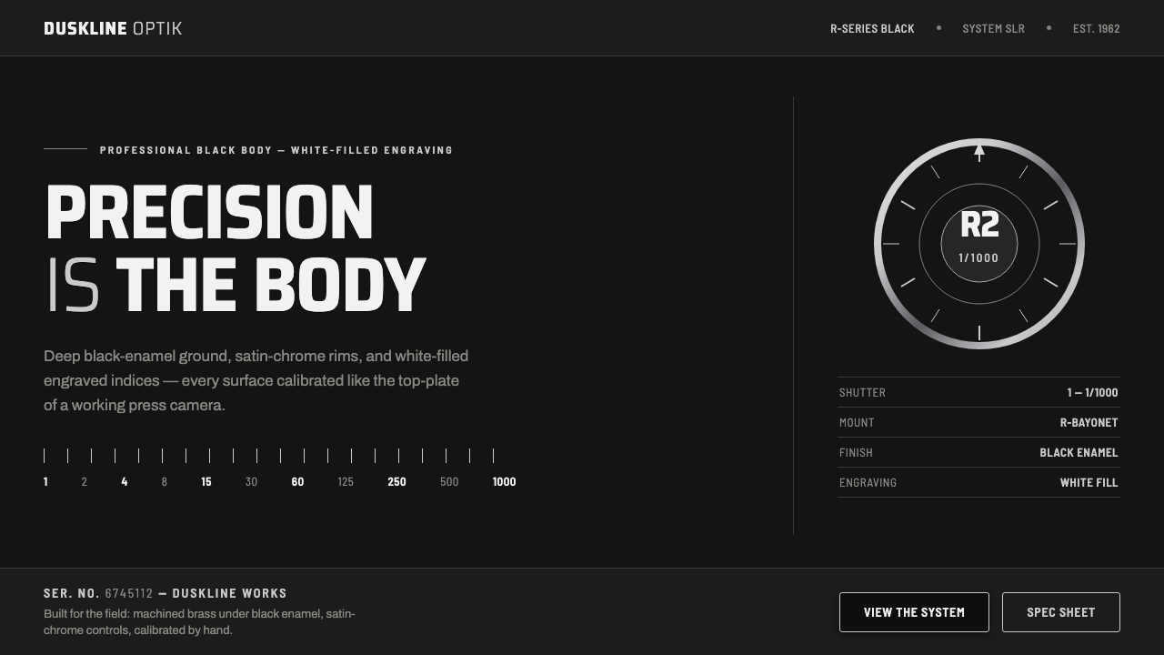 Nikon F Professional BlackMechanical precision as brand. Black-enamel ground, chrome rims, white-filled…
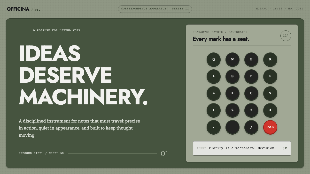 Olivetti LetteraEngineered, never styled. Grey-green enamel, precise type blocks and one red…
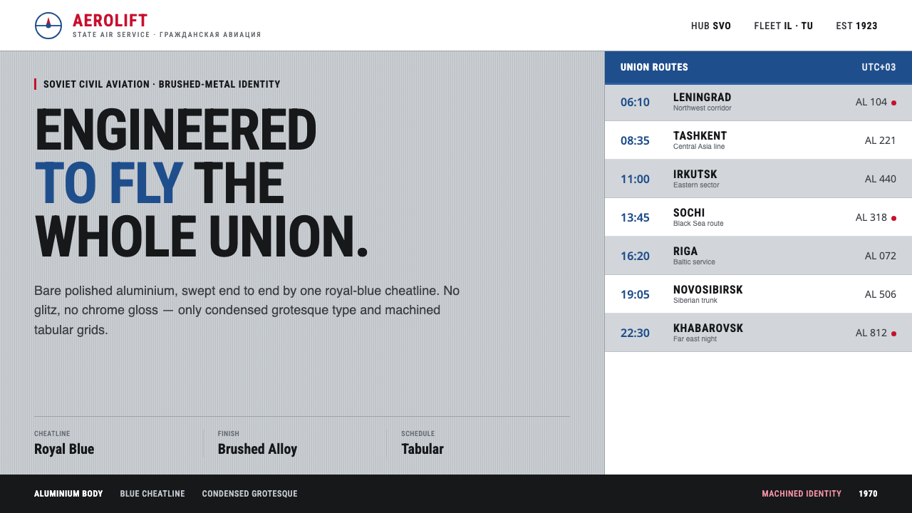 Aeroflot Soviet AirlineEngineered restraint rules. Silver ground, royal-blue cheatlines, and flat gr…
 Danish PH5 Louis Poulsen (1958)Engineered, not styled. Blue-gray ground, brass hairlines, and a precise shad…