What is Shinkansen Bullet?
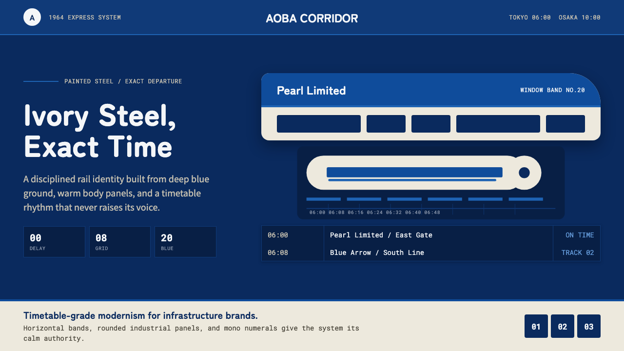
Shinkansen Bullet is timetable authority made visual — an ivory-steel body and a deep blue band, moving with the exact, unhurried restraint of a train that is never late.
Shinkansen Bullet in brief
Shinkansen Bullet takes its visual language directly from the 0 Series Shinkansen, the train that opened Japan's Tokaido high-speed rail line on 1 October 1964, days before the Tokyo Olympics, and instantly became the visual emblem of a rebuilt, forward-looking postwar Japan. Its design is restrained and exact rather than futuristic or flamboyant: a warm ivory-white painted-steel body, a deep window band and lower stripe in the specific blue developed for the train, and a smoothly rounded nose that reduced wind resistance while giving the train its unmistakable, bullet-like silhouette.
The defining quality of the style is discipline expressed through precision rather than ornament. Everything about the visual system — the crisp horizontal division between ivory and blue, the perfectly consistent width of the window band running the length of the train, the rounded but unadorned nose — communicates the same value the train itself was built to embody: exact, dependable performance, delivered without excess or flourish. There is no chrome trim for its own sake, no decorative badge beyond functional signage; the design is entirely in service of legibility and speed.
Visually, the palette stays clean and industrial: ivory-white dominates the body, a deep, saturated blue marks the window line and lower stripe, and a small amount of red or other accent color appears only in functional signage — line numbers, safety markings, station indicators. Nothing glows, gradients, or simulates depth; every surface reads as painted steel under clear daylight, evoking a machine built for exactness rather than spectacle.
Where does Shinkansen Bullet come from?
The Shinkansen project emerged from postwar Japan's determination to rebuild not just its infrastructure but its international reputation, and the timing of the launch — deliberately scheduled to open just before the 1964 Tokyo Olympics, the first Olympics held in Asia — made the train an explicit statement to the world that Japan had transformed itself in under two decades from wartime devastation into a technologically advanced, orderly, modern nation. The Tokaido line connected Tokyo and Osaka, Japan's two largest economic centers, cutting travel time dramatically and symbolizing the speed of the country's economic recovery as much as the speed of the train itself.
The project's chief institutional champion was Shinji Sogo, president of Japanese National Railways, who pushed the high-speed rail concept through intense political and financial opposition — many officials at the time considered dedicated high-speed passenger rail an outdated, overly expensive gamble in an era increasingly oriented toward highways and air travel. Sogo staked his reputation and ultimately his position on the project, resigning before its completion amid cost overruns, but living to see the line's triumphant opening vindicate the wager.
The engineering vision was realized by Hideo Shima, the chief engineer who led the design of the 0 Series train itself. Shima drew on aeronautical engineering principles — he had previously worked on aircraft design — to shape the train's rounded nose for reduced aerodynamic drag at speeds no passenger train had previously sustained, and he oversaw the specific ivory-and-blue livery that became the train's permanent visual signature. The color scheme was not arbitrary: the warm ivory body was chosen to appear clean and modern against any backdrop, while the deep window-band blue, officially specified as JNR Bullet Blue, gave the train a serious, authoritative visual anchor without resorting to bright or playful color.
The 0 Series ran in continuous service for over four decades, retiring in 2008, and during that time its silhouette and livery became so closely identified with Japan itself that the design has rarely been substantially altered across subsequent Shinkansen generations — later trains have grown faster and more aerodynamically refined, but the ivory-and-blue color logic and the ethos of exact, unornamented discipline it represents have remained a constant thread through Japanese high-speed rail design for six decades.
What defines the Shinkansen Bullet look?
Color
A warm ivory-white dominates the body, chosen to read as clean and modern against any backdrop of sky, station, or landscape. A deep, saturated blue marks the window band and lower stripe with unwavering consistency along the entire length of the train, and small functional accents — line numbers, safety markings — provide the only other color, always subordinate to the ivory-and-blue relationship.
Precision and Alignment
Every horizontal division — the line between ivory and blue, the window band, the lower stripe — runs perfectly level and consistent, with no variation in width or angle along the length of the form. This exactness is the visual equivalent of the train's punctuality: nothing wavers, nothing is approximate.
Aerodynamic Form
The rounded, bullet-like nose is functional rather than decorative, shaped to reduce drag at high speed. In application, this translates to smoothly rounded, unadorned forms rather than sharp angular geometry — curves that exist for a structural or functional reason, never purely for visual flair.
Restraint
There is no ornamentation beyond what serves function: no decorative chrome trim, no badge beyond necessary signage, no flourish on the livery. The design communicates confidence through the absence of excess rather than through visible display, trusting that precision alone is impressive enough.
Horizontal Rhythm
Windows repeat at a fixed, even interval along the entire body, creating a steady horizontal rhythm that reinforces the sense of continuous, unbroken motion. This repetition is treated as structural, not decorative — a visual metronome that mirrors the exactness of a rail timetable.
Clean Industrial Surface
Surfaces read as painted steel under clear daylight — flat, matte-to-satin, and free of any simulated gloss, glow, or gradient that would suggest ornament rather than engineering. The material honesty here echoes the discipline of mid-century Japanese industrial design more broadly.
Functional Signage
Any lettering or numbering on the train — line names, car numbers, safety notices — is set plainly and legibly, sized for clear reading at a platform's distance rather than for visual branding impact. Typography here is instructional, not promotional.
Who shaped Shinkansen Bullet?
The state railway operator that conceived, funded, and built the Tokaido Shinkansen line, JNR specified the exact ivory-and-blue livery that became the 0 Series' permanent visual signature and that continues to inform Shinkansen design decades later.
President of Japanese National Railways, Sogo championed the Shinkansen project against intense political and financial skepticism, resigning before its completion amid cost overruns but living to see the line's opening vindicate the wager he had staked his career on.
The chief engineer who led the 0 Series Shinkansen's design, Shima applied aeronautical engineering principles from his earlier aircraft work to shape the train's rounded, drag-reducing nose and oversaw the specific ivory-and-blue color scheme that defined the train's look.
How do you use Shinkansen Bullet today?
This style communicates dependable, exact performance, and it works best whenever a product wants to project the trustworthiness of a system that runs precisely on schedule rather than the excitement of novelty.
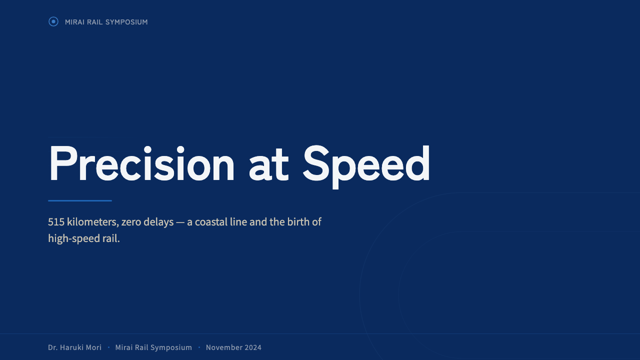
For presentation slides, the aesthetic gives cover pages a clean, confident anchor: an ivory ground with a single deep-blue horizontal band running across the lower third, title type set plainly and legibly rather than decoratively. Content slides work well with a strict horizontal rhythm — evenly spaced sections mirroring the repeated window rhythm of the train — and data slides suit a timetable-like presentation of information, with numbers and labels set for clarity over visual flair.
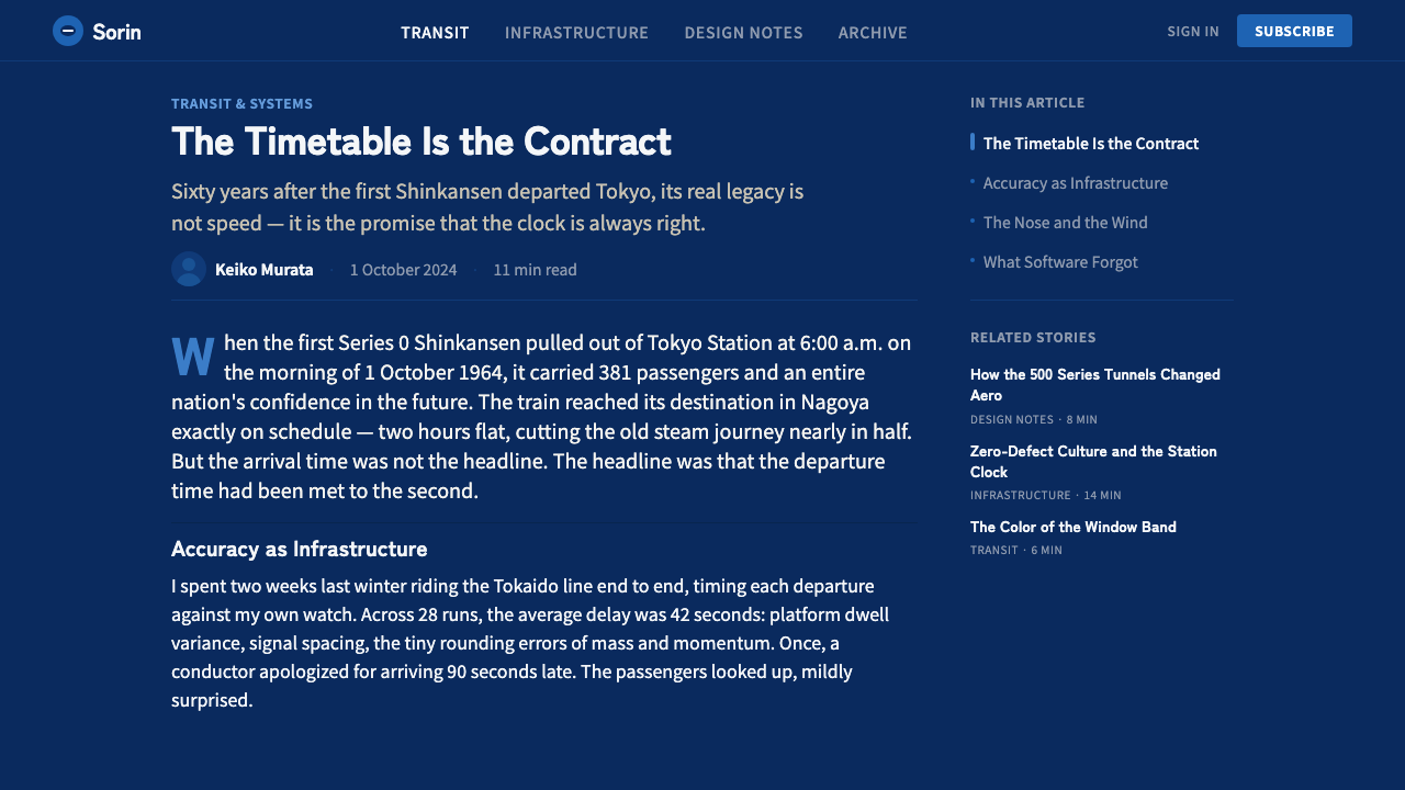
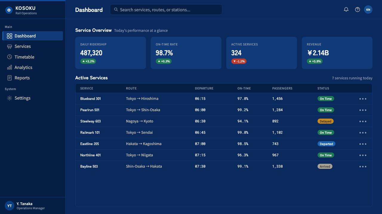
For web interfaces, the style suits products built around reliability, scheduling, logistics, or infrastructure — transit apps, operations dashboards, enterprise tools where the promise is precision and dependability. An ivory or off-white background with a single deep-blue band marking primary navigation or key status information communicates authority without needing bright accent colors; functional labeling should stay plain and legible rather than stylized.
For editorial and marketing content, the style suits narratives about engineering achievement, national infrastructure, postwar design history, or transportation. Feature layouts can use the horizontal-band motif as a section divider, and pull quotes benefit from plain, confident typography rather than ornamental display faces, echoing the restraint of the original livery.
The most common mistake is treating the style as merely futuristic or sleek and pushing it toward glossy, high-tech gradients or neon accents. The 0 Series aesthetic is disciplined and matte, not flashy — its authority comes from restraint and precision, and any attempt to make it feel more exciting through added color or shine undermines the exact quality that is the entire point.
Shinkansen Bullet — FAQ
Why does this style avoid bright or playful colors entirely?
The 0 Series livery was designed to project the calm authority of a dependable, high-performance national infrastructure project, not consumer excitement. Bright or playful colors would undercut the sense of exactness and seriousness that the ivory-and-blue combination was specifically chosen to convey.
Is the rounded nose shape just a stylistic choice?
No — it originated as a functional aerodynamic solution to reduce drag at unprecedented passenger-rail speeds, drawing on aircraft design principles. When applying this style, rounded forms should still feel functionally motivated rather than purely decorative, preserving the sense that form follows engineering necessity.
Does this aesthetic work for consumer-facing, playful products?
It is a poor fit there. The style's entire value comes from projecting calm, exact reliability, which reads as cold or overly formal in playful, casual contexts. It suits infrastructure, logistics, enterprise, and transit-adjacent products far better than lighthearted consumer apps.
How important is the exact horizontal alignment of the color bands?
Very important. The unwavering consistency of the ivory-blue division across the full length of the train is what makes the style read as disciplined engineering rather than casual paint. Any variation in the band's width or angle breaks the sense of precision the entire aesthetic depends on.
What role does typography play in this style?
Typography is treated as functional signage rather than branding — plain, legible, sized for clarity at a distance, closer to a station platform sign than a marketing headline. Ornamental or highly decorative display type undermines the instructional, exact character the style depends on.
Related design styles
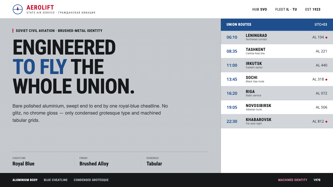 Aeroflot Soviet AirlineEngineered restraint rules. Silver ground, royal-blue cheatlines, and flat gr…
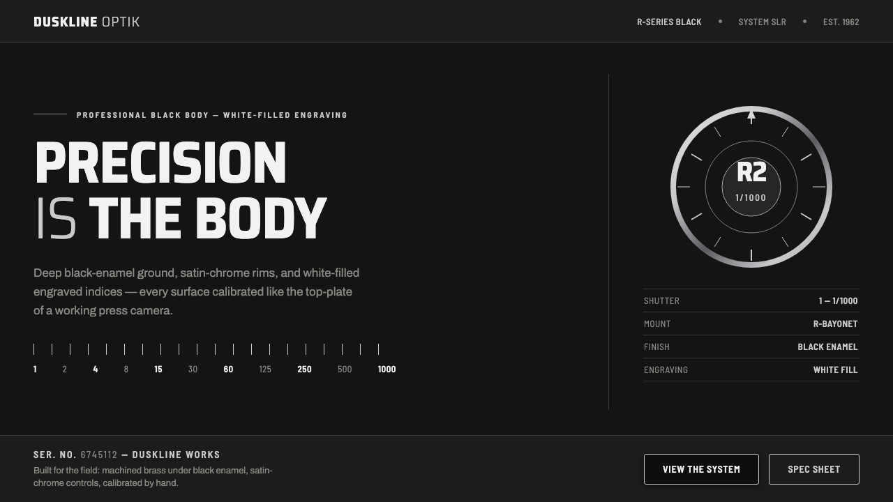 Nikon F Professional BlackMechanical precision as brand. Black-enamel ground, chrome rims, white-filled…
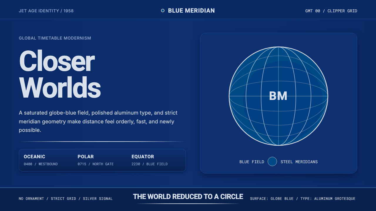 Pan Am Jet AgeJet-age confidence. Globe-blue field, steel type, meridian circle on a strict…
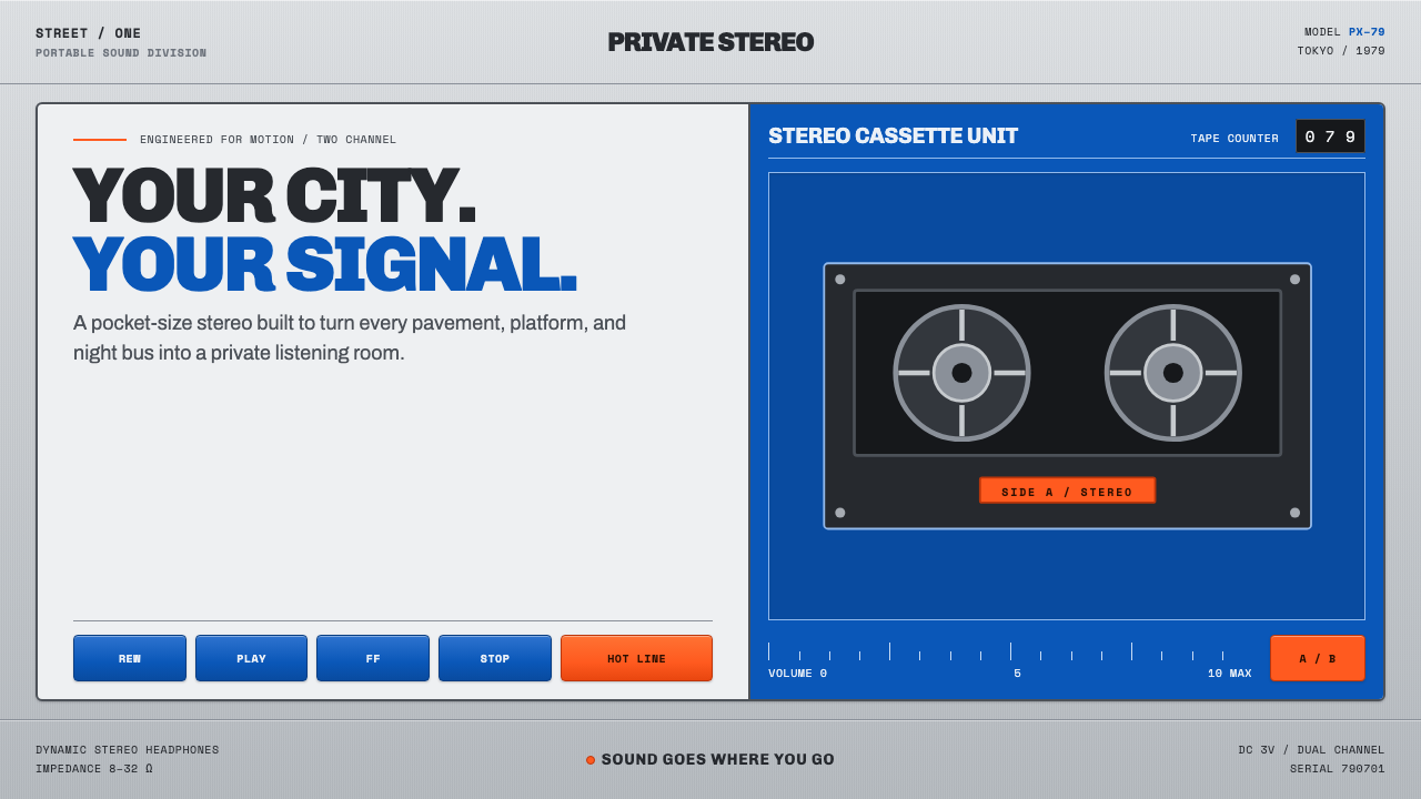 Sony Walkman (1979)The street turns private. Cobalt panels, silver grain and orange controls mak…
 Air Traffic Control RadarOperational gravity. Phosphor green rings, sweep wedges, and monospace blips…
 Fluorescent Antifreeze GreenCoolant becomes hazard signal. Fluoro green burns through steel-gray label gr…