What is Müller-Brockmann Grid?什么是 Müller-Brockmann Grid?
Josef Müller-Brockmann proved that the grid is not a constraint but a force — a mathematical system that gives visual communication the same inevitability as a Bach fugue.约瑟夫·米勒-布罗克曼证明了网格并非束缚,而是一种力量——一套数学系统,使视觉传达拥有巴赫赋格曲般的必然性。
Müller-Brockmann Grid in briefMüller-Brockmann Grid 速览
The Müller-Brockmann Grid refers to the systematic approach to layout and visual organization developed and codified by Swiss designer Josef Müller-Brockmann, whose 1981 book Grid Systems in Graphic Design became the definitive reference for structured layout worldwide. The method divides any printed or digital surface into a precise network of columns, rows, and margin zones. Every element — headline, body text, image, caption, rule line — is placed in rational correspondence with this invisible architecture. Nothing drifts; nothing is eyeballed. The grid is the argument, and every placement is a sentence in that argument.米勒-布罗克曼网格,是指瑞士设计师约瑟夫·米勒-布罗克曼所发展并系统化的版面与视觉组织方法。他1981年出版的《平面设计中的网格系统》成为全球结构化排版领域的权威参考。这套方法将任何印刷或数字表面划分为一套精确的栏、行与页边距网络。每个元素——标题、正文、图片、图注、分割线——都以理性的对应关系置于这一不可见的建筑之中。没有游移,没有目测。网格即论点,每一处排布都是这个论点中的一句话。
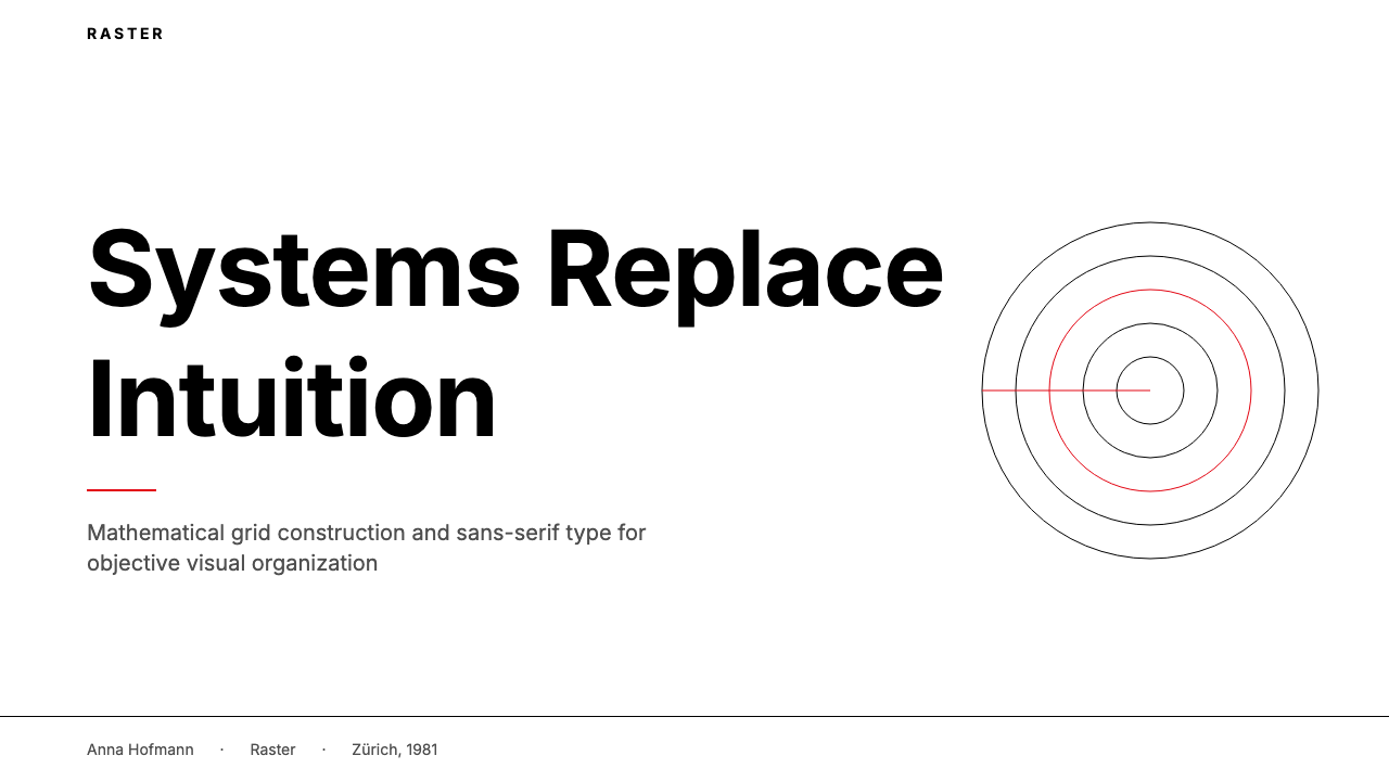
Visually, this system produces work of extraordinary rigor and calm authority. The palette is typically reduced to near-extremes: pure black on white, or white on black, with a single accent color — historically a saturated primary — used sparingly to mark the most critical element on the page. Type is set in a single geometric sans-serif family at clearly differentiated scales, creating hierarchy through contrast of size and weight alone. There are no decorative dividers, no gradient fills, no softening shadows. The white space is not emptiness — it is the grid's breathing, as structurally intentional as the content it frames.在视觉上,这套系统产生出具有非凡严谨性与平静权威感的作品。色板通常缩减至近乎极端:纯黑置于白底,或白字置于黑底,以单一强调色——历史上通常是一种饱和的纯色——克制地标记页面上最关键的元素。字体以一种几何无衬线字体家族的多级尺寸排印,仅凭大小与字重的对比建立层级。没有装饰性分割线,没有渐变填充,没有柔化的阴影。留白并非空洞——它是网格的呼吸,与其所框定的内容一样出于结构性的深思熟虑。
The style belongs to the broader Swiss International Typographic Style (Schweizer Typografie), but Müller-Brockmann's specific contribution was to make the underlying grid explicit and teachable. Where others felt their way to balanced layouts through experience and taste, he gave designers a repeatable, transferable system. The result is a visual language that is simultaneously humble — it never calls attention to its own cleverness — and commanding, because every decision can be accounted for by the mathematics underneath.这种风格属于更广泛的瑞士国际排印风格(Schweizer Typografie),但米勒-布罗克曼的独特贡献在于使底层网格变得显性且可教授。其他人凭经验与品位摸索出平衡的版面,他却给了设计师一套可重复、可迁移的系统。由此产生的视觉语言同时兼具谦逊——它从不炫耀自身的机巧——与命令感,因为每一个决定都可以被其背后的数学追根溯源。
See the Müller-Brockmann Grid design system查看 Müller-Brockmann Grid 完整设计系统
Where does Müller-Brockmann Grid come from?Müller-Brockmann Grid 从何而来?
Josef Müller-Brockmann was born in 1914 in Rapperswil, Switzerland, and trained in Zurich under the designers Ernst Keller and Walter Käch — two figures who instilled in him the belief that design must be logical, universal, and free from personal expression. He opened his own studio in Zurich in 1936, the same year he began designing for the Zurich Tonhalle concert hall. The Tonhalle posters became the laboratory in which his grid methodology was tested against the most demanding constraint: communicating the emotional character of music through purely abstract geometry.约瑟夫·米勒-布罗克曼1914年生于瑞士拉珀斯维尔,在苏黎世师从设计师恩斯特·凯勒和沃尔特·卡赫,这两位老师灌输给他一个信念:设计必须是逻辑性的、普遍性的、无关个人表达的。1936年他在苏黎世开设自己的设计工作室,同年开始为苏黎世音乐厅设计海报。这些音乐会海报成为他网格方法论的实验室,在最严苛的约束下被检验:以纯粹的抽象几何传达音乐的情感性格。
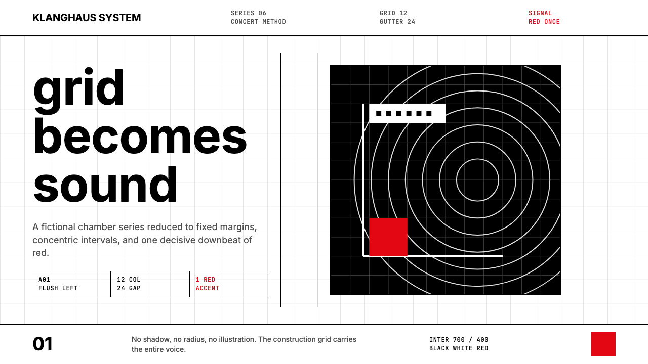
The peak years of his Tonhalle poster work, roughly 1955 to 1965, produced images that remain among the most recognizable in twentieth-century graphic design. The Beethoven poster — its concentric circles expanding outward from a dense center — was not an illustration of Beethoven's music but a geometric equivalent of it: waves of structured energy organized by mathematical interval. The Musica Viva series used expanding squares and arcs to give visual form to the temporal structure of modern composition. These works established the principle that would define his career: pure abstract structure, governed by mathematics, can communicate with the force of the most elaborate representational imagery.他为音乐厅创作海报的鼎盛时期,大约在1955至1965年间,产生了一批至今仍是二十世纪平面设计中最具辨识度的图像。贝多芬海报——同心圆从密集的中心向外扩展——并非贝多芬音乐的插图,而是其几何等效物:以数学间隔组织的结构性能量波。当代音乐(Musica Viva)系列则用扩展的方形与弧线,为现代作曲的时间结构赋予视觉形态。这些作品确立了一个将定义他整个职业生涯的原则:受数学支配的纯粹抽象结构,能够以最精密的具象图像所具有的力量进行传达。
The intellectual underpinning came from a broader Zurich context. Müller-Brockmann was a contemporary of Richard Paul Lohse, Carlo Vivarelli, and Hans Neuburg — the four designers who launched the journal Neue Grafik in 1958, which became the theoretical organ of the Swiss style. Emil Ruder at the Basel School of Design was developing parallel ideas about typographic rhythm and proportion. This was not a movement invented by one person but a collective reckoning with the same question: how can visual design achieve the objectivity and universality of mathematics without sacrificing communicative power? Müller-Brockmann's answer was the structured grid, and his 1961 book Gestaltungsprobleme des Grafikers (The Graphic Artist and His Design Problems) was the first systematic attempt to articulate it.其思想根基来自更广泛的苏黎世语境。米勒-布罗克曼与理夏德·保罗·洛泽、卡洛·维瓦雷利、汉斯·纽堡是同代人——这四位设计师1958年创办了杂志《新平面》(Neue Grafik),那是瑞士风格的理论喉舌。巴塞尔设计学院的埃米尔·鲁德则在发展关于排版韵律与比例的平行思想。这不是由一个人发明的运动,而是对同一问题的集体追问:视觉设计如何在不牺牲传达力的前提下,达到数学的客观性与普遍性?米勒-布罗克曼的答案是结构化网格,而他1961年出版的《平面艺术家及其设计问题》是第一次系统性地将其表述出来的尝试。
The 1981 publication of Grid Systems in Graphic Design (Rastersysteme für die Visuelle Gestaltung) crystallized decades of practice into a handbook that designers worldwide could apply directly. Written in both German and English with extensive diagrams, it showed not just what a grid was but how to construct one from first principles — how to determine column width from type measure, how to proportion the gutter to the column, how to nest image grids within text grids. The book arrived at the exact moment when desktop publishing was beginning to democratize layout design, and it became the standard reference for a generation of designers learning to navigate that new landscape. Müller-Brockmann continued to work and lecture until his death in 1996, and the methodology he codified has outlasted every stylistic trend of the intervening decades.1981年出版的《平面设计中的网格系统》(Rastersysteme für die Visuelle Gestaltung)将数十年的实践提炼为一本全球设计师可直接应用的手册。该书以德英双语写成,配有大量图解,不仅说明网格是什么,更展示如何从第一原则构建网格——如何从字体行宽确定栏宽,如何将间隔与栏的比例对应,如何在文字网格内嵌套图像网格。这本书恰好在桌面出版开始使版面设计民主化的时刻问世,成为一代设计师驾驭这一新格局的标准参考。米勒-布罗克曼持续工作与讲学,直至1996年辞世,而他所整理的方法论已经比此后数十年间的每一种风格潮流都更为持久。
What defines the Müller-Brockmann Grid look?Müller-Brockmann Grid 的视觉特征是什么?
The Mathematical Grid数学网格
The defining feature of the system is the grid itself: a precisely calculated network of vertical columns and horizontal fields, with gutters and margins derived from the same proportional logic as the type measure. Every layout begins with the construction of this invisible scaffold, and every element — regardless of its nature — must align to it. The grid is not a suggestion; it is the architecture. Departures from it must be deliberate and justified, because any element that ignores the grid implicitly argues that the grid was wrong.这套系统的核心特征是网格本身:一套精确计算的竖向栏与横向字段网络,其间距与页边距由与字体行宽相同的比例逻辑推导而来。每一个版面都从构建这个不可见的支架开始,每一个元素——无论其性质——都必须与之对齐。网格不是建议;它是建筑。偏离网格的做法必须是经过深思熟虑且有充分理由的,因为任何无视网格的元素都隐含地主张网格是错误的。
Reduced Palette with Single Accent简化色板与单一强调色
The color approach is built on extreme restraint. The ground is near-pure white or full black; all body text and structural elements are the opposite extreme. Into this high-contrast field, a single accent color is introduced — typically a saturated primary, historically reds with urgency and authority — used only to mark the single most critical element in the composition. Everything else earns its place through contrast of value, not hue. The effect is that the accent color, used sparingly, carries disproportionate visual weight and immediately directs the eye.色彩处理方式建立在极度克制之上。底面接近纯白或全黑;所有正文与结构元素处于相反的极端。在这一高对比度的画面中,引入单一强调色——通常是饱和的纯色,历史上常以具有紧迫感与权威感的红色为主——仅用于标记构图中最关键的单个元素。其他一切元素凭借明度对比而非色相对比赢得自身位置。由此产生的效果是:克制使用的强调色携带了超乎比例的视觉重量,并立即引导视线。
Geometric Sans-Serif Typography几何无衬线排版
Text is set in a single geometric sans-serif family — historically Akzidenz-Grotesk or Helvetica in Müller-Brockmann's own work. The selection is not arbitrary: geometric sans-serifs share the same constructivist logic as the grid, reducing letterforms to their structurally necessary components without decorative addition. Type hierarchy is established exclusively through size contrast and weight contrast, not through mixing families. A headline might be several multiples larger than a subheading, which is itself clearly distinct from body text — the three levels are self-evident without any additional ornamentation.文字以单一几何无衬线字体家族排印——米勒-布罗克曼本人的作品中历史上使用Akzidenz-Grotesk或Helvetica。这一选择并非随意:几何无衬线字体与网格共享相同的构成主义逻辑,将字形简化至其结构上必要的组成部分,不作任何装饰性添加。字体层级完全通过尺寸对比与字重对比建立,而非通过混用字体家族。标题可能比副标题大数倍,副标题本身又与正文明显区分——三个层级无需任何额外装饰便不言自明。
Functional White Space功能性留白
The white space in a grid-system layout is not residual — it is as calculated as the content it surrounds. Margins are wide enough to give the type field a sense of contained precision; column gutters are narrow enough to make the column relationship clear but generous enough to prevent visual merging. The negative space between sections is governed by the same grid intervals as the type spacing, so the whole surface has a single underlying rhythm. Purposeless decoration — anything not serving structure or communication — is absent because the white space already does that work.网格系统版面中的留白并非剩余——它与其所环绕的内容一样经过精确计算。页边距足够宽,使文字区域具有被容纳的精确感;栏间距足够窄,使栏与栏之间的关系清晰,但又足够充裕,以防止视觉上的融合。区块之间的负空间由与字体间距相同的网格间隔支配,使整个版面拥有单一的底层韵律。无目的的装饰——任何不服务于结构或传达的元素——全部缺席,因为留白本身已经完成了那项工作。
Objective Image Placement客观的图像放置
Images in a grid-system layout are not floated freely — they snap to the grid like every other element, occupying exactly one column, two columns, a half-field, or a full span. The image's scale is determined by its informational relationship to the surrounding text, not by its visual appeal in isolation. Photographs, when used, are typically high-contrast and tightly cropped, treated as flat geometric blocks rather than atmospheric scenes. Bleeds are permitted when the image's structural role justifies it; otherwise the image respects the same margin system as the type.网格系统版面中的图像不是自由浮动的——它们像其他所有元素一样吸附于网格,恰好占据一栏、两栏、半个字段或完整跨度。图像的尺寸由其与周围文字的信息关系决定,而非由其单独的视觉吸引力决定。照片在使用时,通常是高对比度且裁剪紧凑的,被当作平面几何块而非大气场景处理。当图像的结构作用能为之辩护时,可以使用出血;否则图像遵守与文字相同的页边距系统。
Structural Rule Lines结构性规则线
Horizontal and vertical rules — thin lines that divide or underscore sections — are used to make the grid's logic visible where needed. These are not decorative borders; they are grid lines promoted to the surface of the design. A rule separating a headline from body text confirms the grid field boundary. A vertical rule between columns makes the column structure explicit. Rules are used with economy: one or two visible grid-lines per composition is typically sufficient; using many converts a structural device into ornament.水平与垂直规则线——用于划分或强调区块的细线——在必要时用于使网格逻辑可见。这些不是装饰性边框;它们是被提升至设计表面的网格线。将标题与正文分开的规则线确认了网格字段的边界。栏间的垂直规则线使栏结构清晰显现。规则线的使用讲求经济:每个构图中一两条可见的网格线通常已经足够;过多使用会将结构性手段转化为装饰。
Systematic Consistency系统性一致
Perhaps the most underappreciated characteristic is the system's insistence on consistency across every page and surface. The same grid that governs a title page must govern the body pages, the index, and the appendix. The same proportion that determines the headline size on page one determines it on page eighty. This is not mechanical repetition — it is the application of a single underlying principle across all instances. In multi-page documents, this consistency is what makes the whole feel like a designed object rather than a collection of designed pages.也许最容易被低估的特征,是这套系统在每一页面与每一版面上对一致性的坚持。支配标题页的同一网格,必须同样支配正文页、索引页与附录页。决定第一页标题大小的同一比例,同样决定第八十页的标题大小。这不是机械的重复——而是将单一底层原则贯穿所有实例的应用。在多页文档中,正是这种一致性使整体感觉像一个被设计的对象,而非一组被设计的页面的集合。
See the Müller-Brockmann Grid design system查看 Müller-Brockmann Grid 完整设计系统
Who shaped Müller-Brockmann Grid?谁塑造了 Müller-Brockmann Grid?
Müller-Brockmann (1914–1996) is the central figure. His Zurich Tonhalle concert posters, his foundational texts, and his decades of practice in corporate identity design for clients including IBM and Nestlé established the grid system as both an aesthetic position and a professional standard. His 1961 book The Graphic Artist and His Design Problems articulated the philosophical case for objective design, while the 1981 Grid Systems in Graphic Design provided the practical methodology. He also served as a co-founder and editor of Neue Grafik, the journal that gave the Swiss International Style its theoretical voice.米勒-布罗克曼(1914—1996年)是核心人物。他为苏黎世音乐厅创作的系列音乐会海报、他的奠基性著作,以及他为IBM、雀巢等客户从事企业视觉设计数十年的实践,共同确立了网格系统作为一种美学立场与职业标准的地位。他1961年出版的《平面艺术家及其设计问题》阐述了客观设计的哲学依据,而1981年的《平面设计中的网格系统》则提供了实践方法论。他还担任《新平面》杂志的联合创办人与编辑——正是这份杂志赋予了瑞士国际风格理论上的声音。
Ruder (1914–1970) worked in parallel with Müller-Brockmann at the Basel School of Design, developing the typographic dimension of the Swiss style into a comprehensive pedagogy. His 1967 book Typographie: A Manual of Design articulated how the grid should govern not just column structure but the rhythm of type itself — the relationship between line length, leading, and the optical density of the text block. Ruder's teaching and writing shaped an entire generation of Swiss designers who carried the discipline to design schools across Europe, North America, and Japan.鲁德(1914—1970年)在巴塞尔设计学院与米勒-布罗克曼并行工作,将瑞士风格的排版维度发展为一套完整的教学法。他1967年出版的《字体排印》将网格如何支配的范畴,从栏结构扩展至字体本身的韵律——行长、行距与文字块视觉密度之间的关系。鲁德的教学与写作培育了整整一代瑞士设计师,他们将这门纪律带往欧洲、北美与日本的各大设计学院。
Lohse (1902–1988) approached the same mathematical systematization from the direction of fine art rather than applied design. His serial and modular paintings — which explored how color and geometric form could be organized by strict mathematical rules rather than expressive intuition — gave the Swiss style its deeper theoretical grounding in constructivist logic. As a co-founder of Neue Grafik alongside Müller-Brockmann, he helped frame the intellectual argument that objective, system-based design was not a technical constraint but a philosophical position.洛泽(1902—1988年)从纯艺术而非应用设计的方向接近同样的数学系统化命题。他的序列与模块绘画——探索色彩与几何形态如何以严格的数学规则而非表现性直觉加以组织——赋予了瑞士风格在构成主义逻辑上更深层的理论根基。作为与米勒-布罗克曼共同创办《新平面》的联合发起人,他帮助构建了这样一个知识论点:基于客观性与系统性的设计,不是一种技术约束,而是一种哲学立场。
Yoshikawa (1934–2021) was Müller-Brockmann's partner, collaborator, and eventual wife, and her contribution to the studio's output has often been underacknowledged. She brought a rigorous understanding of Japanese visual culture to the Swiss grid methodology, demonstrating that the system's underlying logic — precise proportion, respect for negative space, the subordination of decoration to structure — was not culturally specific to Europe but had deep affinities with East Asian typographic and compositional traditions. Her presence in the Zurich studio contributed significantly to the international reach of the grid methodology.吉川静子(1934—2021年)是米勒-布罗克曼的伴侣、合作者与最终的妻子,她对工作室作品的贡献长期以来未获应有的认可。她将对日本视觉文化的深刻理解带入瑞士网格方法论,证明这套系统的底层逻辑——精确的比例、对负空间的尊重、装饰服从于结构——并非欧洲文化所特有,而是与东亚排版和构图传统有着深厚的亲缘关系。她在苏黎世工作室的存在,为网格方法论的国际传播做出了重要贡献。
Hofmann (1920–2020) taught at the Basel School of Design for decades and became one of the most influential design educators of the twentieth century. His approach to the grid was less strictly mathematical than Müller-Brockmann's and more rooted in visual perception and Gestalt psychology — but the results shared the same economy of means, the same rejection of decoration, and the same conviction that visual structure must be rational and demonstrable. His students, who spread across Europe and North America, carried the Basel discipline into the next generation of design education.霍夫曼(1920—2020年)在巴塞尔设计学院执教数十年,成为二十世纪最具影响力的设计教育家之一。他对网格的处理方式不像米勒-布罗克曼那样严格数学化,而是更多植根于视觉感知与格式塔心理学——但其成果同样具备相同的手段经济性、相同的对装饰的拒绝,以及相同的信念:视觉结构必须是理性的且可被证明的。他的学生散布欧洲与北美,将巴塞尔纪律带入下一代设计教育。
How do you use Müller-Brockmann Grid today?今天怎么用 Müller-Brockmann Grid?
The Müller-Brockmann Grid translates directly and powerfully into presentation design, where the lack of a structured system is one of the most common sources of visual disorder. For a slide deck, the grid approach begins before any content is placed: establish a consistent column structure — typically four or twelve equal columns — and commit to aligning every element to it. On cover slides, the title should occupy a defined grid zone (often the left two-thirds or the lower half), with white space performing structural work in the remaining area. A single accent element — a heavy rule line, a bold numeral, a geometric shape in the accent color — provides the only visual emphasis. For content slides, two or three typographic levels set at clearly contrasting sizes handle all information hierarchy without any decorative treatment. Data slides acquire a diagrammatic authority: charts and graphs become geometric objects aligned to the grid, with the accent color used only for the data series that matters most.米勒-布罗克曼网格可以直接而有力地运用于演示文稿设计——缺乏结构化系统,正是视觉混乱最常见的根源之一。对于一套幻灯片,网格方法在放置任何内容之前就已开始:建立统一的栏结构——通常是四列或十二列等宽栏——并承诺将每个元素对齐于其上。在封面幻灯片上,标题应占据一个明确的网格区域(通常是左侧三分之二或下半部分),留白在其余区域承担结构性工作。单一的强调元素——一条粗规则线、一个粗体数字、一个强调色的几何形——提供唯一的视觉重点。对于内容页,以明显对比尺寸设置的两到三个排版层级,在没有任何装饰处理的情况下承载所有信息层级。数据页获得一种示意图式的权威感:图表成为对齐于网格的几何对象,强调色仅用于最重要的数据系列。
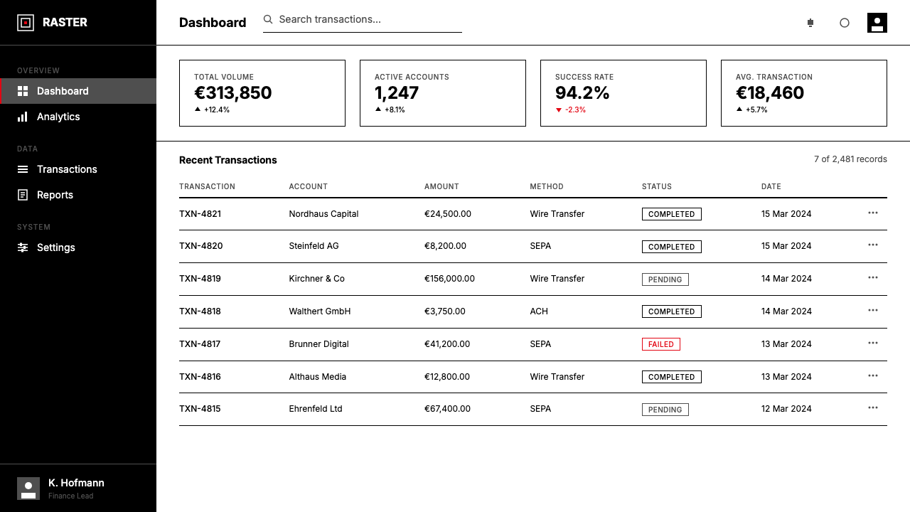
For web and digital interfaces, the system is particularly suited to dashboards, analytics platforms, pricing pages, and documentation sites — anywhere that density of information and clarity of hierarchy are the primary design problems. Establish a strict column grid (twelve columns is now standard in web frameworks), set body text in a geometric sans-serif at a comfortable reading size, and reserve all color beyond black and white for interactive states and critical alerts. Cards and panels should have clean rectangular borders rather than soft shadows; inputs should be clearly bordered rather than ghost-styled. Navigation is typographic — labels and wordmarks, not icon-heavy menus. The resulting interface feels authoritative and precise: every element earns its pixel because every element can be accounted for.对于网络与数字界面,这套系统尤其适合仪表板、数据分析平台、定价页面与文档网站——凡是信息密度与层级清晰度是首要设计问题的地方。建立严格的列网格(十二列在网络框架中现已成为标准),以几何无衬线字体设置阅读舒适尺寸的正文,并将黑白以外的所有色彩保留给交互状态与关键提示。卡片与面板应具有清晰的矩形边框而非柔和阴影;输入框应有明确边框而非幽灵样式。导航是字体性的——标签与字标,而非图标密集的菜单。由此产生的界面感觉权威而精确:每个元素赢得其像素,因为每个元素都可以被追责。
Editorial and marketing applications reward the system's poster-like boldness. A long-form article designed with these principles uses a narrow text column with a substantial outer margin — the margin becomes the home for pull quotes, footnotes, or running heads, all aligned to the same grid. Section breaks are marked by a bold horizontal rule at a grid-field boundary, not by decorative ornament. Marketing pages work well with alternating full-width blocks: cream ground with dark type, then dark ground with light type, with the accent color used consistently for a single call-to-action element. The boldness of the typographic scale — headlines that feel monumental — does the work that illustration would otherwise do, keeping the composition graphic rather than photographic in character.编辑与营销应用能回报这套系统的海报式大胆感。以这些原则设计的长篇文章,使用窄文字列配以充裕的外侧页边距——页边距成为引用语、脚注或页眉的容身之所,全部对齐于同一网格。区块分隔以网格字段边界处的粗水平线标记,而非装饰性元素。营销页面适合交替的全宽区块:奶油底深色字,然后深色底浅色字,强调色一致地用于单一的行动号召元素。字体尺度的大胆感——感觉如纪念碑般宏大的标题——完成了插图本应完成的工作,使构图保持平面图形而非摄影的性格。
In brand identity systems, the grid methodology produces materials that maintain coherence across every format without requiring a designer to make fresh decisions each time. A brand-standard document defines the column structure, the typographic scale, the margin proportions, and the accent color application rules. Everything that follows — business cards, letterheads, environmental signage, digital templates — is a faithful application of those rules. The result is not monotony but consistency: each artifact feels unmistakably part of the same system while being appropriate to its own format and function.在品牌视觉识别系统中,网格方法论产生的物料能在每种格式之间保持连贯性,无需设计师每次都做出全新决策。品牌标准文档定义栏结构、排版尺度、页边距比例与强调色应用规则。其后的一切——名片、信头纸、环境标识、数字模板——都是对这些规则的忠实应用。结果不是单调,而是一致性:每件物料都无误地感觉是同一系统的组成部分,同时又适合其自身的格式与功能。
The most common mistake when working with this system is treating the grid as a background option rather than a load-bearing structure. Designers will define a column grid and then place elements wherever they look right, crossing column boundaries without intention, floating objects in the middle of fields with no alignment logic. This produces layouts that have the visual austerity of the style without its underlying intelligence — they look empty rather than precise. A related error is the cosmetic application of the accent color: using it on multiple elements simultaneously, applying it for visual variety rather than to mark hierarchy, or choosing a muted or complex hue rather than a clean saturated primary. The accent color only works when it is singular and unmistakable — the moment it appears on three elements, it stops being an accent and becomes noise.使用这套系统时最常见的错误,是将网格当作背景选项而非承重结构。设计师会定义列网格,然后将元素放置在任何看起来正确的地方,无意图地跨越列边界,在字段中间漂浮没有对齐逻辑的对象。这产生出具有这种风格视觉简约感但缺乏其底层智识的版面——看起来空洞而非精确。一个相关的错误是强调色的表面化应用:同时在多个元素上使用它,为视觉多样性而非标记层级而应用它,或选择一种柔和或复杂的色调而非干净饱和的纯色。强调色只有在唯一且无误时才有效——一旦它出现在三个元素上,它就不再是强调,而成了噪音。
See the Müller-Brockmann Grid design system查看 Müller-Brockmann Grid 完整设计系统
Müller-Brockmann Grid — FAQMüller-Brockmann Grid · 常见问题
What is the difference between the Müller-Brockmann Grid and generic grid-based design?米勒-布罗克曼网格与普通网格设计有何区别?
Every layout has some kind of implicit grid, even if it was never consciously constructed. What distinguishes the Müller-Brockmann approach is the rigor and derivability of the system: the grid is constructed from first principles — column width derived from the optimal line length for the typeface and size in use, gutter width proportional to the column, margin proportional to both — and then applied without exception. There is also a philosophical dimension: the grid is not a tool for achieving visual balance but a statement that objective, mathematical order is the correct foundation for all visual communication. Generic grid use is opportunistic; the Müller-Brockmann approach is principled.每个版面都有某种隐性网格,即使它从未被有意识地构建。米勒-布罗克曼方法的区别在于系统的严格性与可推导性:网格从第一原则出发构建——栏宽由所用字体与字号的最优行长推导而来,间距与栏成比例,页边距与二者成比例——然后毫无例外地贯彻执行。还有一个哲学维度:网格不是实现视觉平衡的工具,而是一种声明——客观的数学秩序是所有视觉传达的正确基础。普通网格使用是机会主义的;米勒-布罗克曼方法是有原则的。
Does this system require only black, white, and one accent color, or can a broader palette work?这套系统是否只能使用黑、白和一种强调色?可以用更宽泛的色板吗?
The historical work of Müller-Brockmann himself used an extremely reduced palette — often only black, white, and a single intense red or yellow. The underlying reason is not aesthetic preference but logical necessity: the grid system achieves its authority through clarity of hierarchy, and every additional color competes for attention and dilutes that hierarchy. A broader palette is possible in contemporary applications, but it requires a corresponding increase in structural discipline. If two accent colors are used, they must be clearly differentiated in their roles — one for primary actions, one for secondary states — and neither should appear in the same composition as a decorative element. Three or more accent colors typically exceed the system's ability to maintain hierarchy without the layout beginning to feel arbitrary.米勒-布罗克曼本人的历史作品使用极度简化的色板——通常只有黑、白与单一浓烈的红色或黄色。其根本原因不是美学偏好,而是逻辑必要性:网格系统通过层级的清晰度获得权威性,每增加一种颜色都会争夺注意力并稀释那种层级。在当代应用中,更宽泛的色板是可能的,但需要相应增加结构性纪律。如果使用两种强调色,它们在角色上必须有明确区分——一种用于主要动作,一种用于次要状态——且两者都不应在同一构图中作为装饰元素出现。三种或更多强调色通常会超出这套系统在不使版面开始显得随意的前提下维持层级的能力。
How does this style handle photography and complex imagery?这种风格如何处理摄影与复杂图像?
Photography in a Müller-Brockmann layout is treated as a geometric block, not as a naturalistic scene. Images are cropped to fit the grid — meaning they snap to one, two, or more column widths and to defined field heights — rather than being sized for their pictorial content. Photographs that contain a great deal of atmospheric complexity or tonal gradation tend to create visual tension with the surrounding high-contrast typography; the style works better with images that have clear, simple geometric structure: a single object on a plain ground, a strong horizontal or vertical composition, a high-contrast duotone reproduction. Images that resist cropping and geometric containment can be used, but they require careful handling, typically by treating them as full-width bleeds separated clearly from the typographic grid zones.在米勒-布罗克曼版面中,摄影被当作几何块而非自然主义场景处理。图像被裁剪以适应网格——即吸附至一栏、两栏或更多列宽,以及定义的字段高度——而非根据其画面内容调整尺寸。包含大量大气复杂性或色调渐变的照片,往往与周围的高对比度排版产生视觉张力;这种风格更适合具有清晰简洁几何结构的图像:纯色背景上的单一对象、强烈的水平或垂直构图、高对比度的双色调复制品。抗拒裁剪与几何约束的图像可以使用,但需要仔细处理,通常是将其作为出血的全宽区块,与排版网格区域明确分隔。
Is this style appropriate for brands that want to feel warm or approachable?这种风格适合希望传达温暖感或亲切感的品牌吗?
The grid system's visual character is precision, authority, and objectivity — qualities that are genuinely valuable for brands positioning themselves as expert, trustworthy, analytical, or rigorously modern. These are not warm qualities in the sensory or emotional sense. Brands in categories that depend on warmth, organic texture, or personal intimacy — food, wellness, children's products, artisan goods — will find the style working against their core communication goals. The style can be softened slightly through the choice of an accent color that reads as warm rather than clinical — a burnt amber reads differently than a process red — but this is adjustment at the margins, not a fundamental shift in character. For any brand where the user's emotional response of comfort or delight is the primary goal, a different foundational aesthetic will be more effective.网格系统的视觉性格是精确、权威与客观——对于将自身定位为专业、可信赖、分析性或严格现代性的品牌而言,这些品质真正有价值。但这些不是感官或情感意义上的温暖品质。依赖温暖感、有机质感或个人亲密感的品类品牌——食品、健康、儿童产品、手工艺品——会发现这种风格与其核心传达目标相悖。可以通过选择读感温暖而非临床的强调色,对这种风格略作柔化——焦糖琥珀色的读感与印刷红截然不同——但这是边际调整,而非性格上的根本转变。对于任何以用户的舒适感或愉悦感为首要目标的品牌,不同的基础美学将更为有效。
How do I know if I am applying the grid correctly, rather than just making things look neat?我如何判断自己是在正确地应用网格,而不仅仅是让版面看起来整洁?
The test is derivability: can you explain every placement decision by reference to the grid? If you moved a headline slightly to the left because it looked more balanced, you are not on the grid — you are eyeballing. If you can say the headline occupies column one through column five and its top edge aligns to the fourth horizontal field, you are on the grid. A secondary test is consistency: are you applying the same grid intervals for body-to-headline spacing as for image-to-caption spacing? If different relationships in the layout are governed by different logic, the grid is not really doing the structural work — it is a background presence rather than the load-bearing architecture. True grid discipline feels almost over-rigid before you are accustomed to it; the softening comes from understanding that the white space and proportion are doing aesthetic work, so the individual elements do not need to.测试在于可推导性:你能通过引用网格来解释每一个放置决定吗?如果你将标题略向左移是因为看起来更平衡,你就不在网格上——你在目测。如果你能说标题占据第一栏至第五栏,其顶边与第四个水平字段对齐,你就在网格上。一个次要测试是一致性:你是否将相同的网格间隔应用于正文到标题的间距,以及图像到图注的间距?如果版面中不同的关系由不同的逻辑支配,网格就没有真正承担结构性工作——它是背景存在而非承重建筑。真正的网格纪律在你习惯之前感觉几乎过于僵硬;柔化来自于理解留白与比例正在完成美学工作,因此单个元素不需要这样做。
Related design styles相关设计风格
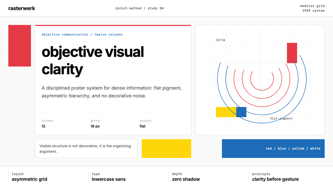 Müller-Brockmann SwissClarity is the system. Inter grids, red-blue blocks, and concentric arcs make…清晰即系统:Inter网格、红蓝色块与同心弧显露结构。
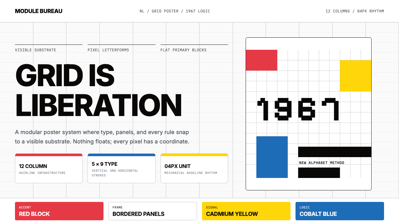 Wim Crouwel GridGrid becomes freedom. Cobalt, red and yellow blocks lock Inter type to a 12-c…网格即自由。钴蓝、红与黄块把Inter锁进12栏基底。
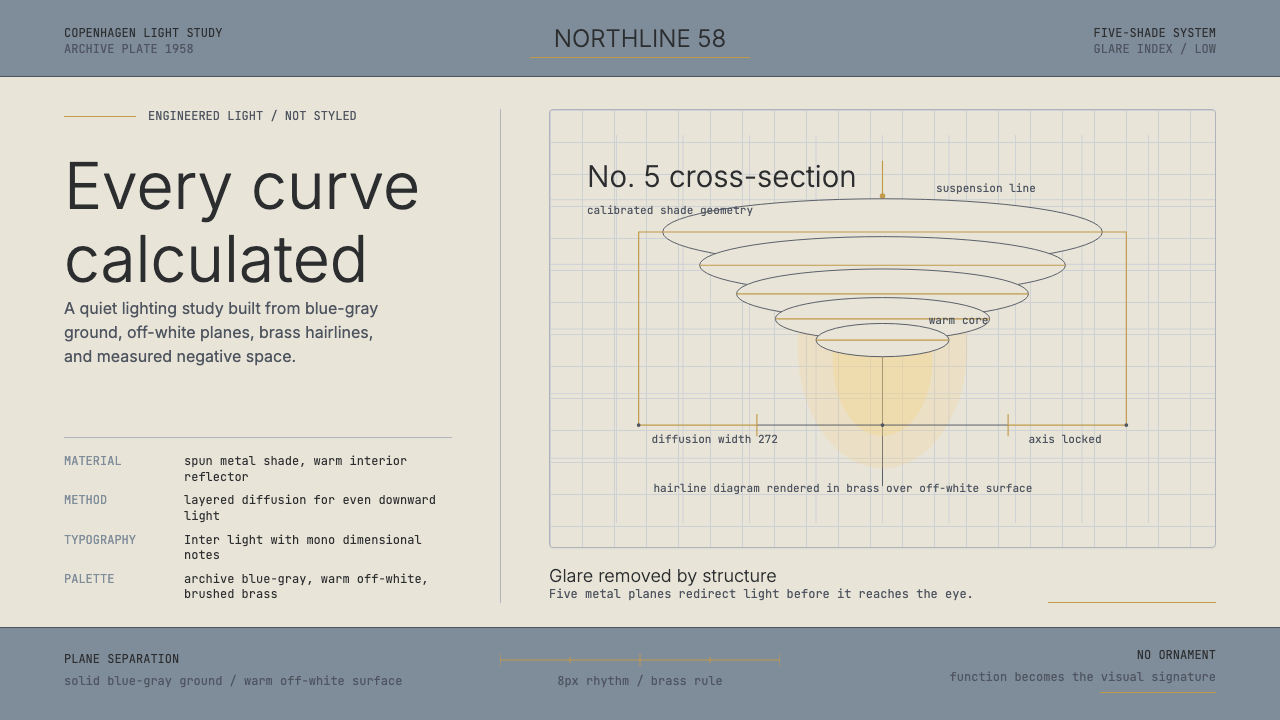 Danish PH5 Louis Poulsen (1958)Engineered, not styled. Blue-gray ground, brass hairlines, and a precise shad…工程感胜过装饰。蓝灰底、黄铜发丝线与精密灯罩剖面。
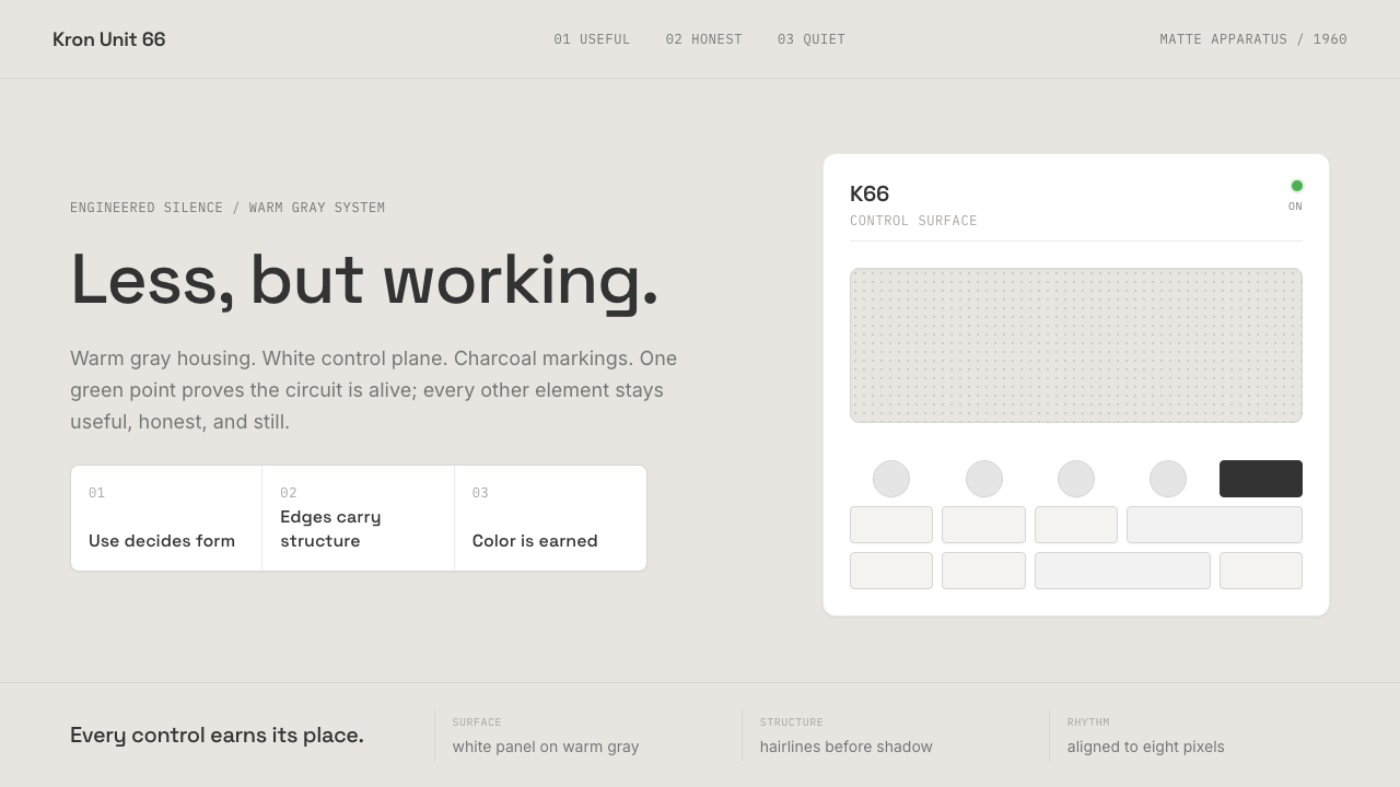 Dieter Rams / BraunQuiet by design. Warm gray, white panels, hairline grids, and one earned gree…安静即设计:暖灰、白面板、细网格,只留一枚绿色指示点。
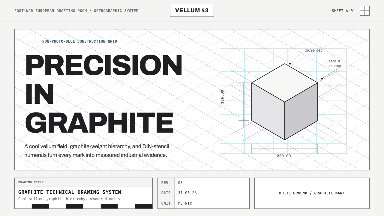 Graphite Technical DrawingDrafting-room precision. Non-photo-blue grid and graphite DIN lettering do th…制图室般精确:淡蓝网格与石墨DIN字母构成秩序。
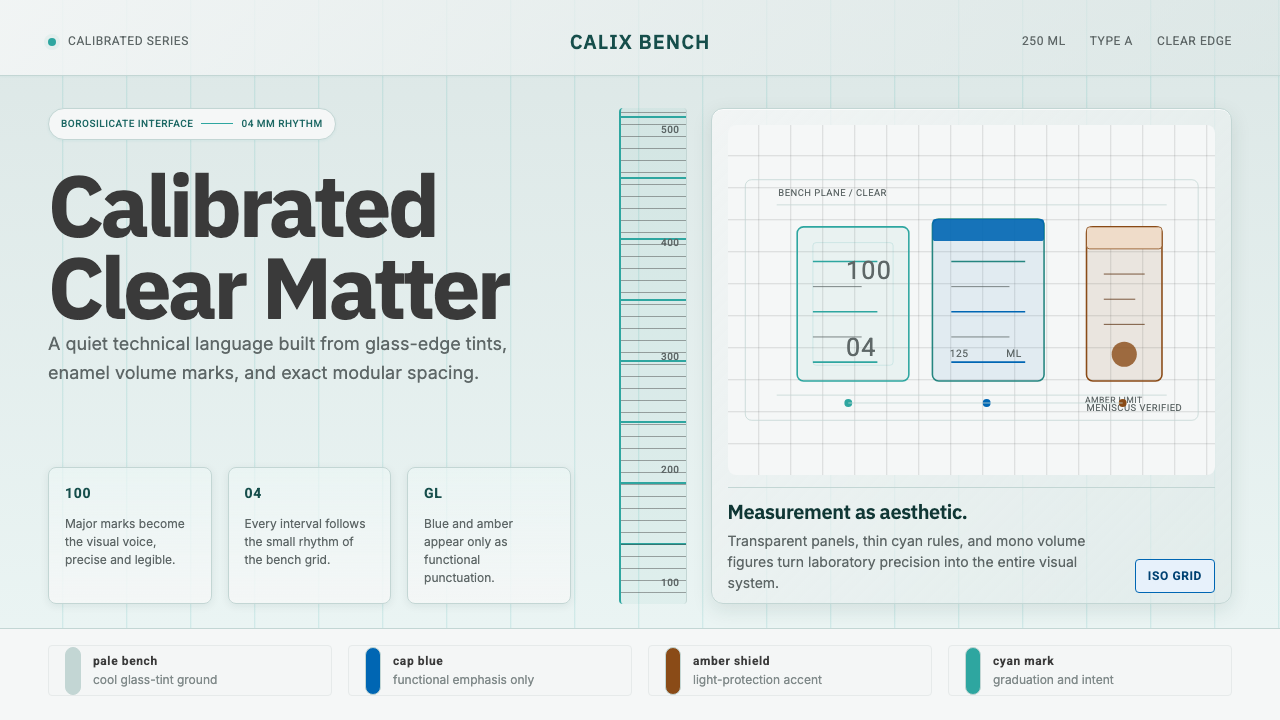 Laboratory GlasswareClarity is the system. Pale glass cyan, volume marks, and bordered bench grid…清澈即系统:浅玻璃青、刻度数字与细边框台面网格。