What is Interstate Highway Shield?
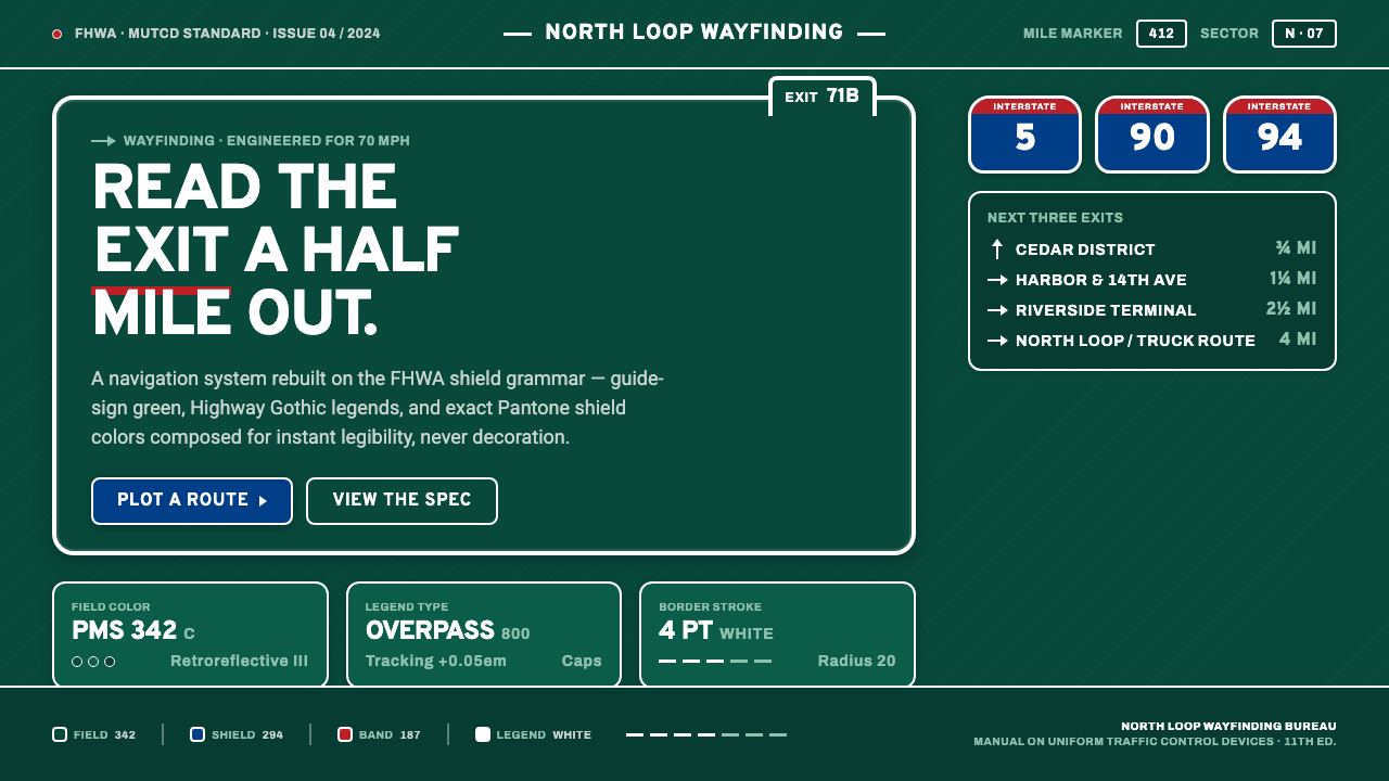
The Interstate Highway Shield turns a nation-sized road network into an instant visual command: green field, white legend, red-white-blue emblem, and nothing that cannot be understood at speed.
Interstate Highway Shield in brief
The Interstate Highway Shield system is the standardized visual language of American high-speed road navigation. Its central emblem is a heraldic red-white-blue shield, usually presented on a dark green retroreflective guide panel and paired with white Highway Gothic lettering. Standardized through the Federal Highway Administration and the Manual on Uniform Traffic Control Devices, the system was engineered to make route identity and directional information recognizable within the short viewing window available to a driver traveling at highway speed.
Its visual character comes from the separation of distinct informational roles. The green panel establishes the navigational field; white lettering carries destinations and directions; the shield isolates the route designation as a compact national symbol. Blue and red give the emblem civic authority without competing with the guide message, while the white border clarifies its silhouette against the darker ground. Each component remains visually independent, allowing the eye to identify route, destination, and movement in sequence rather than decode a decorative composition.
Translated into contemporary design, the Interstate vocabulary is not merely roadside nostalgia. It is a system of high-contrast grounds, condensed uppercase legends, thick outlines, emblematic containers, and disciplined hierarchy. Its strongest applications preserve the original engineering premise: information must remain clear under limited attention, across distance, and amid surrounding visual noise. The result feels direct, infrastructural, and unmistakably American.
Where does Interstate Highway Shield come from?
The system belongs to the mid-century expansion of American wayfinding and to the creation of the Interstate Highway System beginning in 1956. A road network intended to connect regions across the United States required more than individual signs designed according to local taste. Drivers needed a stable visual grammar that would remain familiar as they crossed municipal and state boundaries. The Interstate shield answered the route-identification problem with a repeatable national emblem, while the surrounding guide-sign system organized destinations, exits, and directional choices within a consistent field.
Standardization was led institutionally rather than by a celebrated individual designer. The Federal Highway Administration, operating within the United States Department of Transportation, and the standards process represented by the Manual on Uniform Traffic Control Devices established the shared conventions. This administrative origin is essential to the style. Its forms were not selected primarily for personal expression or commercial distinction; they were coordinated so that public agencies, sign fabricators, road authorities, and motorists could rely on the same meanings throughout the network.
Retroreflective guide-sign engineering shaped the system as strongly as national identity did. Signs had to remain visible under changing daylight, darkness, weather, motion, and headlamp illumination. Dark guide-sign green provided a stable field for white legends, and the shield needed a silhouette strong enough to survive distance and visual competition. Condensed uppercase Highway Gothic lettering helped place necessary information within limited sign areas while preserving clear word shapes. Thick borders and decisive color divisions prevented the emblem from dissolving into its background.
From the Interstate System's establishment through the later twentieth-century development of MUTCD color specifications, the shield became more than a road marker. Repetition transformed it into a piece of civic infrastructure that could be understood without explanation. Its authority comes from consistency: the same family of colors, forms, and lettering returns at every decision point. Contemporary adaptations inherit that accumulated recognition, but their success still depends on respecting the original system's functional order rather than treating the shield as a free-floating patriotic decoration.
What defines the Interstate Highway Shield look?
Guide-Sign Color
Dark guide-sign green forms the principal field, with white reserved for legends, borders, arrows, and other high-priority information. The shield introduces blue and red as controlled identity colors rather than general decoration. These hues should remain concentrated within the emblem or a similarly important marker. When red and blue spread indiscriminately across a composition, the distinction between route identity and navigational content collapses.
Highway Gothic
Lettering is direct, condensed, and commonly uppercase, reflecting the need to recognize words rapidly from a moving vehicle. Highway Gothic supplies sturdy strokes, open internal spaces, and practical proportions without theatrical personality. In digital adaptations, typography should preserve this blunt legibility: short labels, decisive headings, generous separation between information groups, and no ornamental display face competing with the navigational voice.
Shield Silhouette
The shield is both an information container and a recognition device. Its heraldic outline gives route information a stable boundary that can be detected before the enclosed legend is fully read. A thick white edge separates the emblem from green or other dark surroundings, while the red crown and blue body divide identity from content. The silhouette should remain intact and visually dominant; excessive internal detail weakens its distance performance.
Contrast and Retroreflection
The palette is designed around visibility rather than atmospheric subtlety. Light legends stand sharply against dark grounds, and neighboring color regions meet through firm edges. Retroreflective engineering reinforces this contrast under headlamp illumination, but the visual lesson survives outside physical signage: critical information should not depend on faint tonal shifts, soft overlays, or decorative texture. The hierarchy must remain understandable when conditions are imperfect.
Directional Hierarchy
Every element answers a navigational question: which road, which destination, which direction, and which decision comes next. The route shield identifies the network, the legend names the place, and directional marks indicate action. Scale, placement, grouping, and repetition establish priority. Decorative elements are acceptable only when they reinforce this sequence; anything that interrupts scanning or makes secondary information resemble a primary instruction works against the system.
Engineered Restraint
The style gains character through limitation. Broad color fields, solid outlines, plain lettering, and compact symbols replace illustration, texture, and expressive effects. This restraint is not generic minimalism: it is the result of designing for limited attention at speed. Empty space separates decisions, borders define operational regions, and repetition builds trust. A successful adaptation feels assembled from standards, not decorated according to a theme.
Who shaped Interstate Highway Shield?
The Federal Highway Administration is the principal institutional steward named in the system's standardization. Its role places the shield within transportation engineering and public administration rather than commercial branding. Through national guidance, it supports the consistency that allows a driver to encounter the same navigational language across jurisdictions. The visual authority of the shield therefore rests partly on federal coordination: repeated forms acquire meaning because agencies agree to use them predictably.
The United States Department of Transportation provides the broader federal framework within which highway guidance is administered. In the Interstate visual system, its significance is organizational: route identity, sign practice, and road safety belong to a connected public network rather than isolated graphic artifacts. This framework helps explain why the style feels official and infrastructural. Its coherence reflects a transportation system intended to operate across the country as a shared whole.
The standards process associated with the Manual on Uniform Traffic Control Devices converts engineering needs into shared conventions for color, sign categories, legends, and road communication. Rather than authoring a personal aesthetic, the committee model evaluates how devices should function consistently in public space. Its influence is visible in the system's disciplined distinctions: green guide fields, white information, standardized route emblems, and a hierarchy intended to reduce uncertainty at moments of travel decision.
How do you use Interstate Highway Shield today?
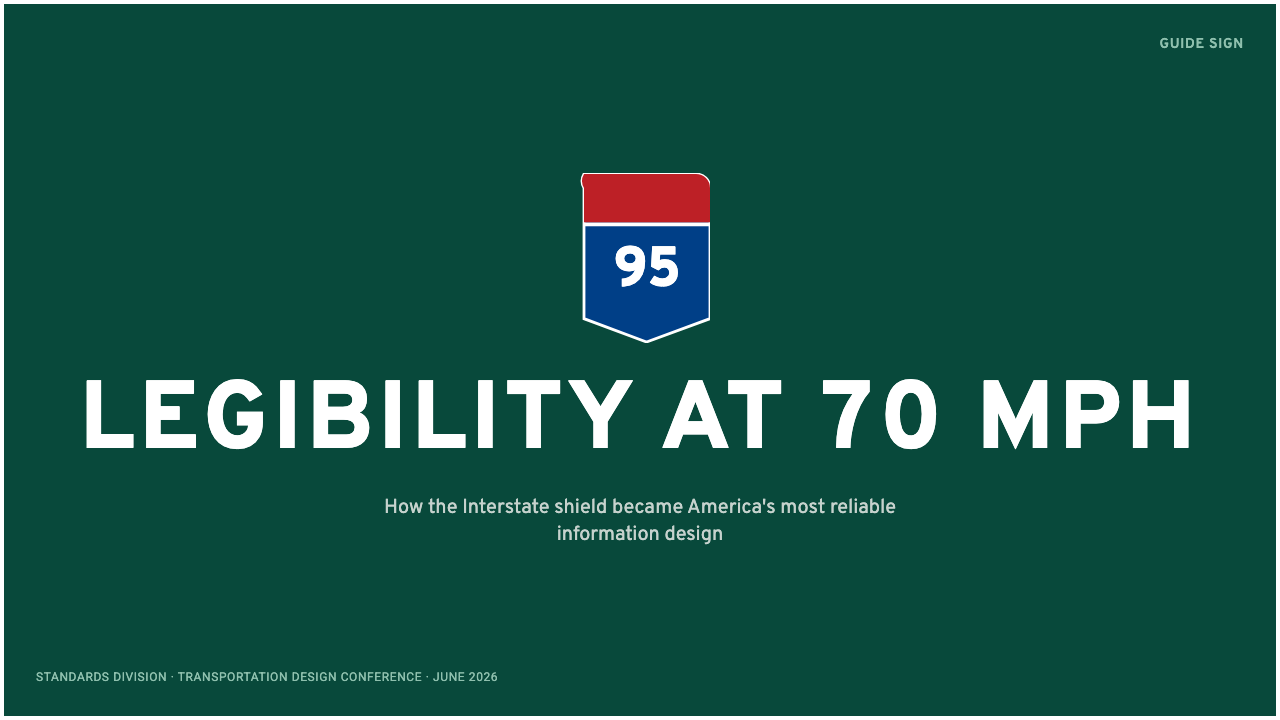
For presentation slides, the style is strongest when the deck behaves like a sequence of guide signs. A cover can use a broad green field, a single shield-shaped title marker, and a concise white legend arranged with the confidence of a destination panel. Content slides should divide information into clearly bounded regions, with short uppercase section labels and quieter supporting text. The theme loses authority when every heading becomes a shield; reserve the emblem for the deck identity or major transitions.
Data slides benefit from the system's separation of categories and actions. Charts should use white marks against a dark ground, with red and blue reserved for the few series requiring immediate distinction. Labels belong close to the values they explain, and directional devices can clarify sequence, movement, or change. A dashboard-like slide should be readable in a rapid scan: first the overall status, then the route or category, then the supporting evidence. Avoid ornamental maps or road motifs that do not carry data.
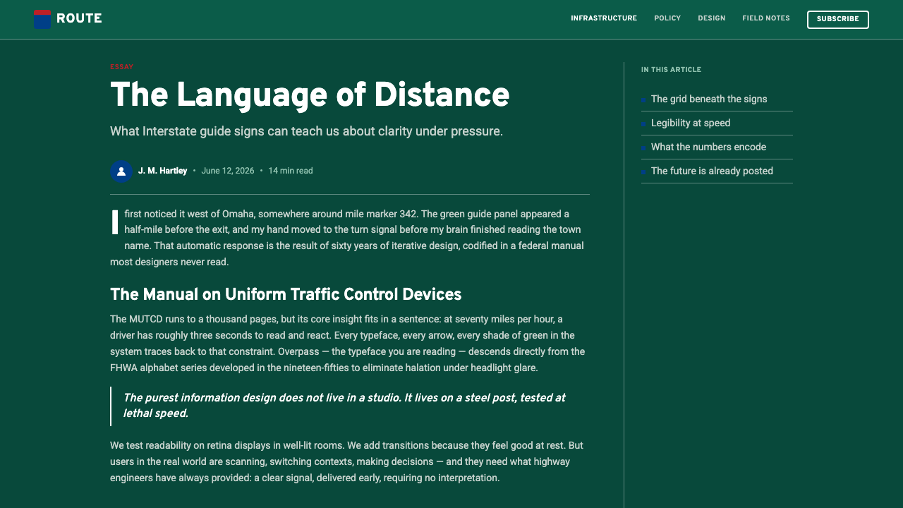
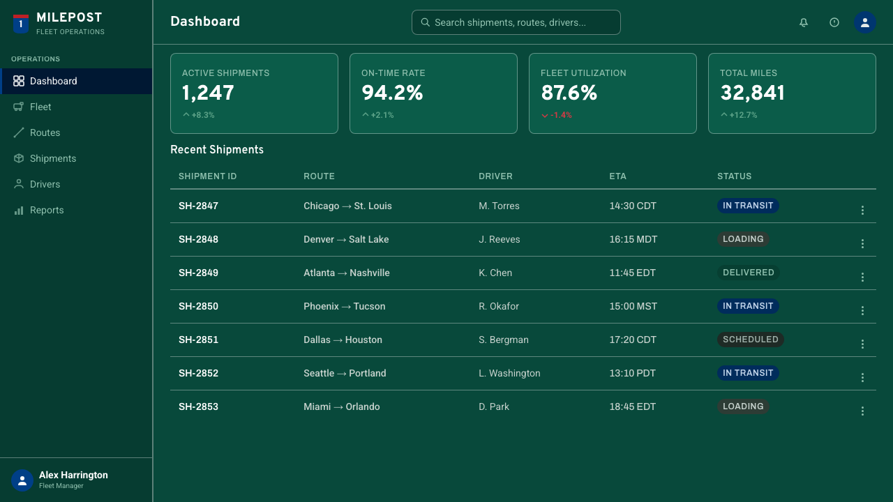
For web interfaces, Interstate language suits operational dashboards, logistics products, status systems, and pricing pages whose users must compare choices quickly. Green can establish the application shell, while white panels or outlined dark regions organize modules. Shield forms work well for plan names, account tiers, route-like identifiers, or selected states, but ordinary controls should remain simpler. Pricing cards can borrow the sign system's firm borders and condensed headings, with red or blue distinguishing the recommended path rather than decorating every option.
Editorial and marketing layouts can use the style's public-information authority to structure complex stories. A feature page may open like an overhead guide panel, then move into calmer reading sections punctuated by shield markers, directional rules, and compact metadata. Campaign pages benefit from terse, destination-like headlines and a clear route from proposition to evidence to action. Photography, if present, should support the journey or infrastructure narrative and remain subordinate to the typography rather than becoming an atmospheric backdrop.
The most common mistake is confusing the modern Interstate system with generalized American road nostalgia. Faded surfaces, sepia travel imagery, diner lettering, and decorative Route 66 references belong to a different visual story. Interstate design is green-ground, standardized, and engineered for active navigation. Another frequent error is placing red, white, and blue everywhere simply because they are recognizable. Their power depends on concentration inside the shield; the broader composition should remain governed by green, white, hierarchy, and restraint.
Interstate Highway Shield — FAQ
Is the Interstate Highway Shield style the same as Route 66 nostalgia?
No. Route 66 nostalgia is commonly associated with aged surfaces, roadside commerce, vintage travel imagery, and an informal culture of individual places. The Interstate system is modern public infrastructure: dark green guide panels, standardized red-white-blue shields, white Highway Gothic legends, and repeatable rules intended for national consistency. One celebrates the romance of the roadside; the other organizes movement through a coordinated high-speed network. Mixing them usually weakens both stories.
Why is guide-sign green so important to the visual system?
Green is not simply a background color or a stylistic preference. It establishes the navigational category, supports strong contrast with white legends, and creates a stable field against which the shield can be recognized. In digital work, preserving green as the dominant ground keeps red and blue available for route identity and priority. Replacing it with patriotic colors throughout turns a wayfinding system into a general national motif and removes much of its functional character.
Must every piece of text use uppercase Highway Gothic?
No. The roadside language favors direct, highly legible legends, and condensed uppercase forms are especially effective for short identifiers and headings. Long passages in a digital article or dashboard need a calmer reading voice. Use the highway-derived treatment for labels, routes, statuses, and decisive headings, then allow supporting copy to prioritize sustained reading. The essential principle is not universal capitalization but rapid differentiation between navigational commands and explanatory material.
Can the shield be simplified for small digital contexts?
Yes, provided its recognition structure survives. Preserve the heraldic silhouette, the strong white boundary, and the clear division between the red upper region and blue body. Remove minor internal information before weakening those defining relationships. At very limited scales, the shield may function as a category marker beside a separate label rather than carrying a full legend. Simplification should improve recognition, not transform the emblem into an unrelated generic badge.
Where does this style work poorly?
It struggles when a product depends on softness, intimacy, luxury, or leisurely exploration. The system was created to reduce hesitation and direct action, so its condensed lettering, hard boundaries, civic colors, and command-like hierarchy can feel institutional in emotional consumer contexts. It is strongest where clarity, coordination, movement, and public authority are genuine product values. If those values are absent, applying shields and guide-sign green may create a costume rather than a coherent design system.
Related design styles
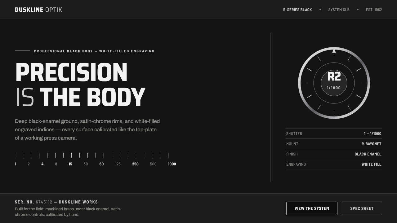 Nikon F Professional BlackMechanical precision as brand. Black-enamel ground, chrome rims, white-filled…
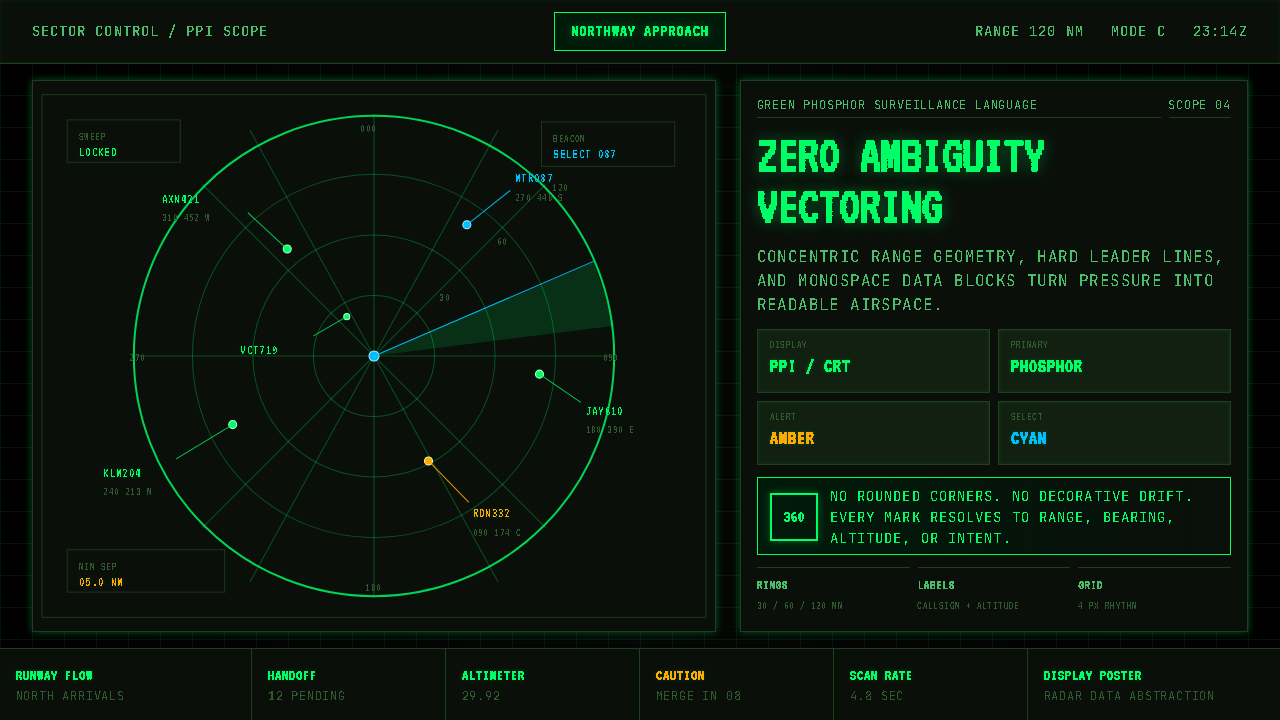 Air Traffic Control RadarOperational gravity. Phosphor green rings, sweep wedges, and monospace blips…
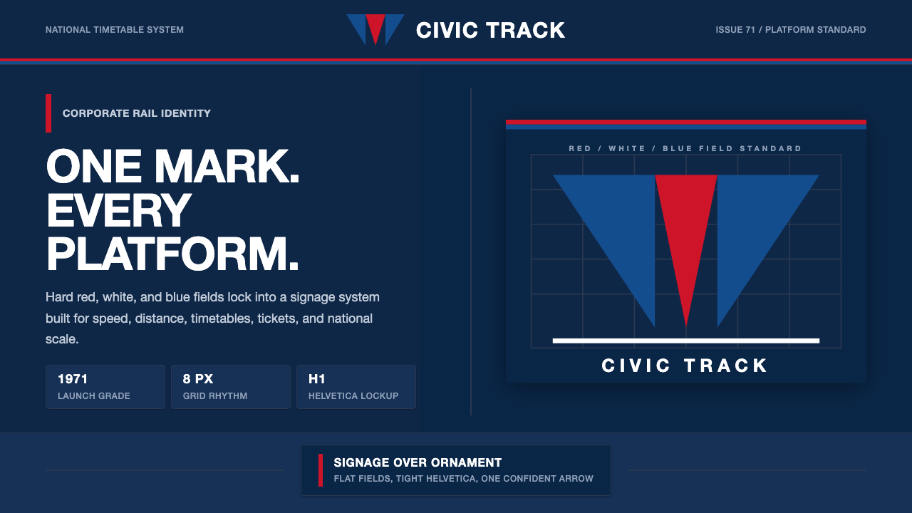 Amtrak Arrow (1971)Civic authority at speed. Deep navy, Helvetica lockups, and red-blue arrows.
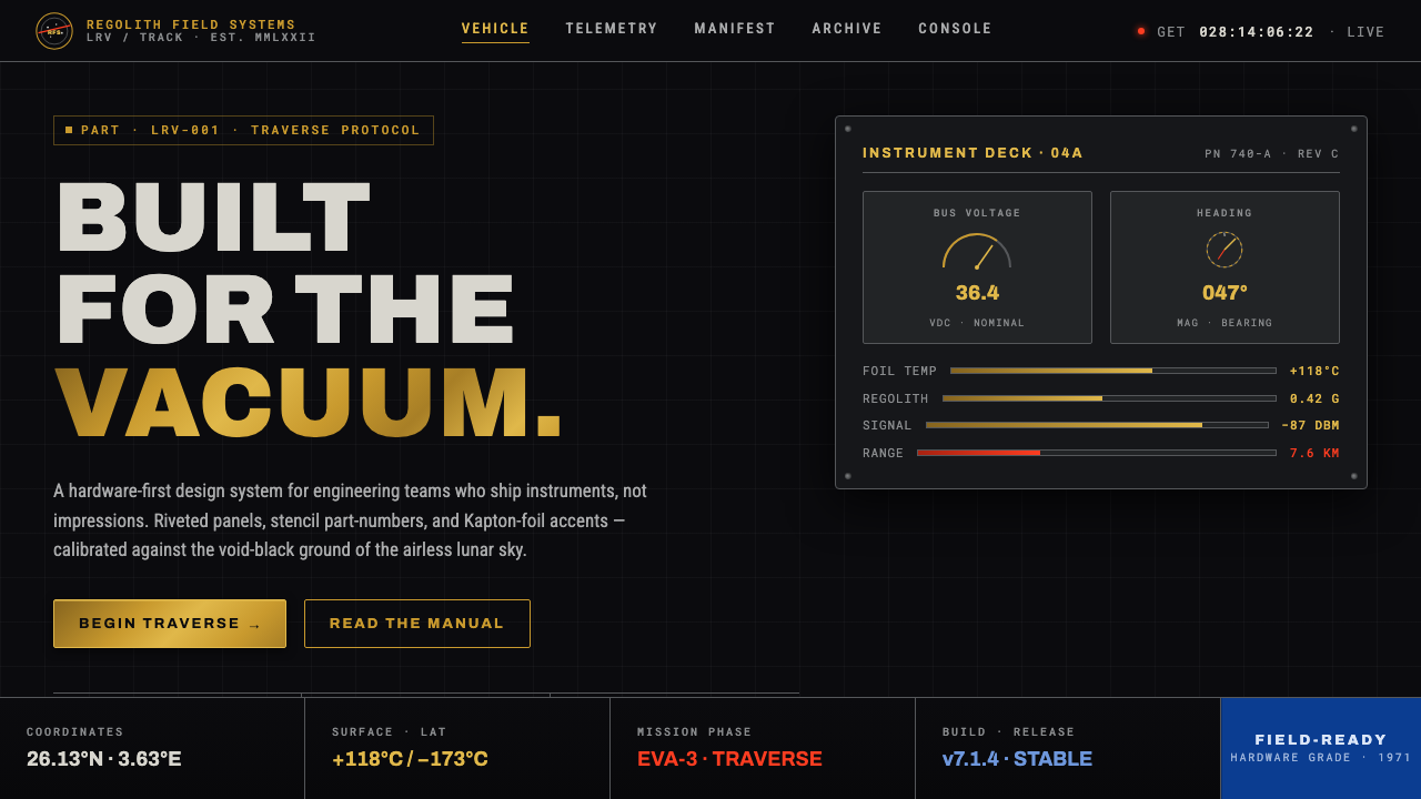 Lunar RoverBuilt for the vacuum. Kapton-gold foil and stencil part-numbers against void-…
 Massimo Vignelli NYCClarity becomes infrastructure. Black rules and route stripes lock the white…
 NYC Subway VignelliThe city as a circuit diagram. Flat trunk-line color on black, angles locked…