What is Nikon F Professional Black?
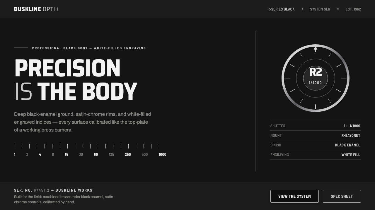
Nikon F Professional Black turns the working camera into a visual language: black enamel, satin chrome, engraved white indices, and the calm authority of an instrument built to be trusted.
Nikon F Professional Black in brief
Nikon F Professional Black is a design language derived from the professional black-body Nikon F and the later F-series black professional editions. Its defining materials and cues are a deep black-enamel painted body over machined brass, restrained satin-chrome accents around dials and lens rims, and engraved index marks filled in white. The result is not decorative darkness. It is the visual behavior of a calibrated tool: every contrast exists to make a control, boundary, reading, or state immediately legible.
The Nikon F established the Japanese system SLR as a professional standard from its 1959 launch onward. It was made for working photojournalists, people whose equipment needed to communicate reliably under pressure. That context gives the style its character. Surfaces are dense and durable rather than theatrical; markings feel engraved rather than printed; metallic details signal mechanical interfaces rather than luxury trim. The black ground absorbs visual noise so that the important information can appear with unusually direct clarity.
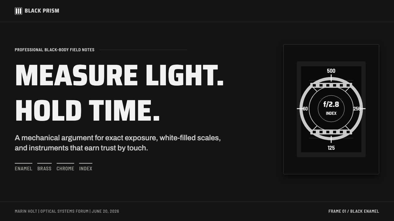
The most specific authenticity cue is the engraving fill. On black Nikon bodies, engraved marks use white fill, where chrome bodies use black. That reversal matters because it reveals that the style is governed by legibility and material contrast, not by a generic black-and-silver palette. A faithful Nikon F Professional Black application therefore feels measured, optical, and tactile: a near-black field, satin metallic boundaries, semi-condensed engraved-looking type, and white-on-black indices that read as purpose-built calibration.
Where does Nikon F Professional Black come from?
The style begins with Nippon Kogaku K.K. in Japan and with a period defined in the supplied record as Japanese precision optics. Its historical span runs from 1950 to 1990, with the Nikon F launching in 1959 and professional black-body editions continuing through the F-series. This is not the origin story of a decorative movement with a manifesto. It is the origin story of professional equipment whose appearance emerged from the demands of optics, machining, handling, and rapid visual reading.
The Nikon F belongs to the professional system camera tradition. A system camera is understood through its working relationships: body, lens, dial, rim, index, and the physical information that helps an operator orient themselves. In the Professional Black expression, the body becomes a dark, unified ground while chrome identifies selected mechanical edges and touchpoints. White-filled engraving then functions as the visual equivalent of instrument calibration, giving the user contrast where exact reading matters most.
Photojournalist tooling is the third source movement named for this theme, and it explains the style’s economy. Working equipment cannot depend on ornamental atmosphere to establish character. Its identity has to survive handling, inspection, and use. Nikon F Professional Black therefore treats precision as the brand itself. Black enamel suggests a protected, continuous shell; machined brass implies mass and permanence beneath it; satin chrome reveals controlled mechanical interruption; engraved indices make operation visible without turning the object into a display.
Masahiko Fuketa is named among the theme’s key figures alongside Nippon Kogaku K.K. and the Nikon F. Within this public material, those names form a compact historical frame rather than a broad roster of personalities: the manufacturer, the camera platform, and a named individual associated with its story. For design use, that restraint is productive. The visual vocabulary does not require invented nostalgia. It is anchored in the documented professional black body, its white engraving fill, and the exact relation between dark enamel, chrome rims, and legible instrument marks.
What defines the Nikon F Professional Black look?
Black-Enamel Ground
The ground should feel like a continuous black-enamel body, dense rather than empty. It is a field that suppresses distraction and gives controls, labels, and boundaries a disciplined place to appear. Avoid treating black as a dramatic background for unrelated effects. In this system, darkness represents the body of the instrument: substantial, protective, and visually quiet.
Satin Chrome
Silver appears as satin chrome on dials, lens rims, separators, and selected structural edges. Its purpose is to distinguish a mechanical interface from the black body, not to flood the composition with shine. The finish should read as controlled metal with a softened reflection. Highly glossy, mirror-like surfaces break the working-tool character; dull gray surfaces lose the precision that chrome supplies.
White-Filled Engraving
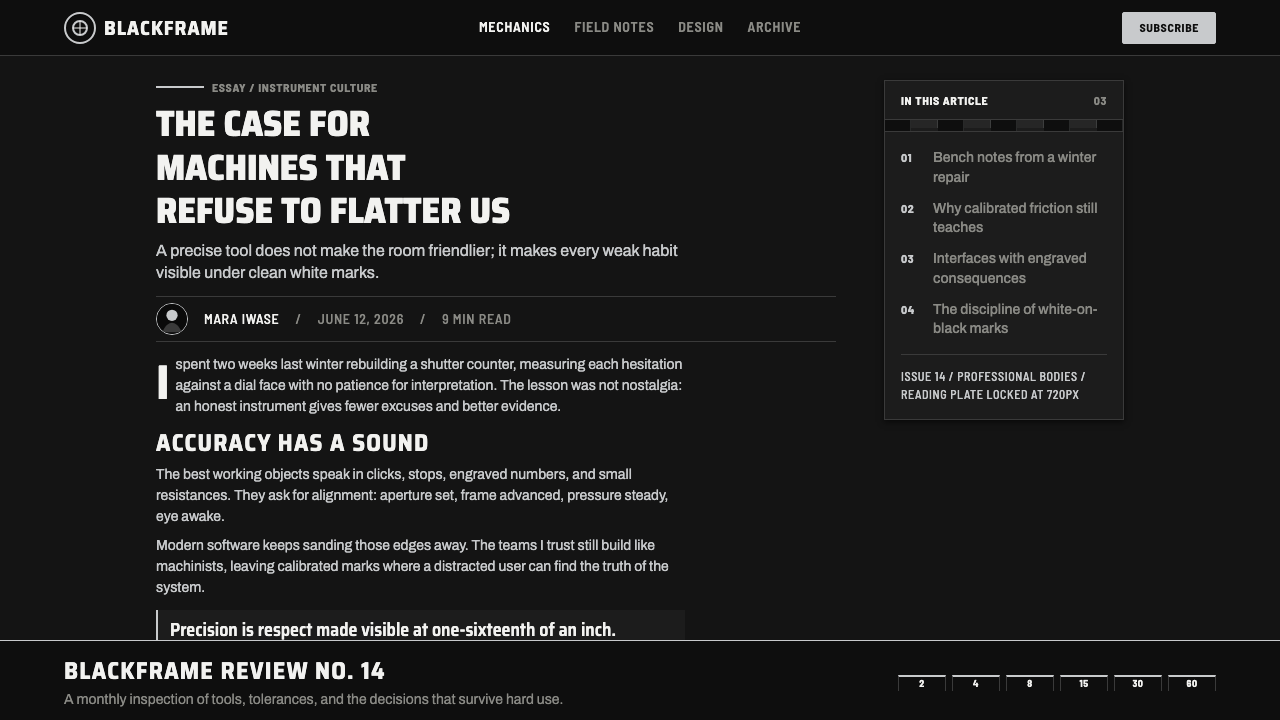
White-filled engraving is the system’s decisive contrast rule. On the black professional body, labels and indices should look recessed into the surface and filled for readability, like calibrated marks on an optical instrument. This differs from floating white display type. The feeling is durable and mechanical: information belongs to the object, rather than hovering over it as a temporary layer.
Semi-Condensed Instrument Type
Typography should be semi-condensed and composed with the economy of engraved labeling. Compact letterforms allow names, values, and controls to sit close to the mechanical structure without becoming casual or crowded. Favor clear, deliberate spacing and a firm hierarchy between primary readings and supporting labels. Ornamental scripts, soft editorial forms, and playful rounded letters undermine the calibrated voice.
Index and Calibration
Lines, ticks, numerals, and small markers carry much of the composition. They should imply that a user can read position, direction, or state from them, even when the interface is not literally a camera. Group marks around controls, align them with edges, and make every cluster purposeful. Random technical decoration is a mistake: an index earns its place only when it organizes information or interaction.
Mechanical Restraint
The style gains authority through selective detail. A rim, a recessed panel, an engraved divider, or a single highlighted dial can establish mechanical depth without making the surface busy. Components should feel assembled rather than illustrated. Decorative textures, expressive gradients, excessive glows, and ornamental screws turn the language into retro costume instead of professional equipment.

Who shaped Nikon F Professional Black?
Nippon Kogaku K.K. is the Japanese manufacturer named as the institutional origin of this theme. The Nikon F Professional Black language is inseparable from the precision-optics context attributed to the company: a machined-brass body, black enamel, chrome interfaces, and engraved markings whose clarity carries the identity.
Launched in 1959, the Nikon F is the central camera platform for the theme and the stated professional standard for the Japanese system SLR. Its professional black-body expression supplies the style’s key distinction: white-filled engraving on black, alongside a deep enamel ground and restrained chrome rims.
Masahiko Fuketa is listed among the key figures for Nikon F Professional Black. The approved material places the name within the theme’s historical frame without expanding it into a biographical account. That limitation is useful for public interpretation: the visual system should remain centered on the documented camera language and its professional optical context.
How do you use Nikon F Professional Black today?
For presentation slides, Nikon F Professional Black is especially effective when the subject needs to feel exact, technical, or quietly premium. On a cover, use the black-enamel ground as the body of the composition, place the title in semi-condensed high-contrast type, and let one satin-chrome rim, rule, or calibrated marker establish orientation. The visual interest should come from the relation between field, metal, and engraving rather than from large decorative imagery.
Content slides should behave like an instrument panel with a generous reading area. Establish one dominant title, clear secondary labels, and tightly aligned information blocks. Use chrome-like separators to define sections sparingly, and use white ticks or small index groups to guide attention toward key values. On data slides, charts should read as measured displays: dark fields, highly legible white labels, muted structural divisions, and selected chrome or white emphasis for the data that needs immediate comparison.
For web interfaces, the style is particularly suited to dashboards, professional tools, configuration screens, portfolio systems, and pricing pages whose product promise involves control or reliability. Make the black ground feel structural, reserve metallic treatment for navigation boundaries and interactive hardware-like elements, and use white-filled marking logic for labels, states, and values. A dashboard should feel less like a neon command center and more like a well-maintained professional instrument with information placed exactly where an operator expects it.
For editorial and marketing work, Nikon F Professional Black gives a campaign a strong sense of authorship when the story concerns craft, optics, engineering, fieldwork, or durable equipment. Use cropped product details, dial-like captions, restrained metallic framing, and dense black title bands to create a disciplined rhythm. In long-form editorial layouts, allow the dark field to alternate with lighter reading areas so the system retains intensity without exhausting the reader. The metallic cue should frame and organize, never become a generic luxury signal.
The common mistake is reducing the style to black surfaces plus random silver decoration. That loses the Nikon F logic, which depends on a hierarchy of material meaning: black is the body, chrome identifies selected mechanical boundaries, and white-filled engraving makes important readings clear. Another mistake is adding exaggerated retro details such as gratuitous film grain, faux damage, or arbitrary technical numerals. The style succeeds when every mark appears necessary, calibrated, and physically attached to the system it describes.
Nikon F Professional Black — FAQ
Is Nikon F Professional Black simply a luxury black-and-silver style?
No. Its authority comes from professional instrument logic, not from contrast for its own sake. Deep black represents the enamel-coated body, satin chrome identifies selected dials and rims, and white-filled engraving makes information readable. If silver is applied everywhere or made excessively reflective, the result shifts toward generic luxury and away from a working camera.
Why is white-filled engraving so important on a black-body interpretation?
It is the stated authenticity pin of the theme. Black Nikon bodies use white fill where chrome bodies use black. Beyond historical specificity, this creates the system’s core reading behavior: information appears as a permanent, recessed calibration mark against the dark body. Replacing it with casual white text preserves contrast but loses the mechanical relationship between information and surface.
Can this style use photography?
Yes, especially when photography supports the professional-tool narrative. Product details, machined surfaces, lens rims, dials, and controlled close views fit naturally because they reinforce material precision. The image should not compete with the instrument language through excessive effects. Treat it as evidence of craft or use, framed by the same black, chrome, and engraved-index hierarchy.
Where does Nikon F Professional Black work best in digital products?
It works best where the product benefits from confidence, control, precision, and durable professional character: dashboards, analytical tools, creative workflows, configuration experiences, equipment catalogs, and focused pricing pages. It is less natural for products that depend on softness, playful spontaneity, or overt emotional warmth. The fit depends on whether the product can honestly inhabit the values of a calibrated instrument.
What is the quickest way to tell an authentic application from a pastiche?
Ask whether every detail has an operational role. In an authentic application, chrome frames a mechanical distinction, engraving clarifies a reading, a tick marks a state or direction, and the black field gives all of those elements contrast. In a pastiche, metallic lines, numbers, scratches, and camera references accumulate without explaining anything. The original language is restrained because it is built around use.
Related design styles
 Interstate Highway ShieldEngineered for 70 mph. Guide-sign green, Pantone shield blue and red, Highway…
 Air Traffic Control RadarOperational gravity. Phosphor green rings, sweep wedges, and monospace blips…
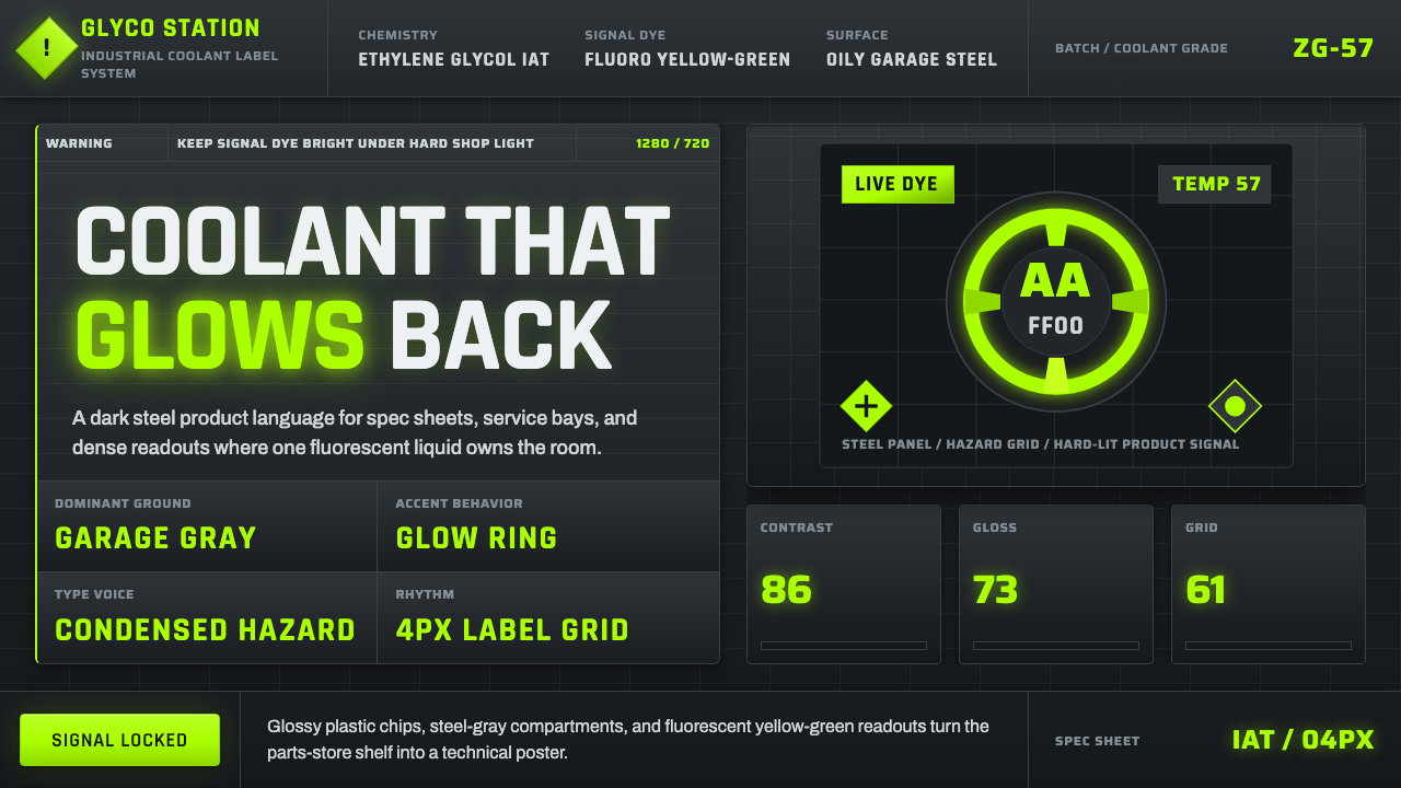 Fluorescent Antifreeze GreenCoolant becomes hazard signal. Fluoro green burns through steel-gray label gr…
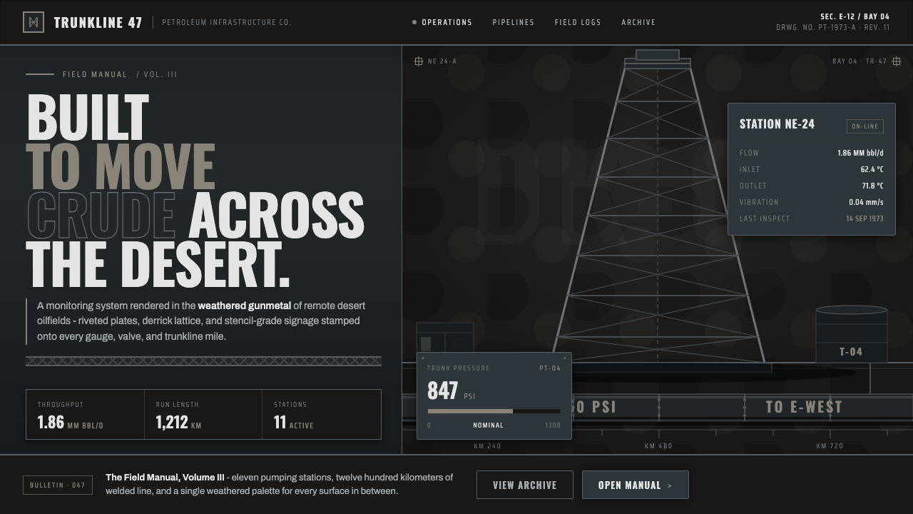 Gulf Oil Derrick IndustrialEngineered, not decorative. Soot-darkened gunmetal, derrick lattice, condense…
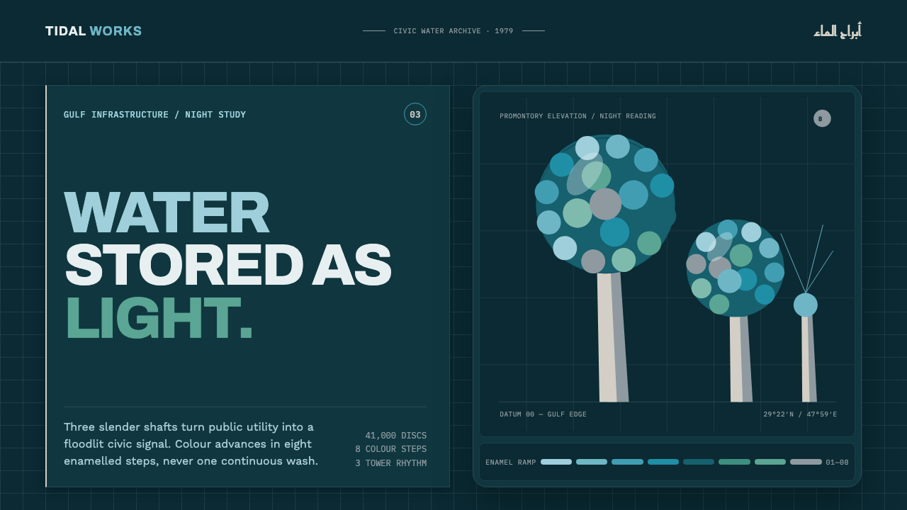 Kuwait Water TowersInfrastructure becomes a night monument. Eight enamel steps spiral across a d…
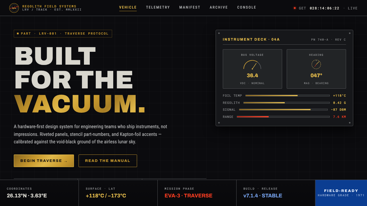 Lunar RoverBuilt for the vacuum. Kapton-gold foil and stencil part-numbers against void-…