What is Czech Devětsil Avant-Garde?什么是 Czech Devětsil Avant-Garde?
Devětsil declared that modern art should be joyful — and then proved it with scarlet ink blocks, rotated type, and aggressively asymmetric grids that still feel urgent a century later.Devětsil 宣告现代艺术应当是欢愉的——然后用猩红墨块、旋转字体与极端非对称网格来证明这一点,一个世纪后依然锐气逼人。
Czech Devětsil Avant-Garde in briefCzech Devětsil Avant-Garde 速览
Czech Devětsil Avant-Garde is the visual language produced by the Devětsil group, a Prague-based modernist collective founded in 1920 whose members issued the Poetism manifesto — the radical declaration that art should be joyful, technical, and democratic. Their magazines, book covers, exhibition posters, and typographic experiments fused Russian Constructivism with Bauhaus structural rigor and a distinctly Bohemian wit, producing a style that is at once politically charged and visually playful.捷克 Devětsil 先锋派,是布拉格现代主义团体 Devětsil 所创造的视觉语言。该团体成立于 1920 年,其成员发布了《诗意主义》宣言,激进地宣称艺术应当是欢愉的、技术的、大众的。他们的杂志、书籍封面、展览海报与排版实验,将俄国构成主义与包豪斯的结构严谨性、波希米亚特有的机智融为一体,产生了一种既饱含政治张力又充满视觉游戏感的风格。
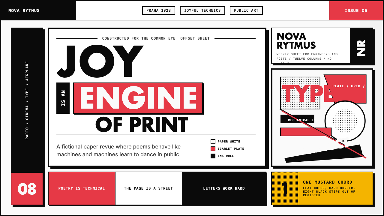
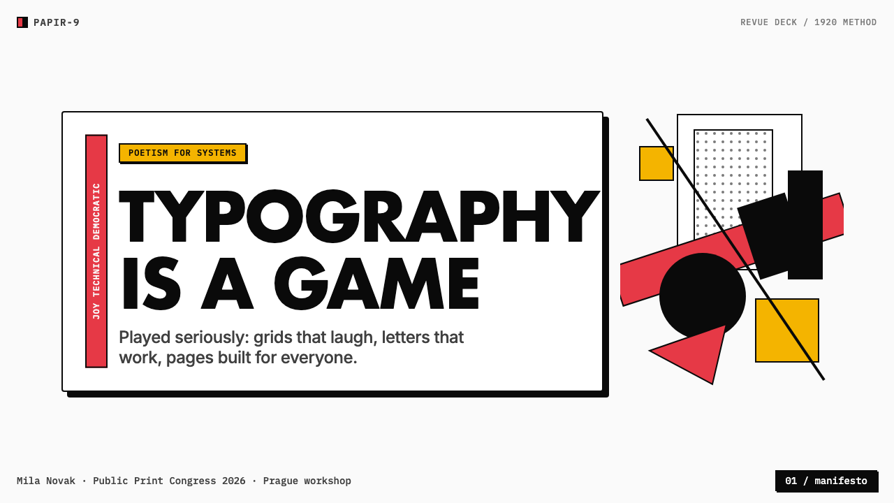
The aesthetic is built on three structural pillars. First, a focused palette: scarlet and ink-black on paper white, with mustard yellow as the signature third chord — no pastels, no gradients, only the saturated primary hues of the offset press. Second, typographic freedom: letterforms treated as objects in their own right, set at wildly varying scales, rotated at sharp angles, and mixed in weight within a single phrase so that the page reads as a visual event before it is read as language. Third, the photomontage and geometric color block as compositional devices — hard-edged shapes and sharply cropped photographs collide on the page along diagonal sight lines, creating the kinetic energy of a machine in motion.这一美学建立在三根结构支柱之上。第一,聚焦的色板:猩红与墨黑铺陈于纸白之上,以芥末黄作为标志性的第三和弦——没有粉彩,没有渐变,只有胶印时代的饱和原色。第二,自由的字体排印:字形被当作独立对象处置,以悬殊的尺度差异排列,以锐角旋转,在同一句话中混用不同粗细,让页面在被阅读为文字之前先被感受为视觉事件。第三,以照片蒙太奇与几何色块作为构图手段——硬边形状与硬裁照片沿斜向视觉锋线碰撞,释放出机器运转般的动能。
What separates Devětsil work from its Constructivist and Bauhaus contemporaries is the Poetist insistence on pleasure. The grid is real but never austere; the geometry is strict but animated by the sense that design should be fun to look at. Karel Teige, the group's primary theorist and art director, described Poetism as an art of living — closer to circus, cinema, and sport than to the gallery wall. That sensibility shows in every page he designed.将 Devětsil 作品与构成主义、包豪斯同时代者区别开来的,是诗意主义对愉悦的坚持。网格是真实的,却从不失于严苛;几何是严格的,却因设计应令人赏心悦目的信念而充满生气。团体的主要理论家兼艺术总监卡雷尔·泰格将诗意主义描述为一种生活的艺术——比起画廊,它更接近马戏团、电影院与体育运动。这种感性在他设计的每一张页面上都显而易见。
See the Czech Devětsil Avant-Garde design system查看 Czech Devětsil Avant-Garde 完整设计系统
Where does Czech Devětsil Avant-Garde come from?Czech Devětsil Avant-Garde 从何而来?
Devětsil was founded in Prague in October 1920, just two years after the establishment of Czechoslovakia as an independent republic. The country's sudden sovereignty created a cultural vacuum and an intellectual hunger: Czech artists who had spent decades subordinate to Viennese taste now had license to build something entirely new. The group took its name from a common meadow plant — the butterbur — a deliberately humble, anti-monumental choice that signaled its rejection of the grand gestures of nineteenth-century Czech nationalism.Devětsil 于 1920 年 10 月在布拉格成立,彼时捷克斯洛伐克作为独立共和国诞生才不过两年。国家骤然独立制造了一片文化真空与智识渴望:数十年来服从维也纳品味的捷克艺术家,如今获得了构建全新事物的许可。该团体以一种普通草甸植物——款冬——命名,这是一个刻意谦逊、反纪念碑式的选择,表明他们拒绝十九世纪捷克民族主义的宏大姿态。
The founding circle included the theorist and graphic designer Karel Teige, the painter and poet Vítězslav Nezval, and the painters Toyen (born Marie Čermínová) and Jindřich Štyrský. Teige was the organizing intelligence: he traveled to Paris, Berlin, and Moscow, corresponded with Le Corbusier and El Lissitzky, and brought back a first-hand knowledge of international avant-garde movements that he then synthesized into the Poetism framework. The 1924 Poetism manifesto, co-authored by Teige and Nezval, argued that Constructivism had solved the problem of useful form — now art should solve the problem of joy.创始核心圈子包括理论家兼平面设计师卡雷尔·泰格、画家兼诗人维捷斯拉夫·内兹瓦尔,以及画家 Toyen(本名玛丽·切尔米诺娃)和因德日赫·什蒂尔斯基。泰格是这一切的组织智慧:他游历巴黎、柏林与莫斯科,与勒·柯布西耶和埃尔·利西茨基通信,亲历了国际先锋运动的第一手知识,再将其综合进诗意主义框架。1924 年由泰格与内兹瓦尔联合撰写的《诗意主义》宣言主张:构成主义已经解决了有用形式的问题——现在艺术应当解决欢愉的问题。
The visual laboratory for the movement was the little magazine. Teige edited and designed Disk (1923) and then ReD — an acronym for Revue Devětsilu — from 1927 to 1931. These publications were themselves designed objects: asymmetric covers with rotated type, photomontage interiors, geometric color blocks used as structural dividers. The printing technology of the era — letterpress and offset lithography with manually mixed inks — gave the work a characteristic slight off-register quality, a faint misalignment between color layers that reads not as error but as hand-made energy.这一运动的视觉实验室是小杂志。泰格主编并设计了《Disk》(1923 年),随后是《ReD》——Revue Devětsilu 的缩写——从 1927 年持续至 1931 年。这些出版物本身就是被设计的对象:非对称封面配以旋转字体,蒙太奇内页,几何色块用作结构性分割。那个时代的印刷技术——凸版与人工调墨的胶版印刷——赋予作品一种特有的轻微套印偏差感,色彩层之间若有若无的错位读来不像错误,而像手工制作的能量。
By the late 1920s, several members were moving toward Surrealism — Toyen and Štyrský founded a movement they called Artificialism, which merged Constructivist structure with dreamlike subject matter. The group formally dissolved in 1931 after a decade of sustained and remarkably coherent output. Its legacy was kept alive partly through Prague's architecture — Teige was a theorist of the functionalist housing blocks built in the city through the 1930s — and partly through the diaspora of its ideas into postwar Czech graphic design, which remained one of the most inventive in Europe through the 1960s and 1970s.1920 年代末,部分成员转向超现实主义——Toyen 与什蒂尔斯基创立了一个名为「人工主义」的运动,将构成主义结构与梦境般的主题融合。团体于 1931 年正式解散,留下了长达十年的连贯创作。其遗产通过两条路径得以延续:一是布拉格的建筑——泰格是 1930 年代建于该市的功能主义住宅街区的理论家;二是其思想向战后捷克平面设计的扩散——捷克平面设计在整个 1960 至 1970 年代仍是欧洲最富创造力的存在之一。
What defines the Czech Devětsil Avant-Garde look?Czech Devětsil Avant-Garde 的视觉特征是什么?
Palette: Scarlet, Black, Mustard色板:猩红、墨黑、芥末黄
The Devětsil palette is three-note and uncompromising: scarlet as the dominant action color, ink-black for typographic structure and shadow masses, and mustard yellow as the warm third chord that keeps the composition from reading as merely aggressive. Paper white is the ground, never tinted or broken. This is not the broad primary triad of the Bauhaus but a more specific, hotter selection — the scarlet is closer to a printer's vermilion than to a painterly crimson, reflective of the movement's explicit embrace of industrial offset printing as the medium of democratic art.Devětsil 色板是三音的、毫不妥协的:猩红作为主导的行动色,墨黑用于字体结构与阴影体量,芥末黄作为温暖的第三和弦,使构图不至于读来只剩攻击性。纸白是底色,从不着染或打断。这不是包豪斯宽泛的三原色三角,而是一种更精确、更热烈的选择——猩红更接近印刷工的朱砂红,而非画家式的深红,映射出该运动对工业胶印作为大众艺术媒介的明确拥抱。
Typography as Object字体即对象
In Devětsil design, type is never merely a vehicle for language — it is a visual form that occupies space, has weight, and commands attention as a drawn shape does. Letterforms appear at wildly varying scales within a single composition, rotated at forty-five or ninety degrees, mixed across heavy and light weights in the same phrase. Sans-serif forms are overwhelmingly preferred, reflecting the Constructivist identification of the serif as a historical remnant incompatible with modernity. The title of a magazine might be set vertically down the left margin while a pull-quote runs at a diagonal across the center of the page.在 Devětsil 设计中,字体从不仅仅是语言的载体——它是一种占据空间、具有重量、如同绘画形状一般命令注意力的视觉形式。字形在同一构图中以悬殊的尺度差异出现,旋转四十五度或九十度,在同一句话中混用粗重与纤细的字重。无衬线字形压倒性地被偏好,反映了构成主义将衬线认定为与现代性不相容的历史遗留的立场。杂志标题可能沿左边距垂直排列,而引语则以斜线穿越页面中央。
Asymmetric Grid and Diagonal Energy非对称网格与斜向张力
Devětsil compositions are organized on a strict underlying grid but are never symmetrical. Balance is achieved through tension rather than mirroring: a heavy scarlet block in one quadrant is counterweighted by a cluster of small rotated text in another. The distinctive feature that separates Devětsil from other Constructivist traditions is the diagonal — sight lines, text rotations, and the implied vectors of photomontage elements all create oblique movement across the page, giving layouts a kinetic quality that feels more like a frame from a film than a static object.Devětsil 构图建立在严格的潜在网格之上,却从不对称。平衡通过张力而非镜像来实现:一个象限里的猩红重色块,被另一象限里的一簇旋转小字所平衡。将 Devětsil 与其他构成主义传统区别开来的标志性特征是斜线——视觉锋线、文字旋转,以及蒙太奇元素所暗示的矢量,共同在页面上制造斜向运动,赋予版面一种动态品质,更像电影的一帧而非静止对象。
Photomontage and Hard-Edge Collage照片蒙太奇与硬边拼贴
Devětsil was among the earliest Central European movements to treat photomontage as a primary compositional language rather than a novelty. Photographs are cropped to geometric silhouettes — a face reduced to a circle, a hand to a rectangle — and combined with flat color blocks in compositions that read as diagrams of modernity. The cutting is always hard: no feathered edges, no soft blends. The effect is a visual world where photographic reality and geometric abstraction occupy the same flat plane on equal terms.Devětsil 是中欧最早将照片蒙太奇当作主要构图语言而非新奇手法的运动之一。照片被裁剪为几何剪影——面孔简化为圆形,手简化为矩形——与平面色块组合成读来像现代性示意图的构图。剪切永远是硬边的:没有羽化边缘,没有柔和混合。效果是一个视觉世界,在其中摄影现实与几何抽象以平等的姿态占据同一平面。
Off-Register Print Texture套印偏差的印刷质感
A characteristic surface quality of Devětsil-period work is the slight misalignment between color layers that offset lithography of the 1920s produced when inks were hand-registered. This is not imprecision to be corrected but a structural property of the medium: the faint halo of one color appearing just beyond the edge of another, or the slight shift that makes a black headline sit a hair off its scarlet ground. Contemporary applications of this aesthetic treat this quality as a deliberate choice — introducing a controlled degree of layer offset that signals hand-craft without abandoning precision.Devětsil 时期作品的一个特征性表面质感,是 1920 年代胶版印刷在人工套版时色彩层之间产生的轻微错位。这不是需要纠正的不精确,而是媒介的结构性属性:一种颜色的淡晕隐约溢出另一种颜色的边缘,或是轻微的偏移使得黑色标题恰好偏离其猩红底色一丝。这一美学在当代的应用将此品质视为刻意选择——引入一定程度的受控图层偏移,在不放弃精准的同时传递手工制作的能量感。
Geometric Color Blocks as Architecture几何色块作为版面建筑
Flat geometric shapes — rectangles, squares, occasional circles — function as the structural architecture of the page, not as decorative fills. A scarlet rectangle is not illustrating anything; it is organizing space, anchoring the composition's weight, and creating the visual pressure that makes the surrounding type resonate. These blocks are drawn from the same printer's vocabulary as the typographic forms: they have the density and tactility of a saturated ink layer, not the weightlessness of a software fill.平面几何形——矩形、正方形、偶见的圆形——作为页面的结构建筑而运作,而非装饰性填充。一个猩红矩形不在图解任何事物;它在组织空间,锚定构图的重量,制造使周围字体共鸣的视觉压力。这些色块来自与字体形式相同的印刷工词汇:它们具有饱和墨层的密度与触感,而非软件填充的失重感。
Democratic Joy as Principle民主欢愉作为原则
The most distinctive thing about Devětsil work relative to its contemporaries is not any single formal device but the underlying attitude: design should be pleasurable to encounter. Where Bauhaus work can read as sober and where Soviet Constructivism can read as commanding, Devětsil layouts have a playful wit — the composition feels like it is enjoying itself. This is not decoration; it is a political commitment to the idea that beauty and pleasure belong to everyone, not only to the educated elite who could afford the gallery wall.Devětsil 作品相对于同时代者最独特之处,不是任何单一形式手段,而是潜在态度:设计应当令人愉悦地相遇。包豪斯作品可能读来严肃,苏联构成主义可能读来命令式,而 Devětsil 版面则带有游戏式的机智——构图感觉在享受自身。这不是装饰;这是一种政治承诺:美与愉悦属于所有人,而非仅属于能够负担画廊墙壁的受教育精英。
See the Czech Devětsil Avant-Garde design system查看 Czech Devětsil Avant-Garde 完整设计系统
Who shaped Czech Devětsil Avant-Garde?谁塑造了 Czech Devětsil Avant-Garde?
Teige was the intellectual engine and primary visual practitioner of Devětsil. As editor and art director of Disk and ReD, he designed covers and layouts that remain among the most cited examples of Central European modernism. He wrote the theoretical frameworks — from Poetism through Constructivism to his later engagement with Surrealism — that gave the group its ideological coherence. His typographic experiments, particularly the practice of treating letterforms as autonomous graphic objects on the page, anticipate practices that would not become standard in graphic design until the postmodern era.泰格是 Devětsil 的智识引擎与主要视觉实践者。作为《Disk》和《ReD》的编辑兼艺术总监,他设计的封面与版面至今仍是中欧现代主义最常被引用的案例。他撰写了理论框架——从诗意主义到构成主义,再到后期对超现实主义的介入——赋予团体以意识形态凝聚力。他的排版实验,尤其是将字形当作页面上自主图形对象处置的实践,预示了直到后现代时代才成为平面设计常规的做法。
Toyen adopted a gender-neutral pseudonym as a deliberate act of identity construction, rejecting conventional feminine categorization. As a painter and illustrator within Devětsil, she contributed imagery that sat at the boundary between Constructivist geometry and surrealist dreamscape. With Štyrský she developed Artificialism — a short-lived but historically significant movement that attempted to fuse the structural clarity of Constructivism with the interior imagery of psychoanalytically influenced painting. Her work demonstrates that the Devětsil orbit was not a single unified style but a conversation among distinct visions.Toyen 以一个中性笔名作为身份构建的刻意行动,拒绝常规的女性归类。作为 Devětsil 内部的画家与插画家,她贡献了介于构成主义几何与超现实主义梦境之间的图像。她与什蒂尔斯基共同发展出「人工主义」——一个短暂却具历史意义的运动,尝试将构成主义的结构清晰性与受精神分析影响的绘画内在图像融合。她的作品表明,Devětsil 轨道并非单一统一的风格,而是不同视野之间的对话。
Štyrský was Devětsil's most restless visual experimenter. His book cover designs pushed the photomontage vocabulary further than Teige's more systematically typographic approach — combining deeply personal imagery with the movement's hard-edged formal language. His collaboration with Toyen in Artificialism produced some of the most psychologically complex images associated with the Czech avant-garde. His work points toward the later surrealist current that would absorb many Devětsil members as the 1930s progressed.什蒂尔斯基是 Devětsil 最不安分的视觉实验者。他的书籍封面设计将照片蒙太奇词汇推得比泰格更为系统性排印的方式更远——将极为个人化的图像与该运动硬边的形式语言结合。他与 Toyen 在「人工主义」中的合作产生了与捷克先锋派相关的一些心理上最复杂的图像。他的作品预示了随着 1930 年代推进将吸收许多 Devětsil 成员的超现实主义潮流。
Nezval was the movement's poet and co-author of the 1924 Poetism manifesto. His contribution to the visual culture of Devětsil was less direct than Teige's but no less important: his language — celebrating the cinema, the circus, the department store window, and the modern city — gave Teige's visual vocabulary its subject matter and its emotional register. Nezval later became the primary Czech proponent of Surrealism, founding the Czech Surrealist Group in 1934, and his trajectory from Poetism to Surrealism tracks the broader evolution of the Devětsil generation.内兹瓦尔是该运动的诗人,也是 1924 年《诗意主义》宣言的联合作者。他对 Devětsil 视觉文化的贡献不如泰格直接,却同等重要:他的语言——颂扬电影院、马戏团、百货公司橱窗与现代城市——赋予泰格视觉词汇以主题内容与情感基调。内兹瓦尔后来成为超现实主义在捷克的主要倡导者,于 1934 年创立捷克超现实主义团体,他从诗意主义到超现实主义的轨迹,追踪了 Devětsil 一代更广泛的演变。
How do you use Czech Devětsil Avant-Garde today?今天怎么用 Czech Devětsil Avant-Garde?
Devětsil Avant-Garde is one of the more technically demanding historical styles to apply well, because it combines strict structural discipline — the asymmetric grid, the deliberate color restriction — with a quality of energetic playfulness that is hard to fake. The starting point for any application is to understand that the scarlet is doing structural work, not decorative work: it marks the primary focal point, anchors the most important piece of information, and is used once in the composition rather than scattered.Devětsil 先锋派是历史风格中较难正确应用的一种,因为它将严格的结构纪律——非对称网格、刻意的色彩限制——与一种充满活力的游戏感结合,而后者很难伪造。任何应用的出发点,是理解猩红在做结构性工作,而非装饰性工作:它标记主要焦点,锚定最重要的信息,在构图中使用一次而非四处散布。
For presentation slides, the style works at two registers. Cover slides benefit from treating the entire frame as a single poster-like composition: one dominant color block, a title in large sans-serif type at a scale that fills the available space, and a secondary element — a date, a subtitle, a cropped photograph — held in deliberate tension with the primary block. Content slides should be stripped to a single organizing grid: type hierarchies defined purely by size and weight rather than color, with scarlet reserved only for the single most critical label or data point per slide. Data visualization slides take on a diagrammatic quality — the bars and segments of charts become geometric color objects, with the key metric rendered in the accent color and all supporting data in black or near-black.在演示文稿中,这种风格在两个维度上均可发挥作用。封面页宜将整个画面作为单一的海报式构图处理:一个主导色块,一个以大尺度无衬线字体书写的标题填满可用空间,以及一个次要元素——日期、副标题、裁切照片——与主色块保持刻意的张力。内容页应简化至单一组织网格:字体层级纯粹以尺度与字重定义,而非色彩,猩红只保留给每张幻灯片中单一最关键的标签或数据点。数据可视化幻灯片呈现示意图式品质——图表的柱条与扇区成为几何色彩对象,关键指标以强调色呈现,所有辅助数据以黑色或近黑色呈现。
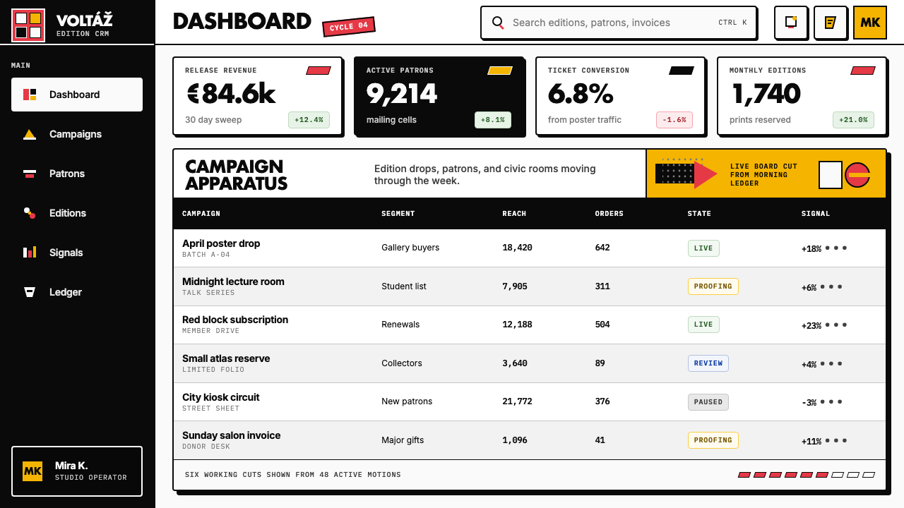
For web interfaces, the style is particularly effective on dashboards, analytics tools, and pricing pages where information density demands clear visual hierarchy. Apply a strict column grid, use paper-white or near-white as the background, set body text in black for maximum contrast, and deploy the scarlet exclusively for primary actions, critical alerts, or the highlighted tier in a pricing table. Card components should use hard offset shadows rather than soft ones, giving the UI the physical quality of layered paper. Navigation should be typographic — the wordmark and page labels — with geometric indicators rather than illustrative icons.对于网页界面,这种风格在信息密度要求清晰视觉层级的仪表板、分析工具与定价页面上尤为有效。应用严格的列网格,以纸白或近白色作为背景,正文以黑色书写以获得最大对比度,猩红专用于主要操作、关键警示,或定价表中的高亮等级。卡片组件应使用硬边偏移阴影而非柔和阴影,赋予界面分层纸张般的物质感。导航应当是字体性的——文字标识与页面标签——以几何指示符代替具象图标。
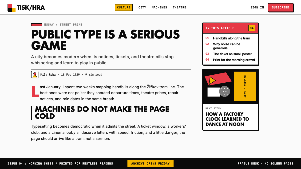
For editorial and marketing applications, the style's poster-like boldness is most effectively deployed through strong typographic contrast. A feature section header set at an outsized scale, with a short body text block in a much smaller weight, creates the size-contrast energy that characterizes authentic Devětsil typography. Marketing landing pages can alternate between white-ground and scarlet-ground sections for visual rhythm, with mustard as an accent color for secondary calls-to-action. Editorial layouts should assign a wide margin — left or right — for pull-quotes or labels, and use a hard horizontal rule in black or scarlet as a section break rather than decorative ornaments.对于编辑与营销应用,这种风格的海报式大胆感最有效地通过强烈的字体对比来发挥。以超大尺度设置的特性章节标题,搭配以小得多的字重排列的短正文块,制造出真实 Devětsil 排版所特有的尺度对比能量。营销落地页可以在白底版块与猩红底版块之间交替以形成视觉节奏,以芥末黄作为次要行动号召的强调色。编辑版面应在左侧或右侧留出宽阔边距用于引语或标签,以黑色或猩红色的硬边水平线作为段落分隔,而非装饰性元素。
The most common mistake when applying this style is using the scarlet and mustard simultaneously at high saturation across large areas, which collapses the hierarchy that makes the palette effective. Authentic Devětsil compositions lead with one dominant color and introduce the second as a calculated accent — not a co-equal partner. A second common error is applying rotation to type decoratively, spinning labels without a compositional reason. In the original work, rotated type creates a diagonal vector that the rest of the composition answers; it is not garnish but architecture. A third mistake is softening the palette toward orange or terracotta because the original scarlet reads as aggressive — but that tension is the point. The scarlet earns its place by doing structural work.应用这种风格时最常见的错误,是在大面积区域同时以高饱和度使用猩红与芥末黄,这会瓦解使色板有效的层级。真实的 Devětsil 构图以一种主导色领衔,将第二种作为经过计算的强调色引入——而非平等的伙伴。第二个常见错误是装饰性地旋转字体,在没有构图理由的情况下旋转标签。在原始作品中,旋转字体制造了一条构图其余部分予以呼应的斜向矢量;它是建筑,而非点缀。第三个错误是因为原始的猩红显得过于强烈而将色板软化为橙色或赤陶色——但这种张力正是关键所在。猩红通过完成结构性工作来赢得它的位置。
See the Czech Devětsil Avant-Garde design system查看 Czech Devětsil Avant-Garde 完整设计系统
Czech Devětsil Avant-Garde — FAQCzech Devětsil Avant-Garde · 常见问题
How does Devětsil differ from Russian Constructivism if they look so similar?Devětsil 与俄国构成主义看起来如此相似,它们之间有何不同?
The visual vocabulary overlaps substantially — both movements use asymmetric grids, sans-serif type, geometric color blocks, and photomontage. The difference is ideological and emotional. Russian Constructivism was in the service of collective political goals: its imagery is commanding, its tone often heroic or instructional. Devětsil's Poetism manifesto explicitly argued that Constructivism had solved the problem of useful form, and that the next task was joy. Devětsil layouts have a wit and playfulness — rotated type used with evident delight, compositions that feel like they are enjoying themselves — that Soviet work rarely permitted. The palette also differs: Devětsil's scarlet-and-mustard is warmer and more specific than the broader red-black-white of most Soviet work.两者的视觉词汇有大量重叠——两个运动都使用非对称网格、无衬线字体、几何色块与照片蒙太奇。差异在于意识形态与情感。俄国构成主义服务于集体政治目标:它的图像是命令式的,基调往往英雄主义或教导式。Devětsil 的《诗意主义》宣言明确主张构成主义已解决了有用形式的问题,下一个任务是欢愉。Devětsil 版面有一种机智与游戏感——旋转字体用得明显充满乐趣,构图感觉在享受自身——这是苏联作品很少允许的。色板也有差异:Devětsil 的猩红加芥末黄比大多数苏联作品更广泛的红-黑-白更温暖、更具体。
Can the style work on a dark background, given that the originals were almost all printed on white paper?考虑到原作几乎都印在白纸上,这种风格能在深色背景上运作吗?
A dark inversion is possible but requires significant adjustment. On a dark ground, the mustard yellow tends to dominate aggressively — it becomes the loudest element rather than the warmest — and the scarlet, which on white reads as vibrant but controlled, can bleed into the surrounding field and lose its structural precision. A workable dark variant commits to a single foreground accent color, typically scarlet or mustard but not both, treats the other as a structural or typographic element only, and uses near-white rather than pure white for type to reduce the harshness of the contrast. The off-register print texture quality, if carried into a dark variant, becomes more prominent and needs to be used with restraint.深色反转是可能的,但需要大幅调整。在深色底面上,芥末黄往往会强势主导——成为最响亮的元素而非最温暖的——而猩红在白底上读来活泼却受控,在深底上可能渗入周围区域而失去结构精准性。可行的深色变体以单一前景强调色为准——通常是猩红或芥末黄,但不同时使用两者——将另一种仅作为结构性或字体性元素,并使用近白色而非纯白色排字以减少对比的刺激感。若将套印偏差的印刷质感带入深色变体,它会变得更加突出,需要克制地使用。
Is Poetism the same as the Devětsil visual style, or are they different things?诗意主义与 Devětsil 视觉风格是同一回事,还是不同的事物?
Poetism was the philosophical and aesthetic program — the argument that modern art should prioritize joy, entertainment, and democratic accessibility, drawing on cinema, circus, sport, and urban life as its reference points. The Devětsil visual style is the design practice that emerged from this argument: the specific palette, typographic approach, and compositional methods that Teige and others developed in their magazines and book covers. Poetism is the 'why'; the visual style is the 'how'. This distinction matters in application: you can apply the Devětsil visual vocabulary to any context, but the result will feel authentic only if the underlying intent carries some of the Poetist spirit — a genuine desire to make the designed object pleasurable rather than merely correct.诗意主义是哲学与美学纲领——主张现代艺术应优先考虑欢愉、娱乐与大众可及性,以电影、马戏团、体育与都市生活为参照点。Devětsil 视觉风格是从这一主张中涌现的设计实践:泰格等人在他们的杂志与书籍封面中发展出的具体色板、排版方法与构图手段。诗意主义是「为什么」;视觉风格是「怎么做」。这一区分在应用中至关重要:你可以将 Devětsil 视觉词汇应用于任何语境,但只有当底层意图带有某种诗意主义精神时——一种使设计对象令人愉悦而非仅仅正确的真诚渴望——结果才会感觉真实。
How should photography be handled in a Devětsil-inspired design?在受 Devětsil 启发的设计中,照片应如何处理?
Photography in Devětsil work is never naturalistic and never decorative in the conventional sense. Images are cropped to geometric silhouettes or to hard rectangular blocks that read as color planes rather than windows onto scenes. High contrast is essential: the photograph should read clearly alongside solid color blocks without competing tonally or creating ambiguity about which element is primary. In contemporary applications this translates to treating photography as a flat plane — silhouetting against white, cropping to a strict geometric shape, or converting to a high-contrast duotone using the palette's black and scarlet. Soft-edged images, vignettes, and atmospheric photography are incompatible with the style's structural logic.Devětsil 作品中的照片从不是自然主义的,也从不以传统意义上的装饰方式存在。图像被裁剪为几何剪影,或被裁剪为读来如色彩平面而非场景之窗的硬边矩形块。高对比度至关重要:照片应与实心色块并列时读来清晰,不在调子上形成竞争,也不制造哪个元素为主的歧义。在当代应用中,这转化为将照片当作平面处理——在白底上做剪影,裁剪为严格的几何形状,或使用色板中的黑色与猩红转化为高对比度双色调。柔边图像、渐晕效果与氛围化摄影与这种风格的结构逻辑不相容。
What kinds of products or brands are a poor match for this style?哪类产品或品牌与这种风格不匹配?
The Devětsil aesthetic is demanding and specific in its emotional register — it projects energy, intelligence, and a degree of confrontational boldness. This makes it poorly suited to contexts where softness, warmth, or organic sensory richness are the desired emotional qualities: food and beverage brands, children's products, wellness and healthcare, luxury goods that trade on heritage or artisanal craft, and consumer products whose audience expects approachability and ease. The style also struggles in contexts that require cultural specificity or local warmth — the geometric universalism that is its strength can read as cold or rootless in markets where cultural connection is a purchase driver. It works best for technology tools, analytical platforms, editorial media, and any brand that wants to signal rigor, intelligence, and a commitment to the modern.Devětsil 美学在情感基调上是苛求而具体的——它传递能量、智识与一定程度的对抗性大胆。这使它不适合柔软感、温暖感或有机感官丰富性是期望情感品质的语境:食品与饮料品牌、儿童产品、健康与医疗、以传承或手工工艺为核心价值的奢侈品,以及受众期待亲切与易于接触的消费品。这种风格在需要文化特殊性或地方温度的语境中同样力不从心——其作为优势的几何普遍主义,在文化连接是购买驱动力的市场中可能读来冷漠或缺乏根基。它最适合技术工具、分析平台、编辑媒体,以及任何希望传递严谨、智识与对现代性承诺的品牌。
Related design styles相关设计风格
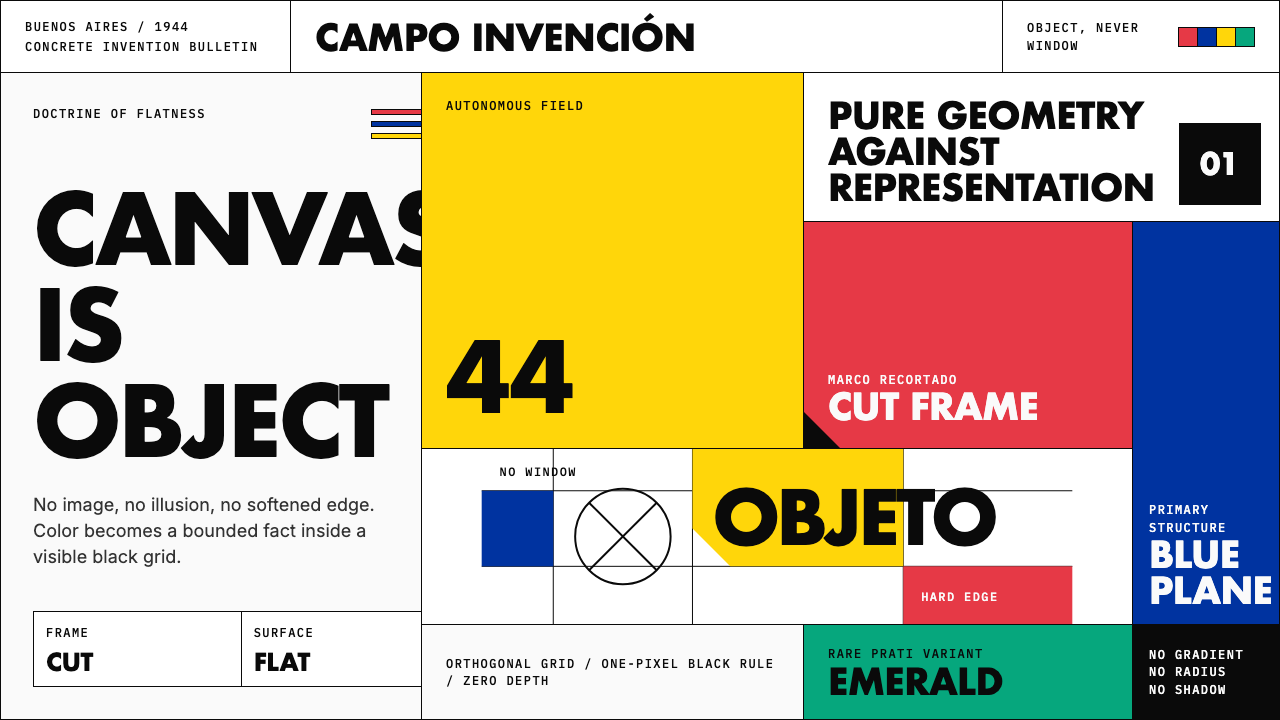 Argentine Arte ConcretoCanvas becomes object. Primary blocks, black hairlines, and a cut-frame grid…画布成为物:原色块、黑色细线与剪裁框网格强制平面性。
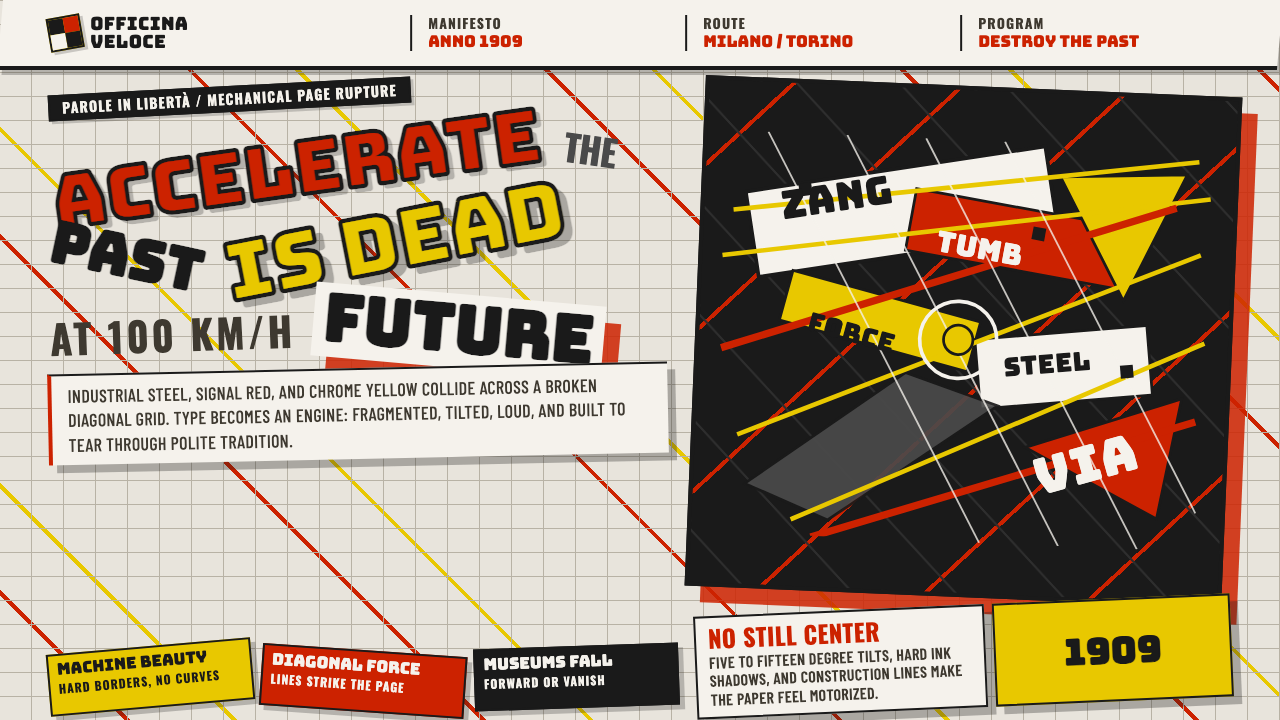 Italian Futurism (Marinetti 1909)Speed murders tradition. Signal red and chrome yellow slash a broken diagonal…速度杀死传统:信号红与铬黄斩开破碎斜向网格。
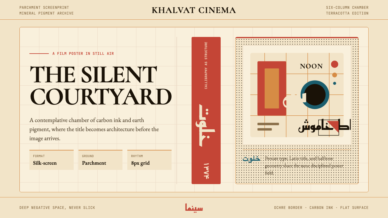 Iranian Modernist Cinema PosterStillness becomes monumental. Terracotta Kufi type breathes inside a Swiss pa…静默成碑。赤陶库法字在羊皮纸瑞士网格中呼吸。
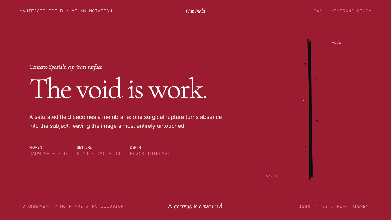 Spatialism (Fontana Cut, 1949)Absence becomes medium. Carmine field, Garamond restraint, one black incision.缺席成为媒介:胭脂红色场、Garamond克制排版、一道黑色切口。
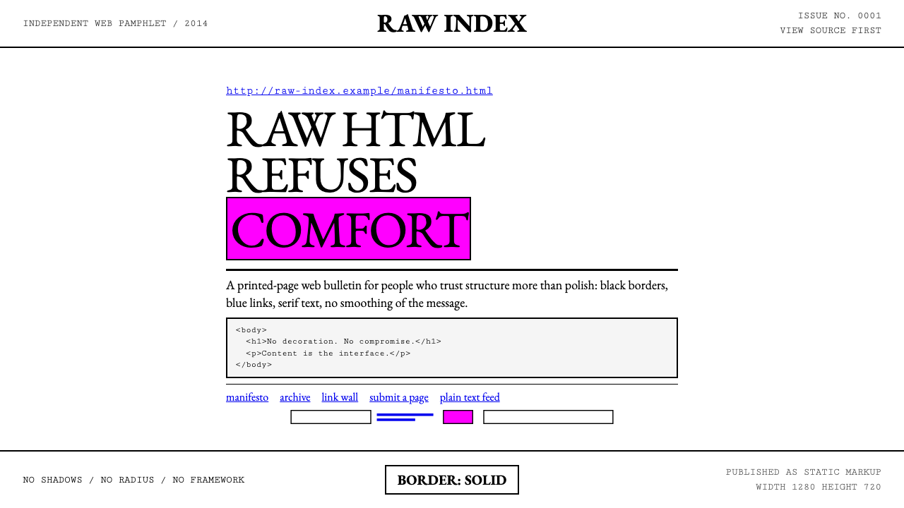 Brutalist Web 2014Browser defaults, weaponized. Times New Roman, electric-blue links — raw HTML…把浏览器默认样式当武器:Times New Roman、电蓝链接——HTML…
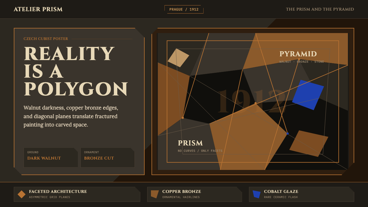 Czech Cubism (Prague 1912)Reality is faceted. Walnut ground, Cinzel capitals, and bronze diagonals cut…现实是多面体。胡桃木底、Cinzel 大写与青铜斜线切开平面。