What is Vorticism?
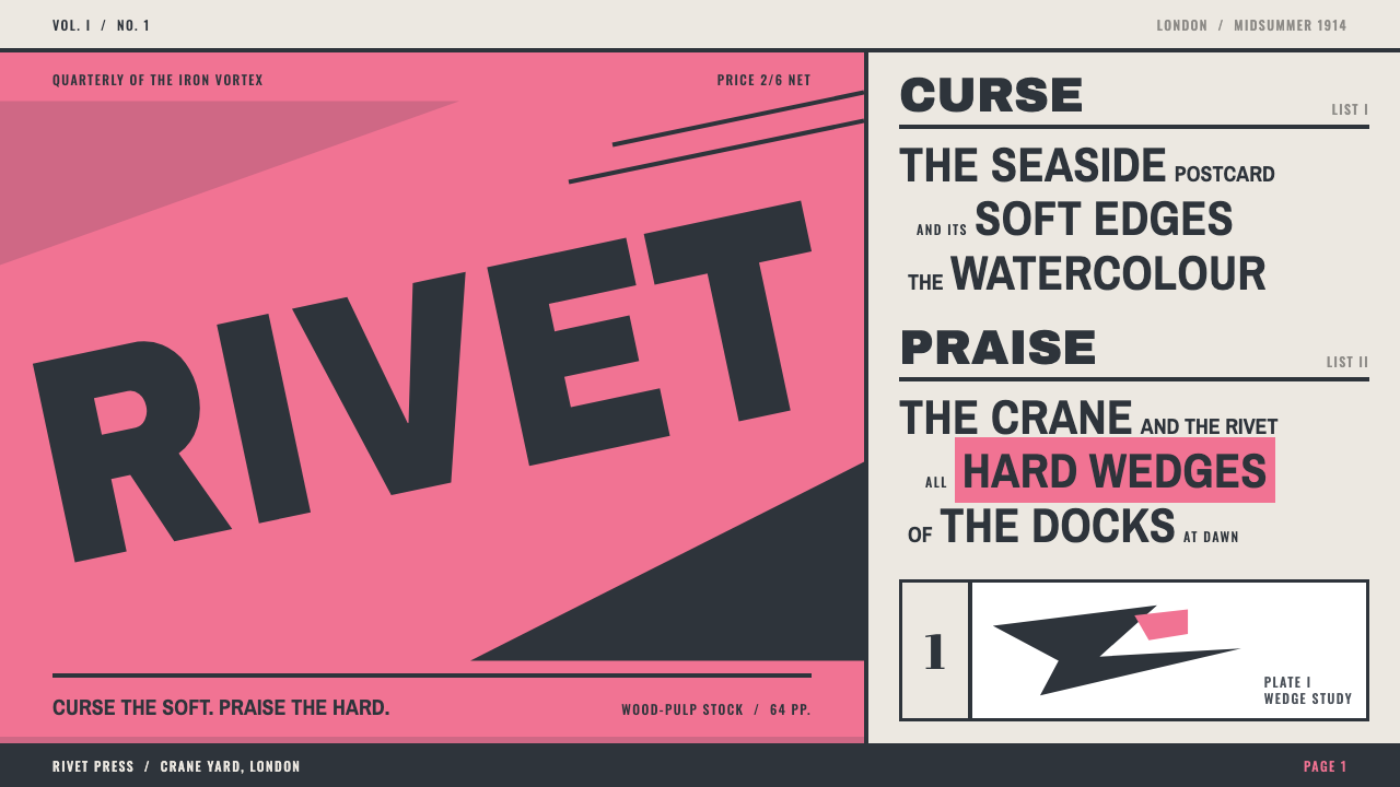
Vorticism was typography as a shout: black capitals slammed across a violent pink cover in a London magazine that lived for two issues.
Vorticism in brief
Vorticism was a short-lived London avant-garde of 1914–1915 whose visual language is angular, heavy and loud: black wood-type capitals, hard diagonals, framed numerals, thick rules and plates that look machined rather than drawn. Its manifesto and magazine, BLAST, remain the clearest record of the style, and it is the source of this design system.
The look begins with the page itself. The first issue came in a violent pink card cover with the title set diagonally across it in black capitals. Inside, the paper was a dull grey wood-pulp stock, and the type ran at clashing sizes on a single line, listing what the editors wanted to blast and what they wanted to bless. The result is typography that behaves like an argument: it does not describe, it declares.
Today the style is a way of making interface and page layout feel confrontational and immovable. It keeps the stillness of a printed plate and the tension of an angle, without the flowing curves of decoration. It is graphic design with its sleeves rolled up, closer to a poster nailed to a wall than a gentle brochure.

Where does Vorticism come from?
Vorticism was the work of a small circle in London around the writer and painter Wyndham Lewis. He edited BLAST; the poet Ezra Pound is credited with giving the movement its name. The idea of a vortex — a point of maximum energy at the centre of a whirling mass — suited a group that wanted British art to stop imitating the past and start expressing the speed and machinery of the modern city.
BLAST No. 1 is dated 20 June 1914 and appeared in July 1914. Its pink cover, with the title slammed diagonally in black wood-type capitals, was meant to be impossible to ignore. Inside, the editors printed a manifesto in a ragged, asymmetrical typographic layout, with lists of things to be blasted and blessed. The tone was deliberately insulting to the genteel art world of the period. It was also a typographic experiment: instead of one tidy column in one size, the page used heavy capitals at different scales, wide empty spaces and bold rules.
Behind the typography stood a group of artists. Henri Gaudier-Brzeska, the sculptor, and Edward Wadsworth, the painter and printmaker, are named among the key figures alongside Lewis and Pound. Their work shared an interest in hard-edged, geometric forms. Vorticism is closely tied to Cubism: it borrowed the Cubist habit of breaking subjects into planes, but it pushed the planes toward mechanical, almost industrial angularity, and it replaced Cubist reserve with noise and aggression.
The movement did not last. BLAST No. 2, the so-called War Number, appeared in July 1915, and the First World War broke the group apart. The brevity is part of the legend: a magazine with only two issues, a movement that barely lasted a year, and yet a graphic style that is still instantly recognisable. Its energy came from the sense that it was happening right before something ended.
What defines the Vorticism look?
The pink slab
A violent, almost abrasive pink is used as a solid slab, the way the first issue used it for its entire cover. It is not a soft or romantic pink. It works as a shock of colour against the dull paper and the black type, and it is typically used once, at large scale, rather than scattered across small details.
Pulp-grey paper
The ground of the pages is the grey of cheap wood-pulp paper, slightly dull and slightly cold. It gives the black type a rough, printed, unglamorous setting. It also makes the pink feel harsher by contrast. White is avoided because this is meant to look like a printed object that has been handled, not a clean screen.
Slammed capitals
Type is set in heavy black grotesque capitals at clashing sizes on one line, and titles are tilted onto a diagonal. The letters are blunt and wide, closer to wood-type posters than to refined book typography. Hierarchy comes from sheer scale and weight rather than from subtle variations in style.
Heavy rules and frames
Thick rules cut across the page and numerals sit inside frames. The lines are used as structural beams, not as hairline dividers. They create a sense of load-bearing architecture, and they hold the loud type in place so the page feels braced rather than chaotic.
Machined plates
Illustrations are angular plates built from planes and wedges, looking cut and assembled rather than drawn by hand. They carry a Cubist ancestry but lean toward the mechanical. In a layout they act as dense black-and-white masses that balance the large empty areas around the text.
Stillness with tension
Despite the noise, nothing blurs, glows or floats. The composition is fixed like a printed plate, and the energy comes from angles and scale clashes rather than from motion. Shadows, if any, are hard. The style is loud and motionless at the same time.

Who shaped Vorticism?
Painter and writer who edited BLAST and led the Vorticist group. The magazine's aggressive tone and layout are largely his.
The poet who named the movement Vorticism, linking its ideas to the image of a vortex as a point of concentrated energy.
Sculptor associated with the group, whose hard-edged, compact forms are among the clearest sculptural expressions of its geometry.
Painter and printmaker whose angular, machine-like compositions show the Vorticist interest in industrial form.
How do you use Vorticism today?
In slide decks, Vorticism is ideal for a manifesto slide, a provocation, or a cover that needs to feel like a statement. Set a single title in black capitals on a diagonal against a large pink slab, and leave everything else sparse. Content slides work best with one heavy headline, a rule or two, and wide empty margins. For data slides, use the frames and thick rules as structure and keep charts to flat black marks on the pulp-grey ground, so the numbers look stamped rather than drawn.
In web interfaces, the style suits manifestos, campaign sites, cultural institutions, portfolios and anything that wants to argue with the visitor. A hero can carry a slammed headline over a block of pink, with a heavy rule beneath. Navigation should be blunt: uppercase labels, hard rectangles, no soft transitions. It is awkward for dense dashboards, where the shouting capitals and angled titles would fight the data; there it is better as an accent on the page header.
For editorial and marketing work, it is an excellent fit for zines, posters, event announcements, opinion pieces and lists that take a position, since the original magazine was built around lists of things to blast and bless. Set a list in capitals of clashing sizes with wide spacing, and the format does the arguing for you. A single angled element is usually enough tilt for a whole page.
The key is to commit to a few loud decisions and keep everything else quiet: one slab of pink, one slammed title, one or two plates. The roughness of the paper tone and the weight of the rules do the rest.
The most common mistake is to use the angles and the capitals everywhere, which turns the layout into noise and makes the diagonals meaningless. The second is to smooth it: adding soft shadows, rounded corners or gradients removes the machined, printed quality that defines the style. A third is to treat the pink as a pastel; it should be violent, not sweet.

Vorticism — FAQ
What was BLAST?
BLAST was the magazine of the Vorticists, edited by Wyndham Lewis. Its first issue is dated 20 June 1914 and appeared in July 1914, with a violent pink cover and a title in black capitals set diagonally across it. The second issue, the War Number, appeared in July 1915. It is the main source of the style's visual language.
Where does the name Vorticism come from?
The poet Ezra Pound named the movement. The vortex is a point of intense energy at the centre of a whirling mass, an image the group used for a modern art that was concentrated, forceful and in motion, rather than a calm reflection of the past.
How is Vorticism related to Cubism?
Vorticism borrowed from Cubism the practice of breaking forms into planes. But it pushed those planes toward sharp, mechanical angles and added a loud, polemical tone that Cubism did not have. In design terms, that means hard-edged geometry combined with aggressive typography.
Why is the paper grey rather than white?
The original pages were printed on grey wood-pulp paper. In the design system, that grey gives the black type a rough, printed look and makes the pink feel harsher by contrast. A bright white ground would turn the same layout into a clean, polite screen, and the confrontational quality would weaken.
What kinds of projects is it wrong for?
It is wrong for anything that needs warmth, reassurance or quiet: healthcare, children's products, wellness, or long-form reading. The style demands attention and does not relax. It works for projects with something to declare, and it is best used in small, high-impact doses.
Related design styles
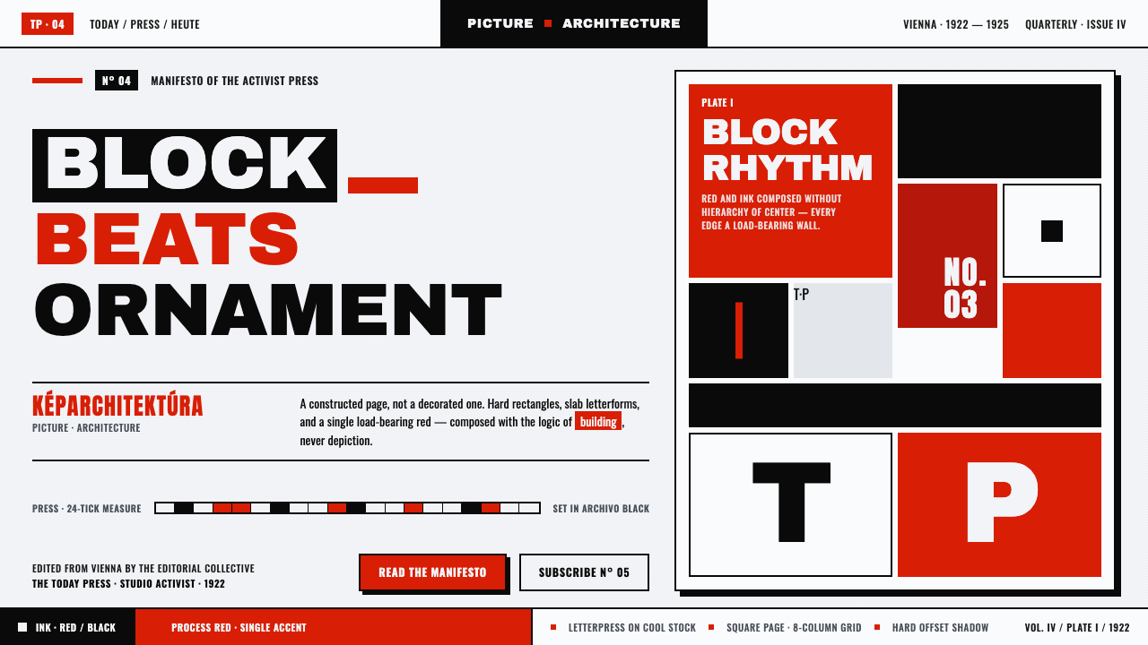 Lajos Kassák MA ConstructivismPage as building, not picture. Red and ink slab-sans blocks set asymmetricall…
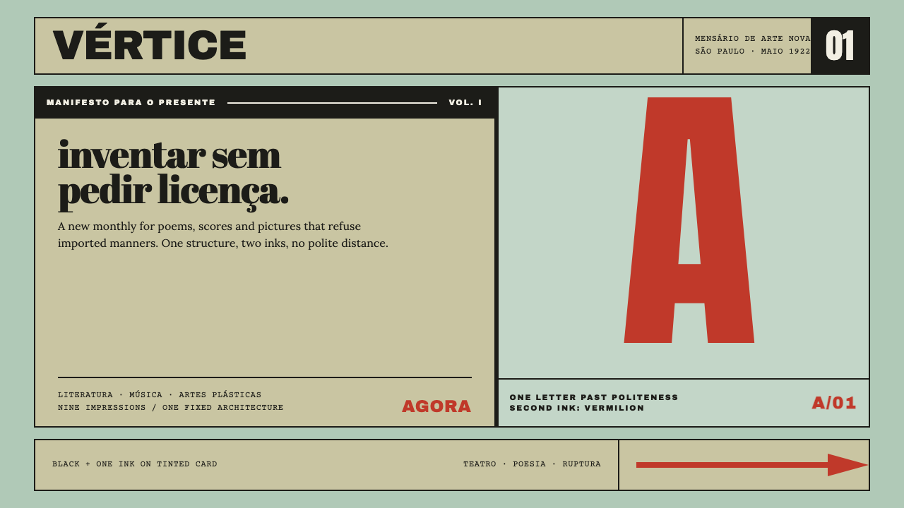 Semana de Arte ModernaType refuses politeness. Black and vermilion lock one giant letter onto mint…
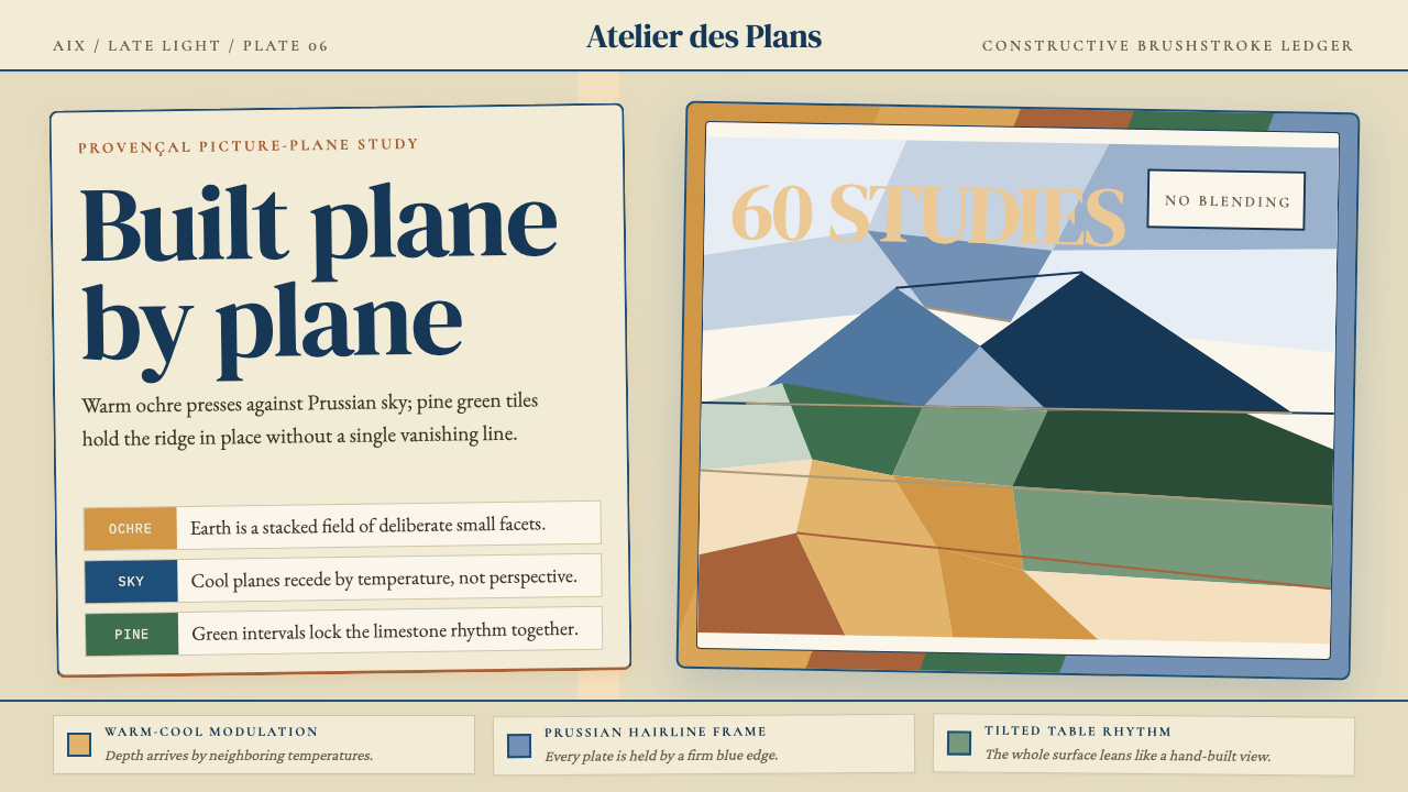 Cézanne — Mont Sainte-VictoireBuilt, not blended. Ochre, Prussian blue, and pine facets tilt into a constru…
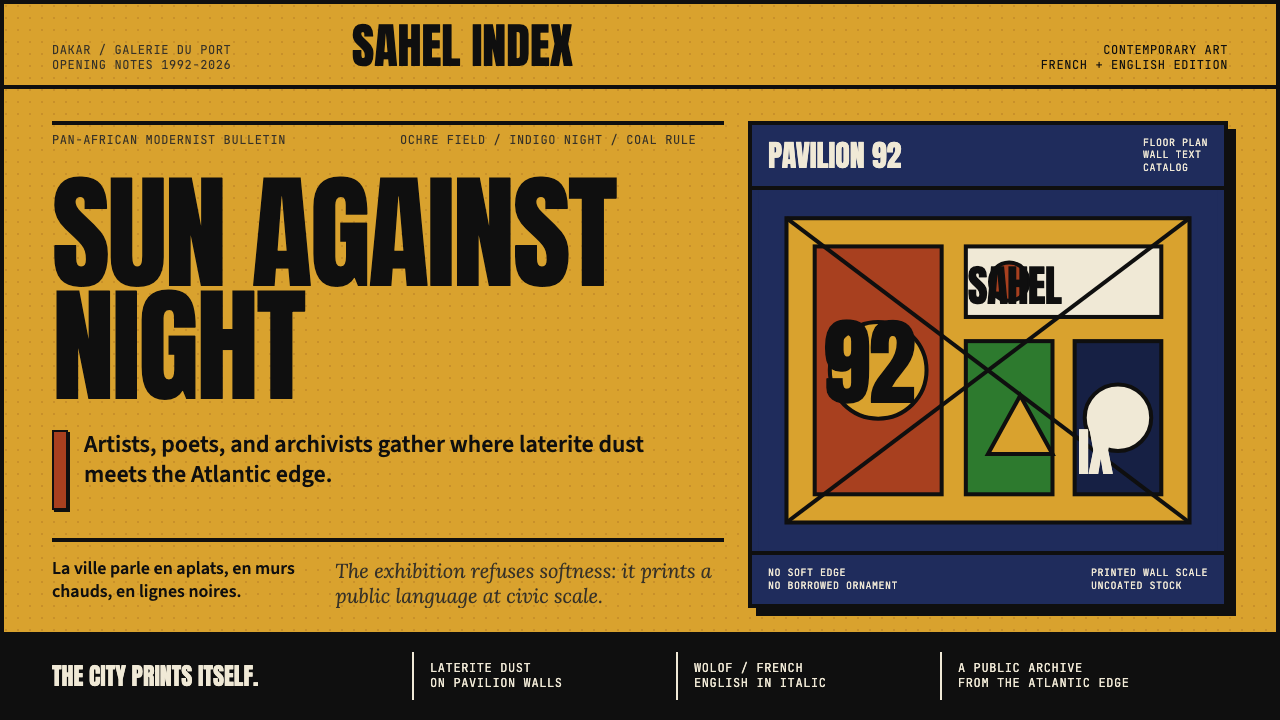 Dak'Art BiennalePan-African modernism speaks loud. Ochre ground, indigo block, Anton type, bl…
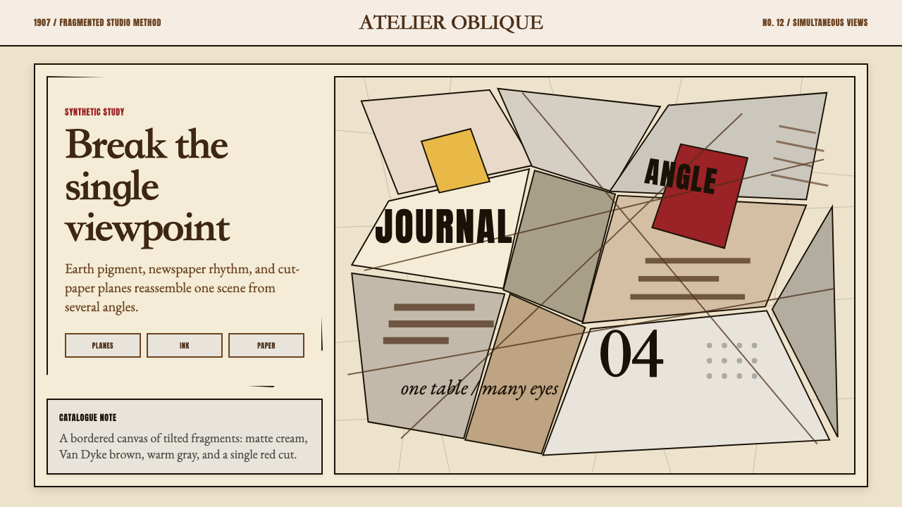 Picasso CubismSingle sight is shattered. Cream collage paper fractures brown-gray planes wi…
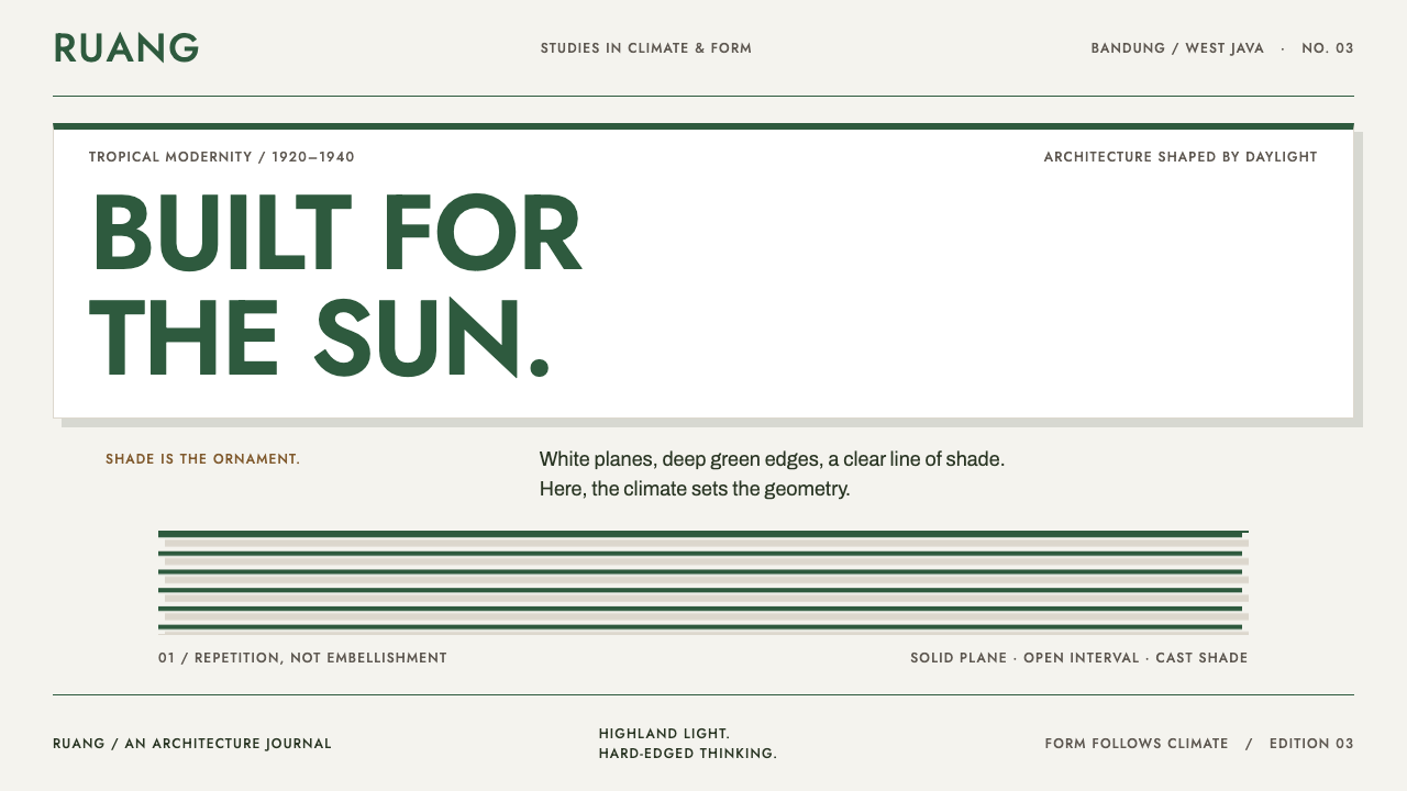 Bandung Tropical Art DecoClimate writes the geometry. Bottle-green bands on stucco white make hard sha…