What is Skopje 1963 Reconstruction?
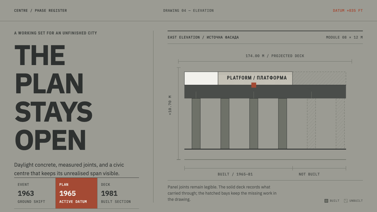
After an earthquake destroyed most of Skopje in 1963, Kenzo Tange's reconstruction became a city drawn as unfinished work, and this style turns that honesty into a language of concrete grey, solid built bays and hatched ones still to come.
Skopje 1963 Reconstruction in brief
Skopje 1963 Reconstruction is a design style drawn from the rebuilding of Skopje, then part of the Socialist Republic of Macedonia in Yugoslavia, after the earthquake of July 1963. The quake took roughly eighty percent of the city. A UN-backed competition to rebuild the centre was won by Kenzo Tange, whose plan was organised around two symbols: a ring of housing called the City Wall and a megastructural transit hub called the City Gate. What was actually built is bush-hammered precast concrete, a mid-grey surface in daylight, striated vertically and jointed panel to panel.
The style takes its stance from a fact that is rare in architectural history and rarer in design systems: the plan was never completed. Where most styles present themselves as finished monuments, this one is drawn like a working set of construction drawings. It carries phase dates, dimension callouts, and bays that have been outlined but not filled. Completion is not the point. The honest picture of the project is a grid in which some parts are solid because they exist and others are hatched because they were only promised.
Visually the palette is almost entirely grey. The page is the colour of cast concrete, structure and rules are drawn in a darker grey, and two accents appear once each: the white of polished marble and the earthy red of a fresco. The effect is sober, technical and oddly moving. It reads less like a brand than like the sheet pinned to the wall of a site office, and it gains its authority from exactly that.
Where does Skopje 1963 Reconstruction come from?
On 26 July 1963 an earthquake struck Skopje and destroyed roughly eighty percent of its buildings. A loss on that scale made the recovery an international undertaking, and the United Nations backed a competition to rebuild the centre. Kenzo Tange won it. For a planner the situation was extraordinary: a capital that had to be rebuilt more or less at once offered a chance to test ideas about cities at the scale of a whole district, rather than one building at a time.
In the reference record Tange's name is attached to Metabolism, the architectural current that imagined cities as systems that grow and renew by adding, replacing and plugging in parts, rather than being completed once and left alone. Its fingerprints on Skopje are the two symbols of the plan. The City Gate is a megastructural transit hub, a building that is part infrastructure and part threshold. The City Wall is a ring of housing that gives the centre a bounded and legible shape. A plan built on growth can be extended in stages, which is why an unfinished drawing sits comfortably inside this plan's logic.
The material language of what was built belongs to Brutalism: concrete left rough, here bush-hammered precast panels, struck with vertical striations and visibly jointed from one panel to the next, grey in daylight. It also sits within Yugoslav modernism, the local context in which an international plan was received and carried out. The record gives dates for the stages: the quake in 1963, the Tange master plan in 1965 and the completion of the Transport Centre in 1981. Those three dates make an eighteen-year arc, and the design system quotes them on the page as phase markers, the way a drawing set quotes its revisions.
Alongside Tange the record names Janko Konstantinov and Borko Lazeski, who stand for the local, Yugoslav side of the rebuilding. The fresco whose earthy red the system borrows as a single accent is tied in the source material to Lazeski's name, and the polished white marble belongs to the Museum of Contemporary Art. Both are used once, as notes, so that the grey of the concrete stays the voice of the page. The most distinctive decision is the last: because the master plan was never finished, the system leaves its unbuilt portions as outline and treats that gap as part of the subject.
What defines the Skopje 1963 Reconstruction look?
Cast-Concrete Ground
The page is the colour of cast concrete, a mid-grey that reads as daylight on bush-hammered panels. It is matte, cool and slightly weathered, and it replaces white paper as the neutral. Because the ground itself is grey, contrast is judged against it, and the page feels like a surface that has been built rather than a blank sheet waiting for content.
Darker-Grey Structure
Structure and rules are drawn in a darker grey than the ground. Hierarchy comes from line weight, position and spacing, not from colour. This is the discipline of a working drawing: every line has a job, and the eye learns to read heavy lines as primary structure and light ones as annotation.
Solid and Hatched Bays
This is the signature device. A built bay is drawn solid; a future bay is drawn as outline or hatching. A grid therefore shows state as well as structure, and the viewer can see at once what exists and what is promised. It is the visual form of the style's own claim that completion is not the point.
Vertical Striation and Panel Joints
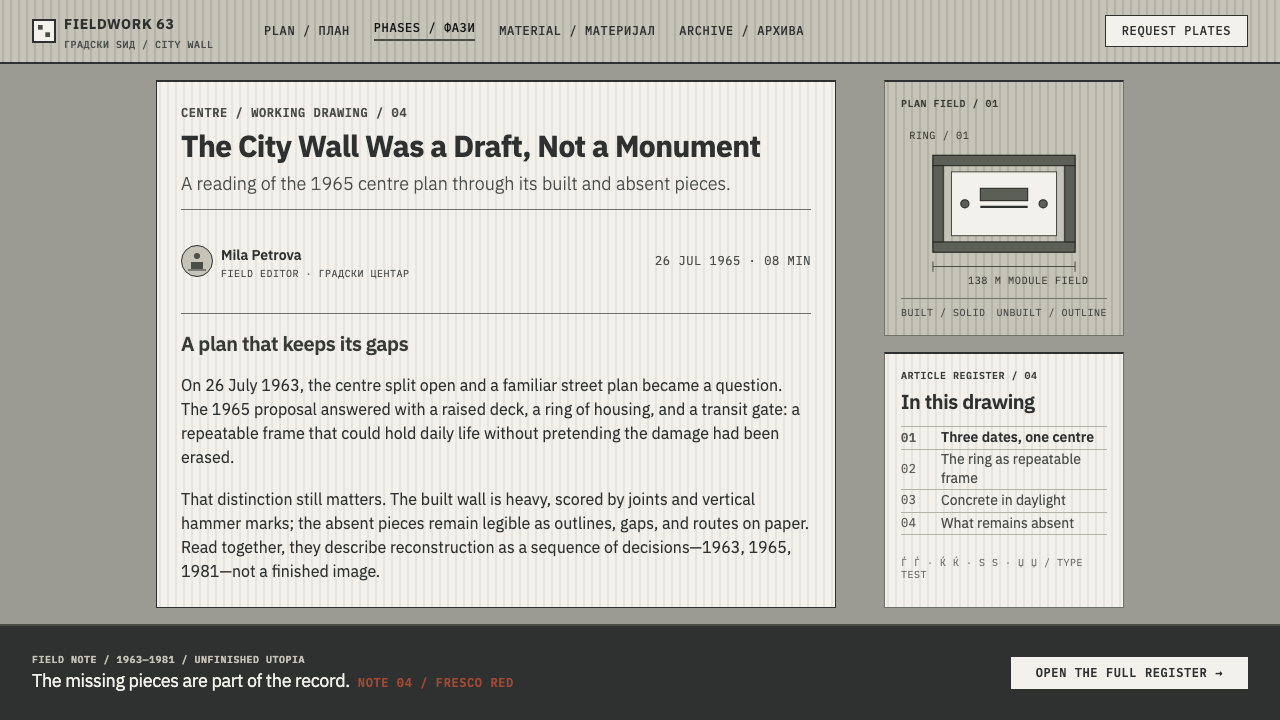
Texture comes from the construction of the surface, not from a photograph laid on top. Bush-hammered precast concrete shows vertical striations and clear joints from panel to panel. On the page this appears as a repeated vertical rhythm and visible seams between modules, and cards are separated by joint lines instead of shadows or fields of colour.
Working-Set Annotation
The page explains itself the way a set of drawings does. Phase years, dimension callouts and small technical labels sit beside the content in a compact, drafted voice. The years 1963, 1965 and 1981 anchor the system's timeline. Annotation is part of the design, not an afterthought, and it gives even marketing content the credibility of a document that someone had to check.
Two Single-Use Notes
Polished marble white and fresco red appear once each, as notes. They behave like a stamp or a marker pen on a drawing: one red mark, one white mass, then silence. Their rarity is what gives them force, and repeating either turns a note into decoration.
Mass Without Polish
Proportions are heavy and blocky, surfaces are large and plain, corners are square and nothing is glossy. The style is monumental in weight but never finished in finish. There is no soft shadow, no gradient and no ornament, because a site drawing has no use for them.
Who shaped Skopje 1963 Reconstruction?
Tange won the UN-backed competition to rebuild central Skopje and gave the plan its two symbols, the City Wall and the City Gate. The reference record ties his name to Metabolism, the idea of the city as a structure that grows by stages. His 1965 master plan is the document the system's phase markers point back to. For designers, Tange is the reason an unfinished grid can be a serious proposition rather than an apology.
Konstantinov is named in the reference record beside Tange as one of its three key figures, and he stands for the local, Yugoslav side of the rebuilding. The record does not attribute a particular building to him in this style, so the name is best read as a pointer for further research into the architects who carried the plan through. The span between the 1965 plan and the 1981 completion of the Transport Centre is a reminder that the rebuilding was done over many years by many hands.
Lazeski is the third name in the record, and the fresco associated with him is the source of the system's single earthy-red accent. In the page language it is the colour of a fresco wall beside the grey of concrete: one warm note, used once. The pairing shows how a rationed accent can carry the memory of a particular artwork without turning it into a theme.
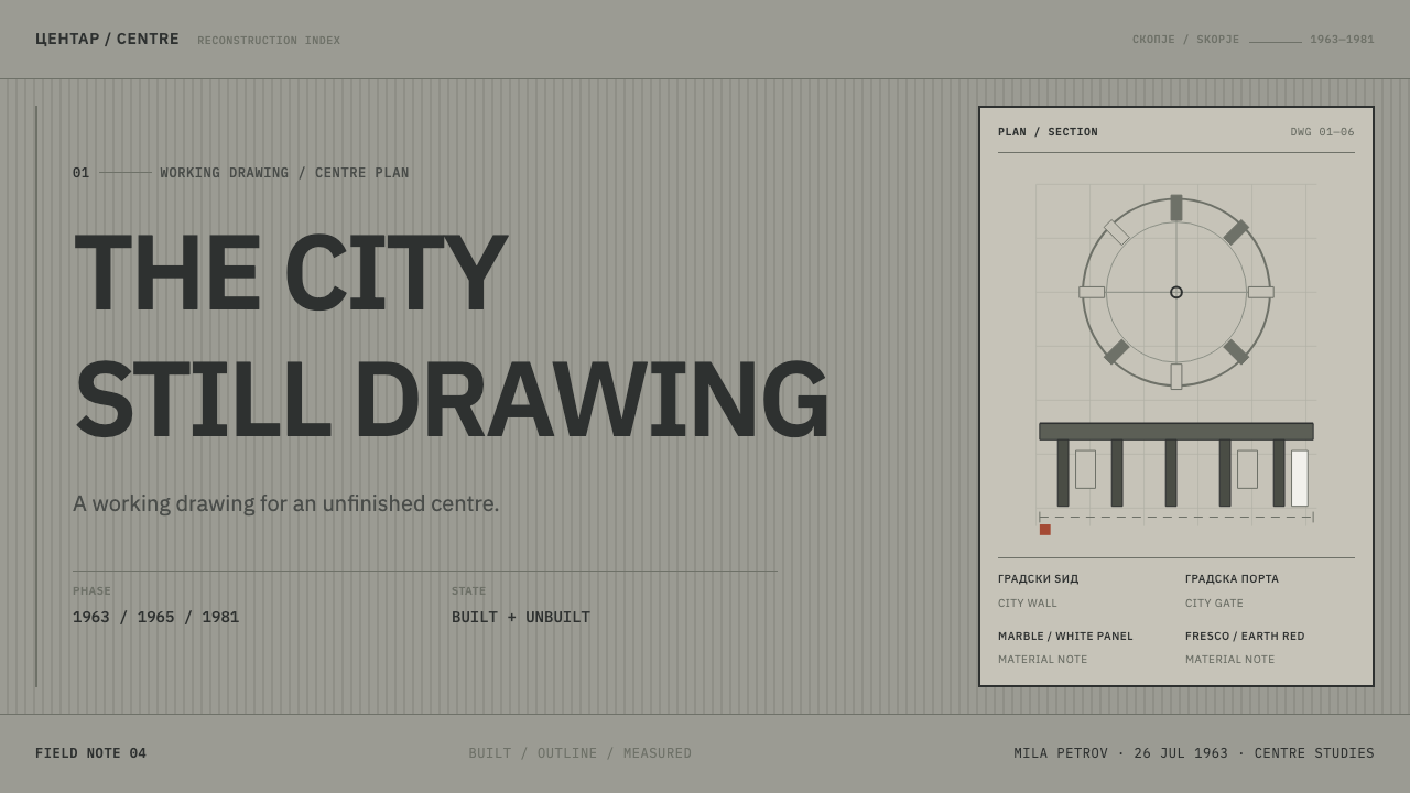
These are the two symbols of the plan. The City Wall is a ring of housing; the City Gate is a megastructural transit hub. They give the system its grid logic: one is a continuous enclosing band, the other a large threshold structure. Together they supply the bays that the page draws solid where built and as outline where only planned.
How do you use Skopje 1963 Reconstruction today?
Skopje 1963 Reconstruction suits any project whose honest state is 'in progress'. It is a sober, light, technical style: grey rather than white, drawn rather than decorated. It rewards content that has structure to show, such as plans, roadmaps, programmes and reports, and it punishes content that wants to look finished and glossy.
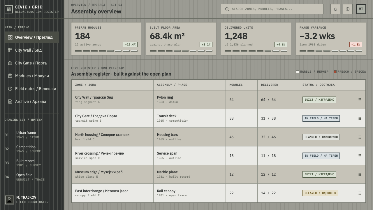
For presentation slides, a cover can be a field of concrete grey with the title in a darker grey, a small strip of phase years along the bottom edge and one fresco-red marker placed once. Content slides work as panels with visible joints between them, and roadmap slides are the style's natural home: shipped items solid, planned items hatched, with a dimension line or callout for scope. Data slides can show forecast or uncollected values as hatched bars beside solid actuals, which makes uncertainty visible without a legend of colours.
On the web, the style is well suited to project trackers, status boards, planning tools, changelogs, civic and infrastructure sites, and documentation. Replace coloured status badges with the solid-or-hatched convention, and make cards into panels separated by joint lines rather than shadows. On a pricing page, features that have not yet shipped can be hatched rather than hidden, which is both honest and distinctive. Keep the fresco red for a single primary action per view and let everything else stay in grey.
For editorial and marketing work, the style fits writing about architecture and urbanism, engineering and infrastructure reports, public-sector communication, and case studies where the process matters as much as the outcome. A timeline of phase dates can be the structure of a whole page. Photography works best in monochrome or near-monochrome, with raw concrete, scaffolding and construction subjects. The copy should be plain and specific about what exists, what is planned and what is uncertain.
The most damaging mistake is to fill in the hatched bays. The whole point of the system is that unbuilt portions remain outline, and a page that shows everything as complete has abandoned its premise. Other mistakes include using the marble white and the fresco red repeatedly until they stop being notes, adding gloss, gradients or soft shadows to a surface that is supposed to be matte concrete, and confusing the style with 'brutalist web design' that is deliberately chaotic. This system is orderly: a drafted, gridded, annotated page whose roughness lives in the material, not in the layout.
Skopje 1963 Reconstruction — FAQ
Is this the same as Brutalist web design?
No. Brutalist web design is usually deliberately raw, anti-grid and confrontational. This style borrows the material of Brutalism, grey concrete with visible joints, but applies the discipline of a technical drawing: a clear grid, ranked line weights, annotated phases and a restrained palette. It is closer to a working plan than to a protest poster.
Why leave parts of the grid hatched?
Because the Skopje master plan was never completed, and the system treats that as part of the subject. Hatching marks bays that are planned but not built, so a grid can show status honestly. It also turns out to be practical: roadmaps, release plans and reports all need a way to show what is promised without pretending it already exists.
What does Metabolism have to do with a page layout?
Metabolism imagined a city as something that grows by adding and replacing parts. Applied to a page, the idea becomes modular bays that can be added in stages, with their status visible. The layout expects future change instead of hiding it, which suits products and projects that are never really finished.
Where do the years 1963, 1965 and 1981 come from?
They are the three phase markers in the reference record: the earthquake in 1963, Tange's master plan in 1965 and the completion of the Transport Centre in 1981. In your own project you would replace them with your own phases. What carries over is the habit of dating every stage on the page, like the revisions on a drawing.
Can this style be used on a dark background?
The premise is a page the colour of cast concrete in daylight, so the reference style is light-grounded. A dark version loses that reading and tends to feel like a generic dark theme. If one is needed, keep the solid-versus-hatched logic, the ranked line weights and the rule that each accent appears only once, and accept that the result is a variant.
Related design styles
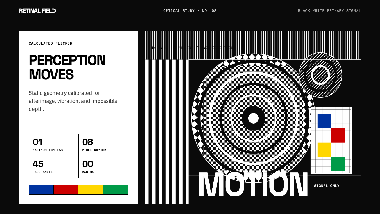 Op Art (Riley / Vasarely)Perception is engineered. Black-white grids and primary signals make static g…
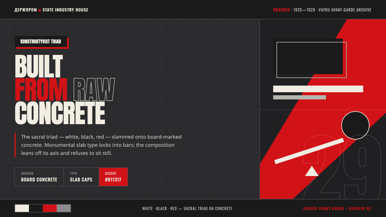 Kharkiv Constructivism (Derzhprom)Monumental, made structural. White-black-red triad on raw concrete, slab caps…
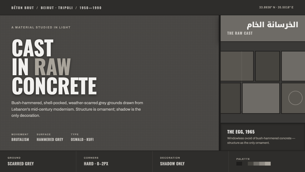 Beirut Brutalist GrayStructure is the only ornament. Scarred bush-hammered grey, monumental Oswald…
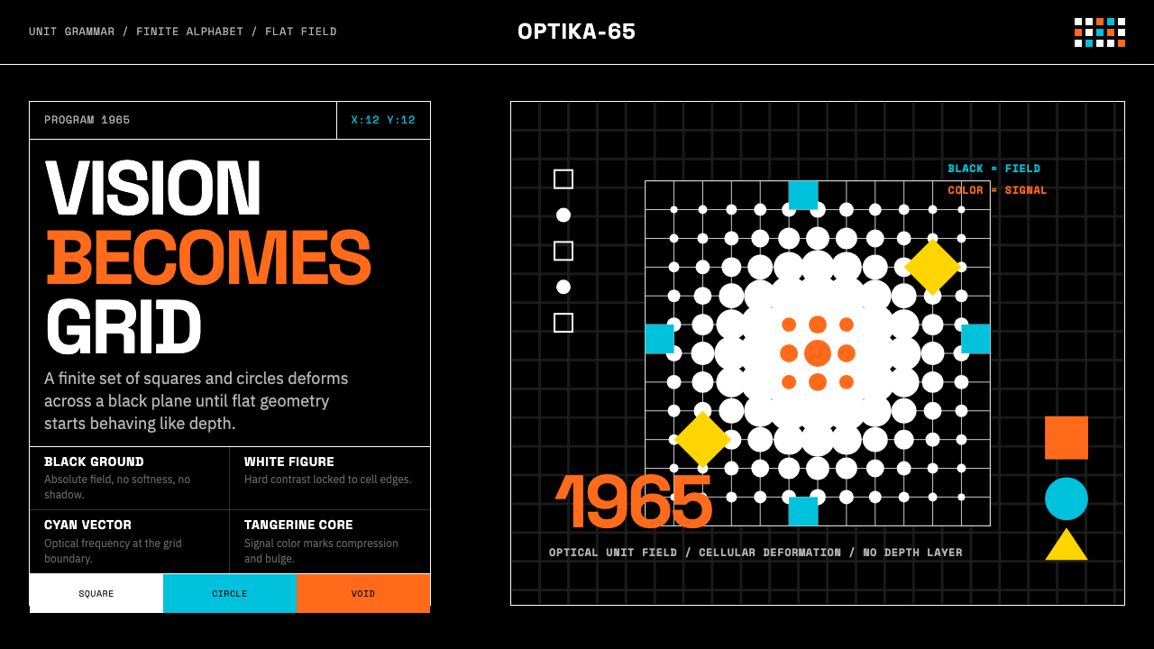 Hungarian Vasarely Op Art (1965)Mathematics makes vision pulse. Black grids, white units, cyan and tangerine…
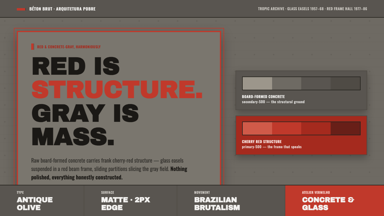 Lina Bo Bardi ConcreteRed is structure, gray is mass. Cherry-red beam frames suspended over board-f…
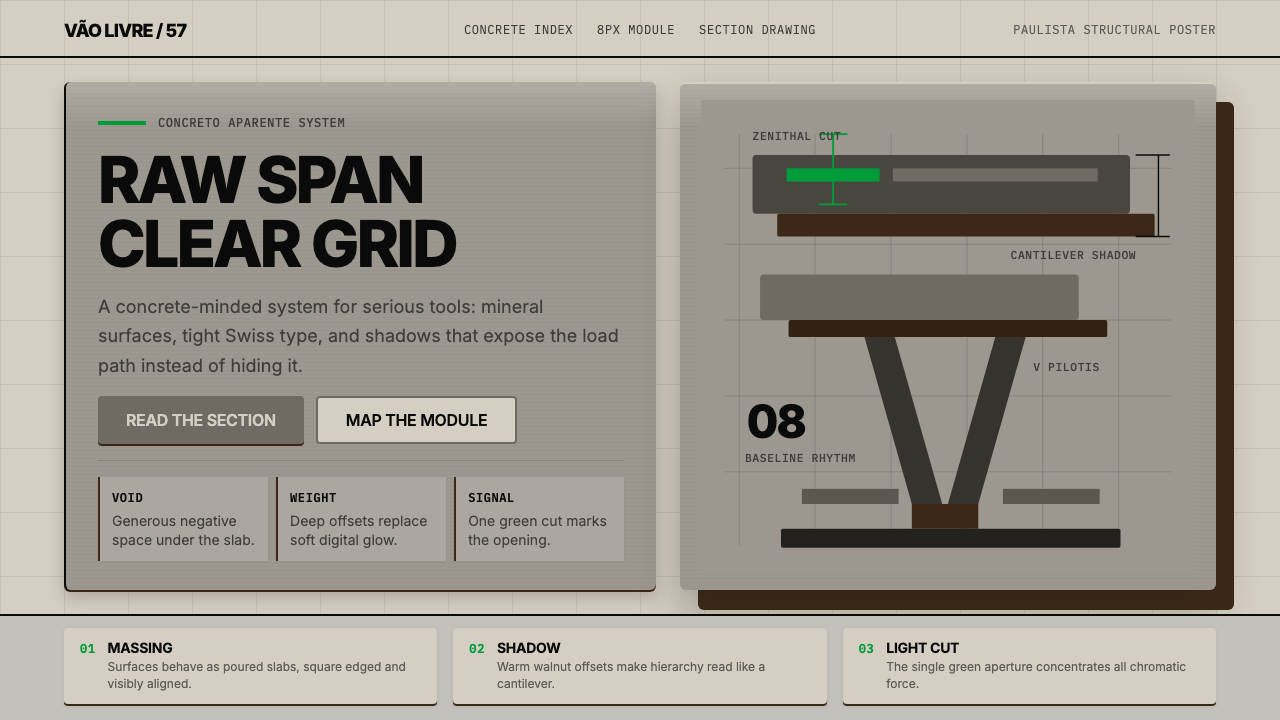 Paulista BrutalismStructural honesty, made heavy. Mineral grays, Inter grids, and walnut cantil…