What is Beirut Brutalist Gray?
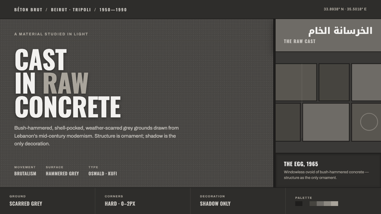
Beirut Brutalist Gray turns scarred concrete, monumental Oswald capitals, and bilingual Kufi signage into a digital language where structure carries the emotion.
Beirut Brutalist Gray in brief
Beirut Brutalist Gray distills the raw béton brut architecture of mid-century Lebanon into a dark digital design system. Its surfaces suggest bush-hammered concrete: rough, shell-pocked, weather-scarred, and marked by the evidence of making rather than concealed beneath polish.
The palette is monumental and austere. A genuinely dark grey concrete ground carries a faintly warm cast associated with aged cement, while broad grey fields create the feeling of mass and distance. Bold condensed Latin display in Oswald capitals supplies the voice of the system; bilingual Arabic-Latin signage adds a distinctly regional identity.
Nothing is ornamental in the conventional sense. Texture, alignment, typographic scale, and shadow do the decorative work. The result should feel architectural rather than atmospheric: heavy, weathered, restrained, and legible, with every visual decision expressing structure.
Where does Beirut Brutalist Gray come from?
Beirut Brutalist Gray draws from raw béton brut architecture in Lebanon during the period from 1950 to 1990, when Lebanese modernism and concrete modernism formed its historical field of reference. The system treats that architectural language as a source of digital form rather than as a surface style to be copied literally.
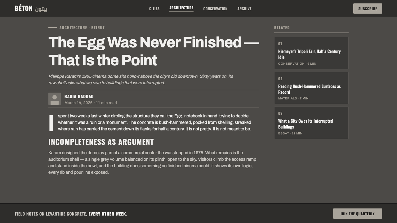
Its geography is concentrated in Beirut and Tripoli. Beirut supplies the unfinished Egg cinema associated with Philippe Karam, while Tripoli supplies Oscar Niemeyer’s Fair. Together, these references establish a connection between unfinished mass, monumental public architecture, and the severe physical presence of exposed concrete.
The unfinished Egg cinema is important precisely because its concrete identity remains inseparable from structure. The Tripoli Fair extends that idea into a larger civic scale. In the digital translation, broad grounds, heavy typographic blocks, and hard-edged divisions create a comparable sense of architectural weight.
The source tradition is therefore a convergence of Brutalism, béton brut concrete modernism, and mid-century Lebanese architecture. Beirut Brutalist Gray preserves their shared conviction that construction should remain visible: the mark, joint, shadow, and mass are not flaws to be hidden but evidence of the system’s logic.
What defines the Beirut Brutalist Gray look?
Concrete Ground
The ground is genuinely dark grey rather than a decorative black, with a faint warmth inherited from aged cement. Large grey fields should feel continuous and weighty, giving the interface the presence of a solid architectural plane rather than a neutral digital canvas.
Weathered Texture
Surfaces are bush-hammered, shell-pocked, and weather-scarred. Texture should read as evidence of material and time: irregular enough to feel physical, but controlled enough that it never dissolves text or hierarchy into visual noise.
Monumental Typography
Latin display type is bold, condensed, and frequently set in Oswald capitals. Its role is architectural: letters form walls, markers, and directional masses. Contrast comes from scale, density, and placement rather than decorative type effects.
Bilingual Signage
Arabic and Latin are paired as structural partners. Kufi lettering brings a firm, block-like rhythm to the Arabic side, while condensed Latin capitals provide a parallel monumental register. Neither language should feel like a caption beneath the other.
Mass and Alignment
Composition favors broad blocks, strict edges, and deliberate alignment. Empty space is not softness; it is the ground around a built mass. Titles, labels, and content areas should appear placed, anchored, and load-bearing.
Hard Shadow
Shadow is the system’s only overt decoration. It should feel cut into the structure or cast by a heavy slab, with a clear edge and restrained direction. Soft atmospheric glow would weaken the material discipline and make the work feel lighter than intended.
Who shaped Beirut Brutalist Gray?
Niemeyer enters the reference system through the Tripoli Fair. His presence establishes the civic and monumental side of the language: large public scale, strong concrete mass, and architecture understood as an expressive structure rather than a decorated container.
Karam is represented by the unfinished Egg cinema in Beirut. The project anchors the system’s interest in incompletion, exposed construction, and the visual authority of a form that remains legible even when its surface is rough and weathered.
This is a regional architectural context rather than an individual figure. It gives the style its geographic identity, connecting Brutalism and béton brut modernism to the concrete buildings and public works of Beirut and Tripoli.
How do you use Beirut Brutalist Gray today?
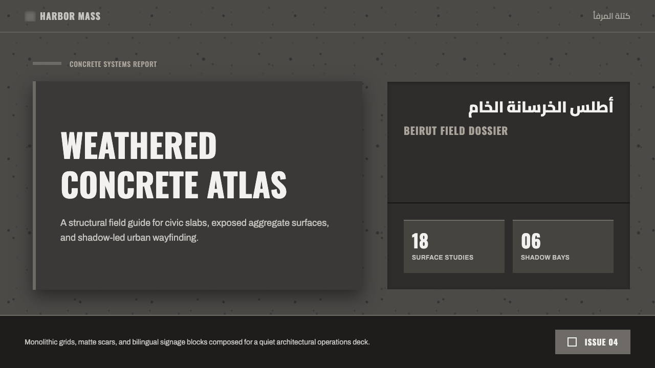
For presentation slides, let the cover behave like a monumental sign: a large title in Oswald capitals, a dark concrete field, and a strong block or shadow that establishes the composition. Content slides should use broad structural bands, bilingual labels where relevant, and a clear reading path. Data slides should treat charts as built forms, using tonal grey contrast and hard divisions instead of decorative color variety.
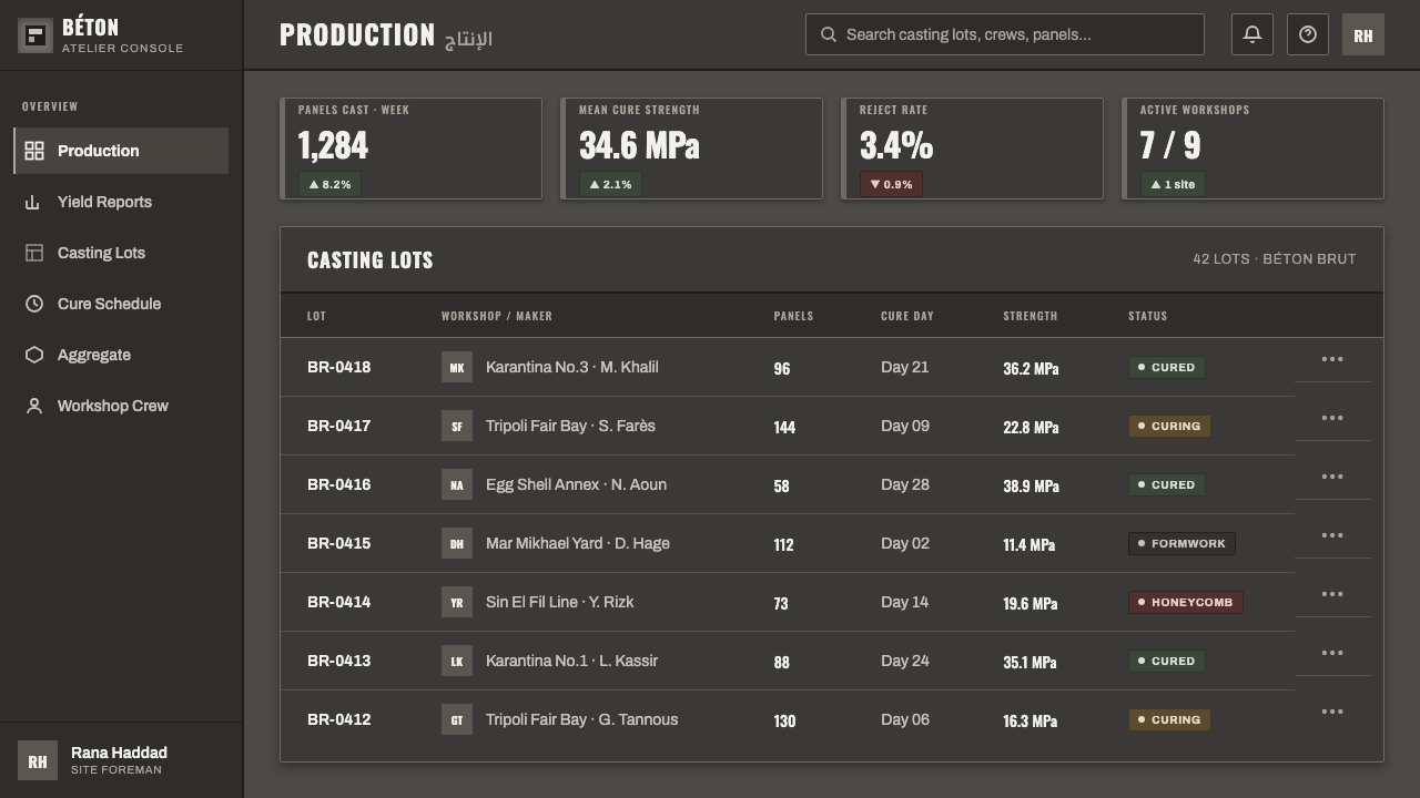
For web interfaces, the style suits dashboards and pricing pages that need authority, hierarchy, and a sense of engineered seriousness. Use the dark scarred ground as the environment, keep panels visibly related to concrete mass, and reserve the strongest contrast for active states, key figures, and calls to action. Arabic and Latin labels can share navigation, filters, and plan names without making either language secondary.
For editorial and marketing work, Beirut Brutalist Gray supports posters, campaign pages, architectural reports, and cultural announcements. Give headlines generous presence, place metadata like engraved signage, and allow large uninterrupted grey areas to frame the content. Marketing blocks can alternate between concrete-dark fields and lighter grey planes, with shadow and alignment providing rhythm.
The common mistake is treating brutality as random distress. Scattered noise, excessive cracks, theatrical glow, and too many competing textures turn the style into a generic grunge treatment. The system depends on restraint: one convincing material ground, disciplined typography, deliberate bilingual pairing, and structural contrast strong enough to carry the page without extra decoration.
Beirut Brutalist Gray — FAQ
Is Beirut Brutalist Gray simply a generic brutalist style?
No. It shares Brutalism’s commitment to visible structure and raw material, but its identity is more specific. The dark aged-concrete ground, Beirut and Tripoli references, Oswald capitals, and Arabic-Latin Kufi pairing give it a distinctly Lebanese and bilingual character.
Can the style work on a light background?
It can be adapted, but the genuinely dark concrete ground is central to the style’s atmosphere and weight. A light inversion may preserve the typography and alignment, yet it will lose some of the monumental tension. If a lighter field is necessary, retain weathered grey, hard shadow, and strong structural contrast.
How should Arabic and Latin text be balanced?
Treat them as parallel signage systems, not as primary text and translation. Kufi provides a firm Arabic rhythm, while condensed Latin capitals provide a matching monumental voice. Balance should come through placement, scale, and alignment, with neither script reduced to a footnote.
How much concrete texture is enough?
Enough to establish material presence, not enough to compete with language. Bush-hammered marks, shell-pocked variation, and weather scars should remain legible as a unified ground. When texture becomes the subject instead of the structure, the style has crossed into noise.
Related design styles
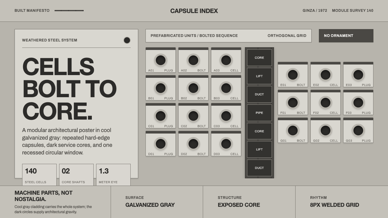 Nakagin Capsule TowerArchitecture as cells. Cool gray modules, dark cores, and porthole circles lo…
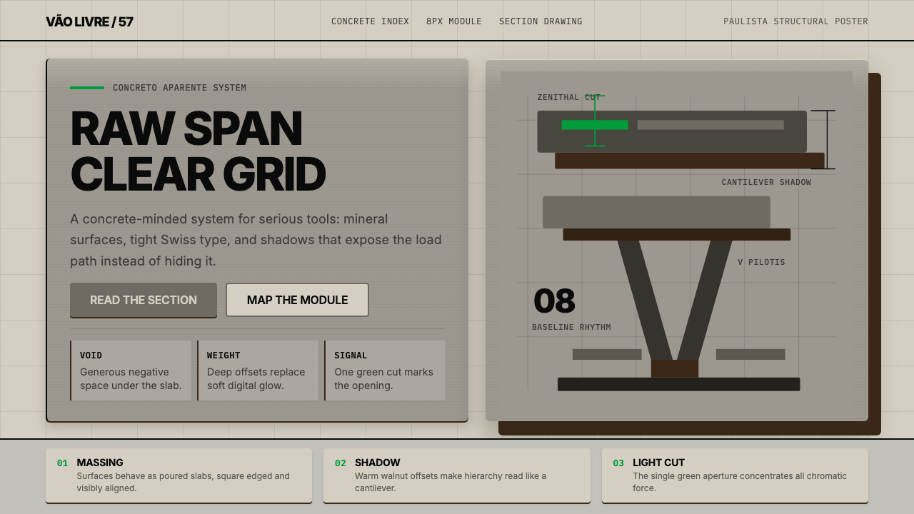 Paulista BrutalismStructural honesty, made heavy. Mineral grays, Inter grids, and walnut cantil…
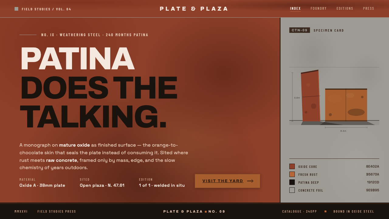 Corten Rust SculpturePatina does the talking. Saturated rust-oxide planes hard against raw concret…
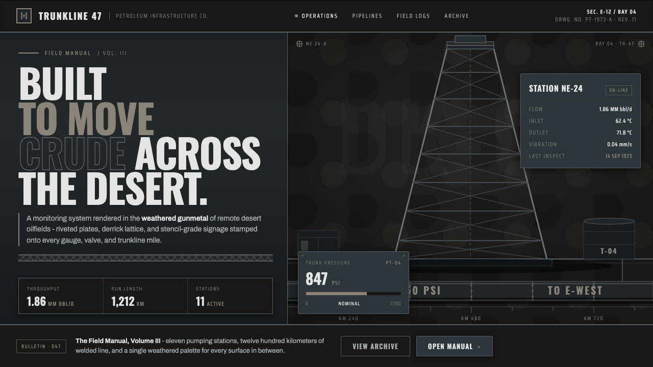 Gulf Oil Derrick IndustrialEngineered, not decorative. Soot-darkened gunmetal, derrick lattice, condense…
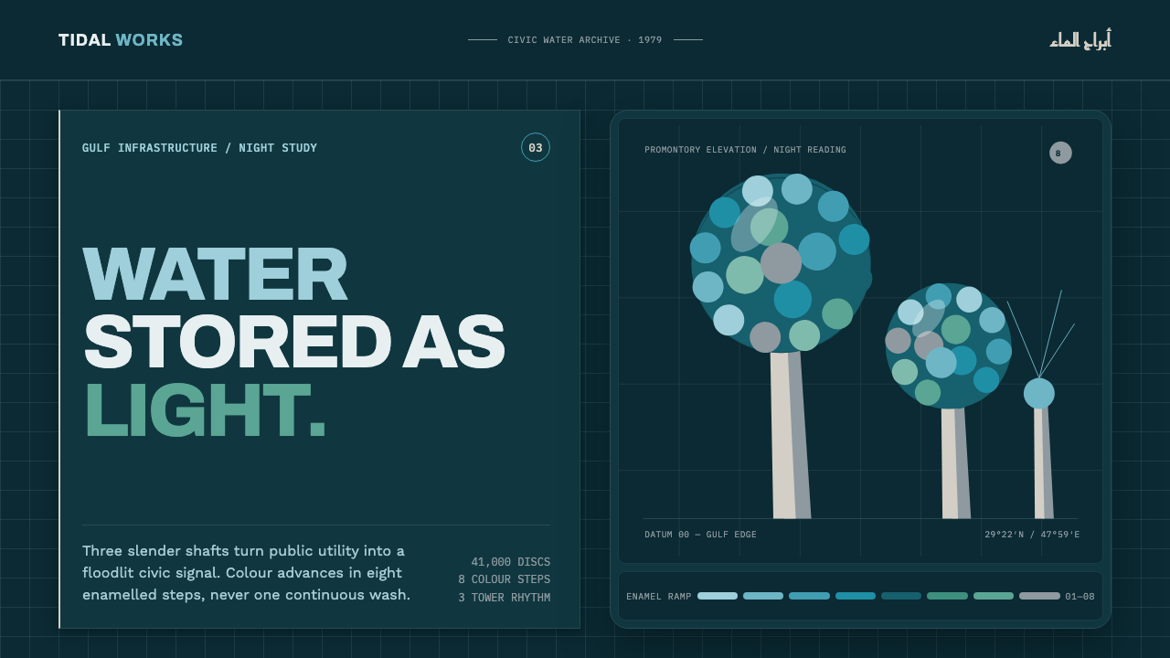 Kuwait Water TowersInfrastructure becomes a night monument. Eight enamel steps spiral across a d…
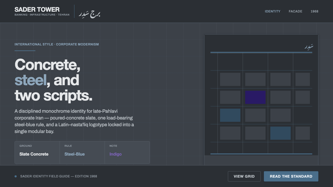 Tehran Bank ModernismLate-Pahlavi corporate cool. Slate concrete ground, one steel-blue rule, a La…