What is Paulista Brutalism?什么是 Paulista Brutalism?
The Paulista School turned raw concrete into civic poetry — and its muscular honesty translates directly into digital surfaces that want to feel permanent, structural, and uncompromisingly real.保利斯塔学派将清水混凝土化为公民诗篇——那种结构主义的力量感,可以直接转译为渴望显得永恒、坚实而毫不妥协的数字界面。
Paulista Brutalism in briefPaulista Brutalism 速览
Paulista Brutalism is a Brazilian architectural movement that flourished in São Paulo between the late 1950s and the mid-1980s, producing some of the most formally powerful civic and institutional buildings in the Americas. Its visual signature is radical structural candor: massive reinforced-concrete slabs cantilevered far beyond their supports, V-shaped or Y-shaped pilotis lifting entire buildings off the ground, and zenithal skylights that pour natural light into deep interior volumes. Nothing is cased, clad, or hidden. The structure is the architecture.保利斯塔粗野主义是一场在巴西圣保罗兴起于1950年代末、繁盛至1980年代中期的建筑运动,留下了美洲大陆形式感最为强烈的一批公共建筑与机构建筑。其视觉标志是激进的结构坦诚:巨型钢筋混凝土板大幅悬挑于支撑点之外,V形或Y形支柱将整栋建筑托举离地,天顶天窗将自然光引入深邃的内部空间。没有任何包覆、贴面或遮掩——结构本身就是建筑。
As a design language, Paulista Brutalism is built on a palette of mineral and aggregate grays — the natural color of raw concrete ranging from pale ash to deep charcoal — offset by deliberate, high-contrast accents. Typography is disciplined and tight, drawn from the Swiss rationalist tradition: compact grids, generous internal spacing, and a typographic scale that mirrors the proportional ambition of the buildings themselves. Shadows are not decorative; they are structural — deep, cast, and offset in ways that read as three-dimensional cantilever logic applied to a flat surface.作为设计语言,保利斯塔粗野主义建立在矿物灰与骨料灰的色调体系之上——清水混凝土的自然色域从浅灰到深炭依次展开——并以高对比度的强调色予以点破。字体排印遵从瑞士理性主义传统:紧凑的网格、充裕的内部间距,以及与建筑比例野心相呼应的字号层级体系。阴影不是装饰;它是结构性的——深邃、硬朗、偏移,以一种将悬挑逻辑平面化的方式呈现。
The style is distinct from European or North American Brutalism in one crucial way: its makers were committed modernists who believed — with real urgency — that architecture and designed artifacts could democratize culture in a developing country. Lina Bo Bardi's MASP, with its bold red concrete frames and suspended glass box, is not grim social housing; it is a democratic gesture in the middle of the city's wealthiest boulevard. This optimistic, civic dimension is essential to understanding the aesthetic. Paulista Brutalism looks heavy because it aspires to be permanent, not because it is indifferent.这种风格与欧洲或北美粗野主义的关键区别在于:保利斯塔的创作者是有真实紧迫感的现代主义者,他们相信建筑与设计能够在一个发展中国家推动文化民主化。利纳·博·巴蒂的圣保罗美术馆,用大红色混凝土框架和悬空玻璃盒子矗立于城市最富裕的林荫大道上,绝非阴郁的社会住宅,而是向城市全体市民发出的民主宣言。这种乐观的公民性维度,是理解这一美学的关键。保利斯塔粗野主义看起来沉重,是因为它渴望永恒,而非因为它漠然。
See the Paulista Brutalism design system查看 Paulista Brutalism 完整设计系统
Where does Paulista Brutalism come from?Paulista Brutalism 从何而来?
The Escola Paulista — the São Paulo School of architecture — coalesced in the mid-1950s around the Faculty of Architecture and Urbanism at the University of São Paulo, where Vilanova Artigas was its most formative figure. Artigas, who had trained as an engineer before turning to architecture, was radicalized by his contacts with North American modernism and, later, by the Soviet Union's approach to collective building. His 1961 FAU-USP building — a single monolithic volume raised on V-pilotis, with all interior spaces organized around a single raking concrete ramp — became the movement's founding monument: a building that refused the separation between professor and student, between interior and exterior, between structure and program.保利斯塔建筑学派——圣保罗建筑学派——于1950年代中期在圣保罗大学建筑与城市规划学院周围聚合成形,其中最具塑造力的人物是维拉诺瓦·阿尔蒂加斯。阿尔蒂加斯在转向建筑之前受过工程师培训,他通过与北美现代主义的接触,以及后来对苏联集体建筑思想的研习,逐渐走向激进化立场。他于1961年完成的圣保罗大学建筑学院大楼——一个单一整体形体抬升于V形支柱之上,内部所有空间围绕一条倾斜的混凝土坡道组织——成为这一运动的奠基纪念碑:这座建筑拒绝了师生之间、内部与外部之间、结构与功能之间的隔离。
Paulo Mendes da Rocha, who would win the Pritzker Prize in 2006, gave the movement its most consistent global presence. His Brazilian Pavilion at Osaka Expo 1970 and his São Paulo Museum of Science — a vast concrete frame suspending an enclosed box — extended the Artigan vocabulary into structures of monumental civic ambition. Mendes da Rocha's work is characterized by a nearly absolute economy: the fewest possible structural members, the most exposure of their structural logic, and a conviction that concrete's capacity to span enormous distances without intermediate support was itself a poetic act.保罗·门德斯·达·洛恰——他将于2006年获得普利兹克奖——赋予了这一运动最为持续的国际声望。他为1970年大阪世博会设计的巴西馆,以及圣保罗科学博物馆——一个用混凝土框架悬挂封闭盒体的巨构——将阿尔蒂加斯式词汇延伸至具有纪念碑式公民抱负的尺度。门德斯·达·洛恰的作品以近乎绝对的经济性著称:最少数量的结构构件,最大限度地暴露结构逻辑,以及一种信念——混凝土无需中间支撑即可跨越巨大跨度的能力,本身就是一种诗意行为。
Lina Bo Bardi arrived in Brazil from Italy in 1946 and, though technically working outside the São Paulo School's academic lineage, became its most internationally recognized practitioner. Her MASP (Museu de Arte de São Paulo), completed in 1968, is the movement's most cited work: two massive red-painted concrete beams spanning a full city block, suspending a glass-enclosed museum volume entirely above a public plaza — deliberately leaving the ground free for markets, demonstrations, and civic life. Bo Bardi's work added a dimension of cultural populism to the school's structural ethos.利纳·博·巴蒂于1946年从意大利来到巴西,尽管在技术上处于圣保罗学派学术脉络之外,却成为其最具国际知名度的实践者。她于1968年竣工的圣保罗美术馆是这一运动被引用最多的作品:两根涂成大红色的巨型混凝土梁横跨整个街区,将一个玻璃封闭的博物馆盒体完全悬置于公共广场之上——刻意将地面留给集市、集会与公民生活。博·巴蒂的创作为这一学派的结构主义气质增添了文化民粹主义的维度。
The movement's peak ran from approximately 1957 to the mid-1970s, coinciding with Brazil's period of rapid industrialization and the construction of Brasília under Oscar Niemeyer and Lúcio Costa. While Niemeyer's Brasília was sculptural and lyrical — curves and parabolas — the Paulista School was orthogonal, structural, and deliberate. The two strands together constitute Brazilian Modernism, but they have very different visual identities. The Paulista legacy persisted beyond the movement's historical peak through Mendes da Rocha's continued practice and through the 2006 Pritzker, which renewed international attention to the school's foundational works.该运动的鼎盛期大约从1957年延续至1970年代中期,与巴西快速工业化时期以及奥斯卡·尼迈耶和卢西奥·科斯塔主导的巴西利亚建设同步推进。尼迈耶的巴西利亚是雕塑性的、抒情性的——曲线与抛物线;保利斯塔学派则是正交的、结构性的、深思熟虑的。两条脉络共同构成巴西现代主义,却拥有截然不同的视觉身份。通过门德斯·达·洛恰持续的建筑实践以及2006年普利兹克奖的颁布,保利斯塔遗产在运动历史高峰之后得以延续,并重新唤起了国际社会对这一学派奠基作品的关注。
What defines the Paulista Brutalism look?Paulista Brutalism 的视觉特征是什么?
Mineral Gray Palette矿物灰色系
The governing palette derives from the natural color range of exposed concrete: pale ash, mid-gray aggregate, and deep charcoal shadow. These are not neutral backgrounds — they are the material itself, and every tonal variation carries a structural reading. Accent colors, when they appear, are typically a single bold hue — the red of Bo Bardi's MASP beams, the ochre warmth of a walnut panel — used with restraint against the mineral field. The absence of decorative color variation is a statement of material fidelity.主导色板源自裸露混凝土的自然色域:浅灰、中调骨料灰与深炭阴影。这些并非中性背景——它们就是材料本身,每一处色调变化都承载着结构性解读。强调色在出现时,通常是单一的醒目色相——博·巴蒂圣保罗美术馆梁体的大红,或胡桃木板的赭石暖意——在矿物质底色前克制地使用。缺乏装饰性色彩变化,本身就是一种材料忠实性的声明。
Cantilever Shadow Logic悬挑投影逻辑
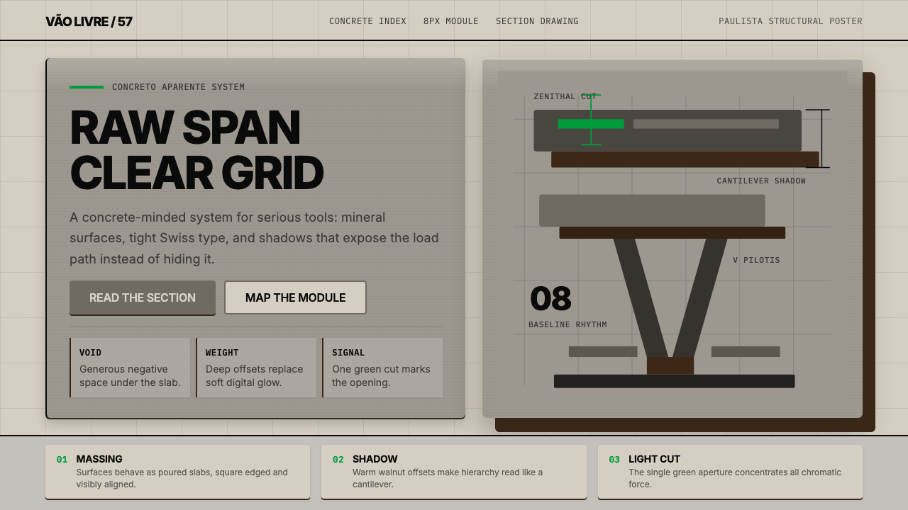
The cantilever — an overhanging structural element supported at only one end — creates the movement's most distinctive shadow profile: a deep, hard underside shadow that lines the entire bottom edge of a projecting mass. In digital translation, this becomes an unusually deep, hard-edged shadow offset primarily downward, giving surfaces the visual weight of a concrete slab rather than the floating lightness of a modern card. The shadow is not atmospheric; it is gravitational.悬挑——仅在一端受支撑的外挑结构构件——创造了这一运动最具辨识度的阴影轮廓:一道深邃、硬朗的下缘阴影,沿突出体量的整个底边延伸。转译至数字界面,这演变为一种异常深厚、硬边、以向下偏移为主的阴影,赋予表面混凝土板的视觉重量,而非现代卡片的飘浮轻盈感。这种阴影不是大气的;它是重力性的。
Structural Grid Exposure结构网格裸露
Paulista buildings make the structural grid visible rather than hiding it behind cladding. Columns, beams, and floor plates are expressed on the exterior and interior alike. In design terms, this translates to layouts where the underlying grid is never disguised: column gutters are generous and legible, alignment is strict and consistent, and elements appear to rest in their grid positions rather than float freely over them. The grid is the composition, not a tool for producing it.保利斯塔建筑使结构网格可见,而非将其隐藏在覆面之后。柱、梁与楼板在外立面和室内同等表达。就设计语言而言,这转译为底层网格从不被掩盖的版面:栏间距慷慨而清晰,对齐严格而一致,元素看起来是停驻在网格位置中,而非自由漂浮于其上。网格即是构图,而非生产构图的工具。
Zenithal Light and Contrast顶光与对比
Skylights cutting through massive concrete roofs produce a characteristic interior quality: extreme brightness from above against deep shadow in the volumes below, with no gradual transition between the two. This high-key contrast — near-white against near-black, with no soft midtone buffer — is the movement's tonal signature. In digital work, it produces compositions with a bold, almost graphic contrast ratio: text elements are either very light on very dark, or very dark on very light, with minimal midtone accommodation.穿透厚重混凝土屋顶的天窗产生了一种典型的室内光线品质:来自头顶的极度明亮,对照下方体量中的深邃阴影,两者之间没有渐进过渡。这种高调对比——近白对近黑,没有柔和的中间调缓冲——是这一运动的色调标志。在数字设计中,它产生了对比度大胆、几近图形化的构图:文字元素要么是极暗底上的极亮,要么是极亮底上的极深,几乎不留中间调的余地。
Monolithic Mass and Proportion整体形体与比例
Paulista buildings favor large, unbroken surfaces — walls that continue without punctuation, slabs that span without visual interruption. In layout terms, this translates to a preference for large, undivided zones rather than fragmented card-grid arrangements. A single full-width section reads as a monolithic slab; a sprawling multi-column mosaic reads as its opposite. Content is organized into substantial blocks, each treated as a complete structural element rather than a fragment in a mosaic.保利斯塔建筑偏好大面积、不间断的表面——无标点延续的墙体,无视觉中断延展的板体。就版面语言而言,这转译为对大型、未切割区域的偏好,而非碎片化的卡片网格排列。一个全宽横幅读起来如同整体式板体;蔓延的多列马赛克则读出相反的感受。内容被组织为实质性的块体,每一块都被视为完整的结构元素,而非马赛克中的碎片。
Pilotis and Void at Ground底层支柱与架空虚空
The pilotis — columns that lift the building off the ground — create a characteristic void at the base: the ground plane flows freely beneath the elevated mass. This spatial inversion, solid above and open below, is a recurring compositional motif. In UI terms, it appears as generous bottom spacing beneath heavy elements, or as wide open zones beneath dense content blocks — a deliberate structural void that makes the weight above feel intentional rather than accidental.底层支柱——将建筑抬离地面的柱体——在底部创造了一种特征性的虚空:地平面在抬升的体量下方自由流淌。这种空间反转——上实下空——是一种反复出现的构图母题。在界面设计语言中,它体现为重型元素下方的慷慨底部留白,或密集内容块下方的宽阔开放区域——一处刻意的结构性虚空,让上方的重量感觉是有意为之,而非偶然所得。
Disciplined Swiss Typography克制的瑞士排印
The Paulista movement's buildings were accompanied by graphic materials — exhibition catalogs, faculty publications, competition drawings — that drew on the Swiss International Style prevalent in São Paulo's cultural institutions of the 1960s and 1970s. The typographic corollary to brutalist architecture is compact, rational, and unsentimental: condensed sans-serif type set at multiple scales, tight leading that respects the grid, and a strict hierarchy communicated through size and weight alone. Decorative type treatments are as foreign to this system as ornamental molding is to the buildings.保利斯塔运动的建筑伴随着平面材料——展览图录、学院出版物、竞赛图纸——这些材料汲取了1960至70年代圣保罗文化机构中盛行的瑞士国际主义风格。与粗野主义建筑相对应的字体排印语言是紧凑的、理性的、不带感情色彩的:压缩无衬线字体以多尺度排列,紧凑的行距遵从网格,层级仅靠字号与字重来传达。装饰性字体处理对这一体系而言,就如同装饰性线脚对那些建筑一样格格不入。

See the Paulista Brutalism design system查看 Paulista Brutalism 完整设计系统
Who shaped Paulista Brutalism?谁塑造了 Paulista Brutalism?
João Batista Vilanova Artigas (1915–1985) is the intellectual and pedagogical founder of the Escola Paulista. His FAU-USP building (1961–1969) remains the canonical statement of the movement's principles: a single concrete volume raised on V-pilotis, its entire interior organized around a continuous ramp, with no enclosed offices and no separation between any of the building's users. Artigas believed that architecture was fundamentally a political act, and his building was designed to embody the institution's commitment to collective intellectual life. His influence on successive generations of São Paulo architects was decisive and direct.若昂·巴蒂斯塔·维拉诺瓦·阿尔蒂加斯(1915—1985年)是保利斯塔学派的思想与教学创始人。他的圣保罗大学建筑学院大楼(1961—1969年)至今仍是这一运动原则的经典陈述:一个单一混凝土体量抬升于V形支柱之上,全部室内空间围绕连续坡道组织,没有封闭式办公室,建筑的所有使用者之间没有任何隔离。阿尔蒂加斯相信建筑从根本上是一种政治行为,他的建筑被设计为体现机构对集体智识生活的承诺。他对圣保罗后续几代建筑师的影响是决定性的、直接的。
Paulo Mendes da Rocha (1928–2021) is the movement's most decorated practitioner, recipient of the Pritzker Prize in 2006 and the RIBA Gold Medal in 2017. His work extends Artigas's structural candor to an almost metaphysical economy of means. His São Paulo Gymnasium (1958), the Brazilian Pavilion at the 1970 Osaka Expo, and the Pinacoteca do Estado renovation (1998) each demonstrate his conviction that the most powerful architectural gesture is the one that uses the least structure to cover the greatest span. The 2006 Pritzker was instrumental in securing international recognition for the Escola Paulista as a whole.保罗·门德斯·达·洛恰(1928—2021年)是这一运动获奖最多的实践者,2006年普利兹克奖与2017年英国皇家建筑师学会金奖得主。他的作品将阿尔蒂加斯的结构坦诚延伸至一种近乎形而上的手段经济性。他的圣保罗体育馆(1958年)、1970年大阪世博会巴西馆,以及圣保罗美术馆修缮工程(1998年),都体现了他的信念:最有力的建筑姿态,是以最少的结构覆盖最大的跨度。2006年普利兹克奖对于帮助保利斯塔学派作为整体获得国际认可,起到了决定性的作用。
Lina Bo Bardi (1914–1992) was born in Rome, trained in Milan under Gio Ponti, and arrived in Brazil in 1946 — where she produced her most important work. Her MASP (1968) is the movement's most internationally recognized building: a glass box suspended between two massive red concrete beams spanning nearly seventy meters, holding the ground level entirely free as public space. Her work consistently combined structural ambition with a populist program — theater seats made of improvised scaffolding, exhibitions that placed art on glass easels at human eye level. Bo Bardi's legacy has grown substantially since her death, as her MASP has become one of the most photographed buildings in Latin America.利纳·博·巴蒂(1914—1992年)出生于罗马,在米兰师从乔·庞蒂受训,1946年来到巴西——并在那里创作了她最重要的作品。她的圣保罗美术馆(1968年)是这一运动国际知名度最高的建筑:一个玻璃盒子悬置于两根近七十米跨度的巨型红色混凝土梁之间,将地面层完全留作公共空间。她的作品始终将结构雄心与民粹主义功能纲领相结合——由即兴脚手架制成的剧场座椅,将艺术品置于玻璃画架上与人眼齐平的展览。博·巴蒂的遗产在她身后持续扩大,她的圣保罗美术馆已成为拉丁美洲被拍摄最多的建筑之一。
Carlos Millan (1927–1964) was among the most formally rigorous of the early Paulista generation and one of the movement's most significant losses: he died in an automobile accident at thirty-seven, before completing most of the projects that would have established his mature practice. His work, particularly his residential projects of the late 1950s and early 1960s, demonstrates an exceptional refinement of the structural vocabulary — slender pilotis, generous overhangs, and a careful integration of garden and built form that anticipated concerns that would not become mainstream in Brazilian architecture for another generation.卡洛斯·米兰(1927—1964年)是早期保利斯塔一代中形式语言最为严谨的建筑师之一,也是这一运动最令人惋惜的损失之一:他在三十七岁时死于一场交通事故,大多数本可奠定其成熟实践的项目尚未完成。他的作品,尤其是1950年代末至1960年代初的住宅设计,展示了对结构词汇的卓越提炼——纤细的支柱、慷慨的挑檐,以及对花园与建成形态细致整合的处理,这些关切在巴西建筑界要再过一代人才会成为主流。
João Batista Martinez Corrêa (1933–2003) extended the Paulista vocabulary into a broader range of building types — schools, cultural centers, and transportation infrastructure — demonstrating that the movement's formal language was not limited to prestige civic commissions. His work in the 1970s and 1980s represents the movement's engagement with the constraints of public practice in a developing economy: reduced budgets, compressed timelines, and institutional clients who were not always sympathetic to formal experimentation. The results showed that structural candor and formal ambition could survive resource constraints.若昂·巴蒂斯塔·马丁内斯·科雷亚(1933—2003年)将保利斯塔词汇延伸至更广泛的建筑类型——学校、文化中心与交通基础设施——证明了这一运动的形式语言并不局限于高规格公共委托项目。他在1970至80年代的作品,代表了这一运动在发展中经济体的公共实践约束下的探索:有限预算、压缩工期,以及并不总是对形式实验抱有同情心的机构客户。这些成果表明,结构坦诚与形式雄心能够在资源约束下存活。
How do you use Paulista Brutalism today?今天怎么用 Paulista Brutalism?
Paulista Brutalism translates into digital design most naturally wherever the goal is communicating weight, permanence, and institutional seriousness — without tipping into the cold detachment that more austere modernist styles can carry. The key distinction from generic brutalist aesthetics is the civic warmth encoded in its history: this is a style that believed concrete could be generous, that structure could be democratic. Applied well, it produces interfaces that feel load-bearing rather than decorative.保利斯塔粗野主义在数字设计中最自然的落脚点,是那些以传达重量感、永恒性与机构严肃性为目标的场景——同时又不会滑向更为严苛的现代主义风格有时携带的冷漠疏离。它与泛化粗野主义美学的关键区别,在于其历史中编码的公民温度:这是一种相信混凝土能够慷慨大方、相信结构能够具有民主性的风格。应用得当,它产生的界面感觉是承重的,而非装饰性的。
For presentation slides, the style is well-suited to both cover pages and heavyweight content pages. A cover works best with a monolithic composition: one dominant color field — deep mineral gray, or a single bold accent against near-white — anchored by a large, condensed headline set with tight tracking. The V-pilotis motif translates naturally into a pair of converging vertical elements that frame the title zone. Content slides should treat each section as a concrete slab: full-width horizontal bands with generous vertical padding, type set at a scale that references the proportional ambition of the architecture, and data visualizations rendered as geometric objects with hard-shadow depth rather than soft ambient glows. A common error on data slides is adding too many tonal gradients; the system calls for flat fills and hard edges throughout.对于演示文稿,这种风格非常适合封面页与重量级内容页。封面最适合整体性构图:一个主导色域——深矿物灰,或单一醒目强调色对近白底——由一个以紧凑字距排列的大号压缩标题来锚定。V形支柱母题自然地转译为一对汇聚的垂直元素,框定标题区域。内容页应将每个区块视为一块混凝土板:全宽水平带状区域配以慷慨的纵向内边距,字号设置参照建筑的比例野心,数据可视化呈现为带有硬边阴影深度的几何对象,而非柔和的环境光晕。数据页上的常见错误是添加过多的色调渐变;这套系统在整个设计中要求平面填充与硬边。
For web interfaces, the style performs strongly on dashboards, pricing pages, and institutional product sites where hierarchy and credibility are paramount. Apply a strict grid that is visibly expressed — gutters are part of the composition, not invisible infrastructure. Use the mineral gray range for background fields: the lightest values for primary surfaces, deeper mid-grays for secondary zones, and near-black for the highest-contrast moments. Reserve any accent color — ideally a single warm hue — for primary calls to action, active states, and critical data points. Card components should use pronounced, directional shadows rather than the diffuse floating-card convention of contemporary UI; this gives them the visual mass of cantilevered elements.对于网页界面,这种风格在仪表板、定价页面与机构产品站点上表现突出——这些地方层级与可信度至关重要。应用一个可见表达的严格网格——栏间距是构图的一部分,而非不可见的基础设施。用矿物灰色域处理背景区域:最浅的色值用于主要表面,较深的中灰用于次要区域,近黑用于最高对比度的时刻。将任何强调色——理想情况下是单一暖色调——保留给主要行动号召、激活状态与关键数据点。卡片组件应使用显著的方向性阴影,而非当代界面设计中常见的漫射浮动卡片惯例;这赋予了它们悬挑元素的视觉质量。
For editorial and marketing layouts, the style supports bold information hierarchy and extended reading. An editorial spread benefits from the zenithal-light contrast principle applied to typography: a very large section label or pull quote set in a nearly full-width column above a narrow-measure body text column — the proportional disparity itself creates the drama. Marketing pages work best when they alternate full-width monolithic sections between dark mineral grounds and near-white grounds, using a single accent color consistently for every interactive element. Photography, where used, should be treated as a flat geometric element: cropped to a strong rectangular shape with no border radius, and placed flush with grid edges rather than floated with surrounding padding.对于编辑与营销版面,这种风格支持大胆的信息层级与长篇阅读。编辑版面受益于将顶光对比原则应用于排印:一个非常大的章节标签或摘引段落,以接近全宽的栏宽置于窄行宽正文栏之上——比例差异本身就制造了戏剧性。营销页面在全宽整体式区块之间交替使用深矿物灰底色与近白底色时效果最佳,每一个交互元素都一致地使用单一强调色。摄影图像(若使用)应被视为平面几何元素:裁切为强烈的矩形,无圆角,与网格边缘齐平放置,而非以周围填充浮动处理。
A common mistake when applying Paulista Brutalism is confusing structural weight with visual heaviness — over-darkening backgrounds, stacking multiple deep shadows, and eliminating all lighter tonal zones. Authentic Paulista work is not uniformly dense; it uses extreme contrast — very light against very dark — rather than uniform darkness. The zenithal skylights of Artigas's FAU building flood the interior with brilliance precisely because the surrounding masses are so heavy. The same logic applies digitally: the deep cantilever shadows are powerful because the surfaces they frame are clean and uncluttered. Another common error is applying the style's gravitas to content that does not warrant it — consumer checkout flows, onboarding sequences, or playful marketing. Paulista Brutalism should be reserved for contexts where permanence and institutional seriousness are genuine product values, not applied as a surface aesthetic to content that pulls in the opposite direction.应用保利斯塔粗野主义时的一个常见错误,是混淆了结构重量与视觉沉重——过度加深背景、叠加多层深阴影、消除所有较亮的色调区域。真实的保利斯塔作品并非均匀致密;它使用极度对比——极亮对极暗——而非整体黑暗。阿尔蒂加斯圣保罗大学建筑学院大楼的顶部天窗之所以将室内灌满光亮,正因为周围的体量如此厚重。同样的逻辑适用于数字设计:深悬挑阴影之所以有力,是因为它们框定的表面干净而整洁。另一个常见错误,是将这种风格的庄重感强加于并不匹配的内容——消费者结账流程、引导流程,或轻松愉快的营销内容。保利斯塔粗野主义应当保留给永恒性与机构严肃性是真实产品价值的场景,而不是作为表面美学施加于内容方向截然相反的场景。
See the Paulista Brutalism design system查看 Paulista Brutalism 完整设计系统
Paulista Brutalism — FAQPaulista Brutalism · 常见问题
Is Paulista Brutalism the same as generic Brutalism?保利斯塔粗野主义与泛化的粗野主义风格是一回事吗?
They share structural candor and exposed concrete as a material value, but Paulista Brutalism has a specific formal identity and a specific political conviction that generic brutalist aesthetics often lack. European and North American Brutalism frequently carries associations of austere social housing — concrete as a material of necessity. The Paulista tradition, by contrast, was produced by architects who chose concrete as an expressive medium and believed it could embody democratic civic values. Lina Bo Bardi's MASP, with its suspended volume and free public ground plane, is a fundamentally optimistic building. This civic generosity is encoded in the style and distinguishes it from brutalist aesthetics that read as merely severe.两者都将结构坦诚与裸露混凝土作为材料价值,但保利斯塔粗野主义拥有泛化粗野主义美学通常缺乏的特定形式身份与特定政治信念。欧洲与北美的粗野主义经常携带朴素社会住宅的联想——混凝土作为必要性材料。相比之下,保利斯塔传统是由主动选择混凝土作为表达媒介、并相信它能够体现民主公民价值观的建筑师所创造的。利纳·博·巴蒂的圣保罗美术馆,以其悬浮体量与自由的公共地面层,是一栋从根本上充满乐观主义的建筑。这种公民慷慨被编码进这种风格之中,将其与那些读起来仅仅是严苛的粗野主义美学区别开来。
Does the style work on light backgrounds, or does it require dark surfaces?这种风格适用于浅色背景吗,还是必须使用深色表面?
The historical buildings are not uniformly dark — raw concrete in bright São Paulo daylight reads as a medium, warm gray rather than a dark tone, and the interiors of Artigas's FAU building are flooded with light from skylights. The canonical palette is therefore a range centered on mid-tone mineral grays, with both very light (near-white aggregate concrete) and very dark (deep underside shadow) present as deliberate contrasts. A light-background digital application is entirely appropriate and arguably more historically accurate than a uniformly dark one. The defining quality is not darkness but tonal extremes: very light and very dark present simultaneously, with minimal soft midtone.历史上的这些建筑并非整体黑暗——圣保罗明亮日光下的清水混凝土读起来是中调、偏暖的灰色,而非深色调,阿尔蒂加斯圣保罗大学建筑学院大楼的室内被天窗的光线灌满。因此,正典色板是以中调矿物灰为核心的色域,极浅(接近白色的骨料混凝土)与极深(深邃的底面阴影)同时以刻意的对比方式呈现。浅色背景的数字应用完全适当,甚至可以说比整体深色方案在历史上更为准确。定义性的品质不是黑暗,而是色调极端:极浅与极深同时存在,几乎没有柔和的中间调。
How do you handle color accents in Paulista Brutalism without disrupting the mineral palette?在保利斯塔粗野主义中如何处理强调色而不破坏矿物灰色板?
The model is Bo Bardi's MASP: a single bold accent — the red of the structural beams — used at large scale against an otherwise achromatic palette. The accent is not scattered across the composition as a recurring highlight; it is concentrated on one structural element and carries the weight of that concentration. In digital practice, this means selecting one accent color, deploying it on the most structurally significant element in the composition — the primary call to action, the active navigation state, the key data threshold — and using it nowhere else. The restraint amplifies the accent's impact precisely because of its singularity. Two competing accents undermine the logic entirely.参考模型是博·巴蒂的圣保罗美术馆:单一醒目的强调色——结构梁的大红——以大尺度使用,置于其他方面均为无彩色的色板之上。这种强调色并非分散在构图各处作为反复出现的高光;它集中于一个结构性元素上,承载着这种集中带来的重量。在数字实践中,这意味着选定一种强调色,将其部署在构图中最具结构意义的元素上——主要行动号召、激活的导航状态、关键数据阈值——并在其他任何地方不再使用。这种克制恰恰因为唯一性而放大了强调色的冲击力。两种相互竞争的强调色会彻底瓦解这套逻辑。
Can Paulista Brutalism suit consumer-facing products, or is it only for institutional contexts?保利斯塔粗野主义适合面向消费者的产品吗,还是仅适用于机构场景?
It can work in consumer contexts, but only for specific product categories — those where the consumer's primary desire is to feel that the platform or tool is serious, durable, and built to last. Financial platforms, legal-tech products, premium construction or real-estate tools, and high-stakes professional software can all benefit from the style's encoded permanence. It struggles when the consumer desire is for lightness, playfulness, warmth, or novelty. The style communicates that something has weight; that is an asset when the product is genuinely weighty and a liability when it is not. Misapplying the style to casual consumer experiences tends to read as severe or even unwelcoming rather than sophisticated.它可以在消费者场景中发挥作用,但仅限于特定产品类别——那些消费者的首要渴望是感受到平台或工具严肃、耐久、为长期存在而构建的场景。金融平台、法律科技产品、高端建筑或房地产工具,以及高风险专业软件,都能从这种风格编码的永恒感中受益。当消费者渴望的是轻盈、趣味性、温暖或新奇感时,它则力不从心。这种风格传达出某种东西具有重量;当产品本身确实具有分量时,这是资产,否则便是负担。将这种风格误用于轻松的消费者体验,往往读起来是严苛甚至令人望而却步的,而非精致的。
What is the relationship between Paulista Brutalism and Brazilian Modernism more broadly?保利斯塔粗野主义与更广义的巴西现代主义是什么关系?
Brazilian Modernism comprises two major formal strands. The first, associated with Oscar Niemeyer and Lúcio Costa (and most visible in Brasília), is sculptural, lyrical, and curvilinear — it uses concrete to produce forms that appear to defy gravity through curves and parabolas rather than by exposing the structural logic of defying it. The second strand is the Paulista School: orthogonal, structural, and explicit. Both are modernist, both refuse ornament, and both use reinforced concrete as the primary material — but their visual languages are almost opposite. Niemeyer's work asks concrete to be sensuous; Artigas's asks it to be honest. Understanding this distinction is important for applying Paulista Brutalism correctly, as the curvilinear Niemeyer aesthetic is sometimes mistakenly conflated with it.巴西现代主义包含两条主要形式脉络。第一条与奥斯卡·尼迈耶和卢西奥·科斯塔相关(在巴西利亚最为显著),是雕塑性的、抒情性的、曲线性的——它用混凝土产生看起来通过曲线与抛物线而非通过暴露结构逻辑来挑战重力的形态。第二条脉络是保利斯塔学派:正交的、结构性的、明确的。两者都是现代主义的,都拒绝装饰,都以钢筋混凝土作为主要材料——但它们的视觉语言几乎是相对的。尼迈耶的作品要求混凝土是感性的;阿尔蒂加斯的作品要求它是诚实的。理解这一区别对于正确应用保利斯塔粗野主义非常重要,因为曲线性的尼迈耶美学有时会被错误地与之混淆。
Related design styles相关设计风格
 Dieter Rams / BraunQuiet by design. Warm gray, white panels, hairline grids, and one earned gree…安静即设计:暖灰、白面板、细网格,只留一枚绿色指示点。
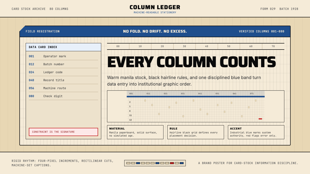 IBM Punchcard 029 (1928)Constraint becomes authority. Manila stock, hairline grid, industrial blue.约束即权威。米黄色卡纸、发丝网格与工业蓝。
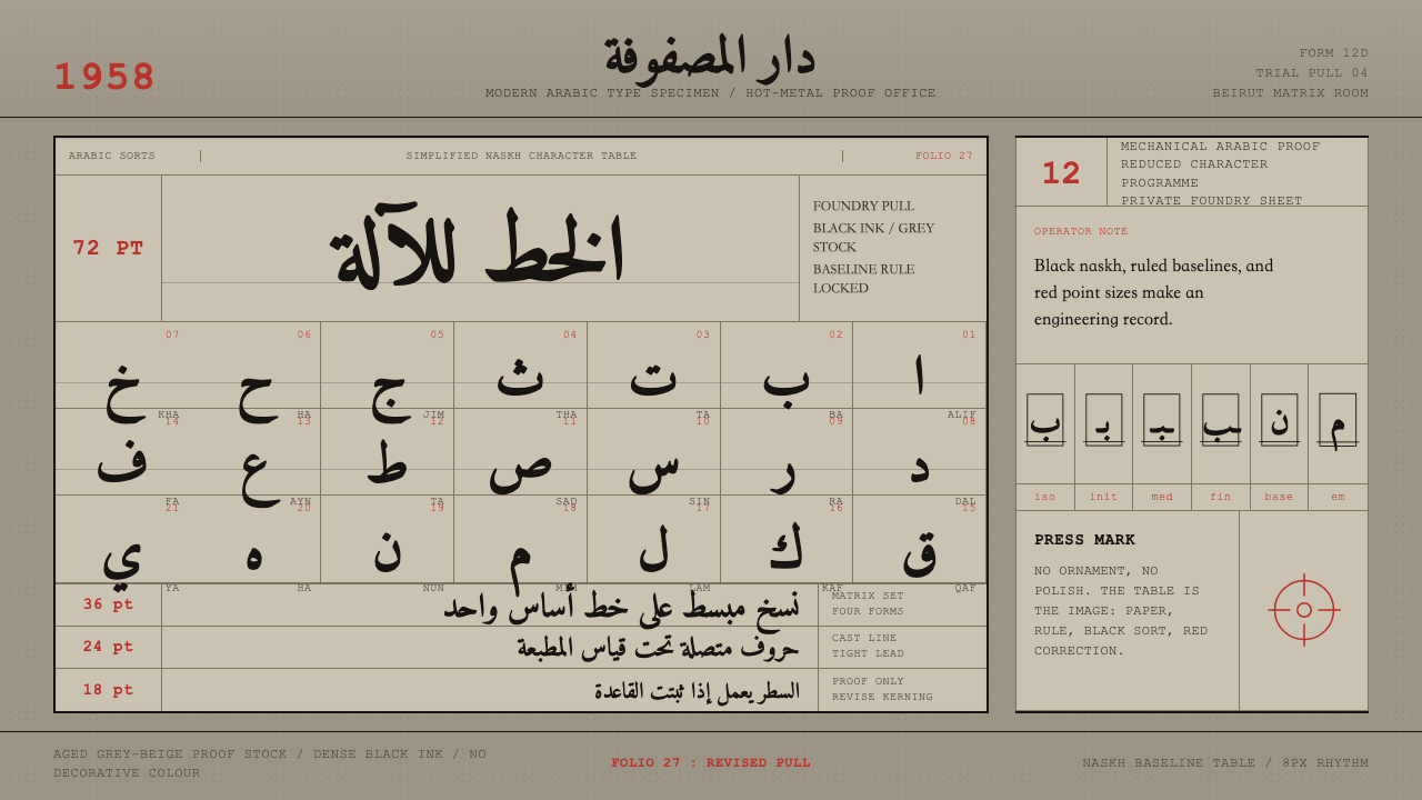 Modern Arabic Type SpecimenDry proof-sheet gravity. Black naskh grids on aged grey-beige, cut by red fol…冷峻的校样气质:灰米纸上黑色纳斯赫网格,由红色页码点破。
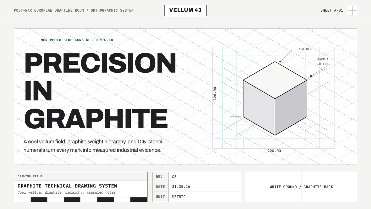 Graphite Technical DrawingDrafting-room precision. Non-photo-blue grid and graphite DIN lettering do th…制图室般精确:淡蓝网格与石墨DIN字母构成秩序。
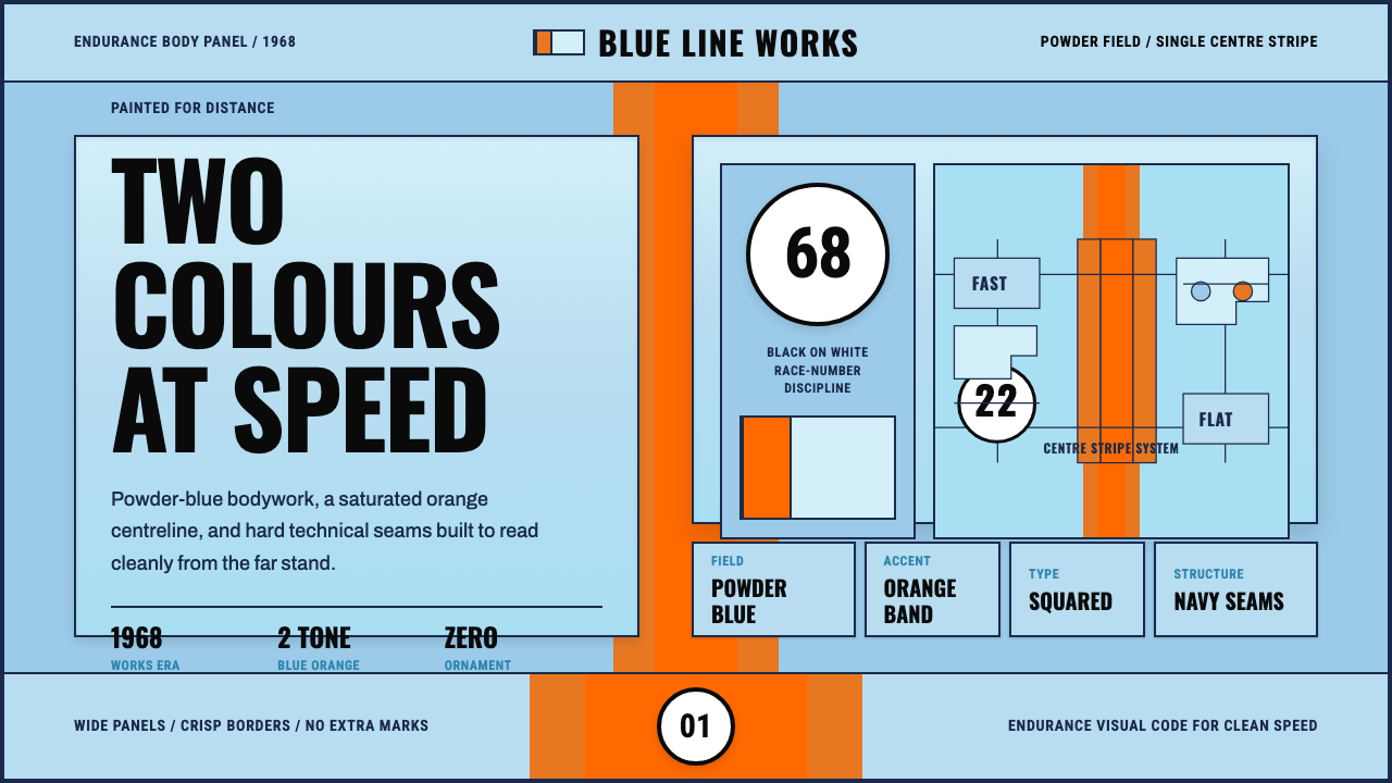 Gulf Racing LiverySpeed made disciplined. Powder blue, orange stripe, black roundel, strict gri…速度被纪律化:粉蓝车身、橙色中线、黑白圆号与硬网格。
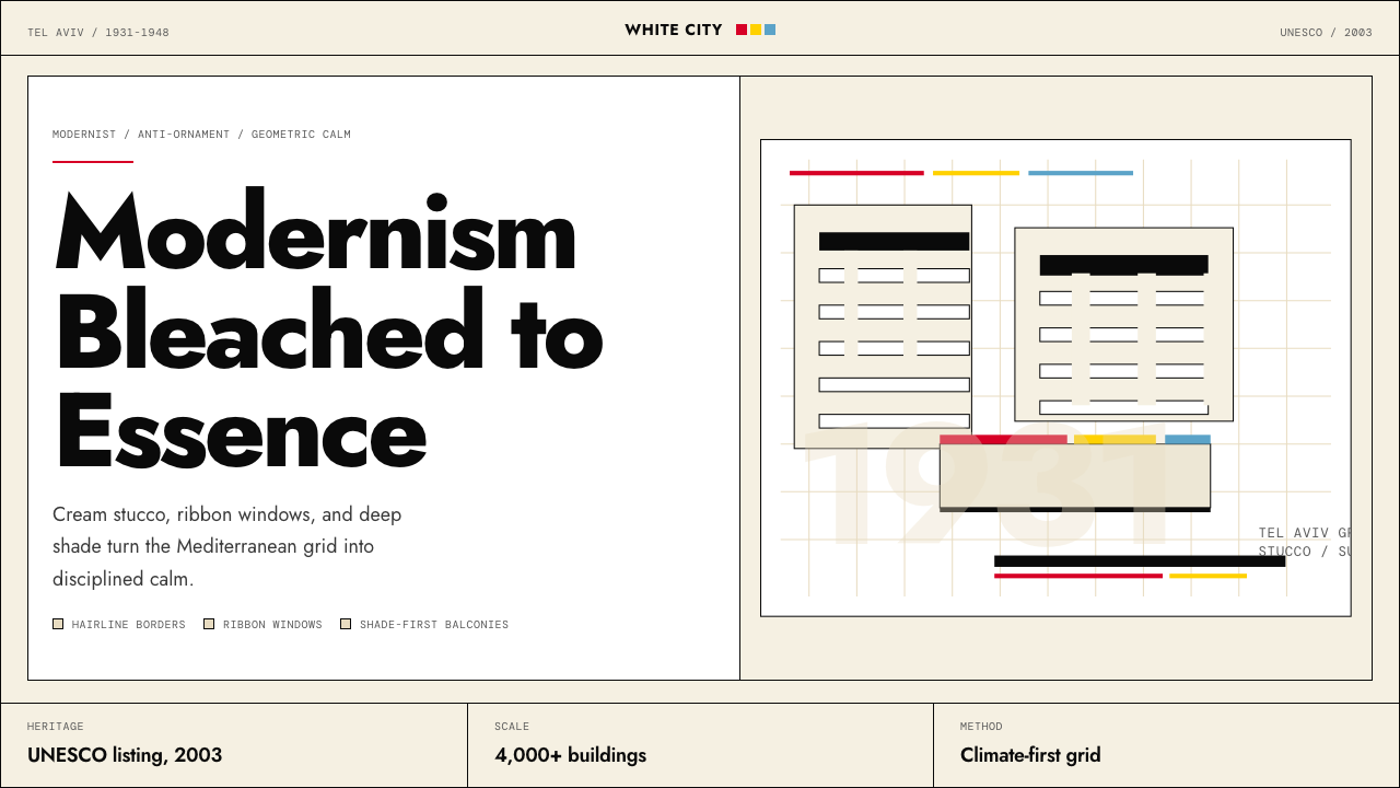 Israeli Bauhaus Tel Aviv (White City)Austere urban modernism. Stucco-white grid, Jost type, hairline borders, and…克制都市现代主义。灰泥白网格、Jost 字体、细黑线与三原色点睛。