What is Gulf Racing Livery?
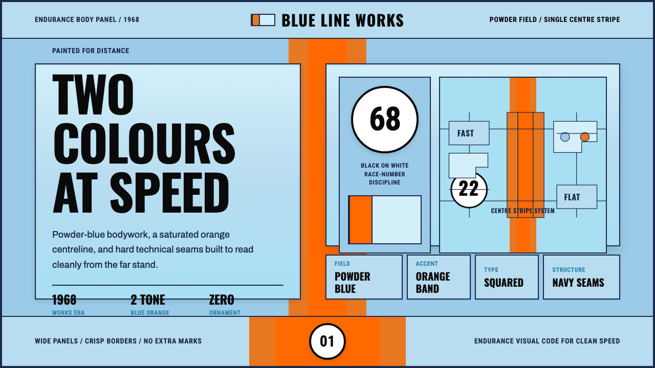
Gulf Racing Livery took a fuel company's corporate colors and turned them into motorsport's most recognizable paint scheme — proof that two disciplined colors beat a dozen decorative ones.
Gulf Racing Livery in brief
Gulf Racing Livery is the paint scheme worn by the Gulf Oil-backed endurance racing cars of the late 1960s: a pale powder-blue body split by one broad, saturated orange stripe running down the center, with black-on-white circular race numbers (roundels) placed on doors and nose. Nothing else competes for attention. There is no third color, no secondary pattern, no gradient fade between the blue and the orange — just a hard, clean division of the surface into two fields.
The system treats color as identity rather than decoration. Powder blue is the brand's base, orange is the accusation of speed cutting through it, and the roundel is the only place where information — a number, a name — is allowed to interrupt the color field. Everything is flat, gloss-finished, and drawn with squared, technical numerals that look machined rather than lettered by hand.
As a design system, it translates a very narrow set of constraints — a two-tone livery meant to be legible at 200 miles an hour, from a grandstand, in a photograph — into a visual language that reads as fast, confident, and utterly unfussy even when it is sitting still on a screen.
Where does Gulf Racing Livery come from?
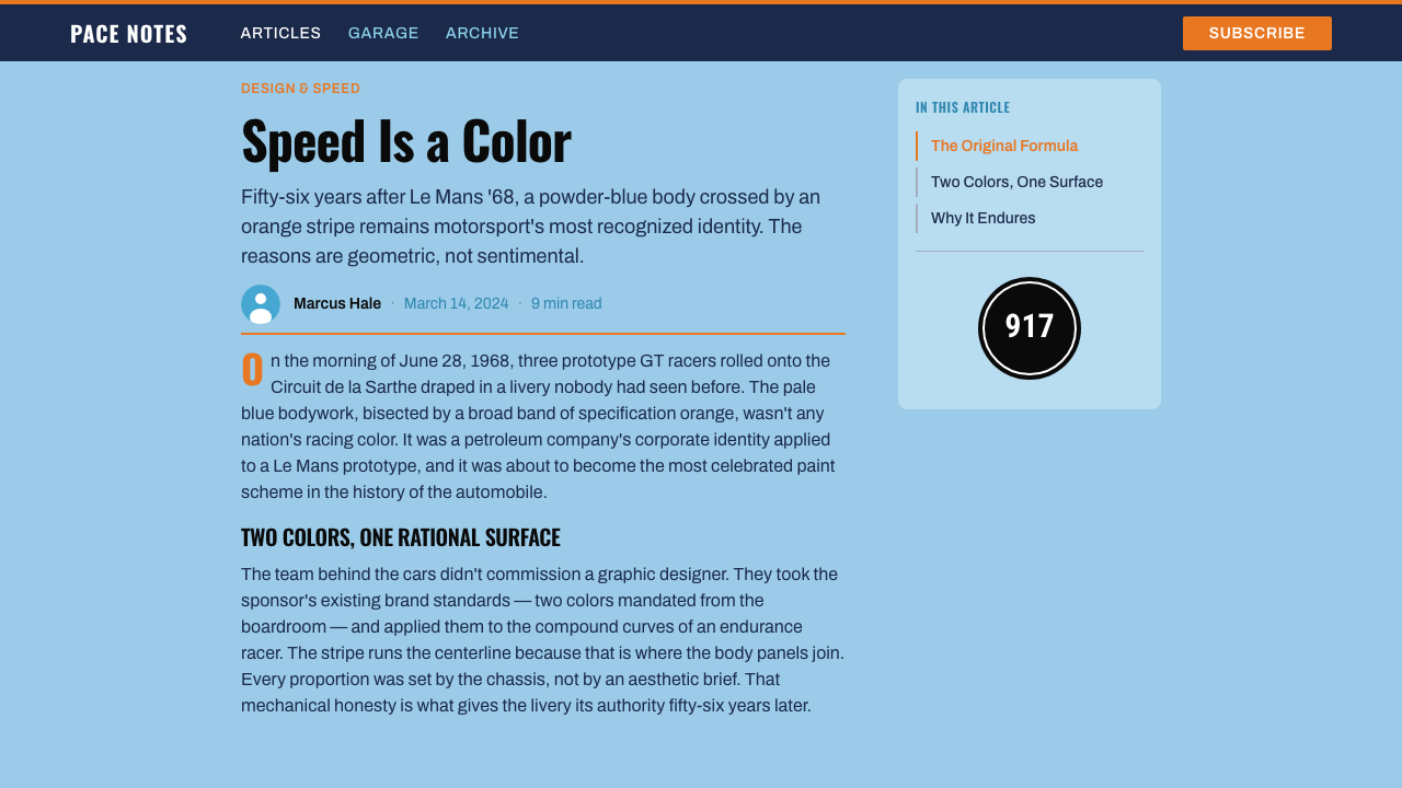
Gulf Oil's turquoise-and-orange corporate identity dates to a mid-1960s rebrand, but it became a cultural icon only when the company decided to sponsor a factory-supported endurance racing team rather than simply buy advertising space. In 1967, Gulf partnered with John Wyer, a veteran British racing manager who had previously run Aston Martin's works team and had helped Ford's GT40 program win Le Mans in 1966 and 1967. Wyer's outfit — known as John Wyer Automotive, or JWA — took over the Ford GT40 program for Gulf and repainted the cars in the now-famous scheme for the 1968 season.
The timing mattered. Endurance racing in the late 1960s was reaching peak visibility: Le Mans, the Spa 24 Hours, and the Brands Hatch circuit drew huge crowds and, increasingly, television cameras. A livery designed to be legible at speed and distinctive in black-and-white newsprint as well as color broadcast was a genuinely new kind of design problem, and Gulf's powder-blue-and-orange solved it decisively. The JWA Gulf GT40s won Le Mans outright in both 1968 and 1969, cementing the livery's association with victory rather than mere sponsorship.
The team's driver roster gave the livery its human face. Belgian driver Jacky Ickx and Mexican driver Pedro Rodríguez were among the era's most celebrated endurance racers, both piloting Gulf-liveried cars to major wins in the JWA years. When JWA moved on to the Porsche 917 for the early 1970s World Championship of Makes, the livery moved with the team rather than the car — the same powder blue and orange applied to an entirely different chassis, which is part of why the scheme reads as a brand system rather than a one-off paint job.
The livery's leap into mainstream culture came via film: actor and racing enthusiast Steve McQueen wore Gulf-sponsored driving suits and raced a Gulf-liveried Porsche 917 in the 1971 film *Le Mans*, a production shot with real endurance-racing footage and cars. That film fixed the powder-blue-and-orange scheme in the public imagination well beyond motorsport circles, and it remains the reason the livery is instantly recognizable to people who have never watched a sports car race.
What defines the Gulf Racing Livery look?
Color
The palette is exactly two colors: a pale, slightly desaturated powder blue as the dominant field, and a saturated, warm orange as the interrupting stripe. Black and white appear only as the neutral ground for the roundel numbers. There is no tertiary color, no accent beyond the two, and critically, the blue is never allowed to read as white — it must stay visibly, if subtly, blue. The relationship between the two hues is one of complement and contrast rather than harmony: they are chosen to separate cleanly at a glance, not to blend.
The Center Stripe
The orange stripe is not a thin accent line — it is a broad, confident band that runs the full length of the surface, wide enough to read as a structural division rather than a trim detail. Its edges are hard and straight, never feathered or tapered, and it sits perfectly centered rather than offset. This single gesture does most of the compositional work: it gives an otherwise plain field a clear axis and a sense of forward motion, without requiring any additional graphic elements.
Roundels and Numerals
Race numbers sit inside a plain white or cream circle outlined in black, with the digit itself rendered in a squared, geometric numeral style — no serifs, no italics, no decorative flourish. The roundel is placed with deliberate, almost rigid symmetry on the door panel or nose, functioning less like a label and more like an emblem. This is the only place in the system where information is allowed to sit inside the color field, and it is treated as an inset object rather than text layered on top of a background.
Flat, Gloss Surfaces
Every surface in the livery is rendered as a flat plane of color with a uniform glossy finish — there is no texture, no brushed-metal simulation, no weathering. Reflections and highlights, where they appear at all, are treated as clean, hard-edged bands of lighter tone rather than soft diffuse gradients. The effect is one of manufactured precision: the livery looks engineered and sprayed, not painted by hand or artificially aged.
Composition and Symmetry
Unlike many decorative liveries that build asymmetric compositions from multiple sponsor marks and patterns, the Gulf scheme is bilaterally symmetric and extremely sparse: one stripe, centered; roundels, mirrored left and right; minimal secondary branding kept small and low-contrast. The restraint is what allows the livery to be read instantly from any angle and at any distance — there is no hierarchy to parse because there is almost nothing competing for attention in the first place.
Technical, Not Decorative, Typography
Where lettering appears — car numbers, small sponsor wordmarks — it is set in a plain, geometric, mechanically-drawn style associated with mid-century motorsport signage: even stroke widths, no ornamental serifs, tight and confident spacing. The typography never tries to look elegant or handcrafted; it is meant to look like it was stenciled or painted by a technical crew working to a template, which reinforces the livery's overall sense of engineered discipline rather than artistic flourish.
Zero Ornament
Nothing appears in the system that does not carry either brand identity (the two colors) or functional information (the number). There are no decorative borders, no secondary patterns, no gradients applied for visual richness, and no textures layered in for warmth. Any element that cannot justify its presence by identity or legibility is absent — which is precisely why a livery designed for cars in 1968 still reads as clean and modern applied to a screen today.
Who shaped Gulf Racing Livery?
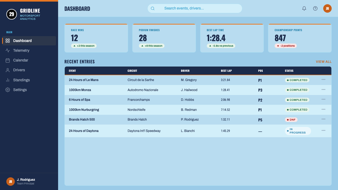
Wyer was the British racing team manager whose outfit, John Wyer Automotive (JWA), ran the Gulf-sponsored Ford GT40s and later Porsche 917s. A meticulous strategist rather than a designer by trade, Wyer nonetheless understood that a consistent, disciplined livery reinforced the professionalism of his team, and he maintained the powder-blue-and-orange scheme across multiple chassis and seasons rather than redesigning it car by car. His insistence on continuity is a large part of why the livery reads today as a coherent brand system rather than a single famous paint job.
The Belgian driver was one of the era's most successful endurance racers, winning Le Mans multiple times across his career, including behind the wheel of Gulf-liveried JWA cars. Ickx's association with the livery helped establish it as a marker of serious competitive pedigree rather than mere sponsorship decoration — a car in Gulf colors was, in this era, a car that was expected to win.
The Mexican driver piloted Gulf-liveried cars for JWA, including the Porsche 917, and was regarded as one of the most naturally gifted wet-weather and endurance drivers of his generation. His career reinforced the livery's international reach — a British team, an American sponsor, and drivers from across Europe and the Americas all converging under the same two colors.
The American actor and amateur racer wore Gulf-branded driving suits and raced a Gulf-liveried Porsche 917 in the making of the 1971 film *Le Mans*, shot using real endurance-racing footage and cars rather than studio effects. McQueen's celebrity carried the livery out of the racing world and into mainstream visual culture, where it has remained a recognizable symbol of speed and style ever since, independent of any specific race result.
How do you use Gulf Racing Livery today?
Gulf Racing Livery transfers well into digital design precisely because its rules are so few and so strict: two colors, one stripe, one roundel motif. Applying it correctly means resisting the urge to add a third color or extra patterning, and instead using the discipline of the two-tone system to carry hierarchy and energy on its own.
For presentation slides, the scheme makes for a striking cover: a powder-blue field crossed by a single orange band, with the title set in bold, squared type sitting cleanly in the blue area rather than competing with the stripe. Content and data slides should keep the blue as the dominant background, use orange sparingly as a single accent — a highlighted bar in a chart, a call-out number, one active tab — and reserve the black-and-white roundel treatment for numbering slides or sections rather than scattering it decoratively.
For web interfaces, the livery suits dashboards and pricing pages that want to feel fast and confident without looking playful. A dashboard built on this system keeps the base interface in the powder-blue-and-white register, uses the orange exclusively for primary actions, active states, or alerts, and treats any badge or counter element as a roundel — a circular, high-contrast object rather than a soft pill shape. On a pricing page, the recommended-plan card is the natural place for the orange stripe motif, letting the two-color logic double as a hierarchy signal without adding a third color for emphasis.
For editorial and marketing pages, the style rewards bold, poster-like composition: full-width blue sections broken by a single confident orange divider, numerals used as oversized graphic elements the way race numbers dominate a car door, and captions or bylines set in the same squared, technical numeral style used for racing decals. Marketing hero sections benefit from the stripe motif as a literal design device — a diagonal or horizontal band of orange crossing an otherwise calm blue field creates immediate visual energy without needing imagery.
The most common mistake is treating the palette as merely 'blue and orange' and then loosening the discipline around it — softening the stripe into a gradient, adding a third neutral color for 'balance,' or scattering the roundel motif as generic decoration rather than reserving it for numbers, badges, and identifiers. The livery's power comes from its restriction, not its color choice alone; loosen the restriction and it stops reading as Gulf and starts reading as generic racing stripes.
Gulf Racing Livery — FAQ
Is Gulf Racing Livery the same as generic 'racing stripes'?
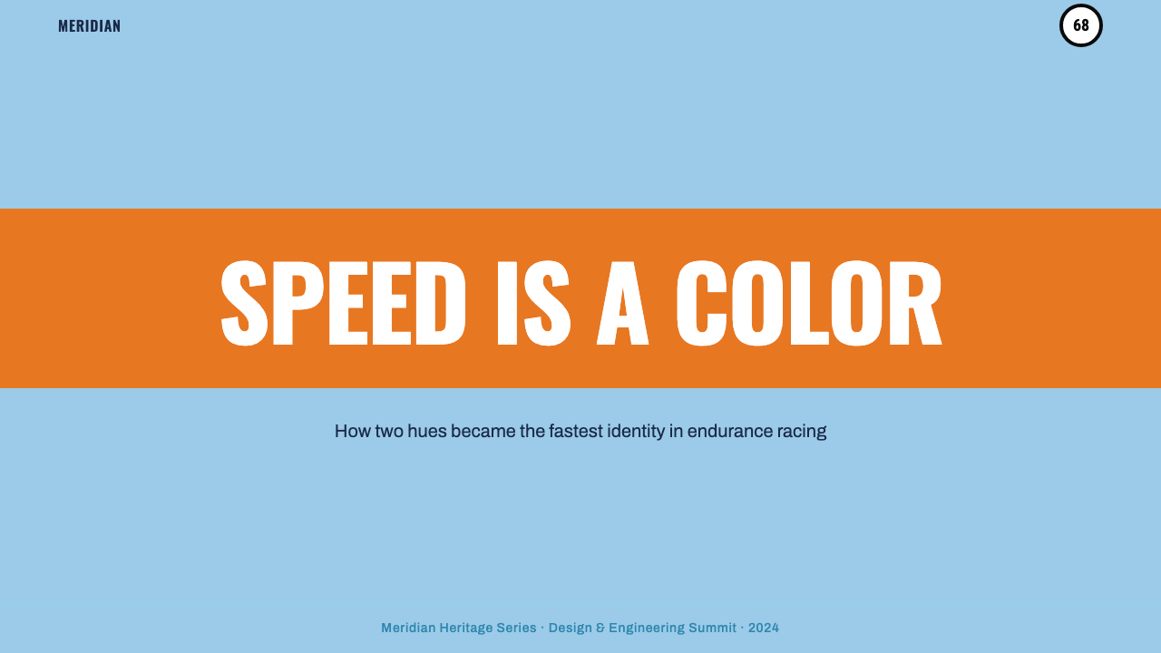
No. Generic racing stripes are a decorative motif — often two or three thin parallel lines added to suggest sportiness. Gulf Racing Livery is a specific, historically documented brand system built around one particular pair of colors, one broad centered stripe, and a specific roundel numeral treatment, all developed to identify a specific team's cars across multiple seasons and chassis. The distinction matters: applying 'racing stripes' to a design borrows a generic sporty feeling, while applying the Gulf system borrows a very particular, disciplined identity with real motorsport history behind it.
Can the Gulf palette work with a dark background?
It is possible but requires care, because the historic system is built on the powder blue reading as a light, airy base rather than a dark one. A dark-background adaptation works best by keeping the orange stripe as the dominant bright accent against near-black, and treating the powder blue as a secondary, cooler highlight rather than the dominant field. What must be preserved regardless of background is the hard, clean edge between colors — any softening into gradients breaks the system's core discipline faster than a background color change ever would.
Why does the system rely on only two colors instead of a fuller palette?
Because the livery was solving a real constraint: a car needs to be identified instantly, at speed, from a grandstand or in a photograph, often reproduced in black-and-white print as well as color broadcast. A two-color system with maximum contrast between the colors solves that problem more reliably than a richer palette would — more colors mean more decisions about hierarchy, and more chances for the scheme to blur together at a glance or a distance. The same logic applies on a screen: a two-color system with one accent used sparingly reads instantly, while a five-color palette requires the viewer to work harder to find what matters.
How should the roundel numeral motif be used outside of an actual number badge?
Sparingly, and only where it makes sense as an identifier. The roundel's visual power comes from the fact that it always marks something specific — a car number, a driver name — rather than existing as pure decoration. In a digital product, that translates to using the circular, high-contrast badge treatment for things that genuinely identify or count: a step number in an onboarding flow, a notification count, a section index. Applying the same circular treatment to purely decorative icons dilutes the motif until it reads as generic UI chrome rather than a deliberate reference to the livery.
What kinds of products or brands does this style struggle to fit?
The style is built on speed, precision, and a slightly masculine motorsport heritage, so it can feel misplaced in contexts that call for softness, warmth, or organic texture — children's products, wellness or care-oriented brands, and anything built around handcraft or artisanal positioning. It can also feel oddly narrow for products with genuinely broad, multi-category content, since the two-color discipline works best when there is a single clear hierarchy to express, not a sprawling set of unrelated sections each needing its own visual treatment.
Related design styles
 Soviet Space ProgramHeroic by construction. Red fields, gold stars, black keylines, and diagonal…
 El Al Israel AirlinesNational blue takes command. White aircraft geometry cuts a flat jet-age post…
 Mod Scooter ChromeSharp chrome discipline. Steel ground, roundel targets, condensed type, mirro…
 Sony Walkman (1979)The street turns private. Cobalt panels, silver grain and orange controls mak…
 Aeroflot Soviet AirlineEngineered restraint rules. Silver ground, royal-blue cheatlines, and flat gr…
 Amtrak Arrow (1971)Civic authority at speed. Deep navy, Helvetica lockups, and red-blue arrows.