What is Mod Vespa London (1964)?
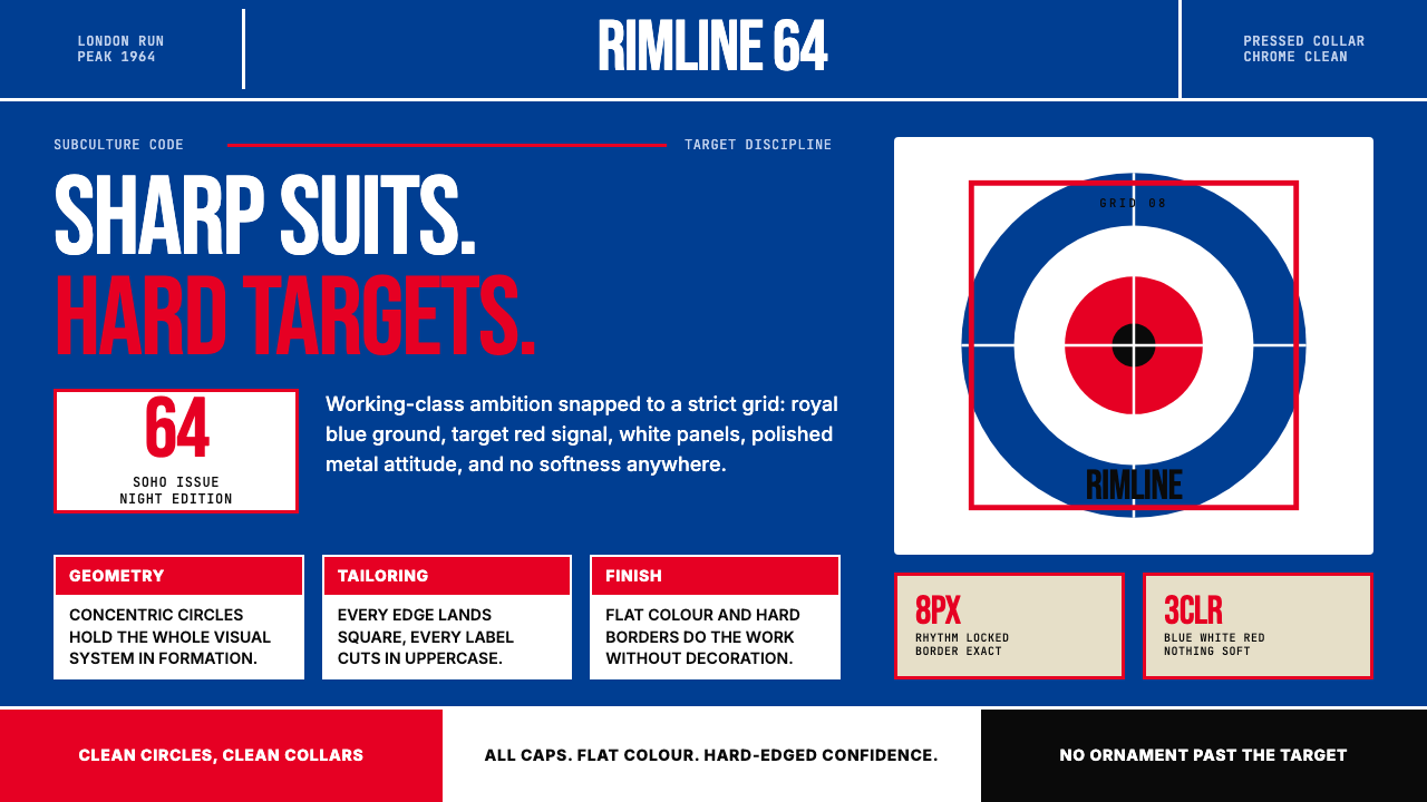
Mod Vespa London (1964) distills working-class British cool into a precise visual code: the RAF target roundel, royal blue grounds, and all-caps sans-serif headlines that refuse every compromise.
Mod Vespa London (1964) in brief
Mod Vespa London (1964) is a design aesthetic rooted in the peak years of British Mod subculture, when a generation of young working-class Londoners turned precision, geometric boldness, and obsessive attention to detail into a declaration of identity. The visual language is built around the RAF roundel — concentric rings of red, white, and blue — transposed from military insignia into an emblem of youth rebellion and sharp self-presentation. Every compositional choice is hard-edged, high-contrast, and unapologetically bold.
The system's palette is strict: royal blue as the dominant ground, target red as a structural accent, and white as the neutral field that makes both colours sing. Black governs type and outline. There is no warmth, no softness, no transition between tones — only the clean snap of one flat colour against another. This refusal of gradation is not austerity but exactness: the same exactness a Mod brought to the crease in his trousers or the chrome on his Vespa.
Typography in this system is confrontational. Headlines are set in uppercase geometric sans-serifs, condensed and tall, filling the frame with deliberate aggression. Body text, where it appears, is sparse — the visual system trusts geometry and colour hierarchy over words. The roundel motif recurs across compositions as both logo and architecture, organizing space the way a compass rose organizes a map.
Where does Mod Vespa London (1964) come from?
The Mod movement emerged in London in the late 1950s, centred on working-class teenagers in the East End and suburbs who sought a form of cool that was entirely their own — distinct from American rock and roll, from trad jazz, and from the British establishment. They looked to Italy for tailoring and scooters, to Black American soul music for rhythm, and to their own ingenuity for a visual identity. By 1962 and 1963 the subculture had developed a recognisable look: slim Italian suits, desert boots, and — above all — the Lambretta and Vespa scooters adorned with mirrors, aerials, and fox tails.
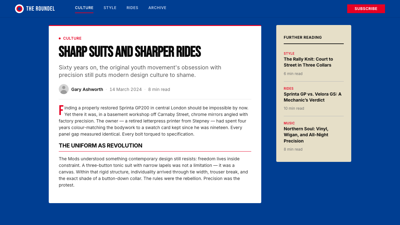
The RAF roundel, originally the identification marking painted on Royal Air Force aircraft, entered Mod iconography as an act of ironic appropriation. By 1964, the year of the Clacton and Margate bank-holiday riots between Mods and Rockers, the target symbol had become the movement's definitive emblem. Pete Townshend of The Who adopted it as the band's visual signature — appearing on amplifiers, jacket backs, and album artwork — while the scene's tastemakers, including Pete Meaden (who managed The Who's early career and coined the phrase 'clean living under difficult circumstances'), refined the imagery into a coherent aesthetic position.
Carnaby Street in the West End was the commercial and sartorial heart of the scene. John Stephen, a Scottish-born menswear designer who opened his first shop there in 1957, transformed a narrow side street into the fashion capital of mid-1960s Britain. His boutiques sold the slim-cut jackets, hipster trousers, and colour-saturated shirts that defined Mod dress. Steve Marriott of the Small Faces and other musicians became living advertisements, photographed constantly and disseminated through magazines like Rave and Fabulous.
The aesthetic had a precise year of peak coherence: 1964. Before that, the scene was still coalescing; after the Clacton riots and the subsequent press coverage, commercialisation began to dilute the subculture's edge. By 1966 Mod had splintered — into psychedelic directions (the early Pink Floyd), into the harder working-class strain that would become skinhead culture, and into the pop mainstream. The visual language captured in this design system represents the movement at its most concentrated: the year before compromise arrived. Revival waves followed in 1979 with the ska and Two-Tone movement, and again in 1995 with Britpop — both of which drew heavily on the roundel geometry and the royal-blue-and-red palette.
What defines the Mod Vespa London (1964) look?
Roundel Geometry
The RAF roundel — three concentric rings in red, white, and blue — is both the system's logo and its spatial engine. Compositions are often anchored by circular forms that organize the field the way a bull's-eye organizes a target: the outermost ring defining the edge of attention, the innermost circle demanding focus. The roundel can scale from a small badge on a corner to a full-bleed motif that swallows the entire composition. Its geometry is always hard, never distorted.
Royal Blue Dominance
Royal blue is the ground against which all other elements operate. It reads as authoritative and cool — closer to the navy of a uniform than to the sky, but lighter and more assertive than either. The blue does not recede as a background typically would; it advances, giving the composition a front-loaded visual weight. Everything placed on it — white type, red roundel rings, black outlines — is sharpened by the contrast.
All-Caps Condensed Typography
Headlines are set entirely in uppercase, using geometric sans-serif letterforms that are tall and narrow rather than wide and open. The condensed proportion creates urgency — the letters press against one another, the words fill horizontal space efficiently, the overall effect is banner-like rather than conversational. Tracking is tight. There is no lowercase option in the headline register; lowercase would signal informality, and informality is not Mod.
Hard-Contrast Flat Colour
Colour transitions do not exist in this system. Every shape has a single, unmodulated fill — the red is one red, the blue is one blue, the white is pure white. The boundary between any two colours is a clean hard edge, never blurred or feathered. This flatness is not a simplification: it is the correct register for a visual language designed to be read instantly, at velocity, from the back of a scooter or across a dance floor.
Target Red as Structural Accent
Red appears in precisely controlled doses: the outermost and innermost rings of the roundel, headline accents, and critical call-to-action elements. It never floods the composition — that is the blue's role. Instead, red functions as a structural signal, marking the thing that demands attention within an already bold field. The proportion of red to blue to white is not decorative; it mirrors the original roundel's deliberate ratio.
Chrome and Mirror Detailing
Where photographic or illustrative elements appear, they tend toward the reflective and metallic — chrome handlebars, mirror surfaces, polished metal badges. In two-dimensional work, this translates to high-contrast white highlights placed at angles that suggest reflection, not ambient light. The effect is that objects appear sharp and machine-finished rather than organic and handmade. This detailing echoes the Mod obsession with the immaculate surface of a perfectly maintained scooter.
Poster-Scale Boldness
Every element is calibrated for legibility and impact at distance. There are no fine details that reward close reading; the system communicates at poster scale regardless of the actual format. This is not an accident — it reflects the subculture's roots in street-level visual culture, from scooter club insignia to concert flyer typography. Applied to a small format, the effect can feel intentionally oversized; that pressure is part of the aesthetic.
Who shaped Mod Vespa London (1964)?
Meaden was The Who's first manager and the scene's most articulate theorist, coining the phrase 'clean living under difficult circumstances' as a summary of the Mod ethic. He understood that Mod was not simply a fashion — it was a complete lifestyle philosophy that governed clothing, music, transport, and attitude simultaneously. His framing of the roundel as a symbol of working-class aspiration gave the image its ideological weight and separated it from simple nostalgia for wartime iconography.
Townshend's adoption of the RAF roundel on The Who's equipment and stage wear transformed a subculture emblem into a mass-media image. His art-school background — he studied at Ealing College of Art — meant he approached the visual language with intentionality rather than instinct alone. The target became the band's consistent graphic identity through their peak years, appearing in configurations that ranged from a small badge on a jacket to an overwhelming full-stage projection, demonstrating the motif's scalability.
Stephen was the commercial architect of the Mod look. His cluster of boutiques on Carnaby Street — at peak he owned fourteen shops on the same street — made him the primary supplier of the slim-cut, colour-saturated clothes that defined the subculture's dress code. His genius was translating a street aesthetic into affordable retail without diluting its visual intensity. The bold colour blocking and precise tailoring of his clothing directly inform the colour system's values: richness without excess, precision without expense.
Marriott, lead singer of the Small Faces, was among the movement's most photographed figures and one of the few performers whose personal style and musical persona were indistinguishable. As a working-class East Ender who rose to fame without altering his origins, he embodied the Mod ideal of aspiration without pretension. The Small Faces' visual presentation — sharp suits, geometric haircuts, high-contrast black-and-white photography — is a direct expression of the design system's aesthetic priorities.
Weller brought Mod's visual language into a second life. As founder of The Jam (formed 1972, breakthrough 1977–1982) and later The Style Council, he consciously revived the roundel, the royal blue palette, and the all-caps poster typography for a generation that had not experienced the original. His approach demonstrated that the system's visual principles were durable enough to survive transplantation across decades and socio-political contexts — the 1979 revival retained the geometry while loading it with new urgency under Thatcherism.
How do you use Mod Vespa London (1964) today?
Mod Vespa London (1964) is most effective in contexts where authority, precision, and confident youth energy are desirable qualities — rather than warmth, softness, or approachability. Understanding the system means understanding that every element serves the same function as the Mod's pressed suit: it signals that care has been taken, that nothing is accidental, and that the presenter knows exactly what they are doing.
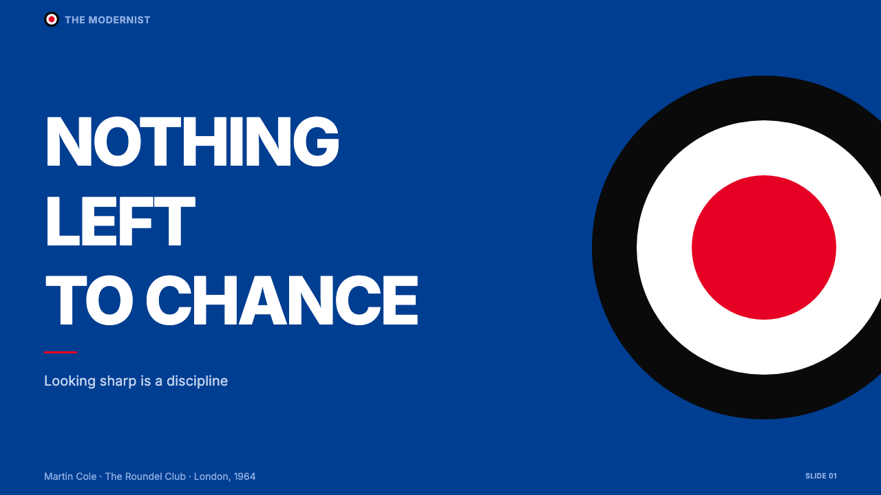
For presentation slides, the system works best as a cover-heavy approach. A cover slide using the full royal blue ground, a roundel motif anchoring one quadrant, and an all-caps headline in white commands attention immediately. Content slides should be restrained by comparison: a white or near-white ground, black body text, and blue or red used only for section headers or data highlights. Data visualizations — bar charts, progress indicators, comparison tables — benefit from the palette's inherent clarity: one data series in royal blue, a contrasting series in target red, gridlines and axes in black. Avoid mixing both accent colours simultaneously in the same chart; let one colour carry the primary data story.
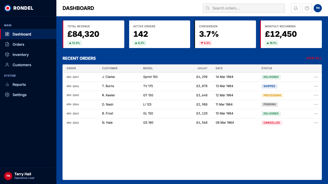
For web interfaces, the system is well-suited to product pages, pricing tiers, and hero sections where the goal is to project confidence rather than friendliness. A full-width hero in royal blue with a centred roundel watermark and a large all-caps headline creates immediate visual authority. Navigation should be typographic and minimal — no icon decorations beyond geometric indicators, no rounded corners that soften the system's edge. Cards should use hard drop shadows rather than soft ones; borders, where used, should be crisp and single-weight. The system is less suited to long-form reading experiences where users need visual rest.
For editorial and marketing work, the roundel becomes a flexible compositional tool. A magazine cover can treat it as a full-bleed circle that the subject's face or product image sits inside. A poster can use it as a layered background that the headline punches through. In marketing contexts — event announcements, launch campaigns, social media graphics — the system's poster-scale boldness reads immediately even at thumbnail size, which makes it unusually effective for digital environments where content competes at small formats. The all-caps headline lockup should be treated as the primary graphic element, not supporting text.
A common mistake when applying this system is confusing Mod precision with Mod excess. The original aesthetic was characterized by restraint within a loud palette — one dominant colour, one accent, one geometric motif. Designers who add additional accent colours, introduce gradient fills, or layer multiple competing patterns quickly lose the system's clarity. The roundel should appear in one configuration per composition, not repeated at multiple scales simultaneously. Similarly, lowercase type or script letterforms introduced alongside the all-caps system break the tonal register: Mod typography is confrontational and uniform, never relaxed.
Mod Vespa London (1964) — FAQ
Is Mod Vespa London (1964) the same as British Pop Art?
They overlap but are distinct. British Pop Art — associated with artists like Richard Hamilton and Peter Blake — also used bold colour, flat imagery, and commercial visual languages, and shared cultural space with Mod in the early 1960s. But Pop Art was gallery-oriented and often ironic in its relationship to mass culture, whereas the Mod aesthetic was mass culture from the inside. The roundel in Mod was not a comment on military iconography; it was simply the most powerful symbol available, chosen for its visual force. Pop Art tends toward the illustrative and the playful; Mod design tends toward the emblematic and the precise.
Can the roundel motif be used without the full royal blue palette?
Technically yes, but the results diverge from the source system quickly. The roundel's power in this context comes from its relationship with the royal blue ground — the concentric rings pop because of the contrast, not because of the rings alone. On a white or neutral ground, the roundel reads as decoration rather than as an organizing principle. If the full palette is not available (for example, in a single-colour print context), black and white versions of the roundel are more coherent than a version that substitutes arbitrary colours for the original three.
How does this system differ from other British 1960s design aesthetics, like Swinging London?
'Swinging London' as a cultural phenomenon was broader and more diffuse than Mod — it included the psychedelic graphics of the late 1960s, the Op Art influence of Bridget Riley, and the flower-power typography that began appearing from 1966 onward. The Mod Vespa aesthetic is specifically pre-psychedelic: it belongs to the phase before colour became fluid and before letterforms began to bend and wave. The contrast is instructive — Swinging London embraced ornament and sensory excess; Mod resisted both. If a design uses circular forms but also includes flowing lines, curved type, or pastel tones, it has drifted out of Mod and into the Swinging London register.
Is the dark background version authentic to the historical style?
The original Mod aesthetic was built on royal blue as an active, saturated ground — not a neutral dark background. This distinguishes it from systems where the dark background is a neutral field. Royal blue in this context reads as a colour choice with historical specificity, not simply as 'dark mode'. A fully dark or black background can work in contemporary applications of the style, but it softens the system's association with the specific cultural context. The authentic register is royal blue as foreground colour, not as shadow or void.
How should this style handle photography or realistic imagery?
When photography appears within this system, it should be treated with the same precision and hardness the system applies to everything else. High-contrast black-and-white photography — the way Mod musicians were typically photographed in the early 1960s — integrates well because it shares the system's tonal logic: stark, uncompromising, with no tonal middle ground. Colour photography is more difficult; if used, it should be tightly cropped, placed within a defined geometric container (such as inside a roundel circle), and never allowed to bleed freely across the royal blue ground in a way that dilutes the palette's control. Soft, ambient, or lifestyle photography is incompatible with the system's values.
Related design styles
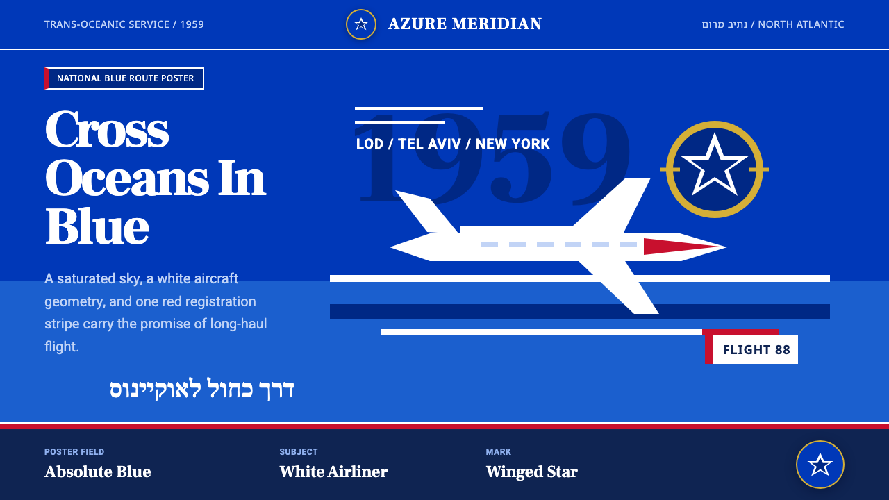 El Al Israel AirlinesNational blue takes command. White aircraft geometry cuts a flat jet-age post…
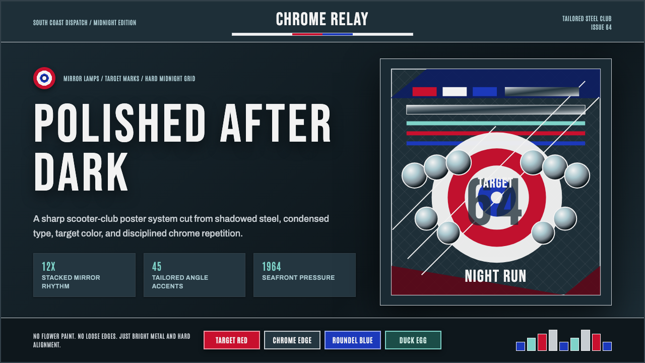 Mod Scooter ChromeSharp chrome discipline. Steel ground, roundel targets, condensed type, mirro…
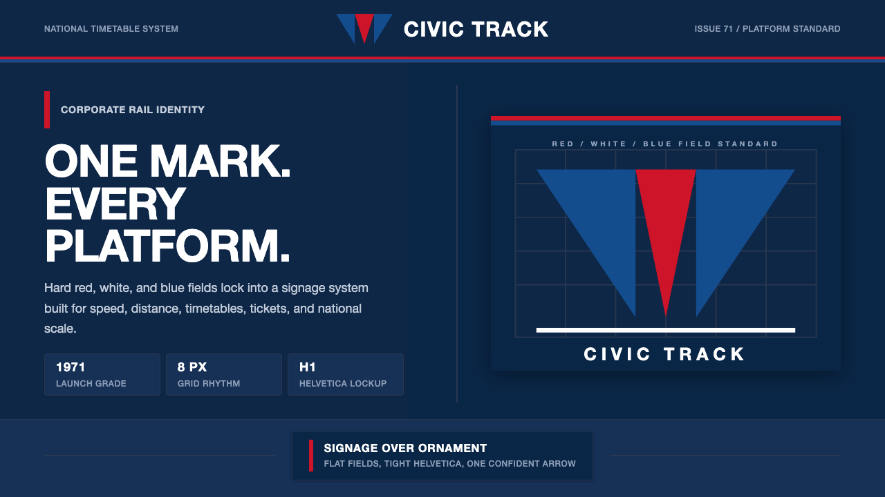 Amtrak Arrow (1971)Civic authority at speed. Deep navy, Helvetica lockups, and red-blue arrows.
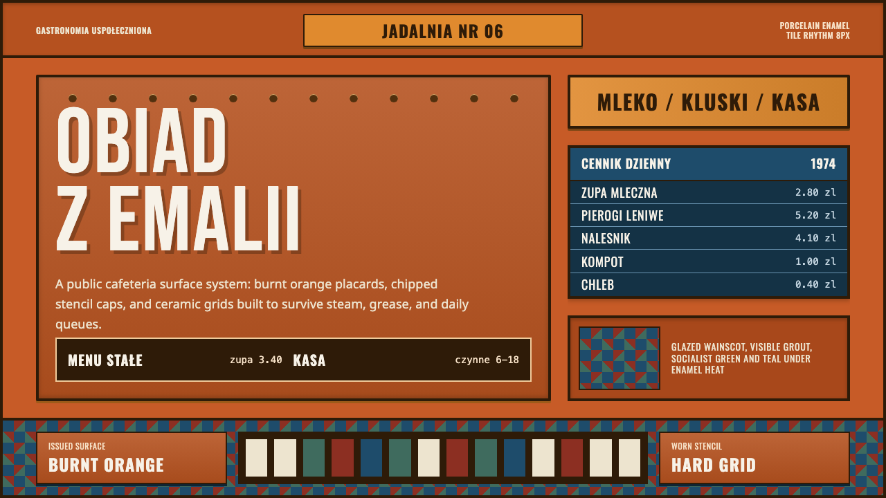 Polish Milk Bar (PRL)State-issued warmth. Burnt orange enamel, stencil caps, and hard tile grids.
 Saul Bass CorporateAuthority distilled. Deep blue geometry, tight Inter lockups, and white space…
 Air Niugini Livery 1975A flag engineered for flight. Signal red sweeps across enamel white, underlin…