Design style guide设计风格指南
What is Basque Pelota Fronton Red & Green?什么是 Basque Pelota Fronton Red & Green?
Basque Pelota Fronton Red & Green is a fiercely regional visual language forged on concrete courts and carried by a community that has never confused sport with mere entertainment.巴斯克回力球场朱红与绿是一套骄傲的地域视觉语言,锻造于混凝土球场之上,由一个从未将运动与消遣混为一谈的民族代代传承。
Basque Pelota Fronton Red & Green in briefBasque Pelota Fronton Red & Green 速览
Basque Pelota Fronton Red & Green is a design system rooted in the visual world of the fronton — the open-air or enclosed concrete court where pelota and its fastest variant, cesta punta, have been played for well over a century. At its core are two colors: a saturated vermilion red and a deep eusko green, placed against glacial white wall surfaces and rendered with a directness that owes more to functional signage than to graphic refinement.巴斯克回力球场朱红与绿是一套植根于回力球场视觉世界的设计体系。回力球场是供人们打回力球(pelota)及其最快变体投篮球(cesta punta)的开放式或封闭式混凝土场地,这项传统已延续一个多世纪。体系的核心是两种颜色:饱和的朱红与深沉的巴斯克绿,置于冰川白的墙面之上,以一种更近于功能性标牌而非精致图形设计的直接方式呈现。
The style is inseparable from place and identity. The palette echoes the ikurriña, the Basque national flag — a white background carrying a green diagonal cross overlaid by a red diagonal cross — and the saturated lithographic posters that advertised professional jai alai matches from Biarritz to Miami and Havana throughout the mid-twentieth century. This is not a color choice made for aesthetic pleasure alone; it is a declaration of origin.这种风格与地域和身份密不可分。色板呼应着巴斯克民族旗帜(ikurriña)——白色底面上叠加绿色对角十字与红色对角十字——以及二十世纪中期从比亚里茨到迈阿密、哈瓦那宣传职业回力球赛事的饱和石版印刷海报。这不仅仅是出于审美愉悦的色彩选择;它是一个关于起源的宣言。
Typographically, the system draws on nineteenth-century Basque commercial lettering: wide, high-contrast letterforms with strong vertical stress, designed for outdoor readability at speed. Euskara, the Basque language, is treated as a first-class visual element — never subordinate to Spanish or French, always present in signage, headings, and navigational text. The geometry of the fronton itself — long horizontal datum lines, clearly marked court boundaries, the vertical wall plane — provides the structural logic that underlies the compositional approach.在字体排印上,这套体系借鉴了十九世纪巴斯克商业招牌字:宽体、高对比度的字形,纵向笔画有力,专为户外高速可读性而设计。巴斯克语(Euskara)被视为一等视觉元素——在标牌、标题与导航文字中始终出现,绝不居于西班牙语或法语之下。回力球场本身的几何结构——长水平基准线、清晰标记的场地边界、竖向墙面——为构图方式提供了底层结构逻辑。
Where does Basque Pelota Fronton Red & Green come from?Basque Pelota Fronton Red & Green 从何而来?
Pelota — a catch-all name for a family of handball and racquet games played against a wall — is one of the oldest codified sports in Europe. Its roots are traced to medieval ball games played in the villages and plazas of the Basque Country, the mountainous region straddling what is now northern Spain and southwestern France. By the nineteenth century, the sport had developed a formal vocabulary: the fronton, a purpose-built court with a high front wall called the frontis, lateral walls, and a precisely measured playing surface. The court's geometry was strict and functional, and its proportions — the height of the frontis, the distances marked in chalk or painted lines — became the visual grammar of Basque athletic culture.回力球——一个泛指靠墙打球的手球与球拍球类运动家族的统称——是欧洲最古老的成文运动之一。其根源可追溯至巴斯克地区村庄与广场上进行的中世纪球类游戏,这片多山地带横跨今日西班牙北部与法国西南部。至十九世纪,这项运动已发展出一套正式词汇:回力球场(fronton)是专门建造的场地,高耸的前墙(frontis)、侧墙与精确测量的场地面构成其基本形态。球场的几何结构严谨而实用,其比例——前墙高度、用粉笔或油漆标注的距离线——成为巴斯克体育文化的视觉语法。
The most spectacular variant of the game, cesta punta — known in the Americas as jai alai, a Basque phrase meaning 'merry festival' — emerged in the Basque Country in the late nineteenth century and was exported to Cuba and Florida as Basque diaspora communities established themselves in the Americas. Professional jai alai frontons in Havana, Miami, and other cities became sites of intense spectatorship and gambling, generating a rich visual culture: painted fronton interiors in red and green, typographically bold promotional posters, numbered player pennants, and the distinctive curved cesta baskets that players used to hurl a hard rubber ball at tremendous speed.这项运动最具观赏性的变体投篮球(cesta punta)——在美洲以巴斯克语「快乐节日」之意命名为jai alai——在十九世纪末出现于巴斯克地区,随巴斯克移民社区在美洲扎根而传入古巴与佛罗里达。哈瓦那、迈阿密等城市的职业jai alai球场成为高强度观赏性运动与博彩的场所,催生了丰富的视觉文化:涂以红绿两色的球场内部、印刷粗犷的宣传海报、编号球员旗帜,以及球员用于以极高速度掷出硬橡皮球的独特弧形柳条球篮(cesta)。
The visual language of professional jai alai reached its peak expression between the 1920s and 1950s. Poster artists working for the Miami Jai-Alai fronton and Cuban venues produced lithographic images that combined high-contrast athletic photography with bold sans-serif and display lettering, saturated in the red-green palette that had by then become synonymous with the sport. These posters drew on both European modernist printing conventions and the local visual culture of the Americas — a fusion that gave the style an unusual cosmopolitan quality while retaining its strongly regional identity.职业jai alai的视觉语言在1920至1950年代间达到顶峰。迈阿密Jai-Alai球场与古巴场馆的海报艺术家创作了大量石版印刷图像,将高对比度的运动摄影与粗犷的无衬线和展示字体相结合,在早已与这项运动同义的红绿色板中饱和呈现。这些海报同时借鉴了欧洲现代主义印刷传统与美洲本地视觉文化——这种融合赋予了这种风格不同寻常的世界主义气质,同时保留了其强烈的地域身份认同。
The Basque cultural revival that gathered force from the 1970s onward, and intensified after the transition to democracy in Spain, brought renewed attention to all aspects of Basque visual heritage, including the design language of the fronton. Contemporary Basque graphic designers — working in contexts ranging from municipal identity programs to cultural festival branding — have returned to the fronton palette and typography as a resource for expressing identity that is modern without being anonymous. The ikurriña tricolor, the court-line geometry, and the Euskara lettering conventions have been reinterpreted in digital and screen contexts while retaining the directness and regional pride that defined the original.从1970年代开始积聚力量、在西班牙民主转型后进一步深化的巴斯克文化复兴,使人们重新关注巴斯克视觉遗产的各个层面,包括回力球场的设计语言。当代巴斯克平面设计师——工作于市政识别项目到文化节庆品牌等各种语境中——将球场色板、字体排印惯例作为表达身份认同的资源,以一种现代而不失个性的方式重新加以诠释。巴斯克旗帜三色、球场线条几何与巴斯克语书写惯例在数字与屏幕语境中获得新的诠释,同时保留了原始形态中的那种直接性与地域自豪感。
What defines the Basque Pelota Fronton Red & Green look?Basque Pelota Fronton Red & Green 的视觉特征是什么?
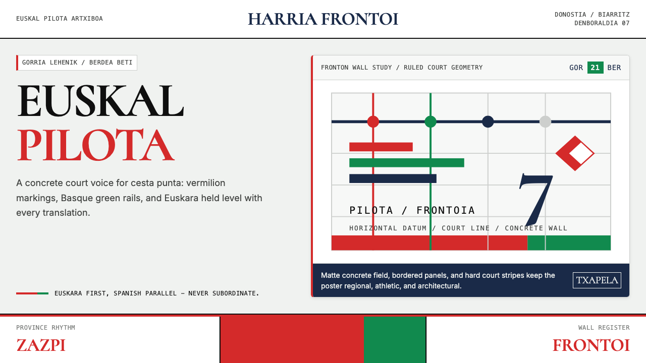
Color色彩
The palette is anchored by two dominant colors: vermilion red and eusko green. Vermilion is warm, almost aggressive — the red of sport markers, warning signals, and flag symbolism — while eusko green is deep and earthy, referencing the forested mountains of the Basque interior. These two saturated colors are never blended or graduated; they meet at hard edges, usually against an expanse of glacial white that represents the fronton wall itself. The white is not neutral — it is structural, the ground that gives both colors their maximum impact.色板以两种主导色为锚:朱红与巴斯克绿。朱红是温暖的、近乎进攻性的——运动标记、警示信号与旗帜象征的那种红;而巴斯克绿则深沉厚实,指向巴斯克内陆林木覆盖的山地。这两种饱和色彩从不相互混合或渐变;它们以硬边相遇,通常置于大面积冰川白之上——代表球场前墙本身的白。这种白色并非中性底色,而是结构性的存在,赋予两种颜色最大的视觉冲击力。
Typography字体排印
Letterforms draw on nineteenth-century Basque commercial signage tradition: wide, robust, and high in stroke contrast, designed to be legible at a distance from a moving position. Display type tends toward condensed width and generous height, mimicking the proportions of hand-painted fronton lettering. Crucially, Euskara — the Basque language — is always typographically present. Bilingual or trilingual text is treated as a feature rather than a complication, with Euskara given visual priority or at minimum equal weight alongside Spanish or French.字形借鉴了十九世纪巴斯克商业招牌传统:宽厚、粗壮、笔画对比度高,专为运动中远距离可读性而设计。展示字体倾向于窄体与充足的高度,仿效手绘球场招牌字的比例。关键在于,巴斯克语(Euskara)始终在字体排印上保持在场。双语或三语并置被视为特色而非累赘,巴斯克语获得视觉上的优先权,或至少与西班牙语或法语保持同等分量。
Geometry and Court Lines几何形态与球场线条
The fronton's architectural geometry provides the structural vocabulary: strong horizontal lines define the datum of the court floor and the foul line painted on the frontis wall; vertical elements refer to the height of the frontis itself. These lines are functional in origin — they demarcate the playing field — but in the design system they become compositional devices, organizing space with the same directness as architectural drawing. Layouts follow a horizontal grid logic, with text and imagery aligned to strong horizontal anchors rather than centered on the page.回力球场的建筑几何构成了结构词汇:强横线定义球场地面基准线与前墙上的界外线;竖向元素指向前墙本身的高度。这些线条起源于功能——划定运动场地——但在设计体系中它们成为构图手段,以建筑制图般的直接性组织空间。版面遵循水平网格逻辑,文字与图像对齐于强烈的水平锚点,而非居中于页面。
Material Directness材料的直接性
The fronton is a functional structure: raw concrete, painted lines, numbered sections. There is no decoration applied to the court beyond what is needed for the game. The design system inherits this absence of adornment — surfaces are flat, textures are avoided, gradients are absent. When a red field appears, it is solid and saturated, not shaded or textured to simulate depth. This material directness communicates athletic seriousness; ornamentation would read as incongruous.回力球场是一个功能性结构:原始混凝土、粉刷线条、编号区段。除比赛所需之外,场地上没有任何额外装饰。这套设计体系继承了这种无装饰性——平面是平的,质感被回避,渐变缺席。当朱红色块出现时,它是实心的、饱和的,而非通过阴影或纹理来模拟深度。这种材料的直接性传递出运动的严肃感;装饰在此只会显得格格不入。
Regional Identity as Structural Element地域身份作为结构要素
In most design systems, cultural identity is expressed through styling — it is applied over a neutral structural base. In this system, identity is structural. The palette is the ikurriña palette. The language on the page is Euskara first. The geometric references are the fronton's own proportions. This means the style cannot be separated from its origins without becoming something entirely different — it is constitutively Basque, not generically sporty or generically red-green.在大多数设计体系中,文化身份通过风格化来表达——它被施加于中性结构底座之上。而在这套体系中,身份本身就是结构。色板就是巴斯克旗帜的色板。页面上的语言首先是巴斯克语。几何参照是球场本身的比例。这意味着,这种风格一旦与其起源分离就会变成截然不同的东西——它从本质上是巴斯克的,而非泛化的运动感或泛化的红绿色系。
Scale and Impact尺度与冲击感
The fronton poster tradition trained viewers at scale: these images were designed to be read from across a crowded public space, in motion, against the visual noise of a crowd. The design system carries this scale sensitivity into smaller formats. Type is set large relative to the field; color blocks are generous; thin lines and small detail are treated with suspicion. The system works best when it commits to boldness — an undersized headline or a timid color application produces work that looks like a facsimile of the style rather than an expression of it.回力球场海报传统在大尺度中训练了观看者:这些图像是为在拥挤公共空间中远距离阅读、在移动中、在人群视觉噪声中辨认而设计的。这套设计体系将这种尺度敏感性带入更小的格式。字体相对于底面设置得很大;色块面积慷慨;细线与小细节受到审视。这套体系在致力于大胆时效果最佳——过小的标题或胆怯的色彩运用会产生看起来像是风格摹本而非风格表达的作品。
Who shaped Basque Pelota Fronton Red & Green?谁塑造了 Basque Pelota Fronton Red & Green?
Chillida is the most internationally recognized artist to emerge from the Basque Country in the twentieth century. Working primarily in sculpture and printmaking, his mature work — iron forms of tremendous physical presence, and graphic works combining geometric abstraction with Basque spatial sensibility — is inseparable from the landscape and cultural logic of Euskal Herria. While Chillida did not design for sport contexts, his visual grammar of hard-edged form, the tension between mass and void, and his insistence on Basque cultural rootedness as an artistic position informed the broader visual culture from which the fronton design language draws.奇利达是二十世纪从巴斯克地区涌现的国际知名度最高的艺术家。他主要从事雕塑与版画创作,其成熟期作品——具有巨大物理存在感的铁质形态,以及融合几何抽象与巴斯克空间感性的平面作品——与巴斯克故土的地景和文化逻辑密不可分。尽管奇利达并非为运动语境而设计,但他的视觉语法——硬边形态、质量与虚空之间的张力,以及将巴斯克文化根性坚持为艺术立场的态度——浸润了回力球场设计语言所植根的更广泛的视觉文化。
Sarrionandia is a Basque writer and poet whose work in Euskara has shaped contemporary understandings of Basque visual and textual identity. His commitment to writing exclusively in Euskara — maintained through years of political exile — exemplifies the principle that animates the typography of this design system: Basque language is not a decorative addition to a work produced primarily in Spanish or French, but its primary and essential medium. The visual insistence on Euskara in the fronton tradition mirrors this linguistic and political stance.萨里奥南迪亚是一位用巴斯克语写作的诗人与作家,其作品塑造了当代对巴斯克视觉与文字身份的理解。他坚持只以巴斯克语写作——这一立场在多年政治流亡中始终未变——体现了这套设计体系字体排印背后的原则:巴斯克语不是对以西班牙语或法语为主要媒介的作品的装饰性补充,而是其首要且本质的媒介。回力球场传统对巴斯克语的视觉坚持,正是对这一语言与政治立场的呼应。
Atxa represents a generation of contemporary Basque graphic designers who have engaged directly with the fronton visual heritage as raw material for contemporary work. Designers in this tradition have applied the fronton palette and court-line geometry to municipal signage systems, cultural festival identities, and sports communications — demonstrating that the style is not a historical artifact but a living visual language capable of contemporary application. Atxa's work in particular has explored how the ikurriña color logic can function in screen-based and digital contexts without losing its intensity.阿特夏代表了当代一代巴斯克平面设计师,他们直接将回力球场视觉遗产作为当代创作的原材料加以运用。这一传统中的设计师将球场色板与场地线条几何应用于市政标识系统、文化节庆品牌与体育传播——证明这种风格不是历史文物,而是能够进行当代应用的活的视觉语言。阿特夏的工作尤其探索了巴斯克旗帜色彩逻辑如何在屏幕与数字语境中发挥作用,同时保留其强烈感。
Lopez Mendizabal was among the key figures in the twentieth-century movement to codify and promote Euskara as a written and visual language. His work in typography and book design established models for how Basque text should look on the page — generous spacing, readable letterforms, and the positioning of Euskara as the primary language of any bilingual publication. These typographic norms filtered directly into commercial and sporting visual culture, shaping the way Basque sport venues and publications treated their language.洛佩斯·门迪萨瓦尔是二十世纪将巴斯克语系统化为书写与视觉语言运动中的关键人物之一。他在字体排印与书籍设计领域的工作确立了巴斯克文字在页面上应有的样貌标准——充足的字距、易读的字形,以及将巴斯克语定位为任何双语出版物首要语言的原则。这些排印规范直接渗透进商业与体育视觉文化,塑造了巴斯克体育场馆与出版物对待本民族语言的方式。
How do you use Basque Pelota Fronton Red & Green today?今天怎么用 Basque Pelota Fronton Red & Green?
Basque Pelota Fronton Red & Green is a style that demands commitment. Its strength comes from the combination of saturated color, bold scale, and regional identity markers — applied at half measure, it reads as generic sports branding. Applied with conviction, it produces work with an unusual combination of physical directness and cultural depth. The contexts where it works best are those where the product or event shares something of the style's own values: community identity, physical presence, seriousness about craft.巴斯克回力球场朱红与绿是一种要求全力投入的风格。它的力量来自饱和色彩、大胆尺度与地域身份标识的组合——半心半意地应用,它只会呈现为普通的运动品牌;全力以赴地应用,它会产出兼具物理直接性与文化深度的作品。它最适用的语境,是产品或活动与这种风格的价值观有所共鸣的场合:社区认同、实体存在感、对技艺的认真态度。
For presentation slides, the style works best on covers and transition pages where full-color impact can be used without overwhelming long text passages. A fronton-inspired cover might divide the slide field with a strong horizontal line at roughly one-third height, placing a vermilion block above it and a white or near-white field below, with the presentation title set in wide, high-contrast type. Content slides should discipline themselves to the horizontal grid logic: text anchored to a left or bottom rail, with color used only for structural emphasis — section markers, data highlights — rather than decorative fill. Data slides can adopt the color duality directly: two data series mapped to vermilion and green, with white or light gray as the neutral ground.在演示文稿中,这种风格在封面页与过渡页上效果最佳——在这些页面上,全彩冲击感可以充分发挥而不至于压倒长文本段落。一个受回力球场启发的封面可能将幻灯片画面用一条约三分之一高度的横线分割,上方置朱红色块,下方置白色或接近白色的底面,演示标题以宽体高对比度字体排列。内容页应严格遵循水平网格逻辑:文字锚定于左侧或底部基准线,色彩仅用于结构性强调——章节标记、数据高亮——而非装饰性填充。数据页可直接运用这种色彩二元性:两个数据系列分别映射朱红与绿色,以白色或浅灰色作为中性底色。
For web interfaces, the style is well-suited to event registration pages, sports league dashboards, cultural organization sites, and any context where a strong regional or community identity needs visual expression. The approach: a strict horizontal grid, generous use of white as the structural ground, color reserved for primary calls to action, headers, and active states. Navigation should be typographically bold — labels in wide, high-contrast letterforms — with Basque language support treated as a first-class feature rather than a localization afterthought. Card components should use the hard-edged aesthetic: flat color fills rather than gradients, solid borders or no borders at all, without soft drop shadows that would soften the style's physical character.对于网页界面,这种风格非常适合赛事报名页面、运动联赛仪表板、文化机构网站,以及任何需要强烈地域或社区身份视觉表达的语境。方法如下:严格的水平网格,白色作为结构性底色被大量使用,色彩只保留给主要行动号召、标题与激活状态。导航应当字体排印大胆——标签使用宽体高对比度字形——巴斯克语支持被视为一等功能而非本地化事后补充。卡片组件应采用硬边美学:平面色彩填充而非渐变,实心边框或完全无边框,不使用会软化这种风格物理特质的柔和投影。
For editorial and marketing applications, the style's poster heritage provides a strong model. Full-width horizontal bands in vermilion or green, carrying reversed-out white text, can punctuate long-form content without resorting to decorative illustration. Section headings benefit from the wide letterform tradition: set large, allowed to occupy the full measure, with generous space above and below. Bilingual text — where both languages are given full typographic presence rather than one subordinated to a smaller size — is both historically accurate and visually distinctive in contemporary contexts where such equality is still uncommon.对于编辑与营销应用,这种风格的海报传统提供了强有力的模型。以朱红或绿色为底的全宽横向色带,承载反白文字,可以在不诉诸装饰性插图的情况下为长篇内容增添节奏感。章节标题得益于宽体字形传统:设置得很大,允许占满全行宽,上下留有充足空间。双语文字——两种语言都获得完整排印分量而非其中一种被缩小为次要尺寸——在当代语境中既是历史上准确的,也是视觉上独特的,因为这种语言平等至今仍不多见。
A common mistake when applying this style is to treat the red and green as interchangeable accents, applying them at similar weight and frequency throughout a layout. Authentic fronton visual culture assigns clear roles: vermilion is the primary signal color, commanding immediate attention; green is the complementary ground or secondary signal, giving context to the red. Using them at equal weight creates visual competition rather than hierarchy. A second common error is softening the palette — choosing a more muted red or a less saturated green because the full-strength colors seem aggressive. The style's entire character depends on that intensity; softened, it loses its connection to the source.应用这种风格时常见的错误,是将朱红与绿色当作可互换的强调色,在整个版面中以相似的分量与频率使用两者。真实的回力球场视觉文化赋予二者明确的角色:朱红是主信号色,命令即时注意;绿色是补充性底色或次级信号,为红色提供背景。以相同分量使用两者会造成视觉竞争而非层级关系。第二个常见错误是软化色板——选择更为沉闷的红色或饱和度更低的绿色,因为全强度色彩看起来过于强烈。这种风格的全部特质依赖于那种强度;一旦被软化,它就失去了与源头的连接。
Basque Pelota Fronton Red & Green — FAQBasque Pelota Fronton Red & Green · 常见问题
Is this style appropriate for contexts outside sport and regional identity?这种风格适用于运动与地域身份之外的语境吗?
Yes, but with awareness of what the style carries. The fronton palette and geometry are visually powerful in any context that benefits from directness, physical presence, and strong hierarchy — food and beverage brands with a craft or artisanal positioning, cultural institutions presenting heritage content, and technology products that want to signal regional specificity rather than generic global modernity. The style struggles where warmth, softness, or decorative richness are valued, and it will always carry some association with Basque identity even when applied to entirely different subject matter. Designers should decide whether that cultural resonance is an asset or a liability for their specific context.可以,但需要意识到这种风格所携带的含义。回力球场色板与几何形态在任何受益于直接性、实体存在感与强层级感的语境中都具有视觉冲击力——具有手工艺或工匠定位的食品饮料品牌、呈现文化遗产内容的文化机构,以及希望传递地域特殊性而非泛化全球现代性的科技产品。这种风格在温暖感、柔和性或装饰丰富性受到重视的场合则力不从心,而且即便应用于完全不同的主题,它也始终携带着与巴斯克身份相关的联想。设计师应当判断这种文化共鸣对其具体语境而言是资产还是负担。
How does this style differ from generic sports branding?这种风格与普通运动品牌有何不同?
Generic sports branding typically uses bold color and dynamic typography as stylistic choices — they signal energy and competition but carry no deeper content. The fronton style uses the same visual means but each element is load-bearing: the red-green palette references the ikurriña and specific cultural history; the wide letterforms reference Basque signage tradition; the horizontal geometry references the court itself. Removing any of these specifics produces work that looks generically sporty; retaining them produces work that communicates a particular place, history, and community. The difference is between style as decoration and style as argument.普通运动品牌通常将粗犷色彩与动感字体作为风格选择——它们传递能量与竞争感,但不携带更深的内容。回力球场风格使用了相同的视觉手段,但每个元素都承载着重量:红绿色板指向巴斯克旗帜与特定文化历史;宽体字形指向巴斯克招牌传统;水平几何指向球场本身。去除这些具体性中的任何一项,作品就会变得看起来像是泛化的运动风格;保留它们,作品就能传递一个特定的地方、历史与社区。这是风格作为装饰与风格作为论点之间的差异。
Can the style work in a dark or night-mode layout?这种风格能用于深色或夜间模式版面吗?
The historic fronton palette is emphatically light-ground — the white of the court wall is structural, not incidental. A dark inversion is possible but changes the nature of the system significantly. On a dark ground, vermilion retains much of its impact while eusko green can read as either menacing or lush depending on its exact shade and surroundings. The key risk in dark mode is losing the structural role of white, which in the original system acts as a spatial anchor giving both colors room to operate. A dark variant works best when it uses black or very dark gray as a neutral structural ground and introduces white as a typographic element rather than trying to reproduce the full three-color fronton dynamic on a dark field.历史上的回力球场色板以浅色底面为主——球场墙面的白色是结构性的,而非偶然的。深色反转是可能的,但会显著改变这套体系的性质。在深色底面上,朱红很大程度上保留了其冲击感,而巴斯克绿根据其确切色调与周围环境,可能呈现出威胁性或郁郁葱葱的质感。深色模式的主要风险在于失去白色的结构作用——在原始体系中,白色作为空间锚点,给两种颜色以运作的余地。深色变体效果最佳的做法是:以黑色或极深的灰色作为中性结构底色,将白色引入作为字体排印元素,而非试图在深色底面上再现完整的三色回力球场动态。
How should Euskara be handled if the target audience does not speak Basque?如果目标受众不会说巴斯克语,应如何处理巴斯克语元素?
Euskara's visual presence in this design system is not primarily communicative — it is identity-marking. In the fronton tradition, Basque text appears in contexts where most viewers may not read it fluently, but its presence signals cultural location, seriousness about identity, and respect for the source community. In a contemporary application targeting a non-Basque audience, Euskara can still appear as headings, labels, or structural text — especially in contexts like event names, section titles, or navigational elements — without requiring full comprehension. The choice should be made intentionally: using Euskara as a decorative flourish without genuine commitment to the identity it represents will read as hollow. Using it with purpose, even in contexts where most viewers will treat it as texture, honors the visual tradition.巴斯克语在这套设计体系中的视觉存在,主要不是传达性的——而是身份标记性的。在回力球场传统中,巴斯克文字出现在大多数观看者可能无法流利阅读的语境中,但它的存在传递了文化定位、对身份的认真态度,以及对源头社区的尊重。在针对非巴斯克受众的当代应用中,巴斯克语仍然可以作为标题、标签或结构性文字出现——尤其在活动名称、章节标题或导航元素等语境中——而无需要求完整理解。这个选择应当出于明确意图:将巴斯克语作为装饰性点缀使用,却没有对其所代表的身份的真正承诺,会显得空洞。有目的地使用它,即便在大多数观看者只将其视为纹理的语境中,也是对这种视觉传统的尊重。
What is the relationship between this style and Basque nationalist visual identity more broadly?这种风格与更广泛的巴斯克民族主义视觉身份有何关系?
The fronton style shares its palette and some of its typographic conventions with Basque nationalist visual identity — both draw on the ikurriña colors and on the Basque signage tradition. But the fronton style is sport-specific in its geometry and material sensibility: it is grounded in the physicality of the court, in the poster culture of professional competition, and in the specific aesthetic of painted concrete and hand-lettered signage. Nationalist political design tends toward more symbolic and heraldic compositions; the fronton style is more physical and commercial in origin. The two are related as cousins rather than parent and child — they share cultural DNA without being identical.回力球场风格与更广泛的巴斯克民族主义视觉身份共享色板与部分字体排印惯例——两者都借鉴了巴斯克旗帜色彩与巴斯克招牌传统。但回力球场风格在其几何形态与材料感性上是运动特定的:它植根于球场的物理性,植根于职业竞赛的海报文化,以及混凝土涂漆与手绘标牌的特定美学。民族主义政治设计倾向于更多象征性与纹章式的构图;回力球场风格在起源上则更具实体性与商业性。两者的关系如表亲而非亲子——共享文化基因,却并非相同。
Related design styles相关设计风格
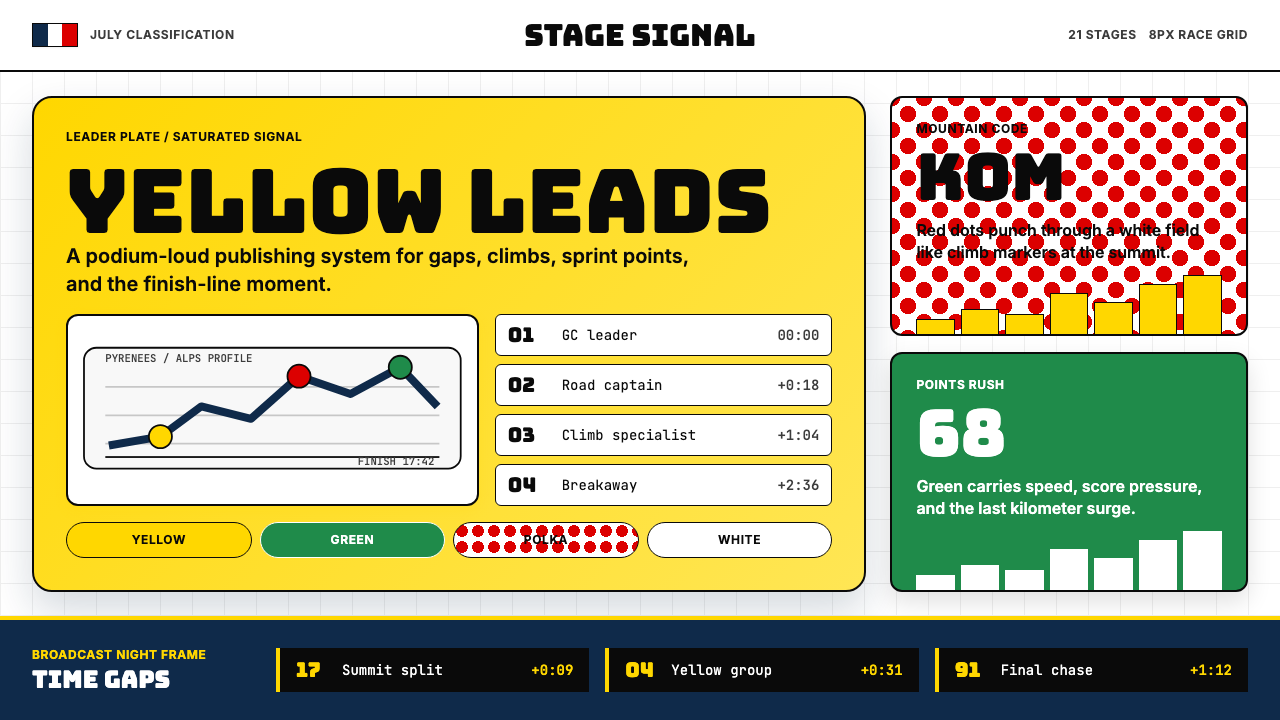 Tour de France (Yellow Jersey)Yellow owns the finish. Bungee type, polka dots, and navy tickers snap to an…黄衫统治终点:Bungee 字体、圆点红与海军蓝计时条咬合 8px 网格。
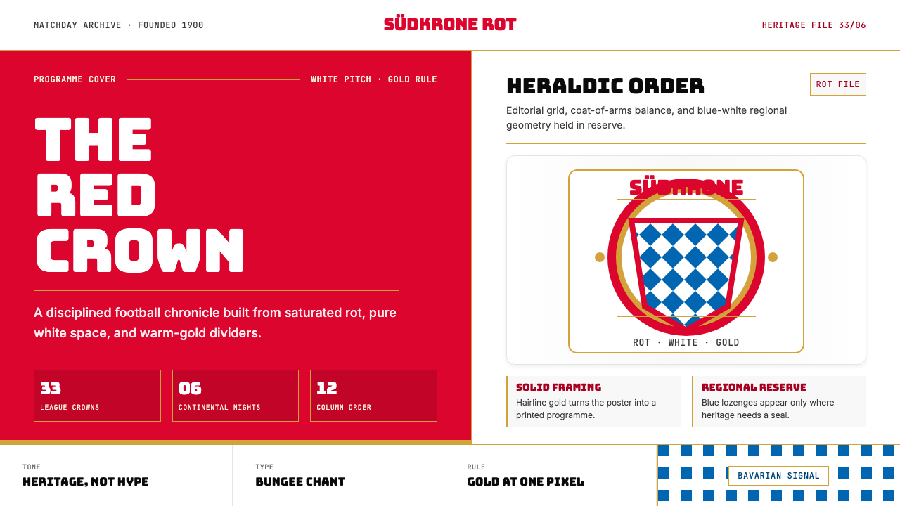 Bayern Munich (Rot)Heritage, not hype. Saturated rot fields, gold rules, and blue lozenges enfor…传统胜过喧哗:饱和红、金细线与蓝白菱格建立秩序。
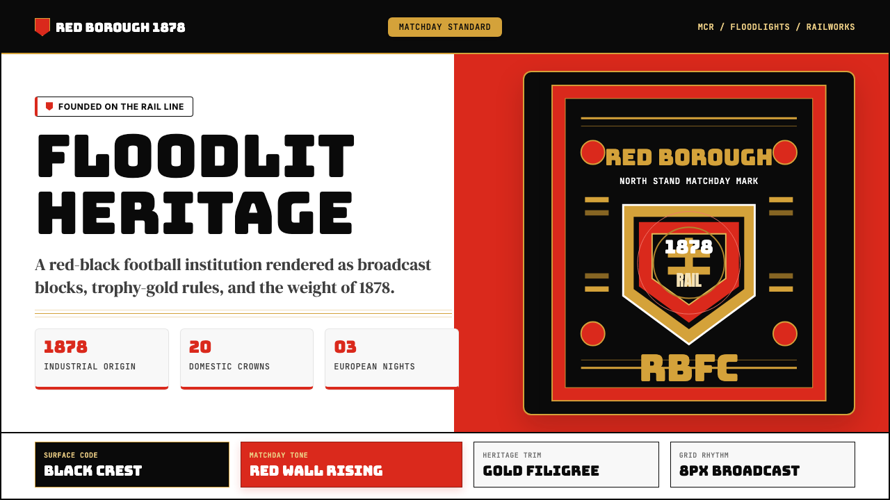 Manchester United (Red Devils)Heritage hits like a chant. Red-black blocks, Bungee type, and gold filigree…百年声浪压场:红黑块面、Bungee粗字与金色纹线撑起比赛日。
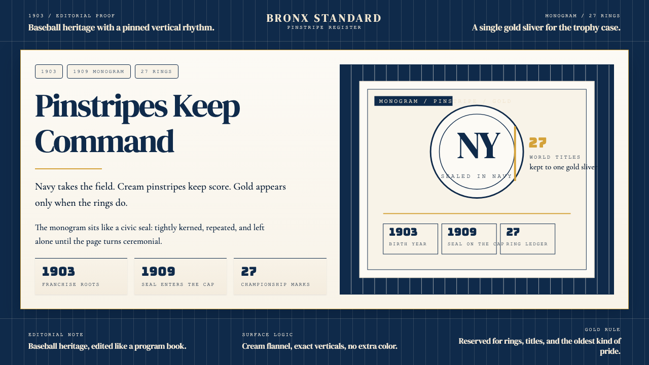 New York Yankees (Navy-Pinstripe)Navy restraint, not noise. Cream pinstripes and a gold monogram seal do the w…海军蓝克制到底。奶油细条纹与金色徽章撑起整页。
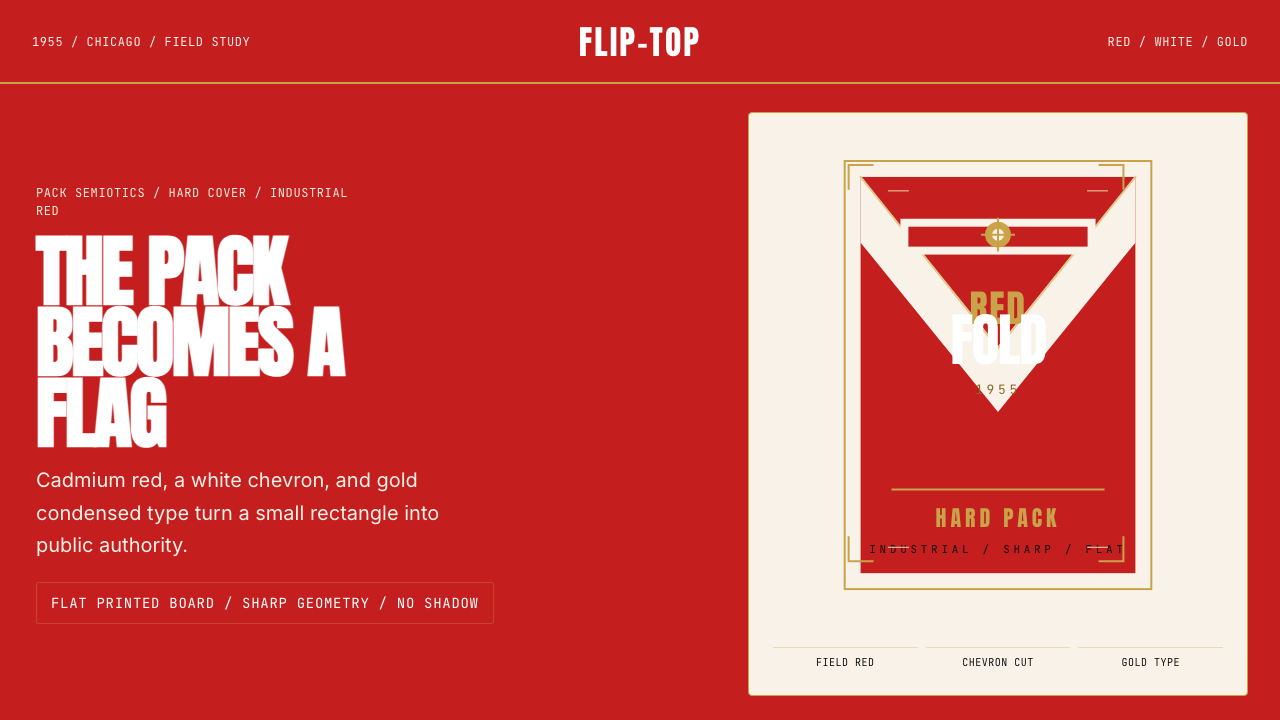 Marlboro Red Flip-Top (1955)Authority in one fold. Cadmium red, white chevron, and gold type read like a…一折成旗。镉红、白人字与金字排出强硬权威。
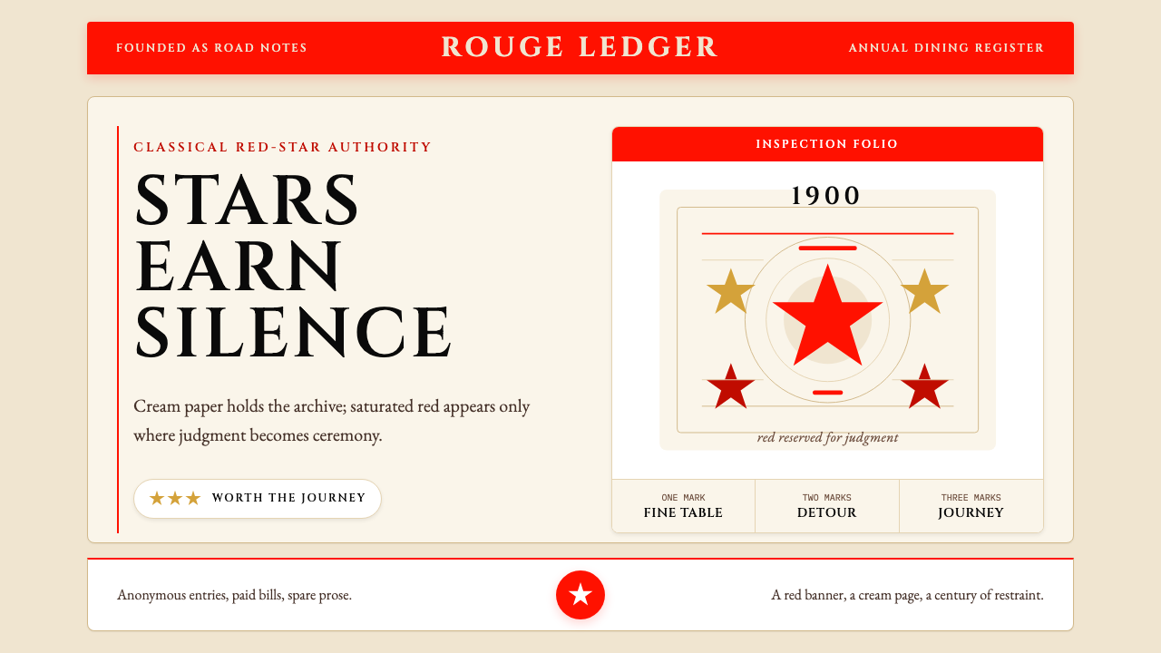 Michelin Guide Red-StarsRed is earned, not spread. Cream paper, Cinzel spacing, and sparse stars carr…红色只留给勋章:奶油纸、Cinzel字距与稀疏星标显出权威。