What is Tour de France (Yellow Jersey)?什么是 Tour de France (Yellow Jersey)?
The Yellow Jersey turns a three-week race into an instantly legible color system — saturated, hierarchical, and built for podiums, not whispers.黄衫把一场为期三周的赛事变成了一套人人即读即懂的色彩系统——饱和、层级分明,为领奖台而生,不为细语。
Tour de France (Yellow Jersey) in briefTour de France (Yellow Jersey) 速览
The Tour de France Yellow Jersey design language is a sports-broadcast graphic system built around a four-jersey color code: yellow for the overall leader, green for the points classification, red polka dots on white for the mountains classification, and white for the best young rider. Each jersey is a signal, not a decoration — the complete system lets a viewer standing on a mountain pass or watching on a screen identify race hierarchy at a glance, even at speed.环法自行车赛黄衫设计语言是一套围绕四件赛服色彩编码构建的体育转播图形系统:黄色代表总成绩领骑者,绿色代表积分榜领先者,白底红圆点代表山地分类领先者,白色代表最佳年轻车手。每件赛服都是一个信号,而非装饰——这套完整系统让站在山路边或坐在屏幕前的观众,哪怕是在高速运动中,也能一眼读懂赛事排名。
Visually, the style is characterized by extreme color confidence. Saturated cadmium yellow dominates as the primary signal, supported by a vivid sprint green and a bold polka-dot red, all set against a foundation of deep maritime navy that anchors broadcast graphics and timing displays. The palette is deliberately loud and unapologetic — it belongs to finish-line arches, gap-ticker overlays, and mountain summit banners, not to understated sophistication.在视觉上,这种风格以极度的色彩自信为特征。饱和的镉黄作为主信号占据主导,由鲜艳的冲刺绿和大胆的圆点红支撑,所有颜色都依托深邃的海洋蓝作为底色——这抹深蓝压住了转播图形与计时板的基调。这套色板刻意张扬、毫不道歉:它属于终点拱门、时间差计时条和山顶横幅,而不属于内敛的精致。
Typography in this system is heavy, compressed, and built for legibility at scale. Display letterforms are wide-set and slab-like, capable of holding their own against the visual noise of a peloton photograph or a hillside crowd. Numbers — race times, stage distances, rider rankings — are treated as graphic objects in their own right, set large, often in yellow against navy or white, functioning as both data and visual anchor simultaneously.这套系统中的字体厚重、压缩,为超大尺度下的清晰易读而生。展示级字形宽展而近乎板状,能在车队集团照片或山坡人群的视觉噪音中稳住阵脚。数字——赛段时间、里程、车手排名——被当作独立的图形对象处理,放大呈现,常以黄色压海军蓝或白底,同时扮演数据与视觉锚点两种角色。
See the Tour de France (Yellow Jersey) design system查看 Tour de France (Yellow Jersey) 完整设计系统
Where does Tour de France (Yellow Jersey) come from?Tour de France (Yellow Jersey) 从何而来?
The Tour de France was founded in 1903 by Henri Desgrange, the editor of the French sports newspaper L'Auto, as a publicity stunt to boost circulation against a rival publication. The race covered approximately two and a half thousand kilometers across France in six stages, and sixty cyclists entered. The event was an immediate sensation, cementing a national obsession with road cycling that would shape French sporting culture for more than a century.环法自行车赛由法国体育报纸《L'Auto》主编亨利·德格朗日于1903年创立,最初是为了提振发行量、与竞争对手抗衡的一次宣传噱头。首届比赛分六个赛段横越法国,总里程约两千五百公里,共有六十名车手参赛。赛事一炮而红,奠定了法国对公路自行车运动长达一个多世纪的迷恋。
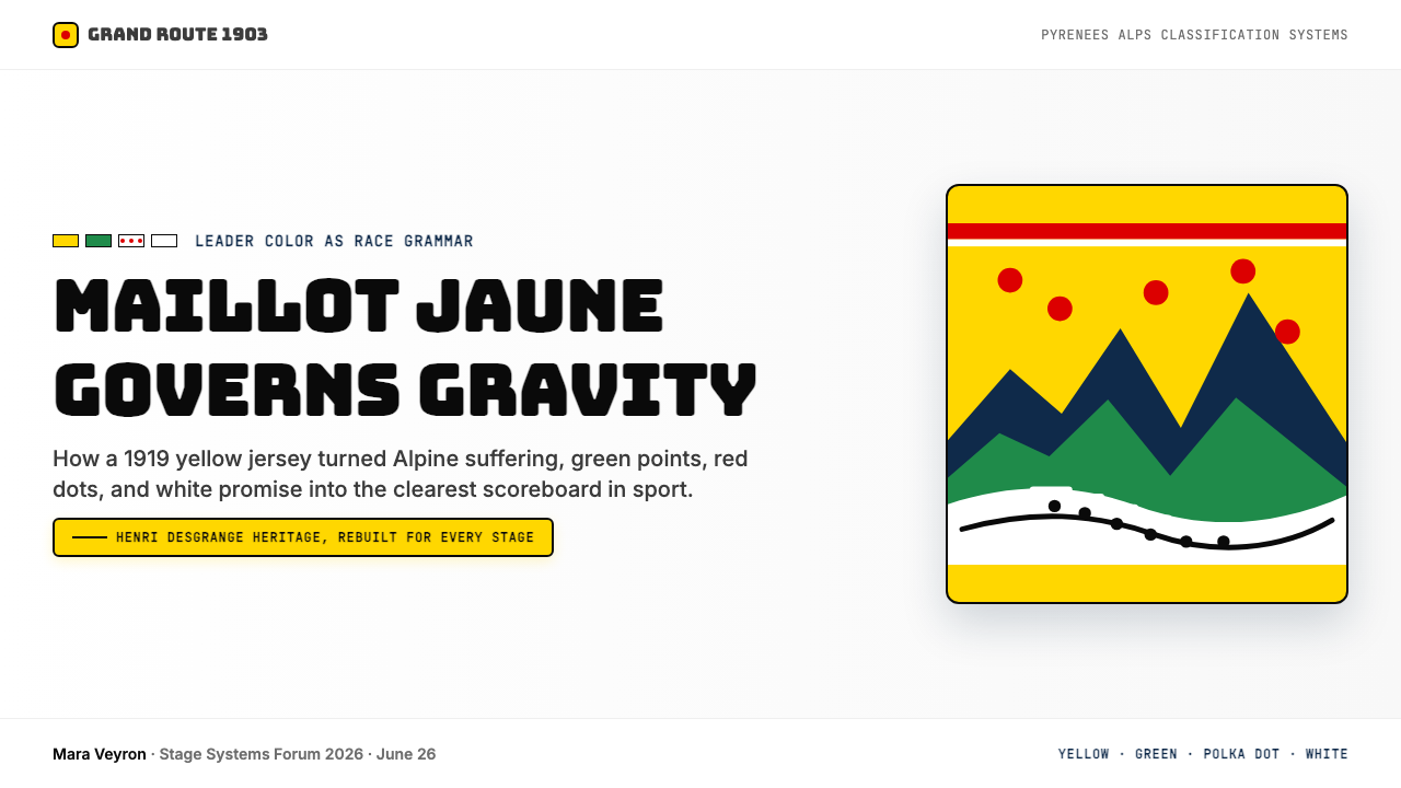
The Maillot Jaune — the yellow jersey worn by the overall leader — was introduced in 1919, the race's first post-World War I edition. The color yellow was chosen deliberately to echo the pages of L'Auto, which was printed on yellow newsprint to distinguish it from its competitors. This origin is significant: the yellow jersey began as a branding device tied directly to print media, which may explain why the Tour's visual identity has always had an unusually graphic, almost editorial quality — bold colors, hard contrasts, and strong typographic hierarchy rather than the more illustrative or heraldic approaches seen in other sports.领骑衫——由总成绩领先者穿着的黄色赛服——于1919年首次引入,也就是一战后的第一届比赛。黄色的选择出于刻意:《L'Auto》印刷在黄色新闻纸上,以此区别于竞争对手。这一起源意义重大:黄衫最初是一个与印刷媒体直接挂钩的品牌装置,这也许可以解释为何环法的视觉身份始终具有一种异常具有图形感、近乎编辑风格的气质——大胆色彩、强硬对比、清晰的字体层级,而非其他运动中更常见的插图式或纹章式路径。
The broader jersey system developed incrementally over subsequent decades. The green jersey for the points classification was introduced in 1953 to mark the race's fiftieth anniversary and provide a second narrative thread for sprinters. The polka-dot jersey for the King of the Mountains competition came later, formalized in the 1970s following its association with the chocolate brand Chocolat Poulain, whose product packaging featured the same red-dot-on-white pattern. The white jersey for the best young rider was added formally in 1975. By the late twentieth century the four-jersey code had crystallized into one of sport's most coherent graphic systems — a color vocabulary legible across countries, languages, and television generations.更完整的赛服系统在此后数十年间逐步发展。绿色赛服于1953年为庆祝比赛五十周年而引入,为短程冲刺选手提供了第二条叙事线索。圆点衫代表爬坡王,其正式化发生在1970年代,与巧克力品牌Chocolat Poulain的赞助相关——该品牌的产品包装恰好使用了与赛服相同的白底红点图案。白色赛服则于1975年正式加入,颁给最佳年轻车手。到二十世纪末,这套四衫编码已凝固为体育史上最具连贯性的图形系统之一——一套跨越国家、语言与电视世代皆可解读的色彩词汇。
The race's visual identity was further consolidated by the rise of broadcast television in the 1960s and the global expansion of live cycling coverage in the 1980s and 1990s. Riders like Eddy Merckx — who won the yellow jersey five times — and Bernard Hinault — another five-time winner — became international icons partly through the force of that yellow on screen. In the contemporary era, riders such as Tadej Pogačar have continued to give the jersey its status, while digital graphics and streaming have extended the system's reach into real-time data visualization, animated timing graphics, and interactive race trackers that all draw on the original four-color vocabulary.赛事的视觉身份随着1960年代电视转播的兴起,以及1980至1990年代环法直播的全球扩张而进一步巩固。埃迪·梅克斯(五届黄衫得主)与贝尔纳·伊诺(同样五届得主)等车手成为国际偶像,黄色在屏幕上的力量功不可没。在当代,塔德伊·波加查尔等车手持续赋予黄衫以地位,而数字图形与流媒体则将这套系统的触角延伸至实时数据可视化、动态计时图形与交互式赛段追踪器——它们无一例外地汲取自最初的四色词汇。
What defines the Tour de France (Yellow Jersey) look?Tour de France (Yellow Jersey) 的视觉特征是什么?
Color Hierarchy色彩层级
Yellow occupies the top of an explicit color hierarchy, functioning as the primary signal across every touchpoint — jersey, banner, ticker, and broadcast overlay. It is never used decoratively or ambiguously; when yellow appears, it means leader. Green and polka-dot red are secondary signals, each with a fixed semantic role. Deep navy serves as the neutral foundation that makes all three accent colors vibrate at maximum intensity without competing with each other. The system's power comes from this discipline: every color has exactly one job.黄色占据明确色彩层级的顶端,在每一个触点上都充当主信号——赛服、横幅、计时条、转播叠加图层,无一例外。它从不用于装饰性或模糊性目的;黄色出现,意味着领先。绿色与红点是次级信号,各有其固定的语义角色。深海军蓝作为中性底色,让三种强调色以最大强度振动,而不互相竞争。这套系统的力量正来自这种自律:每种色彩只承担一项工作。
Polka-Dot Pattern圆点图案
The red polka-dot motif on a white ground is one of the most recognizable patterns in international sport. The dots are uniform in size and regularly spaced — a geometric repeat that reads as pattern from a distance and as individual marks up close. Used as a texture element in design contexts, the polka-dot carries the full semantic weight of mountain achievement and altitude. It should be handled as a contained pattern field rather than scattered decoration, preserving the original jersey's disciplined repeat logic.白底红圆点图案是国际体育赛事中辨识度最高的图形之一。圆点大小统一、间距规律——一种远看作整体纹样、近看作独立标记的几何重复。在设计语境中作为质地元素使用时,圆点图案承载着山地成就与海拔征服的全部语义重量。它应被作为一个有边界的纹样区块而非散落的装饰来处理,以保留原版赛服严格的重复逻辑。
Bold Numeric Typography大胆的数字字体
Race times, stage distances, and rider numbers are treated as graphic objects, not as incidental data labels. Display numerals are set at extreme scale — often substantially larger than any accompanying text — in compressed, heavy letterforms that maximize presence within a narrow horizontal band. This convention derives from physical timing boards and roadside kilometer markers, where legibility at high speed and from a distance is the primary constraint. The result is a typographic register that communicates urgency and precision simultaneously.赛段时间、里程与车手号码被当作图形对象,而非附带的数据标签。展示数字以极端尺度呈现——往往比任何配套文字都大出许多——采用压缩、厚重的字形,在狭窄的横向空间内最大化视觉存在感。这一惯例源自实体计时板和路边公里标志,在那里,以高速和远距离保证清晰易读是首要约束。结果是一种同时传达紧迫感与精准感的字体语域。
Stage-Finish Spatial Logic终点站的空间逻辑
The compositional model for the style is the stage finish: a strong horizontal band of primary color at the top (the arrival arch), a deep field below (the road, the crowd, the mountain slope), and overlaid data in high-contrast type. Layouts built in this tradition organize information in clear horizontal registers — header, primary content zone, supporting data strip — rather than in symmetrical or centered arrangements. The eye is always moving left to right and top to bottom, following the race's own directionality.这种风格的构图模型是赛段终点:顶部一道强力的横向主色色带(终点拱门),下方是深邃的底场(赛道、观众、山坡),叠加以高对比度字体呈现的数据。以这一传统构建的版面将信息组织在清晰的水平层次中——标题区、主内容区、数据条——而非对称或居中排列。目光始终从左到右、从上到下地移动,追随赛事本身的方向性。
Broadcast Legibility转播清晰度
Every element of this visual system was stress-tested by television and now by streaming: jerseys must pop against tarmac, crowd, and sky at any time of day; timing graphics must be readable on small screens; sponsor banners must be legible at speed from helicopter footage. The result is a design language that privileges maximum contrast over subtlety — outlines where they reinforce legibility, color fills at full saturation, type at weights that would be considered heavy in any other context. Restraint is not part of the system's vocabulary.这套视觉系统的每个元素都经过电视——如今还有流媒体——的严酷检验:赛服必须在任何时段的柏油路、人群与天空背景下清晰跳脱;计时图形必须在小屏幕上仍然可读;赞助商横幅必须在直升机航拍中依然清晰。结果是一套将最大对比度置于一切微妙之上的设计语言——轮廓线只在强化易读性时才出现,色彩填充以全饱和度呈现,字体粗度在任何其他语境中都会被认为过重。克制不属于这套系统的词汇。
Jersey as Icon赛服作为图标
The four jerseys function as brand marks in their own right — so potent that each can serve as a standalone icon without text. In design applications this translates to a principle of symbolic color use: any block of saturated yellow in the right context will carry race-leadership connotations, any white-and-red-dot field will read as mountain. This iconographic strength means the system rewards restraint: using all four colors simultaneously collapses the hierarchy, while leading with one and supporting with another preserves semantic clarity.四件赛服各自作为品牌标志发挥作用——其力量之强,以至于每一件都可以在不附文字的情况下独立充当图标。在设计应用中,这转化为一条色彩符号化使用原则:在正确语境中,任何一块饱和黄色都将携带领骑联想,任何白底红点色场都将被解读为山地。这种图标式力量意味着这套系统奖励克制:同时使用四种颜色会使层级崩溃,而以一种为主、另一种为辅则能保持语义清晰。
Momentum and Directionality动势与方向性
The style carries an inherent sense of forward motion. Angled elements — diagonal stripes, raked typography, offset number treatments — appear frequently in Tour-derived graphic language because they evoke the lean of a cyclist at speed. Where static design styles might favor stable, horizontal compositions, this system uses angles and asymmetric weight to create visual energy that reads as progress. Data that is moving — improving times, rising rankings, shortening gaps — is presented with this same kinetic sensibility.这种风格内含一种向前运动的力量感。斜向元素——斜纹条、倾斜排版、偏移数字处理——在源自环法的图形语言中频繁出现,因为它们唤起了车手在高速行驶中的前倾姿态。在静态设计风格倾向于稳定水平构图的地方,这套系统用角度与非对称重量制造视觉能量,令其读来像是进步。正在变化的数据——缩短的时间、攀升的排名、收窄的差距——以同样的动态感受呈现。
See the Tour de France (Yellow Jersey) design system查看 Tour de France (Yellow Jersey) 完整设计系统
Who shaped Tour de France (Yellow Jersey)?谁塑造了 Tour de France (Yellow Jersey)?
Desgrange founded the Tour de France in 1903 as editor of L'Auto and personally introduced the yellow jersey in 1919. His choice to tie the jersey's color to his newspaper's yellow print stock was the founding act of the entire visual system — a branding decision that proved durable enough to outlast the publication that inspired it by nearly a century. Desgrange shaped the race as a test of endurance and suffering, and that ethos of extreme effort translated directly into the visual language: nothing soft, nothing tentative, everything at maximum.德格朗日于1903年以《L'Auto》主编身份创立了环法自行车赛,并于1919年亲自引入黄色领骑衫。他选择以报纸黄色印刷纸为赛服定色,是整套视觉系统的奠基之举——这个品牌决策足够持久,以至于比启发它的出版物本身还要长寿近一个世纪。德格朗日将比赛塑造为一场耐力与苦行的考验,这种极限努力的精神直接转化进了视觉语言:没有柔软,没有犹豫,一切都在最大限度。
The Belgian rider Eddy Merckx, known as 'The Cannibal,' won the yellow jersey five times between 1969 and 1974 and dominated the race so thoroughly that his yellow-clad image became the archetype for the jersey as a symbol of total athletic dominance. Merckx's era coincided with the expansion of European cycling television coverage, and his repeated appearances in yellow helped establish the jersey's international visual weight. His name has become virtually synonymous with the garment itself in cycling culture.比利时车手埃迪·梅克斯,外号「食人者」,在1969至1974年间五度赢得黄衫,对赛事的统治如此彻底,以至于他身着黄衫的形象成为黄衫作为全方位竞技统治象征的原型。梅克斯的时代恰逢欧洲自行车赛电视转播的扩张,他反复以黄衫示人,帮助奠定了这件赛服在国际上的视觉分量。在自行车文化中,他的名字几乎已与这件赛服本身同义。
French champion Bernard Hinault, 'The Badger,' won five yellow jerseys from 1978 to 1985 and was the last Frenchman to win the race. His victories during the period when the Tour's broadcast reach was expanding globally helped cement the jersey's status as an international symbol rather than a purely French one. Hinault's combative racing style and the intensity of his jersey defenses contributed to the visual drama that the broadcast system was built to communicate — the yellow jersey as contested prize, not ceremonial garment.法国冠军贝尔纳·伊诺,外号「獾」,在1978至1985年间五度摘得黄衫,是最后一位赢得该赛事的法国人。他的胜利恰逢环法转播覆盖全球范围迅速扩张的时期,帮助将黄衫的地位从一个纯粹的法国符号固化为国际象征。伊诺对抗性的竞赛风格与捍卫黄衫时的激烈程度,为这套转播系统所要传达的视觉戏剧性提供了内容——黄衫是一件争夺中的奖品,而非礼仪性的服装。
The Slovenian rider Tadej Pogačar represents the contemporary era of the yellow jersey, winning multiple editions of the Tour in the 2020s and becoming the face of the race for a streaming-native global audience. In the digital broadcast era, the jersey's visual identity has had to function across social media graphics, animated timing displays, and interactive tracking interfaces — and Pogačar's dominance has driven the proliferation of these formats. His presence in yellow is as much a data-visualization event as a sporting one, with real-time gap numbers and power statistics surrounding the jersey image at all times.斯洛文尼亚车手塔德伊·波加查尔代表着黄衫的当代时代,在2020年代多次赢得环法,成为面向流媒体原生全球受众的赛事代言人。在数字转播时代,黄衫的视觉身份必须在社交媒体图形、动态计时显示和交互式追踪界面上同时发挥作用——波加查尔的统治推动了这些格式的扩散。他身着黄衫的形象既是一个数据可视化事件,也是一个体育事件:实时时间差数字与功率统计始终环绕着那件赛服的图像。
The French confectionery brand Chocolat Poulain is credited with originating the polka-dot jersey's signature pattern. The brand's association with the mountains competition in the 1970s — its product packaging featured red dots on white — led directly to the jersey's distinctive visual identity. This makes Poulain an unusual figure in design history: a commercial sponsor whose packaging graphic was absorbed wholesale into a sporting institution's official color system and has outlasted the sponsorship itself by decades. The polka-dot pattern is now inseparable from the Tour's visual canon regardless of who sponsors the mountains classification.法国糖果品牌Chocolat Poulain被认为是圆点衫标志性图案的起源。该品牌在1970年代与山地竞赛的赞助关联——其产品包装采用白底红点——直接催生了这件赛服的标志性视觉身份。这使得Poulain成为设计史上一个罕见的案例:一个商业赞助商的包装图形被整体吸收进一个体育机构的官方色彩系统,并在赞助合同本身结束后数十年间持续留存。如今,无论山地竞赛由谁赞助,圆点图案都已与环法视觉规范不可分割。
How do you use Tour de France (Yellow Jersey) today?今天怎么用 Tour de France (Yellow Jersey)?
The Tour de France Yellow Jersey style is one of the most transferable sports-derived visual systems in contemporary design because its color logic is semantic rather than decorative. Applying it correctly means understanding the hierarchy: yellow is the primary signal — reserved for the most important element on any given surface — while green, polka-dot red, and navy play supporting roles with fixed meanings. Treating all four colors as interchangeable decoration destroys the system's legibility and its power.环法自行车赛黄衫风格是当代设计中可移植性最强的体育衍生视觉系统之一,因为它的色彩逻辑是语义性的,而非装饰性的。正确应用它意味着理解其层级:黄色是主信号——保留给任何界面上最重要的元素——而绿色、圆点红与海军蓝以固定含义扮演配角。将四种颜色视为可互换的装饰,会摧毁这套系统的清晰度与力量。
For presentation slides, the style works exceptionally well on both cover and stage-summary formats. A cover slide built in this register uses a full-bleed field of saturated yellow or deep navy, with a single bold numeric or title treatment in maximum-weight type — no decorative borders, no gradient backgrounds, no soft shadows. Content slides function best when organized as horizontal data registers: a narrow header band in navy or yellow, a primary content zone in white or near-white, and a bottom data strip for supporting statistics. Charts and race-gap timelines become natural fits; bar widths and gap markers should be rendered in the primary palette, with yellow reserved for the leading element and navy or green for the rest. The polka-dot pattern can be used as a texture accent for a section header or divider, but only in a contained, disciplined repeat — never scattered.在演示文稿中,这种风格无论是在封面还是赛段摘要格式上都表现出色。以这种语域构建的封面页面使用满版的饱和黄或深海军蓝,配合单一的大号数字或最重字重的标题处理——没有装饰性边框,没有渐变背景,没有柔和阴影。内容页最适合组织为水平数据层次:顶部一道海军蓝或黄色的窄标题色带,主内容区保持白色或近白色,底部数据条放置配套统计信息。图表与时间差折线图在此天然契合;柱条宽度与差距标记应以主色板呈现,黄色保留给领先元素,海军蓝或绿色用于其余。圆点图案可作为质地强调元素用于区块标题或分隔符,但只能在有边界的、严格的重复中——绝不散落。
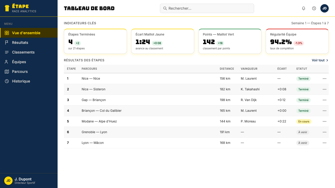
For web user interfaces, the system is especially well suited to dashboards, leaderboards, pricing pages, and competitive comparison tables — anywhere that hierarchy and fast scanning are the primary user needs. The approach: establish a strong typographic skeleton using heavy display numerals for key metrics, keep backgrounds in deep navy or clean white depending on mode, and deploy yellow exclusively for the primary call-to-action or the top-ranked item in any list. Secondary classifications get green or the polka-dot treatment; neutral states stay in mid-tone navy or grey. Hard-edged borders replace soft shadows; the overall visual register should feel like a race-timing graphic, not a consumer app.对于网页用户界面,这套系统尤其适合仪表板、排行榜、定价页面与竞争比较表——任何层级与快速扫描是首要用户需求的场景。方法如下:使用厚重的展示数字为关键指标建立强力字体骨架,根据模式将背景保持在深海军蓝或干净白色,黄色专属于主要的行动号召或任何列表中排名第一的项目。次级分类获得绿色或圆点处理;中性状态保持在中调海军蓝或灰色。硬边边框替代柔和阴影;整体视觉语域应该感觉像一个赛事计时图形,而不是消费类应用。
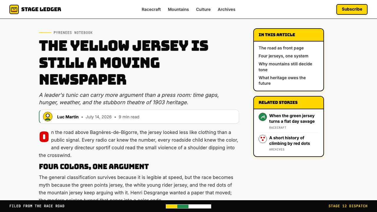
For editorial and marketing work, the style supports high-impact, poster-like compositions. An editorial spread in this register alternates full-width color blocks — yellow-on-navy for features, white-on-navy for supporting content — with the polka-dot pattern used as a section-break texture. Marketing pages work well with the style's inherent boldness: a hero module with a saturated yellow background and maximum-weight headline, followed by content sections in alternating navy and white, with green or polka-dot accent elements used to mark key differentiators or achievement milestones. Social cards and event graphics benefit from the system's extreme legibility: a single large number or short phrase in compressed heavy type, set in yellow against navy or navy against yellow, reads instantly at thumbnail scale.对于编辑与营销内容,这种风格支持高冲击力的海报式构图。以这种语域制作的编辑版面交替使用满版色块——黄底海军蓝文字用于特写,白底海军蓝用于配套内容——圆点图案作为区块分隔质地使用。营销页面适合这种风格固有的大胆感:一个饱和黄背景配最重字重标题的主视觉模块,随后内容区块在海军蓝与白色间交替,绿色或圆点强调元素用于标记关键差异点或成就里程碑。社交媒体卡片与活动图形得益于这套系统极端的易读性:单个大号数字或短句,以压缩粗重字体设置,黄底海军蓝字或海军蓝底黄字,在缩略图尺度下即刻清晰可读。
A common mistake when applying this system is treating it as a sports theme — adding cycling imagery, wheel motifs, or literal jersey shapes — rather than as an abstract color and typographic language. The Yellow Jersey style's real value is its semantic color hierarchy and its broadcast-grade legibility, not its association with bicycles. Another frequent error is reaching for all four jersey colors simultaneously at full saturation, which produces visual chaos rather than hierarchy. Authentic application uses one color as the dominant signal, a second as accent, and reserves the remaining two for specific semantic purposes only. Similarly, introducing rounded corners, soft gradients, or playful typefaces imports values from consumer product design that are incompatible with the system's essential character: direct, urgent, and built for maximum readability at speed.应用这套系统时最常见的错误,是将其作为一个体育主题来处理——添加自行车图像、车轮图案或字面的赛服形状——而非将其视为一套抽象的色彩与字体语言。黄衫风格真正的价值在于其语义色彩层级和广播级清晰度,而非与自行车的联想。另一个频繁出现的错误是同时以全饱和度使用四种赛服颜色,结果产生视觉混乱而非层级感。真实的应用以一种颜色作为主信号,以第二种作强调,将其余两种仅保留用于特定语义目的。同样,引入圆角、柔和渐变或活泼字体,会将消费品设计的价值观引入这个系统,而这些价值观与系统的核心气质不兼容:直接、紧迫,为在高速中最大化易读性而生。
See the Tour de France (Yellow Jersey) design system查看 Tour de France (Yellow Jersey) 完整设计系统
Tour de France (Yellow Jersey) — FAQTour de France (Yellow Jersey) · 常见问题
Is this style only appropriate for sports-related content?这种风格只适合与体育相关的内容吗?
No — the Yellow Jersey system's real transferable value is its semantic color hierarchy and broadcast-grade legibility, not its cycling associations. It works well for any context where fast scanning, clear hierarchy, and high contrast are primary requirements: financial dashboards, competitive leaderboards, pricing comparison pages, event timelines, and data-heavy editorial layouts. The cycling connection only becomes limiting if you import literal cycling imagery; if you apply the color logic and typographic system abstractly, the result reads as bold, urgent, and authoritative rather than as sport-themed.不——黄衫系统真正可移植的价值在于其语义色彩层级和广播级清晰度,而非其自行车联想。它在任何以快速扫描、清晰层级和高对比度为首要需求的语境中都运作良好:财务仪表板、竞争排行榜、定价比较页面、活动时间线,以及数据密集的编辑版面。只有当你引入字面的自行车图像时,自行车的联想才会成为限制;如果你抽象地应用色彩逻辑与字体系统,结果读来是大胆、紧迫而权威的,而非体育主题的。
How do I use the polka-dot pattern without it looking kitschy?如何使用圆点图案而不让它显得俗气?
Restraint and containment are the keys. The polka-dot pattern works when it occupies a defined zone — a section header band, a sidebar accent, a contained texture block — rather than when it is scattered across a layout. The dots should be uniform in size and consistently spaced, echoing the original jersey's disciplined repeat. Using the pattern at reduced scale as a background texture for a single content block, then keeping all surrounding areas clean and solid, preserves the pattern's iconic quality without overwhelming the composition. Combining the polka-dot with both yellow and green simultaneously will almost always produce visual overload — use it as the sole accent against navy or white.克制与边界是关键。圆点图案在占据一个界定区域时有效——区块标题色带、侧边栏强调、有边界的质地块——而非散落在整个版面时。圆点应大小统一、间距一致,呼应原版赛服严格的重复逻辑。将图案以缩小尺度作为单一内容块的背景质地,同时保持周围区域干净纯色,能保留图案的图标品质,而不会压倒构图。同时将圆点图案与黄色和绿色结合,几乎总会产生视觉过载——应将其作为对抗海军蓝或白色的唯一强调元素来使用。
Can this style work for light and dark modes in a web application?这种风格能在网页应用的浅色与深色模式中都有效运作吗?
Yes, and the system transitions cleanly because navy and yellow form a naturally reversible high-contrast pair. In light mode, the canonical arrangement is a near-white or clean white background with navy type, yellow for primary interactive elements, and green or polka-dot red for secondary classifications. In dark mode, navy becomes the dominant background, yellow remains the primary accent, and white takes the role navy played in light mode for typography. The key constraint is that yellow should retain its semantic role as the top-tier signal in both modes — avoid reassigning it to decorative use in dark mode simply because it becomes more visually prominent against a dark ground.可以,而且系统切换很流畅,因为海军蓝与黄色构成一对天然可逆的高对比色。在浅色模式下,标准排列是近白或纯白背景配海军蓝文字,黄色用于主要交互元素,绿色或圆点红用于次级分类。在深色模式下,海军蓝成为主导背景,黄色保持为主要强调色,白色则接替海军蓝在浅色模式中扮演的字体角色。关键约束是:黄色在两种模式中都应保留其作为顶级信号的语义角色——不要因为它在深色底面上视觉更突出,就在深色模式中将其重新分配给装饰性用途。
How does this style differ from generic sports branding?这种风格与通用体育品牌有何不同?
Generic sports branding typically uses high contrast and bold type as emotional amplifiers — to generate excitement without semantic precision. The Yellow Jersey system is different because every color carries a fixed, legible meaning: yellow means leader, green means sprinter, polka-dot means climber. This makes it a semantic system, not just a visual attitude. Applying it well means honoring that semantic precision — using yellow specifically for the most important element, not simply whenever you want visual impact. The discipline is what distinguishes the style from its many imitators, who borrow the color energy without the underlying logic.通用体育品牌通常将高对比度与大胆字体用作情感放大器——制造兴奋感,而无语义精确性。黄衫系统不同,因为每种颜色都承载着固定的、可读的含义:黄色意味着领先,绿色意味着冲刺王,圆点意味着爬坡王。这使它成为一套语义系统,而不仅仅是一种视觉态度。应用它意味着尊重那种语义精确性——专门将黄色用于最重要的元素,而非仅仅在想要视觉冲击时随意使用。这种自律,正是将这种风格与众多模仿者区分开来的东西——那些模仿者借用了色彩能量,却没有底层逻辑。
What kind of content or brand values are a poor match for this style?什么样的内容或品牌价值观与这种风格不匹配?
The Yellow Jersey system is fundamentally about hierarchy, competition, and performance at the extreme end of the spectrum. It communicates urgency, dominance, and precision — values that work for competitive tools, high-stakes data platforms, and event-driven experiences. It struggles wherever warmth, approachability, or sensory softness are the primary emotional goals: wellness products, children's experiences, luxury goods positioning around restraint and quiet sophistication, or any brand that wants to seem humble or community-driven. The style's loudness is structural — it cannot be softened into a whisper by using lighter tints or smaller type without losing the quality that makes it distinctive.黄衫系统从根本上是关于层级、竞争和极限表现的。它传达紧迫感、主导力与精准度——这些价值观适用于竞争性工具、高风险数据平台和活动驱动型体验。在温暖感、亲和力或感官柔软性是首要情感目标的地方,它会力不从心:健康类产品、儿童体验、以克制与安静精致为定位的奢侈品,或任何希望呈现谦逊或社区驱动感的品牌。这种风格的张扬是结构性的——它无法通过使用更浅的色调或更小的字体被柔化成细语,而不失去令其与众不同的品质。
Related design styles相关设计风格
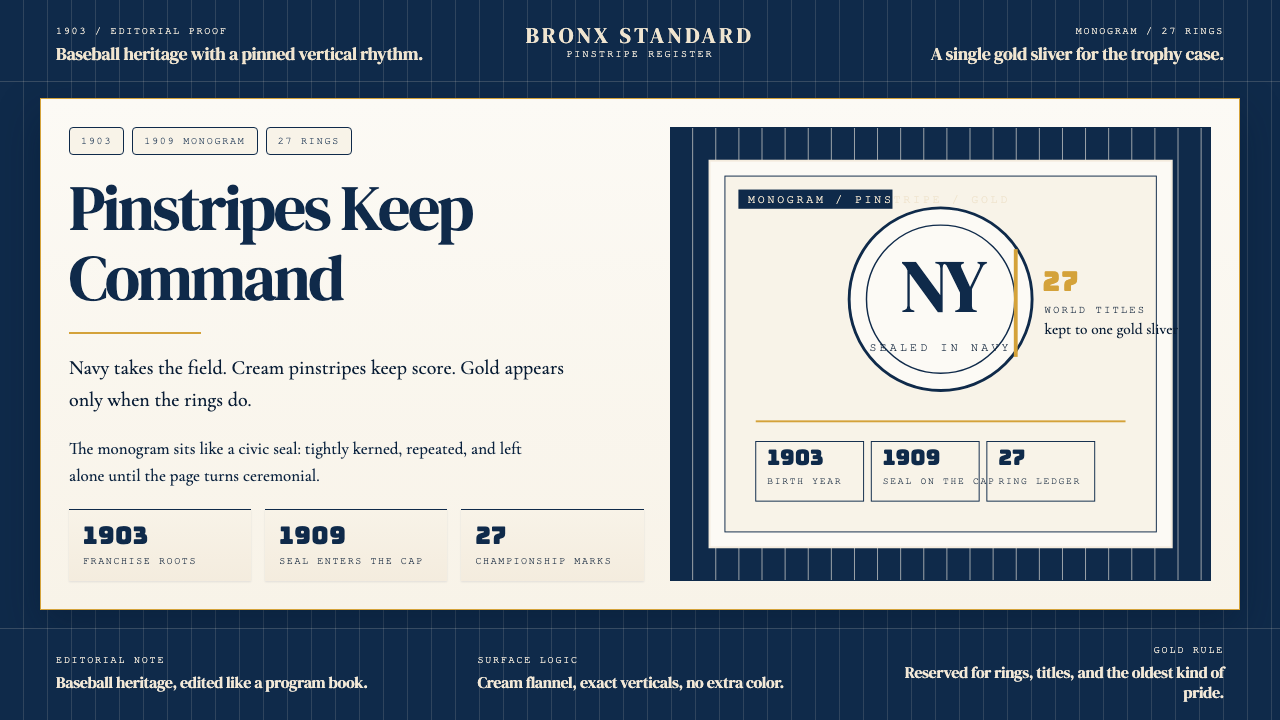 New York Yankees (Navy-Pinstripe)Navy restraint, not noise. Cream pinstripes and a gold monogram seal do the w…海军蓝克制到底。奶油细条纹与金色徽章撑起整页。
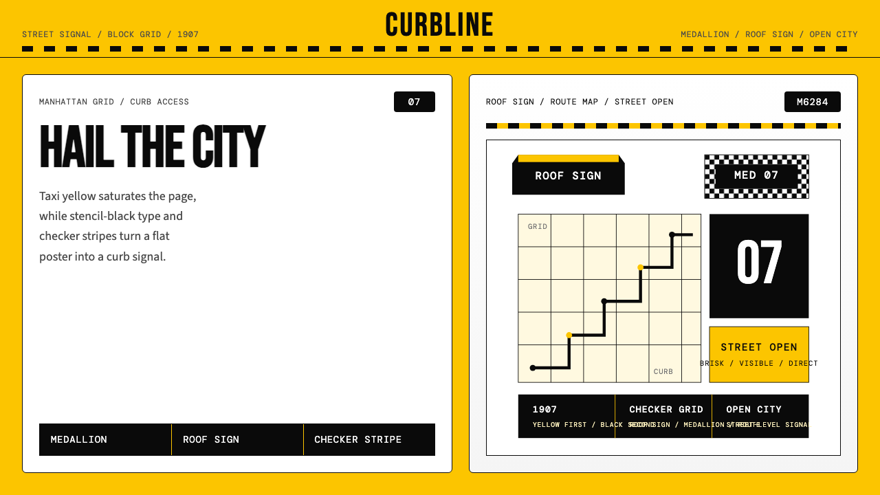 New York Yellow Cab (1907)Visibility is the brand. Taxi yellow, stencil type, checker stripes.可见性就是品牌。出租车黄、模板字与棋盘格定调。
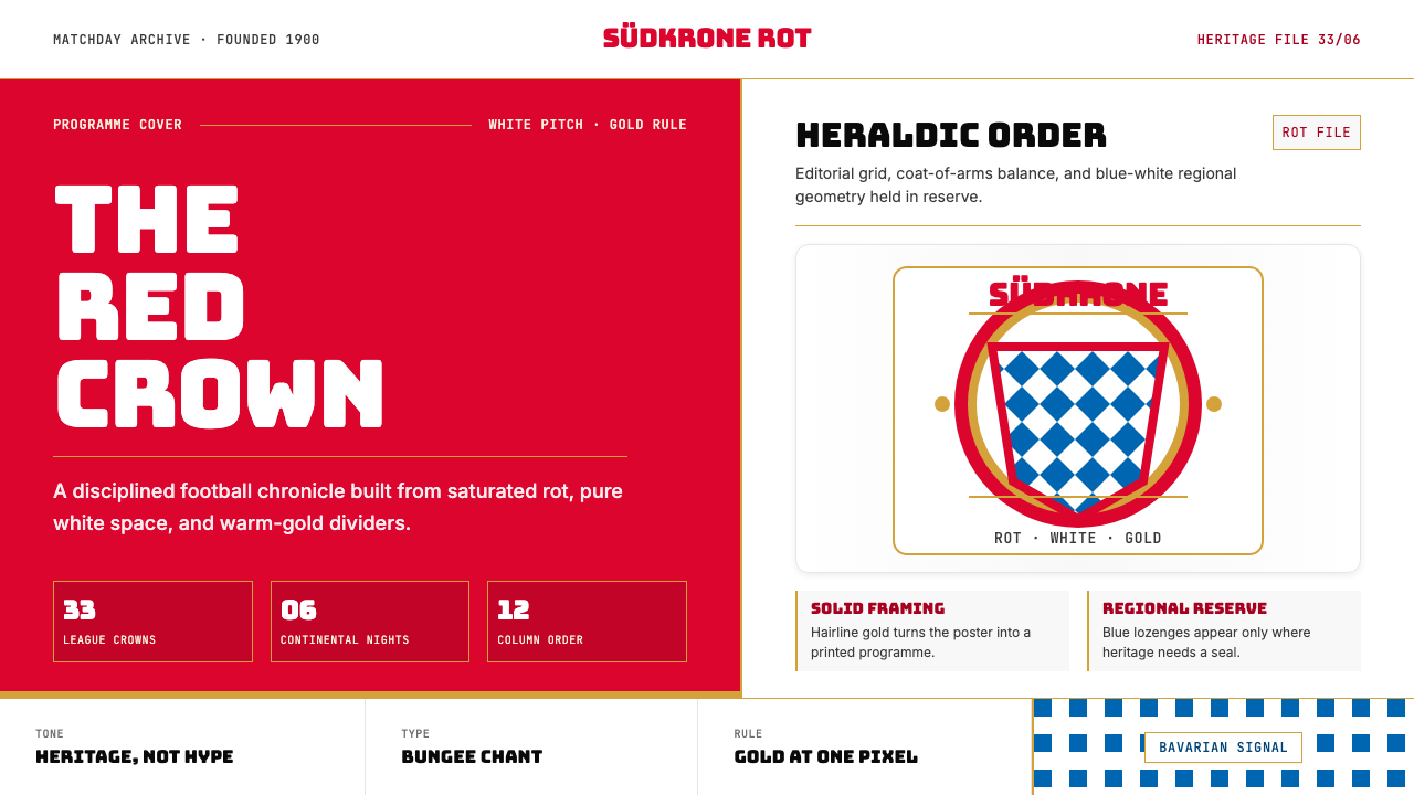 Bayern Munich (Rot)Heritage, not hype. Saturated rot fields, gold rules, and blue lozenges enfor…传统胜过喧哗:饱和红、金细线与蓝白菱格建立秩序。
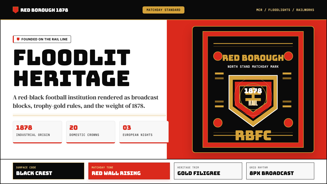 Manchester United (Red Devils)Heritage hits like a chant. Red-black blocks, Bungee type, and gold filigree…百年声浪压场:红黑块面、Bungee粗字与金色纹线撑起比赛日。
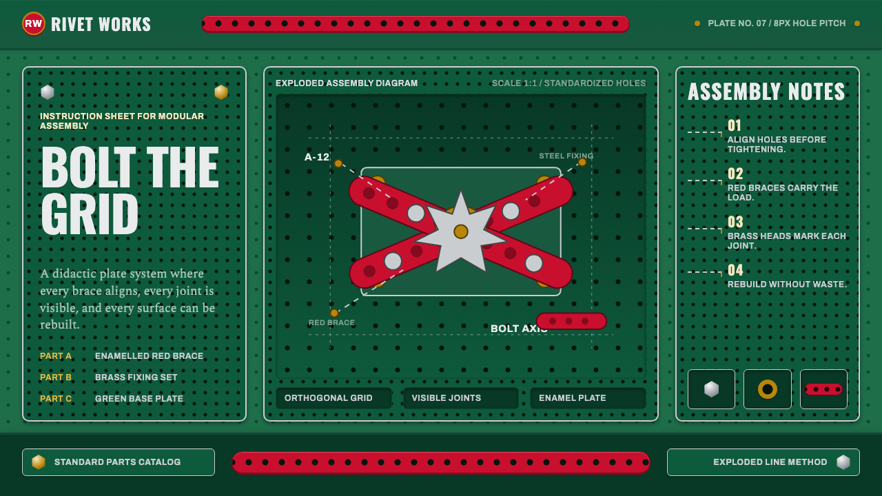 Meccano Erector SetEngineering becomes tactile. Red perforations and brass bolts lock to a green…工程变得可触:红色孔条与黄铜螺栓锁在绿色网格上。
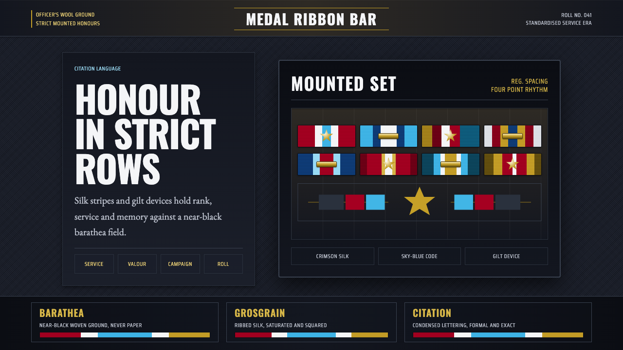 Medal Ribbon BarDiscipline worn as color. Crimson, sky-blue and gilt bars lock onto black woo…军规化为色彩:绯红、天蓝与鎏金绶带钉在黑呢上。