What is Manchester United (Red Devils)?什么是 Manchester United (Red Devils)?
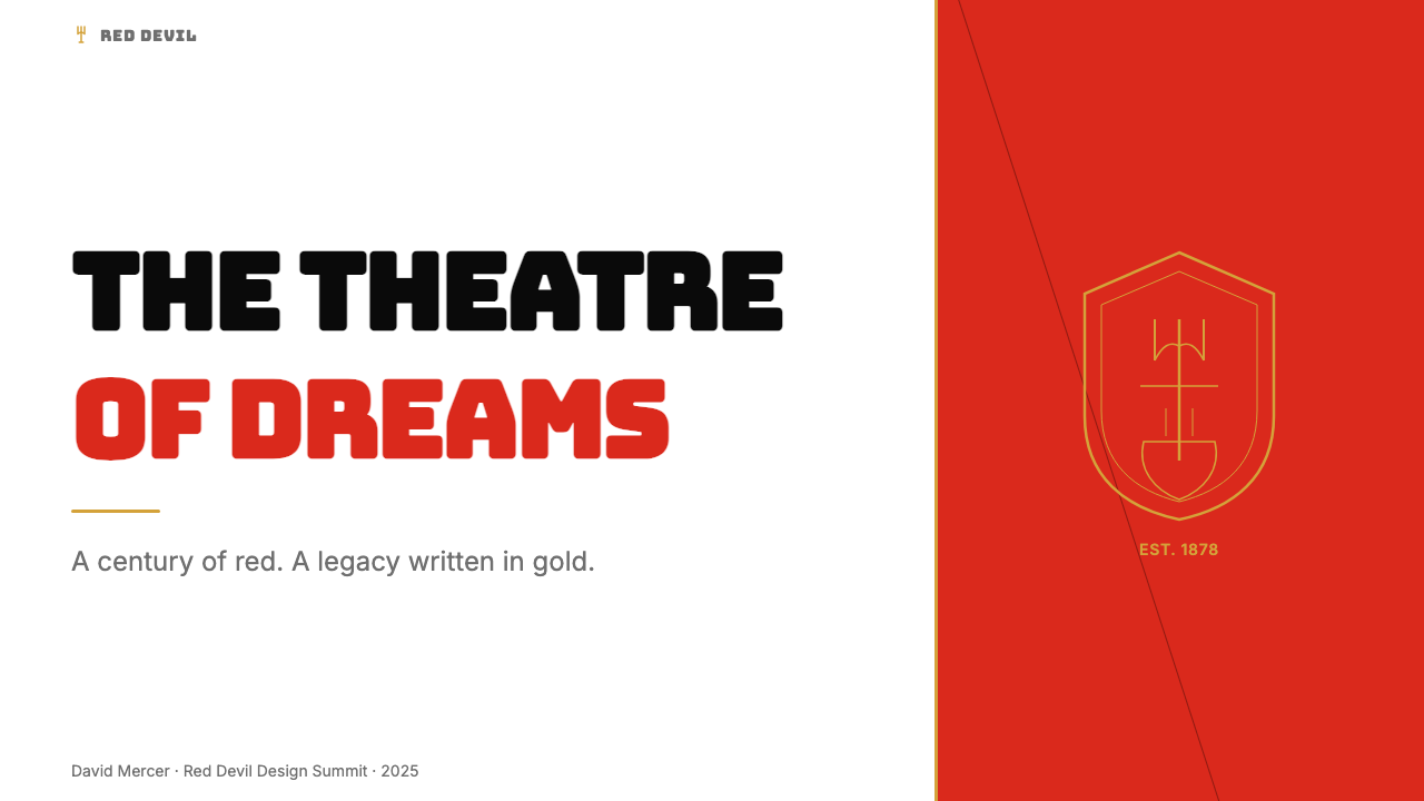
Red, black, and gold forged in a century of English football — Manchester United's visual identity hits with the force of a matchday crowd.百年英格兰足球淬炼的红、黑与金——曼联的视觉语言以比赛日球场的声浪力度扑面而来。
Manchester United (Red Devils) in briefManchester United (Red Devils) 速览
Manchester United is the most globally recognized football-club brand in the English Premier League — a visual system built from saturated United red, heraldic gold, deep black, and the heraldic crest bearing a ship, a devil, and a trident. The aesthetic is not borrowed from fine art or graphic design movements; it evolved from a century of English football culture, stadium signage, jersey printing, and the weight of institutional history pressing down on every design decision.曼联是英超历史上全球认知度最高的足球俱乐部品牌——视觉系统由饱和的曼联红、纹章金、深黑,以及承载着船、恶魔与三叉戟的纹章徽标共同构成。这套美学并非借鉴自纯艺术或平面设计运动,而是从一个世纪的英格兰足球文化、球场标牌、球衣印刷,以及每一个设计决策背后沉甸甸的历史重量中自然生长出来的。
The identity reads as controlled intensity. Heavy block lettering — the kind that can be read from the upper tier of Old Trafford — coexists with fine gold filigree on the crest, a tension between raw power and ceremonial dignity. Color is deployed in large, confident masses rather than subtle gradations: red dominates, black anchors, gold accents. There is no softness in the palette, no pastel inference, no room for ambiguity. Every element declares its allegiance.这套视觉系统散发出一种受控的强度。能从老特拉福德上层看台清晰辨认的粗重块状字体,与徽标上精细的金色纹饰并置,在原始力量与礼仪尊严之间形成张力。色彩以大面积、自信的方式铺陈,而非微妙的渐变:红色主导全局,黑色提供锚点,金色担任点睛之笔。整个色板没有柔软,没有粉彩的暗示,没有留下任何歧义的余地。每一个元素都在表明立场。
What separates this aesthetic from generic sportswear branding is its heraldic dimension. The Manchester United crest draws on the tradition of civic arms — the ship from Manchester's coat of arms, the red devil adopted as mascot in the early twentieth century, the motto Trinity. These elements introduce a vocabulary of ceremony and permanence into what might otherwise be a purely commercial identity, giving the visual system a depth that casual replication cannot replicate.将这套美学与普通运动品牌区别开来的,是它的纹章维度。曼联徽标借鉴了市民纹章传统——船来自曼彻斯特市徽,红魔作为吉祥物于二十世纪初被采用,格言「三位一体」也赫然在列。这些元素将仪式感与永恒性的词汇引入了本可能只是纯粹商业身份的设计语境,赋予这套视觉系统一种深度,使浅尝辄止的模仿无从复制。
See the Manchester United (Red Devils) design system查看 Manchester United (Red Devils) 完整设计系统
Where does Manchester United (Red Devils) come from?Manchester United (Red Devils) 从何而来?
The club was founded in 1878 as Newton Heath Lancashire and Yorkshire Railway Football Club — a works team for railway employees in the Newton Heath district of Manchester. Its earliest visual identity was purely functional: jerseys in whatever colors were available, no consistent graphic language, no crest with meaning. The railway connection established the utilitarian, working-class character that would underpin the club's identity even after it shed its industrial origins. In 1902 the club was renamed Manchester United, and the transformation from a railway workers' team to a commercial sporting institution accelerated through the first decades of the twentieth century.俱乐部于1878年以「牛顿希斯兰开夏与约克郡铁路足球俱乐部」之名创立,最初是曼彻斯特牛顿希斯区铁路工人的业余球队。最早的视觉形象纯粹出于功能需要:球衣颜色随手可得,没有一致的图形语言,没有具有意义的徽标。铁路工人的出身奠定了这个俱乐部的实用主义、工人阶级气质,即便在脱离工业起源之后,这一底色依然渗透在其品牌身份中。1902年,俱乐部更名为曼彻斯特联足球俱乐部,在二十世纪头几十年里,从铁路工人球队向商业体育机构的转型迅速加速。
The red jersey — now inseparable from the club's identity — was not always the signature color. Newton Heath played in green and gold, then in various combinations. Red became dominant in the early twentieth century, a choice that aligned Manchester United with a color carrying maximum visual impact in stadium contexts: saturated red reads at distance, against green grass, under artificial floodlighting, in television broadcast. The practical logic of sports visibility merged with the symbolic weight of passion and danger traditionally associated with red, cementing the color as the irreplaceable core of the palette.如今与俱乐部身份密不可分的红色球衣,最初并不是标志性颜色。牛顿希斯时代穿绿金配色,其后经历多种组合。红色在二十世纪初成为主导色——这一选择将曼联与在球场语境中视觉冲击力最强的颜色绑定在一起:饱和的红色能在距离之外被清晰辨认,无论是映衬翠绿草坪、泛光灯照射还是电视转播画面。运动能见度的实用逻辑,与红色在传统上承载的热情与危险的象征重量相互融合,将这种颜色铸成了色板中不可替代的核心。
The visual identity was decisively shaped by two managerial eras that together define the modern club's character. Sir Matt Busby, manager from 1945 to 1969, rebuilt the club after the Second World War and then — with devastating tragedy — after the 1958 Munich air disaster, in which eight of his young 'Busby Babes' died. Busby's legacy imposed a dimension of perseverance and human cost on the club's identity that no graphic system alone could carry; it became embedded in how supporters and designers alike approached the brand. The club's three floodlights-and-red visual language sharpened during these years as European competition brought the identity onto an international stage for the first time.曼联的视觉形象被两个管理时代决定性地塑造,这两个时代共同界定了现代俱乐部的性格。马特·巴斯比爵士自1945年至1969年担任主教练,在二战后重建球队,又在1958年慕尼黑空难——八名年轻的「巴斯比宝贝」在灾难中罹难——之后再次重建。巴斯比的遗产为俱乐部的品牌身份注入了一种坚韧与生命代价的维度,这是任何图形系统单独无法承载的;它沉淀在球迷与设计师面对这个品牌时共同的情感方式之中。随着欧洲赛事的开展,泛光灯与红色的视觉语言在这些年间愈发清晰,俱乐部形象首次进入国际舞台。
Sir Alex Ferguson's tenure from 1986 to 2013 transformed Manchester United into a global commercial brand. The Ferguson era saw the Premier League's commercial revolution — satellite television, global sponsorship, merchandise empires — and the club's visual identity was systematized to meet these demands. The crest was refined, the typography became more consistent, and the red-black-gold system was applied across kit design, stadium graphics, print, and eventually digital environments. By the time Ferguson retired, Manchester United had become one of the most recognized sporting brands on Earth, with a visual system that could operate on a stadium facade in Manchester or a jersey in Jakarta with equal legibility.亚历克斯·弗格森爵士自1986年至2013年的执教生涯,将曼联转型为一个全球性商业品牌。弗格森时代见证了英超的商业革命——卫星电视、全球赞助、球迷商品帝国——俱乐部的视觉形象也随之被系统化以满足这些需求。徽标得到精炼,字体排印趋于统一,红-黑-金系统被应用于球衣设计、球场图形、印刷品,最终延伸至数字环境。弗格森退休之时,曼联已成为全球最具辨识度的体育品牌之一,其视觉系统能以同等清晰度运作于曼彻斯特球场的外立面,也能运作于雅加达球迷身上的球衣。
What defines the Manchester United (Red Devils) look?Manchester United (Red Devils) 的视觉特征是什么?
Color色彩
The palette is anchored by three colors deployed at high saturation and in large masses. United red is the dominant hue — a warm, full-bodied red that reads as simultaneously passionate and authoritative, neither orange-shifted nor burgundy-dark. Black provides structural weight, used for backgrounds, outlines, and typographic grounding. Heraldic gold — warmer and richer than simple yellow — appears as accent and trim, introducing a note of ceremonial prestige that elevates the system above pure sportswear. The three colors are rarely mixed or softened; they operate as distinct territories, each claiming its space on any surface.色板以三种高饱和度、大面积铺陈的颜色为锚点。曼联红是主导色——一种温暖而饱满的红,同时传达热情与权威,既不偏橙、也不沉暗为酒红。黑色提供结构重量,用于背景、轮廓与字体基底。纹章金——比单纯的黄色更温暖、更厚实——作为强调色与描边色出现,引入一丝仪式性的尊贵气质,将这套系统提升至纯粹运动品牌之上。三种颜色极少被混合或柔化,它们在任何表面上都作为独立的色彩领地各守其位。
Typography字体排印
Type in the Manchester United system is bold, compressed, and built for legibility at distance. The headline letterforms are heavy and wide, designed to occupy space with confidence rather than refinement — suited to stadium hoardings, broadcast graphics, and the front of a jersey. Decorative lettering associated with the crest introduces a secondary voice: Gothic-influenced script that signals historical continuity and ceremonial weight. The tension between these two registers — the blunt authority of the sports headline and the fine tradition of the heraldic inscription — runs through every typographic application.曼联系统中的字体粗重、紧缩,以远距离可读性为前提构建。大标题字形厚实而宽阔,旨在以自信而非精致的姿态占据空间——适用于球场广告牌、转播图形和球衣胸前。与徽标相关的装饰性字体引入了第二种声部:受哥特体影响的手写风格,传递历史传承与仪式厚重感。这两种语调之间的张力——体育标题字体的直接权威与纹章铭文的精致传统——贯穿于所有字体应用之中。
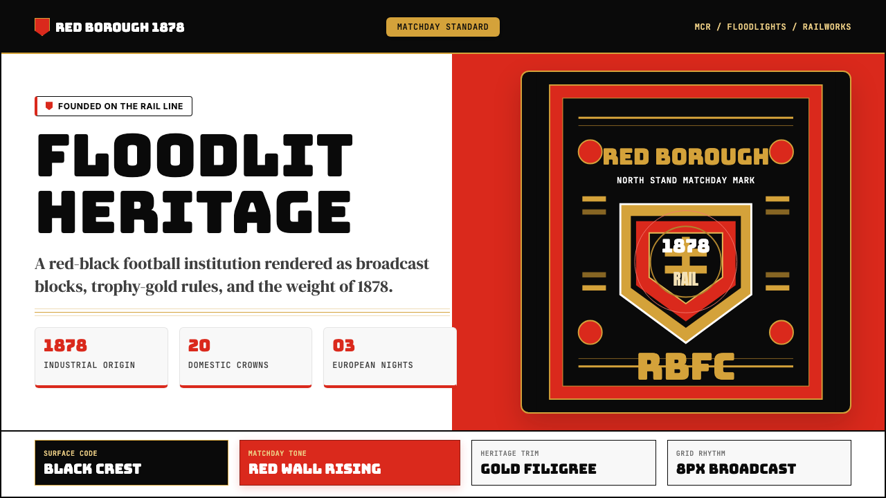
Heraldic Crest纹章徽标
The Manchester United crest is the most information-dense element in the visual system, combining civic symbolism — the ship from Manchester's own coat of arms, representing the city's trading heritage — with the red devil that gives the club its nickname, set against a shield form with the club motto. Fine gold filigree lines define the crest's details: feather textures on the devil's wings, rope work on the shield border, decorative flourishes that introduce craft and intricacy into an otherwise muscular visual system. This level of detail is not replicated across all applications; it is preserved for contexts requiring premium or ceremonial expression.曼联徽标是整套视觉系统中信息密度最高的元素,将市民象征——来自曼彻斯特市徽的船,代表城市的贸易传统——与赋予俱乐部绰号的红魔结合,置于盾形之上,配以俱乐部格言。细腻的金色纹线勾勒出徽标的细节:魔鬼翅膀上的羽毛纹理、盾牌边框上的绳索纹路、精雕细琢的花饰——在这套本以肌肉感为主调的视觉系统中引入了手工艺与繁复美感。这一层次的细节并不复制到所有应用场景,而是保留在需要高端或仪式性表达的语境中。
Contrast and Weight对比与重量
The Manchester United aesthetic depends on high contrast and heavy visual weight rather than on elegance or restraint. Red on black, gold on black, white on red — every canonical color combination exploits the maximum tonal difference between figure and ground. There is no gray area, no mid-tone softening the edges between masses. This high-contrast approach is functional: it produces legibility under the variable lighting conditions of live sport — stadium floodlights, television broadcast, phone screens in direct sunlight — while also projecting the emotional intensity appropriate to a global football brand.曼联美学依赖高对比度与沉重的视觉质感,而非优雅或克制。红底黑字、黑底金字、红底白字——每一种经典配色组合都在图形与底面之间挖掘最大的明度差。没有灰色地带,没有任何中间调来柔化色块之间的边界。这种高对比度方式具有实际功能:它在现场体育赛事多变的光照条件下——球场泛光灯、电视转播、强光下的手机屏幕——保证了可读性,同时也释放出一个全球足球品牌所应有的情感强度。
Geometric Block Composition几何块面构成
Layouts in the Manchester United visual system favor bold geometric blocks — full-bleed color fields, hard-edged panels, and rectangular divisions with no feathering or soft transition. The red jersey against the green pitch is the original block composition; this logic transfers into graphic design as large color areas divided by clean horizontal or vertical lines. Diagonal cuts appear in more dynamic applications such as broadcast motion graphics, introducing a sense of momentum and forward direction. The block approach ensures the identity remains readable at any scale, from a stadium banner to a social media thumbnail.曼联视觉系统的版面构成偏好粗犷的几何块面——满幅色域、硬边面板,以及没有羽化或柔和过渡的矩形分割。红色球衣与绿色草坪之间的对置是最原始的块面构成;这套逻辑在平面设计中转化为以干净水平线或垂直线分隔的大面积色彩区域。对角线切割出现在广播动态图形等更具动感的应用中,引入一种前进的动势。块面方式确保了这套形象在任何尺度下都保持可读性,从球场横幅到社交媒体缩略图皆然。
Ceremonial Gold Accent仪式性金色点缀
Gold in the Manchester United system does more than provide color variety — it assigns hierarchy and signals achievement. It appears on the crest's fine details, on star motifs representing championship titles, on commemorative editions of the kit, and as a finishing note on premium merchandise. The color carries cultural associations with trophies, medals, and club honors, meaning its use is always read in the context of earned status rather than decoration. This makes gold a powerful tool for elevating specific applications — a Champions League final graphic, an anniversary mark — above the everyday visual register.在曼联系统中,金色不仅仅是提供色彩变化——它赋予层级、传递成就。它出现在徽标的精细细节上、代表联赛冠军的星形符号上、球衣的纪念版本上,以及高端周边商品的收尾装饰上。这种颜色承载着奖杯、奖牌与俱乐部荣誉的文化联想,意味着其使用总是被置于「earned status(赢得的地位)」而非装饰的语境中解读。这使金色成为将特定应用——欧冠决赛图形、周年纪念标志——拔高于日常视觉级别的有力工具。
Industrial Physicality工业物质感
The Manchester United aesthetic carries a physical, tactile dimension absent from more digitally native design systems. It originates in woven jersey fabric, embossed crest badges, printed matchday programs, and the texture of stadium concrete. Even when translated to flat digital surfaces, the visual language retains a sense of material weight — bold strokes feel stamped rather than drawn, color fields feel saturated enough to be pigment rather than light. This physicality is an important quality signal: it communicates solidity, permanence, and the legitimacy of institutional history rather than the lightness of a startup brand.曼联美学带有一种物质性、触感性的维度,这是更具数字原生气质的设计系统所不具备的。它源自梭织球衣面料、压印的徽章、印刷的比赛日节目单,以及球场混凝土的肌理。即便转译至平面数字界面,这套视觉语言依然保留着一种材质重量感——粗重的笔画感觉是被压印而非被描绘出来的,色域的饱和度像是颜料而非光线。这种物质感是重要的质量信号:它传递了稳固性、永恒性,以及有别于初创品牌轻盈感的机构历史合法性。
See the Manchester United (Red Devils) design system查看 Manchester United (Red Devils) 完整设计系统
Who shaped Manchester United (Red Devils)?谁塑造了 Manchester United (Red Devils)?
Busby managed Manchester United from 1945 to 1969 and is the foundational figure in the club's modern identity. He built three distinct great teams, the last of which — the Busby Babes — was devastated by the Munich air disaster of 1958. Busby's survival of the crash and subsequent reconstruction of the club embedded a narrative of tragedy, resilience, and renewal into the brand that no visual system alone could create. His tenure produced the club's first European Cup in 1968, positioning Manchester United as an institution with continental ambitions and a story of suffering-earned triumph that continues to shape how the brand is presented.巴斯比自1945年至1969年执教曼联,是俱乐部现代身份的奠基人物。他先后打造了三支伟大球队,最后一支——「巴斯比宝贝」——在1958年慕尼黑空难中遭受重创。巴斯比从空难中生还,随后重建球队,将悲剧、坚韧与重生的叙事深深植入这个品牌,这是任何视觉系统单独无法创造的。他的执教生涯为俱乐部赢得了1968年第一座欧洲冠军杯,将曼联定位为一个有着大陆抱负、以苦难换取荣耀的机构——这一叙事持续塑造着品牌今日的呈现方式。
Ferguson managed Manchester United from 1986 to 2013, the longest continuous tenure of any manager at the club, and the period in which the brand became globally dominant. Under Ferguson, the club won thirteen Premier League titles, two Champions League trophies, and numerous domestic cups. His era coincided with the full commercial expansion of the Premier League through satellite television and international licensing, and it was during these years that the Manchester United visual identity was systematized and globalized. Ferguson's association with the brand is so complete that his silhouette and managerial demeanor — arms crossed, watching from the touchline — became inseparable from the club's public image.弗格森自1986年至2013年执教曼联,是俱乐部历史上连续执教时间最长的主教练,也是品牌走向全球主导地位的时代。在弗格森麾下,俱乐部赢得了十三座英超冠军、两座欧冠奖杯和多个国内杯赛。他的时代与英超通过卫星电视和国际版权授权实现商业全面扩张的时期完全重合,正是在这些年间,曼联的视觉形象被系统化并走向全球。弗格森与这个品牌的关联如此深入,以至于他的剪影和执教风格——双臂交叉、在边线旁注视比赛——已成为俱乐部公众形象不可分割的一部分。
Charlton survived the Munich air disaster as a twenty-year-old and went on to become the defining player of the Busby era, winning the 1966 World Cup with England and the 1968 European Cup with Manchester United — the club's first. His career trajectory from Munich survivor to champion embodies the resilience narrative at the heart of the brand's identity. As a club ambassador and board member for decades after his playing career, Charlton personified the institutional memory that makes the Manchester United identity more than a commercial construct: it is the face of a living tradition.查尔顿在二十岁时从慕尼黑空难中生还,此后成为巴斯比时代最具代表性的球员,分别在1966年代表英格兰赢得世界杯,并于1968年随曼联夺得欧冠——俱乐部历史上的第一座。从空难幸存者到冠军的职业轨迹,体现了品牌核心身份中的坚韧叙事。在球员生涯结束后的数十年间,查尔顿以俱乐部大使和董事会成员的身份,成为机构记忆的化身——正是这种记忆使曼联的品牌形象超越了商业构建,成为一个鲜活传统的面孔。
The French striker Cantona joined Manchester United in 1992 and became the iconic player of the early Premier League era, winning four league titles in five seasons. His personality — theatrical, confrontational, fiercely individual — gave the brand a cultural edge that transcended sport. Cantona was the first Manchester United player to be as widely discussed for his persona and philosophy as for his goals, and his presence helped transform the club from a football institution into a global cultural phenomenon during the critical window when the Premier League was becoming an international product. His collar-up jersey image became one of the most reproduced visual motifs associated with the club.法国前锋坎通纳于1992年加盟曼联,成为英超早期最具代表性的球员,在五个赛季中赢得四座联赛冠军。他的个人特质——充满戏剧感、锋芒毕露、烈性个人主义——赋予了这个品牌一种超越体育范畴的文化锐度。坎通纳是第一个因个人风格与哲学思想而被广泛讨论的曼联球员,其受关注程度不亚于他的进球,他的存在帮助在英超国际化的关键窗口期,将俱乐部从一个足球机构转变为全球文化现象。他衣领竖起的球衣形象,成为与这支俱乐部联结最深的视觉母题之一。
The Manchester-born graphic designer Peter Saville, best known for his work with Factory Records and Joy Division, is among the designers who have engaged with the club's visual identity in various capacities. More broadly, the 1998 crest redesign — which removed the words 'Football Club' from the badge at the direction of then-chairman Martin Edwards, a commercial decision that acknowledged the brand's global reach beyond domestic football — represents a pivotal moment in the visual history. This decision, though controversial among supporters, codified the brand's ambition: Manchester United was no longer naming itself a football club because it understood itself as something larger.出身曼彻斯特的平面设计师彼得·萨维尔以为Factory唱片公司和Joy Division操刀设计而著称,是以多种方式介入俱乐部视觉形象的设计师之一。更具历史意义的是1998年的徽标重新设计——在时任主席马丁·爱德华兹的主导下,从徽章上去除了「足球俱乐部」(Football Club)字样,这一商业决策承认了品牌已超越国内足球的全球影响力。这个决定虽在球迷中引发争议,却将品牌的野心成文化:曼联不再在名称中自称「足球俱乐部」,因为它理解自己是比这更大的存在。
How do you use Manchester United (Red Devils) today?今天怎么用 Manchester United (Red Devils)?
The Manchester United visual system — red, black, gold, bold type, heraldic crest — is a high-intensity aesthetic that works most powerfully when the subject matter matches the emotional register. It is the wrong choice for calm, analytical, or minimalist contexts; it is exactly right for anything requiring presence, authority, and the feeling of earned achievement. Applying it well means committing to the energy of the system rather than moderating it.曼联视觉系统——红、黑、金、粗重字体、纹章徽标——是一套高强度美学,当主题内容与其情感频率匹配时,它的力量最为充分。这套系统不适用于平静、分析性或极简主义的语境;但凡需要存在感、权威感和「实至名归」感觉的场景,它都是绝佳选择。正确应用它,意味着全力投入这套系统的能量,而非试图驯化它。
For presentation slides, the style works exceptionally well on cover and chapter-break pages. A black background with a large red block in one quadrant, the title in heavy white letterforms, and a fine gold rule as the sole decorative element creates immediate impact without visual noise. Content slides should keep the palette tight: black or deep-red backgrounds with white body text, gold reserved only for section labels or key callouts. Data slides benefit from the high-contrast approach — bar charts and comparison tables rendered in the red-black-gold palette become visually assertive and memorable, each data series claiming its territory with the same confidence as a jersey color.在演示文稿中,这套风格在封面页和章节过渡页上效果尤为出众。黑色背景、某一象限内的大面积红块、粗重白色字体的标题,以及一条细金线作为唯一装饰元素——这种组合制造即时的视觉冲击而不带任何噪音。内容页应保持收紧的色板:黑色或深红背景配白色正文,金色仅留给章节标签或关键标注。数据页面受益于高对比度方式——以红黑金色板呈现的柱状图和对比表格,视觉上强劲而令人难忘,每个数据系列以球衣色彩般的自信占据各自领地。
For web interfaces, the system suits contexts where boldness and credibility are primary values: sports platforms, event registration pages, ticketing interfaces, membership dashboards, and any product that needs to communicate strength and heritage simultaneously. The approach is direct: rich red or black as the dominant background tone, white or cream for body text and data fields, gold for interactive highlights, hover states, and premium tier indicators. Navigation should be typographically heavy — large labels with strong visual weight — and hero sections work best with full-bleed color or photography treated as a backdrop for bold text overlays. Soft shadows and rounded corners dilute the aesthetic; hard edges and flat color masses preserve it.在网页界面中,这套系统适合以大胆感与可信度为首要价值的语境:体育平台、活动报名页、票务界面、会员仪表板,以及任何需要同时传递力量感与传承感的产品。方法直接:饱满的红色或黑色作为主导背景调,白色或奶油色用于正文与数据字段,金色用于交互高亮、悬停状态和高级订阅标识。导航应当字体感十足——字号大、视觉重量强;英雄区段最宜以满幅纯色或作为粗重文字叠加背景的摄影图像呈现。柔和阴影和圆角会稀释这套美学;硬边与平面色块则能守住它。
For editorial and marketing work, the style supports strong hierarchical communication. A campaign poster uses the block composition most naturally — a full-field red background with white display type occupying the upper two-thirds, a black band at the base containing a gold-lettered date or location. Brand announcements and anniversary materials can introduce the crest's fine gold filigree as a premium layer, making the distinction between commemorative and everyday communication visible and meaningful. Social media graphics should simplify the system: one dominant color, one message, one weight of type — the club identity is strong enough that restraint reads as confidence rather than emptiness.在编辑与营销工作中,这套风格支持强劲的层级化传播。一张活动海报以块面构成最为自然——全域红色背景,白色大字体占据上三分之二,底部黑色色带内印金字的日期或地点信息。品牌公告和周年纪念材料可引入徽标的精细金色纹饰作为高端层,使纪念性传播与日常传播在视觉上形成清晰可感的区别。社交媒体图形应简化系统:一种主色、一条信息、一种字重——俱乐部形象足够强大,克制在这里读出的是自信,而非空洞。
A common mistake when applying this aesthetic is treating all three colors — red, black, and gold — as equally available in every application. The system's power comes from hierarchy: red dominates, black grounds, gold accents. Reversing this order — gold at full saturation across a layout, with red as a secondary note — produces visual confusion and loses the ceremonial logic that distinguishes this palette from generic warm-toned sports color combinations. Similarly, introducing softness through gradients, blurs, or pastel variants of the primary colors strips the system of its defining quality. The Manchester United aesthetic does not do subtle; it does authoritative.应用这套美学时最常见的错误,是将红、黑、金三种颜色视为在每个应用场景中同等可用的资源。这套系统的力量来自层级:红色主导,黑色奠基,金色点睛。颠倒这一秩序——大面积满饱和度金色铺陈,红色退位为次要色调——将制造视觉混乱,并失去这套色板有别于普通暖调运动色彩组合的仪式性逻辑。同样,通过渐变、模糊或主色调的粉彩变体引入柔和感,将剥去系统的定义性品质。曼联美学不做微妙,它做的是权威。
See the Manchester United (Red Devils) design system查看 Manchester United (Red Devils) 完整设计系统
Manchester United (Red Devils) — FAQManchester United (Red Devils) · 常见问题
Can the Manchester United aesthetic work for non-sports brands?曼联美学可以用于非体育品牌吗?
Yes, with clear intent. The aesthetic's core qualities — high contrast, bold type, strong color hierarchy, institutional authority — are transferable to any context that wants to project strength and heritage. Financial services, premium events, entertainment platforms, and even technology products positioning themselves as market leaders can use the visual logic without the football-specific references. The key is to strip the jersey-and-crest iconography and retain the underlying compositional grammar: dominant color masses, heavyweight type, gold as a prestige signal, and hard rather than soft edges throughout. The mistake to avoid is importing the football atmosphere as surface decoration without understanding the structural principles beneath it.可以,但需要明确的意图。这套美学的核心品质——高对比度、粗重字体、强劲的色彩层级、机构权威感——可迁移至任何希望传递力量感与传承感的语境。金融服务、高端活动、娱乐平台,乃至将自身定位为市场领导者的科技产品,都可以使用这套视觉逻辑,而无需引入足球专属的视觉符号。关键在于剥离球衣与徽标的图标元素,保留其底层构成语法:主导性色彩块面、粗重字体、金色作为尊贵信号,以及贯穿始终的硬边而非软边。需要避免的错误是:将足球氛围作为表面装饰移植过来,却不理解其背后的结构原则。
How do you distinguish this style from other red-dominated sports brands?如何将这套风格与其他以红色为主色的体育品牌区分开来?
The distinguishing elements are the heraldic dimension and the specific red-black-gold triad. Many sports brands use red — it is the default high-energy sports color — but few combine it with the ceremonial weight of heraldic gold and the depth of full black in the same system. The Manchester United identity also introduces fine detail through the crest: gold filigree, illustrated figurative elements, and layered symbolic meaning. Generic sports red aesthetics typically omit this complexity, defaulting to red with white or red with gray. The presence of heraldic gold at the accent position, paired with solid black rather than charcoal or navy, is the primary differentiator.区分性要素在于纹章维度以及红-黑-金的特定三元组合。许多体育品牌使用红色——它是默认的高能量运动色——但很少有品牌在同一系统中将红色与纹章金的仪式重量和纯黑的厚重质感组合在一起。曼联形象还通过徽标引入了精细细节:金色纹饰、具象插图元素和多层次的象征意义。通用的体育红色美学通常省略这种复杂性,默认使用红配白或红配灰。金色出现在点缀位置、与纯黑(而非深灰或深蓝)搭配,是最主要的区分因素。
Is dark mode compatible with this aesthetic?这套美学与深色模式兼容吗?
Very much so — in fact, the black-dominant variant is arguably more powerful than the red-dominant one for many digital applications. The Manchester United crest has long existed in a black-background version where gold filigree reads at its most legible and red operates as a strong secondary. For dark mode interfaces, the approach is: black or near-black as the base, United red for primary interactive elements and prominent type, gold for hover states and premium indicators, white for body text. This ordering keeps the gold from dominating — on dark grounds, gold can overwhelm if used broadly — and uses red to do the structural work that cream-on-white does in lighter variants.非常兼容——事实上,在许多数字应用中,以黑色为主导的变体可以说比以红色为主导的版本更具力量。曼联徽标长期以来存在黑底版本,金色纹饰在黑底上最为清晰可读,红色作为强劲的次要色登场。对于深色模式界面,方法如下:黑色或接近黑色作为基底,曼联红用于主要交互元素和突出字体,金色用于悬停状态和高级标识,白色用于正文。这种排序防止金色占据主导——在深色底面上,大面积金色容易让人目眩——并以红色承担浅色变体中奶油配白色所做的结构性工作。
How does this style handle photography and imagery?这套风格如何处理摄影和图像?
Photography works well in this system when it is treated as a high-contrast, strongly lit element rather than a naturalistic one. Match action photography — players in red under stadium lights, a crowd of red shirts — integrates naturally because the photographic reality shares the palette's energy. For non-football contexts, duotone treatment in red-and-black or gold-and-black allows photography to be absorbed into the graphic system without breaking the color hierarchy. Avoid imagery with soft, warm, or pastel color temperatures that conflict with the palette's intensity. When photography is cropped tightly and placed against solid color fields rather than floated with space around it, it reads as part of the block composition rather than a window inserted into the layout.当摄影被当作高对比度、强光照的元素而非自然主义窗口处理时,它在这套系统中表现出色。比赛动作摄影——球场灯光下身穿红色球衣的球员、一片红色球衣的看台——天然融入,因为摄影现实与色板的能量共享同一频道。在非足球语境中,红黑或金黑双色调处理让摄影在不破坏色彩层级的前提下融入图形系统。避免使用与色板强度相冲突的柔和、暖调或粉彩色温图像。当摄影被紧密裁切并置于纯色色域之上,而非漂浮于留白空间中时,它作为块面构成的组成部分被阅读,而非作为插入版面的窗口。
What contexts should avoid this aesthetic entirely?哪些场景应该完全避免使用这套美学?
The Manchester United aesthetic is poorly suited to contexts requiring warmth, approachability, or emotional softness. Children's products, healthcare interfaces, food and wellness brands, community-oriented nonprofits, and any product where the user experience depends on feeling safe, nurtured, or delighted will struggle against the system's intensity and authority. It is also a poor fit for luxury goods that communicate through refinement and restraint rather than boldness — high-end hospitality, fine jewelry, and premium beauty all require a more delicate visual register. The style's associations with competition, tribalism, and collective identity make it equally unsuitable for any brand that needs to appeal across divisions rather than to a defined and committed community.曼联美学不适用于需要温暖感、亲近感或情感柔软度的场景。儿童产品、医疗界面、食品与健康品牌、以社区为导向的非营利组织,以及任何用户体验依赖安全感、被呵护感或愉悦感的产品,都难以承受这套系统的强度与权威感。它同样不适合通过精致与克制传达价值的奢侈品——高端酒店、精细珠宝和高档美妆都需要更为纤细的视觉频率。这种风格与竞争、部落认同和集体身份的文化联想,也使它不适用于任何需要跨越分歧、广泛吸引受众而非服务于一个明确的忠诚社群的品牌。
Related design styles相关设计风格
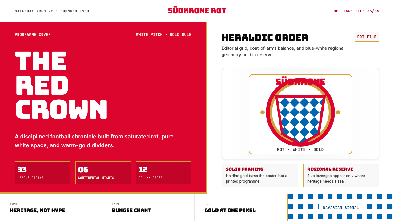 Bayern Munich (Rot)Heritage, not hype. Saturated rot fields, gold rules, and blue lozenges enfor…传统胜过喧哗:饱和红、金细线与蓝白菱格建立秩序。
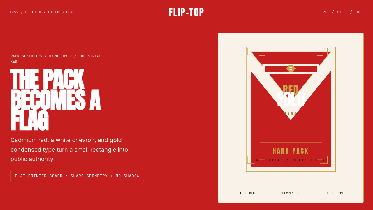 Marlboro Red Flip-Top (1955)Authority in one fold. Cadmium red, white chevron, and gold type read like a…一折成旗。镉红、白人字与金字排出强硬权威。
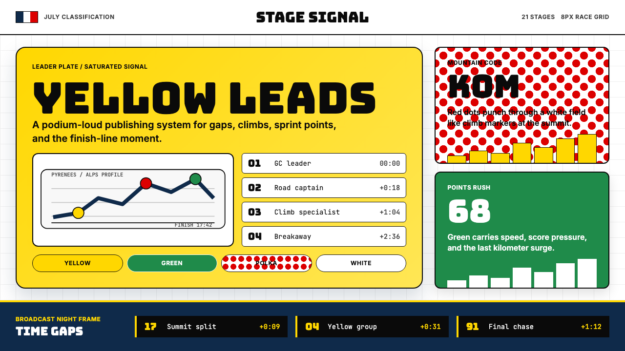 Tour de France (Yellow Jersey)Yellow owns the finish. Bungee type, polka dots, and navy tickers snap to an…黄衫统治终点:Bungee 字体、圆点红与海军蓝计时条咬合 8px 网格。
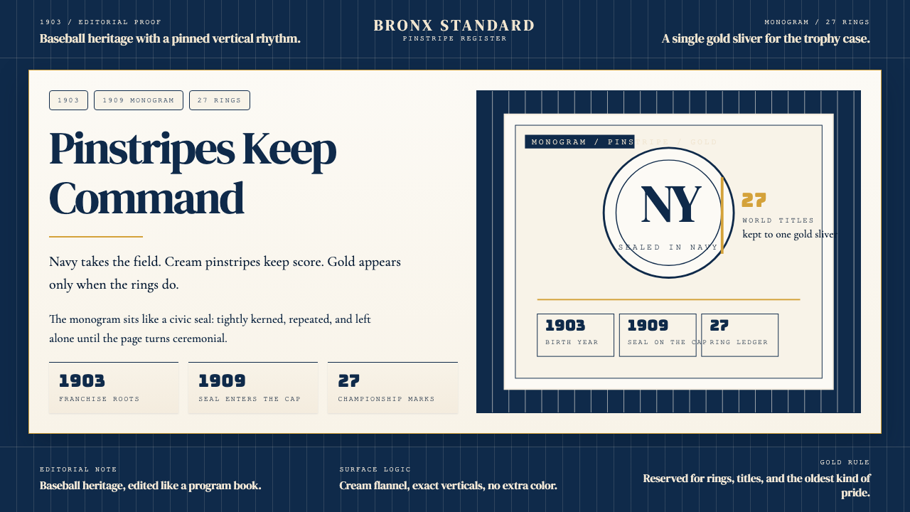 New York Yankees (Navy-Pinstripe)Navy restraint, not noise. Cream pinstripes and a gold monogram seal do the w…海军蓝克制到底。奶油细条纹与金色徽章撑起整页。
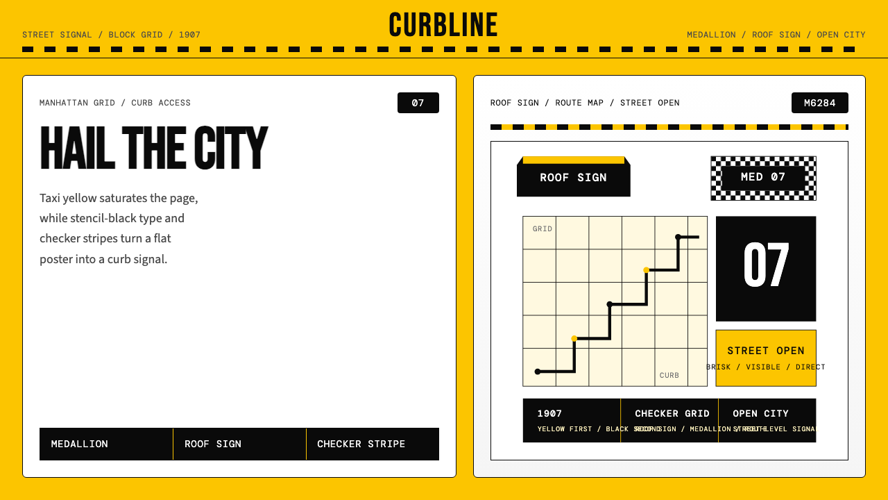 New York Yellow Cab (1907)Visibility is the brand. Taxi yellow, stencil type, checker stripes.可见性就是品牌。出租车黄、模板字与棋盘格定调。
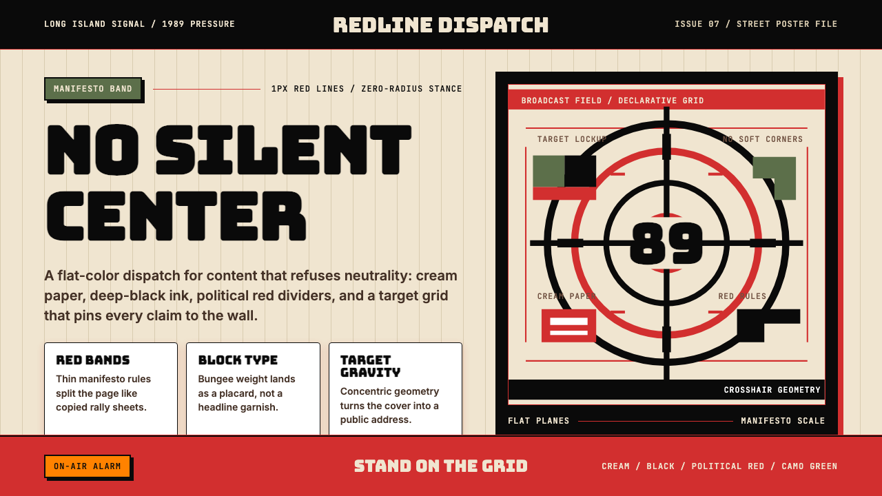 Public Enemy — Fight the PowerTakes a side loudly. Red bands, black ink, and target geometry hit like a ral…立场响亮:红色分栏、黑墨与准星几何像集会海报。