What is Corten Rust Sculpture?
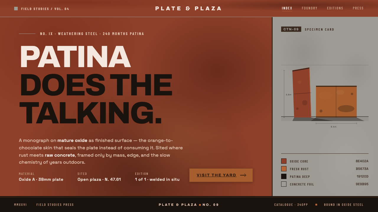
Corten Rust Sculpture lets patina carry the image — saturated rust-oxide planes meet concrete grey, while mass, seams, and silence replace ornament.
Corten Rust Sculpture in brief
Corten Rust Sculpture is a digital design language distilled from Richard Serra’s weathering-steel monoliths, the land-art tradition, and the severe material logic of Minimalism. Its visual ground is not cream or pure white but the deep rust-orange-brown of a mature oxide patina, set against the raw grey of a concrete plaza. The result is dark, mineral, and unapologetically industrial.
The composition is built from massive flat planes, visible plate edges, and weld seams. These are not decorative references added to a neutral interface; they are the interface’s primary vocabulary. A surface may feel heavy even when it is represented digitally, because its organization suggests steel plate, joined construction, and public-scale sculpture. The design asks the viewer to read structure before surface detail.
The style’s restraint is absolute. There are no ornamental flourishes, simulated luxury finishes, playful stickers, or soft visual effects competing with the material. Negative space is generous and deliberate, functioning like the open ground around a monumental sculpture. Patina does the talking: color establishes atmosphere, edges establish construction, and empty space gives the mass room to stand.
Where does Corten Rust Sculpture come from?
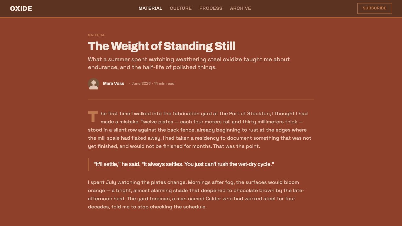
The style belongs to the mature period of large-scale weathering-steel land art and minimalist sculpture associated with 1990–2010. Its regional frame is North America, where large public steel sculpture and earthworks supplied the cultural image of monumental objects placed directly into civic or natural ground. The digital translation preserves that sense of public scale without imitating a particular site.
Richard Serra is the clearest reference point. His weathering-steel monoliths demonstrate how industrial material can become architectural presence: broad planes alter movement, plate edges reveal construction, and rust is allowed to develop as the work’s visible skin. Corten Rust Sculpture takes that logic into interface composition, treating every major block as a plane with weight and every transition as a structural decision.
The land-art tradition contributes the relationship between object and surrounding emptiness. In this lineage, the space around a work is not leftover background; it is part of the experience of scale, distance, and orientation. A digital layout therefore needs room around its strongest elements. Dense ornament would weaken the encounter by turning a monument into a surface pattern.
Minimalism and industrial-material monument sculpture complete the foundation. Minimalism supplies the refusal of excess, while industrial material supplies the visual authority of steel, concrete, and fabrication. The result is neither rustic decoration nor generic brutalism. It is a disciplined system in which oxide color, raw grey, plate geometry, weld seams, and negative space all point back to material honesty.
What defines the Corten Rust Sculpture look?
Patina Color
The palette is anchored by deep rust orange-brown, understood as the mature oxide skin of weathering steel rather than a decorative warm accent. Raw concrete grey supplies the counterweight, making the rust feel denser and more mineral. The relationship is saturated but controlled: rust carries identity, grey carries ground, and neither is diluted into pastel or polished luxury.
Monolithic Planes
Large flat planes organize the visual field as if steel plates had been placed in relation to one another. Their scale should feel architectural or sculptural, not like a collection of small cards. Plane changes create hierarchy through mass and position. A major surface may dominate quietly, while a smaller adjoining plane establishes tension through contrast in edge, tone, or direction.
Weld Seams
Weld seams are the style’s most legible mark of fabrication. They divide broad surfaces without becoming ornamental borders, showing how a mass was joined and giving the eye a route across the composition. Seams should remain sparse, purposeful, and visibly subordinate to the planes they connect. Their value is evidentiary: they make construction present.
Raw Concrete Ground
Concrete grey acts as the plaza, foundation, or earth around the rusted steel. It is not a neutral white substitute and should retain a sense of rawness rather than cleanliness. This ground lets the oxide surface read as an object with physical presence. The contrast is firm and quiet: the steel is warm and saturated, while the concrete is cool, broad, and infrastructural.
Negative Space
Open space is a structural component, not an absence to be filled. It establishes the distance required to perceive monumentality and prevents seams or plate edges from dissolving into visual noise. Generous margins make the composition feel situated in a plaza or landscape. The emptiness should be calm, dark, and intentional, allowing the material forms to remain isolated and legible.
Zero Ornament
Every visible element must justify itself through mass, construction, orientation, or communication. Decorative motifs, soft atmospheric effects, glossy finishes, and ornamental illustrations weaken the material argument. The style is not sparse because it lacks ideas; it is sparse because it gives the ideas fewer places to hide. Patina, plane, seam, edge, and ground are sufficient.

Who shaped Corten Rust Sculpture?
Serra provides the central artistic reference for the style: weathering-steel monoliths treated as massive spatial presences rather than decorated objects. His relevance here lies in the way broad planes, industrial weight, and rusted surface can reorganize how a viewer moves and looks. Corten Rust Sculpture translates that monumental logic into digital hierarchy and composition.
The broader community of weathering-steel sculptors establishes the material vocabulary behind the style. Their work makes oxide patina, plate edges, and fabrication seams visible as part of the object’s identity. In digital use, this means rust should read as a stable material skin, not as random distressing or a decorative texture pasted over an otherwise unrelated layout.
Land artists contribute the style’s understanding of scale, placement, and surrounding emptiness. Their tradition treats the ground around a work as active rather than incidental, allowing distance and landscape to participate in perception. This becomes a digital rule: the strongest form needs an expansive field around it so that mass can be felt rather than merely outlined.
How do you use Corten Rust Sculpture today?
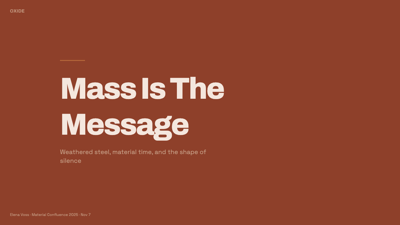
For presentation slides, use the cover as a single monumental field: a rust-oxide plane or heavy title block should establish the subject immediately, with concrete grey supplying the surrounding ground. Content slides should preserve that spatial discipline. Let section titles, body copy, and seams align to a clear structural order, while generous empty areas prevent information from becoming a decorative collage. Data slides should treat charts as plates or cut sections, using rust for the primary signal and grey for the supporting field.
For web interfaces, the style suits dashboards, monitoring tools, analytical products, and pricing pages that want to communicate durability and material seriousness. Panels can feel like joined steel plates, while grey regions act as the infrastructural ground. Rust should be reserved for active states, primary actions, or the most important tier, so the interface retains hierarchy. Borders and seams should explain relationships; they should not become repeated decoration around every component.
For editorial and marketing work, the style creates a strong sense of authority when the subject involves industry, architecture, public space, infrastructure, or serious material practice. Articles benefit from broad opening fields, restrained typography, and section divisions expressed through plate edges or weld-like rules. Marketing pages can alternate between rust-dominant and concrete-grey sections, but every shift should feel like a change of material mass rather than a change of theme.
The approach also works for cultural institutions, sculpture programs, architecture portfolios, and products that want to appear grounded rather than polished. Photography, when used, should be cropped as an architectural or sculptural mass and allowed to sit within the same rust-and-concrete world. The image should reinforce scale, surface, or construction. It should not introduce unrelated softness, decorative color, or lifestyle gloss.
The common mistake is to confuse the style with generic distressed industrial decoration. Adding random scratches, excessive texture, hazard motifs, glowing effects, or many competing rust tones turns material honesty into visual noise. Another mistake is making every surface equally dark and saturated, which removes hierarchy. The strongest application chooses a dominant mass, a supporting ground, a few purposeful seams, and enough silence for the patina to remain the image.
Corten Rust Sculpture — FAQ
Is Corten Rust Sculpture simply an industrial or brutalist style?
It shares industrial material authority with those traditions, but its identity is more specific. The style is grounded in weathering-steel monoliths, Minimalism, and Land Art. Its defining concern is not roughness for its own sake; it is the relationship between patina, monumental planes, fabrication seams, concrete ground, and surrounding emptiness. Remove that spatial and material logic, and only a generic industrial surface remains.
Can the style use cream or pure white backgrounds?
The approved language explicitly rejects both. Its ground is the deep, saturated rust-orange-brown of mature oxide patina paired with raw concrete-plaza grey. A lighter ground may make the result cleaner or more conventional, but it changes the premise. The intended atmosphere is dark, mineral, and rooted in steel and concrete, so the background must participate in that material world.
What role do weld seams and plate edges play?
They make construction visible. A weld seam divides a broad plane, establishes a route for the eye, and shows that the mass was joined rather than magically produced as a seamless graphic. A plate edge clarifies orientation and weight. Both should remain sparse and purposeful. If repeated everywhere, they become ornament and lose the evidentiary force that makes the style convincing.
How should patina be represented digitally?
Treat patina as the image’s core material identity, not as a layer of random damage. The rust should feel deep, saturated, mature, and stable. Its visual force comes from the relationship between the oxide color and concrete grey, and from the large planes that carry it. Excessive grain, scratches, distressed marks, or decorative texture suggest decay and busyness rather than weathered permanence.
Where does this style work best, and where can it struggle?
It works best where durability, seriousness, public scale, and material clarity are useful values: dashboards, analytical tools, pricing pages, architecture portfolios, cultural institutions, and industrial or infrastructure subjects. It can struggle when the experience depends on softness, ornament, cheerful variety, or intimate warmth. Its severity is a strength only when the product or subject can support that severity.
Related design styles
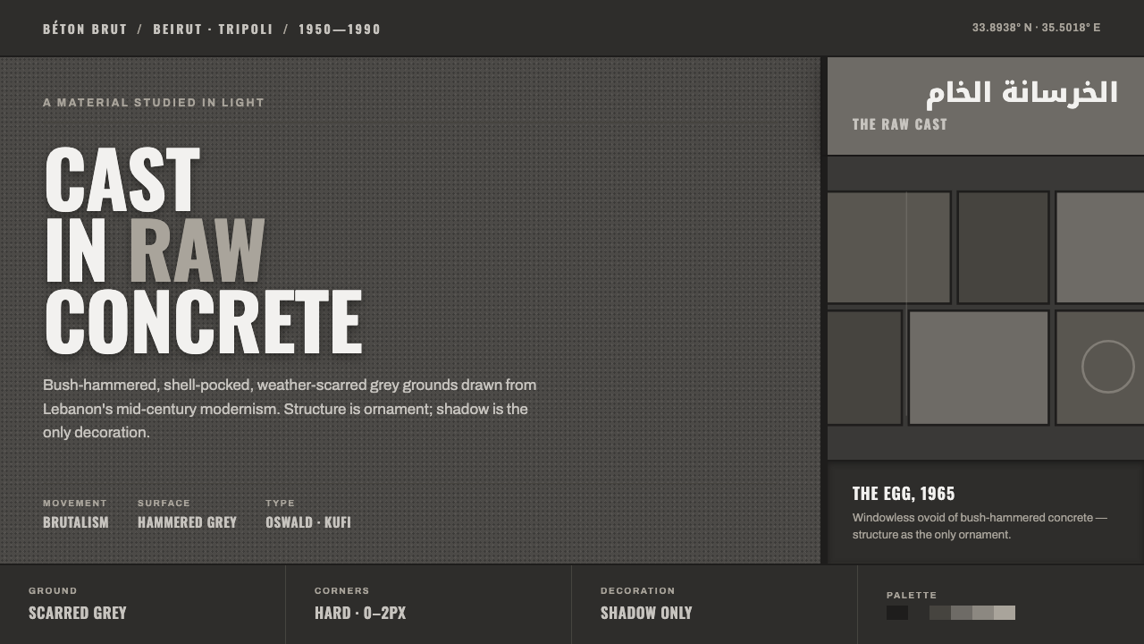 Beirut Brutalist GrayStructure is the only ornament. Scarred bush-hammered grey, monumental Oswald…
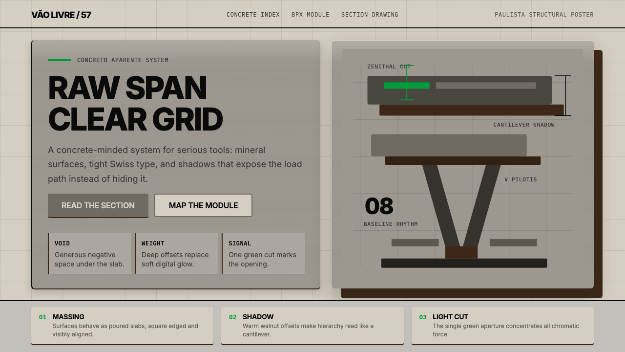 Paulista BrutalismStructural honesty, made heavy. Mineral grays, Inter grids, and walnut cantil…
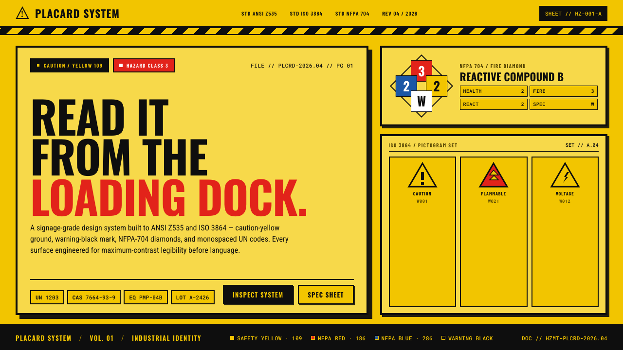 Hazmat SignageRead it from the loading dock. Caution-yellow ground, NFPA diamonds, monospac…
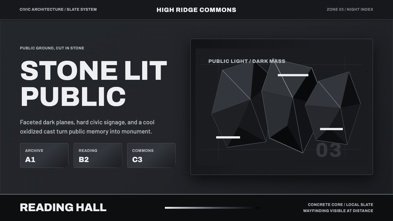 Medellín Library ParkCivic gravity in slate. Near-black planes, cool grey hairlines, and bold wayf…
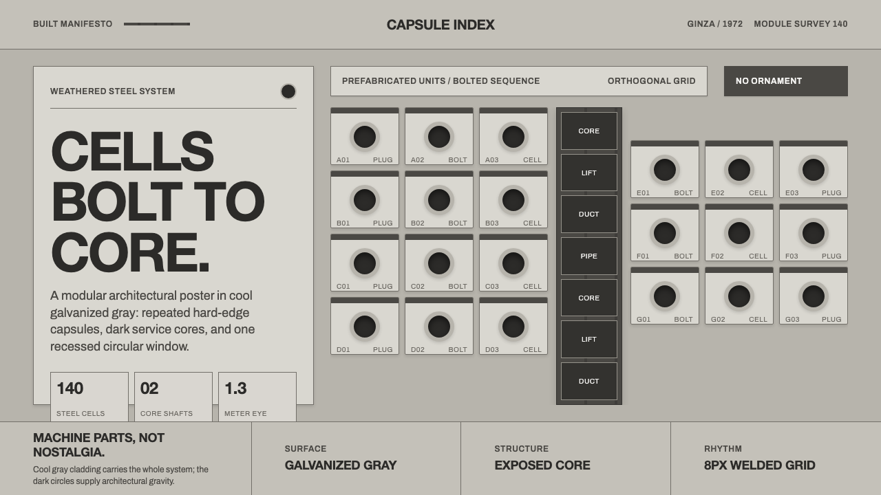 Nakagin Capsule TowerArchitecture as cells. Cool gray modules, dark cores, and porthole circles lo…
 Vexillology Flag DesignDiscipline made visible. Old Glory blue, red and yellow sit on a strict dark…