What is Nakagin Capsule Tower?
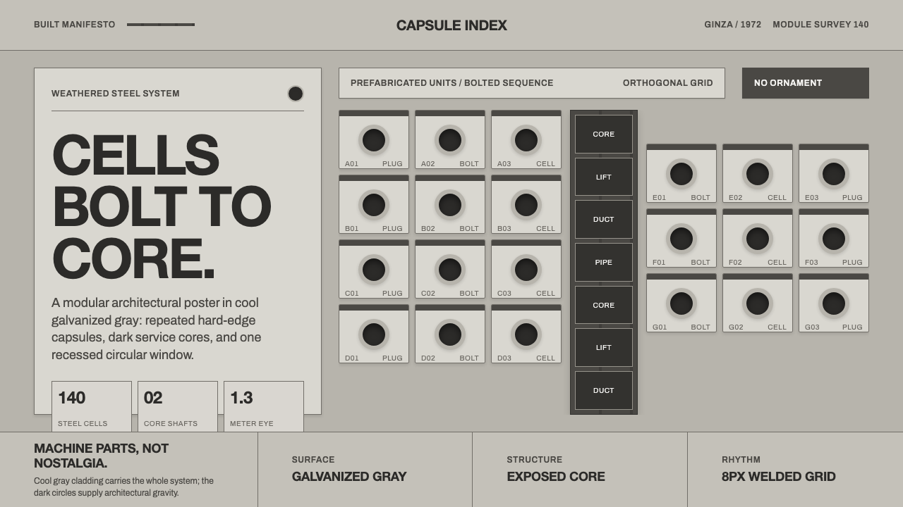
Nakagin Capsule Tower turned housing into a field of cells — pale steel rooms, dark concrete cores, and round windows locked into an unapologetically mechanical grid.
Nakagin Capsule Tower in brief
Nakagin Capsule Tower is a built statement of architecture as biology. Completed in Ginza, Tokyo, in 1972, it assembled 140 prefabricated steel capsules around two exposed concrete service cores. Kisho Kurokawa conceived the structure as a system of parts rather than a single sealed monument: housing units could be attached, replaced, and understood as cells within a larger body. The result is Japanese Metabolism made physical, where industrial repetition is not a compromise but the central visual and conceptual idea.
Each capsule is a compact, machine-made room carried by an all-welded steel truss structure. Its defining feature is a single circular window, reading at a glance like a porthole or the door of a washing machine. Repetition gives these circles unusual force. They are not decorative motifs laid across a facade; they reveal the identity of each room, making the building look simultaneously domestic, engineered, and almost biological.
Its visual character depends on material contrast rather than polish. Rib-reinforced galvanized steel, protective paint, and a glossy Kenitex finish weathered into a pale cool gray off-white over decades. Those capsule surfaces stand against raw, dark concrete cores that declare their structural role without disguise. This is not the spotless brightness often associated with generic modernism. It is the restrained monumentality of aged machine parts: neutral, industrial, cool, and visibly exposed.

Where does Nakagin Capsule Tower come from?
Nakagin Capsule Tower belongs to the high point of Japanese Metabolism, a movement spanning the 1950s through the 1990s. Metabolism proposed that architecture could behave less like a finished object and more like a living system: capable of growth, exchange, replacement, and adaptation. Within that framework, the tower makes a radical proposition legible from the street. Its capsules are individual units, while the concrete cores serve as a durable infrastructural body to which those units are connected.
The project was built in Ginza, Tokyo, in 1972, a setting named in the source material as part of its modernist identity. Ginza gives the tower an urban reading distinct from an isolated experimental prototype. The stacked modules face the city as a repeated field of manufactured rooms, while the paired cores establish a darker, heavier vertical order behind them. The building therefore presents plug-in megastructure theory not as a diagram but as an inhabitable facade.
Kisho Kurokawa is the architect named directly with the tower’s construction and its biological premise. The source material also identifies Kenzo Tange, Kiyonori Kikutake, and Fumihiko Maki as key figures connected to the movement’s context. Together, these names locate the tower within Japanese Metabolism, plug-in megastructure theory, and Ginza modernism rather than treating its capsules as an isolated stylistic novelty.
The material finish is essential to that origin story. The cladding was never intended as pure white: galvanized, rib-reinforced steel was protected with paint and given a glossy sprayed finish. Time altered that surface into a pale, cool, faintly mottled gray-white. This weathering does not erase the building’s industrial logic. It makes the logic more visible, placing aged metal beside raw concrete and allowing construction, maintenance, and exposure to become part of the aesthetic.
What defines the Nakagin Capsule Tower look?
Cellular Repetition
The tower’s primary visual unit is the capsule. Repeating the same prefabricated room produces a cellular field rather than a conventional facade of floors and windows. This repetition feels systemic, not ornamental: each module appears to be a replaceable part of a larger architectural organism.
Cool Weathered Metal
The capsule skin reads as pale, cool, and gray rather than white. Its galvanized rib-reinforced steel and glossy protective finish acquired a faintly mottled character through weathering. The desired feeling is aged industrial equipment, where material history adds depth without becoming rustic or warm.
Exposed Structural Core
The two dark concrete service cores are deliberately legible as infrastructure. They provide a severe counterweight to the lighter capsules and prevent the composition from becoming merely repetitive. Their rawness makes structure visible, establishing a clear difference between permanent support and attached room.
Porthole Circles
Each capsule’s circular window is the facade’s most memorable graphic element. The window reads like a porthole or washing-machine door, giving a domestic room an unexpected mechanical identity. Against the module grid, these circles interrupt the rectilinear order without softening its rigor.
Bolted Assembly
The visual language should suggest assembly, attachment, and interchangeability. Capsules are understood as manufactured units fixed to a larger service structure, so seams, edges, and repeated boundaries carry more meaning than seamless surface effects. The building’s proposition is that architecture can be composed from changeable parts.
Quiet Monumentality
Although made from small rooms, the tower has a monumental presence because of its stacked mass and dark vertical cores. It is cool and neutral rather than theatrical. Its power comes from accumulation, exposed material, and the calm insistence of the grid, not from decorative spectacle.

Who shaped Nakagin Capsule Tower?
Kisho Kurokawa is named as the architect who, in 1972, bolted the tower’s prefabricated steel capsules onto exposed concrete service cores. The project embodies the biological model attributed to him: a building composed of units that can be attached and replaced like living cells.
Kenzo Tange is identified as a key figure in the Japanese Metabolism context surrounding Nakagin Capsule Tower. His inclusion locates the tower within the movement’s broader architectural conversation rather than reducing it to an individual object or a singular facade treatment.
Kiyonori Kikutake is named among the key figures associated with the tower’s Metabolist setting. In this article, his place is to mark the collective intellectual frame in which growth, replacement, and large-scale plug-in systems became architectural questions.
Fumihiko Maki is likewise listed as a key figure in the relevant movement context. Alongside the other named architects, he situates Nakagin Capsule Tower within a period when architecture was being imagined as infrastructure, aggregation, and an urban system of parts.
How do you use Nakagin Capsule Tower today?
For presentation covers, use the tower’s massing as the organizing idea rather than copying every capsule literally. Place a compact title block against a pale cool ground, then let one dark vertical band act as the structural core. A disciplined cluster of circles or modules can gather around it. The composition should feel assembled and slightly industrial: clear boundaries, generous empty field, and no decorative flourish that competes with the grid.
For content slides, treat the service core as an information spine. Place section labels, navigation, or an oversized datum in a dark vertical zone, with lighter modular text areas attached beside it. Data slides can use repeated cells as chart containers, while circular markers identify the key observations. Keep the system calm and mechanical; the purpose is to make comparison and sequence visible, not to turn every data point into a porthole.
For web interfaces, this language suits dashboards, inventory views, room or asset systems, and pricing pages whose value depends on modular comparison. Use a pale weathered-metal atmosphere for surfaces, reserve a dark structural zone for navigation or primary context, and make cards feel attached to an underlying framework. Round indicators can signal status, selection, or detail, but they should remain meaningful markers rather than scattered decoration.
For editorial and marketing work, the style works best when a repeated unit carries the story. A long-form page can organize excerpts, facts, images, or testimonials as capsules aligned to a strong vertical rail. Marketing sections can alternate between pale module fields and deep structural panels, allowing the contrast between dwelling and infrastructure to create rhythm. Photography or product imagery should be framed decisively, with the layout preserving the feeling of visible construction.
A common mistake is to treat Nakagin Capsule Tower as a generic retro-futurist mood board. Random portholes, shiny silver surfaces, and crowded sci-fi decoration miss the building’s crucial tension between replaceable rooms and permanent support. Another mistake is making the palette too clean: the reference is weathered gray metal against raw dark concrete, not sterile white plastic. Keep repetition purposeful, leave the core visually authoritative, and let aging and material honesty do the expressive work.
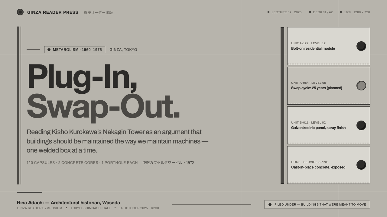
Nakagin Capsule Tower — FAQ
Is Nakagin Capsule Tower simply a futuristic building?
Its futuristic appearance is inseparable from a specific architectural proposition. The tower was built as a Metabolist manifesto in which prefabricated rooms attach to exposed service cores and can be understood as replaceable cells. The circular windows and repeated modules are therefore not merely science-fiction styling; they make the building’s plug-in logic visible.
Why are the windows circular?
The source material identifies one circular window in every capsule, with a diameter of 1.3 meters, and describes its visual resemblance to a porthole or washing-machine door. In the facade, the circles establish an immediate contrast with the rectangular modules and dark vertical cores. The available material presents that visual effect, rather than a separate technical explanation for the shape.
Was the exterior intended to be bright white?
No. The source material explicitly states that the cladding was never meant to be white. Galvanized rib-reinforced steel, rust-preventative paint, and glossy Kenitex spray weathered into a pale cool off-white-gray over time. That aged surface is central to the tower’s character and should not be replaced by a sterile white interpretation.
How should a contemporary design borrow from this building without becoming a pastiche?
Borrow the relationship between parts, not just the porthole motif. Establish a durable structural layer, attach a repeated set of functional modules to it, and use cool weathered surfaces against darker material anchors. Circles should identify a meaningful action or focal point. If every element is shiny, rounded, or decorative, the design loses the tower’s disciplined distinction between infrastructure and replaceable cells.
Related design styles
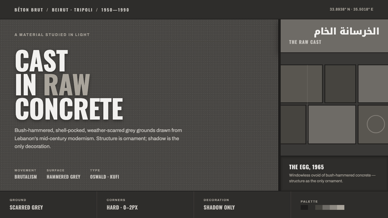 Beirut Brutalist GrayStructure is the only ornament. Scarred bush-hammered grey, monumental Oswald…
 Paulista BrutalismStructural honesty, made heavy. Mineral grays, Inter grids, and walnut cantil…
 Dhaka Shaheed MinarSolemn before dawn. Marble columns and one red sun hold the page in civic sil…
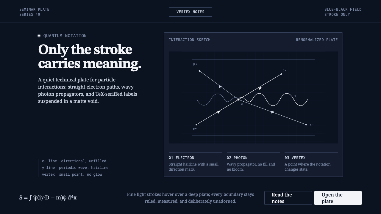 Feynman Diagram QEDMeaning reduced to strokes. Pale QED lines and TeX serif type float on blue-b…
 Sapporo Winter 1972Icy order, exact and calm. Glacial blue grid, snow-white type, one red sun di…
 Snow Crystal ClassificationSnow as taxonomy, not decoration. Frosted ice-cyan crystals on a near-black d…