What is Lina Bo Bardi Concrete?
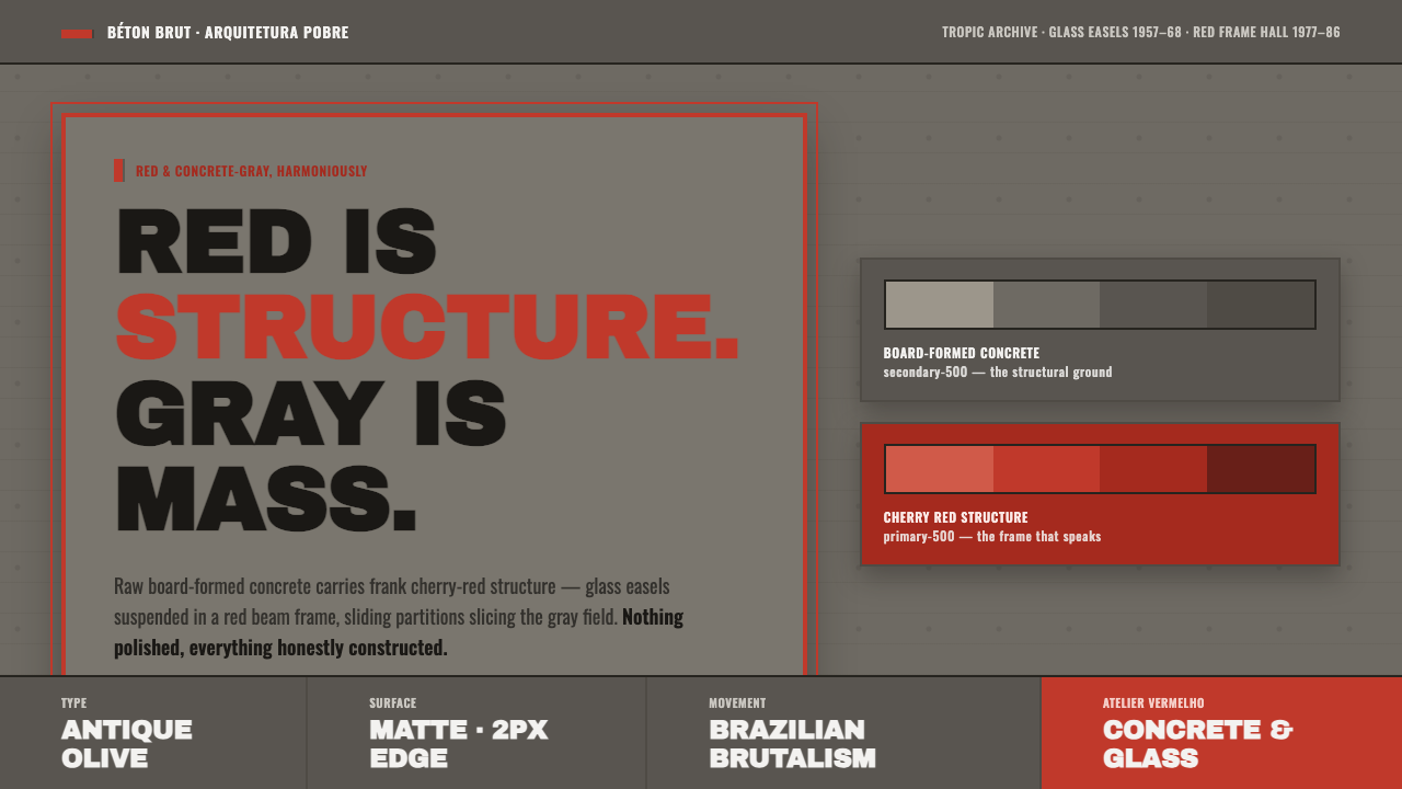
Lina Bo Bardi Concrete turns blunt material into an architectural language: board-formed gray mass held in tension by cherry-red structure, with every rough mark left visible.
Lina Bo Bardi Concrete in brief
Lina Bo Bardi Concrete is a visual system distilled from Lina Bo Bardi’s architecture in São Paulo, Brazil. Its defining tension is simple and forceful: concrete gray carries mass, while saturated cherry red identifies structure, circulation, framing, and movement. The result is industrial without becoming anonymous, and bold without relying on ornament.
The system uses a mid-tone concrete-gray ground, rough matte surfaces, board-formed marks, heavy industrial grotesque type, and red structural members that appear to hold, connect, or direct the composition. At MASP São Paulo, glass picture-easels hang inside a red beam frame; at SESC Pompéia, red circulation and sliding partitions cross stripped concrete masses.
Its character depends on material honesty. Gray should feel dense and constructed, not like a polished neutral background. Red should behave like a beam, rail, frame, or route rather than a casual decorative accent. Typography is similarly structural: heavy uppercase lettering gives the page the blunt presence of an architectural mass.
Where does Lina Bo Bardi Concrete come from?
The style belongs to the period from 1950 to 1990 and is rooted in São Paulo, Brazil, while Lina Bo Bardi herself was born in Rome, Italy. Its historical vocabulary is associated with Brazilian modernism, Brutalism through béton brut, and Arquitetura pobre. These references converge around an architecture that leaves material, construction, and use visibly present.
Lina Bo Bardi built her architecture out of two materials held in frank tension: raw board-formed concrete and bold cherry-red structure. This pairing is not a surface treatment added after construction. It is the organizing idea. Gray establishes weight and enclosure; red makes the supporting and moving parts legible.
At MASP São Paulo, dated 1957–68, glass picture-easels hang inside a red beam frame. The arrangement places transparency within a forceful structural boundary, allowing the red frame to read as an active architectural device rather than background decoration. The contrast between suspended glass and concrete-gray mass becomes a model for the style’s balance of openness and weight.
At SESC Pompéia, dated 1977–86, a converted factory carries red circulation and sliding partitions across stripped concrete masses. The red elements do not merely punctuate the building; they organize how bodies and spaces relate. Together, MASP São Paulo and SESC Pompéia define the system’s central lesson: rough mass becomes more legible when structure is given its own unmistakable color.
What defines the Lina Bo Bardi Concrete look?
Concrete Gray
Gray represents mass, weight, enclosure, and the physical presence of construction. It should remain mid-tone, matte, and substantial, closer to board-formed concrete than to a polished interface neutral. Its purpose is to make the page feel built rather than merely colored.
Cherry-Red Structure
Red is reserved for the parts that hold, frame, connect, or direct. Beam-like bars, rails, dividers, routes, and active markers can all carry the color. Its saturation gives structure an immediate voice, but its meaning weakens when spread across every surface.
Board-Formed Material
Surface marks are evidence, not defects. Rough matte fields, visible form traces, and uneven material character keep the system tied to construction. The effect should feel honestly made, never like a decorative concrete texture layered over an otherwise unrelated composition.
Industrial Grotesque Type
Heavy industrial grotesque type, especially in uppercase, gives language the authority of a constructed object. Lettering should be blunt, stable, and easy to read at a glance. Contrast comes from scale and mass rather than ornamental lettering or delicate typographic variation.
Frame and Suspension
Composition is organized through frames, beams, suspended elements, and clear relationships between mass and void. A red boundary can hold a gray field; a glass-like opening can interrupt a dense block. The layout should feel assembled and supported, not softly blended.
Circulation as Graphic Form
Movement is visible in the system. Red circulation, sliding partitions, and connecting bars can lead the eye through a composition the way architecture leads people through space. Directional elements are therefore structural information, not secondary decoration.
Who shaped Lina Bo Bardi Concrete?
Lina Bo Bardi is the central figure of this system. Born in Rome, Italy, and associated here with São Paulo, Brazil, she developed an architectural language in which raw board-formed concrete and cherry-red structure remain visibly distinct yet mutually dependent. Her work provides the system’s governing relationship between mass, movement, and material honesty.
MASP São Paulo, dated 1957–68, is the clearest expression of red structure framing suspended glass picture-easels. Its visual lesson is contrast without ornament: a forceful red frame makes the transparent elements and surrounding mass easier to understand.
SESC Pompéia, dated 1977–86, demonstrates how a converted factory can retain stripped concrete masses while introducing red circulation and sliding partitions. Its lesson is that movement can be given architectural color and made into an organizing graphic system.
How do you use Lina Bo Bardi Concrete today?
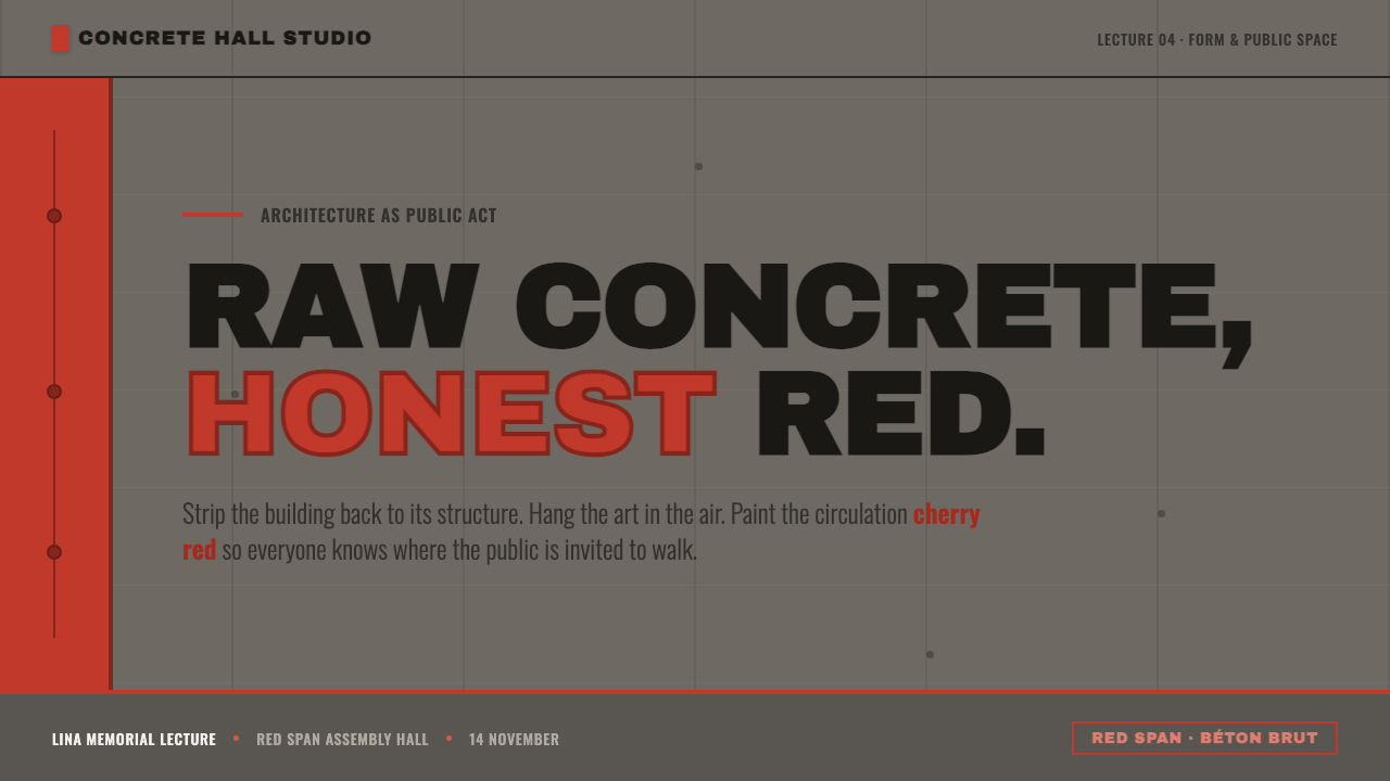
For presentation covers, begin with a concrete-gray field and a strong cherry-red beam or frame that appears to suspend, contain, or direct the title. Use heavy industrial grotesque type in uppercase so the cover reads as a constructed object. Content slides should keep gray responsible for mass and red responsible for connections, section markers, or movement. On data slides, red can identify the active measure while gray holds the supporting information, giving charts a structural rather than decorative presence.
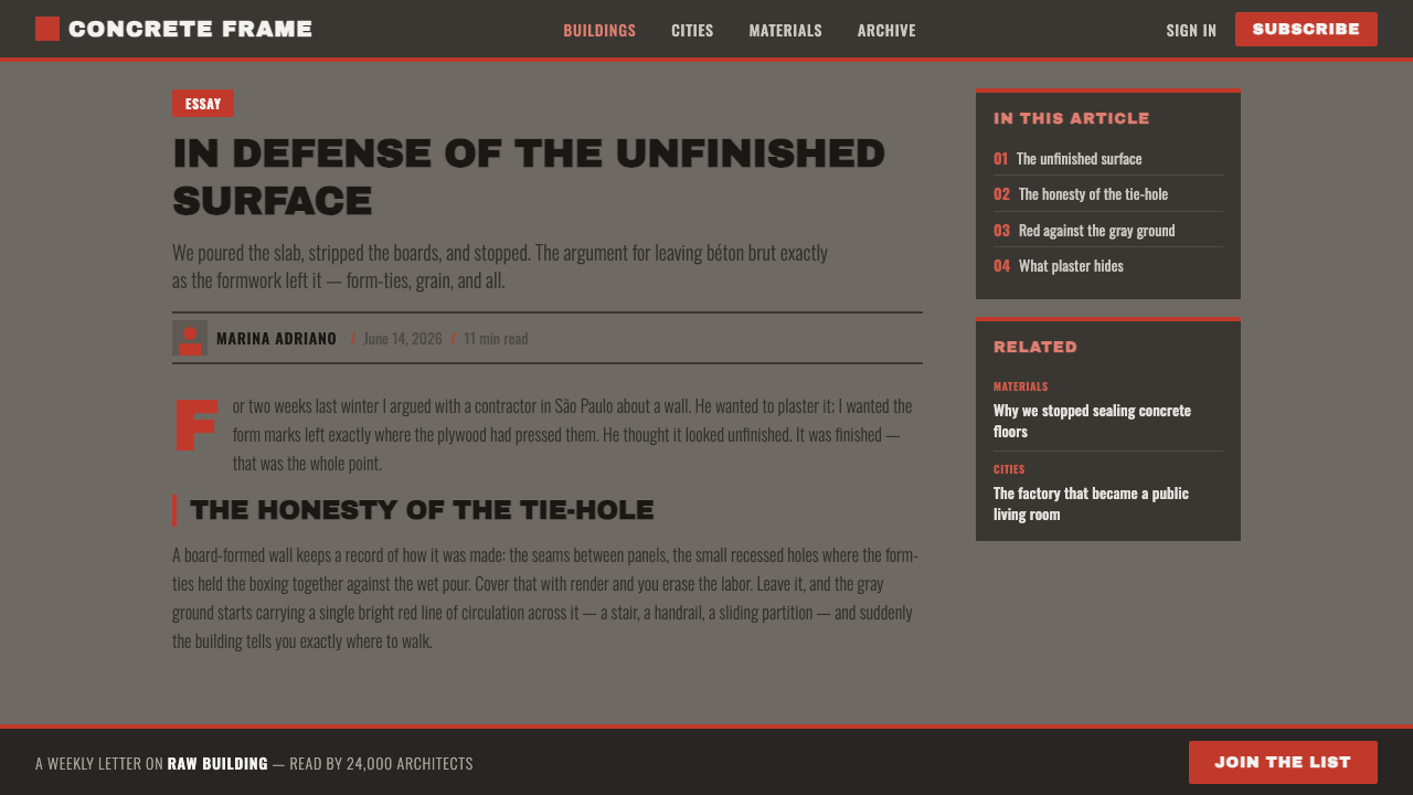
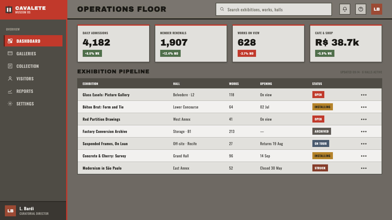
For web dashboards and pricing pages, the system works best when the interface feels assembled from matte masses and red structural signals. Use concrete gray for the main field and larger containers, heavy grotesque type for labels and headings, and cherry red for active routes, selected tiers, progress indicators, or decisive actions. Borders and dividers should feel like beams or rails. The overall interface should remain visibly light-grounded, because the contrast between gray mass and red structure is central to the style.
For editorial and marketing work, treat the page as a sequence of constructed planes. A concrete-gray article field can carry dense uppercase headings, while red bars or frames identify pull quotes, metadata, or transitions. Campaign pages can alternate between open gray space and concentrated red structural moments, using rough matte surfaces to give the message physical presence. The strongest compositions let red guide the reader through the page instead of distributing it evenly as decoration.
For brand systems, packaging, and promotional graphics, the style supports a direct industrial voice. Red can become the recognizable structural signature, while concrete gray gives the identity weight and continuity across applications. Use imagery or content blocks as if they were objects placed within a frame: held, suspended, crossed, or connected. This keeps the visual language related to MASP São Paulo and SESC Pompéia without copying their forms literally.
The common mistake is to treat the style as a red-and-gray color combination while ignoring construction. Overusing red turns structure into noise; smoothing away board-form marks removes the material argument; adding glossy surfaces or delicate type breaks the blunt industrial presence. Every accent should explain what holds, moves, frames, or connects. If it cannot, it is probably decoration rather than Lina Bo Bardi Concrete.
Lina Bo Bardi Concrete — FAQ
What distinguishes Lina Bo Bardi Concrete from generic Brutalism?
It shares Brutalism’s attention to raw concrete and visible construction, but it is more specific in its color and structural vocabulary. The defining relationship is not concrete alone: concrete gray carries mass while cherry red makes beams, frames, circulation, and partitions legible. The result is a focused system of gray weight and red movement.
Why is the red so important?
Red identifies structure rather than simply adding warmth or energy. It marks the elements that hold, connect, frame, or direct, creating a visible relationship between the page’s parts. When used selectively, it gives the gray field a sense of movement. When used everywhere, it loses that structural meaning.
Can this style work on a dark background?
It can be adapted, but the system is fundamentally light-grounded. Its strongest contrast comes from a mid-tone concrete-gray mass against a light field, with cherry red acting as the visible structure. A dark inversion can make the gray feel less substantial and cause the red to dominate too aggressively. If used, it should remain restrained and preserve a clear distinction between mass and structure.
Does rough concrete mean adding a concrete texture effect?
Not necessarily. The important quality is material honesty: a rough matte surface whose form marks appear to belong to the construction, not a decorative texture pasted onto a polished layout. If the medium cannot reproduce literal board-form marks, retain the broader qualities of weight, restraint, and visible making rather than imitating texture for its own sake.
Related design styles
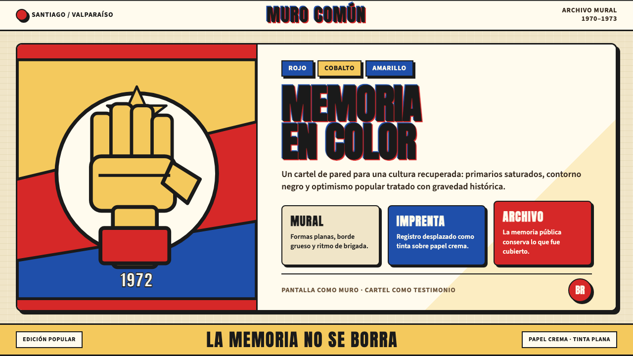 Chilean Allende-Era Propaganda (1972)Solemn revolution. Red, cobalt and yellow lock into thick black mural geometr…
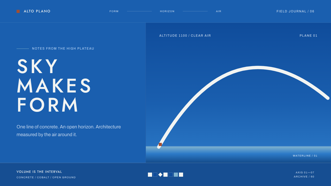 Niemeyer Brasília CurvesEmptiness makes the monument. Concrete-white arcs cut across a saturated coba…
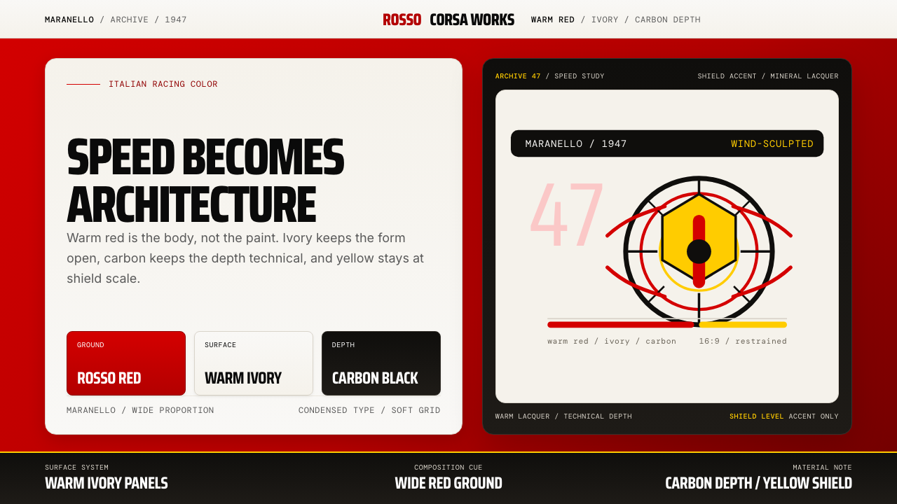 Ferrari Rosso Corsa (1947)Speed becomes architecture. Racing red, warm ivory, and carbon-black panels.
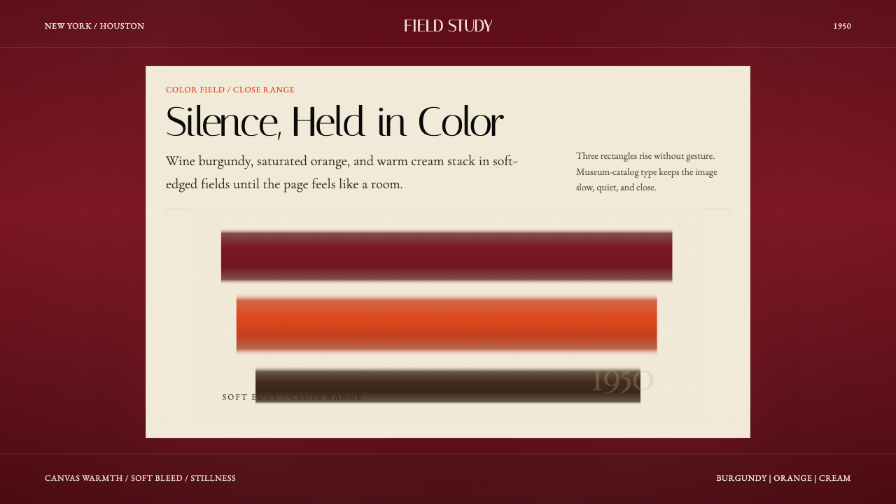 Mark Rothko Color Field (1950)Silence made visible. Burgundy, orange, and cream stack in soft-edged fields.
 Yugoslav Socialist ModernismGeometry on concrete. EXAT-51 circles and bars in hot orange and clean teal,…
 Amtrak Arrow (1971)Civic authority at speed. Deep navy, Helvetica lockups, and red-blue arrows.