What is Photogram Rayograph?
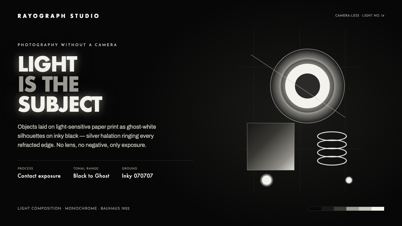
Photogram Rayograph turns the darkroom inside out: light becomes the subject, while ghost-white silhouettes and silver halation emerge from an inky field.
Photogram Rayograph in brief
Photogram Rayograph is a visual system derived from camera-less photography. In a photogram, objects are placed directly on light-sensitive paper and exposed to light. The resulting image is not a view through a lens but a record of contact, obstruction, transparency, and light spill. Fully exposed paper reads as dense black; areas protected by an object remain white; translucent objects settle into gray. The image feels at once scientific and uncanny because it shows an object’s light behavior rather than its familiar surface appearance.
The style takes its name from Man Ray’s rayographs and from the wider experimental language that linked Paris Dada, Surrealism, Bauhaus, and experimental abstraction. A rayograph is not illustration in the ordinary sense. It is an encounter between object and exposure: a glass edge blooms with halation, a solid shape blocks light cleanly, and a thin material allows a faint spectral trace to remain. The subject is therefore never only the object. It is the event of light moving around it.
As an interface language, Photogram Rayograph translates this darkroom logic into a dark, spacious composition. The ground is inky and nearly bottomless. Forms appear as crisp white or gray silhouettes, often geometric, with restrained silver glow around the edges where light seems to bend. It shares Bauhaus’s interest in balance and clear form, but replaces the poster’s flat primary-color assertion with the more atmospheric drama of exposure, absence, and luminous residue.
Where does Photogram Rayograph come from?
The photogram belongs to the early history of photography, but its importance in this visual system lies in the period from 1900 to 1950, when experimental artists treated light-sensitive paper as a medium in its own right. The central move was deceptively simple: remove the camera. Without perspective, lens distortion, or a photographed scene, an object becomes a silhouette, a mask, or a translucent filter. The result shifts attention from depiction to process, making exposure visible as a compositional force.
In Paris, Dada and Surrealism supplied a receptive context for images that could make ordinary things strange. Man Ray’s rayographs, first associated here with 1922, gave the camera-less image a memorable name and an unmistakably avant-garde identity. Their appeal lies in their refusal to behave like conventional photographs. Familiar objects lose scale, texture, and stable setting; they become white presences, dark voids, and accidental-looking bursts of light. That ambiguity made the medium compatible with experimental abstraction as well as with Surrealism’s interest in surprise and altered perception.
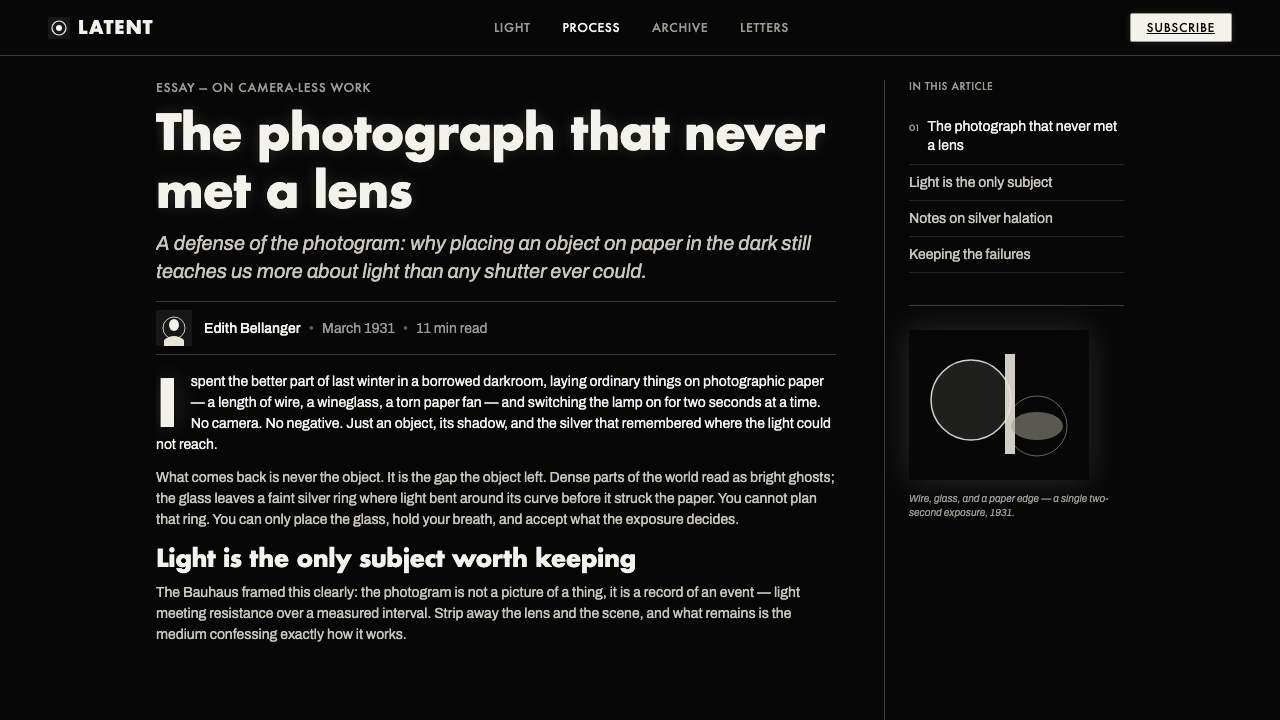
At the Bauhaus, László Moholy-Nagy framed the photogram as a pure composition of light. This emphasis changed how the technique could be understood. Rather than treating the image merely as a darkroom novelty, it positioned light, transparency, density, and geometric arrangement as the actual material of design. A solid object could establish a hard silhouette; glass could scatter a luminous edge; overlapping objects could create a hierarchy of whites and grays. The picture became a constructed field rather than a captured scene.
Photogram Rayograph draws from this shared territory without pretending that Dada, Surrealism, Bauhaus, and experimental abstraction were identical. Dada contributes the disruption of ordinary recognition. Surrealism contributes the uncanny charge of displaced objects. Bauhaus contributes compositional discipline and geometric balance. Experimental abstraction contributes permission to let light itself, rather than a represented subject, carry the image. The contemporary system preserves that tension: it is atmospheric, but never formless; it is dark, but organized by precise silhouettes and deliberate negative space.
What defines the Photogram Rayograph look?
Inky Ground
The background should feel like exposed darkroom paper: dense, quiet, and visually deep rather than merely dark. It functions as active negative space, allowing every pale silhouette to register as an event. The ground should remain broad and uninterrupted, so the composition feels suspended in darkness instead of enclosed inside a decorative frame.
Ghost Silhouette
Forms appear as white or pale gray masks rather than fully rendered objects. Their power comes from omission: texture, local color, and ordinary perspective recede, leaving contour, overlap, and relative opacity to do the communicative work. Geometric silhouettes are especially effective because their edges remain legible even when the composition becomes sparse.
Gray Transparency
Gray is not a neutral filler. It represents partial transmission of light and should be used to distinguish transparent, thin, or secondary forms from fully masked white ones. Layered gray silhouettes create depth without conventional perspective, preserving the feeling that the interface is made by exposure rather than by shaded illustration.
Silver Halation
A restrained silver glow belongs at selected edges where light seems to bend around glass or a sharply separated object. It should read as optical residue, not as a generic luminous effect. The glow is most convincing when it clarifies the relationship between a silhouette and the black field, then fades before it becomes ornament.
Geometric Balance
The system benefits from Bauhaus-like compositional balance: circles, bars, rectangles, and other direct forms are placed with intention across a field of darkness. Balance need not be symmetrical. A single bright disc may counter a column of text, while a long pale rule can stabilize a floating cluster. Geometry gives the dark atmosphere its discipline.
Exposure, Not Texture
The image should feel produced by light meeting material, not by applying decorative surface treatments. Avoid elaborate simulated grain, naturalistic modeling, or busy photographic scenery. A clean white mask, a gray translucent overlap, and a narrow edge of halation are sufficient to imply material behavior while keeping the composition abstract and controlled.
Who shaped Photogram Rayograph?
Man Ray gave camera-less images a distinctive avant-garde identity through the name rayograph. In the Photogram Rayograph lineage, his importance is not simply authorship but the proposition that a familiar object can become strange when reduced to a light-made trace. His rayographs make absence, surprise, and optical accident feel like compositional assets.
Moholy-Nagy framed the photogram as pure light composition. That formulation is essential to the system because it moves attention away from photographed subject matter and toward density, transparency, silhouette, and spatial balance. His Bauhaus-oriented reading turns the darkroom image into a disciplined design exercise rather than an effect.
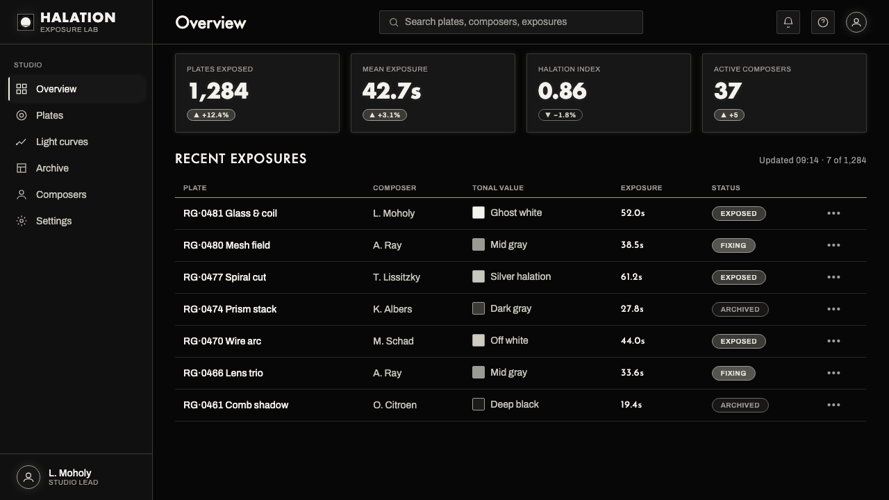
The photogram itself is the system’s operative figure: a camera-less image made through direct contact between object, light, and sensitive paper. Its visual logic provides the interface grammar. Black indicates exposure, white indicates masking, gray indicates partial transmission, and halation marks light’s behavior at an edge.
How do you use Photogram Rayograph today?
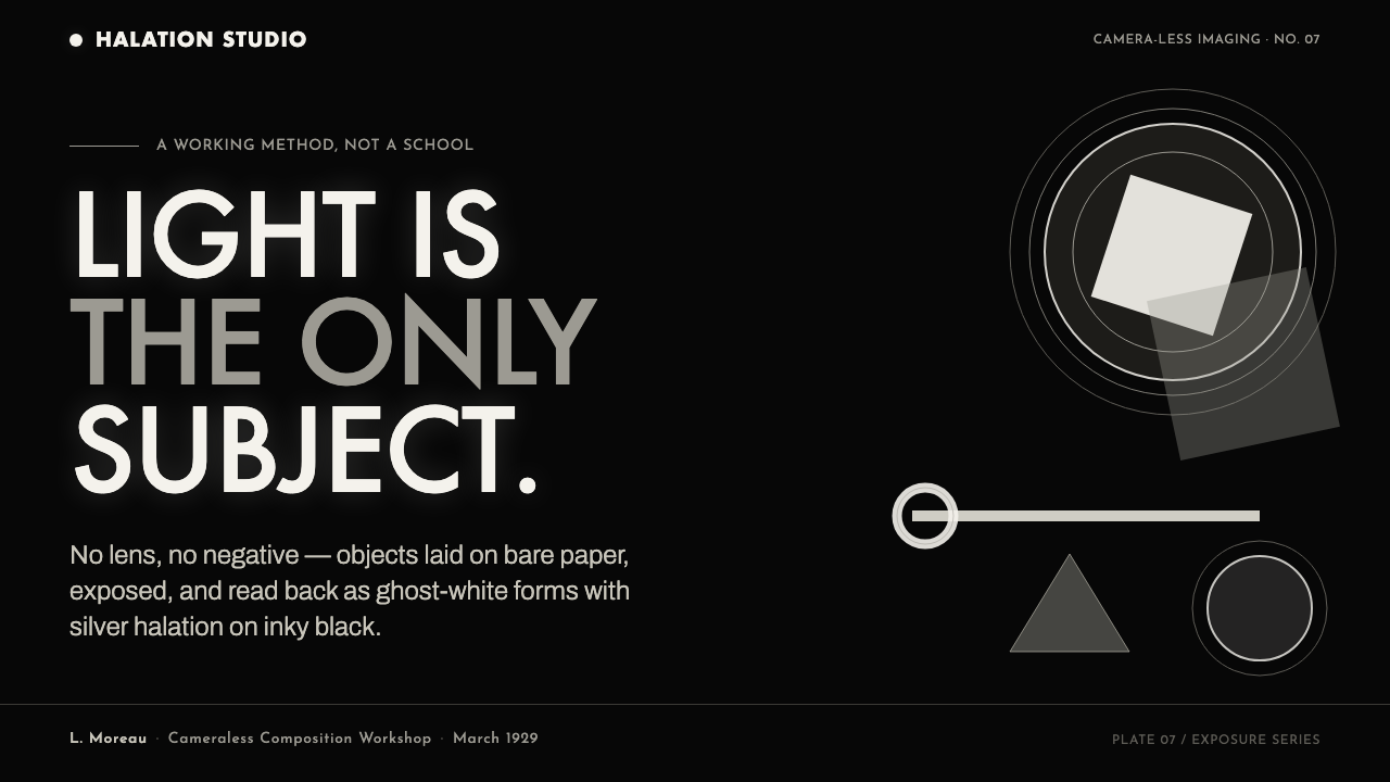
For presentation slides, use the style to make the cover feel like an opening exposure. Let one oversized white silhouette or a small group of translucent geometric forms occupy a generous black field, then place the title with calm, high-contrast restraint. Avoid filling the cover with explanatory imagery. The point is to establish a visual condition of darkness, light, and suspended form before the content begins.
Content slides should use the black ground as a spacing system. Set pale text in a clear hierarchy, keep supporting labels gray, and use fine luminous rules or small silhouettes to anchor sections without enclosing them. On data slides, convert charts into a limited family of pale bars, discs, lines, and translucent overlays. The chart should read less like a conventional dashboard widget and more like a measured exposure: primary values bright, secondary values muted, and contextual information receding into gray.
For web interfaces, Photogram Rayograph is particularly suited to dashboards, analytical tools, portfolio surfaces, and pricing pages that benefit from focus and theatrical contrast. A dashboard can use bright data states against a deep field, with gray layers for secondary context and halation reserved for selected focus states. On pricing pages, tiers should appear as separated light objects rather than soft consumer cards; contrast and negative space can make differences legible without relying on dense decoration.
In editorial and marketing work, the style supports campaigns about experimentation, light, material, technology, photography, culture, or nocturnal events. An article page can pair a dark reading surface with a large ghostly motif that changes position between sections, while pull quotes and metadata sit like exposed fragments at the perimeter. A marketing page can alternate broad dark fields with isolated luminous statements, allowing the copy to feel discovered rather than continuously broadcast.
The most common mistake is to treat Photogram Rayograph as dark mode plus glow. That loses the source logic. Generic neon, crowded gradients, glossy panels, and decorative particles create an unrelated futuristic mood. The system works only when every pale form can plausibly be read as a mask, a translucent overlap, or a halo produced by light. Keep the number of visual events low, reserve bright edges for meaningful relationships, and let the black field remain visibly present.
Photogram Rayograph — FAQ
Is Photogram Rayograph simply a dark version of Bauhaus?
No. It borrows Bauhaus’s concern for geometric balance and disciplined composition, but its central logic comes from camera-less photography. Bauhaus treats form and layout as direct structural decisions; Photogram Rayograph adds exposure, masking, transparency, and halation as image-making principles. The result should feel optical and darkroom-derived, not merely geometric on a black background.
Can this style use photography?
It can, but conventional photography should not dominate the composition. The strongest use is to abstract or isolate the image until it behaves like a photogram: reduce it to a silhouette, emphasize a high-contrast contour, use transparency as a layer, or let a light edge carry the focal role. A naturalistic scene with many local details weakens the system’s camera-less premise.
How should silver halation be used without becoming decorative?
Treat halation as evidence of light behavior. Put it where a transparent object, a sharp silhouette, or an overlap needs separation from the black ground. Keep it selective and subordinate to the form it describes. If every card, label, icon, and border glows equally, halation stops explaining an edge and becomes visual noise.
Where does the style struggle?
It struggles where warmth, casual familiarity, or dense everyday information is the primary requirement. A broad inky field and sparse luminous forms create concentration, but they can also make transactional content feel remote or severe. Products that depend on abundant product imagery, playful tactility, or a bright domestic mood may need a different visual language, or a much lighter use of the photogram vocabulary.
Related design styles
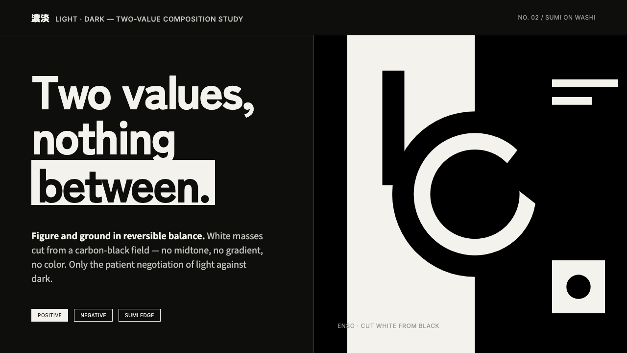 Notan Light-DarkTwo values, nothing between. White masses cut from a carbon-black field, figu…
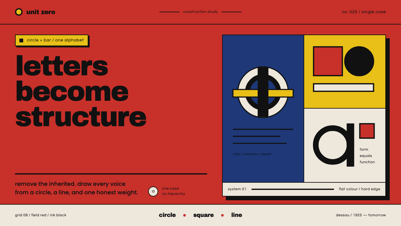 Bayer Universal BauhausLetters become structure. Bauhaus red, primary blocks, and black circle-bar f…
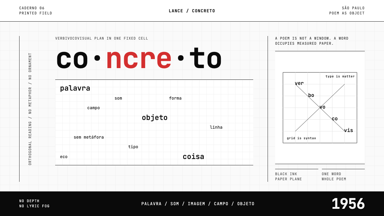 Brazilian Concrete PoetryWords become objects. Monospace cells, black-white paper, one cadmium red rup…
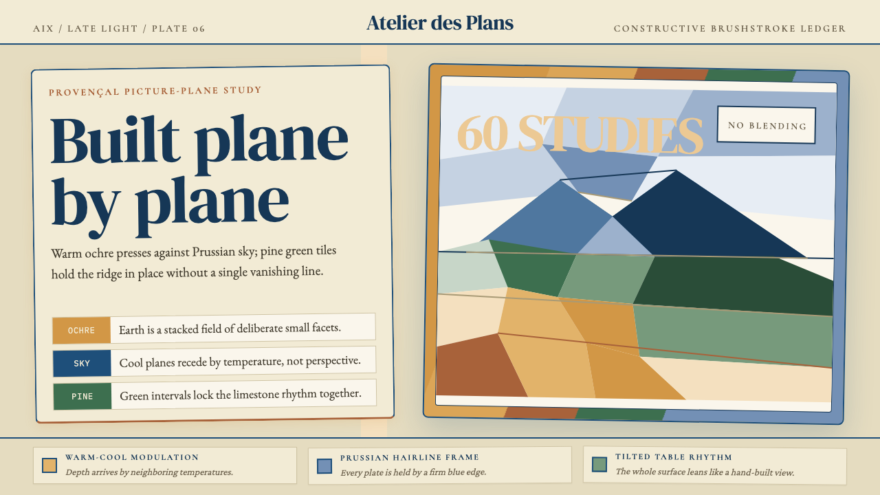 Cézanne — Mont Sainte-VictoireBuilt, not blended. Ochre, Prussian blue, and pine facets tilt into a constru…
 Gill Sans (BBC, 1928)Quiet authority, clearly set. Warm cream, black humanist sans, and hairline o…
 Maldon Sea Salt PyramidCold mineral luxury. Salt-white facets on blue-grey ground, struck once with…