What is Maldon Sea Salt Pyramid?
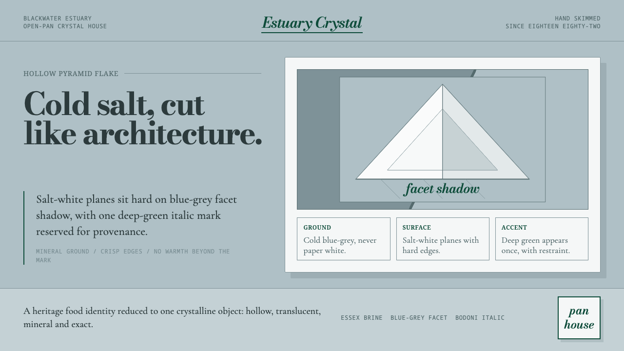
Maldon Sea Salt Pyramid turns a hand-drawn crystal into a complete visual language—cold blue-grey ground, salt-white facets, and a single deep-green mark held with mineral restraint.
Maldon Sea Salt Pyramid in brief
Maldon Sea Salt Pyramid is a heritage food identity built from the character of the salt itself. Its visual world is cold, mineral, and precise: a pale blue-grey ground recalls the shadow within a translucent crystal, while salt-white planes sit sharply above it. The result feels luxurious without becoming decorative, because every decision comes from the physical nature of the product.
The central form is the hollow pyramid flake produced by hand crystallisation in open pans. Its four-sided geometry supplies the system’s basic vocabulary: facets, wedges, angled planes, and crisp intersections. Nothing needs to imitate the crystal with soft realism. The identity works by translating its structure into flat, hard-edged relationships.
Color is deliberately narrow. The dominant relationship is between salt white and cool blue-grey, with deep green reserved for the italic wordmark or a necessary point of emphasis. The green must never drift toward navy or cyan. It should arrive as a decisive mineral stroke, not as a second atmosphere competing with the crystal.

Where does Maldon Sea Salt Pyramid come from?
The identity begins in Maldon, Essex, England, during the Maldon Crystal Salt Company heritage era of 1900–1950. Its regional character is not treated as a decorative story added after the fact. Maldon and the Blackwater estuary provide the geographic and material foundation of the system, giving the design a sense of place before any graphic treatment is introduced.
Maldon sea salt is drawn by hand from the Blackwater estuary and crystallised in open pans. That process matters visually because it produces a specific object rather than an abstract promise of purity: the signature hollow pyramid flake, a translucent four-sided crystal whose clean facets catch a cool blue-grey shade. The system takes this flake as its whole logic.
The heritage belongs to both the Maldon Crystal Salt Company and the traditional pan-house crystallisers who preserve the character of the process. Their presence suggests a form of British heritage food branding grounded in craft, continuity, and material evidence. The identity therefore avoids the theatrical language of luxury packaging and chooses a quieter authority: the product looks valuable because its structure is clear.
The resulting movement is a crisp geometric crystal identity. It does not treat geometry as an arbitrary modernist overlay; geometry is already present in the salt flake. The role of design is to remove competing signals, keep the ground cool and pale, place the salt-white facets with confidence, and allow the deep-green wordmark to appear only where recognition requires it.
What defines the Maldon Sea Salt Pyramid look?
Mineral Palette
The palette is led by salt white and a cool pale blue-grey that behaves like a facet shadow rather than a neutral background. Deep green is the only strong chromatic accent, and it belongs to the wordmark or a tightly controlled point of emphasis. Navy and cyan are excluded because they shift the identity toward nautical or technological associations.
Facet Geometry
The hollow pyramid flake supplies the system’s geometry. Angled planes, wedges, and sharp intersections should feel structural rather than illustrative. Forms can overlap or open into one another, but their edges must remain legible. The crystal is understood through its facets, not through a polished rendering of its surface.
Hard Edges
Edges are crisp and decisive, echoing the clean facets of the flake. Soft blur, atmospheric fading, and decorative gloss weaken the material logic. A plane should read as a plane, and a shadow should suggest the cool turn of a crystal facet rather than a simulated light effect.
Italic Wordmark
The deep-green italic wordmark is the identity’s human stroke within an otherwise mineral system. Its slant introduces movement without breaking the disciplined palette. It should land where recognition is required, with enough surrounding quiet to remain distinct. Repeating it as decoration would turn a signature into noise.
Cold Luxury
The luxury is expressed through restraint, clarity, and the confidence of the material reference. Nothing needs ornate framing or warm embellishment. The pale ground, salt-white facets, and controlled green accent create a refined atmosphere that feels precious because it is exact, not because it is excessive.

Who shaped Maldon Sea Salt Pyramid?
The Maldon Crystal Salt Company provides the heritage frame for the identity, associated with the 1900–1950 era in Maldon, Essex. Its role in the system is not represented through ornamental nostalgia, but through a visual language that makes continuity, locality, and material character immediately legible.
The traditional pan-house crystallisers represent the human craft inside the product story. Their work connects hand-drawn salt and open-pan crystallisation to the finished hollow pyramid flake, giving the identity a reason to be precise rather than merely an aesthetic preference.
The signature hollow pyramid flake is the system’s central figure: a translucent four-sided crystal with clean facets and a cool blue-grey shade. It functions simultaneously as product, symbol, geometry, and source of atmosphere.
How do you use Maldon Sea Salt Pyramid today?
For presentation slides, use the crystal logic to divide roles across cover, content, and data pages. A cover can place a large salt-white facet against the blue-grey ground, leaving the deep-green italic wordmark as the only assertive mark. Content slides should rely on quiet planes, strong alignment, and short blocks of text. Data slides can treat charts, labels, and highlights as crystal facets: pale structure first, green emphasis only where the audience needs direction.
For web interfaces, the system suits dashboards and pricing pages that need to feel precise, premium, and materially grounded. Keep the main surface light and cool, use salt white for cards or elevated information planes, and reserve deep green for actions, selected states, or the most important price distinction. Borders should feel clean and firm. Avoid adding maritime blue, glowing effects, or soft atmospheric depth that would pull the interface away from the salt flake.
For editorial and marketing work, the identity supports a calm but distinctive rhythm. Product stories can alternate blue-grey fields with salt-white crystal forms, while the deep-green wordmark acts as a recurring signature rather than a repeated pattern. Photography or illustration should support the same cold mineral reading: clear planes, cool shadow, and restrained composition. Marketing copy benefits from generous quiet around the product, allowing craft and origin to carry the sense of value.
The common mistake is to confuse a mineral identity with a generic coastal identity. Adding navy, cyan, rope textures, wave motifs, glossy gradients, or abundant green would replace the precise crystal logic with familiar maritime decoration. Another mistake is to draw the pyramid flake as a soft jewel or treat every facet as a separate ornament. The system is strongest when the source remains simple: cool ground, salt-white planes, hard edges, and deep green used only with purpose.

Maldon Sea Salt Pyramid — FAQ
Is Maldon Sea Salt Pyramid a coastal or nautical style?
It begins with sea salt and the Blackwater estuary, but its visual language is mineral rather than nautical. The identity does not depend on navy, cyan, waves, rope, or maritime ornament. Its defining relationship is between a cool blue-grey facet shadow, salt-white planes, and a controlled deep-green wordmark.
Can the system work on a dark background?
The approved direction is light and pale because the system is built around salt white and a cool blue-grey ground. A dark interpretation would weaken the relationship between the crystal and its facet shadow, and could make the deep green feel heavier than intended. If used at all, a dark surface should remain exceptional rather than becoming the default.
How should the pyramid flake be represented?
Represent it through clean facets, angled planes, and the suggestion of a hollow four-sided crystal. The form should feel translucent and cool without becoming glossy or photorealistic. Its edges carry more meaning than surface decoration. A restrained geometric translation will usually feel more faithful than a detailed jewel-like rendering.
Why is the deep green used so sparingly?
The deep green is the identity’s decisive signature, not a secondary background color. Its scarcity gives the italic wordmark authority and keeps the main relationship focused on salt white and blue-grey. If green spreads across every panel, label, or interaction, it stops behaving like a signature and begins to compete with the crystal logic.
Related design styles
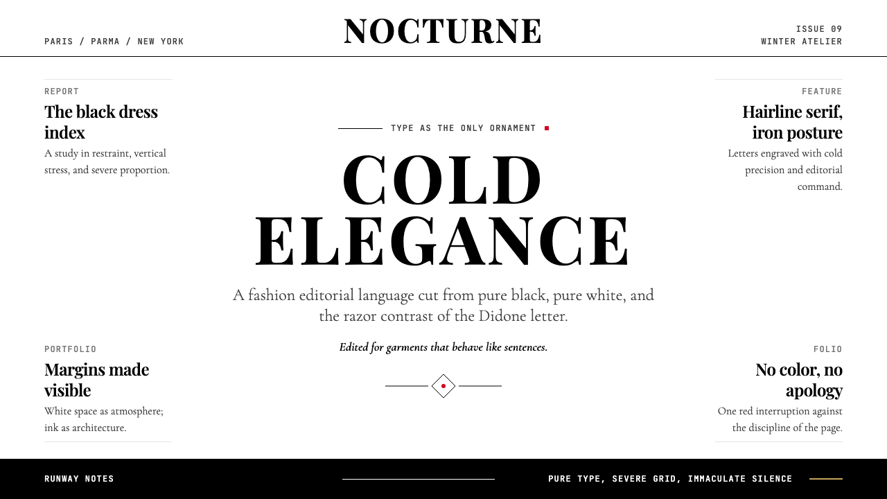 Vogue DidoneCold authority. Black-on-white Didone, red accent, and vast editorial whitesp…
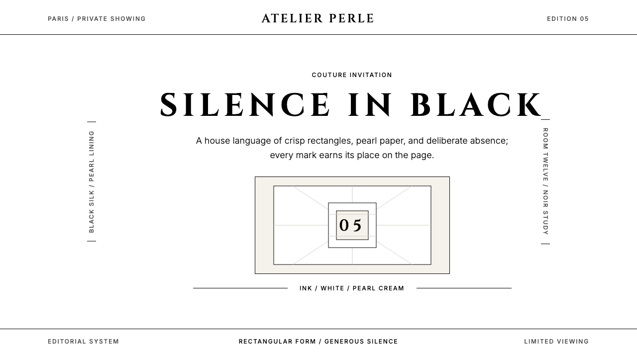 ChanelLuxury needs no color. Black on white, pearl-cream warmth, geometric capitals…
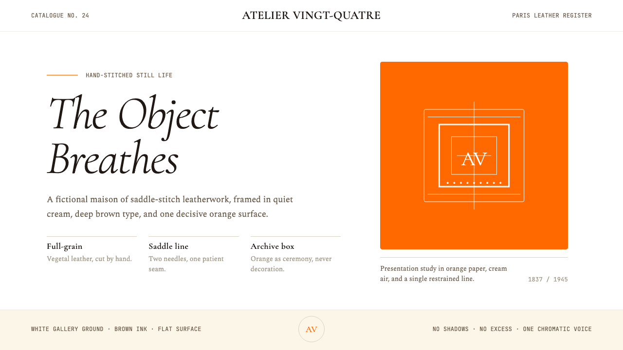 HermèsTwo centuries of restraint in orange. Brown serif on cream, gallery-quiet, ne…
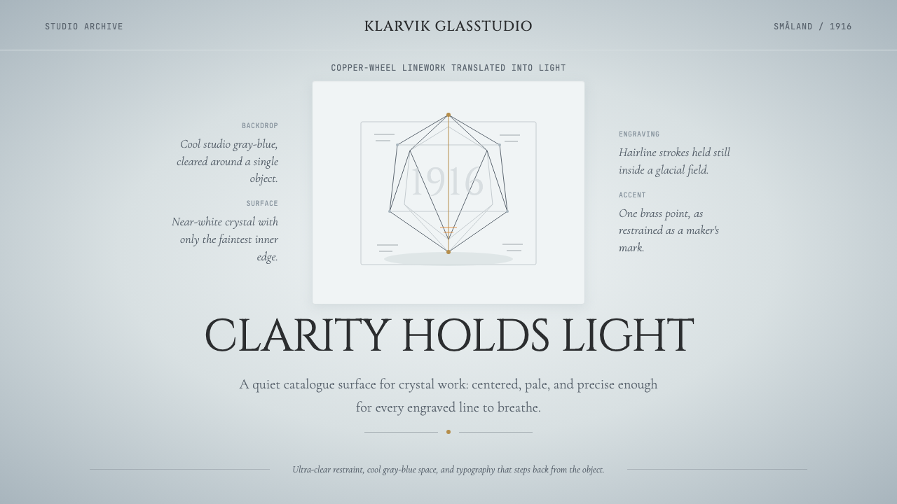 Swedish Orrefors Crystal (1916)Quiet luxury in glass. Gray-blue space, Cinzel capitals, and brass hairlines…
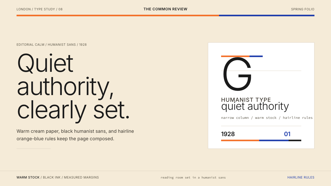 Gill Sans (BBC, 1928)Quiet authority, clearly set. Warm cream, black humanist sans, and hairline o…
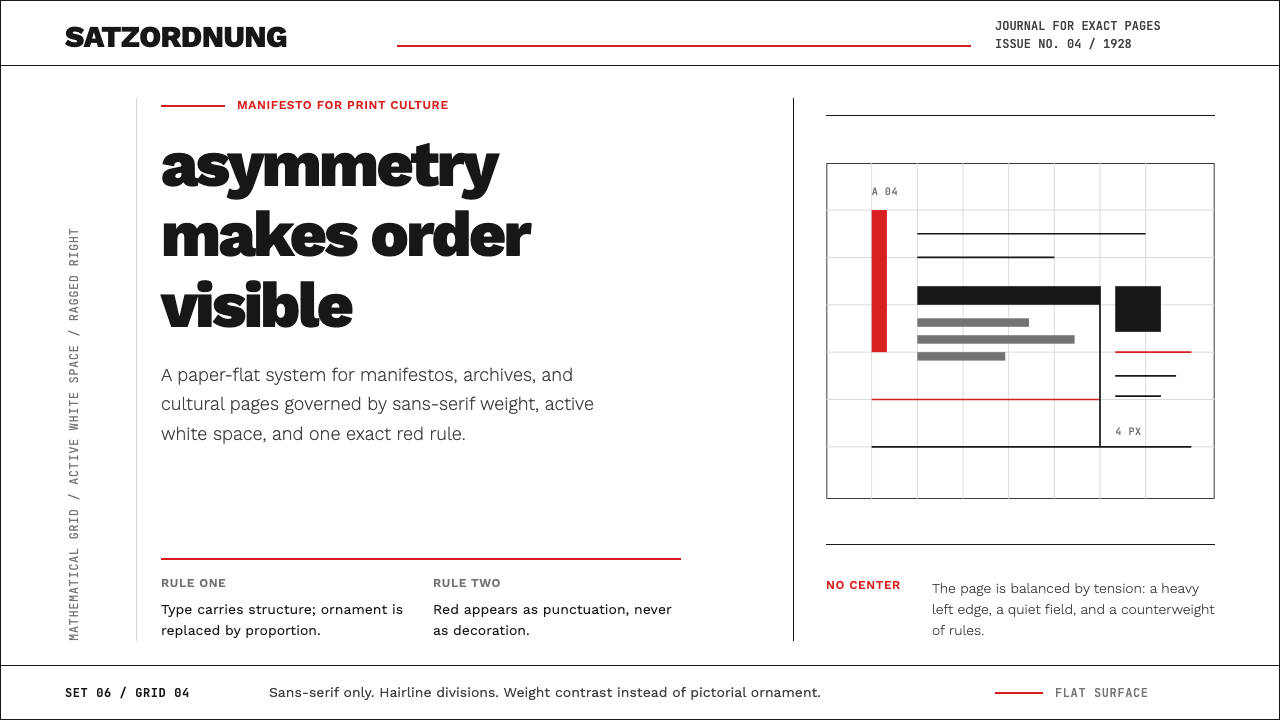 New Typography (Tschichold 1928)Tschichold's 1928 doctrine in CSS. Asymmetric grid, hairline rules, red-and-b…