What is Swedish Orrefors Crystal (1916)?
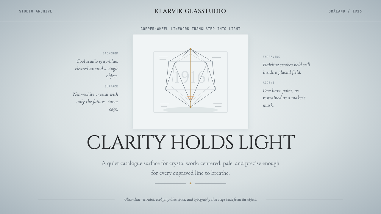
Orrefors turned the ancient craft of glass engraving into a modern design language of light, silence, and hairline precision.
Swedish Orrefors Crystal (1916) in brief
Swedish Orrefors Crystal (1916) is a design aesthetic rooted in the artistic program of the Orrefors Glasbruk, a glassworks founded in 1898 in the Småland province of southern Sweden. When the company hired painters Simon Gate and Edward Hald in 1916, it transformed from a utilitarian bottle factory into one of the defining studios of twentieth-century decorative art. The visual language that emerged — cool gray-blue grounds, abundant negative space, hairline engraving on ultra-clear glass, and typography that defers entirely to the object it frames — became synonymous with what the world calls Swedish Grace.
At its core, the Orrefors aesthetic is an act of subtraction. The surface of the glass is not covered but revealed: copper-wheel engraving cuts fine figurative or abstract lines into the material, allowing light to fracture and scatter through the incisions. The surrounding clear glass does nothing except hold and transmit that light. Every compositional decision serves this central event. Backgrounds in the Orrefors photographic archive — the cool gray-blue studio backdrops that document the pieces — are not neutral; they are chosen so that the glass itself becomes the only warm, luminous presence in the frame.
The design system that derives from this tradition draws on studio-photography conventions as much as on the glasswork itself. Generous negative space, centered and often symmetrical layouts, a palette ranging from glacial white through silvery gray to deep slate blue, and typographic restraint that lets the material object speak — these are the visual constants. It is a style that rewards patience: the more space given to a single object or idea, the more weight that object accrues.
Where does Swedish Orrefors Crystal (1916) come from?
The Orrefors Glasbruk was established in 1898 in the village of Orrefors, set deep in Småland — a region of dense pine forests and small lakes that has been the heartland of Swedish glassmaking for centuries, earning it the name Glasriket, the Kingdom of Crystal. For its first two decades the factory produced everyday domestic glass: ink bottles, medicine containers, window panes. The materials and skills were present, but no coherent artistic direction existed.
Everything changed in 1916 when the factory's owner, Johan Ekman, hired two Swedish painters — Simon Gate and Edward Hald — to work alongside the master glassblowers. Gate had trained in Stockholm and Paris; Hald had studied under Henri Matisse. Neither had ever worked with glass. The combination proved transformative. Gate brought a classical figurative sensibility and a love of mythological and allegorical imagery; Hald brought a lighter, more modernist approach with influences from French decorative art and Japanese graphic clarity. Together with master engraver Knut Bergqvist, they developed the Graal technique in 1916: a method of encasing colored glass layers inside clear crystal, then engraving through the outer layers to reveal the color beneath — producing images of extraordinary depth trapped inside solid glass.
The 1925 Exposition Internationale des Arts Décoratifs et Industriels Modernes in Paris was the pivotal moment for the Orrefors reputation. The glassworks sent a collection of Graal vessels and engraved crystal that stopped international audiences and critics. Orrefors won the Grand Prix, and Sweden's national design identity — quiet, refined, democratic in its belief that everyday objects deserved to be beautiful — gained global recognition as a distinct contribution to modern design. This was the full flowering of Swedish Grace, a movement that had emerged in the early 1920s as a Nordic interpretation of Art Deco, trading that movement's exuberance for a cooler, more archaeological restraint.
Subsequent decades added technical innovations that extended the visual vocabulary. The Ariel technique, developed by Edvin Öhrström and Vicke Lindstrand in 1937, trapped air bubbles in controlled patterns inside the glass — producing geometric or figurative shadow-forms visible only as the piece was turned in light. Sven Palmqvist's Ravenna and Fuga techniques in the 1950s allowed for more systematic pattern-making within the glass body. Gunnar Cyrén introduced a more graphic, color-forward approach in the 1960s that acknowledged Pop Art without abandoning the studio's commitment to craftsmanship. Through all these evolutions, the underlying design constants remained: the object as the protagonist, light as the medium, and restraint as the governing discipline.
What defines the Swedish Orrefors Crystal (1916) look?
Palette
The Orrefors color world ranges from pure crystalline white through cool silver-gray to the particular gray-blue that dominates studio photography of the glassware. This is not a warm palette: no amber, no ochre, no warmth borrowed from earth tones. The blue-gray is approximately the color of overcast Nordic winter light — diffuse, even, without shadow or highlight. Against this field, the glass itself provides all the warmth and variation, as light refracts through the material. Accent color, when it appears in the Graal technique, is typically a single jewel tone — deep cobalt, smoky amber, or soft moss green — never a full palette.
Negative Space
Space is used as generously as material. In the Orrefors photographic tradition, a single piece occupies perhaps a third of the frame; the remainder is cool backdrop, uninterrupted. This is not emptiness but pressure — the space pushes inward, intensifying the presence of the object at its center. In layouts derived from this aesthetic, margins are wide to the point of seeming extravagant, and the default instinct is always to remove rather than add. What feels like too much space at first usually proves, on reflection, to be exactly enough.
Line and Engraving Logic
The dominant mark-making in Orrefors work is the hairline: fine, precise, and cut rather than drawn. Copper-wheel engraving produces lines of consistent width and depth, without the expressive variation of a brushstroke. In design terms, this translates to a preference for rules, borders, and dividers that are thin to the point of fragility — lines that separate zones without announcing themselves. The same logic governs table rules, caption separators, and any structural geometry in layouts that draw on this tradition.
Symmetry and Centering
Unlike the asymmetric dynamism of Bauhaus or the mathematical grid of Swiss Style, the Orrefors aesthetic is fundamentally centered and often symmetrical. This reflects both the nature of glassblowing — a rotary process that naturally produces radially symmetric forms — and the Swedish Grace movement's debt to classical European composition. In layouts, centered type on a light ground, with generous vertical spacing between headline and body, reads as confident quietness rather than indecision. Symmetry here is not timidity; it is ceremony.
Typography as Deference
In the Orrefors studio tradition, the typeface used to label a piece is always secondary: spaced-out, small-capped letterforms in classical roman proportions, set far below the object itself, nearly whispering. Typography in this system earns its place by stepping back. Display type is restrained in size rather than bold in weight; the goal is a letterform that marks without competing. This deference is the opposite of typographic expressionism — it is typography as caption, as witness, as signature.
Light as Material
More than any other quality, the Orrefors tradition treats light as a primary design element — not ambient illumination but structured, directional light that activates the object. In photography of the glass, light is raked from the side or slightly above, so that engraved lines catch and hold it differently from the surrounding surface. In digital and print work derived from this aesthetic, the equivalent is the careful management of luminosity: lighter backgrounds at center graduated to slightly darker values at the edges, surface treatments that suggest translucency rather than opacity, and a general preference for the soft luster of glass over the hard sheen of metal.
Restraint as Confidence
The Orrefors aesthetic makes a consistent argument: that less is not minimalism but mastery. A piece that shows a single engraved figure on clear glass demands that the figure be perfect, because there is nothing else to look at. This same discipline applied to design layouts means that every element must earn its place through necessity rather than decoration. What makes the style difficult to imitate is not its visual vocabulary — which is sparse — but the confidence required to leave space genuinely empty, to resist the impulse to fill, and to trust the viewer to meet the work halfway.

Who shaped Swedish Orrefors Crystal (1916)?
Gate was the first artist hired by Orrefors in 1916, and the most classically inclined of the studio's masters. His Graal vessels drew on ancient Greek and Roman mythological imagery — nymphs, athletes, hunting scenes — rendered with a precision that honored the figurative painting tradition while translating it entirely into the logic of engraved glass. Gate's work was central to Orrefors' triumph at the 1925 Paris Exposition, and his compositions established the template of a single luminous figure against a cool, uncluttered ground that became the studio's defining visual signature.
Hald joined Orrefors the same year as Gate but brought a contrasting sensibility: lighter, more graphic, and more willing to absorb contemporary influences including Matisse's decorative flatness and Japanese compositional principles. His celebrated Fish Graal of 1917 — a vessel in which stylized fish swim through a sea of green glass sealed inside clear crystal — showed that the Graal technique could accommodate modernist abstraction as naturally as classical figuration. Hald eventually became managing director of Orrefors, shaping the studio's direction through the middle decades of the century.
Lindstrand worked at Orrefors from 1928 to 1950 and was among the most technically adventurous of the studio's designers. He collaborated with Edvin Öhrström in developing the Ariel technique in 1937 — a process in which air bubbles are trapped in precise geometric or figurative patterns inside the glass mass, visible only as the piece is rotated in light. Ariel represented a fundamental shift from surface engraving to interior composition, opening a new spatial dimension within the glass object itself and demonstrating that the Orrefors visual language was not a fixed formula but a living experimental discipline.
Palmqvist joined Orrefors in 1928 and spent most of his career developing systematic approaches to pattern within glass. His Ravenna technique, developed in the 1940s and 1950s, produced mosaic-like grids of colored glass embedded in crystal, achieving a regularity and repeatability unprecedented in studio glasswork. His Fuga bowls used centrifugal casting to create precise radial patterns. Palmqvist's contribution was to bring an almost engineering-like rigor to the decorative program — demonstrating that the Orrefors commitment to precision could encompass geometric abstraction as fully as figurative imagery.
Cyrén joined Orrefors in 1959 and introduced a more graphic and color-confident approach that acknowledged the design shifts of the 1960s without abandoning the studio's craftsman foundations. His Pop series of the 1960s brought bright, flat color fields into dialogue with traditional crystal forms, demonstrating that the Orrefors visual tradition was supple enough to absorb the graphic intensity of that decade while retaining its characteristic clarity and precision. Cyrén remained at the studio for decades and helped define its identity through the latter half of the twentieth century.
How do you use Swedish Orrefors Crystal (1916) today?
The Orrefors aesthetic is one of the few historical design languages that translates convincingly to premium digital and print contexts without requiring literal glasswork imagery. Its core disciplines — generous negative space, centered or near-centered composition, a cool and limited palette, typography that defers to content — produce layouts that read as confident and refined rather than sparse or cold, provided the underlying content is substantial enough to justify the space given to it.
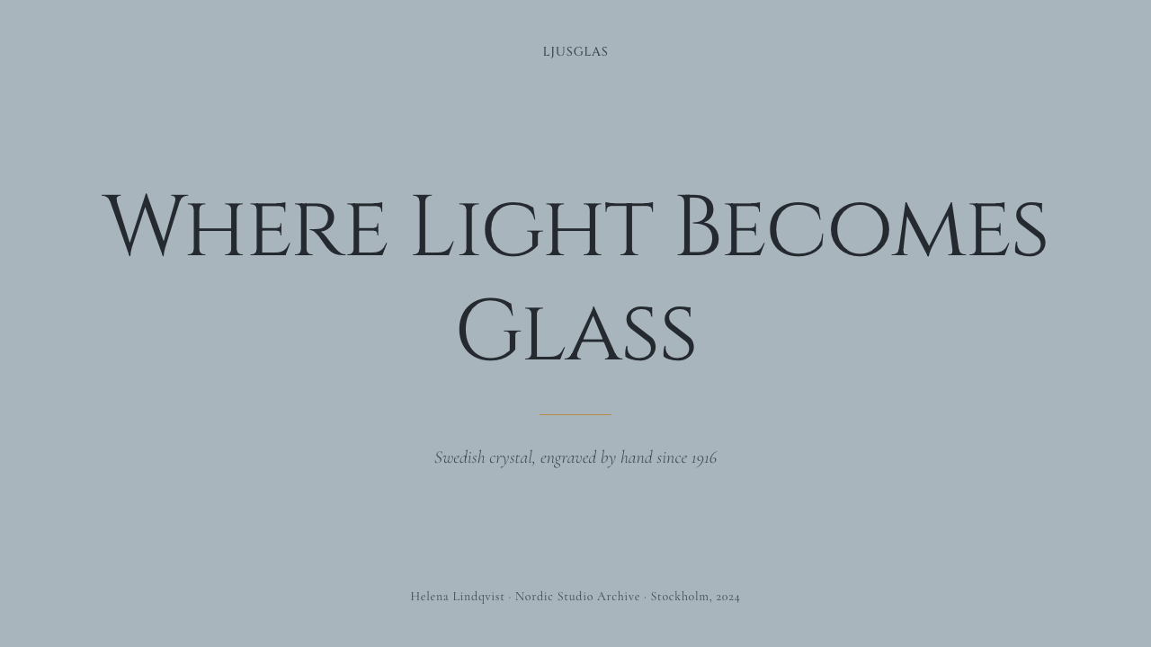
For presentation slides, the style works most naturally as a single-subject-per-slide discipline. Cover slides benefit from a single image or typographic element centered on a gray-blue or off-white ground, with the title set in spaced small capitals or a refined serif, placed well below center to let the visual element breathe above it. Content slides should follow the same restraint: one principal idea per slide, with supporting points reduced to their shortest useful form. Data slides adopt the same spare geometry — clean column charts on a light ground with a single accent color drawn from the Orrefors palette of deep blue or cool gray-green, axis lines rendered as hairlines, no grid fills.
For web interfaces and dashboards, the Orrefors approach rewards products that have genuine depth of content — platforms where the design must signal craft and trustworthiness without overselling. Backgrounds should be near-white with a cool gray-blue tint rather than pure white; card components are best treated as objects in space, with a very subtle elevation shadow rather than a border, and generous internal padding. Navigation is typographic: set in evenly spaced, lightly weighted letterforms with ample clearance. The system is less well-suited to dense, feature-heavy interfaces where information density requires a more assertive grid.
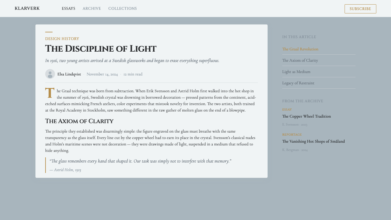
For editorial layouts and marketing materials, the style supports long-form content with authority. An Orrefors-derived editorial page uses a relatively narrow text column centered in a wide format, with a generous outer margin reserved for imagery, pull quotes, or breathing room. Section breaks are marked by a thin horizontal rule — hairline weight, the same visual register as the engraving lines — never by decorative ornaments or bold dividers. Marketing materials work best when they adopt the studio-photography convention directly: a single object or concept, large and centered, on a cool ground, with minimal text set small and below.
A common mistake when working in this aesthetic is mistaking restraint for emptiness and then filling the space to compensate. The Orrefors palette has no room for gradients, layered texture effects, multiple typeface families, or decorative drop shadows. Another frequent error is choosing a sans-serif typeface in the belief that restraint requires modernist letterforms — in fact, this tradition is as comfortable with carefully chosen classical roman proportions as with geometric sans-serifs, provided the weight is light and the spacing is open. The test of any element is whether it survives removal: if the layout works without it, it should go.
Swedish Orrefors Crystal (1916) — FAQ
How does Orrefors Crystal differ from other Scandinavian design traditions?
The Orrefors tradition is more ceremonial and object-focused than the broader Scandinavian Modern movement that dominated mid-century furniture and product design. Scandinavian Modern — associated with designers like Alvar Aalto and Hans Wegner — emphasized democratic access, warm natural materials, and design for everyday use. Orrefors worked in a more rarified register: crystal is fragile, labor-intensive, and has historically been positioned as a luxury or gift object. The visual language reflects this: where Scandinavian Modern is warm and tactile, Orrefors is cool and luminous. Both traditions share a commitment to restraint and material honesty, but they arrive at very different emotional temperatures.
Can this aesthetic work for brands that are not luxury or premium?
The Orrefors aesthetic signals craft, precision, and considered restraint — qualities that can serve any brand that wants to communicate reliability and depth without ostentatious display. The danger is that the extreme generosity of space and the cool palette can read as unapproachable if the content or copy does not have enough warmth or humanity to compensate. For brands in categories like professional services, publishing, cultural institutions, or high-quality food and craft goods, the style translates well. For consumer products that need to signal warmth, fun, or accessibility, the coolness of this visual language works against the brand's communicative goals.
What is the Swedish Grace movement, and how does Orrefors relate to it?
Swedish Grace was a design and decorative arts movement that flourished in Sweden in the 1920s, representing the country's particular interpretation of Art Deco. Where the international Art Deco movement tended toward opulence, gilded surfaces, and exuberant ornament, Swedish Grace filtered these impulses through a Scandinavian sensibility that valued restraint, classical proportion, and high-quality natural materials. Orrefors was one of its central institutions, alongside designers like Carl Malmsten and architects working in the neoclassical strain of the period. The 1925 Paris Exposition was the movement's international debut; Sweden's success there established Swedish Grace as a recognized national design identity and opened European and American markets to Swedish luxury goods.
Is symmetry always required in this aesthetic, or is asymmetry possible?
Symmetry is a strong tendency in the Orrefors tradition but not an absolute rule. The centered, symmetrical composition reflects the nature of blown glass — a rotationally symmetric object — and the classical European compositional heritage that informed Swedish Grace. However, the Orrefors designers, particularly Hald and later Cyrén, showed that the same visual values of generous space, cool palette, and hairline precision could operate in asymmetric compositions without losing their essential character. In contemporary applications of the style, asymmetry is entirely viable as long as the composition is clearly resolved — a deliberate balance of weighted elements — rather than accidental or crowded. What the style cannot tolerate is unresolved tension or visual noise.
How should color accents be introduced without breaking the palette's coolness?
The Orrefors palette is built around a cool neutral field — white, silver-gray, and gray-blue — and the most effective accent colors are those that deepen or intensify this coolness rather than contradict it. Deep cobalt blue, muted teal, and cool sage green all work within the system. Warm colors — amber, terracotta, warm gold — can be introduced but only in very small amounts and only when grounded by a dominant cool field; if warm tones begin to compete with the cool ground for visual dominance, the characteristic quality of the style evaporates. The Graal tradition offers a useful principle: the accent color is always enclosed, always subordinate, always seen through the lens of clear crystal. In flat design terms, this means accent colors appear as small contained elements — an icon, a data point, a highlighted word — never as backgrounds or dominant fields.
Related design styles
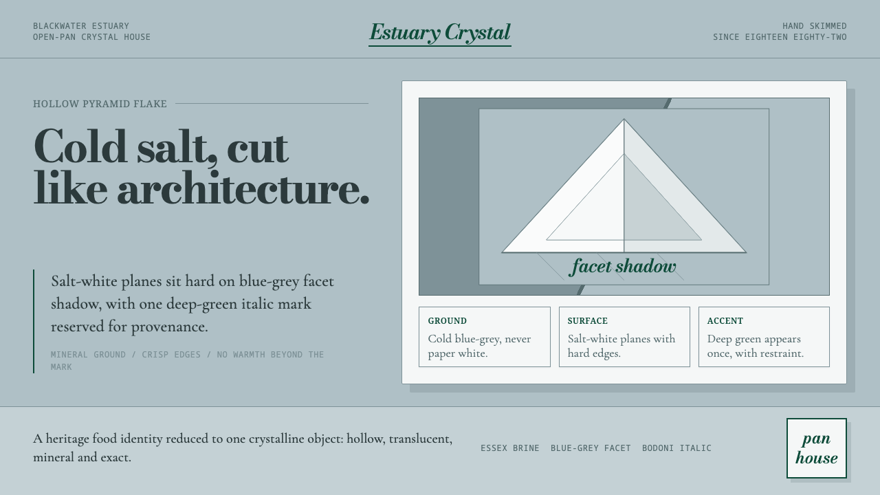 Maldon Sea Salt PyramidCold mineral luxury. Salt-white facets on blue-grey ground, struck once with…
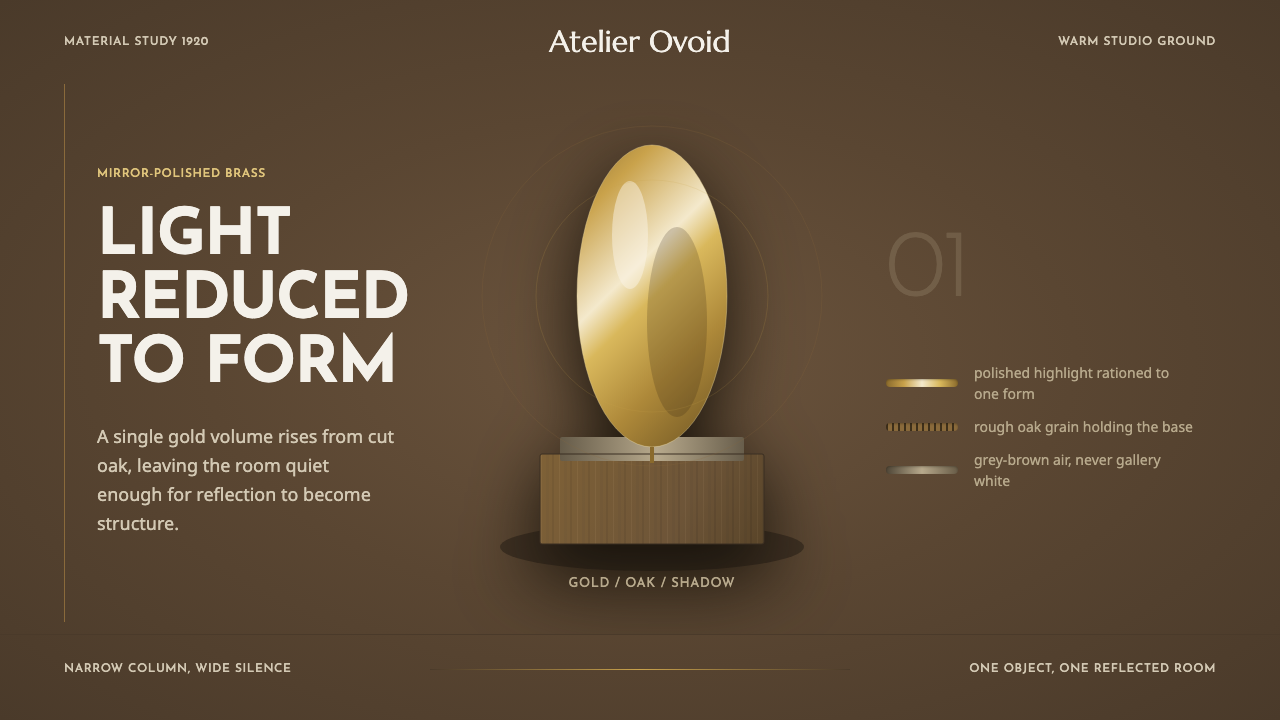 Brâncuși SculptureLight is rationed. Brass ovoids glow against oak-brown space and geometric ty…
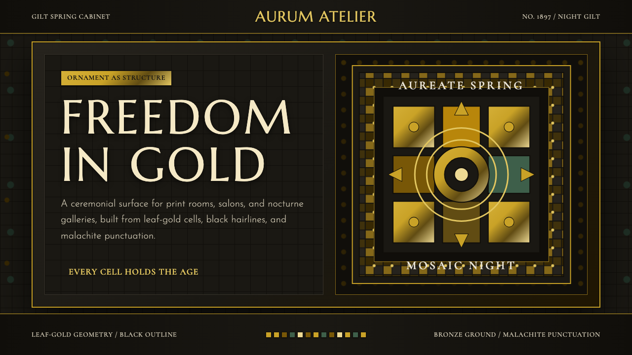 Vienna Secession 1897Ornament is structure. Leaf-gold grids and black hairlines glow on bronze nig…
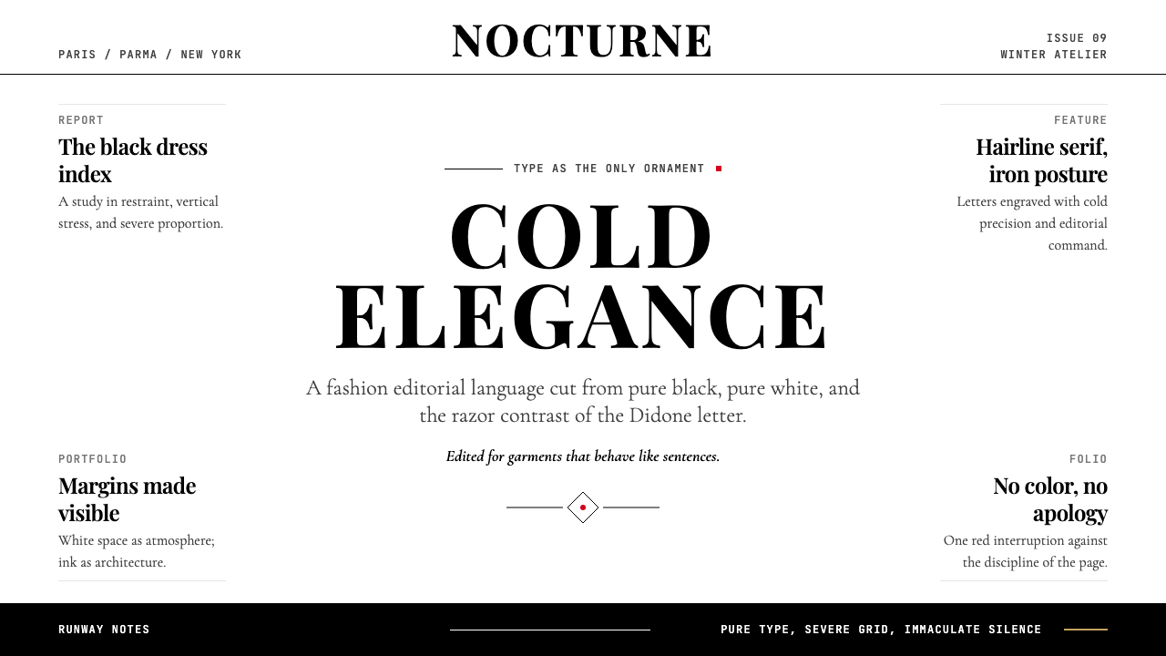 Vogue DidoneCold authority. Black-on-white Didone, red accent, and vast editorial whitesp…
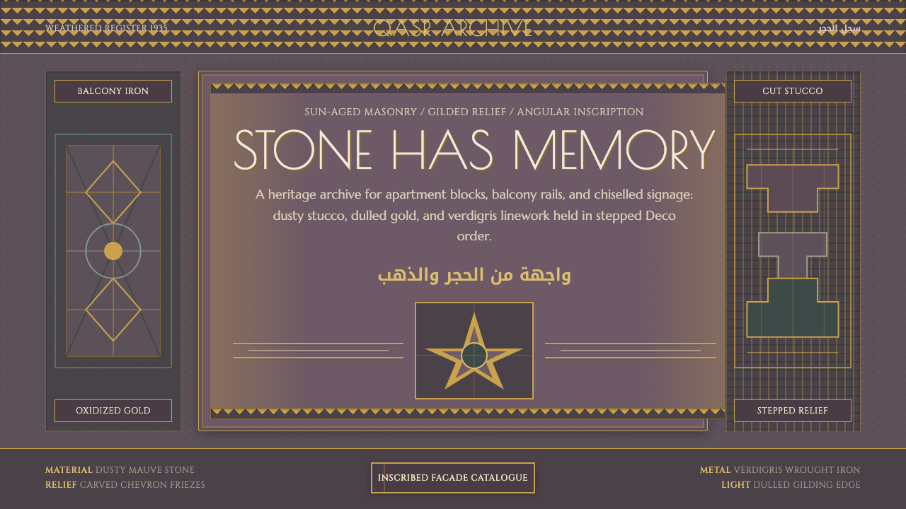 Cairo Downtown Art DecoStone-real glamour. Mauve stucco, dulled gold rules, and verdigris Deco geome…
 Citroën DSSilence made aerodynamic. Silver-grey ground, chrome hairlines, one long glid…