What is Brâncuși Sculpture?
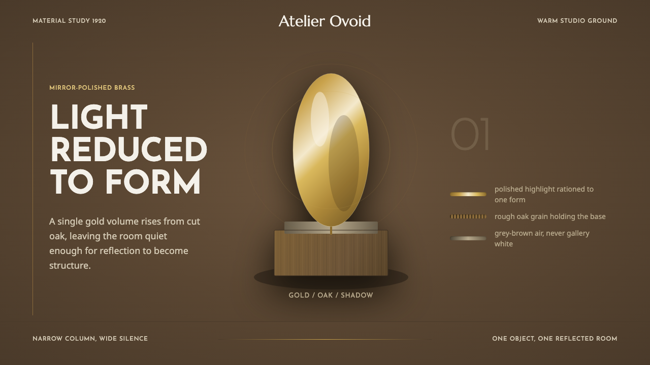
Brâncuși Sculpture treats light as scarce — polished brass ovoids glow like held breath against warm oak-brown dark and geometric early-modern type.
Brâncuși Sculpture in brief
Brâncuși Sculpture is a design system built from the visual world of Constantin Brâncuși, the Romanian-born sculptor working in Paris who is widely credited as one of the founders of modern sculpture. His most famous works — Bird in Space, Maiastra, the various versions of The Kiss — reduced the human and animal figure to smooth, essential ovoid and cylindrical forms, mirror-polished in brass or bronze until the metal itself became the subject: a warm, golden reflective surface that seems to hold light rather than merely catch it.
The system does not photograph that work against gallery white, which is how museums typically present it today. Instead it stages it the way Brâncuși staged it himself, inside his reconstructed Paris atelier: a warm, dim, grey-brown space of raw oak plinths, limestone blocks, and rough plaster walls, where a single polished brass form becomes the one bright thing in the room. Darkness here is not absence — it is the condition that makes the metal's glow legible.
The resulting palette is dark and reductive: warm oak-brown and charcoal grounds, brass-gold as the singular accent of light, and geometric early-modern type set with generous negative space. The core visual tension is material contrast — smooth, reflective, mirror-polished metal set directly against raw, chiseled, unfinished stone or wood grain — and that contrast, more than any single color, is what the whole brand carries.
Where does Brâncuși Sculpture come from?
Constantin Brâncuși was born in 1876 in the Romanian village of Hobița, in a rural Carpathian region where traditional woodcarving and folk craft were part of everyday life; he trained first as a carpenter and stonemason before entering art school in Bucharest and, in 1904, walking much of the way to Paris to continue his studies. He briefly worked in the studio of Auguste Rodin, the dominant sculptor of the age, but left within weeks, reportedly telling Rodin that 'nothing grows in the shadow of a great tree' — a declaration of independence from Rodin's expressive, surface-textured naturalism that set the direction for everything Brâncuși made afterward.
Where Rodin left the marks of the sculptor's hand visible in roughened, unfinished surfaces, Brâncuși moved toward the opposite extreme: forms polished to an almost total absence of visible process, reduced again and again through successive versions until only the essential shape remained. His Bird in Space series, begun in the 1920s, is the clearest statement of this method — not a literal bird but the sensation of flight itself, distilled into a single soaring, mirror-bright ovoid. He famously said he sought 'not the outer form but the idea, the essence of things,' and pursued that essence through decades of repeated carving of the same handful of subjects — birds, heads, kisses, columns — each time paring further.
Brâncuși worked in Paris for most of his career, based first in Montparnasse and settling from 1916 in a studio complex near the Impasse Ronsin, which he treated as an extension of his sculptural practice: he built and arranged the plinths, worktables, and stone blocks with the same care he gave the sculptures themselves, so that studio and artwork formed a single environment. He bequeathed the studio's contents to the French state on his death in 1957, on the condition that it be reconstructed exactly as he left it — it now stands, rebuilt to his specifications, beside the Centre Pompidou in Paris, preserving the warm, workshop atmosphere this design system draws from rather than the neutral white-cube presentation more familiar from conventional museum galleries.
This studio arose against the backdrop of early modernism's broader turn away from academic naturalism — the same decades that produced Cubism, Constructivism, and abstraction more generally — but Brâncuși's path through that period was distinctly his own, rooted as much in Romanian folk carving traditions as in Parisian avant-garde circles. That dual inheritance, rural craft discipline fused with radical formal reduction, is part of why his brass ovoids read as both ancient and startlingly modern at once.
What defines the Brâncuși Sculpture look?
Color
The palette is dark and reductive — warm oak-brown, charcoal, and deep grey grounds — with polished brass-gold reserved as the single point of light in any composition. Color is not distributed evenly across a layout; it is concentrated into one warm, luminous accent that the surrounding darkness exists to set off.
Material Contrast
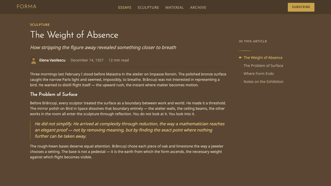
The system's central visual device is the collision of two opposite surfaces: mirror-polished, reflective metal against raw, chiseled stone or unfinished wood grain. One surface erases the marks of its making; the other displays them openly. Nearly every strong composition in this style stages that contrast rather than relying on color or pattern alone.
Reductive Form
Shapes are ovoid, cylindrical, and radically simplified — the visual residue of a working method that repeatedly pared a subject down until nothing further could be removed. There is no representational detail; a form implies a bird, a head, or a kiss without depicting the literal anatomy of any of them.
Studio Atmosphere
Rather than the neutral white-cube backdrop of a conventional gallery, the system stages its subjects inside a warm, workshop-like environment — plaster walls, oak plinths, limestone blocks — with the implication of dust, tools, and daily use. This grounding in a lived workspace rather than a pristine showroom is what separates the style from generic minimalism.
Typography
Type follows an early-modern geometric sensibility — simple, unadorned letterforms with even, confident proportions — set with generous negative space rather than dense blocks of text. Typography behaves the way the sculptures themselves do: reduced to essentials, given room to be read on its own.
Light as Accent
Because the ground is dark throughout, any point of brightness carries disproportionate visual weight. Light is used sparingly and deliberately — a highlight on a curved brass surface, a single illuminated element in an otherwise dim composition — rather than as general even illumination.
Negative Space
Compositions favor a single sculptural form set within a large, unbroken field of dark ground rather than a crowded arrangement of many elements. The emptiness surrounding the form is not wasted space — it is what allows the single accent of brass-gold to register as significant.
Who shaped Brâncuși Sculpture?
Brâncuși spent five decades in Paris repeatedly reducing a small set of subjects — birds, heads, kisses, columns — to their essential ovoid and cylindrical forms, polishing bronze and brass to a mirror finish that made the metal itself, rather than any depicted anatomy, the subject of the work. His bequeathed studio, reconstructed beside the Centre Pompidou, remains the definitive record of how he wanted his work seen — not in gallery white, but in the warm, workshop atmosphere this design system draws directly from.
As the dominant sculptor of the era Brâncuși emerged into, Rodin's expressive, roughened surfaces and naturalistic anatomy were the tradition Brâncuși defined himself against. Brâncuși's brief stint in Rodin's studio, and his swift departure from it, mark the moment his own reductive path — smooth, essential, unattached to naturalistic detail — began to take shape.
The Maiastra, a golden bird from Romanian folklore said to guide heroes and possess magical song, was the recurring subject of Brâncuși's earliest bird sculptures beginning around 1910, and the direct ancestor of the later, even more reduced Bird in Space series. Its presence ties Brâncuși's radical modern reduction back to the Romanian folk tradition he grew up within.
How do you use Brâncuși Sculpture today?
Brâncuși Sculpture is a style for products that want to signal rare, considered craft rather than abundance or speed — luxury goods, fine jewelry, high-end furniture, architecture and design studios, or any brand whose value proposition rests on materials and restraint rather than variety and volume. Applying it well means treating brightness as a resource to be spent once per composition, not distributed evenly.
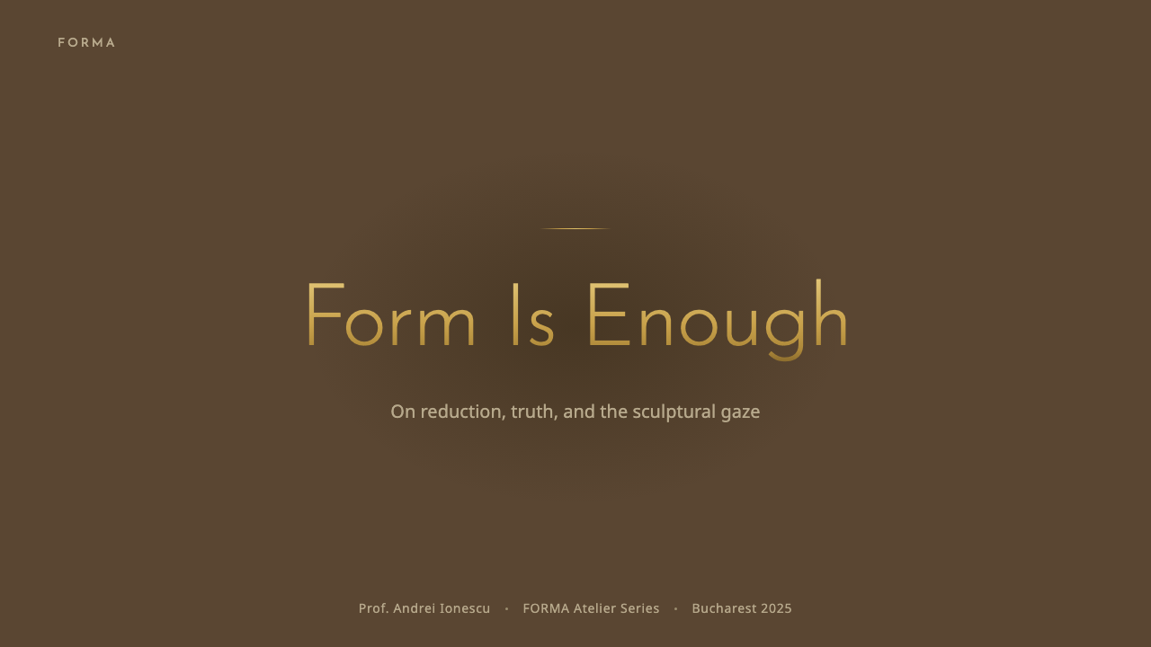
For presentation slides, a cover works best as a single brass-toned form or accent set against a large field of warm dark ground, with a title in simple geometric type placed with generous surrounding space. Content slides should keep almost all of the frame dark, using the brass accent only for the one number, icon, or word that most needs attention on that slide. Data visualizations should resist the temptation to color every bar or segment — a single highlighted data point in brass against otherwise muted, dark bars communicates hierarchy far better than a rainbow of category colors.
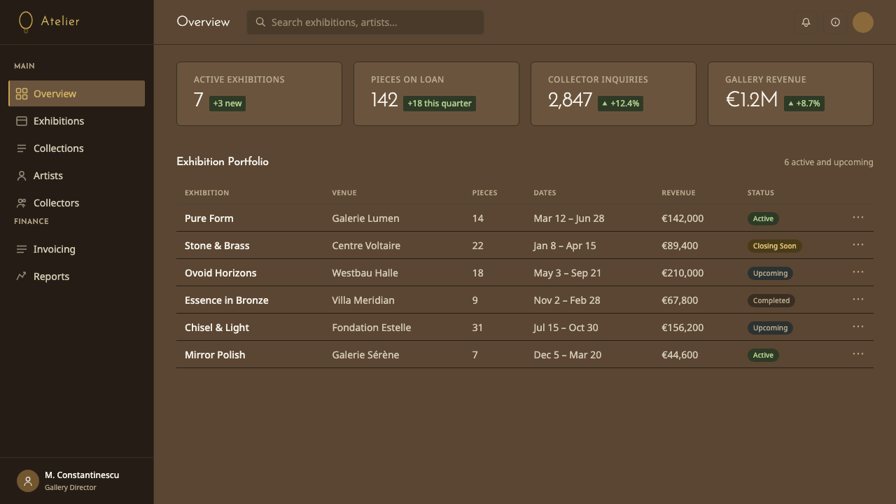
For web interfaces, the style suits dashboards and premium product pages where the goal is to feel considered and expensive rather than energetic. Dark backgrounds throughout, with the brass-gold accent reserved for primary calls to action, active states, or a single hero visual, let the interface breathe the same way Brâncuși's studio did — most of the frame quiet, one element catching the eye. Card borders and dividers should read as raw material — a thin stone-grey line rather than a bright, saturated rule.
For editorial and marketing work, the material contrast at the heart of the style — polished versus raw — makes a strong organizing metaphor: a polished brass pull-quote mark against a rough-textured background photograph, or a single gold-toned headline word against an otherwise monochrome, dark editorial spread. Marketing pages for craft, design, or luxury brands benefit from long stretches of near-black or near-brown ground punctuated rarely by the brass accent, since scarcity is what gives that accent its meaning.
A common mistake is to use the brass-gold color too generously — applying it to every heading, every button, every icon — which flattens the entire point of the style. Brâncuși's own work gains its power from rationing: one bright, reflective form in an otherwise dim room. A layout that spends its gold accent everywhere reads as generically 'luxury gold,' not as this specific, disciplined visual language.
Brâncuși Sculpture — FAQ
Is this the same as generic 'luxury gold and black' branding?
It looks related but works on a different logic. Generic luxury branding typically uses gold as an evenly applied surface color — foil, borders, repeated pattern. Brâncuși Sculpture instead treats brass-gold as scarce: one bright form or accent in an otherwise dark, workshop-toned composition, always paired with the contrast of raw, unfinished material nearby. Strip out that scarcity and the material contrast, and the style collapses into the same generic gold-and-black look it is meant to be more disciplined than.
Can this style work with a light background instead of dark?
It is possible but works against the style's core logic, which depends on darkness to make the brass accent legible as light. A light-ground version would need to invert the relationship carefully — perhaps a pale limestone or bone ground with the same raw-versus-polished material contrast, and the brass accent used just as sparingly. Without that discipline, a light version tends to lose the sense of held, rationed light that defines the original.
How does Brâncuși's reductive form differ from Bauhaus geometric abstraction?
Both reduce form to essentials, but from different starting points and toward different ends. Bauhaus geometry is built forward from primary shapes — circle, square, triangle — assembled according to structural or functional logic, usually in flat, hard-edged color. Brâncuși's ovoids are reductions of specific, once-representational subjects — a bird, a head, a kiss — carved back again and again until only the essence remains; the forms are organic and continuously curved rather than flat and geometric, and the surface finish (mirror-polished metal) is as central to the meaning as the shape itself.
Does this style suit fast-moving consumer products?
Not naturally. Its entire visual logic — darkness, rationed light, a single point of brass accent, generous negative space — is built to communicate patience, rarity, and considered craft. A product built around speed, novelty, and frequent change will fight against a style whose central message is that very little needs to be shown, and what is shown deserves to be looked at slowly.
What role does typography play, given the style is named after a sculptor rather than a typographer?
Typography here is deliberately secondary and quiet — simple, geometric, early-modern letterforms set with generous space, chosen so they do not compete with the sculptural focal point of a composition. The type's job is to organize information without drawing attention to itself, the same way the raw oak plinths and limestone blocks in Brâncuși's studio supported the brass forms without competing with them.
Related design styles
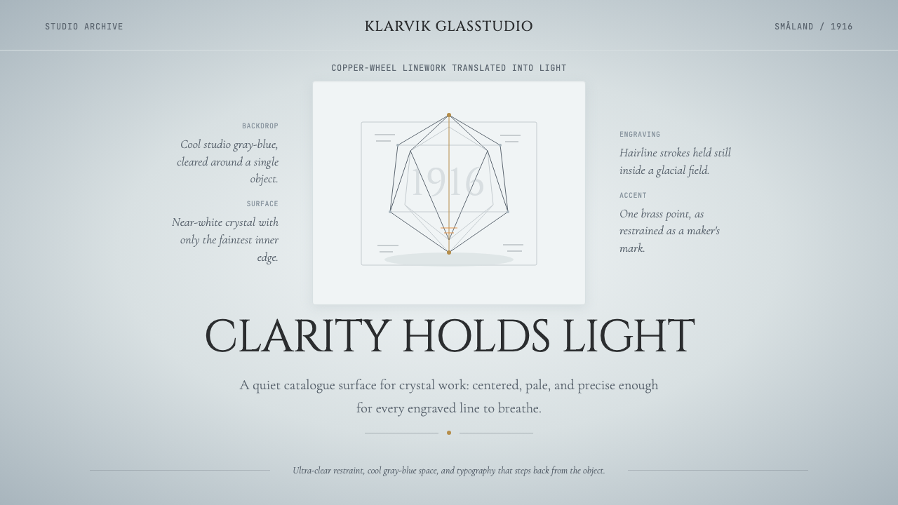 Swedish Orrefors Crystal (1916)Quiet luxury in glass. Gray-blue space, Cinzel capitals, and brass hairlines…
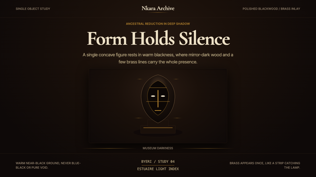 Gabonese Fang Mask & ByeriStillness has weight. Mirror-black forms, brass hairlines, and museum shadow…
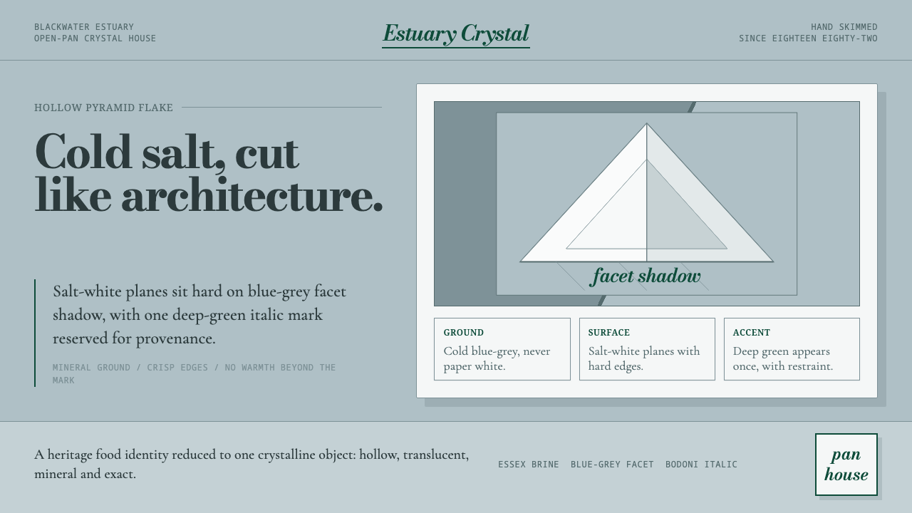 Maldon Sea Salt PyramidCold mineral luxury. Salt-white facets on blue-grey ground, struck once with…
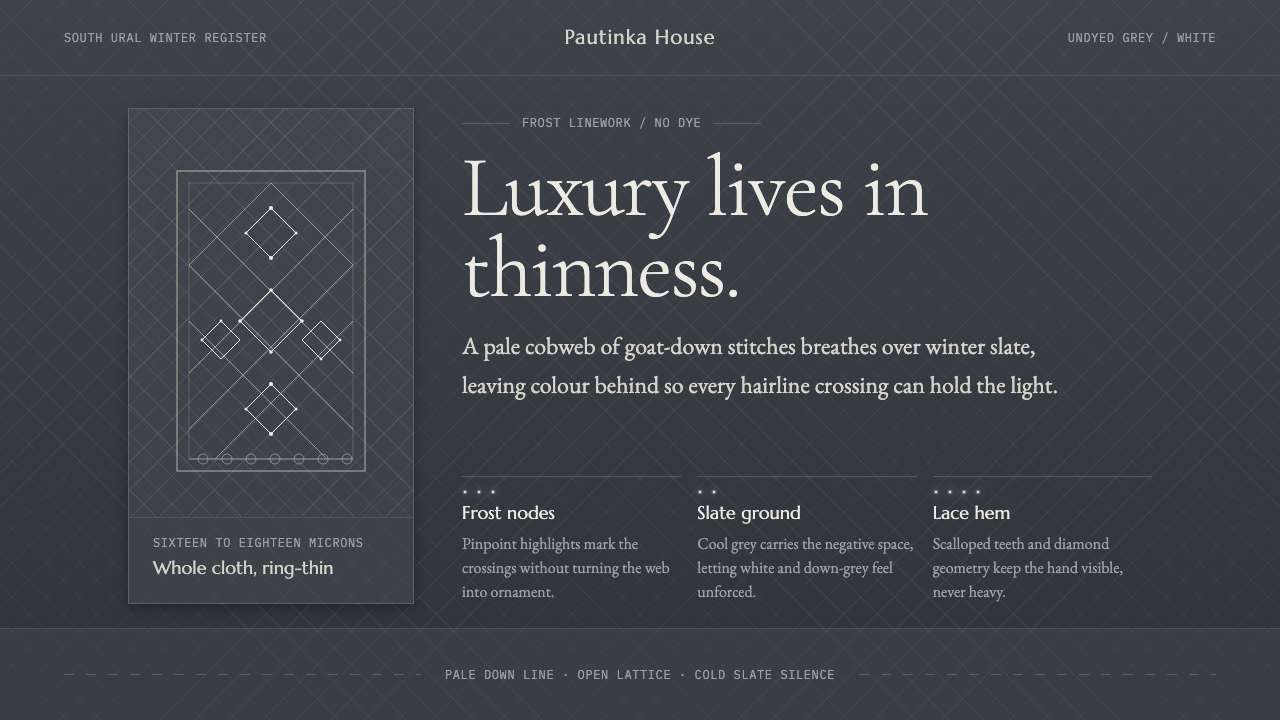 Orenburg Goat-Down Gossamer ShawlLuxury in thinness. Pale Cormorant type and down-lace lines breathe on Ural s…
 Parviz Tanavoli HeechNothing, made monumental. A looping bronze word glows gold over near-black un…
 Tongan Black SandThe sand is stone, not cream. Iron-dark basalt grays with one cool slate-teal…