What is Citroën DS?
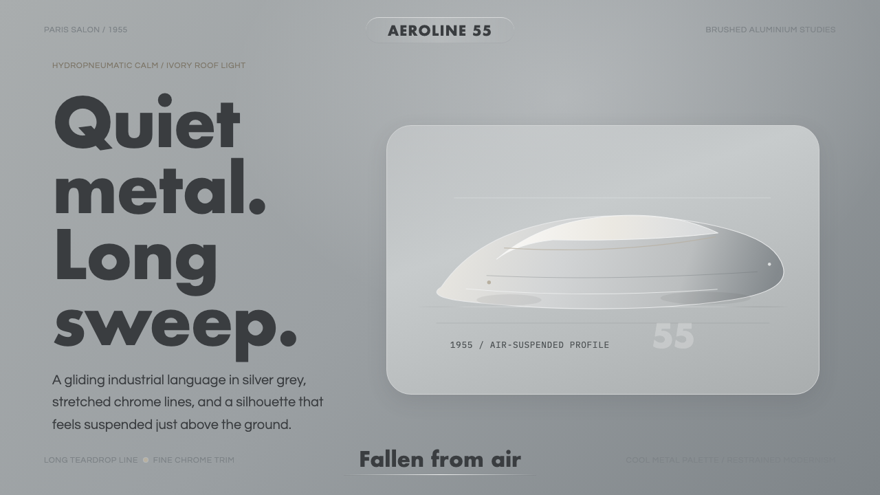
The Citroën DS did not look like a car that had been designed — it looked like one that had been discovered, as if aerodynamics alone had shaped it and the designers merely found it waiting. That quality of inevitability, of form obeying invisible physical law rather than fashion, is what this design language translates into an interface system: long gliding horizontals, hairline chrome accents, a cool silvered palette, and the absolute calm of a machine that has nothing left to prove.
Citroën DS in brief
The Citroën DS design language draws its visual logic from one of the most celebrated industrial objects of the twentieth century — the DS19 saloon, unveiled at the 1955 Paris Salon, where it reportedly received twelve thousand orders on its first day. Sculptor and industrial designer Flaminio Bertoni gave it a body whose teardrop profile was aerodynamically self-consistent from nose to tail, with a roofline that tapered into a sharply cut trailing edge, a glasshouse that dissolved into the bodywork, and a smooth underbelly that eliminated the visual noise beneath the waistline entirely.
As a design system, the DS aesthetic is defined by restraint and precision rather than ornamentation. Its palette is cool and metallic — silvers, pale greys, and blue-greys that suggest polished aluminium and the interior of a cloud. Its signature graphic element is the hairline: ultra-fine horizontal lines used as separators, underlines, and structural borders that recall the chrome window trim and door reveals of the original car. Everything reads as horizontal and therefore in motion — even at rest, the visual language implies speed.
Unlike purely ornamental retro revival styles, the DS language carries an ideological dimension. It emerged from French modernism at a moment when French industrial design was staking a claim to cultural leadership alongside fashion and cinema. The car was not merely styled; it was engineered from principle, and that engineering conviction — the belief that the technically correct solution would also be the beautiful one — gives this visual language its particular authority and composure.
Where does Citroën DS come from?
The DS's origins lie in a project André Lefèbvre began developing secretly at Citroën as early as 1938, though the war interrupted everything and serious production engineering did not resume until the late 1940s. Lefèbvre was Citroën's chief engineer and a former racing-car designer — a background that explains his obsessive interest in aerodynamic drag, weight reduction, and ride quality. He worked on the technical architecture of the car for nearly fifteen years before it reached the public.
Paul Magès, the engineer behind the hydropneumatic suspension system, contributed the feature that made the DS almost as famous for its ride as for its shape. The system replaced conventional steel springs with pressurized fluid spheres, allowing each wheel to respond independently to road surfaces and maintaining the car at a constant ride height regardless of load. The practical result — a car that could float over cobblestones at speed, that could be raised to clear obstacles or lowered for cornering — struck contemporary observers as nearly magical. Journalist and philosopher Roland Barthes, writing in his 1957 collection Mythologies, described the DS as a new Nautilus, 'a goddess' that had apparently 'fallen from the sky.'
Flaminio Bertoni's body design was simultaneously an act of sculpture and engineering analysis. Bertoni was Italian — born in Varese in 1903 — and had trained as a sculptor before joining Citroën in 1932. He modelled the DS form by hand in clay and plaster, working from aerodynamic instinct rather than wind-tunnel data alone. The result was a body with a drag coefficient dramatically lower than any contemporary production car, achieved not through add-on spoilers or aggressive detailing but through the overall shape. The DS roofline, the dissolution of the C-pillar, the way the rear glass wrapped and the boot tapered to a point — these were solutions to fluid dynamics expressed as sculpture.
After launch, the DS became entangled with French national identity in ways that went beyond automotive culture. President Charles de Gaulle was travelling in a DS when his motorcade was ambushed in the Petit-Clamart assassination attempt of 1962; the car's hydropneumatic system, which kept the vehicle drivable even on three punctured tyres, almost certainly saved his life. The anecdote entered French public consciousness and secured the DS a place in the national mythology that no marketing campaign could have manufactured. Production ran until 1975, and the car was named the most beautiful car ever made in a 1999 survey of automotive design professionals.
What defines the Citroën DS look?
Palette
The DS palette is built around a family of cool, desaturated neutrals — silvers, pale blue-greys, and warm off-whites — with chrome and glass as the governing material metaphors. Accents appear sparingly: a deep midnight blue, an oxidised red, or a sage green, each chosen to feel like a carefully selected exterior colour option rather than a marketing bright. The overall effect is of restrained metallic coolness rather than warmth, a palette that reads as technologically serious without being aggressive.
Line and Silhouette
The defining graphic gesture is horizontal — long, low, continuous lines that sweep from edge to edge without interruption. Hairline strokes are used as dividers and underlines in a way that directly references the chrome reveal strips of the original body. Where other styles might use weight or color to delineate sections, this system uses thinness and extension: a single fine line carries more authority than a thick bar because it demands precision in its execution and rewards attention in its reading.
Aerodynamic Curves
The DS form is not made of circular arcs or drawn with a compass — it is defined by compound curves that flatten and accelerate like a flow of air over a surface. Applied to interface elements, this translates to cards, panels, and containers with subtly varied corner radii: slightly more rounded at the front, tighter at the rear, mimicking the teardrop logic of the car's body. These are not arbitrary softness choices but curves that read as directed and purposeful.
Typographic Register
Typography in this system is spare and precise. Geometric or humanist sans-serif faces are used at controlled weights — nothing too light to vanish, nothing too heavy to shout. Letterspacing is generous in headings, suggesting the wide hood and glasshouse of the car rather than the compressed urgency of digital interfaces. Hierarchy is established through scale and tracking rather than through font-switching or decorative labels. The overall tone is editorial and assured, as if the information itself carries sufficient authority.
Surface and Material Language
The DS interior — pale leatherette, brushed aluminium knobs, and a single-spoke steering wheel that looked like nothing else on the road — introduced a material vocabulary of considered restraint. In digital translation, this becomes a preference for surfaces that suggest refinement without ostentation: very slight gradients on metal-toned fields that read as light on aluminium, borders that carry the suggestion of a reveal channel rather than a simple box rule, and negative space used generously to give elements room to read as objects rather than compressed information.
Motion and Flow
The DS was the first car whose aerodynamic form was so fully realised that it appeared to be in motion even at rest — the eye travels along the roofline and does not find a place to stop. Interface animations and transitions in this system carry the same quality: smooth, sustained, and deceleration-weighted rather than snappy. Reveals slide in from the left rather than popping; dismissals carry a gliding exit. Nothing happens abruptly. Everything has the quality of a suspension system absorbing rather than transferring impact.
Structural Calm
Perhaps the most difficult quality to name but the most important to preserve: the DS aesthetic is calm without being cold, restrained without being austere. The car was luxurious in its ride and its cabin; it was never a hair shirt. Translated into interface terms, this means that the system should not feel impoverished or stripped-back — it should feel composed. White space is used because elements need room to breathe, not because minimalism is the goal. The overall impression should be of a design that knows exactly what it is doing and has no need to explain itself.

Who shaped Citroën DS?
Born in Varese, Italy in 1903, Bertoni trained as a sculptor and joined Citroën in 1932. He was responsible for three of the company's most iconic designs — the Traction Avant, the 2CV, and the DS — each expressing a different facet of the house's commitment to form derived from function. For the DS, he worked by modelling in clay and plaster rather than working from engineering drawings, producing a body whose aerodynamic efficiency was achieved through sculptural intuition as much as calculation. He never received the public credit he deserved during his lifetime; his role was largely unacknowledged by Citroën. He died in 1964, just before the DS reached the height of its fame.
Lefèbvre was Citroën's chief engineer and the architect of the DS's technical platform. His background in racing-car engineering gave him an intuitive grasp of aerodynamics and weight distribution that was unusual in mainstream automotive engineering of the 1940s and 1950s. He conceived the DS as a system — suspension, body, engine placement, and aerodynamic form as integrated components rather than separately optimised parts — and this systems thinking is arguably more influential on the car's legacy than any single technical detail. He worked on the project for roughly fifteen years before the car's launch in 1955.
Magès was the engineer who developed and refined the DS's hydropneumatic suspension system over a decade of work before production launch. The system — which used pressurised fluid spheres to replace conventional springs and allowed the car to maintain a constant ride height regardless of load — was so far ahead of contemporary practice that Citroën engineers initially doubted it could be made reliable at scale. Magès persisted, and the resulting system not only defined the DS's character but influenced suspension engineering across the industry for decades. A version of the system was still available in Citroën vehicles into the twenty-first century.
Barthes did not design the DS, but his 1957 essay on it in Mythologies — where he described the car as a 'new Nautilus' and the letters DS as a pun on the French word for goddess, 'Déesse' — gave the car a critical and philosophical frame that has shaped how it is discussed ever since. By treating an automobile as a mythological object worthy of the same analysis as a Racine play or a detergent advertisement, Barthes demonstrated that industrial design could carry cultural meaning at the highest level. His writing made the DS the most philosophically celebrated production car in history.
Opron joined Citroën's design department in 1962 and became head of styling, overseeing the evolution of the DS through its later production years and designing its successors, including the CX and the GS. He maintained and developed the aerodynamic design vocabulary that Bertoni had established — the flowing rooflines, the integrated glass surfaces, the sense of restrained forward momentum — and ensured that the DS aesthetic survived as an institutional sensibility within Citroën rather than as a one-off achievement. His work demonstrates that the DS style was not a lucky accident but a coherent design philosophy capable of systematic development.
How do you use Citroën DS today?
The DS language works best in contexts where refinement and forward momentum are the desired registers — not flashy, not nostalgic, but assured. Technology product presentations, aerospace and mobility sector identities, premium SaaS interfaces, and editorial design for serious publications all sit naturally within its vocabulary. What it cannot do is warmth: this is not the right system for food, family, wellness, or any brand where organic human connection is the primary signal. Its coolness is not a flaw but a constraint — know it before you choose it.
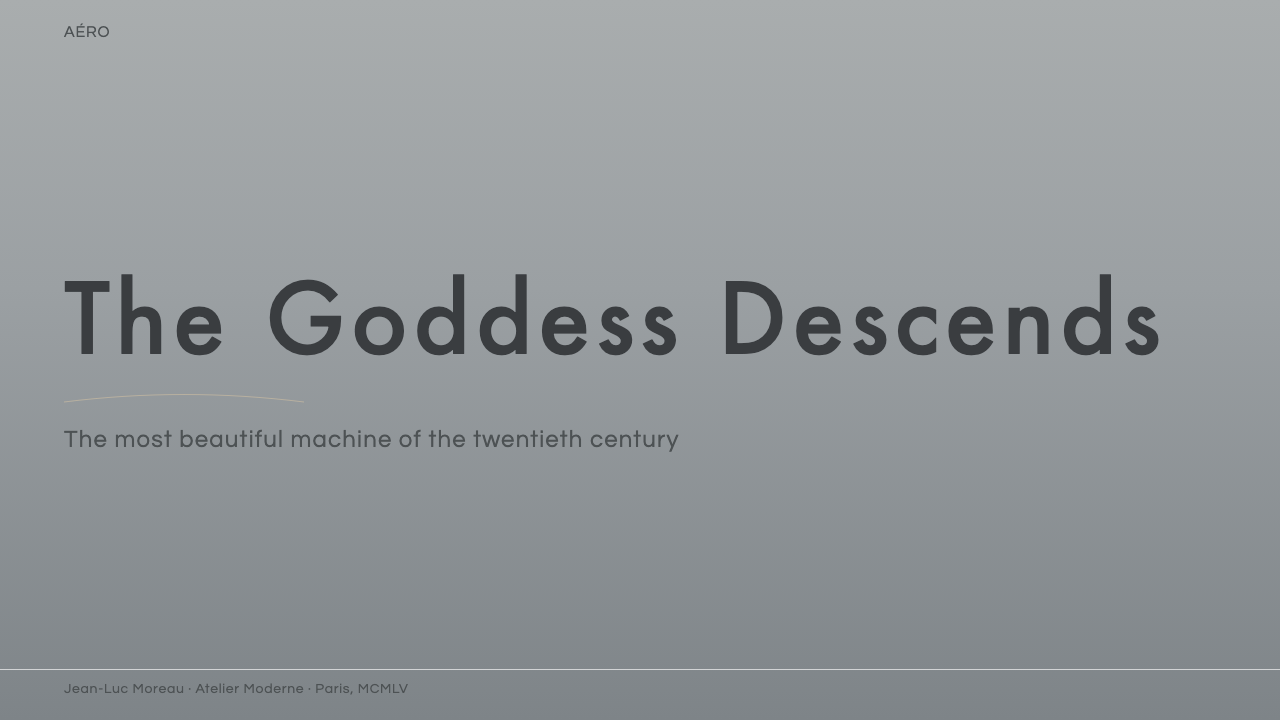
For presentation slides, the DS system is most powerful in the horizontal sweep. Cover pages should use a single full-width image or tonal field with a hairline accent below the title — think of it as the hood of the car. The title itself should sit in generous letterspacing at a controlled weight, centred vertically rather than crowded to the top. Content slides should be treated as surfaces with one primary gesture: a single long horizontal rule dividing a statistics row from supporting text, or a pale grey field occupying the left third while copy floats against white on the right. Data visualisations — line charts especially — become natural expressions of this language: the line itself is a DS silhouette.
For web interfaces and dashboards, commit fully to the horizontal grid and resist the temptation to fill it. Cards should have the proportions of a long low bonnet rather than a square block: wider than they are tall, with hairline top borders rather than full outlines. Navigation should be horizontal and sparse, sitting low and wide like the car's single-spoke instrument binnacle. Interaction states — hover, active, selected — should be expressed through hairline underlines or very subtle tonal shifts rather than color fills or shadows.
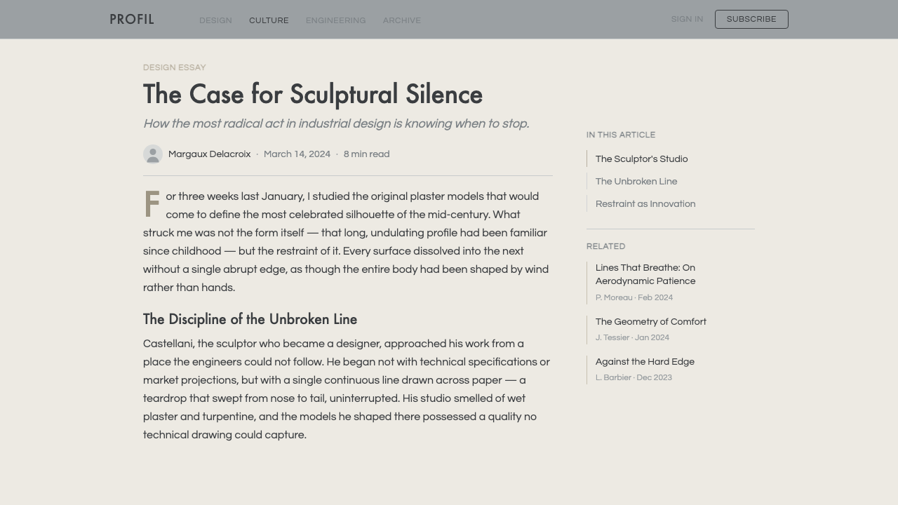
For editorial and marketing design, the DS aesthetic favours wide margins and narrow text measures. An article designed in this system should have one strong horizontal gesture per screen — a full-width tonal band, a hairline rule that reaches the edges — and everything else should be quiet around it. Marketing pages work well with alternating pale silver-grey and white sections, separated by hairlines rather than hard colour breaks. Photography should be cool-toned and automotive in its composition logic: wide, low horizon, strong left-to-right reading direction.
The most common mistake when applying this system is adding curvature for warmth. Designers who feel the palette is too cold will be tempted to round corners aggressively, introduce soft shadows, or warm the grey tones toward beige. Each of these moves betrays the logic of the style. The DS was not warm — it was smooth. Smoothness is not softness; it is the absence of unnecessary transitions. If the layout feels cold, the answer is generous white space and confident scale, not decorative curves or warmer hues.
Citroën DS — FAQ
How does the DS aesthetic differ from other mid-century modern design styles?
Most mid-century modern design languages — Scandinavian, American, Italian — draw their energy from craft, materiality, and human scale. The DS is different because it derives from engineering for an inhuman scale: aerodynamic logic, fluid dynamics, and the physics of a body moving through air at speed. This gives it a quality of inevitability rather than deliberateness. Where Scandinavian modernism feels hand-selected and considered, the DS aesthetic feels discovered — as if the design could not have been any other way. In practice, this means the DS system is colder, more horizontal, and more concerned with flow than with detail.
Can this style work for a dark-mode interface?
Yes, and arguably better than many other mid-century styles. The DS palette's natural repertoire of deep charcoals, dark blue-greys, and near-blacks translates directly into a dark mode that reads as sophisticated rather than dramatic. The key is to treat the dark ground as a continuous metallic surface rather than a black void — think of the interior of the car at night, instrument lit, rather than a screen turned off. Hairline accents in silver or pale blue-grey carry well against dark fields. The one risk is losing the horizontal sweep if the dark values are too uniform; a very slight tonal variation across the ground — darker at the edges, marginally lighter at centre — preserves the sense of a curved surface catching light.
What makes this style feel 'French' rather than generically modernist?
The distinction lies in the relationship between restraint and sensuality. German modernism (Bauhaus, Ulm) was principled to the point of severity — it eliminated ornament as a moral position. French modernism of the DS era retained a conviction that a designed object should be pleasurable to encounter, that refinement and engineering excellence were compatible with sensory appeal. The DS was technically extraordinary and also beautiful to sit inside. In design-language terms, this means the system does not strip elements to their minimum — it composes them to be experienced. Proportion, material suggestion, and the quality of transitions matter more than reduction. If it feels like an argument for reduction, it is not DS; if it feels like a demonstration of composure, it is.
How should this style handle color for calls to action or alert states?
The DS palette is not a monochrome system — the original car was available in a range of carefully considered exterior colours — but it handles accent colour differently from most modern interface palettes. Rather than reaching for a high-saturation digital blue or green, the system works best with colours that feel as if they could appear on a polished metal surface: a deep oxidised red for destructive or critical states, a cool cobalt or slate for primary actions, a pale gold-tinged cream for informational alerts. Saturation should be restrained at all times; the accent colour is meant to draw the eye to a specific element, not to compete with the entire layout. Think of it as a detail colour on a coachwork panel, not a paint-by-numbers highlight.
Is this style appropriate for mobile-first interfaces?
With adaptation, yes — but the DS language faces a genuine challenge at small screen widths because its defining quality is horizontal extension. A style defined by long, sweeping horizontals needs width to breathe. On mobile, the response is to work with vertical rhythm more deliberately than on desktop: treat each card or section as a distinct horizontal slice that carries the sweep within its own narrow width, rather than trying to maintain one unbroken horizontal gesture across the full screen. Hairline top and bottom borders on cards, generous vertical spacing between sections, and consistent left-alignment with a narrow left margin preserve the family resemblance without forcing the desktop composition onto a small screen. The palette and material language translate without change.
Related design styles
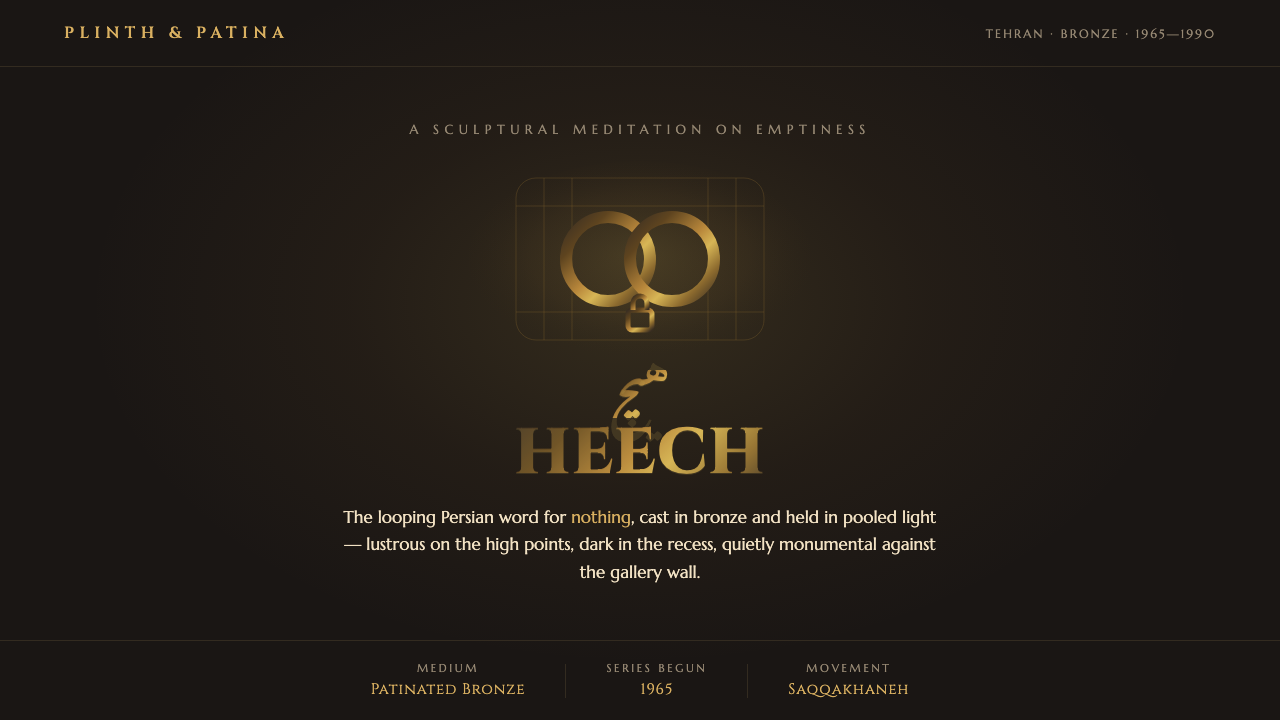 Parviz Tanavoli HeechNothing, made monumental. A looping bronze word glows gold over near-black un…
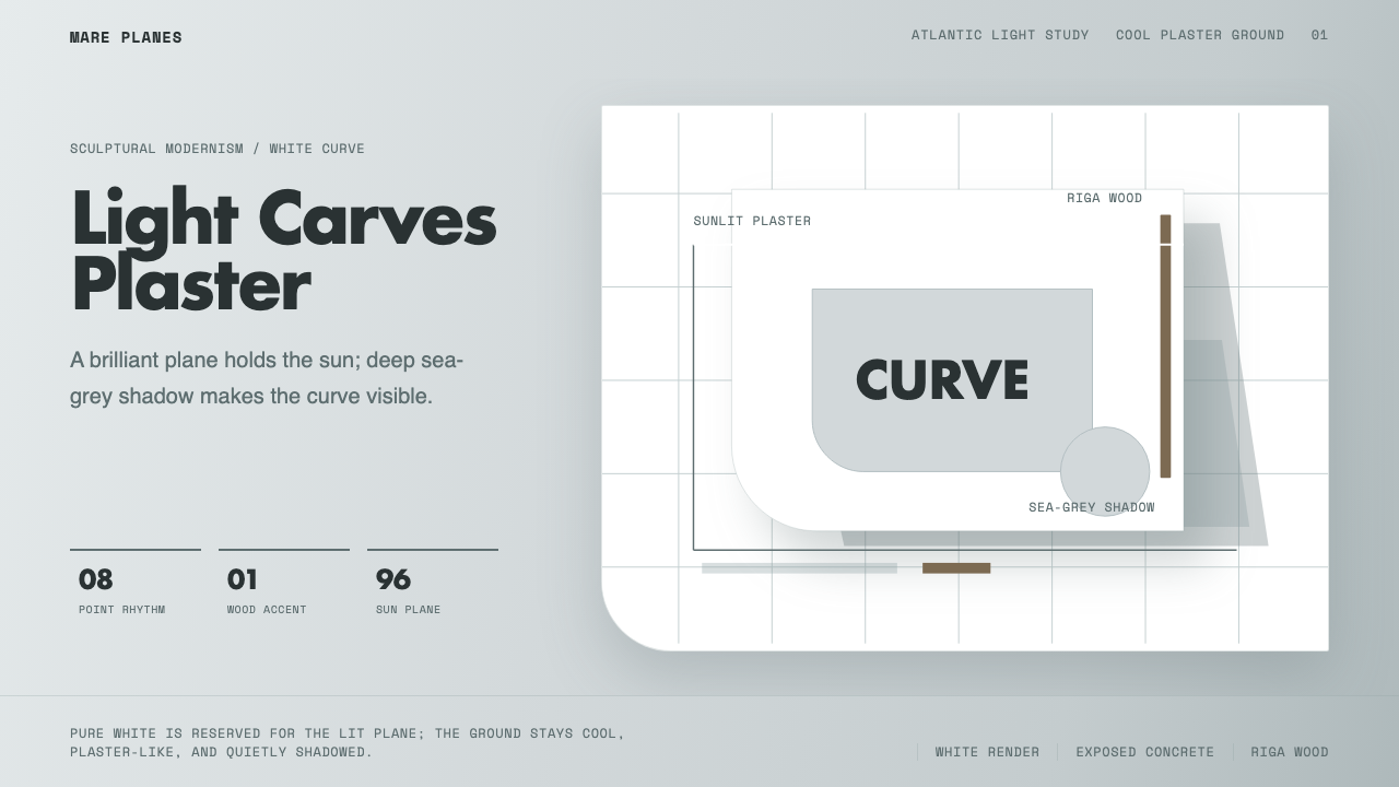 Alvaro Siza WhiteLight makes the form. White planes on cool plaster throw sea-grey shadow and…
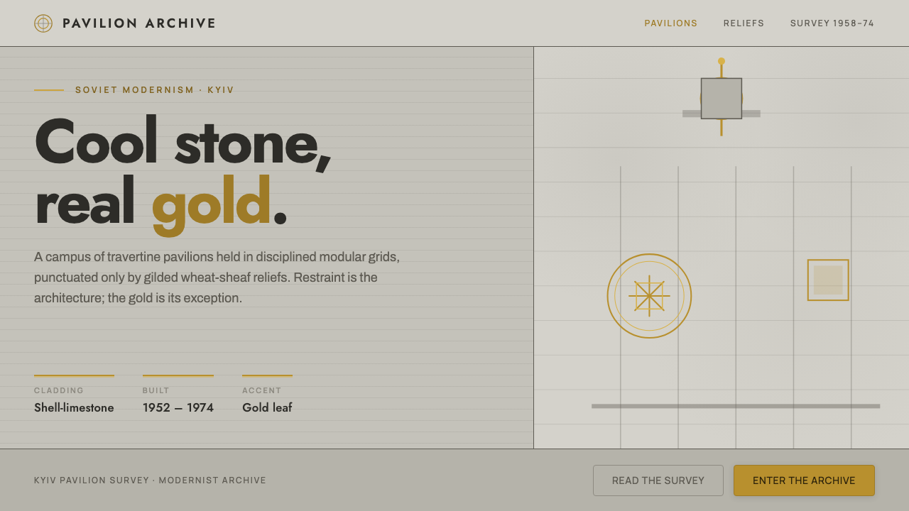 Kyiv VDNH Soviet ModernismRestraint made monumental. Cool travertine grey, geometric Jost type, wheat-s…
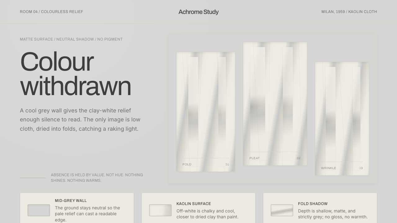 Piero Manzoni AchromeColour withdrawn. Kaolin off-white reliefs on mid-grey cast cool fold-shadows.
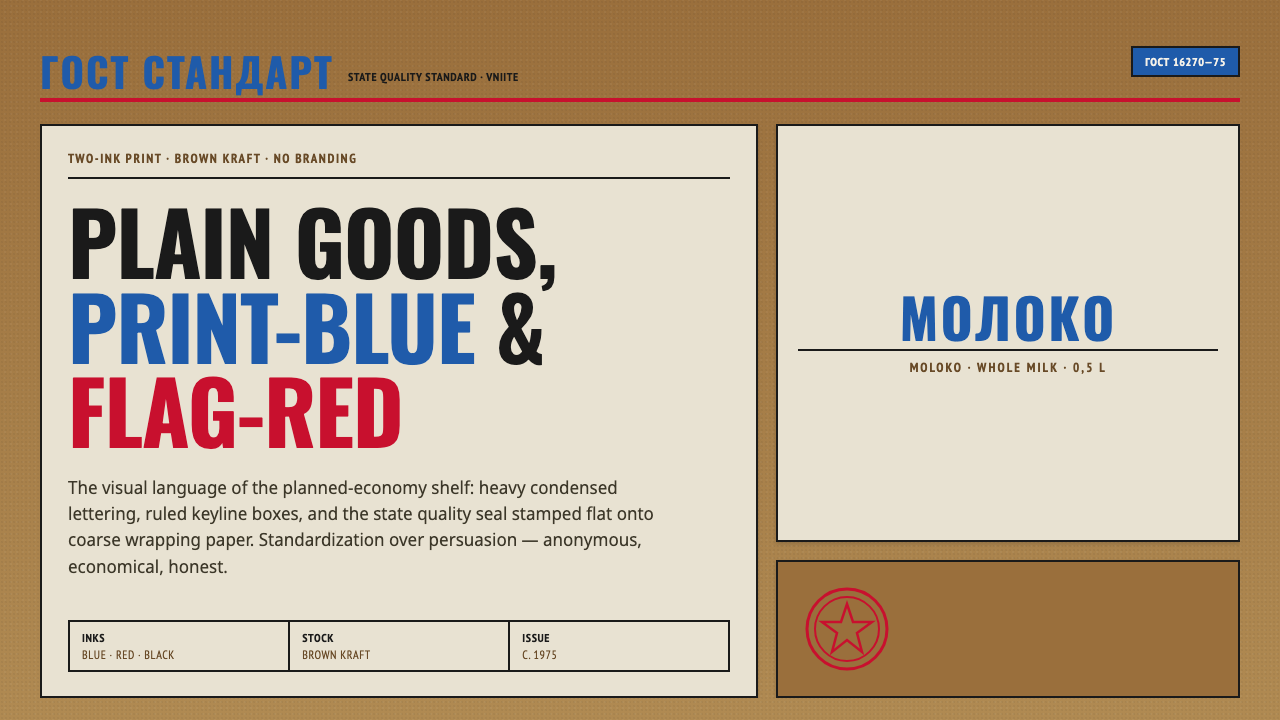 Soviet GOST PackagingAnonymous and strict. Kraft ground, red-blue ink, ruled boxes, condensed type.
 Swedish Orrefors Crystal (1916)Quiet luxury in glass. Gray-blue space, Cinzel capitals, and brass hairlines…