What is Vienna Secession 1897?
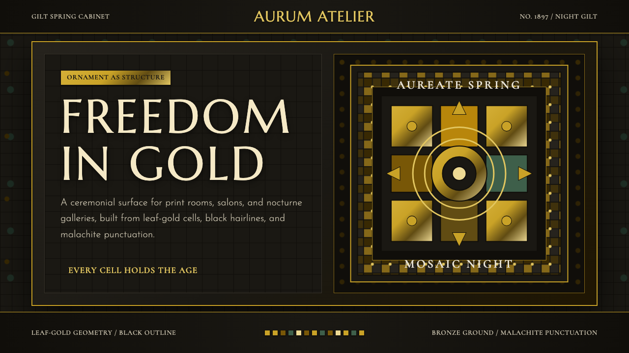
The Vienna Secession turned ornament itself into structure — gold leaf, black hairlines, and dense mosaic pattern glowing against a warm, near-black ground.
Vienna Secession 1897 in brief
The Vienna Secession is a Viennese art and design movement founded in 1897, whose visual language — luminous gold ornament, black hairline outlines, spirals and concentric rings, dense mosaic-like pattern, all set against deep, warm dark grounds — remains one of the most opulent and instantly recognizable aesthetics to come out of turn-of-the-century Europe.
The movement's founders broke away from Vienna's conservative academy of artists under the motto 'To every age its art, to art its freedom,' rejecting the historical revivalism that dominated official Austrian taste. In its place they proposed a total, unified art — one where painting, architecture, furniture, jewelry, and graphic design all answered to the same visual logic. Ornament was not a decorative afterthought applied to a finished object; it was the object's structure, load-bearing in a visual rather than physical sense.
Visually, the style is dense and glowing rather than sparse. Gold — rendered as leaf, as metallic pigment, as pattern rather than solid fill — sits inside black-outlined geometric compartments: circles, spirals, trees, eyes, checkerboards. The background is rarely bright; it is a warm near-black, bronzed rather than neutral, so that gold reads as if lit from within. Nothing is left plain. Surfaces that a later modernist would leave empty are instead filled with rhythmic, repeating pattern.
Where does Vienna Secession 1897 come from?
The Vienna Secession was founded in 1897 by a group of artists who resigned from the Association of Austrian Artists, the official body that controlled exhibition space and, by extension, artistic legitimacy in the Austro-Hungarian capital. The break was led by the painter Gustav Klimt, who became the group's first president, alongside designers and architects including Koloman Moser, Josef Hoffmann, and Joseph Maria Olbrich. Their grievance was as much institutional as aesthetic: the Association favored a narrow, historicist style modeled on past academic conventions, and had little interest in the new currents moving through Paris, Munich, and Brussels.
The Secessionists built their own exhibition hall, designed by Olbrich and completed within months of the group's founding — a startlingly modern building crowned with a dome of gilded laurel leaves, so unlike anything else in the city that Viennese wits nicknamed it 'the golden cabbage.' Above its entrance the group inscribed their founding motto in gold lettering: 'To every age its art, to art its freedom.' The building was not a passive gallery but a manifesto in stone and gold leaf, announcing that the new movement intended to exhibit international avant-garde work alongside its own and treat Vienna as part of a wider European conversation.
The Secession published its own journal, Ver Sacrum ('Sacred Spring'), which functioned as both showcase and laboratory for the group's graphic language — its pages full of the same gold ornament, black linework, and pattern-based composition that would define the movement's visual identity. The name signaled renewal: a new generation claiming the right to define its own art rather than inherit the previous one's. Klimt's so-called golden phase, running roughly from 1899 into the 1900s, produced the movement's most famous works, including canvases where gold leaf and applied ornament dissolve the boundary between figure and pattern, and the Beethoven Frieze, a monumental frieze created for a 1902 exhibition honoring the composer, whose gilt and mosaic surfaces exemplify the Secession's ideal of total, unified decoration.
The movement's cohesion did not last long in institutional terms — internal disagreements over the role of painting versus applied art led Klimt and a group of allies to leave the Secession in 1905 — but its visual vocabulary proved durable well beyond the organization itself. Hoffmann and Moser's parallel venture, the Wiener Werkstätte (Vienna Workshop), founded in 1903, extended Secession principles into furniture, textiles, jewelry, and everyday objects, cementing the idea that the same ornamental logic could govern a painting, a building facade, or a teapot. The style is often grouped with the broader European Jugendstil and Art Nouveau movements of the period, sharing their organic linework and rejection of historicism, but distinguished by its denser geometric patterning, its heavier use of gold, and its Viennese taste for the dark and sumptuous over the pale and floral.
What defines the Vienna Secession 1897 look?
Gold Ornament
Gold is the style's signature material, but it appears as pattern and surface treatment rather than as a flat accent color. Think leaf-gold texture, metallic sheen, and repeating motifs rendered in gold against dark ground — spirals, checkerboards, stylized trees and eyes — rather than a single gold-colored shape. The gold is applied densely enough that it competes with figure and line for the viewer's attention, dissolving the usual hierarchy between subject and decoration.
Black Hairline Framing
Every ornamental compartment — a spiral, a circle, a mosaic tile — is bounded by a thin, decisive black outline. These hairlines do the structural work that a grid might do in a plainer system: they separate one pattern zone from the next, hold the composition together, and keep the dense gold surfaces from blurring into an undifferentiated glow. The line is always fine and precise, never thick or painterly — closer to engraving than to brushwork.
Deep Warm Dark Ground
The background is a near-black warmed toward bronze rather than a neutral or cool black. This warmth is what makes the gold read as luminous rather than merely bright — the two colors are close enough in temperature that the gold appears to glow up out of the dark rather than sit flatly on top of it. A cool or blue-black ground would flatten this relationship; the style depends on that warm undertone.
Geometric Motif Vocabulary
A recurring set of forms carries the ornamental load: spirals, concentric rings, checkerboards, stylized eyes, and tree-of-life motifs with branching, symmetrical limbs. These are not naturalistic illustrations but flattened, repeating symbols, deployed the way a textile pattern repeats — predictable enough to read as rhythm, varied enough to avoid monotony. The vocabulary is closed and consistent, which is part of why the style reads as unified rather than eclectic.
Mosaic Density
Surfaces are treated as fields to be filled rather than backgrounds to be left plain. Small repeating tiles, dots, and pattern units accumulate across large areas, echoing actual mosaic technique — many small fixed units building a larger luminous whole. This density is deliberate: a later minimalist eye would call it excessive, but within this system, an empty surface reads as unfinished rather than restrained.
Ornament as Structure
The style's defining conviction is that pattern is not applied to a composition after the fact — it organizes the composition. A spiral motif can define a focal point the way a headline defines hierarchy elsewhere; a checkerboard field can mark a boundary the way a rule line would in a plainer system. Removing the ornament from a genuine Secession-derived composition does not reveal a simpler underlying structure — it removes the structure itself.
Symmetry and Ritual Composition
Compositions frequently favor a formal, frontal symmetry — a central figure or motif flanked by mirrored ornamental fields — that lends the work a processional, almost ceremonial quality. This is a marked departure from the dynamic asymmetry favored by later modernist movements. Here, symmetry signals significance: the figure or motif at the center is being presented, even venerated, rather than merely arranged.

Who shaped Vienna Secession 1897?
Klimt was the Secession's first president and its most famous painter, whose so-called golden phase — running from roughly 1899 into the following decade — fused figure painting with dense gold ornament until the two became inseparable. His work for the group's 1902 exhibition honoring Beethoven, the monumental Beethoven Frieze, remains one of the fullest expressions of the Secession's ideal of a total, unified decorative art spanning painting, architecture, and applied ornament in a single space.
Moser was a founding member and one of the Secession's most prolific designers, working across painting, graphic design, furniture, and stained glass. He later co-founded the Wiener Werkstätte with Josef Hoffmann in 1903, extending the movement's ornamental logic into everyday production — textiles, jewelry, and household objects — and demonstrating that the same visual grammar could scale from a monumental frieze down to a single decorative object.
An architect and designer, Hoffmann brought the Secession's ornamental principles into built space and furniture, and went on to co-found the Wiener Werkstätte, which became the movement's primary vehicle for applied and decorative arts after the original group's cohesion frayed. His work is characterized by a disciplined geometric restraint applied to surfaces that nonetheless remain richly patterned — a bridge between Secession ornament and the more severe geometry that would follow it in Vienna.
Olbrich designed the Secession Building, completed in 1898 within a year of the group's founding — a compact exhibition hall crowned with a dome of gilded laurel leaves, so distinctive that it was nicknamed 'the golden cabbage' by contemporary Viennese. The building functioned as a manifesto in built form: its facade carries the group's founding motto in gold lettering, and its interior was designed as flexible exhibition space intended to put Viennese and international avant-garde work in direct conversation.
How do you use Vienna Secession 1897 today?
The Vienna Secession's opulence and density make it a distinctive but demanding style to apply, because unlike more austere historical systems, it asks for richness and ornament rather than restraint — the challenge is channeling that richness through a consistent, disciplined vocabulary rather than letting it become visual noise.
For presentation cover slides, the style is striking: a warm near-black field, a central title or figure framed by gold spiral or mosaic ornament, and a thin black hairline border defining the composition's edge. Content and data slides need more care. Body text and data should sit inside clean, quiet compartments — the ornament belongs at the edges, in dividers, and around section markers, not layered behind dense text where it would compete with legibility. A data chart can borrow the style's spiral or concentric-ring motifs for supporting decoration, but the data itself should remain in clear, high-contrast marks against the dark ground.
For web interfaces, the style translates well to dashboards and pricing pages that want to feel premium and considered rather than merely functional — think a warm dark theme with gold accenting for active states, tier badges, and highlighted plans, and thin gold or black hairlines used for card borders and dividers instead of plain gray rules. Restraint is still required: reserve the densest mosaic patterning for header bands, section dividers, or empty-state illustrations, and keep primary interactive surfaces — buttons, form fields, data tables — comparatively plain so the ornament frames the interface rather than fighting the user for attention.
For editorial and marketing work, the style rewards a magazine-like, ceremonial layout: a large opening spread with a dense gold-and-black ornamental band, a pull quote treated almost like an inscription, and generous use of the tree-of-life or spiral motifs as section dividers. Marketing pages built in this style tend to work best for products that want to signal craft, heritage, or luxury — the visual density itself communicates that care and attention went into every surface.
The most common mistake is treating gold as a flat accent color rather than as a textured, patterned material — a solid gold-colored rectangle or button reads as generic 'luxury UI' rather than genuine Secession ornament. A second common mistake is applying the dense mosaic patterning uniformly across an entire layout; the historical style always paired its densest ornament with disciplined black-line framing and left some surfaces — particularly where text needed to be read — comparatively calm. Without that contrast, the richness collapses into visual clutter instead of luminous order.
Vienna Secession 1897 — FAQ
Is the Vienna Secession the same thing as Art Nouveau?
They are closely related but not identical. The Vienna Secession is the Viennese branch of a broader wave of turn-of-the-century movements — including French and Belgian Art Nouveau and German Jugendstil — that all rejected historicist revivalism in favor of a new, unified decorative language. What distinguishes the Vienna Secession within that family is its particular character: denser geometric patterning, heavier and more textured use of gold, a taste for dark, warm grounds over pale ones, and a stronger emphasis on symmetry and formal composition compared to the more flowing, floral, asymmetric lines typical of French Art Nouveau.
Can this style work on a light background instead of dark?
The historical style is defined by its dark ground — the warm near-black is what makes the gold ornament read as luminous rather than flat, and much of the movement's canonical work, including Klimt's golden-phase paintings, depends on that contrast. A light-ground adaptation is possible but changes the character substantially: gold on a pale field reads as gilt trim rather than glowing ornament, and the mosaic density that feels rich against dark can feel merely busy against white. If a lighter treatment is required, it works best when the gold is paired with black linework at the same density as the dark version, so the framing discipline carries the composition even without the warm dark backdrop.
Why does the style rely so heavily on black outlines around every ornamental shape?
Because the ornament in this style is meant to read as structure, not as loose decorative texture, and structure needs edges. A gold spiral or mosaic field without a defining black line would blur into the surrounding pattern and lose its identity as a distinct compositional unit. The hairline does the same job a grid line or a card border does in a plainer system — it tells the eye where one element ends and the next begins — while staying fine enough that it never competes with the gold for visual weight.
Does the Vienna Secession style suit every kind of product?
No. It excels where a product wants to signal craft, heritage, ceremony, or luxury — cultural and arts institutions, premium hospitality, editorial content about design or history, and pricing pages for products that want to feel considered rather than merely efficient. It is a poor fit for products that need to communicate speed, simplicity, or low-friction utility, where the style's density would read as visual clutter rather than richness. It can also clash with content that is itself casual or playful in tone, since the style's ceremonial symmetry carries an inherent formality that resists being undercut.
How does this style handle typography, given how ornament-heavy it is?
Typography plays a supporting role rather than a decorative one — legibility is protected by keeping text inside comparatively calm compartments framed by the black hairlines, away from the densest mosaic fields. Historical Secession graphic work, such as the pages of the movement's own journal Ver Sacrum, paired restrained, evenly weighted lettering with elaborate surrounding ornament rather than making the letterforms themselves ornamental. The lesson for contemporary use is the same: let the frame carry the opulence, and let the type stay quiet enough to read.
Related design styles
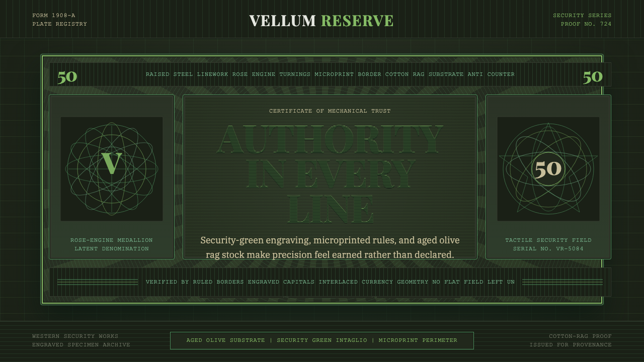 Banknote GuillochéMoney as precision. Security green guilloche frames aged olive rag stock.
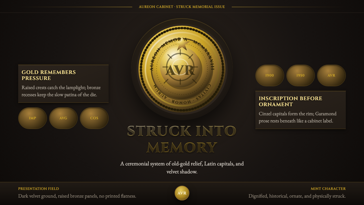 Commemorative CoinAuthority struck in metal. Old-gold relief, denticled rims, and Cinzel capita…
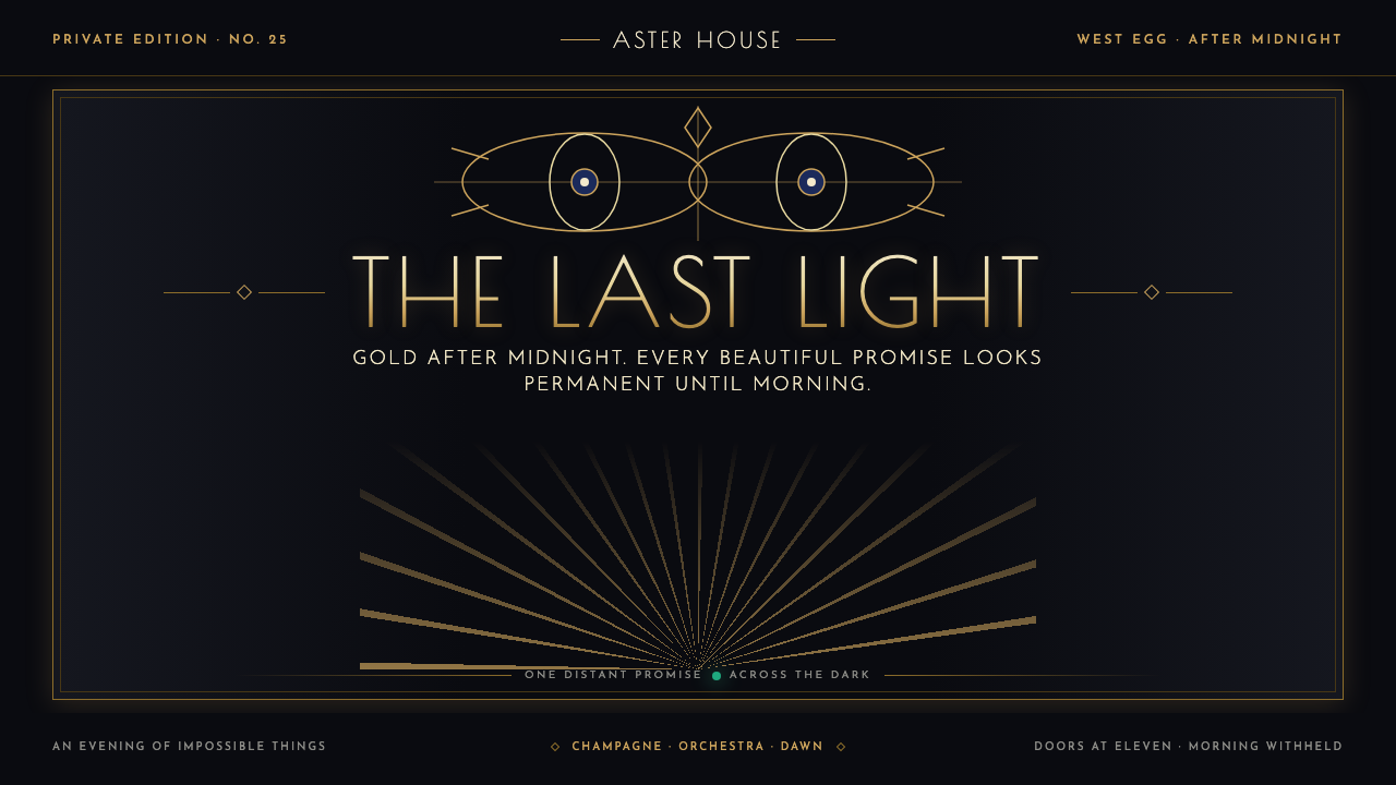 The Great Gatsby (1925)Gilded glamour courts collapse. Deco symmetry burns gold on midnight, with on…
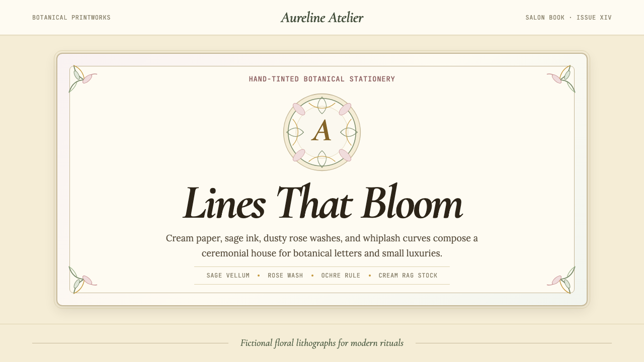 Art Nouveau (Mucha)Mucha's whiplash arabesques. Botanical halos, muted lithograph palette, no ma…
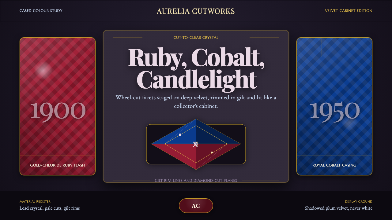 Bohemian Cut CrystalOpulence glows in shadow. Ruby and cobalt facets sit on velvet under gilt rim…
 Cairo Downtown Art DecoStone-real glamour. Mauve stucco, dulled gold rules, and verdigris Deco geome…