What is Kaleidoscope?
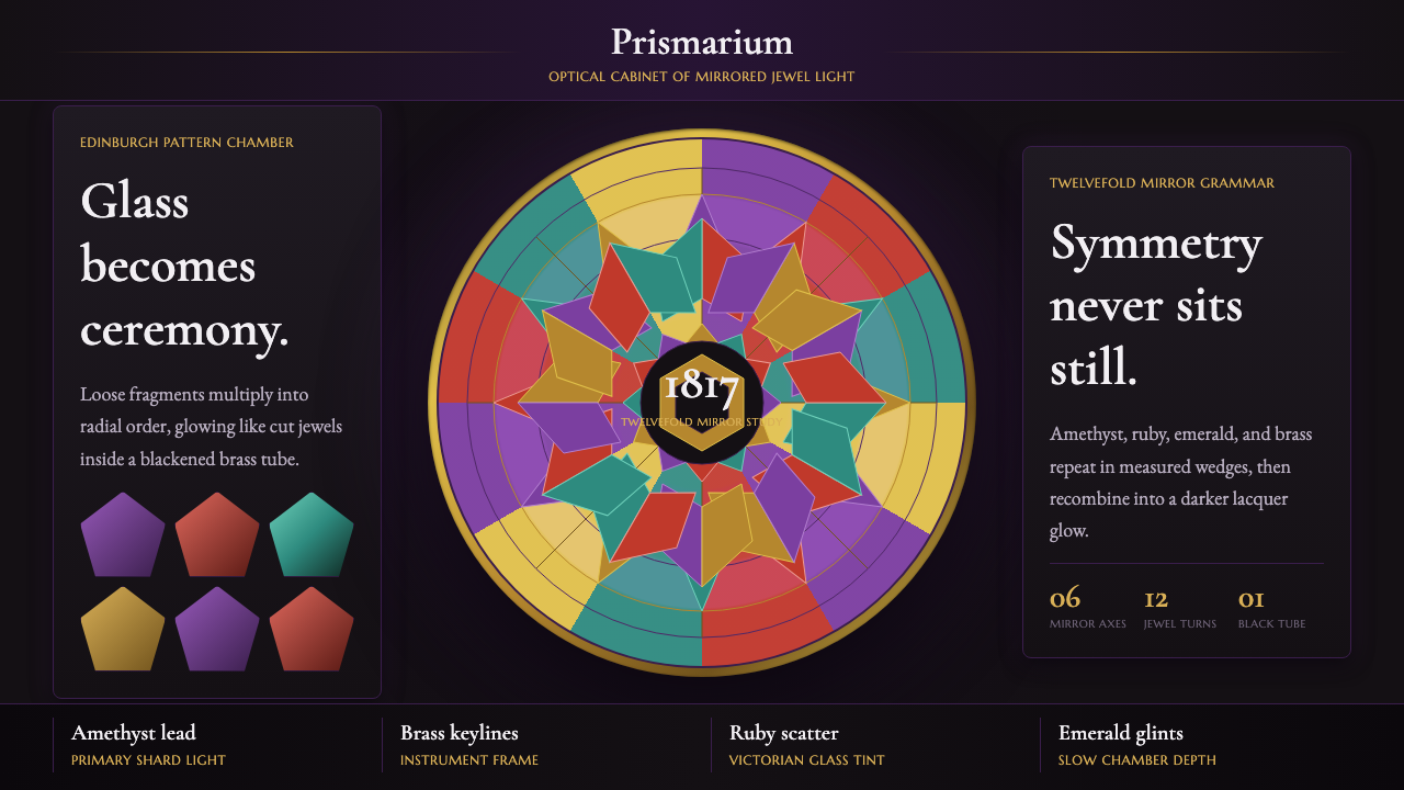
The kaleidoscope turned a handful of loose glass shards into infinite symmetry — and this style borrows that same trick of mirrors to turn a screen into a jewel box.
Kaleidoscope in brief
Kaleidoscope is a design language built around radial symmetry, tumbling jewel-toned shards, and concentric rings of light against a near-black ground — the visual grammar of the optical toy itself, translated into interface and page design. Where most systems organize a layout around a grid, this one organizes it around a center: everything radiates outward in six-fold or twelve-fold repetition, as though a mirrored chamber were folding a few fragments into a mandala.
The palette reads as gemstone under low light — amethyst, ruby, emerald, and brass-gold, each catching a glint rather than sitting flat. Nothing in this system is meant to look printed on paper; it is meant to look lit from within, or reflected across glass. That single decision — treat every color as a jewel under a beam, not a swatch on a page — is what separates an authentic kaleidoscope treatment from a generic 'colorful gradient' theme.
Type and layout stay comparatively disciplined so the ornament has somewhere to land. Period-flavored serif letterforms and layouts built from repeating, mirrored panels keep the composition legible even at its most elaborate — the goal is controlled maximalism, not noise. The style asks to be read as mathematical before it is read as decorative: the dazzle is a byproduct of precise repetition, not an absence of structure.
Where does Kaleidoscope come from?
The kaleidoscope was patented in 1817 by the Scottish physicist Sir David Brewster, working in Edinburgh. Brewster had been investigating the polarization of light — serious optical physics — when he noticed that two mirrors set at an angle inside a tube, with a handful of loose colored-glass fragments at one end, produced a perfectly symmetrical pattern that transformed with every twist of the wrist. He named the device from the Greek kalos (beautiful), eidos (form), and skopein (to see): 'observer of beautiful forms.'
Brewster intended the kaleidoscope as a serious tool for pattern designers — he imagined textile and wallpaper manufacturers using it to generate ornament automatically — and he sought a patent to control its commercial use. The patent, filed too loosely, was quickly circumvented, and the device escaped into a full-blown popular craze. Within a year of its 1817 introduction, an estimated hundreds of thousands of kaleidoscopes had been sold across Britain and the United States; contemporary accounts describe London street vendors selling cheap tin versions on every corner.
The toy's golden age ran through the Victorian parlour-toy era, roughly the 1820s to the 1880s, when manufacturers such as Charles Bush in America refined the form into brass-barreled instruments with genuine cut-glass and mineral chips, sold as both scientific curiosities and drawing-room entertainment. Its appeal cut across audiences that rarely shared a hobby: physicists valued it as a demonstration of optical symmetry, while parlour society valued it purely for spectacle.
The kaleidoscope's underlying logic — a small, fixed set of elements, reflected and rotated into apparently limitless variation — has resurfaced repeatedly wherever design has needed to suggest abundance from restraint: in Victorian pattern-making, in twentieth-century op-art experiments with mirrored repetition, and now in digital interfaces that want to evoke wonder, luxury, or dazzling complexity without literally rendering more content than exists. This style draws directly on that lineage rather than inventing a new one.
What defines the Kaleidoscope look?
Color
The ground is near-black, so every hue reads as if lit from behind rather than printed flat. Amethyst, ruby, emerald, and brass-gold form the working set — deep, saturated jewel tones rather than pastel or muted equivalents. Colors are rarely used alone; they appear in clusters of shards, each catching a slightly different glint, so a single composition can hold four or five jewel tones at once without feeling chaotic, because the dark ground unifies them.
Radial Symmetry
Composition is organized around a center point rather than a grid, repeating a wedge of pattern six or twelve times around that axis — the same mirrored-chamber logic that produces a kaleidoscope's mandala. Elements near the center tend to be smaller and denser; elements toward the outer ring loosen and simplify. This gives even a static layout a sense of rotation, as though the pattern were mid-turn.
Shard Forms
Rather than smooth circles or soft blobs, the geometric vocabulary is angular and faceted — irregular polygons that suggest broken or cut glass, tumbling and overlapping rather than stacked in neat rows. Edges are crisp, never rounded; a shard should look like it could catch a fingertip. Overlap between shards creates the illusion of depth without any actual shadow or blur.
Concentric Light Rings
Beyond the shards themselves, the system uses rings of light emanating from the center — bands that grow fainter as they move outward, echoing the glow a kaleidoscope's mirror chamber casts around its central pattern. These rings are used sparingly, as a unifying halo behind a cluster of shards, never as a background texture repeated indiscriminately across a whole page.
Typography
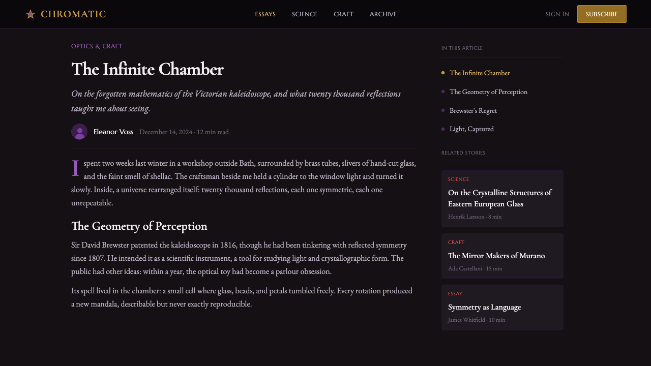
Letterforms lean toward a period-flavored serif — the kind that evokes a Victorian curiosity cabinet or an antique instrument's engraved nameplate, rather than a contemporary geometric sans. This grounds the composition: no matter how much the shard pattern dazzles, the words themselves read as considered and legible, functioning as the still point around which the pattern turns.
Mirrored Repetition
Layout panels are frequently built as mirror pairs — a motif on the left is echoed, flipped, on the right, or a top panel is answered by an inverted twin below. This is a direct structural borrowing from the physical device: a kaleidoscope never draws a new pattern, it only reflects a small set of elements across an axis. Designed compositions that use this style should do the same rather than inventing asymmetric decoration from scratch.
Darkness as Stage
The near-black ground is not incidental — it functions the way the interior of a kaleidoscope's tube does, as the darkness against which every fragment of color becomes vivid by contrast. Large areas of the composition should stay genuinely dark and empty; the temptation to fill every inch with pattern undoes the effect, because a kaleidoscope's magic depends on darkness framing a comparatively small, bright event.

Who shaped Kaleidoscope?
Brewster invented and patented the kaleidoscope in 1817 while researching the polarization of light at Edinburgh, and coined its name from the Greek for 'observer of beautiful forms.' He conceived it as a serious design tool for generating textile and wallpaper patterns, not merely a toy, and his optical research more broadly established principles of light and symmetry that continued to inform both physics and ornamental design long after the kaleidoscope craze itself faded.
Bush was a leading American manufacturer of kaleidoscopes during the Victorian parlour-toy era, producing brass-barreled instruments fitted with genuine cut glass and mineral fragments rather than the cheap tin-and-glass versions sold by street vendors. His instruments elevated the kaleidoscope from a passing fad item into a collectible optical instrument, and surviving Bush kaleidoscopes remain reference objects for understanding how the device's physical materials — brass, glass, mirror — shaped its visual identity.
Beyond any single inventor, the broader Victorian manufacturing trade that mass-produced kaleidoscopes from the 1820s through the 1880s established the object's dual identity as both scientific curiosity and drawing-room entertainment. This trade's willingness to combine genuinely fine materials — brass tubes, real gemstone chips, precision mirrors — with a device intended for casual amusement is itself a key precedent for a style that treats jewel-toned ornament as something to be taken seriously rather than dismissed as decoration for its own sake.
How do you use Kaleidoscope today?
Kaleidoscope reads best wherever a brand wants to signal wonder, luxury, or dazzling craft rather than restraint — it is not a neutral utility style, and applying it well means leaning into spectacle rather than tempering it. The style transfers most successfully when the underlying content can tolerate, or benefits from, being framed as a jewel: something rare and precious being revealed, rather than routine information being delivered.
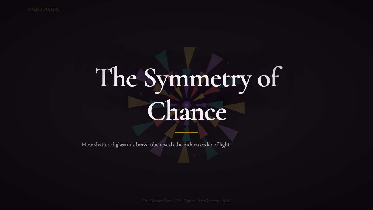
For presentation slides, the style is strongest on cover pages and section dividers, where a radial burst of shards can occupy the full frame around a short, confident title in serif type. Content and data slides need a lighter hand: keep the near-black ground and jewel-tone accent palette, but let only a border, a corner ornament, or a single radial motif carry the kaleidoscope identity, while the body of a chart or bulleted list stays comparatively plain so the data itself remains legible. Overloading a dense data slide with shard patterning is the fastest way to make numbers unreadable.
For web UI, the style suits dashboards and pricing pages that want to feel premium rather than merely functional — a 'vault' or 'collector's' framing for a product works especially well. Use the dark ground as the dominant chrome, reserve the jewel palette for a small number of accent moments (a highlighted plan tier, a key metric, a hover state), and keep dense functional areas — tables, forms, navigation — comparatively restrained so the ornament reads as a considered accent rather than a distraction from the interface's actual job.
For editorial and marketing pages, kaleidoscope motifs work well as full-bleed hero treatments, section breaks, or background texture behind a pull-quote — anywhere the page can afford a moment of pure visual spectacle. It pairs naturally with content about craft, rarity, transformation, or curated collections, since the underlying object's own history — turning a few common fragments into something that looks infinite and precious — mirrors those themes directly.
A common mistake is treating this as a generic 'colorful gradient' or 'confetti' theme and softening the jewel tones into pastels, or replacing the angular shard geometry with smooth blobs and soft shadows. Both moves erase what makes the style recognizable. The palette must stay saturated and gem-like against real darkness, and the shapes must stay faceted and crisp — softness in either dimension turns kaleidoscope into a generic decorative theme with none of the optical-toy specificity that gives it its identity.
Kaleidoscope — FAQ
Is Kaleidoscope the same as a generic 'colorful gradient' or 'confetti' theme?
No, and this is the most common misapplication. A gradient theme blends colors smoothly across a light or neutral ground; kaleidoscope keeps colors as distinct, faceted shards against a near-black ground, with each shard reading as a discrete piece of cut glass rather than a blended transition. The underlying logic is also different: a kaleidoscope's pattern is always built from radial symmetry and mirrored repetition around a center, while a generic colorful theme has no such organizing structure. Treating the two as interchangeable strips out everything that makes the style specific.
Does Kaleidoscope only work on dark backgrounds?
The near-black ground is central to the style's identity, in the same way darkness is essential to how a physical kaleidoscope's mirror chamber makes fragments glow. A light-background version is possible but demanding: it has to find another way to make the jewel tones read as luminous rather than flat, since the usual contrast against darkness is no longer available. For most applications, keeping the dark ground and simply varying how much of the frame the shard pattern occupies is the more reliable path to an authentic result.
How much of a layout should the shard pattern actually cover?
Less than the style's dazzle might suggest. The physical kaleidoscope's magic comes from a relatively small, bright pattern surrounded by real darkness inside the tube — not from every surface being covered in fragments. The most successful applications reserve dense shard patterning for a focal moment (a hero image, a cover panel, a section divider) and let large areas of the composition stay genuinely empty and dark. Covering an entire page edge-to-edge in shards tends to read as cluttered rather than dazzling.
What typography pairs well with the kaleidoscope palette?
A period-flavored serif is the natural pairing, since it evokes the same Victorian instrument-maker's world the physical device comes from — think of the engraved nameplate on a brass kaleidoscope tube rather than a contemporary app interface. A crisp geometric sans can work for small functional labels (button text, form fields) where legibility at small sizes matters more than atmosphere, but the primary display type carrying the brand voice should lean toward that antique, considered serif register rather than a modern grotesque.
Is this style appropriate for serious or professional products, or only playful ones?
It suits products that want to be taken seriously as collectible, rare, or expertly crafted — a premium subscription tier, a curated marketplace, a jewelry or luxury goods brand, a 'vault' of exclusive content — because the physical kaleidoscope itself straddled science and spectacle rather than belonging purely to either. It is a poor fit for products built around speed, efficiency, or plain utility, where dazzling ornament competes with the core promise rather than reinforcing it. The test is whether 'rare and precious' is a message the product actually wants to send.
Related design styles
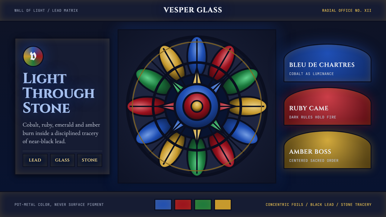 Gothic Rose WindowDarkness becomes light. Cobalt glass, ruby foils and black lead form a radial…
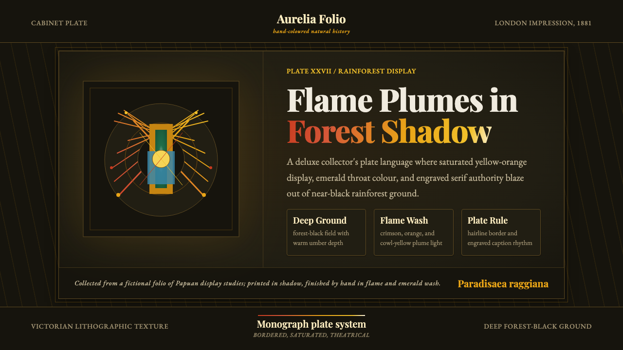 Bird of Paradise MonographTheatrical plate-book darkness. Flame plumes blaze from a bordered forest-bla…
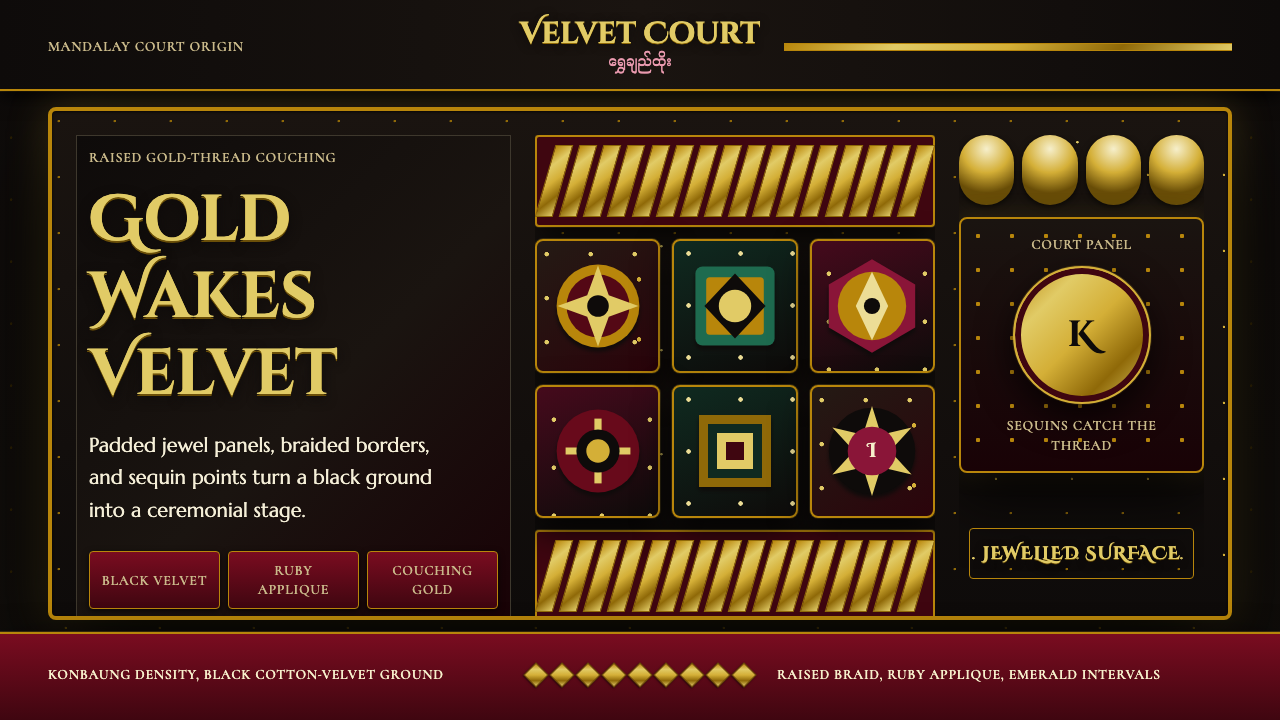 Burmese Kalaga TapestryVelvet becomes theater. Black ground, gold-thread borders, ruby and emerald p…
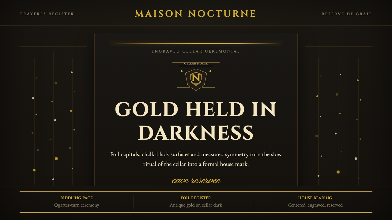 Champagne MaisonGrandeur without glitter. Cinzel capitals and gold foil rules glow in cellar…
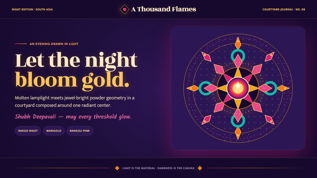 Diwali Festival of LightsNight blooms from within. Molten gold and jewel-bright rangoli radiate across…
 English Afternoon TeaOrnament is the ritual. Old-rose porcelain, gilt rims, and script rest on ros…