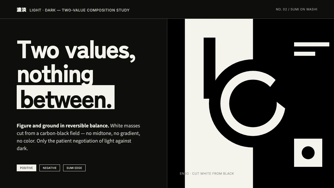
About Notan Light-Dark
Notan — Japanese for "light-dark" — is the design discipline of balancing masses of black and white with no midtone between them. Brushed in sumi ink on white washi, a notan study is fundamentally reversible: a yin-yang interchange where positive and negative carry equal weight. The honest ground is the black field with white shapes cut from it, not a defaulted white page.
This system distills that two-value rigor into an interface language. Components read as flat white masses cut from a carbon-black ground, their edges carrying dry-brush character. No gradients, no grays, no color — only the patient negotiation of light against dark.
- Origin
- East Asia — Japan; transmitted into Western art-school design theory
- Era
- 1900–1950 (rooted in older Japanese ink practice; codified for Western design pedagogy ~1899–1920)
- Key figures
- Arthur Wesley Dow · Ernest Fenollosa
- Movements
- Japanese sumi-e / notan design theory · Early-20th-century compositional design education · Modernist black-and-white abstraction
Notan Light-Dark design spec
Colors
Typography
The other 11 sections — buttons, cards, spacing, motion, techniques and more — open once you unlock. Download the DESIGN.md or send it to your AI in one click. Unlock once, yours forever.
Sign up nowStyles similar to Notan Light-Dark
Also inspired by art & artists, with a close feel.
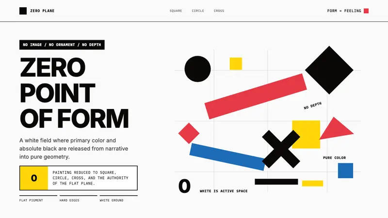 Malevich SuprematismGeometry declares zero. Red, yellow, blue and black blocks float on active white.
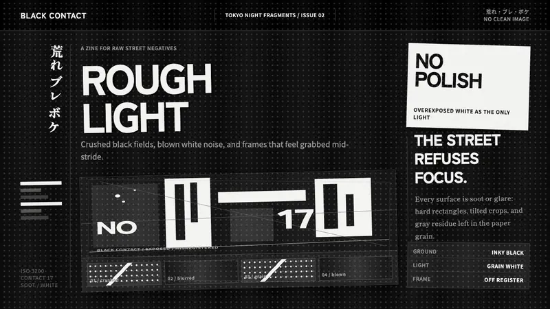 Daido Moriyama Are-Bure-BokeNothing is clean. Inky black, blown white grain, and tilted frames make the image restless.
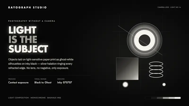 Photogram RayographLight is the subject. Ghost-white silhouettes and silver halation float on inky darkroom black.
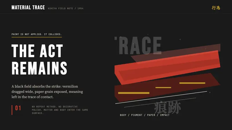 Gutai (Yoshihara, 1954)The gesture survives. Sumi black carries one vermilion strike and rough paper grain.