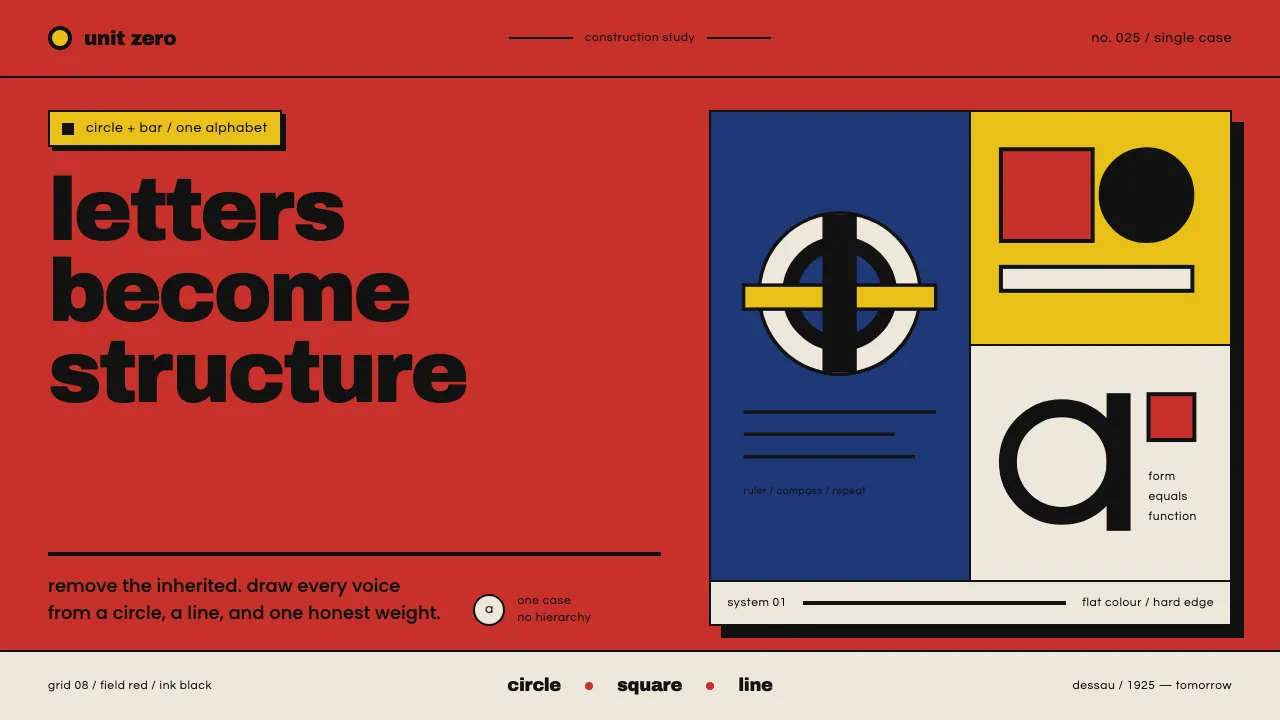
About Bayer Universal Bauhaus
In 1925 at the Bauhaus Dessau, Herbert Bayer drew Universal — a single-case, lowercase-only alphabet built from the circle and the horizontal bar with ruler and compass, letters reduced to their geometric essentials. Though the proof sheet is black ink on white, its native home is Bauhaus flat-colour graphics: monoline black forms sitting on fields of pure primary red, blue and yellow. This system rebuilds that honest ground — Bauhaus red, black letters, hard geometry, no decoration.
- Origin
- Dessau, Germany
- Era
- 1925 (Bauhaus Dessau); native flat-colour graphic language
- Key figures
- Herbert Bayer · Johannes Itten · Wassily Kandinsky
- Movements
- Bauhaus · New Typography · geometric constructivist lettering
Bayer Universal Bauhaus design spec
Colors
Background
Surface
Primary
Secondary
Accent
Text
Typography
Archivo BlackHeadings
PoppinsBody
QuestrialMono
Unlock for 1 credit
The other 11 sections — buttons, cards, spacing, motion, techniques and more — open once you unlock. Download the DESIGN.md or send it to your AI in one click. Unlock once, yours forever.
Sign up nowHave an account? Sign in
Styles similar to Bayer Universal Bauhaus
Also inspired by design movements, with a close feel.
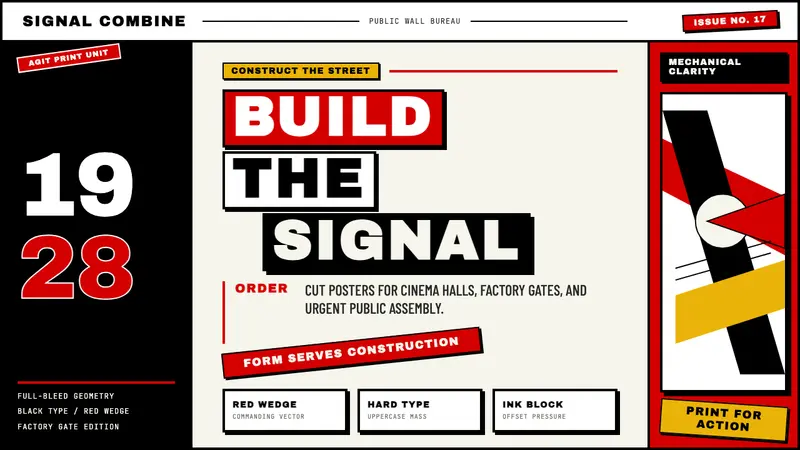 Russian ConstructivismRevolution red, slashed across black and white. Diagonal sans-serif, photomontage collisions.
 Italian Futurism (Marinetti 1909)Speed murders tradition. Signal red and chrome yellow slash a broken diagonal grid.
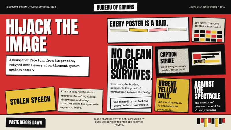 Situationist Détournement (1957)Contraband urgency. Strike red, toner black, and jagged comic panels make theory look stolen.
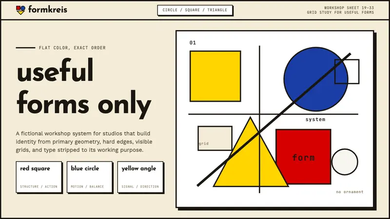 Bauhaus WeimarForm follows revolution. Primary red-blue-yellow on cream, hard shadows, no ornament — pure form.